
Struggling with how to avoid large layout shifts on your website?
Layout shifts can cause a poor user experience on your site. They’ll also increase your Cumulative Layout Shift score, which is one of the three metrics in Google’s Core Web Vitals initiative.
Fortunately, there are a few best practices you can employ to prevent large layout shifts when a page is loading. By simply assigning dimensions and creating structural placeholders, you can drastically improve your site’s loading times. If that doesn’t work, you can try additional strategies like preloading fonts.
 In this post, we’ll briefly introduce you to website layout shifts and discuss their impact on your site’s performance. Then, we’ll share four ways you can avoid them. Let’s get to it!
An introduction to layout shifts
A large layout shift is exactly what it sounds like. When a website isn’t optimized for performance, large areas of content can become unstable, jumping and moving as the page loads.
These shifts can affect any element of a web page including banners, text, side panels, and even buttons. This can be super annoying for the user as it can cause them to click on the wrong element or lose their place on the page:
As you can see, unstable layouts are a serious issue for frontend users. If you have an online store, they can make your customers pretty unhappy!
What’s more, Cumulative Layout Shift (CLS) is one of Google’s metrics for Core Web Vitals. CLS measures visual stability and it is one of the three major indicators of a website’s performance. This collection of key metrics directly affects your site’s rankings in search results.
As a WordPress developer, you’ll likely encounter clients who need help with this issue. Plus, you wouldn’t want to ruin a client’s SEO by neglecting it.
Since large layout shifts directly impact CLS, you may receive a warning about them when testing your site with PageSpeed Insights, Lighthouse, or Chrome DevTools.
When your site has layout issues, any of these performance monitoring tools will return the “avoid large layout shifts” result:
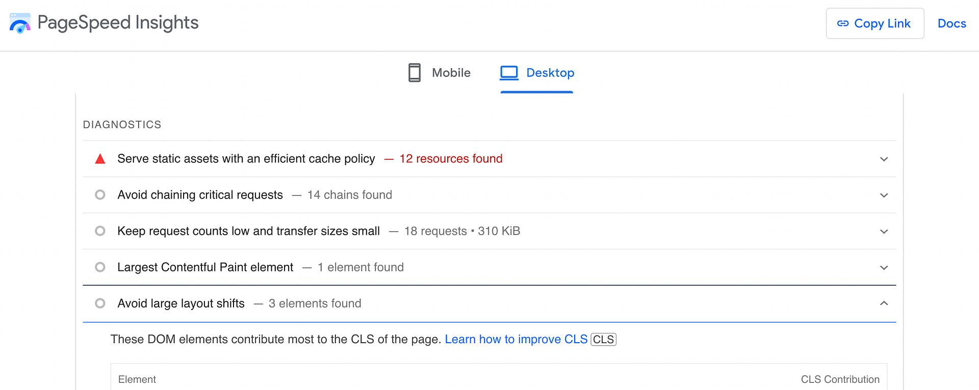
They might also tell you which page elements are behind the issue. With this knowledge, you’ll be able to focus on the right strategies for avoiding large layout shifts. If you haven’t already run a performance test for your site, now might be a good time to do so.
Best practices to avoid large layout shifts
Whether you’re building a website from scratch or helping a client improve their site’s overall performance, you’ll want to pay attention to layout shifts. Here are four ways you can avoid them!
- Assign dimensions to images
- Create placeholders for advertisements and embeds
- Properly manage font loading
- Optimize dynamic content
1. Assign dimensions to images
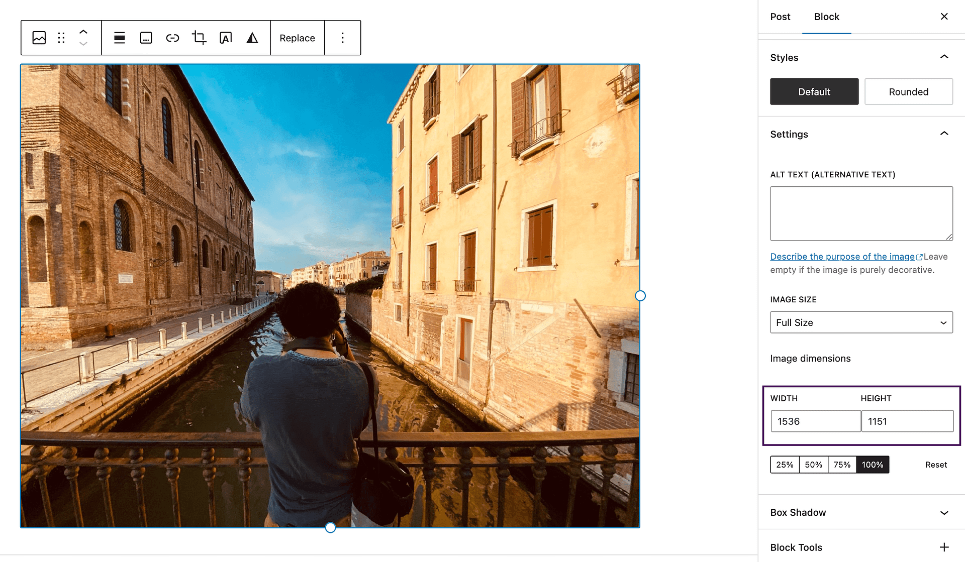
Most websites contain a lot of images in different sizes. This is fine as long as all image dimensions are defined.
When you include height and width attributes for an image, this tells web browsers how much space to reserve for that image as it’s loading. If your client’s website uses lots of different image sizes and their dimensions aren’t defined, the browser will have to predict the amount of space each image will need. This can result in unsightly large layout shifts.
Fortunately, the WordPress block editor automatically defines these dimensions when you use it to upload a file:
So, if you’re building a brand new website, you can use the block editor to avoid any layout issues (and encourage your clients to do the same).
On the other hand, if images have been added manually or with a plugin, you may need to go back to establish their dimensions.
If you feel comfortable, you can add these missing image dimensions using code. Or, if you prefer a more automatic solution, you can also find WordPress plugins that let you add missing image dimensions.
For a feature-specific plugin, you can consider the free Specify Missing Image Dimensions plugin.
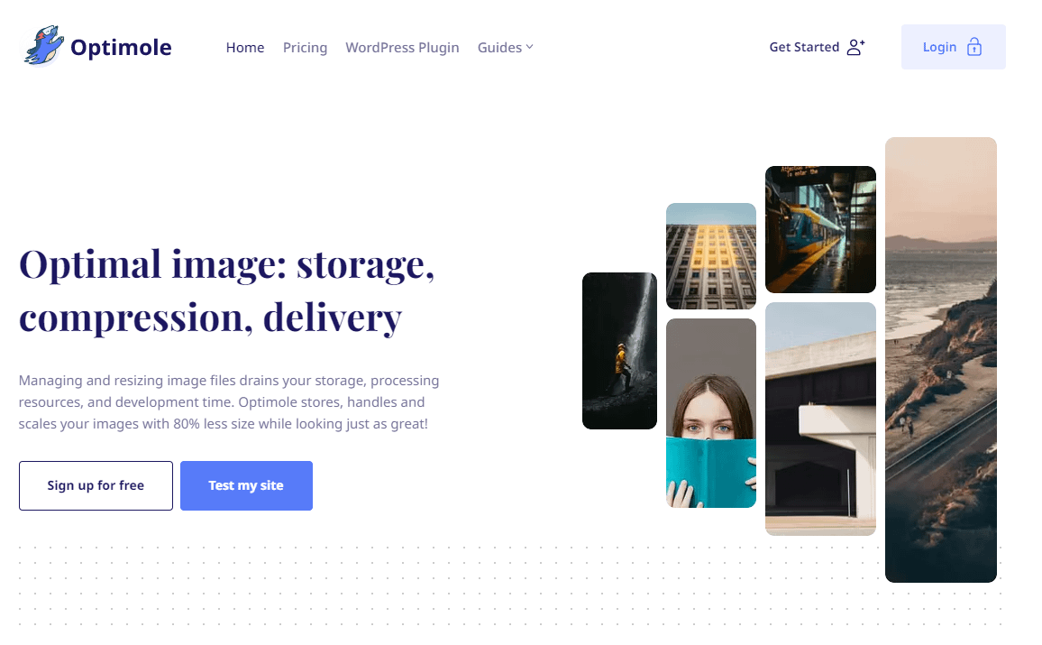
Or, you can consider a plugin like Optimole, which offers a much more comprehensive way to optimize your site’s images, including real-time compression/resizing, adaptive images, lazy loading, and a CDN. As part of that, Optimole will automatically set dimensions for all of your images.
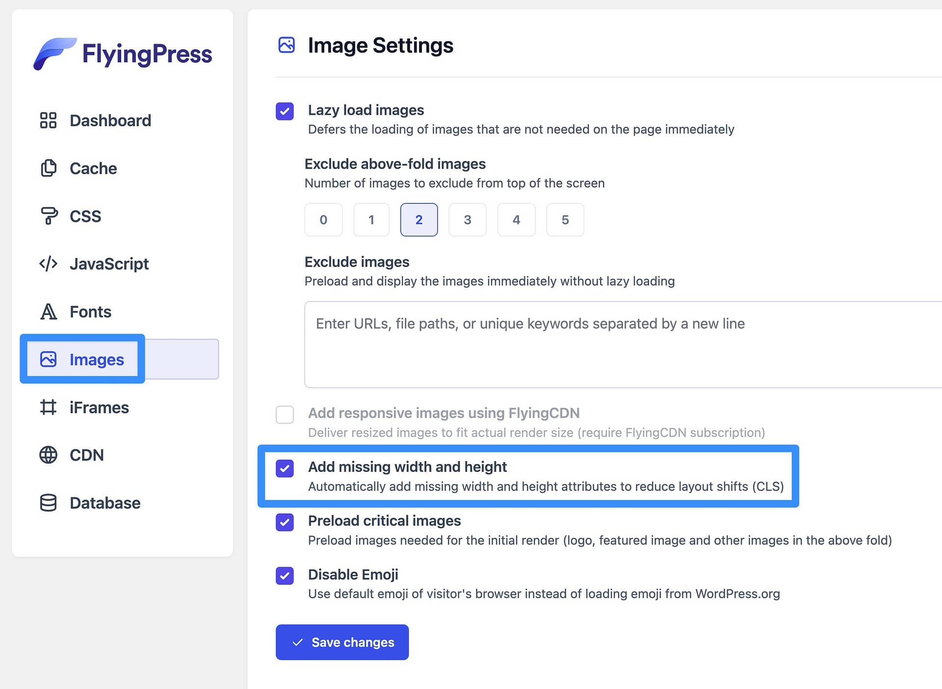
Finally, most all-purpose WordPress performance plugins also offer this as a feature, including Perfmatters, FlyingPress, and WP Rocket.
2. Create placeholders for advertisements and embeds
Other types of media can also impact your site’s layout shifts. However, banners for advertisements and embeds like YouTube videos are some of the most common culprits.
One quick way to avoid large layout shifts caused by display ads and to improve CLS is by implementing lazy loading. Still, this probably won’t completely resolve the issue.
The best way to mitigate layout shifts for both ads and embeds is by manually creating placeholders using custom CSS. Google Developers recommends tackling this with simple min-height and min-width attributes.
Using this approach, you might style your display ad like this:
<div id="ad-slot" style="min-width: 400px; min-height: 350px;"></div>This will create a container, reserving a minimum amount of space for these design elements. However, it will still enable the browser to increase this container when necessary.
Dynamic ads can make this a bit trickier because you won’t necessarily know the exact dimensions of the ad before it loads.
If you want to completely eliminate large layout shifts for ads, you should reserve enough space for the largest possible ad dimensions. But, be aware that this might cause empty space if a smaller ad size loads.
3. Properly manage font loading
How your site’s fonts load can also cause issues with large layout shifts due to FOIT (flash of invisible text) and/or FOUT (flash of unstyled text).
In the past, preloading fonts was a quick and easy way to avoid large layout shifts. However, today, Google cautions against it and suggests other more effective strategies to properly manage web fonts.
The first thing you can do is use inline font declarations. Specifically, you’ll need to employ the @font-face and font-family declarations, which give you more control over how your site’s fonts load.
But first, it’s important to understand how these work.
To put it simply, @font-face and font-family can indicate the name and location of a font file:
@font-face {
font-family: "Comic Sans";
src: url("/fonts/ComicSans-Regular-webfont.woff2") format("woff2");
}
However, you’ll need to add these declarations to the <head> of the main document as opposed to an external stylesheet:
@font-face {font-family: "Comic Sans";
src: url("/fonts/ComicSans-Regular-webfont.woff2") format("woff2");
}
h1 {
font-family: "Comic Sans"
}
You’ll also need to establish what elements these declarations are referring to. In the example above, @fontface will only be triggered when a page contains h1 headings.
Additionally, if the site you’re working on needs to load fonts from a third-party source, you may want to preestablish that connection. You can do this using the preconnect resource hint and the Cross-Origin Resource Sharing (CORS) mechanism.
This will look something like this:
<head>
<link rel="preconnect" href="https://testfonts.com">
<link rel="preconnect" href="https://testfonts.com" crossorigin>
</head>
The first line here sets up a connection for loading a font stylesheet, while the second (with the crossorigin attribute) is for the font specifically. Keep in mind that some font providers serve stylesheets and fonts from separate origins.
4. Optimize dynamic content
Another major issue when it comes to layout shifts is dynamic content. This non-static material often comes in the form of banners containing “related content,” newsletter signup forms, or even GDPR notices.
While this type of content can be highly effective in helping you engage visitors, it can also scare them off if it’s causing visual instability. For instance, if a user was trying to click on an article in the World News section of this page, the slow-loading “Related Articles” banner might prove bothersome:
Therefore, you’ll want to optimize any dynamic content to avoid large layout shifts.
One way you can do this is by employing some best practices in your design process. For example, you might want certain user actions to trigger dynamic page elements like signup forms, instead of prompting them to load right away.
For instance, you could wait until the user clicks a button to display a newsletter opt-in form.
As with other types of media, you can use simple CSS to create containers that serve as placeholders for any dynamic content that may cause a layout shift. This might be advisable for dynamic elements that appear close to the top of your page.
Finally, if you absolutely need to trigger an element automatically, consider loading it from the bottom of the screen. For example, automatically loading a notification bar at the top of the window will cause large layout shifts by pushing all of the other content down.
By loading the notification bar at the bottom of the window instead, you can avoid that.
This can be especially relevant for cookie consent notices, which is why you’ll see a lot of sites load these notices at the bottom of the screen.
Avoid large layout shifts for good 
Slow loading and glitchy pages can create a negative user experience, leaving your visitors frustrated or confused.
Large layout shifts can be especially annoying as they might lead to user errors or cause people to lose their place on a page.
Therefore, you’ll need to implement some good practices in your design process to help prevent this problem.
To recap, here are four ways you can avoid large layout shifts:
- Assign dimensions to all images.
- Create placeholders for ads and embeds.
- Properly manage font loading.
- Optimize dynamic content.
For some other ways to optimize your site’s performance, you also might be interested in our guides on WordPress caching and how to make fewer HTTP requests.
Do you have any questions about how to avoid large layout shifts? Let us know in the comments section below!