DiviCity is a one-page Divi layout available in the Divi Marketplace. It has a versatile design that can be used for many different types of websites and is completely responsive and customizable. In this product highlight, we’ll take a look at the DiviCity layout and help you decide if it’s the right layout for you.
Let’s get started!
Installing DiviCity
DiviCity comes as a ZIP file containing Divi Visual Builder .json files. To install the layout, start by unzipping the file. Next, open your page in the Divi Builder.
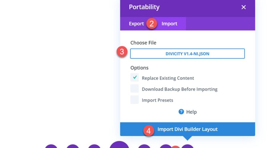
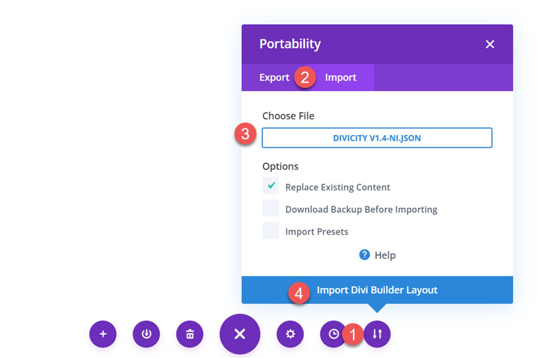
Click the portability option at the bottom of the page and select the import tab. Then select the .json file for the DiviCity layout and begin importing the layout. Once the layout has been imported, all you need to do is replace the content with your own, and your website is complete!
DiviCity
DiviCity consists of a one-page Divi Builder layout. It comes without any of the demo images, so I added my own for the purpose of this article. Let’s take a look at the sections that come with this layout!
DiviCity Header Section
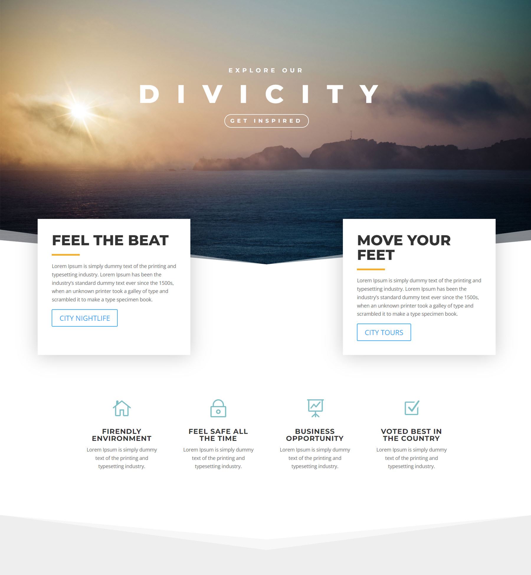
The header consists of a large image with an angled divider at the bottom. The header has features subheader and header text, as well as a button. The text features a loading animation effect. Two boxes overlay the bottom of the header section. Each box contains some heading text, a divider line, body text, and a button. These boxes also have a loading animation and expand on hover. Finally, there are four blurb modules below with an icon, heading text, and body text. The blurb modules reveal one at a time as the page loads. This heading layout can be easily customized with your own photos and content to create a great-looking, engaging heading section that gives your visitors key information about your business at a glance.
DiviCity About Section
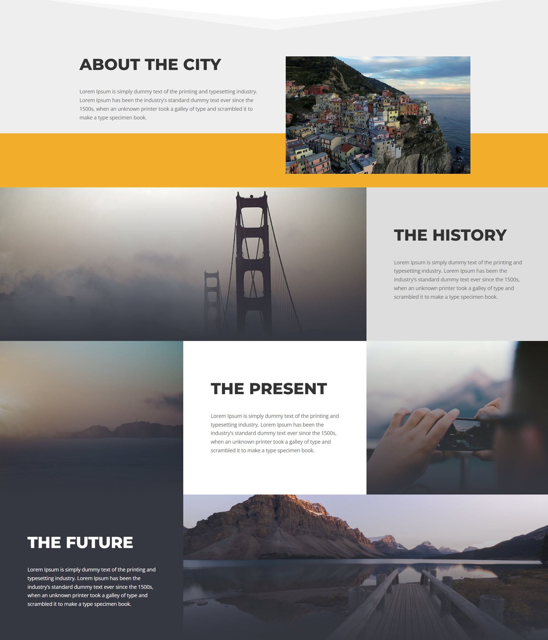
The about section has some introduction text, a header on the left, and an image on the right. Both of these elements have a fade-in animation and move into the center. Below are three fullwidth sections that feature an image and a text block with a heading and some body text. Each of these sections have a loading animation effect as well.
DiviCity Blog Section
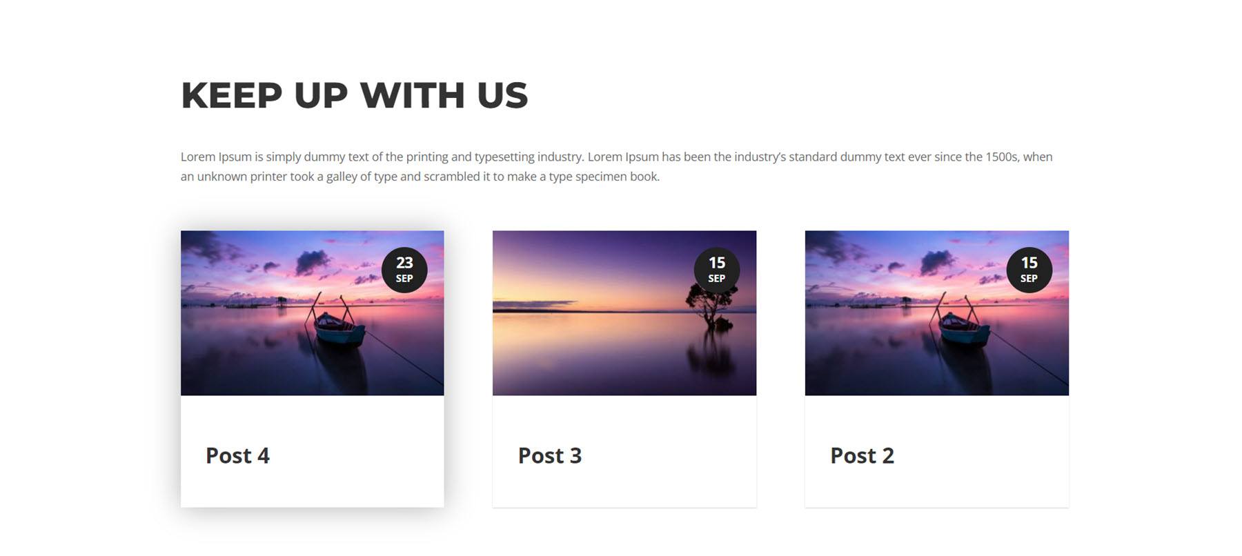
By default, the blog section features a simple recent posts module listing three recent posts with the featured image and post information. There is also some heading text and body text in this section. This section features fade-in animation.
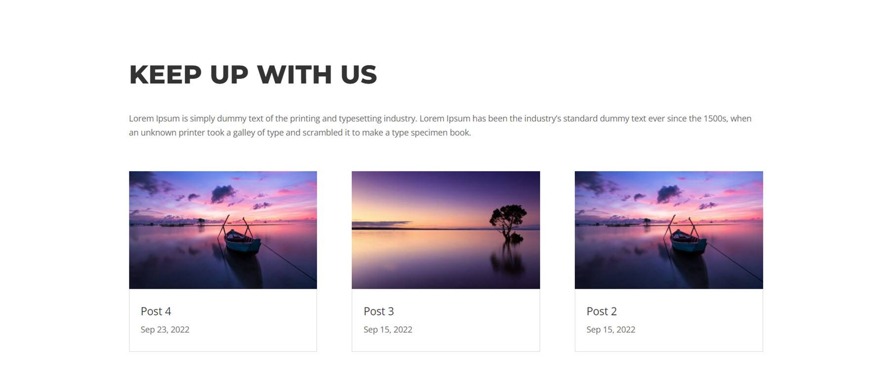
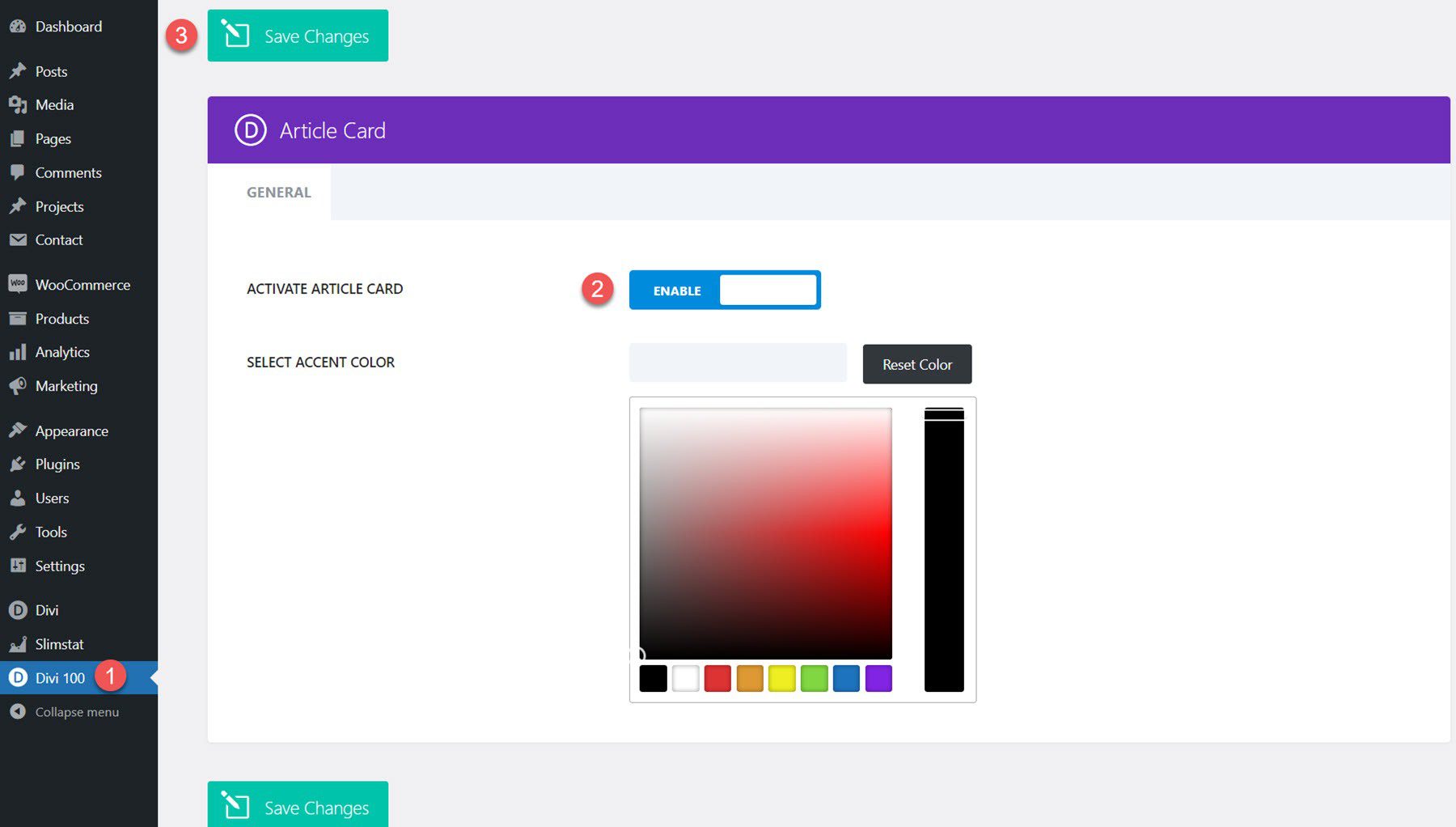
Alternatively, you can achieve the design featured in the layout demo by installing the free Divi Article Cards plugin. Once the plugin is installed and activated on your site, open the Divi 100 settings from the WordPress dashboard menu. Activate the article card, then click save.
Now the blog modules on the DiviCity page should look something like the layout above.
DiviCity Numbers Section
The numbers section features four bar counters on an image background — the number counters load as the page loads.

DiviCity What to Do Section
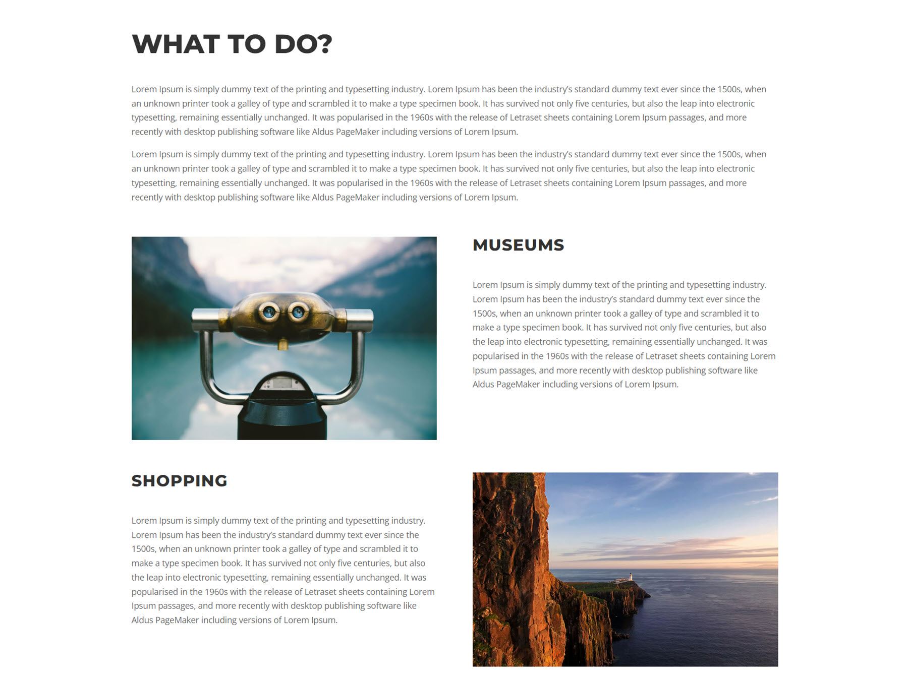
This section features a heading and some body text. There are two sub-sections below this, each with an image, a heading, and body text. This section is a very versatile layout that can be used to demonstrate features, services, or other aspects of your business.
DiviCity Where to Do It Section
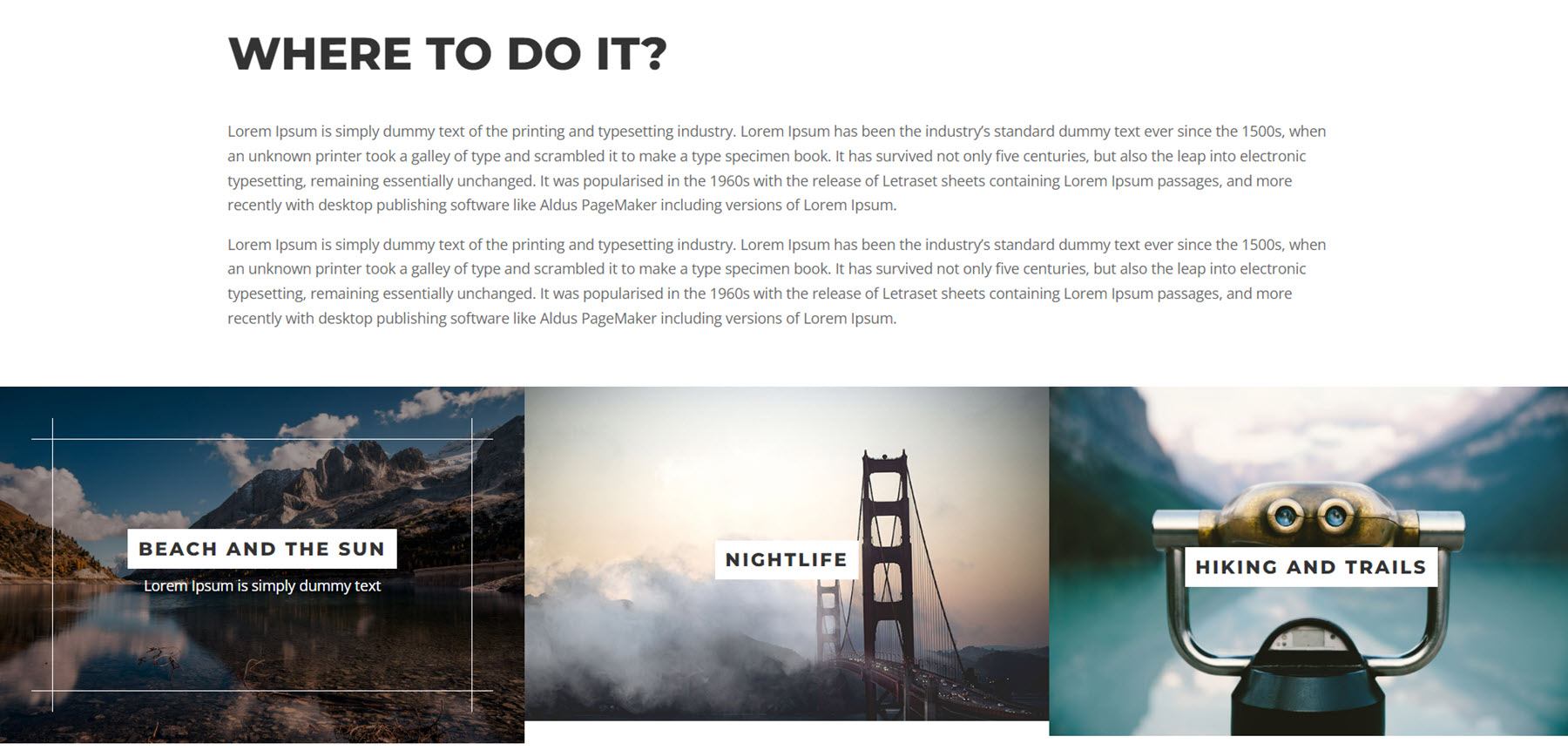
This section is also versatile and features a heading, body text, and three blurbs with an image, some text, some short description text, and a border that appears on hover. The image zooms in on hover as well. You could use these blurbs to link to another page or section on your website, or to simply display some features or information.
DiviCity Visit Us Section
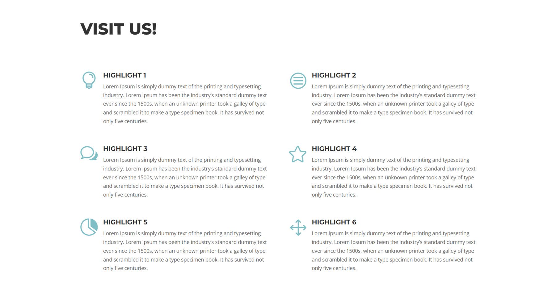
Next, the Visit Us section features six blurb modules, each with an icon, heading text, and body text. You can customize this section to highlight more features or aspects of your services or to break up dense text with separate headings and icons. The blurb modules all feature a zoom-in animation.
DiviCity Contact Section
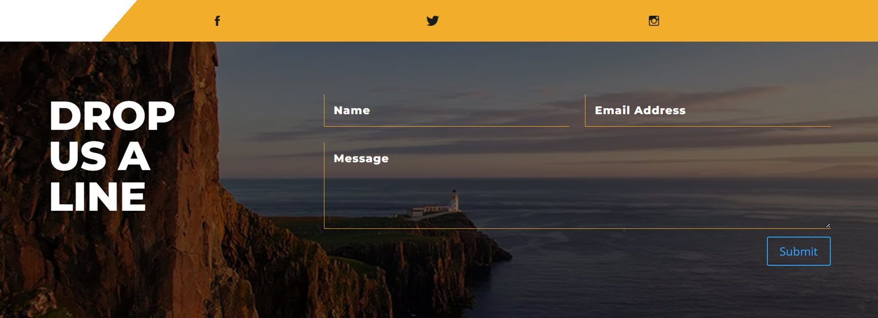
Finally, the contact section begins with an orange strip that has three social media icons. Below is the contact form section with large heading text on the left and the form on the right. The contact section has a large image background with a dark overlay. This section also features a flip-loading animation effect, and the social media icons fade in.
DiviCity Mobile Layout
DiviCity is completely tablet and mobile-responsive. Let’s take a look at the mobile version of a few sections.
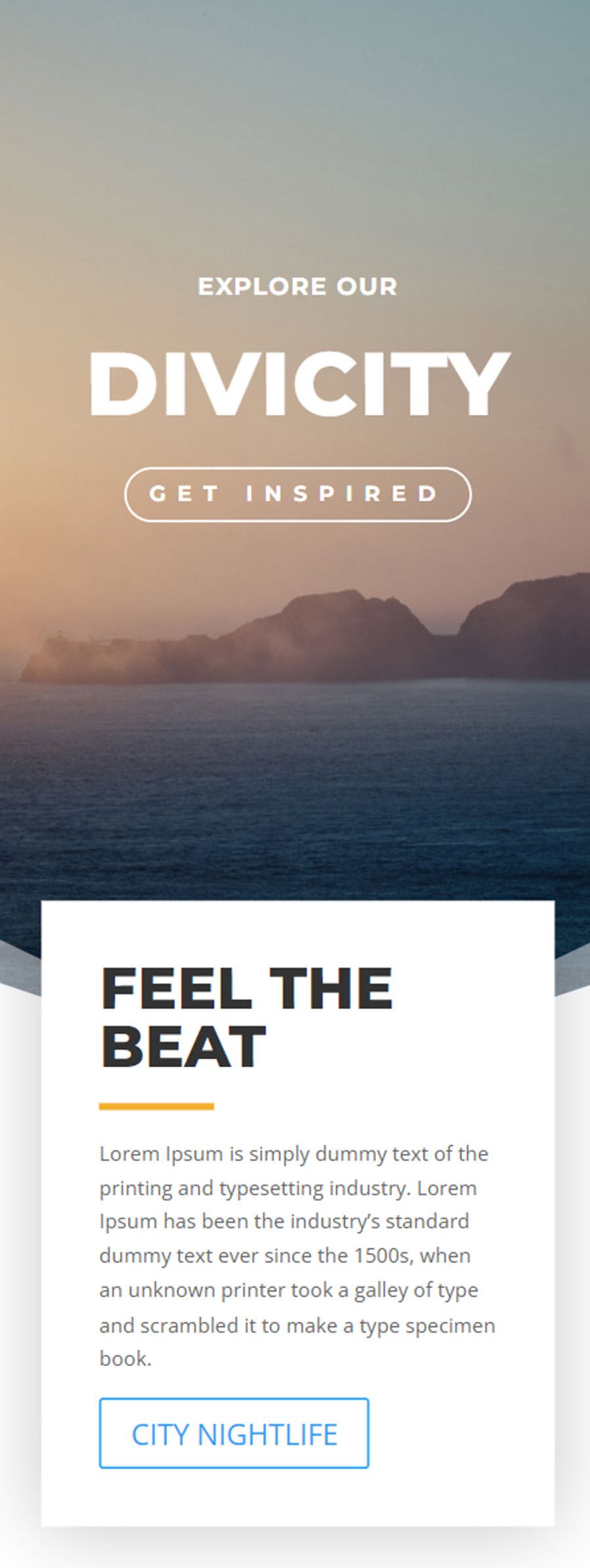
First is the header section, with a large image background, heading text, and button. The first text box overlays the header and the rest of the header section contents follow below.
This is part of the mobile about section with images separated by some sections with text.

This is the mobile version of the “Where to Do It” section. It has a large image at the top, heading text, body text, then three images with a label on each.

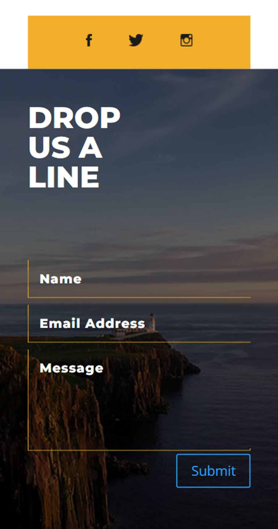
And finally, this is the mobile footer. Like the desktop version, it features an orange bar with social media icons, followed by the footer section with an image background, text, and the contact form.
Purchase DiviCity
DiviCity is available in the Divi Marketplace. It costs $19 for unlimited website usage and lifetime updates. The price also includes a 30-day money-back guarantee.
Final Thoughts
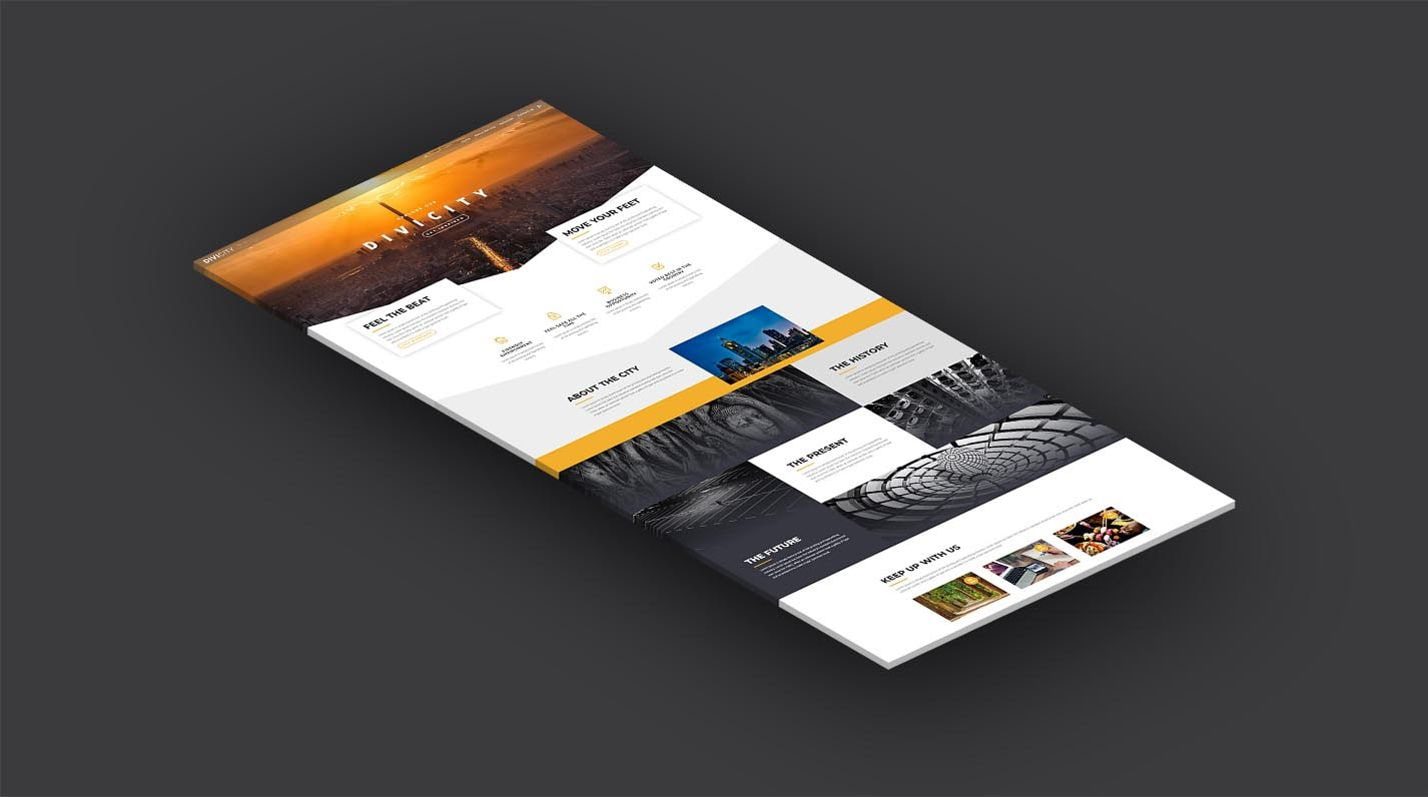
DiviCity is a simple and great-looking website layout that is incredibly versatile. Because it’s built with Divi, the layout is easy and intuitive to customize for your own use. The loading animations and hover effects throughout the layout look nice and cohesive and aren’t too distracting from the page content or usability. I also like the use of large images across the design as well as the typography used in the layout. If you are looking for a simple one-page website layout for your next Divi project, this might be the right product for you.
We would love to hear from you! Have you tried DiviCity? Let us know what you think about it in the comments!
The post Divi Product Highlight: DiviCity appeared first on Elegant Themes Blog.
