We’ve all been there — scrolling through endless design galleries at 2 am, looking for that perfect spark of web design inspiration. With millions of websites competing for attention, finding fresh ideas that actually work can feel like searching for a needle in a haystack.
This guide cuts through the noise. We’ll show you exactly where top designers find their web design inspiration and how they transform those creative sparks into stunning websites using tools like Divi. As a bonus, you’ll also discover practical ways to fuel your next project with fresh ideas that you can actually bring to life. Let’s get to it!
Why Finding The Right Web Design Inspiration Matters
Finding web design inspiration isn’t just about collecting pretty screenshots — it’s about understanding what makes specific designs click with visitors while others fall flat. Behind every stunning website lies a foundation of strategic choices that blend visual appeal with practical function.
After years of studying successful websites, we’ve noticed how seemingly random design elements often have deep strategic roots. That stunning hero section or smooth scroll animation aims to move visitors toward clear goals while maintaining visual appeal.
The path between discovering great design and implementing it effectively requires understanding core principles. Many designers hit roadblocks when they spot a site they love — trying to recreate attractive elements without considering their purpose often leads to disjointed experiences that fail to serve visitors.
The best web designs pull inspiration from multiple sources:
- Industry-specific elements that establish credibility
- Fresh approaches that break conventional patterns
- Proven layouts that guide user behavior
- Original touches that set sites apart
The Difference Between Inspiration & Copying
The line between inspiration and copying gets blurry fast in web design. While browsing web design inspiration, you might spot a navigation menu or hover effect that perfectly fits your project. However, implementing these elements takes more finesse than simply duplicating code.
Real inspiration transforms elements to serve your specific needs. Take Apple’s famous minimalist design approach — countless sites attempt to copy their stark white backgrounds and centered headlines but miss the careful typography and spacing and, most importantly, their reputation that makes their design work.
Here’s what separates inspiration from copying:
| Idea | Inspiration? | Copying? |
|---|---|---|
| Understanding spacing principles and adapting them to your layout | ✅ | ❌ |
| Using competitor’s exact hex codes | ❌ | ✅ |
| Mixing elements from different industries into your design | ✅ | ❌ |
| Drawing influence from print design for web layouts | ✅ | ❌ |
| Using the same stock photos as similar websites | ❌ | ✅ |
| Implementing similar features with your own twist | ✅ | ✅(Debatable) |
| Duplicating entire sections of code from other sites | ❌ | ✅ |
| Testing different approaches to solve the same problem | ✅ | ❌ |
| Recreating popular animation effects frame by frame | ❌ | ✅ |
| Borrowing and tweaking color psychology from successful brands | ✅ | ❌ |
| Using identical font combinations from competitor sites | ❌ | ✅ |
| Studying how others handle mobile navigation | ✅ | ❌ |
| Learning from successful A/B tests in your industry | ✅(Debatable) | ✅(Debatable) |
| Using the exact same call-to-action phrases | ❌ | ✅ |
| Creating similar checkout flows | ✅(Debatable) | ✅(Debatable) |
| Duplicating someone’s entire brand guidelines | ❌ | ✅ |
Web Design Inspiration: Current Web Design Trends
Design trends come and go, but some stick around long enough to reshape how we think about web experiences. Let’s look at what’s working right now — not just what’s trendy on social media, but approaches that users genuinely respond to. Below are some of the trends we covered extensively recently in another post.
1. Storytelling Through Design
Modern web design weaves narratives through every scroll, click, and interaction. Successful sites guide visitors through a carefully crafted journey using visual hierarchy, progressive disclosure, and strategic content placement.
Parallax scrolling, horizontal storytelling, and immersive layouts help create memorable experiences. But compelling design storytelling isn’t just about fancy effects — it’s about understanding your audience’s journey and crafting resonating touchpoints.
2. Retro Resurrection
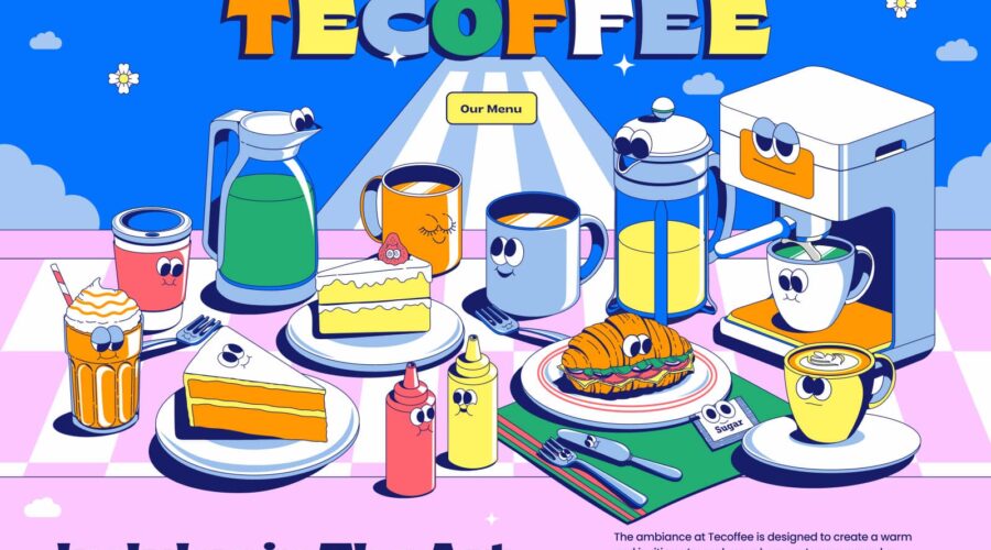
The web is having its vinyl record moment. Those chunky shadows, Y2K aesthetics, Memphis design patterns, and grainy gradients your design teacher warned you about? They’re back with a vengeance. But today’s take on retro isn’t just copying Windows 98 interfaces.
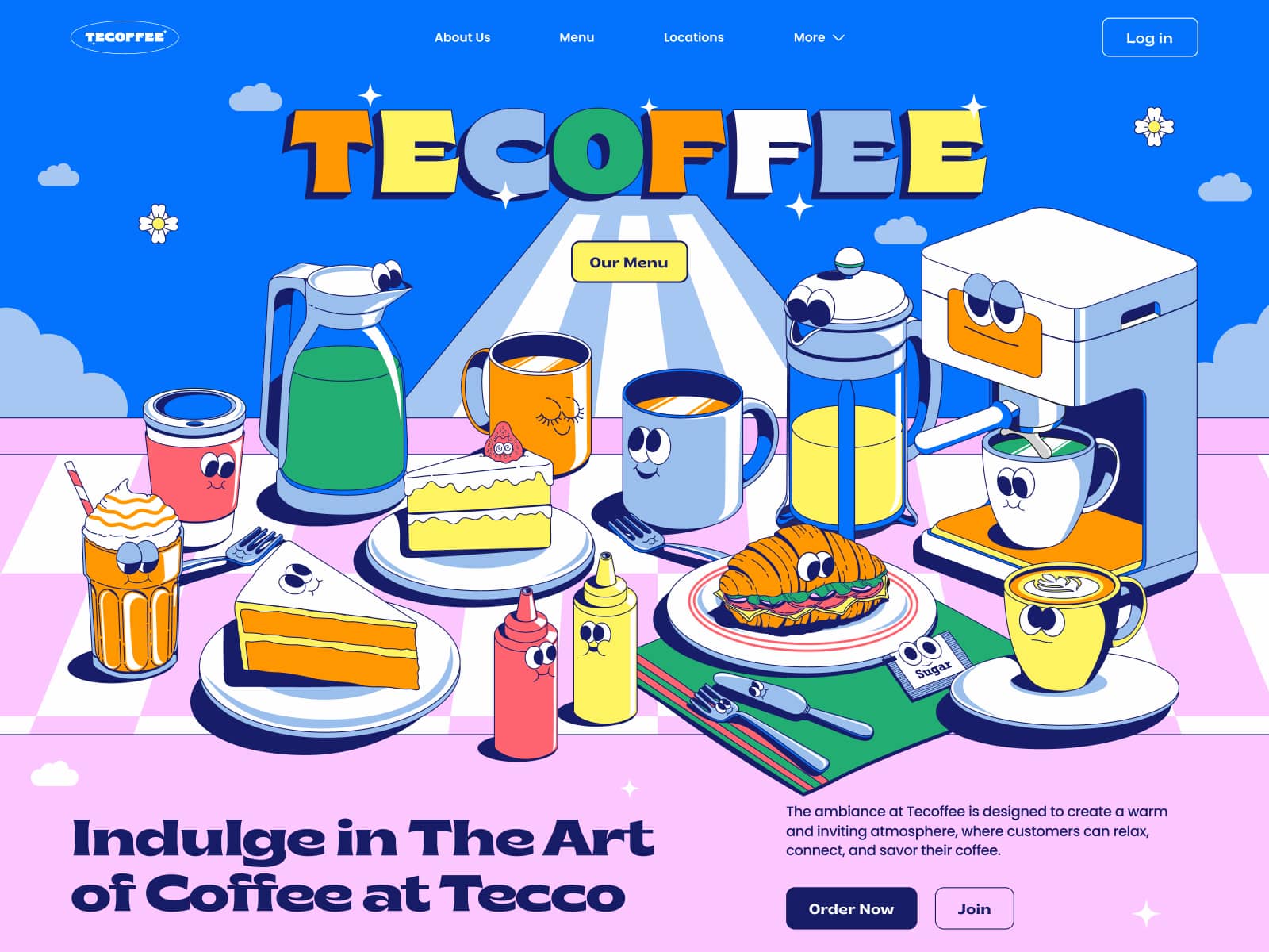
Tecoffee – Header Illustrations by Annisa Puspasari (from Gintera) on Dribbble
Designers are mixing VHS aesthetics with modern performance, creating sites that feel like stepping into a time machine. We’re seeing brutalist grids paired with smooth animations and Comic Sans making an ironic comeback (yes, really). The key? Making nostalgia work for today’s users.
3. Minimalism / Maximalism
Web design has split into two deliciously opposing camps. In one corner, minimalist interfaces strip everything back to its essence — think of Notion’s use of white space, which lets you breathe and think.
Conversely, maximalist designs throw the kitchen sink at your eyeballs, layering bold visuals like Pepsi’s website, which also integrates retro elements.
Both approaches work beautifully when executed with conviction. The secret sauce? Fully committing to your direction rather than playing it safe in the middle ground where designs are forgotten.
4. Personalization
Gone are the days when changing the “Hi {firstname}” tag counted as personalization. Modern sites adapt like chameleons — switching layouts based on behavior, tweaking content based on previous visits, and even adjusting color schemes for time zones. But here’s the catch: it must feel natural, not creepy.
Nobody wants a website resembling an overeager salesperson who remembered your dog’s birthday. Smart personalization enhances the user experience without screaming, “We’re tracking you!”
Where To Find Web Design Inspiration
Some of the most innovative design ideas come from unexpected places. We’ll share my favorite sources that most designers overlook, plus how to build your own inspiration library that you’ll use.
1. Awwwards
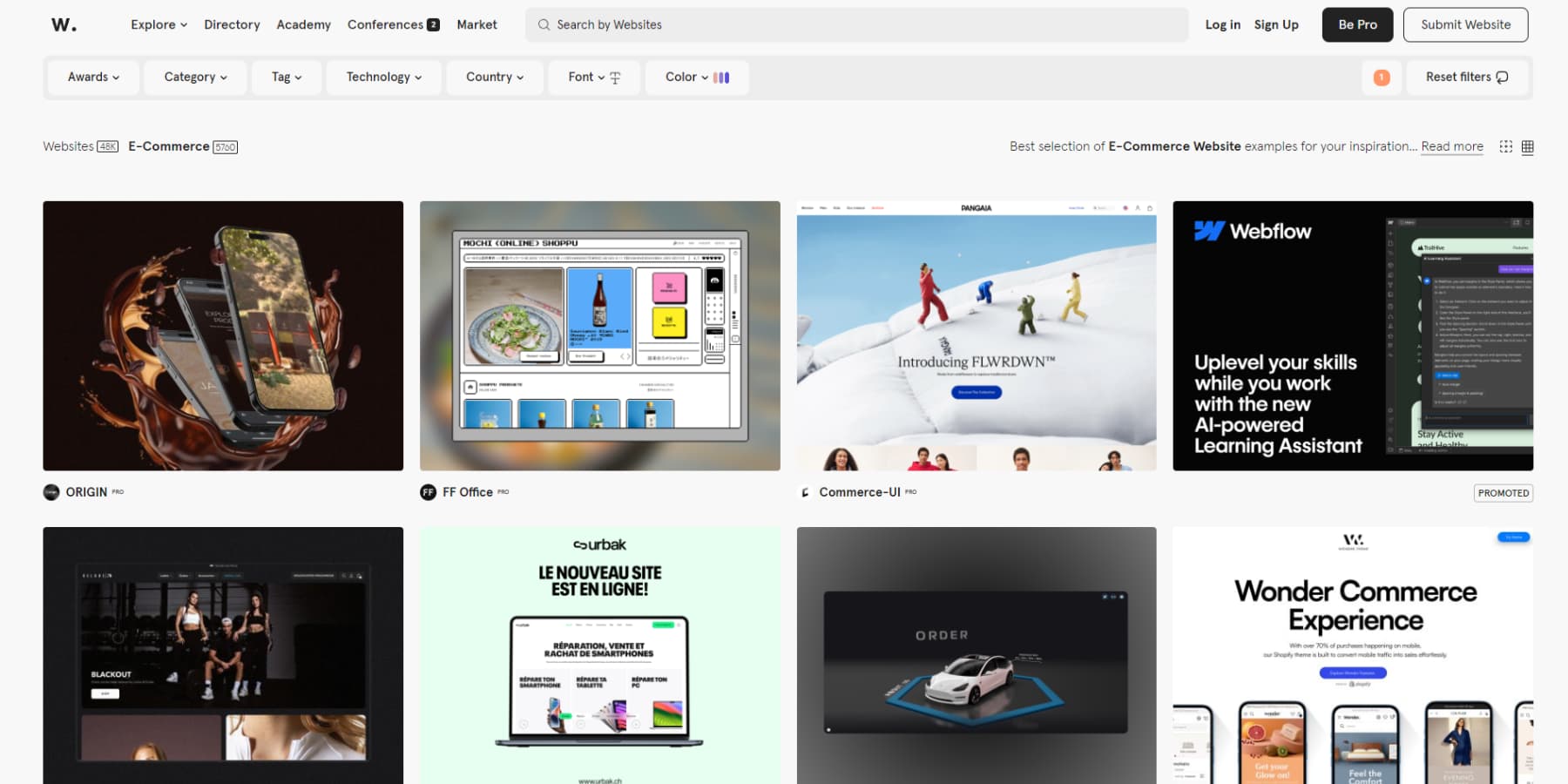
While Awwwards is a popular destination for fresh design inspiration, it sometimes feels like an echo chamber for flashy, overly complex websites.
The technical execution and creativity showcased are often impressive, yet many submissions appear more focused on winning awards than serving users.
When these award-winning sites are used on a slow connection or mobile device, they often fall short. You should occasionally check Awwwards, but you have to learn to look beyond the initial wow factor and consider what elements work in practical applications.
Despite its imperfections, it remains a valuable resource for discovering cutting-edge design work. However, it’s essential to cautiously approach particle effects and WebGL experiments.
2. Refero
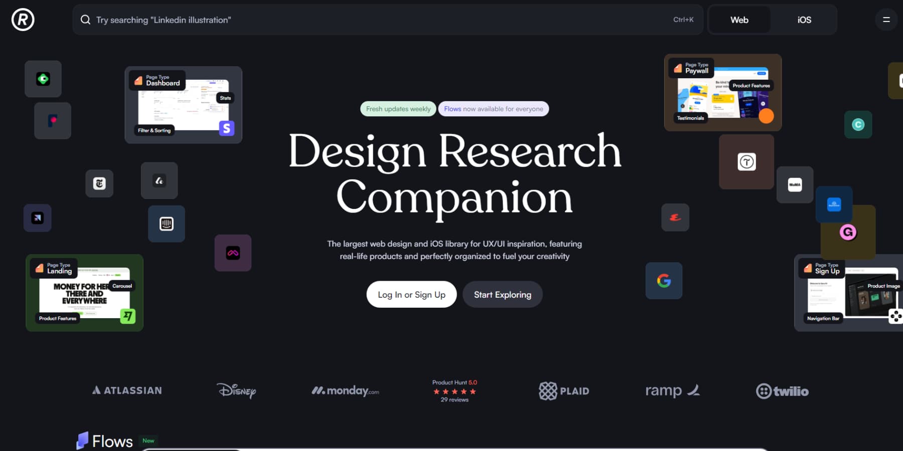
Refero is a goldmine of real-world UI/UX patterns that actually work in production. The platform shines with its precise filtering system. Whether looking at pricing pages, onboarding flows, checkout processes, or even iOS apps, you’ll find examples of successful products across different industries.
It is helpful to see these patterns in their full context, not just isolated components. You can study how leading brands solve complex design challenges and implement proven solutions.
The only catch? Many of the designs on this website are behind a paywall. But if you design websites for a living, having this kind of reference library at your fingertips can save hours of research on each project.
3. Curated
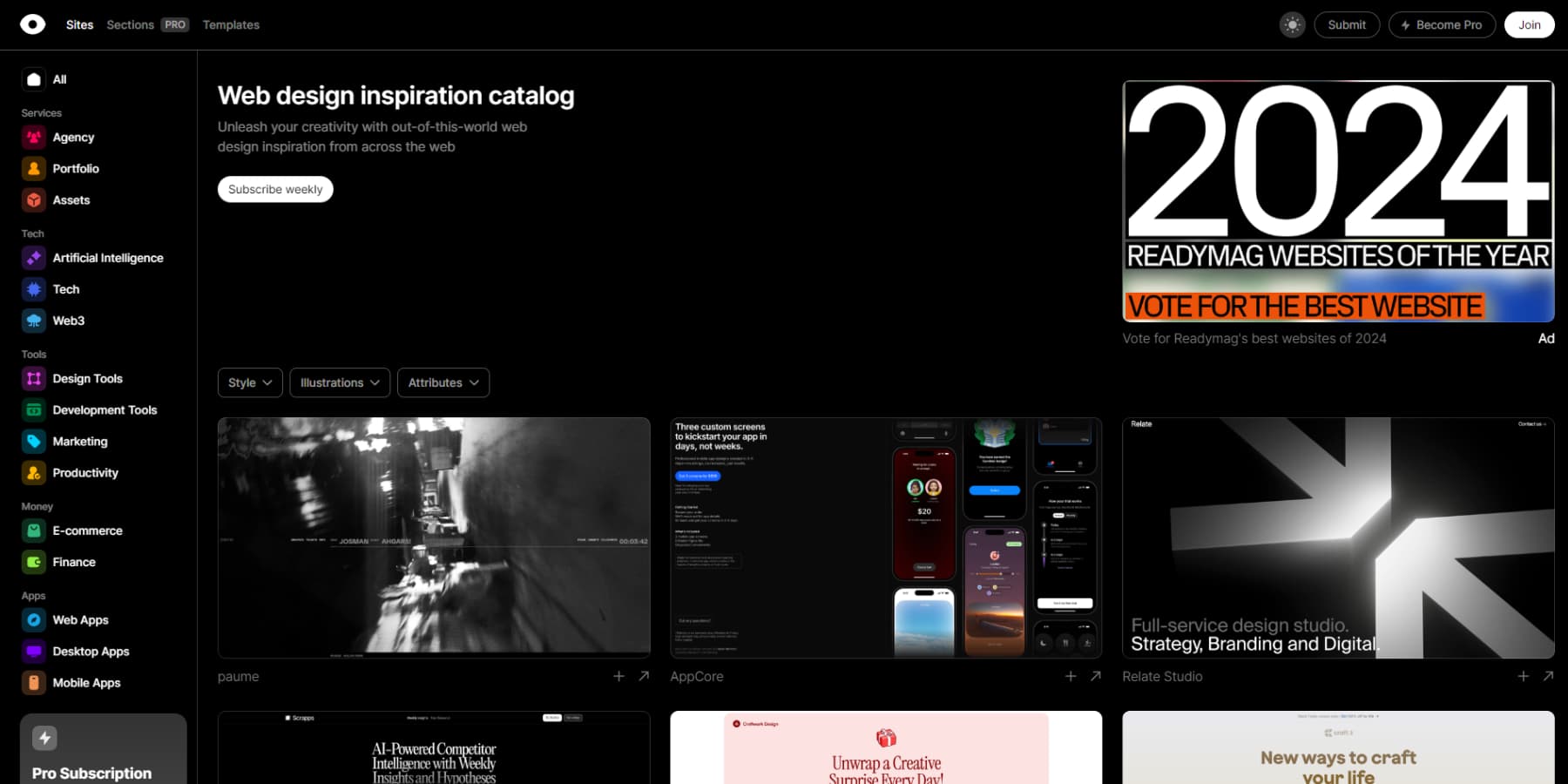
Curated has managed to crack something most resource sites miss — a genuinely useful collection of digital tools that work in the real world. Beyond gathering website builders and design software in one place, they’ve taken the time to vet each resource properly, ensuring everything featured genuinely delivers value.
Breaking down their collection into practical categories like ecommerce, productivity, and development tools makes finding specific solutions surprisingly painless. The platform keeps evolving, too, with fresh additions reflecting current design trends and industry shifts.
While a premium tier exists for those wanting more, the free offerings pack enough substance to make this platform worth your attention.
4. One Page Love
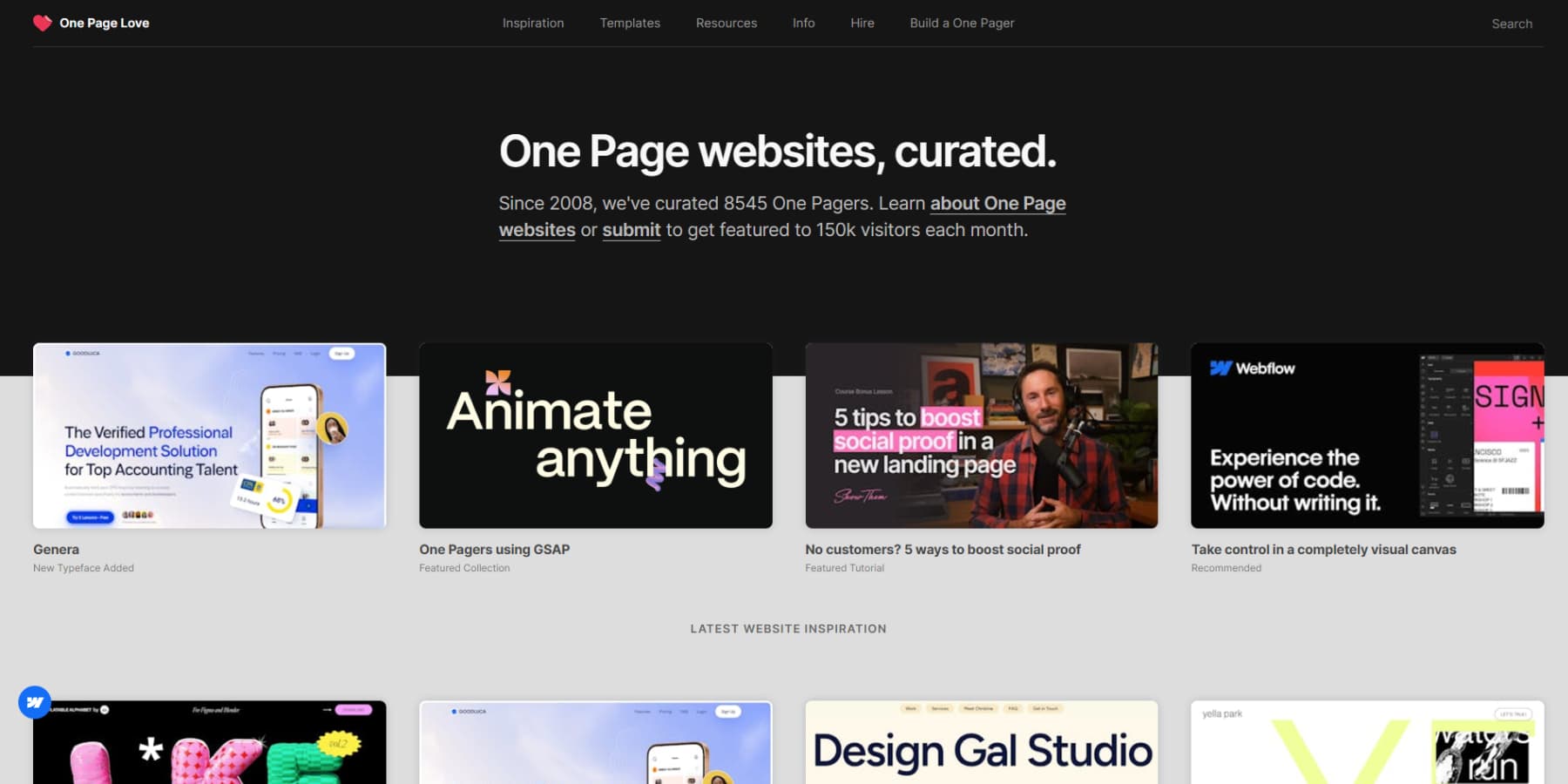
One Page Love has dominated the single-page website space since 2008, building an impressive collection of over 8,500 curated examples of one-page websites or landing pages. With 150,000 monthly visitors, it’s a sweet spot for designers seeking focused inspiration.
The platform breaks down its massive library into practical categories — portfolios, landing pages, and personal sites — making finding precisely what you’re looking for easy.
Their community-driven approach keeps things fresh, welcoming submissions from designers worldwide while maintaining high-quality standards. The clean, intuitive layout reflects their commitment to simplicity, letting you browse through thousands of examples without feeling overwhelmed. For anyone interested in minimal, focused web design, it’s an invaluable resource.
5. Stack Sorted
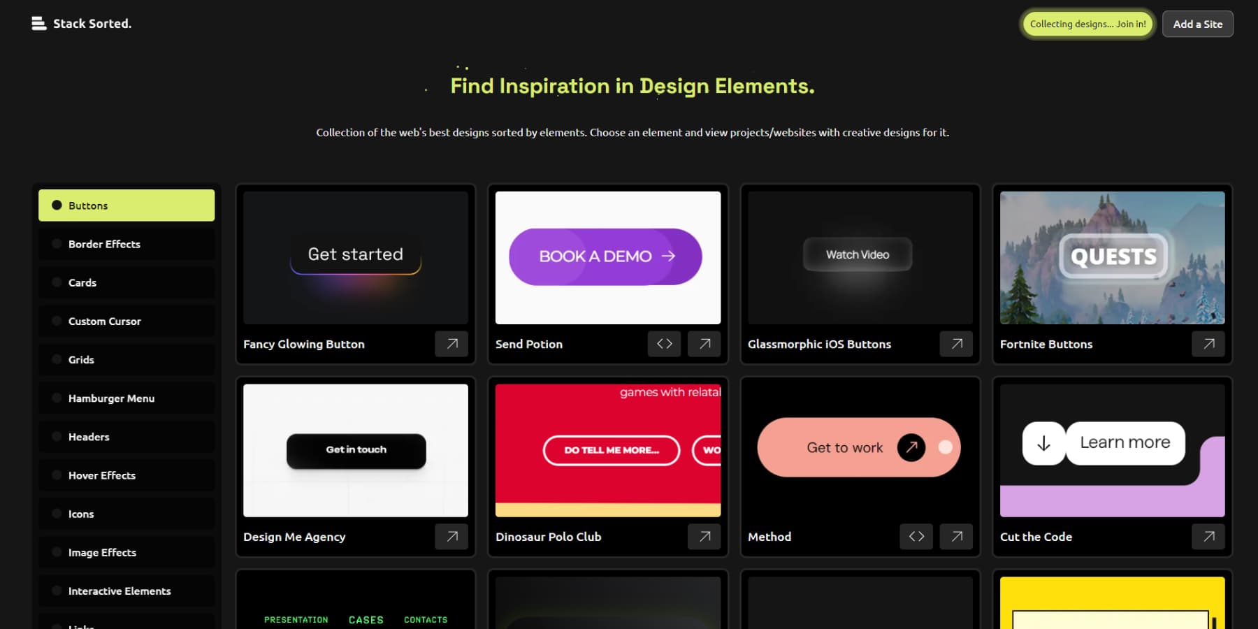
Stack Sorted rethinks how we hunt for design inspiration by ditching the full-page gallery approach. Instead of drowning in complete websites, you’ll find a meticulously organized collection of individual UI elements — from subtle button animations to clever navigation patterns.
Built by the popular YouTube channel Juxtopposed, which seems to be fed up with scattered CodePen tabs, this open-source platform pairs every component with implementation details and source links where available.
The collection keeps evolving with fresh examples from the design community. It’s like having an intelligent design system directory that respects your time and workflow.
6. Lapa Ninja
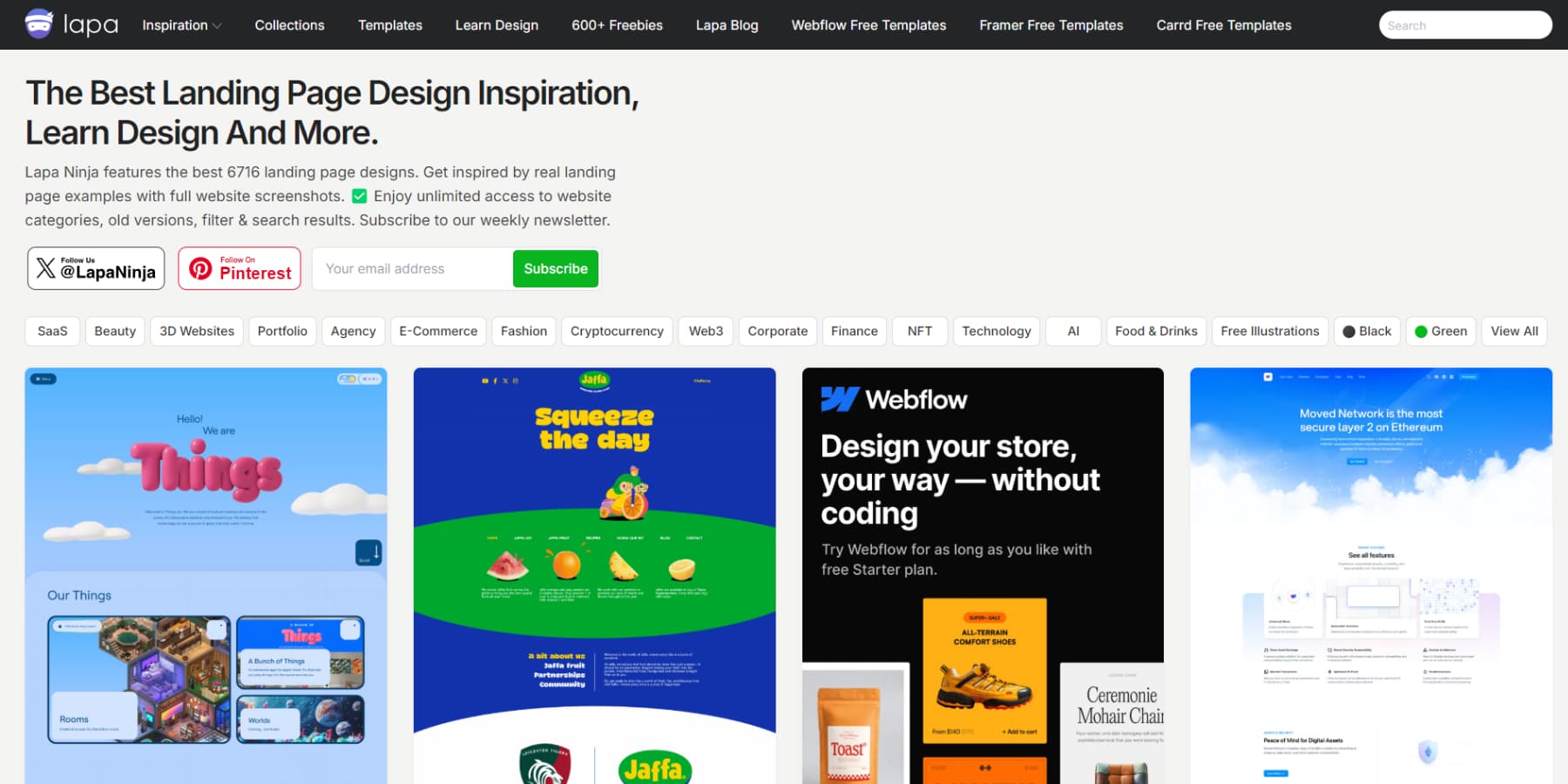
Lapa Ninja stands out with its laser focus on landing page design. The platform houses over 6,700 curated examples from across industries. It organizes its collection into specific categories — 3D, SaaS, and ecommerce — letting designers quickly find relevant project references. You can even sort designs based on colors. How cool!
Beyond pure inspiration, they offer practical resources, including UI kits, illustrations, and mockups for immediate use. Regular updates align the collection with current design trends, while user submissions ensure diverse perspectives.
Their structured approach to categorization, combined with free design assets, makes it particularly valuable for designers tackling landing page projects in any sector.
7. DesignFuell
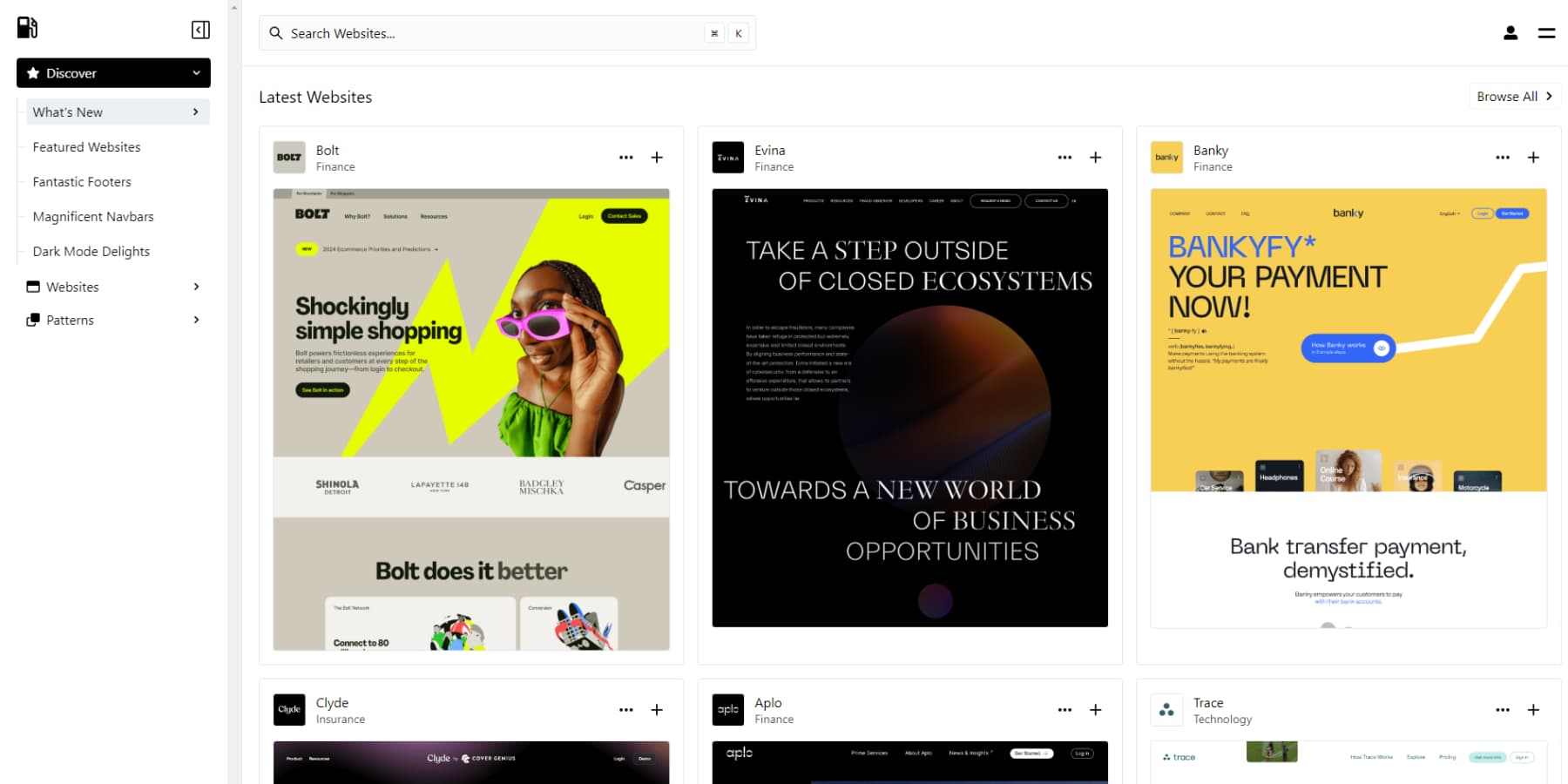
We also find DesignFuell to be another exceptional tool for web design research. It doesn’t just throw a bunch of random patterns at you; instead, it organizes thousands of design patterns in a way that makes sense.
Having access to well-categorized elements like navigation systems and pricing layouts is invaluable when working on a project. It can save you time and help you stay focused. This isn’t just another design platform filled with fluff; it’s a resource that cuts through the noise to deliver precisely what you might need for specific design challenges.
One downside is that you need an account to browse most designs, and there’s also a paywall, but we feel it is still worth checking out.
8. Swype
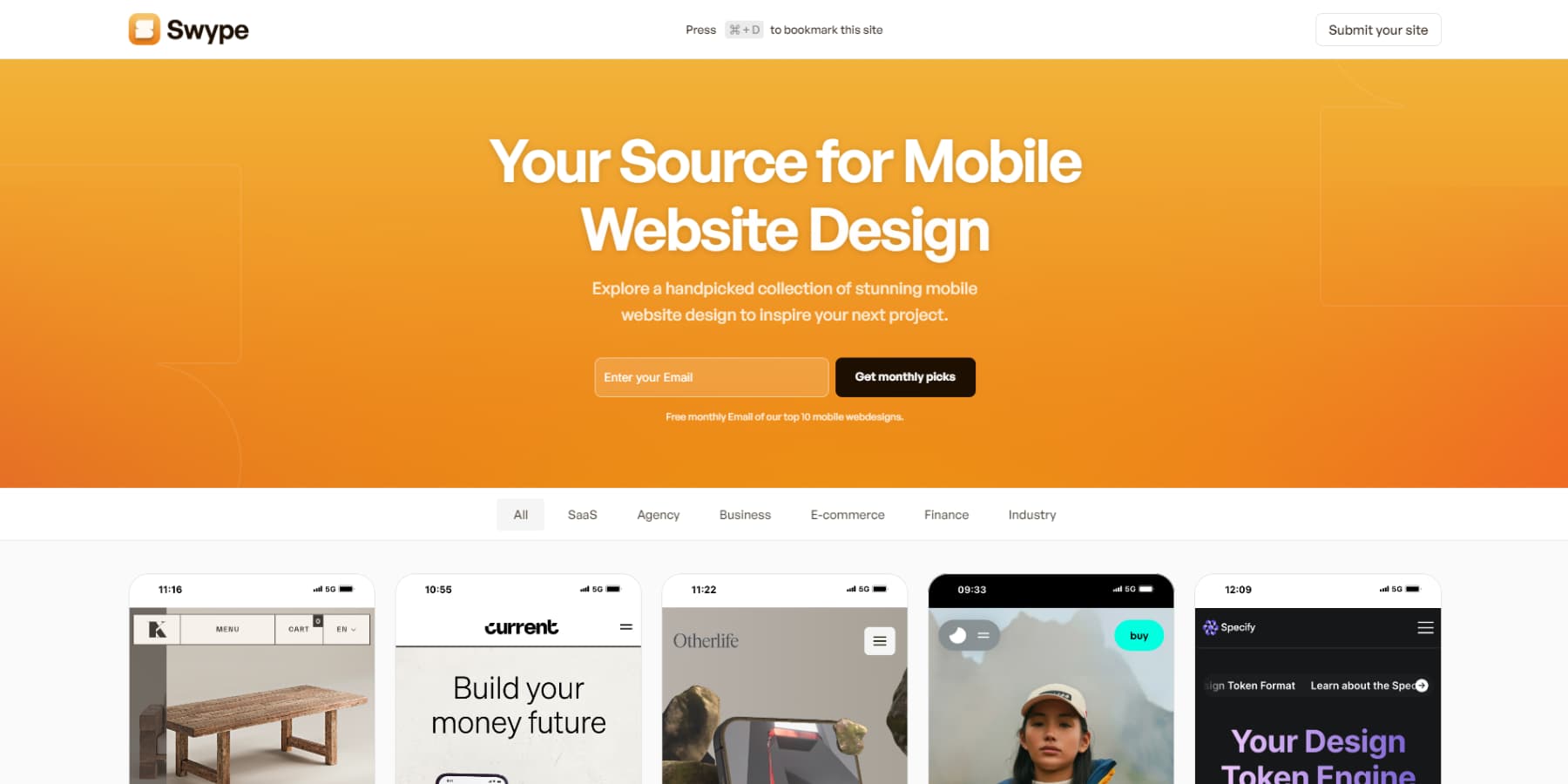
These days, most of your visitors will come from a mobile phone, making mobile design critical — yet many designers still treat it as an afterthought. This is precisely why you should check out Swype. It’s become a go-to spot for mobile web inspiration for many, mainly because they’ve worked to filter out everything but the best mobile UI examples.
We particularly appreciate their focus on practical, implementable designs. Their monthly email highlights ten standout mobile websites. The platform showcases designs that nail the basics — readable text, tappable buttons, and smooth animations that work on phones. Their curated collection is worth checking out if you’re struggling with mobile design.
Other Sources To Find Web Design Inspiration
While everyone knows Dribbble and Behance, these can be helpful for web design inspiration, but you’ll have to search more extensively.
You may also regularly browse tech startup websites, especially in the SaaS space. These companies spend serious money on conversion optimization, so their designs usually balance aesthetics with functionality.
Product Hunt’s daily launches are another goldmine of working websites with innovative approaches.
Architecture and physical spaces can massively influence your thinking about layout and flow. Notice exciting signage systems in museums or airports — they often solve complex navigation problems better than any website menu. Even retail stores’ customer flow offers valuable lessons for digital journeys.
Book cover design is another goldmine, especially for landing pages. Modern book covers are conversion-focused designs — they need to communicate and drive action in seconds, just like websites.
Even city walks can spark ideas — urban infrastructure, street art, and construction barriers all solve design problems in physical space.
Sometimes, stepping away from screens entirely helps break through creative blocks better than any online gallery could. We know this all sounds like boomer hokum, but trust us, this creative remixing is what keeps pushing web design forward.
From Web Design Inspiration To Implementation: Divi Does It All
After countless hours collecting design inspiration, there’s nothing more frustrating than hitting a wall during implementation. We’ve all been there — sketching ambitious layouts only to compromise because tools couldn’t keep up.
While WordPress provides a solid foundation for web design, Divi transforms the implementation process with its visual approach to website building.
The visual builder lets you edit elements directly on the page while viewing real-time changes. Designs can be recreated without diving into complex code when inspiration strikes. With over 200 design modules available, implementing creative concepts becomes straightforward rather than technical.
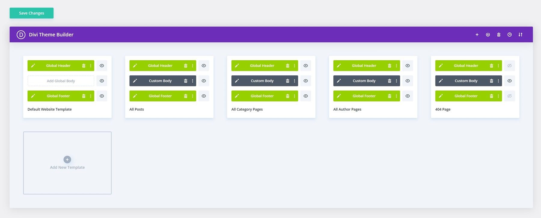
The Theme Builder extends these capabilities by enabling the visual creation of headers, footers, and dynamic templates. This means innovative navigation designs or creative layout patterns can be implemented consistently across an entire site. Divi isn’t just another page builder — it’s the bridge between “that looks amazing” and “I built that.”
Divi’s Layout Collection
While design galleries showcase cutting-edge concepts, sometimes the most practical inspiration comes from exploring proven layout collections.
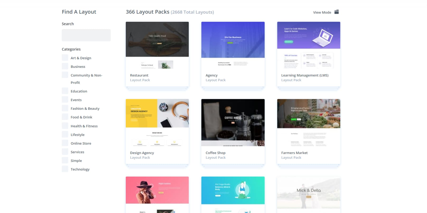
Divi‘s library of over 2,000 professional layouts offers unique insights into current design trends that work. Unlike conceptual mockups on Dribbble or Behance, these designs demonstrate real-world implementation — and better yet, they’re ready to customize for your projects with just a click.
Our active 76,000-member Facebook community adds another dimension to design inspiration. Designers share their creative solutions, implementation tips, and fresh interpretations of layouts daily, and this collaborative environment often sparks ideas and conversation that galleries miss.
The Divi Marketplace extends these possibilities further, featuring curated child themes and layout packs from established developers. Plus, with seamless integration for over 75 popular services like Mailchimp and WooCommerce, you can focus on style and substance.
Web Design & AI
Finding design inspiration is one thing — executing it across an entire website is another challenge entirely. Divi AI transforms this process by bringing AI directly into the visual builder.
Do you need fresh hero images to match that inspiring layout you found? Describe your vision and get custom visuals that align perfectly with your design direction.
The AI works alongside you like a creative partner, helping you maintain a consistent brand voice and design language throughout your site. Spotted an inspiring content layout but struggling with the copy? The AI creates headlines and body text that complement your brand voice.
Product photography often makes or breaks design inspiration — but not everyone can access professional photographers. Divi AI lets you generate custom product visuals or enhance existing photos to match the polished look of your inspiration sources.
Even complex layouts that require code can come to life quickly by describing what you envision. The best part is that Divi AI is wholly trained on Divi’s codebase, so there are meager chances of incompatible code.
Divi Quick Sites
Building websites used to mean starting with a blank canvas. Divi Quick Sites with AI changes that entirely — tell it about your business and watch your complete website take shape. From navigation menus to WooCommerce stores, everything assembles automatically.
The magic lies in the details. Every color scheme, font choice, and spacing design perfectly harmonize. Navigation feels natural, contact forms connect instantly, and your blog templates look professionally polished. Best of all, you can edit everything using Divi’s visual builder.
Want something hand-crafted instead? Browse Divi Quick Sites’ collection of starter sites, each featuring unique photography and illustrations you won’t see anywhere else. Choose your favorite, plug in your brand assets, and launch with professionally structured menus and consistent styling across every page.
Since everything runs on the visual builder, your site can grow alongside your business. Adjust designs, add pages, or update content anytime — these aren’t just templates; they’re foundations built for long-term success.
Core Elements Of Inspiring Web Design
Behind every website that makes you stop and stare, there’s a deliberate combination of design elements working together. These aren’t random choices or happy accidents but calculated decisions that guide users through an experience. Let’s look at these basic elements and how to master them.
1. Visual Hierarchy Principles
Successful websites direct your attention without being obvious about it. Look past the common color-size-contrast guidelines you see everywhere — real visual hierarchy emerges from smart design choices. Bold text here, muted there, a dash of extra spacing where it counts. Web layouts that look “simple” often hide the most sophisticated hierarchies.
Big headers and flashy buttons don’t automatically create hierarchy. Sometimes, it’s the subtle stuff – breaking a long sidebar into clear sections, letting certain images claim more visual weight, or using white space strategically around key content.
Divi‘s visual builder makes testing these hierarchical relationships seamless. You can adjust weights, spacing, and emphasis while watching how elements interact in real time. When hierarchy works, visitors flow through your pages effortlessly. When it fails, they bounce.
2. Interactive Elements
The days when hovering over a link counted as impressive interaction are behind us. Modern websites respond to user behavior in ways that enhance the experience. Scroll effects reveal content. Naturally, hover states provide helpful feedback, and subtle animations guide visitors through complex information.
But there’s a fine line between engaging and annoying. Every interaction needs a purpose — whether it’s highlighting important data or smoothly transitioning between states. Divi‘s transform options make this balance achievable without diving into complex code.
You can test different effects directly on the page, seeing exactly how each interaction feels before committing. The trick is keeping things smooth and intentional – if your fancy animation makes content harder to access, it’s missing the point.
3. Whitespace Utilization
Most designers obsess over what to add to a page. The real skill lies in knowing what to leave out. Empty space isn’t wasted space — it’s the breathing room that makes content digestible. Too many websites cram every pixel with information, creating visual noise that drives visitors away.
Strategic spacing makes complex layouts feel simple. Headers need room above them, paragraphs need separation, and important elements need space to stand out.
Divi‘s spacing controls let you fine-tune these relationships visually so you can see precisely how adjustments affect readability.
The goal isn’t filling gaps — it’s creating purposeful space that makes your content more compelling and easier to process.
4. Responsive Design
When was the last time you checked your site on a phone? Between commutes, coffee breaks, and late-night browsing, mobile visitors make up most of the web traffic — yet somehow still get stuck with squeezed-down desktop designs. Why force users to pinch and zoom?
Everything needs a second look at smaller screens, from menu spacing to button size. Sure, that image grid looks stunning on a desktop, but what happens when it hits a 375px screen?
Divi takes the mystery out of responsive design. You can adjust layouts visually for each device size and see changes in real time.
Want to go further? Use visibility controls to hide tricky desktop elements on phones and replace them with mobile-specific alternatives. That fancy animation? Make it a simple image on mobile. That complex navigation? Build a streamlined version just for phones and hide it on the desktop.
Practical Tips For Great Design
Beautiful design means nothing without solid execution. This section breaks down the essential principles that turn inspiring concepts into high-performing websites.
Balance Creativity With Functionality
We’ve seen countless designers fall into the trap of prioritizing flashy design over function. That stunning parallax effect might look impressive in your portfolio, but you’re missing the point if it makes your contact form harder to find. The sweet spot is enhancing functionality through creative design choices, not fighting against it.
Take navigation patterns, for instance. Instead of hiding your menu behind a hamburger menu with a flashy animation, focus on making it instantly discoverable while adding subtle interactive elements that guide users. The best designs feel fresh without forcing users to learn new patterns.
Divi‘s visual builder achieves this balance by letting you experiment with creative elements while maintaining a solid structural foundation. Before committing to something, you can test how that eye-catching hover effect or dynamic section impacts user flow. Remember, creative flourishes should enhance the user’s journey, not obstruct it.
Maintain Consistency Across Pages
Design consistency builds trust and reduces users’ cognitive load. Colors, typography, spacing, and interactive elements must work seamlessly across every page. Even subtle inconsistencies — like slightly different button styles or varying header sizes — can create friction in the user experience.
Successful websites maintain visual harmony through systematic design choices. Headers, footers, and navigation patterns should function identically throughout the site. Brand elements like colors, fonts, and button styles must remain constant, while content areas follow established layout patterns.
Divi‘s Theme Builder transforms this process from tedious to systematic. Rather than updating elements page by page, you can adjust headers, footers, and dynamic templates site-wide.
Presets ensure brand consistency, while design presets standardize spacing and interactive elements across your website.
Scalability Considerations
Scalability extends beyond server resources and loading times. A truly scalable website anticipates content, features, and functionality growth without requiring massive redesigns. Planning for expansion from day one creates systems that grow naturally rather than hitting walls that force complete rebuilds.
This is where Divi stands out — there are no artificial limits on the number of pages, posts, templates, or even websites you can create.
Your navigation system, content architecture, and template hierarchy can expand freely as your site grows. Category systems adapt to new sections while layout patterns flex to handle varying content types and lengths.
Moreover, Divi’s lifetime license means you’re never penalized for growth. Whether you’re adding new sections to a single site or scaling up your design business with multiple client projects, everything’s included.
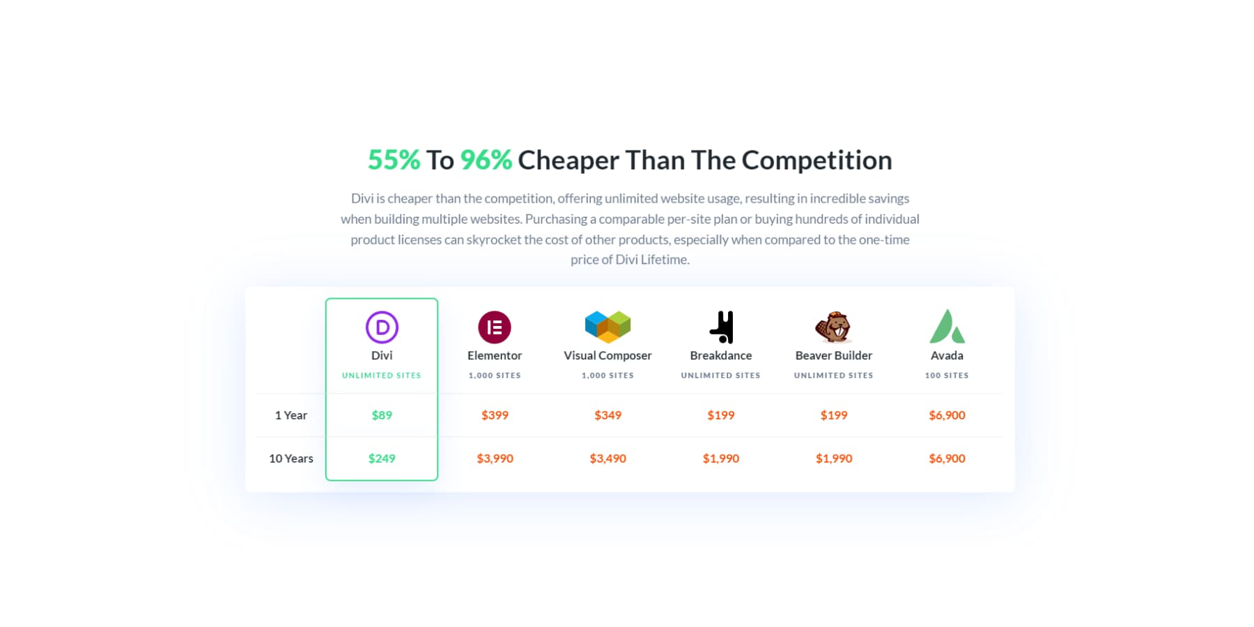
The Theme Builder’s dynamic templates adapt seamlessly as content grows, ensuring consistent design without the recurring costs typically accompanying website expansion.
Quality Assurance Steps
Quality assurance isn’t a final checkbox — it’s an ongoing process that shapes every website development stage. Cross-browser testing reveals layout inconsistencies, while mobile testing catches touch-target issues and responsive breakdowns. Performance testing identifies heavy elements that need optimization.
Key checkpoints include testing form submissions, validating links, reviewing content for typos, and ensuring consistent spacing across templates.
Each page needs thorough review across multiple devices and browsers to catch edge cases before they affect real users.
Consider different user scenarios — how does your site perform on slow connections? Are interactive elements accessible via keyboard? Do images have meaningful alt text? Testing under various conditions helps identify problems early when they’re easier to fix.
Remember to document issues systematically and verify fixes across all affected areas of your site.
Your Design Journey Starts Here
Finding inspiration is more than collecting pretty screenshots — it’s about understanding what makes designs work and adapting those insights to your projects.
Whether browsing curated galleries, the key is maneuvering those creative sparks into functional websites.
Remember: great web design balances visual appeal with practical function. Maintain consistent design elements, plan for scalability, and thoroughly test your work across devices. Most importantly, don’t get caught up chasing trends at the expense of user experience.
With Divi, you’re equipped to bridge the gap between inspiration and implementation. From the visual builder’s intuitive controls to AI-powered Quick Sites, you have everything needed to create stunning, functional websites that stand out.
Ready to stop being just inspired and start creating something extraordinary?
Build That Idea Already With Divi
The post Web Design Inspiration: Where To Find It In 2025 appeared first on Elegant Themes Blog.
