Divi 5 makes adding and editing hover effects easier than ever. In this guide, we’ll walk you through all the key improvements made to hover effects and how to use them in Divi 5 to streamline your workflow like never before.
Learn more about the Divi 5 Public Alpha and how to download it.
Understanding Hover Effects in Divi 5 (Public Alpha)
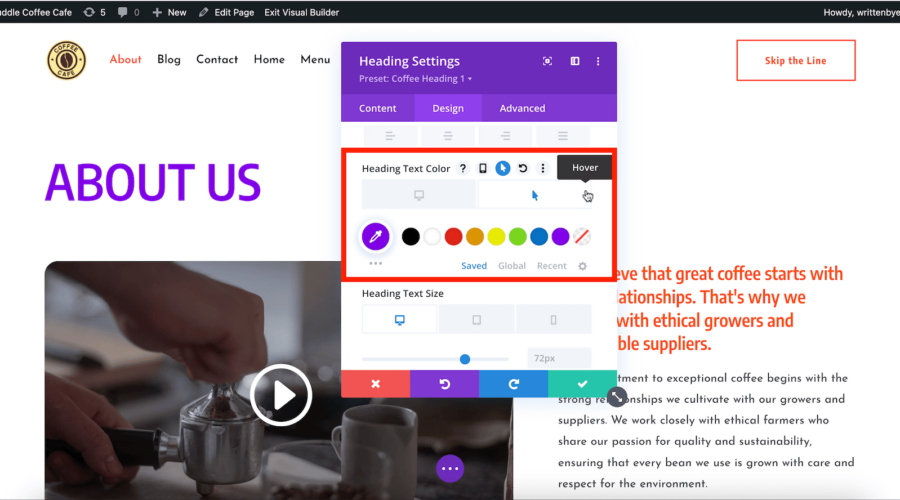
In Divi 5, one of the significant changes regarding hover effects is that they are now easier to implement and more accessible. In Divi 4, you had to manually enable hover effects for each element within the settings. This process could be cumbersome, as you had to find the specific option and activate hover states before applying any changes.
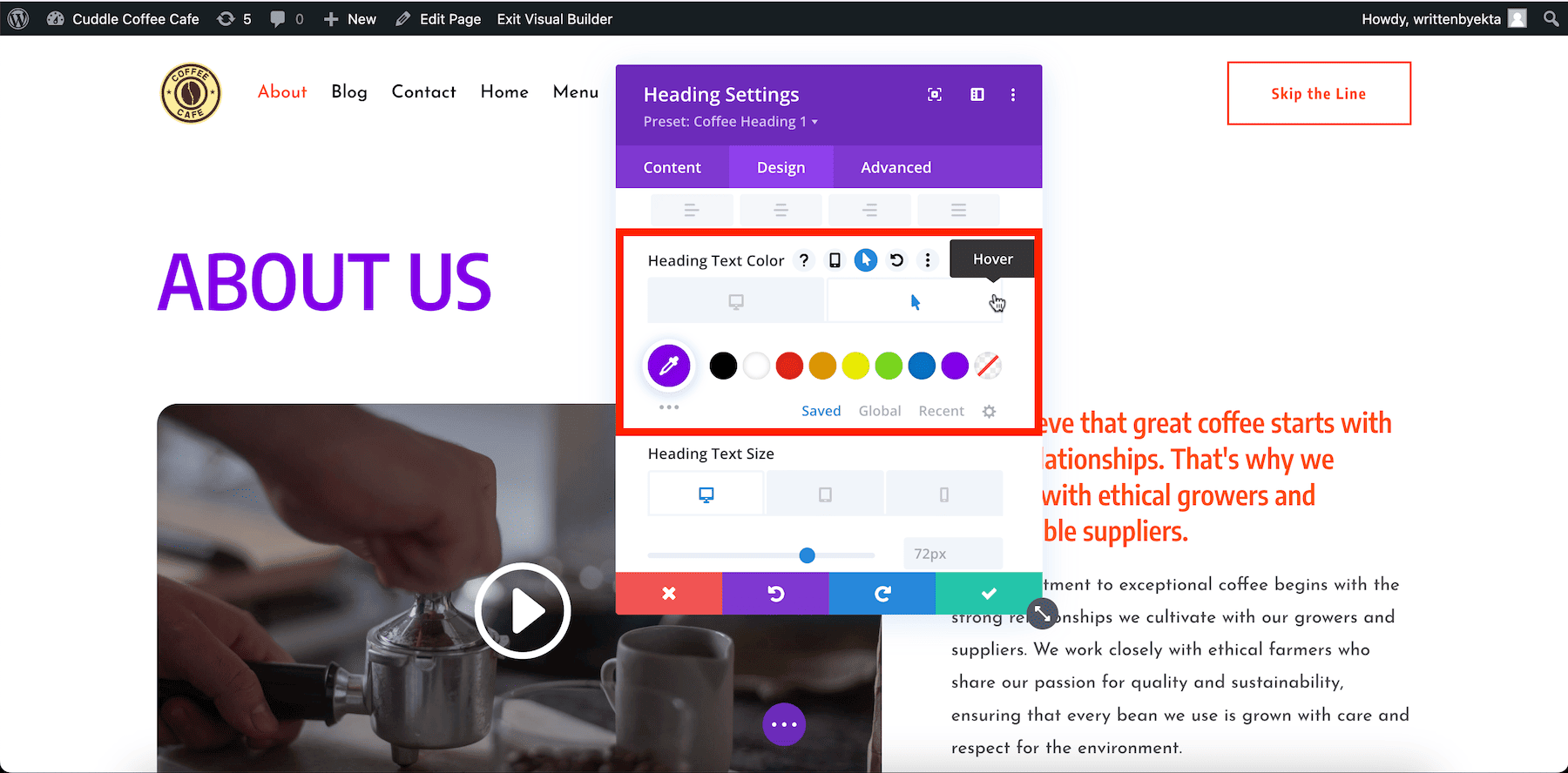
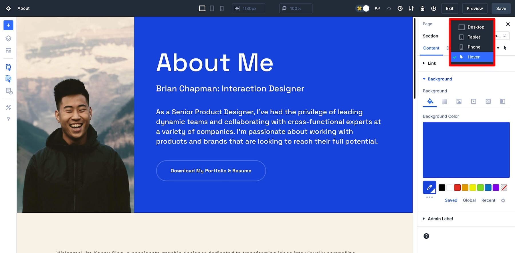
With Divi 5’s new interface, hover effects, responsive, and sticky editing modes are fully integrated, making them instantly accessible. No more enabling them individually!
This improvement streamlines the design process by reducing the steps required to apply advanced hover states designs, speeding up workflows and making it more intuitive to create dynamic interactions.
Key Improvements in Divi 5’s Hover Effects
Here are some of Divi 5’s key improvements that make applying and editing hover effects faster and easier:
- Faster navigation between normal and hover modes: With one-click switching, it’s easier to toggle between states and make adjustments.
- All hover settings in one panel: No more scattered settings. All hover settings for an element can easily be updated in the settings panel.
- Instant visual feedback: Real-time previews show hover effect changes as you make them, speeding up your workflow.
- Better organization and visibility of settings: Inactive settings are grayed out, helping you focus on available options.
These improvements streamline the process of creating dynamic, interactive designs with hover effects.
Want to dive deeper into the new settings? Check out Getting to Know the Divi 5 Interface to see how it can simplify your design workflow.
How To Master Hover Effects In Divi 5 (Public Alpha)
1. Access and Edit All Hover State Settings in One Place
Divi 5’s hover settings are conveniently displayed in the settings panel, giving you quick access to everything in one place. This streamlined panel reduces the need to toggle separate hover effects for each option. In other words, once the hover effects state is selected in the settings panel, all the options under each tab (Content, Design, and Advanced) will now apply only to the hover state of the element.
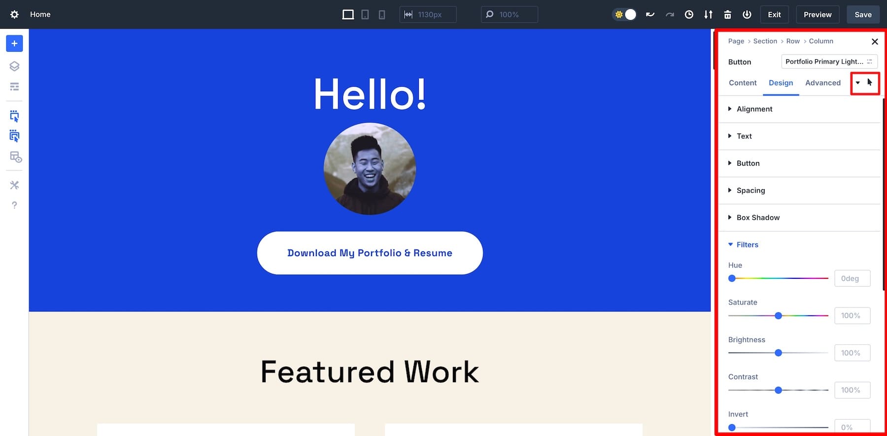
This makes adding custom or complex hover effects faster to implement.
2. Manage Unsupported Hover Settings with Ease
In Divi 5, unsupported hover settings are automatically grayed out (inaccessible), allowing you to quickly see which features aren’t available for the element you’re working on. This visibility prevents time wasted trying to weed out those options that are customizable in the hover state from those that aren’t, improving your overall workflow.
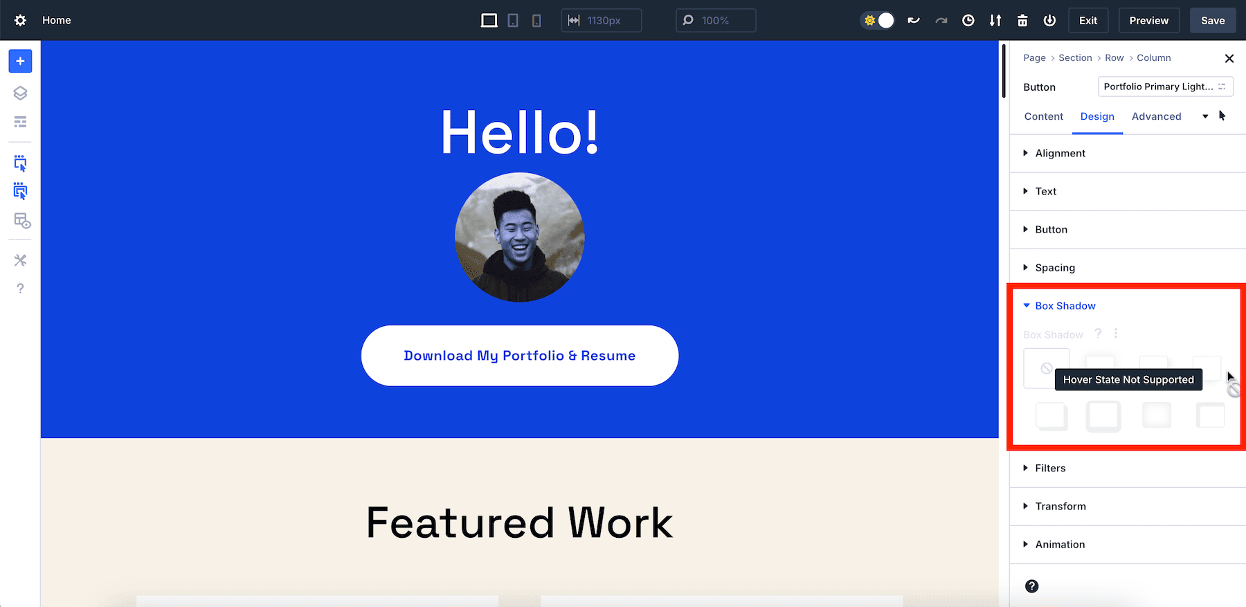
3. Enjoy Instant Real-Time Visual Feedback
Divi 5’s real-time visual feedback is instant. You see the changes immediately as you adjust settings, reducing guesswork and allowing you to fine-tune hover effects on the go.
4. Edit Hover Effects Quickly Throughout Your Page
In Divi 5, the settings panel remains in the hover state when clicking on other elements. This allows you to make quick updates to your hover effects on elements throughout your page simply by clicking on an element and making a change.
5. Preview Hover Effects with Confidence on the Front-end
With the hover state active in the settings panel, you can preview the hover state design of any element in a single click. The hover state will remain active so that if your element has a hover effect, clicking on that element will instantly reveal the hover state design, and simultaneously open the hover state settings for that element.
As you can see in the video snippet below, you can preview the hover state design of each blurb on the front end and it will show the same hover effect as previewing the live page.
So if want to check the hover state designs on your page, just click on an element on your page to reveal the hover state design of that element instantly. This makes it easy to ensure your hover effects are accurate without having to switch back and forth to your live page.
How to Create a Hover Effect in Divi 5: Quick Example
Now that we’ve covered the key features of Divi 5’s hover effects, let’s walk through a quick example to show you how easy it is to create a hover effect in Divi 5:
1. Add a Module
In the Divi visual builder, add the module you want to customize. For this example, let’s add a button.
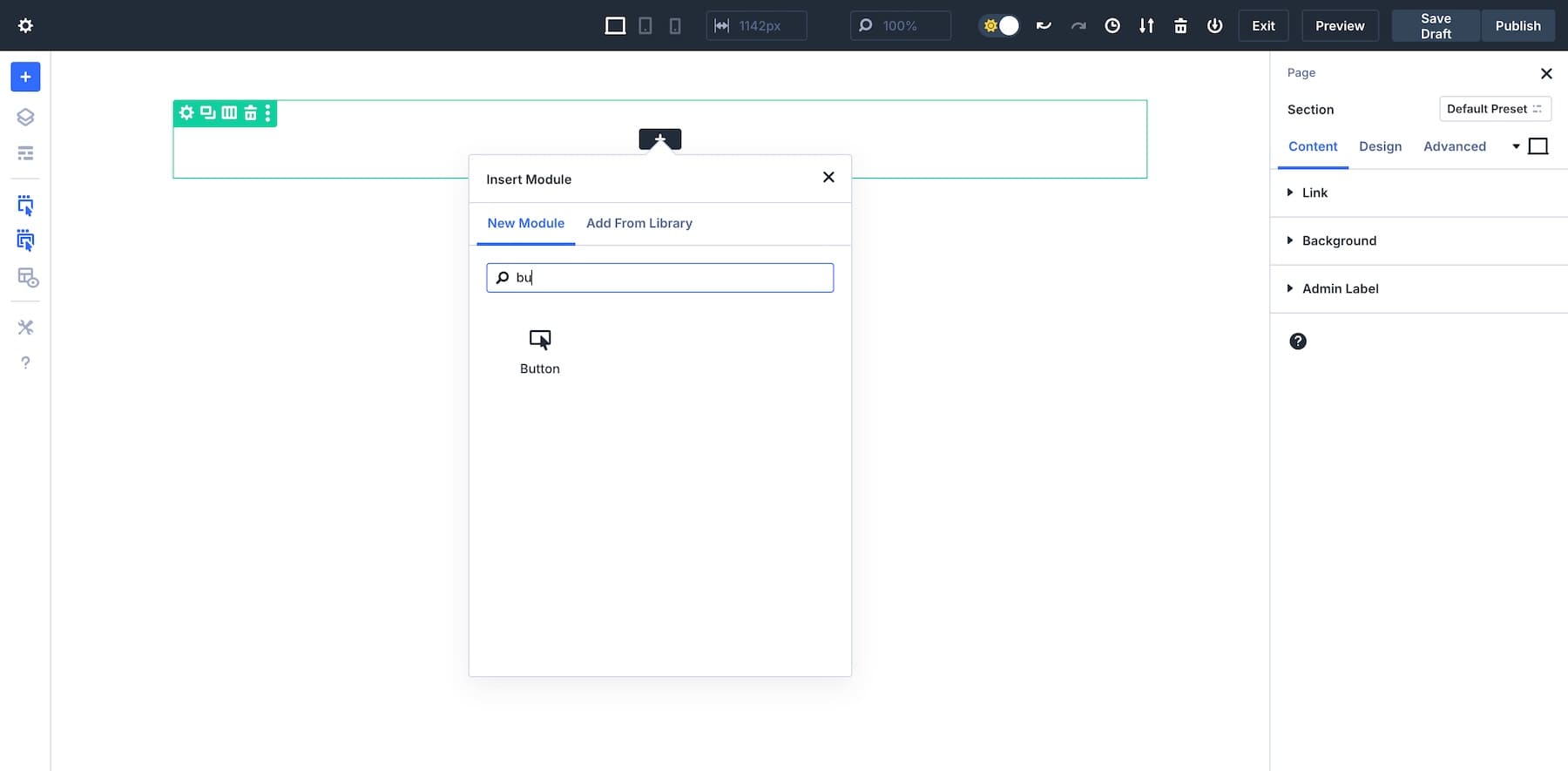
2. Access Hover Settings
Click on the module to bring up the settings panel. In the right sidebar, click the hover icon to switch to hover mode.
3. Customize Hover Effects
While in hover mode, you can change various style properties, such as background color, borders, scaling, or animations. Let’s add a Transform effect to our button so it enlarges on hover.
Don’t forget. Divi 5’s simplified settings panel has all the controls in one panel, so make the desired changes and then click Save once you’re done.
Feel free to test different hover effect settings, including color and background transitions, image and text animations, shadow effects, and transform controls for scaling, rotating, or translating elements. You can also adjust border styles and filters like blur or brightness and apply advanced CSS animations for a more engaging user experience.
Divi 5 Is A Game-Changer For Hover Effect Designs
Divi 5’s hover effects offer unmatched ease, speed, and flexibility, streamlining your design process compared to Divi 4. Whether you’re a seasoned web designer or a newcomer, these intuitive features make adding interactive elements to your site simpler than ever.
Ready to elevate your website’s user experience? Download the Divi 5 Public Alpha today and start experimenting with new hover effects to see your designs come alive!
The post How to Master Hover Effects in Divi 5 (Public Alpha) appeared first on Elegant Themes Blog.
