It’s no secret that designing websites with a mobile-first approach is an essential aspect of web design. Since Google changed its algorithm on how websites are scored with its mobile-first index, its become increasingly important to use a theme that looks great on all devices for your WordPress website. In this post, we’ll introduce you to the best responsive WordPress themes for your website, so you can determine which is right for you.
What is a Responsive WordPress Theme and Why Should You Use One?
A responsive WordPress theme utilizes breakpoints to adapt a website’s content for various screen sizes, ensuring that it looks stunning regardless of the device used to view it. As over 60% of internet users access websites through mobile devices, it has become increasingly vital to incorporate a responsive theme into your WordPress site. Neglecting to do so can result in distorted website content, increasing your bounce rate and negatively impacting SEO for mobile devices.
10 Best Responsive WordPress Themes
We considered several essential factors to compile our list of the best responsive WordPress themes. First and foremost, we evaluated whether the theme has responsive tools that allow you to test how a page will display on desktop, tablet, and mobile devices. Additionally, we assessed the number of features the theme offers, its ease of use, and its responsive tools on the module level. Considering these factors, we present our picks for the best responsive WordPress themes.
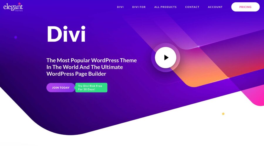
1. Divi
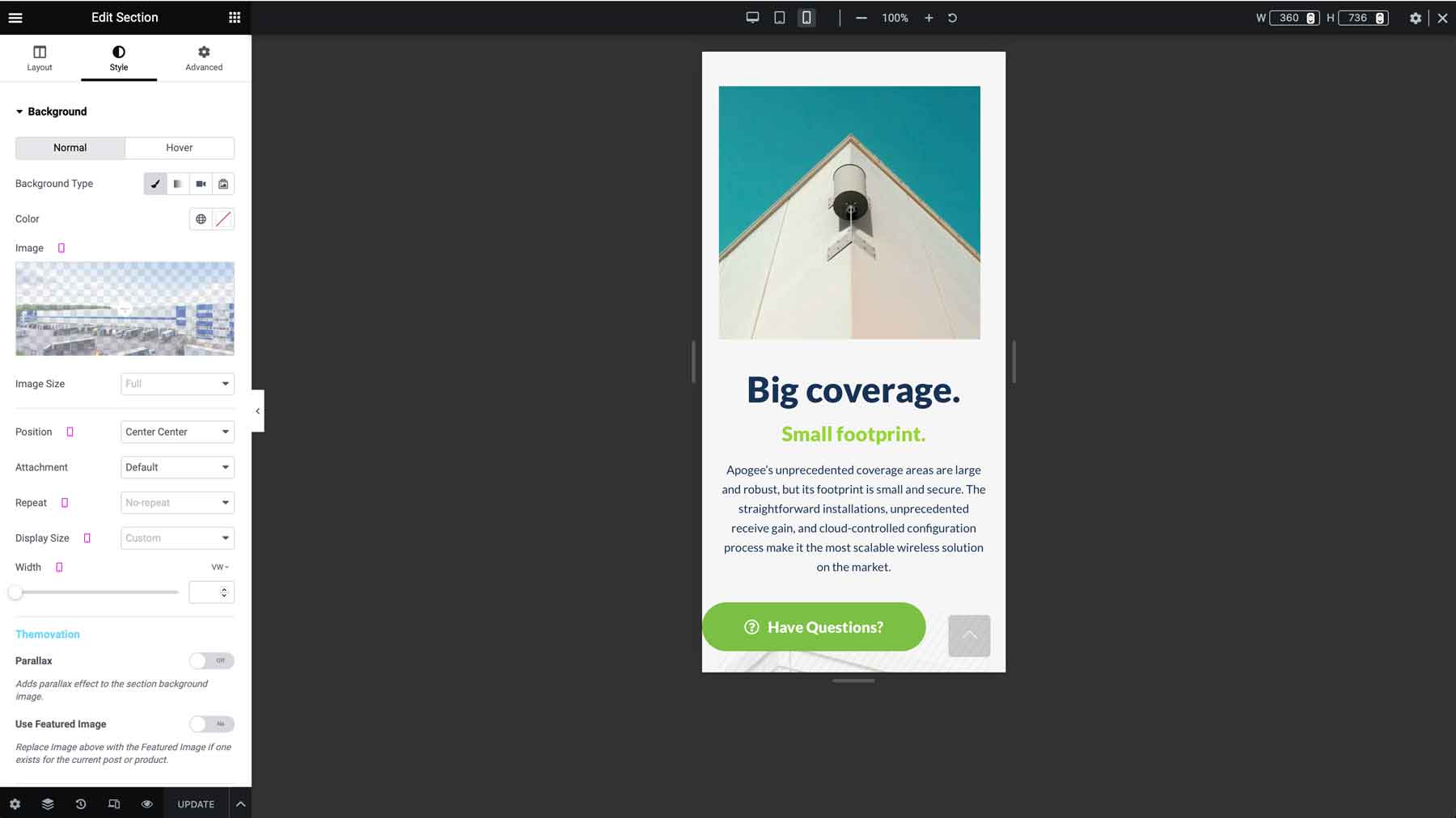
At the top of our list is Divi, the most advanced responsive WordPress theme available. It comes with over 200 fully customizable design elements, each of which can be adjusted based on screen size. Using a no-code front-end Visual Builder, you can easily create beautiful, responsive, and fast web pages to showcase your blog or business.
Key Features for Divi:
- Front-end, no-code Visual Builder
- Build custom page templates with Theme Builder
- Over 200+ design elements
- Responsive page preview
- Edit responsive settings at the module level
- 2200+ professionally designed layouts
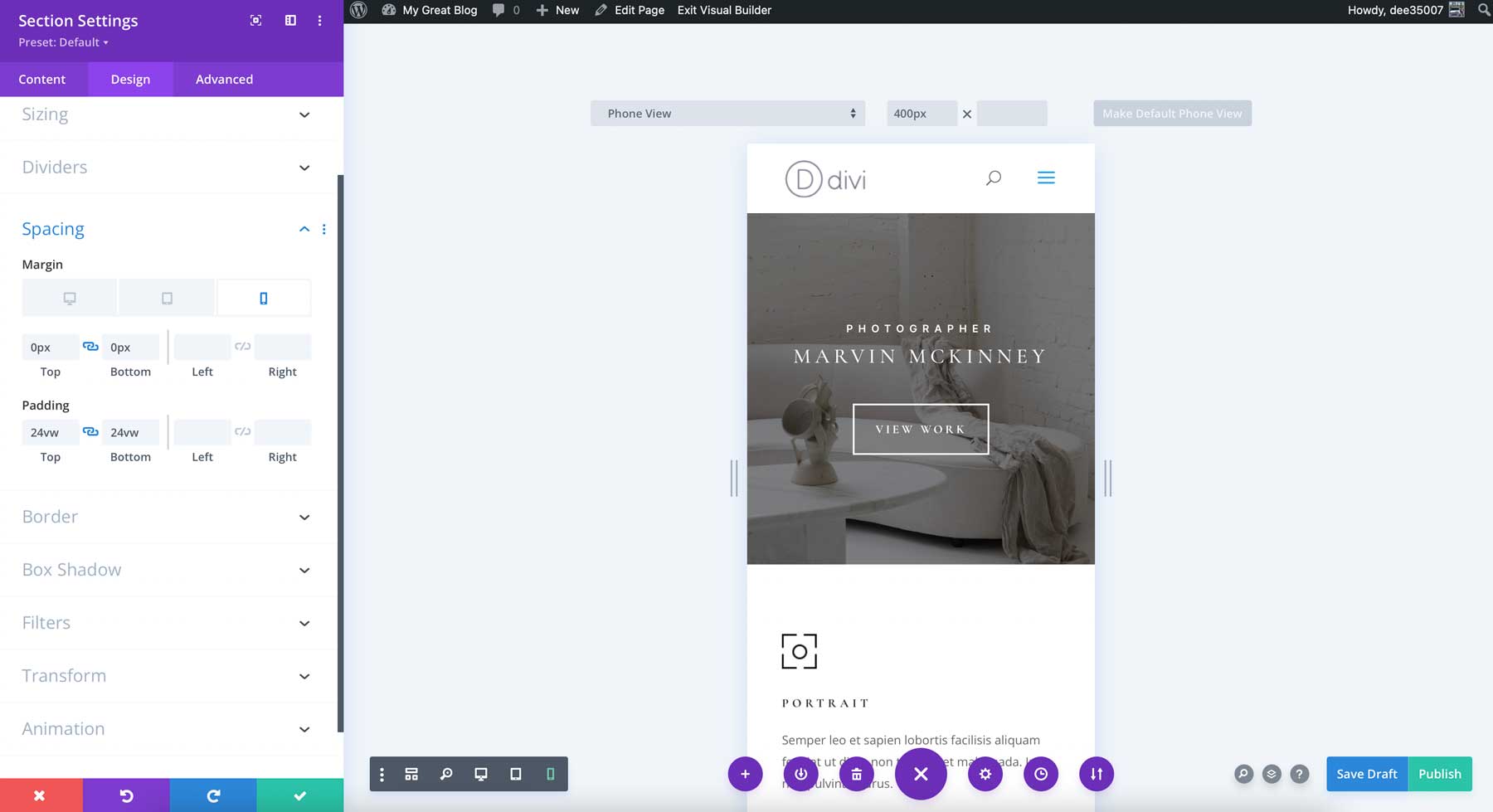
Divi’s responsive page preview is undoubtedly one of its standout features. With this tool, you can get a real-time view of how your page will look on different screen sizes. But that’s not all. Divi’s intuitive and responsive controls allow you to adjust a variety of design elements, including text size, borders, background image placement, and even CSS.
But here’s where things get really interesting: using the responsive settings at the module level, you can change design elements such as text color and background video depending on the device your visitors are using. For example, you can display a background video on desktop screens while using a background image for tablets and mobile devices. This way, your layouts will always have a mobile-first design, no matter what device your visitors are using.
Furthermore, Divi’s Theme Builder, which allows you to create custom templates to display content, works alongside the Visual Builder to create stunning, responsive templates. You can design global headers and footers, page templates, and even WooCommerce product pages, which are all responsive.
Divi is best for:
Divi is best suited for anyone looking for the ultimate responsive WordPress theme that looks amazing on any device. With more design options than any other WordPress theme, you’ll be hard-pressed to find a better option.
| Divi | |
|---|---|
| Starting Price | $89/year |
| Websites | Unlimited |
| Free Layouts | 2200+ |
| Theme Builder | ✔️ |
| Responsive Preview | ✔️ |
| Get Divi | |
2. Hello Elementor
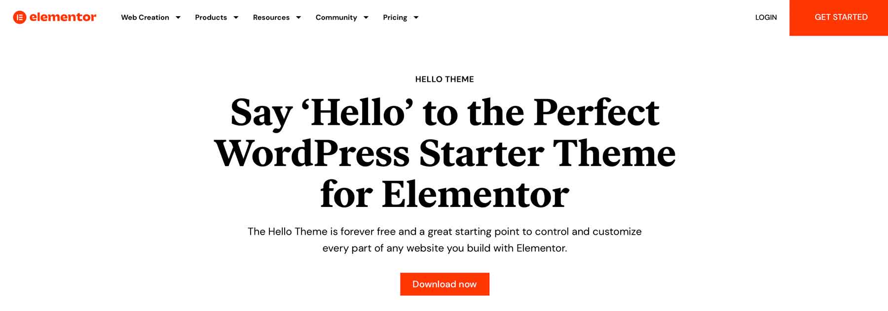
Hello Elementor is one of the best responsive WordPress themes available. Built to work seamlessly with the Elementor page builder plugin, it gives you the complete design freedom to build a custom website with over 100 widgets and responsive controls for every aspect of your site, down to padding and margin.
Key Features for Hello Elementor
- 100+ widgets
- Ultimate header and footer builder (pro)
- Customized page templates (pro)
- 300+ basic and pro templates (pro)
- Responsive design controls at the module level
Elementor’s page editor allows you to preview your page designs for desktop, tablet, and mobile devices, enabling you to make necessary adjustments to ensure a seamless browsing experience for your site visitors on any device. You have complete control over everything from the text size to how images are displayed on various screen sizes, allowing you to tailor your website to look and function perfectly.
Moreover, by upgrading to the pro version of Elementor, you’ll have access to even more advanced features. For instance, you can create custom headers and footers and build page templates for products, categories, taxonomies, and much more. Alternatively, you can use a pre-built template kit to quickly and easily make your website in just a few minutes.
Hello Elementor is best for:
Those looking to build a lightweight, fully responsive WordPress website will like Hello Elementor. Most of the features are free, so it’s perfect for anyone on a budget.
| Hello Elementor | |
|---|---|
| Starting Price | $59/year |
| Websites | Unlimited |
| Free Layouts | 100+ |
| Theme Builder | ✔️ |
| Responsive Preview | ✔️ |
| Get Hello Elementor | |
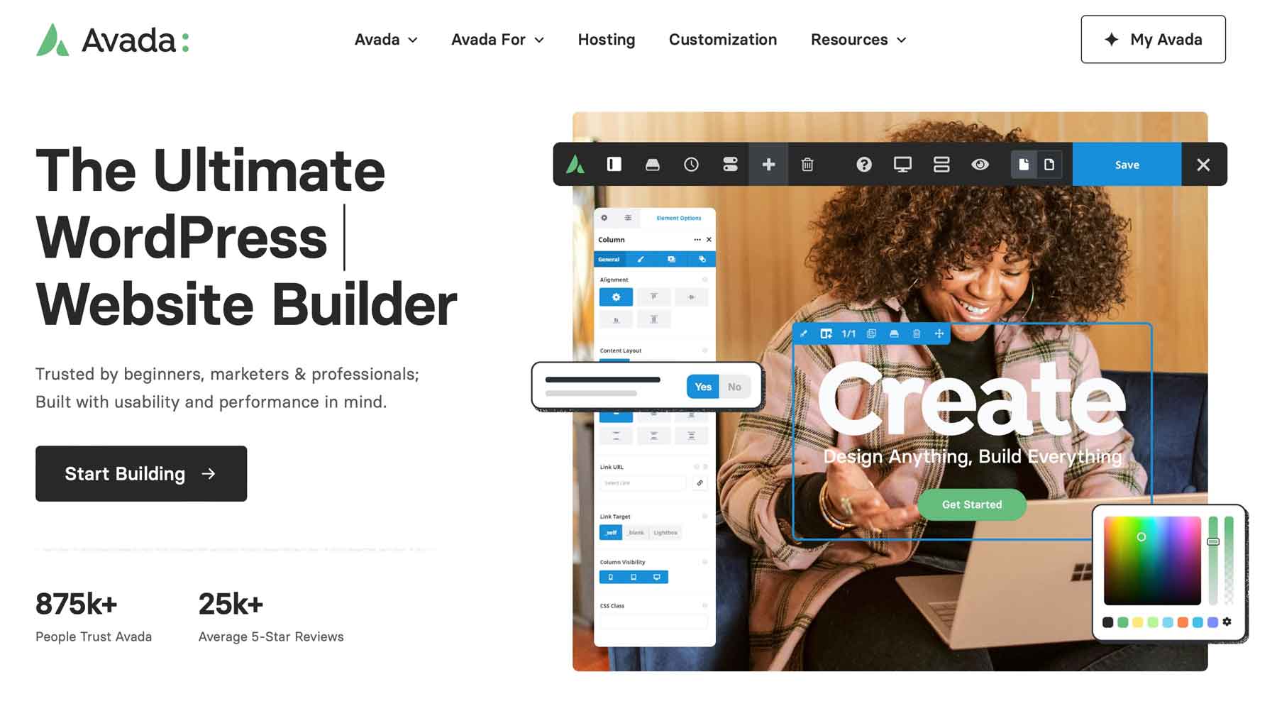
3. Avada
Next on our list of the best responsive WordPress themes is Avada, which stands out for its use of a proprietary front-end page builder called Fusion Builder. With over 120 design elements, it’s easy to customize your website to make it unique. Each element has responsive settings to adjust text size, photo placement, how columns break down on smaller devices, and more. Avada also offers the ability to create responsive, custom layouts for global headers and footers, 404 pages, search results, and more with their Layout Builder. Plus, with its helpful setup wizard, you can quickly and easily set site width, global colors, fonts, and more to make the process smoother.
Key Features for Avada
- Live front-end builder
- 90+ demo websites
- Build custom menus, forms, sliders, and layouts
- Adjust responsive settings at the design element level
Avada makes it easy to preview how your pages will look on different devices while editing. With responsive preview options, you can ensure your website looks great on any screen size. The Fusion Builder also allows you to customize each element’s settings, providing optimal display across all devices. Additionally, Avada offers several other impressive features, such as creating custom mega menus, forms with conditional logic, and image sliders without additional plugins.
Furthermore, for those who want to get started quickly, Avada provides over 90 importable demo websites. These demos offer fully functional, responsive websites you can launch within minutes, then update with your branding using Avada’s global options. It’s an excellent feature for those who want to save time and get their website up and running quickly.
Avada is best for:
With the ability to adjust any setting, import demo content, and control responsive settings at any level, Avada is a great option for those looking for an all-inclusive, fully responsive WordPress theme.
| Avada | |
|---|---|
| Starting Price | $69/year |
| Websites | 1 |
| Free Layouts | 90+ |
| Theme Builder | ✔️ |
| Responsive Preview | ✔️ |
| Get Avada | |
4. Astra
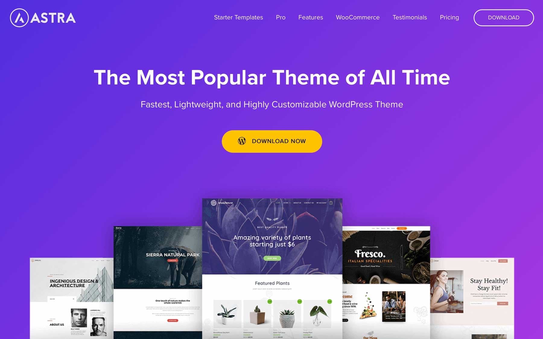
Our next responsive WordPress theme, Astra, is a lightweight and robust theme compatible with popular page builders such as Elementor, Spectra, Beaver Builder, and Visual Composer, amongst others. Astra recommends Spectra, built on top of Gutenberg blocks, to keep things light.
Key Features for Astra
- 240+ starter templates
- Works with popular page builders
- Extremely lightweight at less than 50Kb
- Self-hosted Google fonts
- Extensive header, footer, and blog layout options (pro)
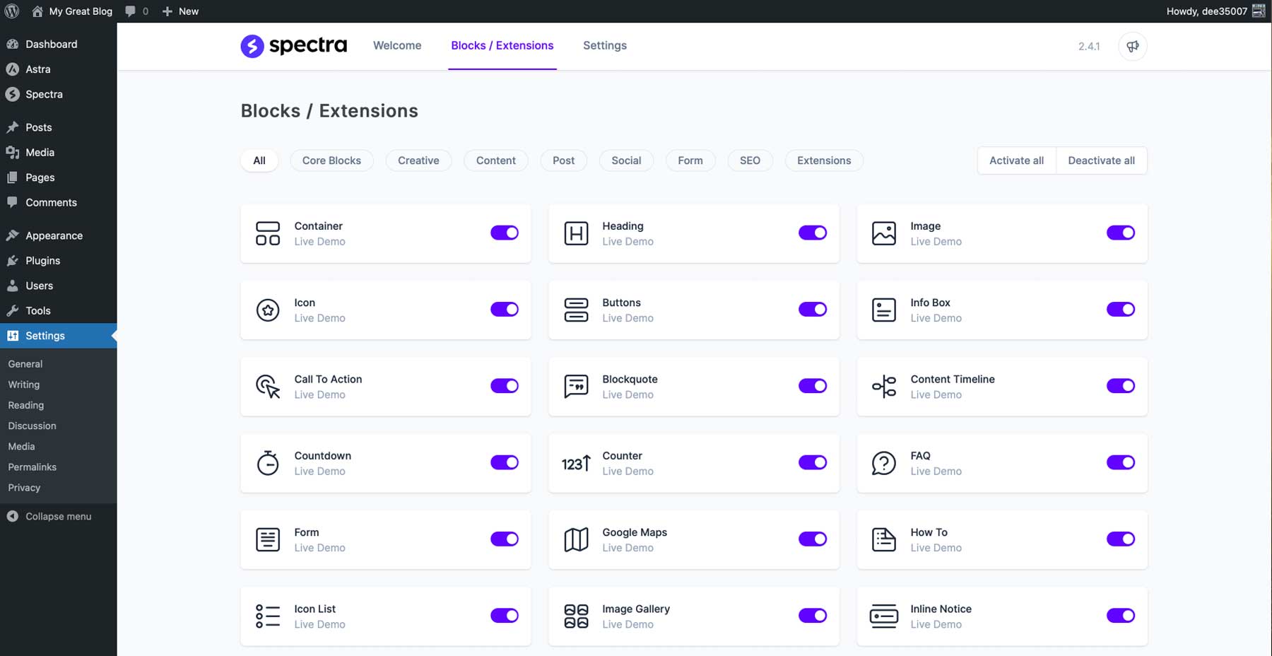
With the Spectra page builder plugin, you can expand the functionality of Gutenberg blocks with over 35 additional blocks, all of which can be used seamlessly with Astra. This plugin also includes other valuable features, including the ability to define content width, adjust container padding and elements gap spacing, and host Google fonts locally, which can significantly reduce page loading times. Additionally, the plugin comes with a vast library of over 240 pre-made starter templates that can be easily imported, making it easy to get started on your website.
Astra is best for:
Astra is a great responsive WordPress theme for publishing a lightweight, fast website built on Gutenberg blocks. Gutenberg provides responsive previews of your pages, so you’ll know how your pages will display on multiple screen sizes.
| Astra | |
|---|---|
| Starting Price | $59/year |
| Websites | 1 |
| Free Layouts | 240+ |
| Theme Builder | ✔️ |
| Responsive Preview | ✔️ |
| Get Astra | |
5. Kadence
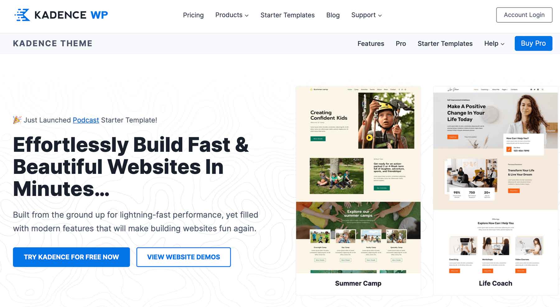
Introducing our next best WordPress theme – Kadence. It’s fully responsive, lightweight, and fast, providing a seamless user experience for beginners and developers alike. Built on Gutenberg blocks, Kadence offers great flexibility and customization options. However, for those who prefer a true front-end visual builder experience, you can easily install a page builder of your choice, such as Elementor.
Key Features for Kadence
- 40+ free templates
- Compatible with Elementor and Gutenberg blocks
- Responsive preview
- Extensive live customizer options
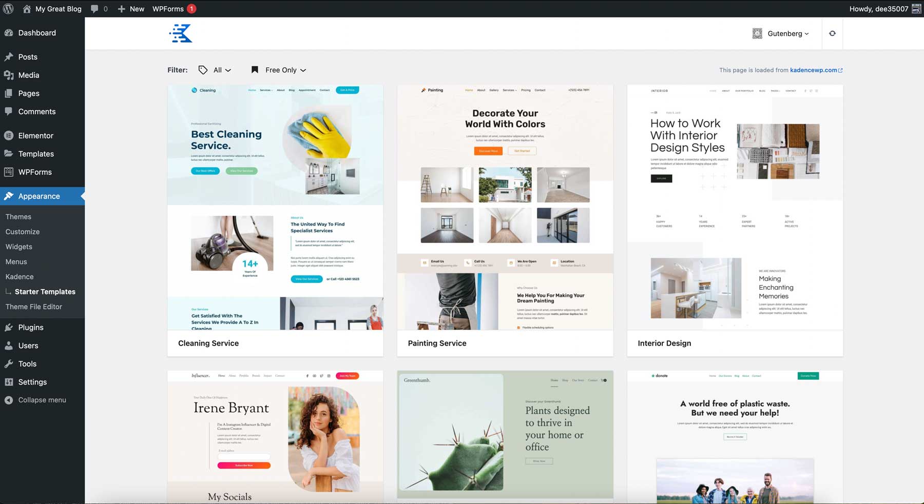
Kadence offers over 50 free starter templates for Gutenberg and Elementor, so you can easily choose a layout suitable for your type of business. If you prefer using the Gutenberg page editor, you can add more capability to it with the Kadence blocks plugin. There are over 15 blocks, including an advanced gallery, Lottie animations, tabs, accordions, and more. Additional features include live customizer settings with responsive preview options, drag-and-drop block patterns, premium support, and integration with WooCommerce.
Kadence is best for:
Those looking for a good, responsive WordPress theme built on Gutenberg should try Kadence. With an abundance of starter templates, extra blocks, live theme customization options, and compatibility with most page builders, it’s a good choice for anyone.
| Kadence | |
|---|---|
| Starting Price | $129/year |
| Websites | Unlimited |
| Free Layouts | 80+ |
| Theme Builder | ✔️ |
| Responsive Preview | ✔️ |
| Get Kadence | |
6. Authority Pro
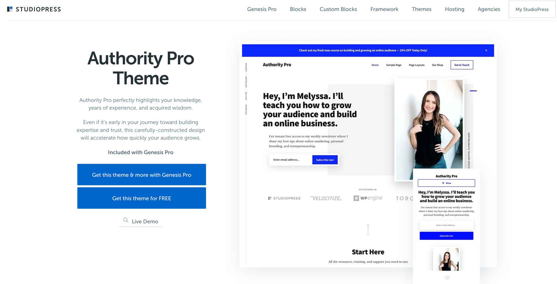
Built on the Genesis Pro framework, Authority Pro is one of over 40 themes by StudioPress. With Genesis Pro, you can create responsive and SEO-optimized WordPress sites using Gutenberg. As one of the most developer-friendly options on our list, Authority Pro empowers you to build a fast, lightweight, and secure website tailored to your unique needs.
Key Features for Authority Pro
- One-click theme setup
- Powered by Genesis framework
- Built for Gutenberg blocks
- Live theme customizer
- AMP and accessibility ready
With Authority Pro, you’ll have everything you need to create a professional-looking website, thanks to its range of pre-built pages. Authority Pro covers you from landing pages to blogs, contact pages to about pages, single post pages to shop, and category pages. But that’s not all – with the Genesis Blocks plugin, you can add custom elements to your website. Genesis Blocks allows developers to build additional functionalities through custom blocks, which can be extended with third-party apps and plugins, enabling you to create a truly unique website.
Authority Pro is best for:
Those that want a high-quality, professional business theme should consider Authority Pro. That said, you’ll need coding knowledge to fully take advantage of Genesis blocks.
| Authority Pro | |
|---|---|
| Starting Price | $360year |
| Websites | Unlimited |
| Free Layouts | 40+ |
| Theme Builder | ✔️ |
| Responsive Preview | ✔️ |
| Get Authority Pro | |
7. Sydney
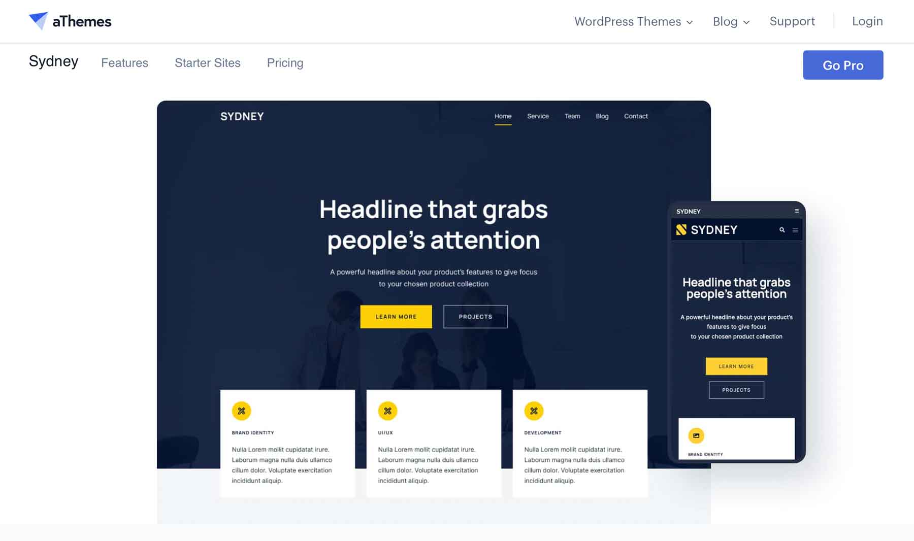
Our next best responsive WordPress theme is Sydney, by aThemes. Sydney offers an array of customizable features to enhance the design and functionality of your website. With five header layouts and the option for a sticky menu, you can choose the perfect layout to suit your needs. In addition, Sydney allows you to personalize your site with custom elements such as buttons and contact info while providing a static hero image, slider, or video background, which can be easily managed through the live WordPress customizer.
Key Features for Sydney
- Desktop and mobile header and footer layouts
- 3 free starter sites
- Integration with Elementor
- Built-in slider(pro)
- 6 blog layouts
Furthermore, Sydney offers six free blog layout options and support for WooCommerce, making it an ideal choice for businesses and bloggers alike. Elementor users can use the testimonial, slider, and team carousel widgets for added functionality. And if you’re catering to a multi-lingual audience, Sydney is translation-ready and supports popular translation plugins, such as WPML.
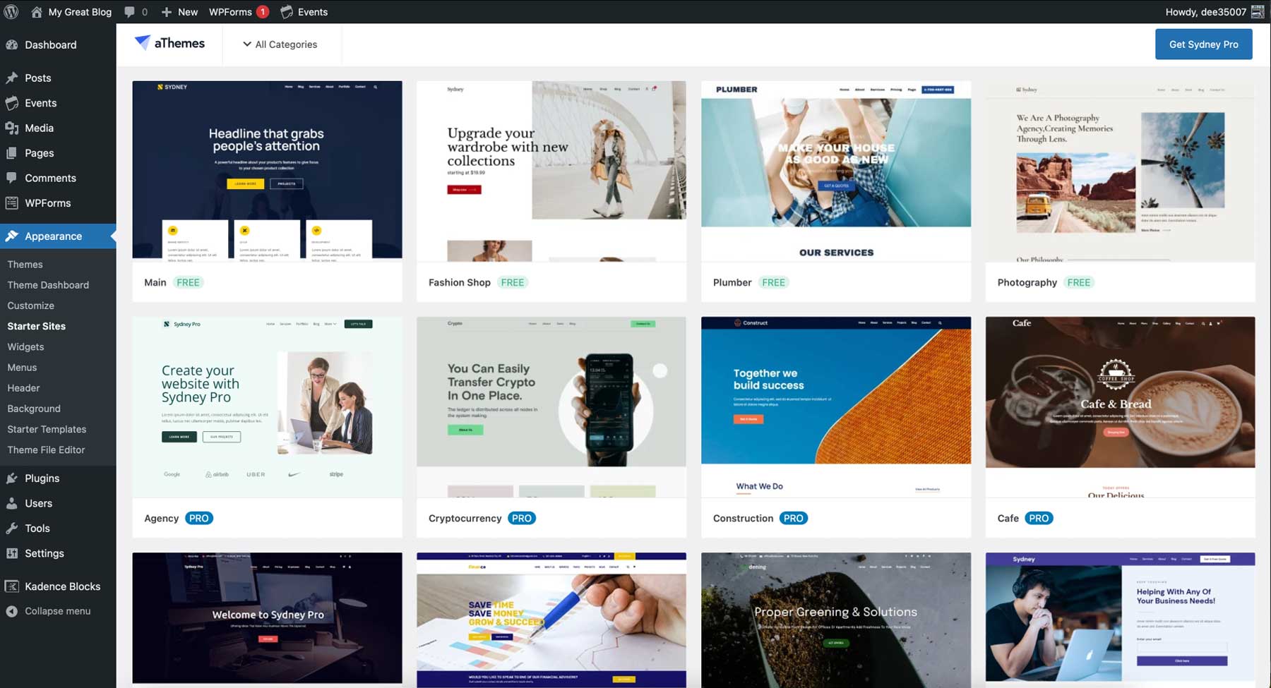
For those who want to get started quickly, Sydney also offers four pre-made starter sites that you can load and customize. If you go for the pro license, you can access over 20 templates, including popular business categories, podcasting layouts, and more. Plus, you can build custom templates with the aThemes theme builder, add custom post type support through Toolset, and create modal popups to highlight sales or other important information.
Sydney is best for:
Those looking for a responsive WordPress theme that’s easy to style, is multi-lingual compatible, and offers plenty of starter templates for different types of businesses should consider Sydney.
| Sydney | |
|---|---|
| Starting Price | $69/year |
| Websites | 1 |
| Free Layouts | 17 |
| Theme Builder | ✔️ |
| Responsive Preview | ✔️ |
| Get Sydney | |
8. Blocksy
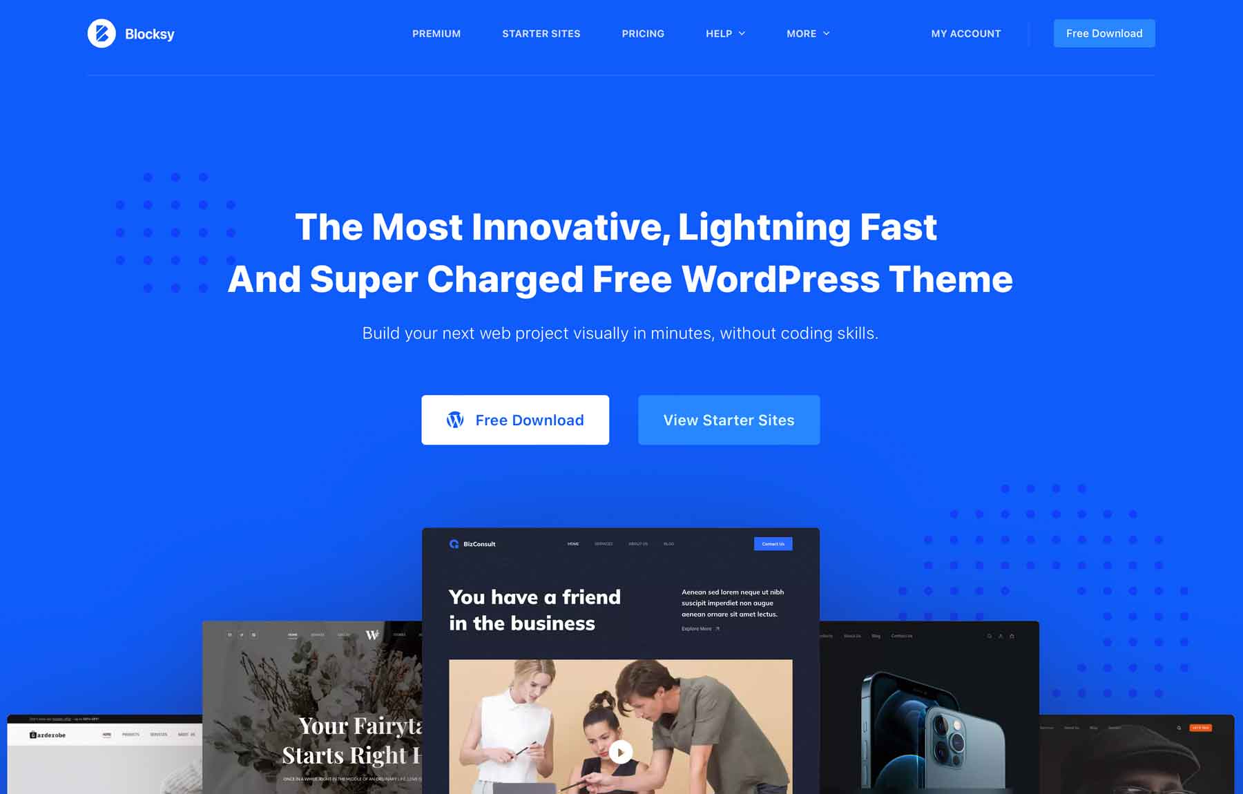
Up next on our list of best responsive WordPress themes is Blocksy. Built on Gutenberg, it’s easy to style, has plenty of blocks to choose from, and is fully responsive with multi-platform page preview options, the ability to adjust block settings for any device, and live preview customizer settings so you can see how your site looks in real-time. Blocksy is available in both free and pro versions, with most features available for free.
Key Features for Blocksy
- Uses Gutenberg blocks
- 28 starter sites (pro)
- Free header and footer builder
- WooCommerce support
- Built-in lazy-loading
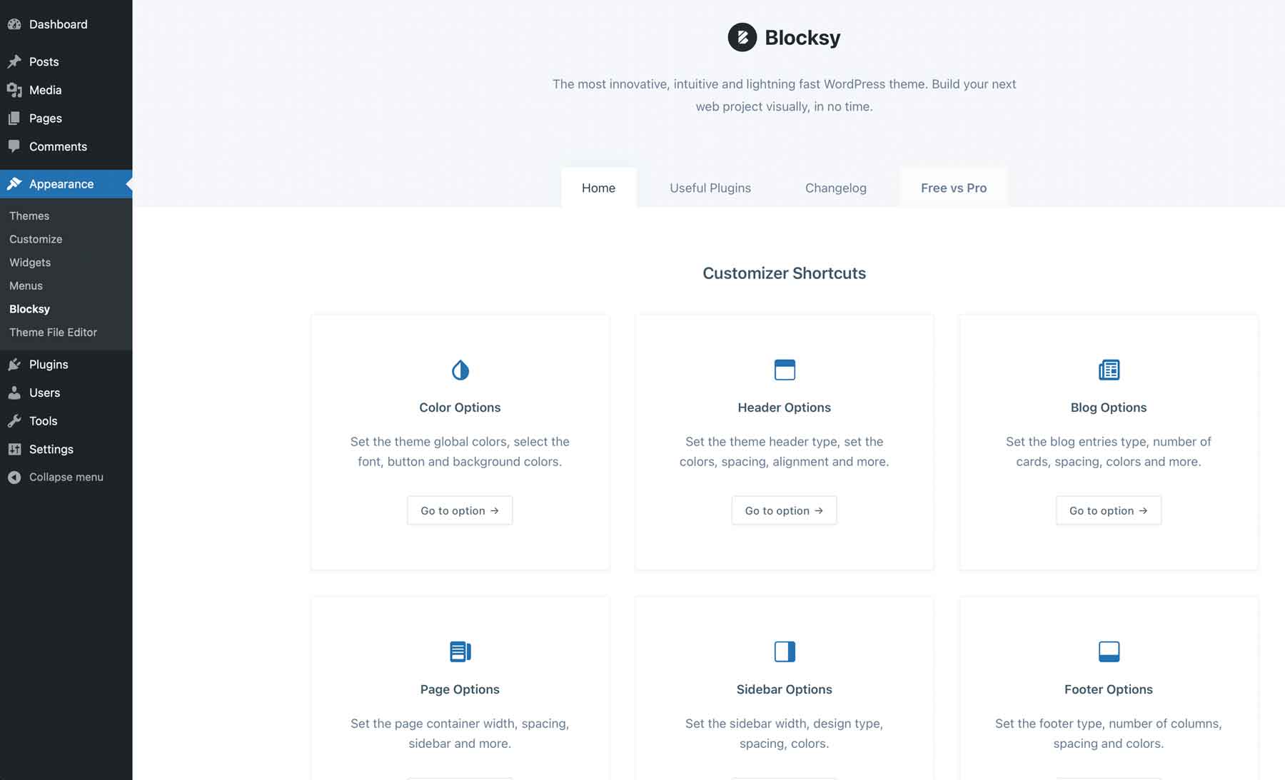
Blocksy offers a handy getting started screen to control color options, header, footer, blog, and page and sidebar options. You can build custom headers and footers with desktop and tablet/mobile options and display them according to conditions. If you want to save time and effort, you can import one of 28 Blocksy starter sites which are all mobile-ready, requiring only text and image changes to make it unique. WooCommerce users will rejoice thanks to Blocksy’s compatibility with the popular e-commerce platform. You can customize product and shop page layouts, category and tag templates, and more.
Blocksy is best for:
People who prefer to build websites with the Gutenberg block editor will find Blocksy one of the best responsive WordPress themes available. With plenty of professional designs available, it’s an excellent option for beginners.
| Blocksy | |
|---|---|
| Starting Price | $49/year |
| Websites | 1 |
| Free Layouts | 28 |
| Theme Builder | ✔️ |
| Responsive Preview | ✔️ |
| Get Blocksy | |
9. Deep
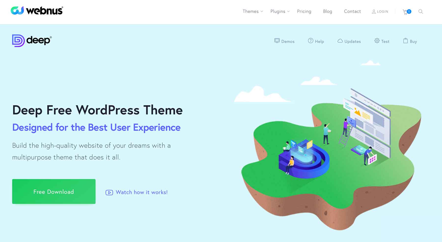
For our next entry, we have Deep – one of the best responsive WordPress themes for beginners. Like others on our list, it supports Elementor, so creating pages is a breeze. With over 120 demo sites, you can build any site you need, then edit your content through Elementor’s front-end builder.
Key Features for Deep
- 120+ demo sites, including 28 free ones
- 160+ ready-made section designs
- Header & Footer builder
- Advanced portfolio builder
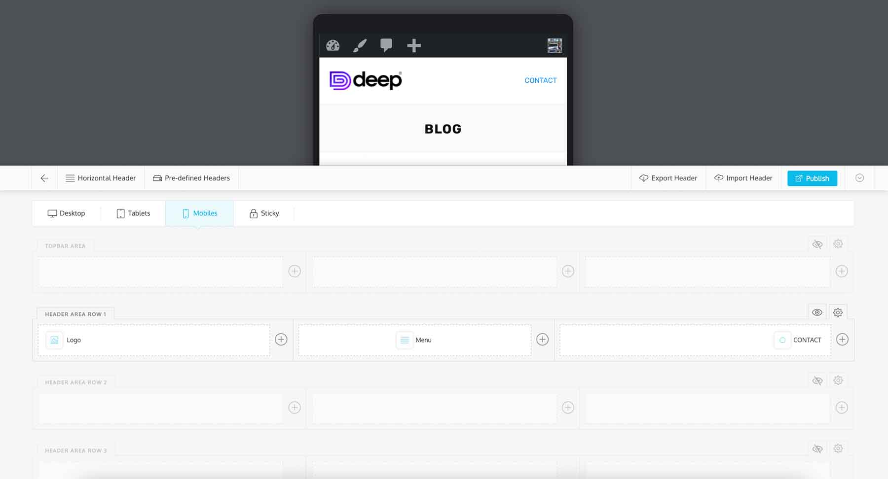
One of the best features of Deep is the header builder. With a drag-and-drop editor, you can easily create custom headers for both desktop and mobile devices. Plus, you can customize the background, add custom colors and images, and add other useful elements simply by dragging them into your header. You can also add headers conditionally, displaying different headers for specific pages or devices. You also have complete control over your footer design, with options to display social media feeds for Instagram and social icons or add a subscribe form through Mailchimp.
Deep is best for:
Anyone looking to build a professional website with a few clicks will be impressed with Deep. With over 120 starter websites, 160 section designs, and integration with popular third-party services like Mailchimp, Deep is one of the best responsive websites for beginners who want to create a website quickly.
| Deep | |
|---|---|
| Starting Price | $39/year |
| Websites | 1 |
| Free Layouts | 120+ |
| Theme Builder | ✔️ |
| Responsive Preview | ✔️ |
| Get Deep | |
10. Zakra
Zakra is the last and one of the best responsive WordPress themes on our list. It offers support for various page builders such as Gutenberg Blocks, Elementor, and Brizy. With these tools, you can effortlessly create a stunning website without coding knowledge. Zakra also supports WooCommerce for those looking to build an eCommerce website.
Key Features for Zakra
- Works with Elementor, Gutenberg blocks, and Brizy
- Quick demo importer
- Compatible with WooCommerce
- Create custom headers and footers
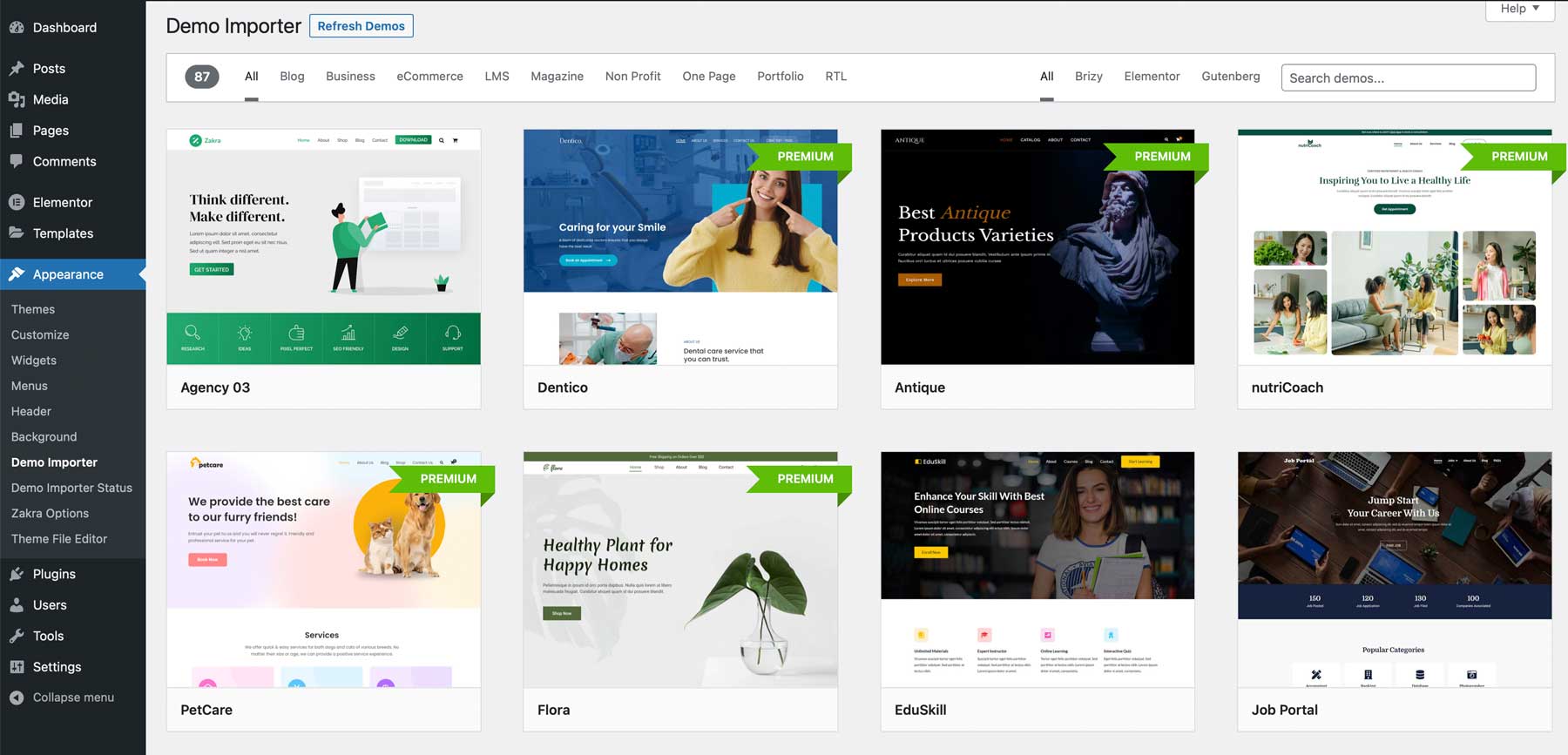
Zakra’s one-click demo importer, powered by the ThemeGrill Demo Importer plugin, is a standout feature of the theme, with over 80 demo sites available with a pro license or just over 40 with the free one. However, it should be noted that for optimal results, starting with a fresh WordPress installation is crucial before importing the demo content. Failing to do so may result in duplicate pages or a failed import.
Zakra is best for:
Zakra is another good, responsive WordPress theme best suited for beginners who want to create a website with just a few clicks effortlessly. Thanks to the number of starter sites available, there are plenty of options to make the website your own.
| Zakra | |
|---|---|
| Starting Price | $59/year |
| Websites | 1 |
| Free Layouts | 80+ |
| Theme Builder | ✔️ |
| Responsive Preview | ✔️ |
| Get Zakra | |
Final Thoughts on the Best Responsive WordPress Themes
Of all the themes we’ve featured in this post, Divi is undoubtedly the most highly recommended. Not only is it suitable for both beginners and developers, but it also provides the most value for your money. With an impressive selection of over 200 design elements and the capability to create custom templates, Divi empowers you to design a professional website without requiring coding skills.
| Starting Price | Websites | Free Layouts | Theme Builder | Responsive Preview | ||
|---|---|---|---|---|---|---|
| Divi | $89/year | Unlimited | 2300+ | ✔️ | ✔️ | Visit |
| Hello Elementor | $59/year | 1 | 100+ | ✔️ | ✔️ | Visit |
| Avada | $69/year | 1 | 90+ | ✔️ | ✔️ | Visit |
| Astra | $59/year | 1 | 240+ | ✔️ | ✔️ | Visit |
| Kadence | $129/year | Unlimited | 80+ | ✔️ | ✔️ | Visit |
| Authority Pro | $360year | Unlimited | 40+ | ✔️ | ✔️ | Visit |
| Sydney | $69/year | 1 | 17 | ✔️ | ✔️ | Visit |
| Blocksy | $49/year | 1 | 28 | ✔️ | ✔️ | Visit |
| Deep | $39/year | 1 | 120+ | ✔️ | ✔️ | Visit |
| Zakra | $59/year | 1 | 80+ | ✔️ | ✔️ | Visit |
Are you looking for more theme reviews? Check out our top 10 best WordPress themes.
The post 10 Best Responsive WordPress Themes in 2023 (Compared) appeared first on Elegant Themes Blog.