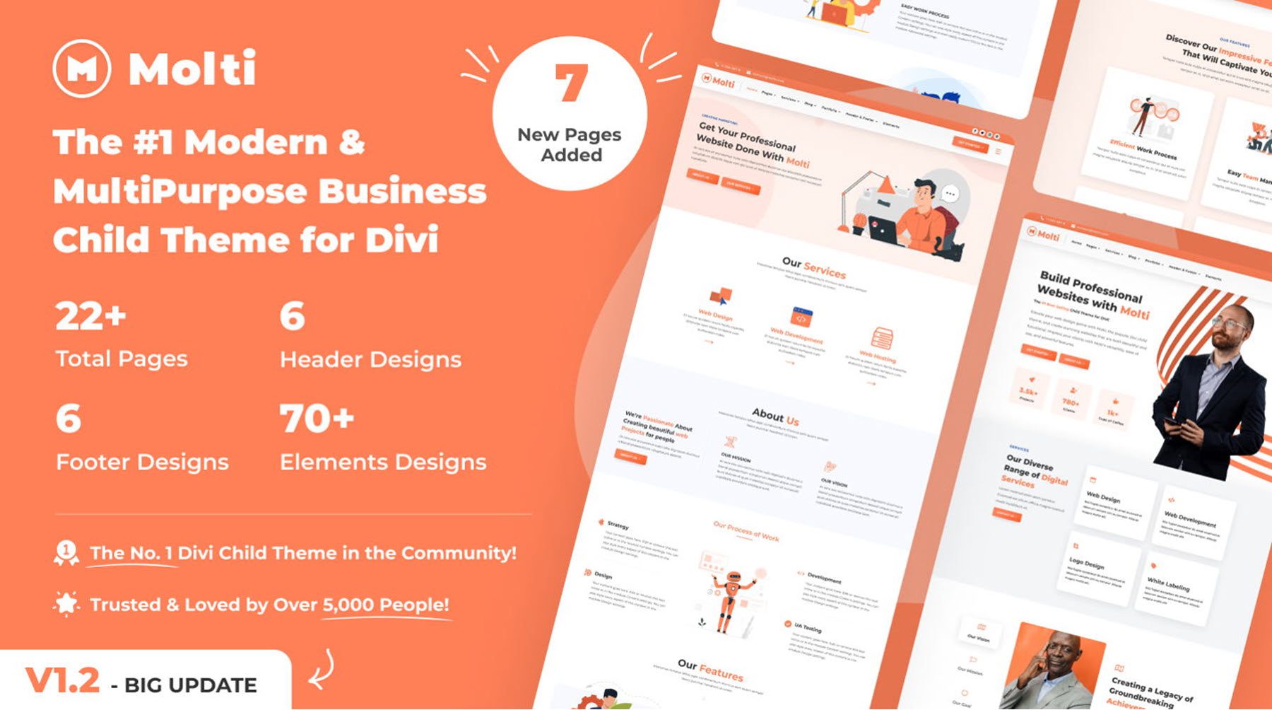
Molti is a multipurpose business child theme for Divi. It features a modern, responsive design with engaging layouts that showcase your services, features, projects, and more. It includes over 22 pages, 6 header and footer designs, and 70+ individual element designs. With a bold color scheme and subtle interactivity throughout that provides an enjoyable user experience, this child theme is a great option for any business looking to update the look of their website.
In this post, we’ll take a close look at Molti to help you decide if it’s the right Divi child theme for you.
Let’s get started!
Installing Molti
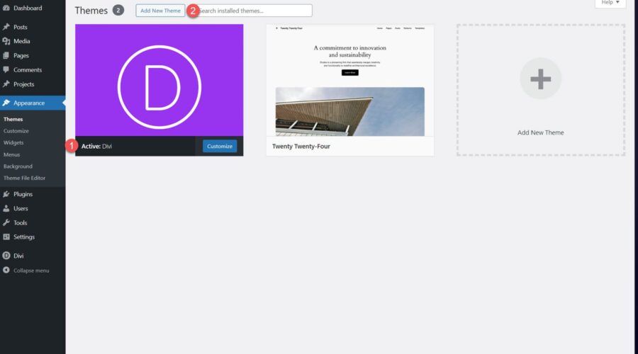
Before installing the Molti child theme, make sure you have Divi installed on your WordPress site. Then, navigate to the Themes page under Appearance in your WordPress dashboard and click Add New Theme.

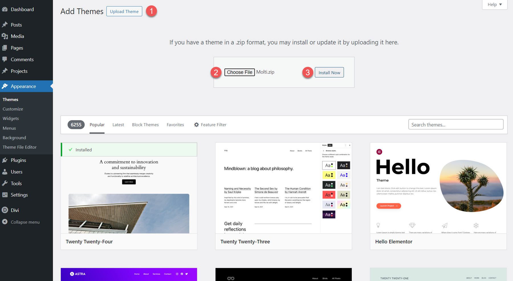
From the Add Themes page, click the Upload Theme button at the top. Select molti.zip from your files, then click Install Now.
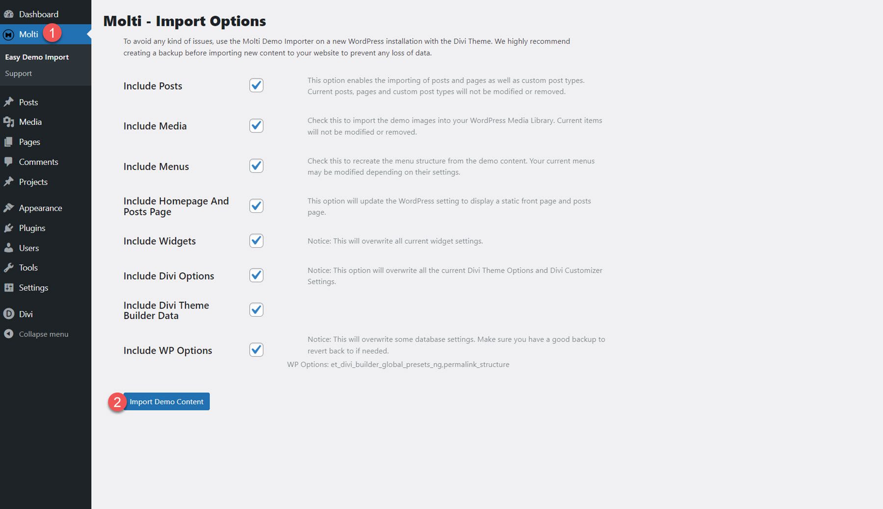
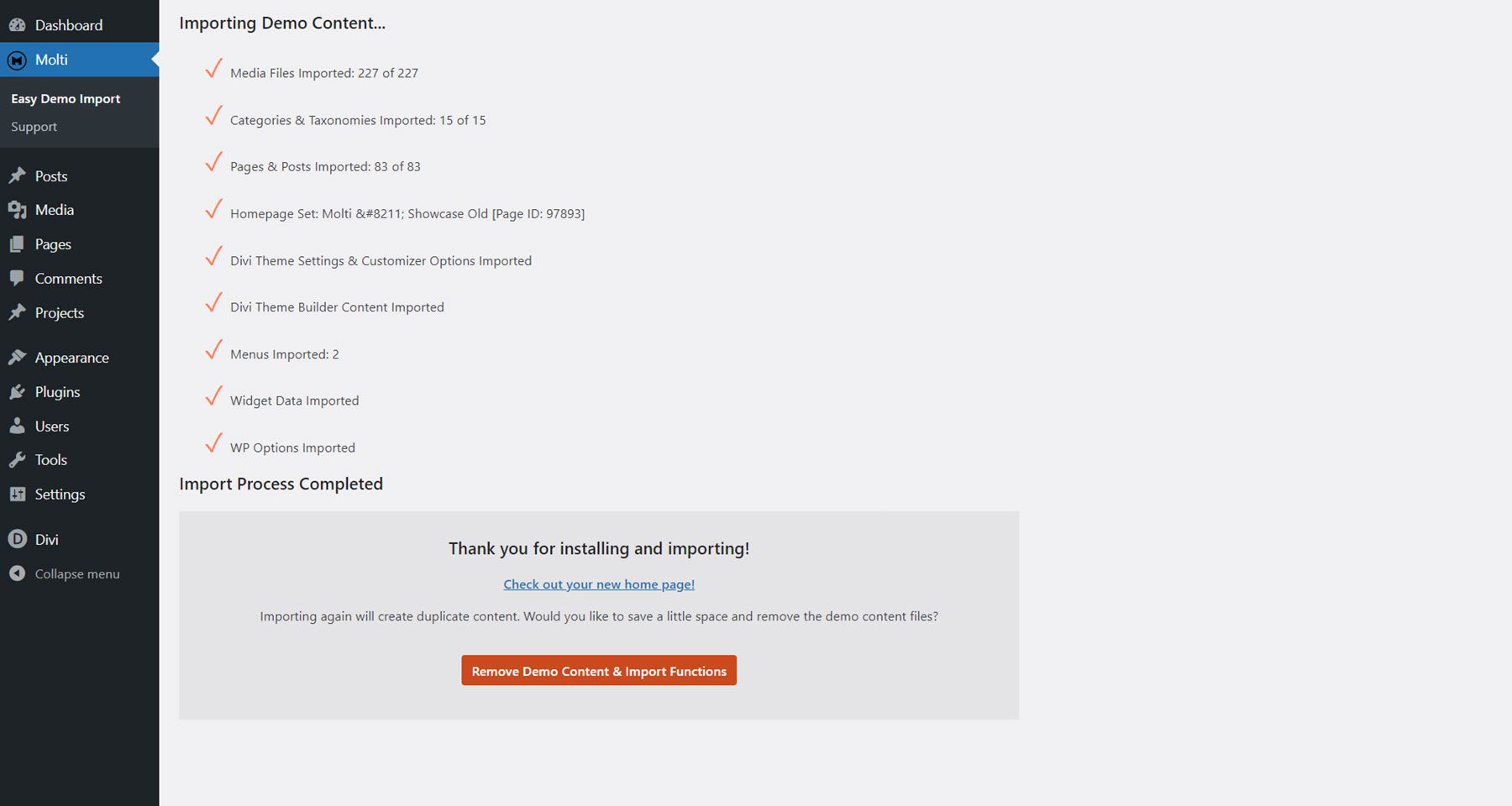
Next, activate the child theme. Once it is active, you will see the Molti tab in the Dashboard menu. Select the Easy Demo Import sub-page. This page allows you to easily import all of the child theme content, settings, and recommended plugins with one click. Select Import Demo Content to begin.
Once the installation is complete, open up your home page, and you will see that the child theme has been fully installed and set up for you to use. To make the site your own, you simply need to replace the content with your own. Now, let’s explore the page layouts that come with the Molti Child Theme.
Molti Child Theme Pages
Molti comes with over 22 pages, including two home page variations, 6 header and footer designs, and 70+ individual element designs. The child theme features an orange and white color scheme with a blue accent color. The styling of the theme is clean and modern, with plenty of white space and a nice use of color as a way to highlight text, features, and call-to-action items. Many of the designs feature subtle hover effects and transition animations that visually indicate to the user where they are on the page. Molti is also completely responsive and works on all screen sizes. Overall, Molti is a stylish, well-built theme that can be easily customized to fit a wide range of business websites.
Business Homepage V1
The first home page layout features a hero section with call-to-action buttons, service items, an about us section, features, number counters, pricing, testimonials, and recent blog posts. The service items feature a nice border that appears on hover, and there are some subtle animations in the features and pricing sections as well. In the testimonial section, you can click on the person’s image to reveal their testimonial above. The page is organized well and presents your services and features in a compelling way.

Business Homepage V2
Next, the second home page layout features a hero section with a transparent image, text, two call-to-action buttons, and three cards with icons that can highlight key information about your business. The page also highlights services, an about section with a dynamic content toggle, features, pricing, a testimonial slider, and recent blog posts.

Contact Page
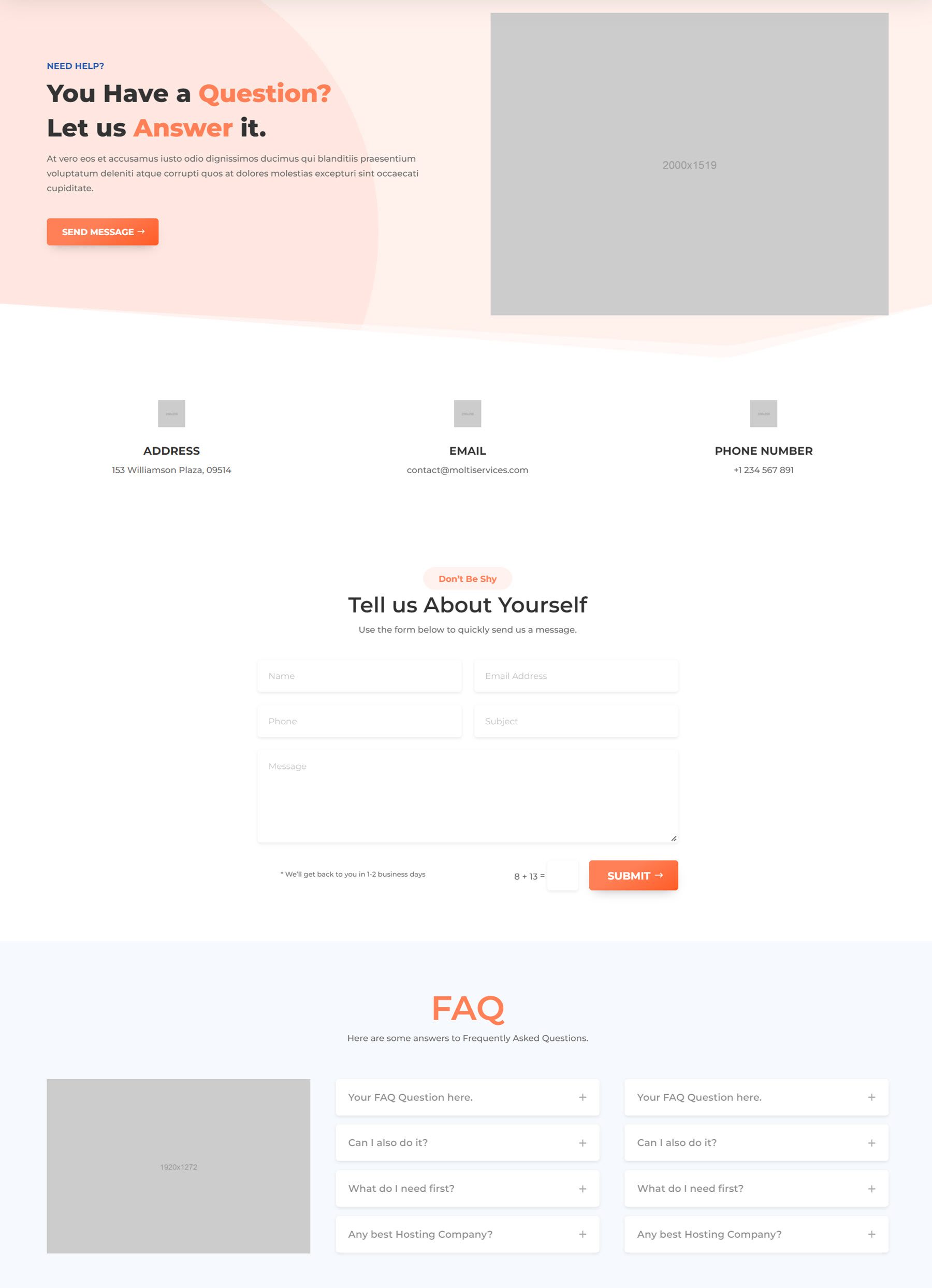
Molti’s contact page includes a header with an image and a call to action button, followed by three blurbs where you can display your address, email, and phone number. On hover, these blocks reveal a call to action button underneath. Below this is a simple contact form and a FAQ section.
About Page
The about page opens with a hero section, then a history section with three features highlighted with icons. There’s a section featuring company logos and a call to action button, followed by team members, key features, and testimonials, and a call to action pointing users towards the careers page.

Pricing Page
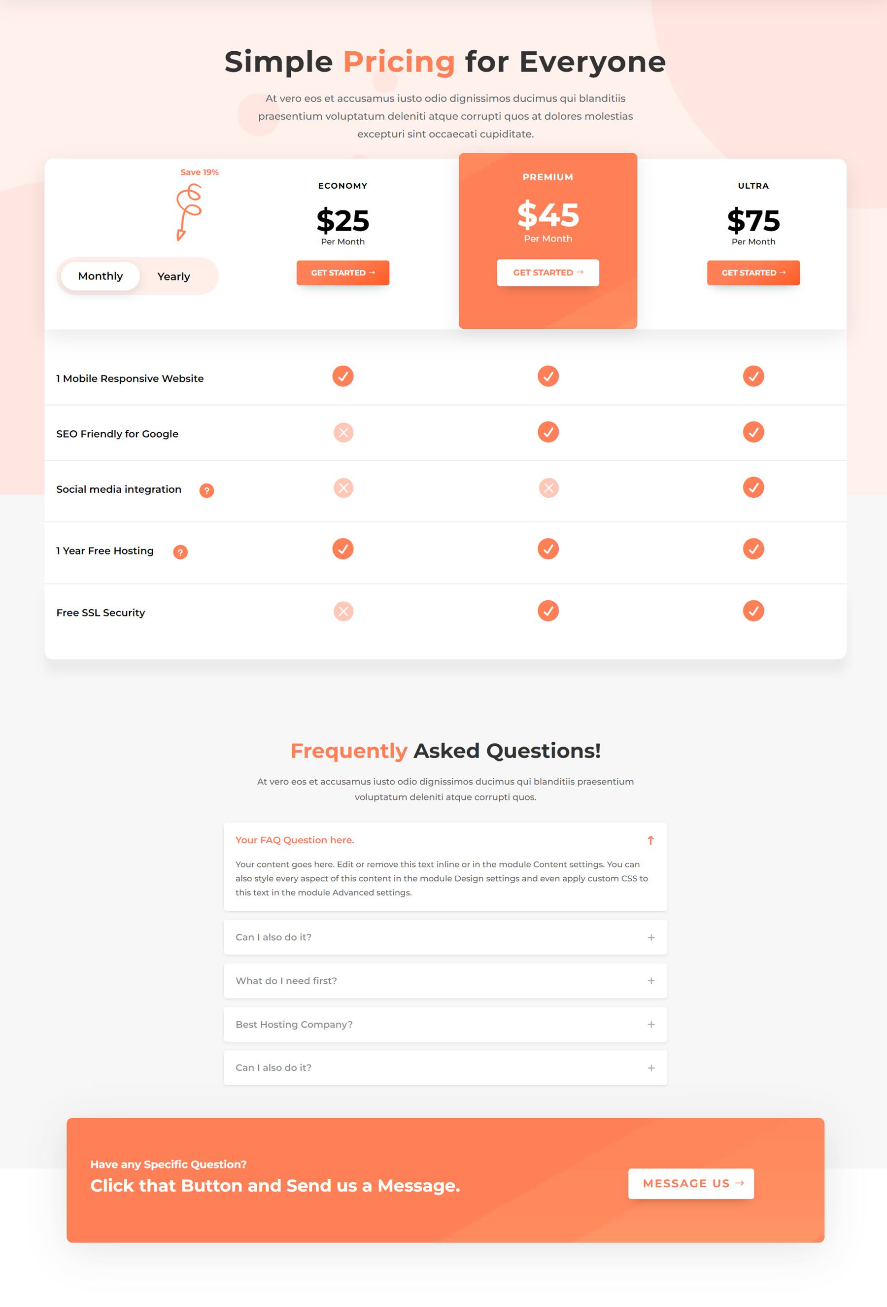
Next is the pricing page. This page features a large pricing table with a toggle to switch between monthly and yearly pricing. At the bottom of the page is an FAQ section, followed by a call to action.
Careers Page
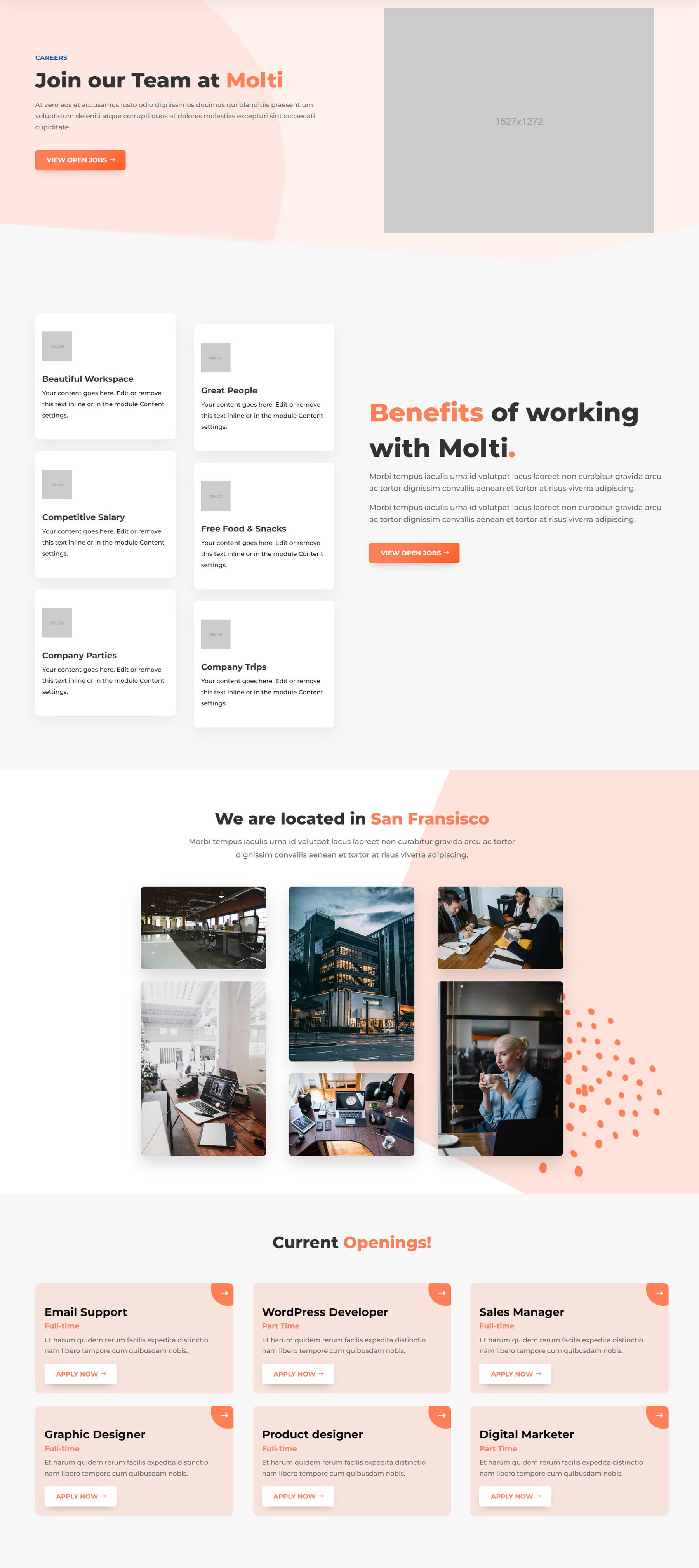
The careers page includes a hero section, then a section highlighting the benefits of the workplace with cards that highlight various features. The next section showcases some photos of the company in a masonry gallery layout. Finally, the current openings section features cards for each open position. On hover, the card turns orange with a nice animation effect.
Single Job Page
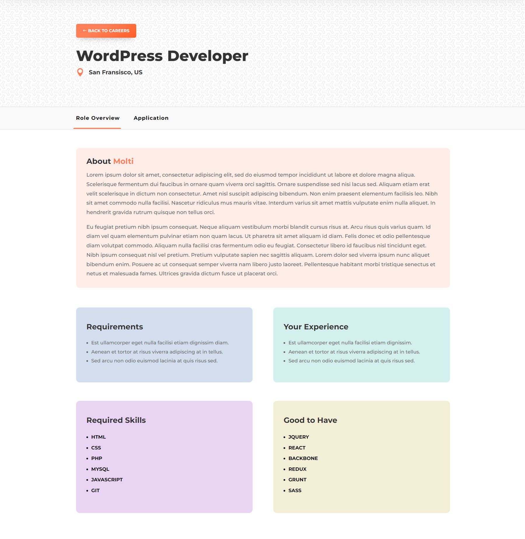
Here is the single job page. It features a header containing the job title and location, as well as a button to return to the careers page. The layout is split into two tabs, with the role overview organized in cards in one tab, and the application form in the other.
FAQ Page
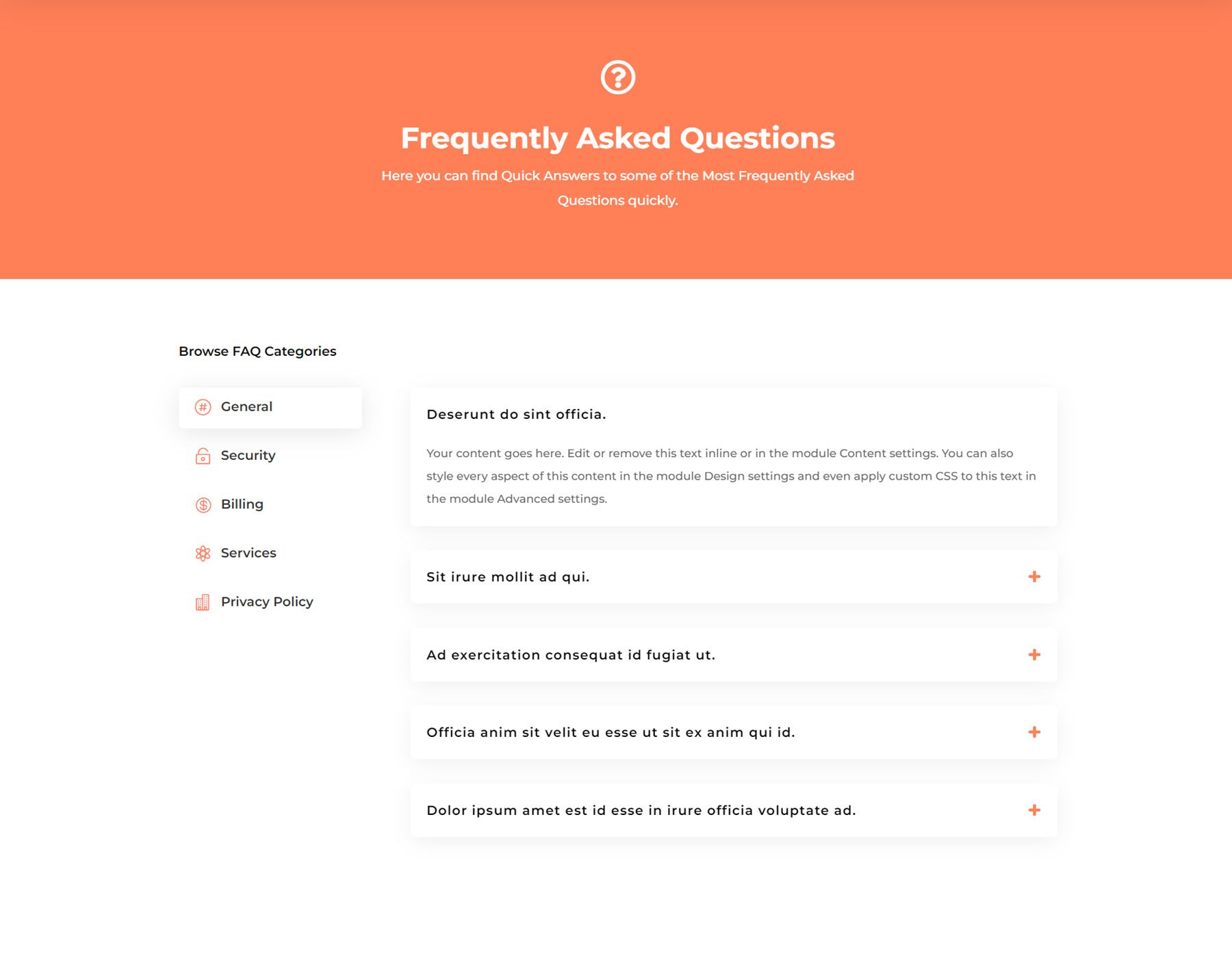
The FAQ page is a relatively simple design, featuring a header with an icon, followed by the FAQ section. The FAQ layout uses dynamic tabs to organize the questions, and each tab features questions that can be toggled open.
Team Page
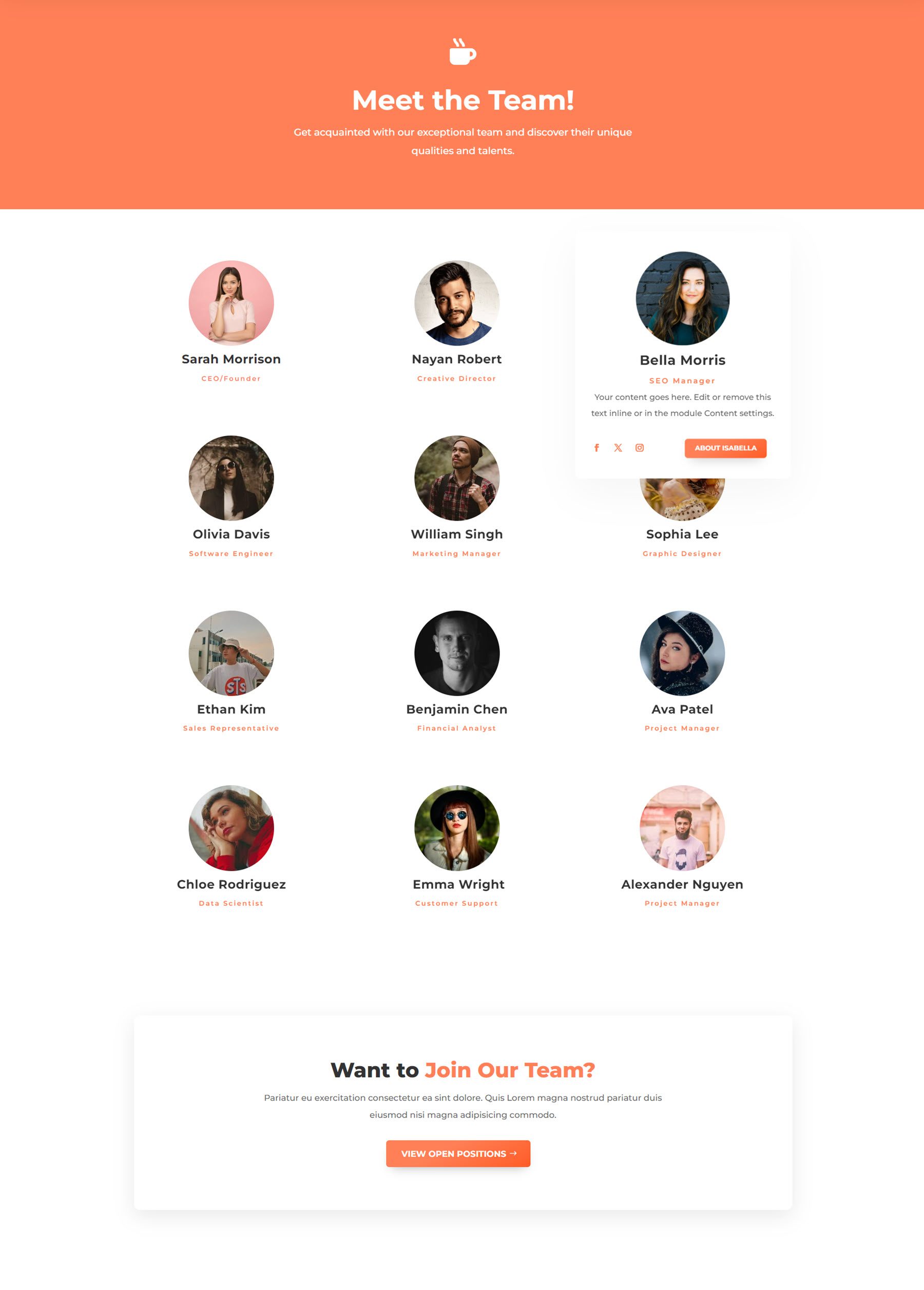
Next up is the team page. This page also has a pretty simple layout with a basic header with an icon. Each team member is highlighted with a circular image along with their name and job title. On hover, it transforms into a card that displays a description, social media links, and a button.
Testimonials Page
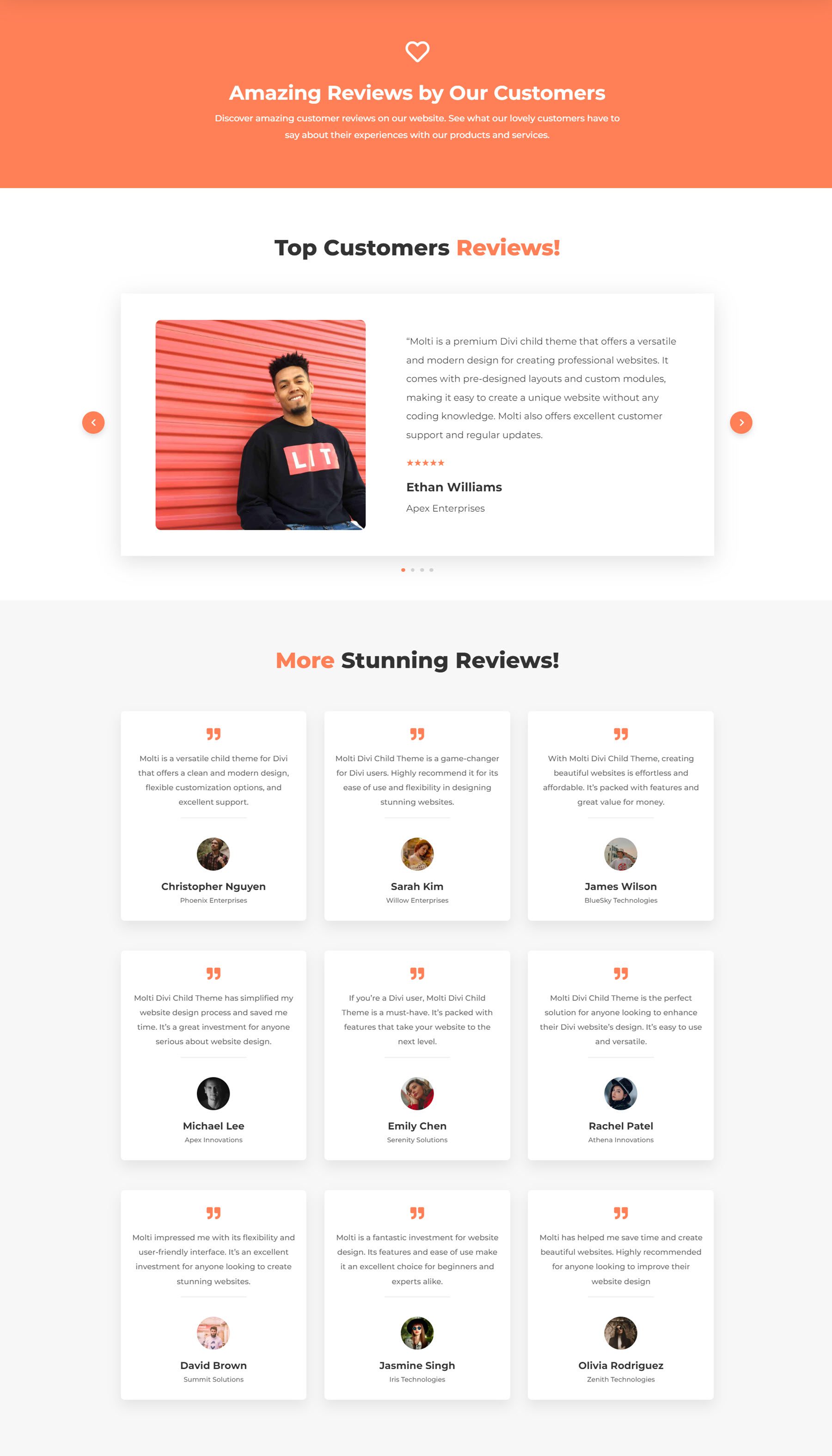
The testimonials page includes two different ways to showcase your customer reviews. The first is a testimonial slider that features an image on the left and the review on the right, followed by a star rating and the person’s name and job title. The second layout is a card-style layout, with a quote icon at the top, followed by the testimonial, then the person’s image, name, and job title.
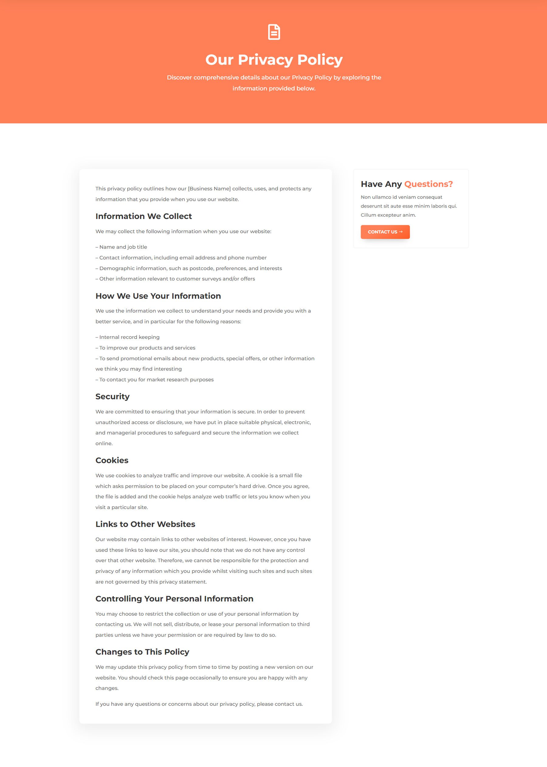
Privacy Policy Page
The privacy policy page is essential on many websites, and Molti includes a great layout for this. The policy text is contained on the left, highlighted with a white background and box-shadow. On the right, the “Have Any Questions?” box stays sticky as you scroll through the policy.
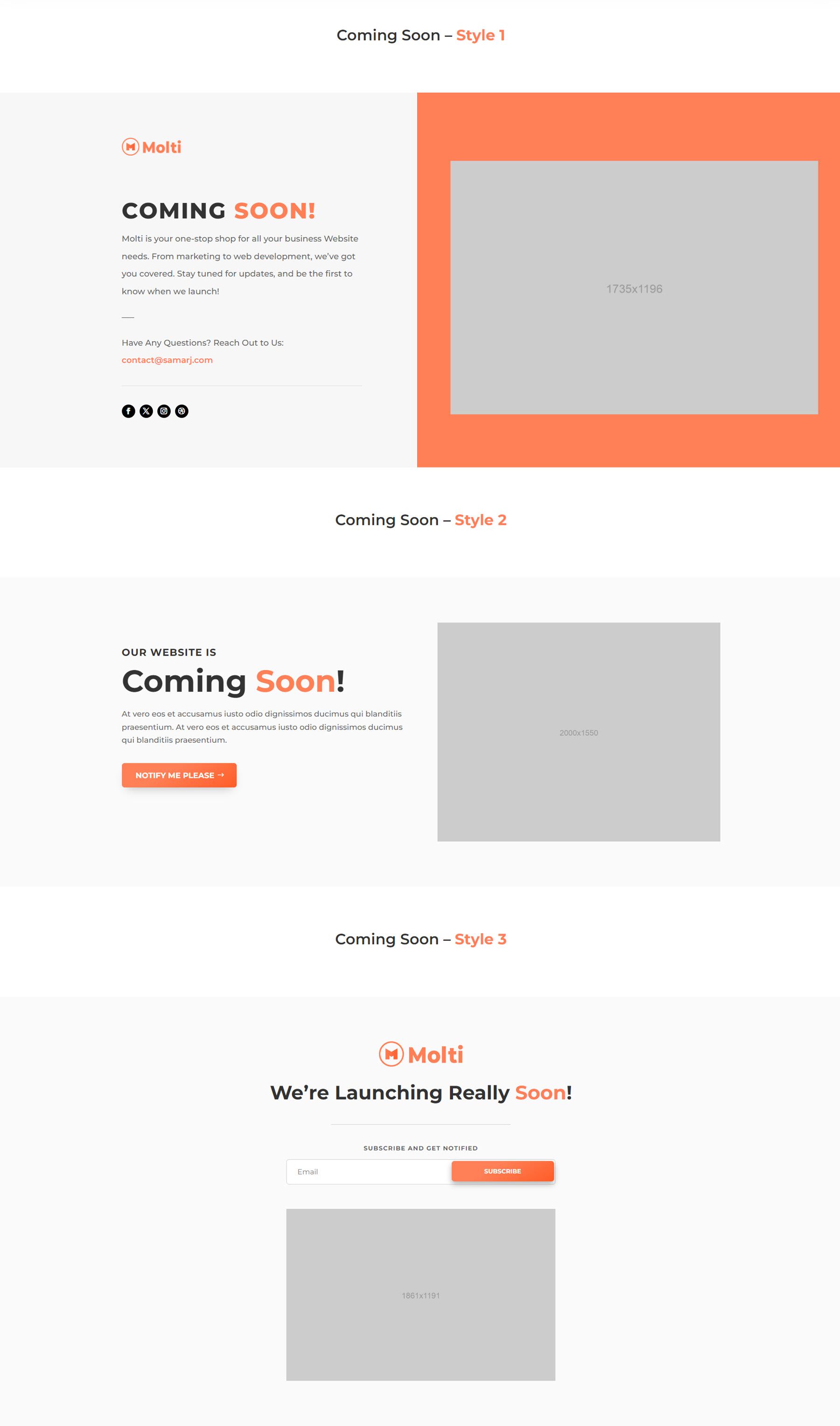
Coming Soon Page
Molti comes with three variations of coming soon page designs. These layouts are great to use while you’re updating your site. The layouts include some ways to get in touch, such as social media links, an email sign-up form, or a contact form.
Services Page
The services page layout makes it easy to showcase the various services your business offers. It includes an about section, some features, and a section with service items highlighted on cards. These cards turn orange on hover and can link to a single service page. This page also includes company logos, a testimonial quote, and a “why choose us?” section with some highlights and images that come together with a scroll animation.

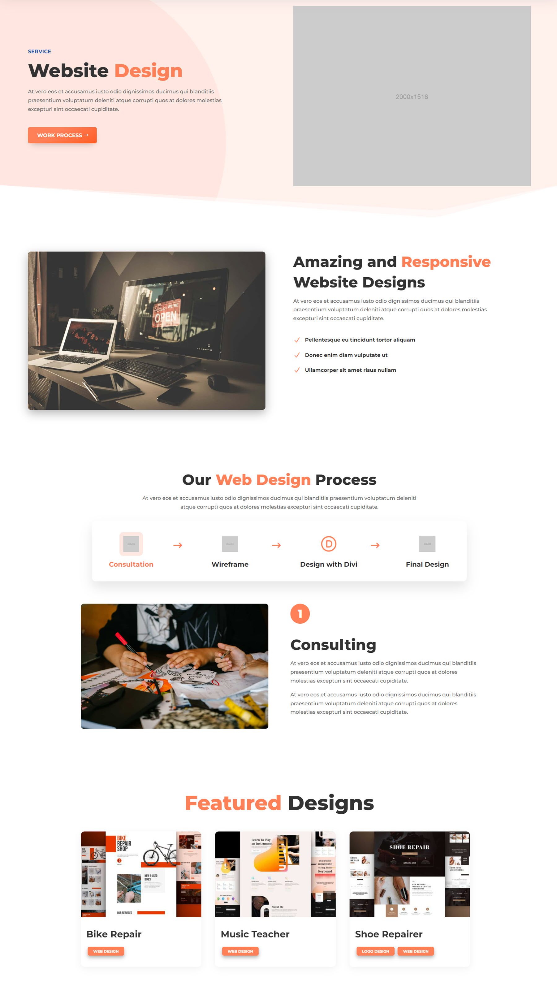
Single Service Page
Next is the single service page, where you can share the details of one of the services you offer. The layout includes an introduction section with some highlights, followed by a dynamic content toggle outlining the process of the service. At the end of the page are featured designs, which link to portfolio items.
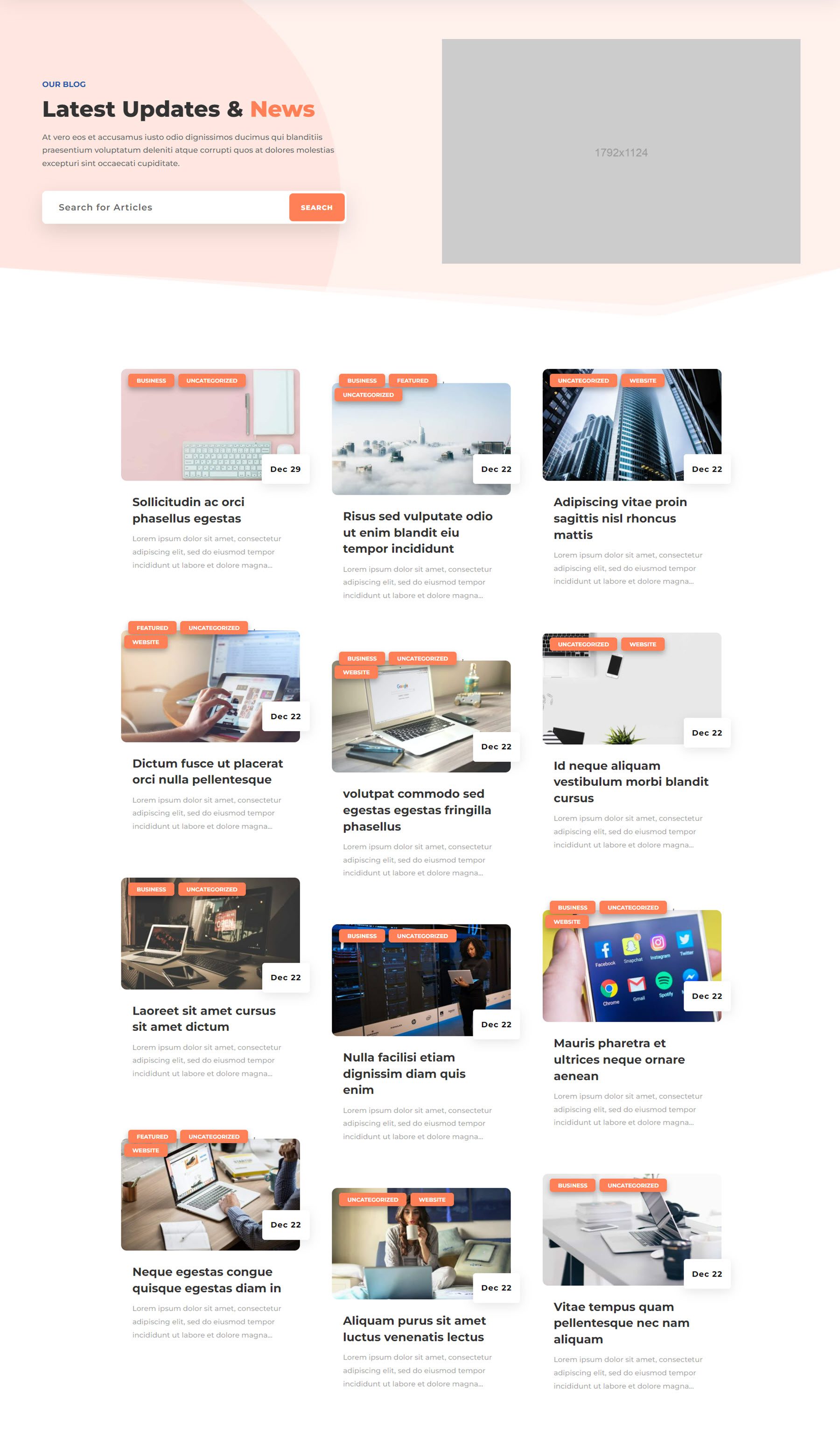
Blog Page
There are three different blog page layouts included in Molti, and this is the first. It features a header with a search bar and an image, followed by the posts in a three-column layout. The featured image for each post is overlaid with cards for the post categories and date. Below the image are the post title and excerpt.
Advanced Blog Page
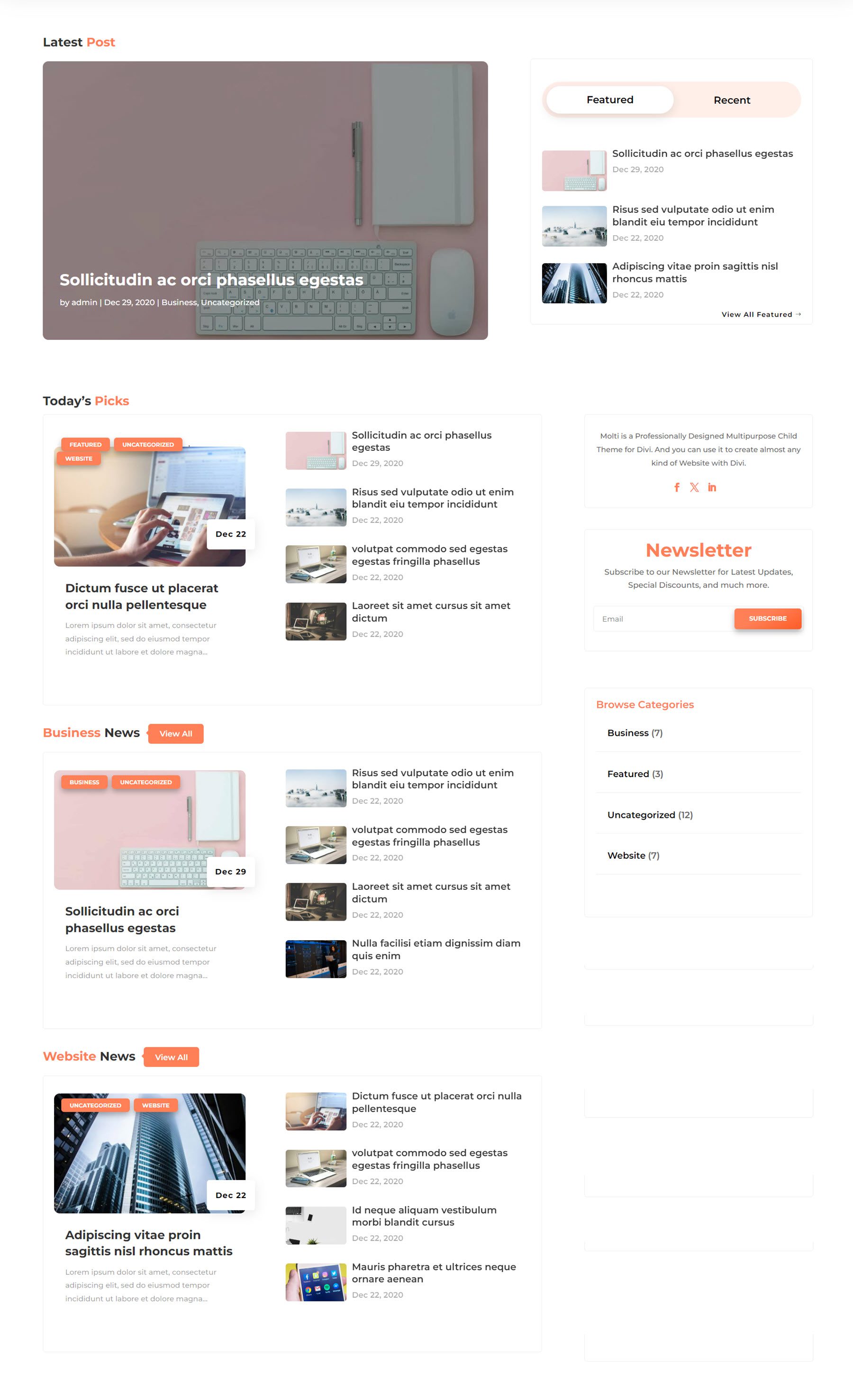
The second blog layout is the advanced layout. The page opens with a large card that features the latest post. On the right, you can toggle between featured and recent to see three posts in that category. Below that are three categories of posts. Each category features a large highlighted post on the left and four posts displayed smaller on the right. The very right column contains an about section with social media links, a newsletter sign-up form, and blog categories.
Blog List Page
Finally, the third blog layout displays recent posts in a single-column list format. Each post is contained within a card, with the image on the left and the blog post information on the right.

Portfolio Page
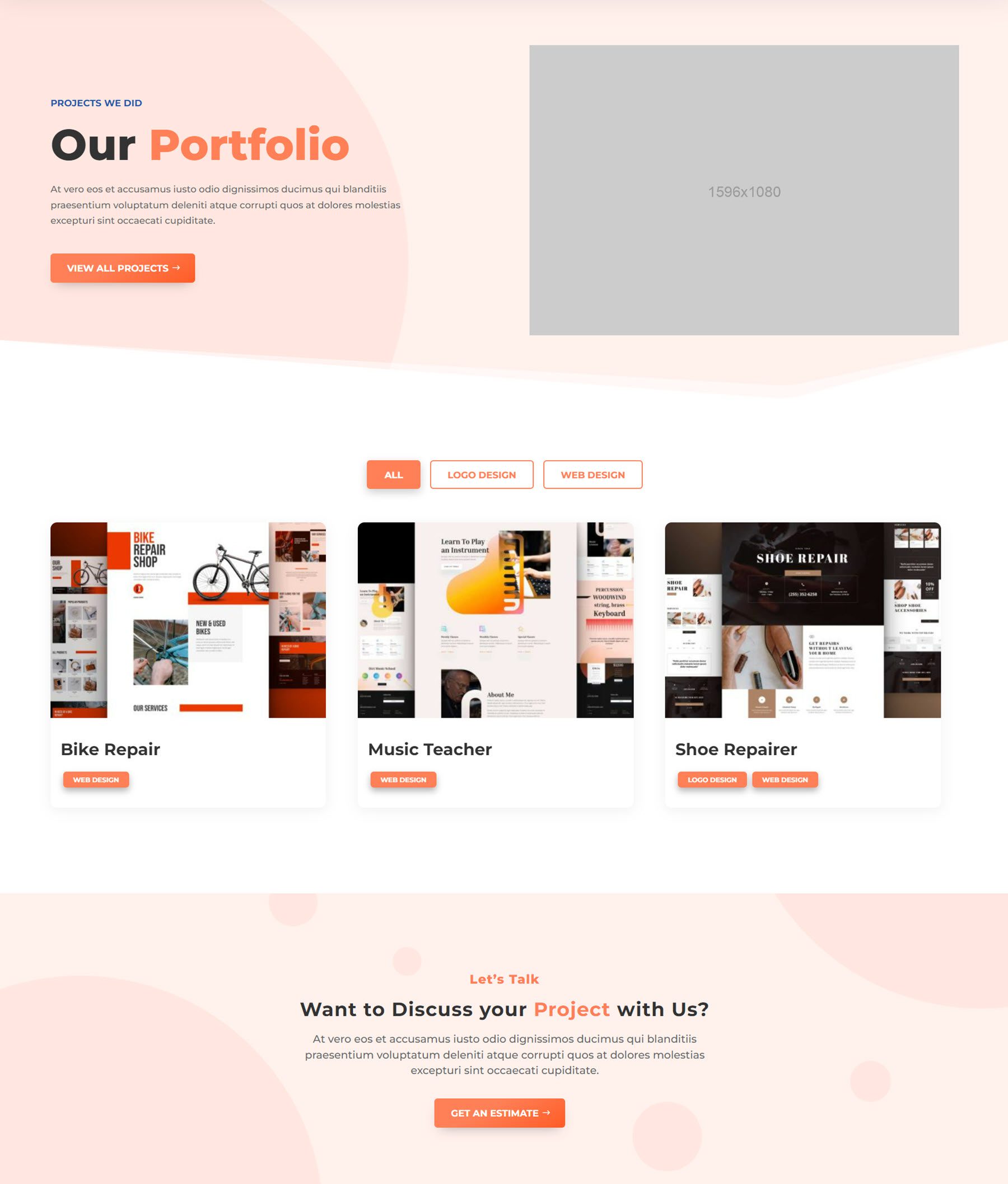
The portfolio page design is relatively simple, with a standard header containing an image and a call-to-action button. The portfolio section can be filtered by the categories at the top, and hovering over a project reveals a button to view the project. The project categories are also displayed on each card and are linked to the portfolio category.
Single Portfolio Page
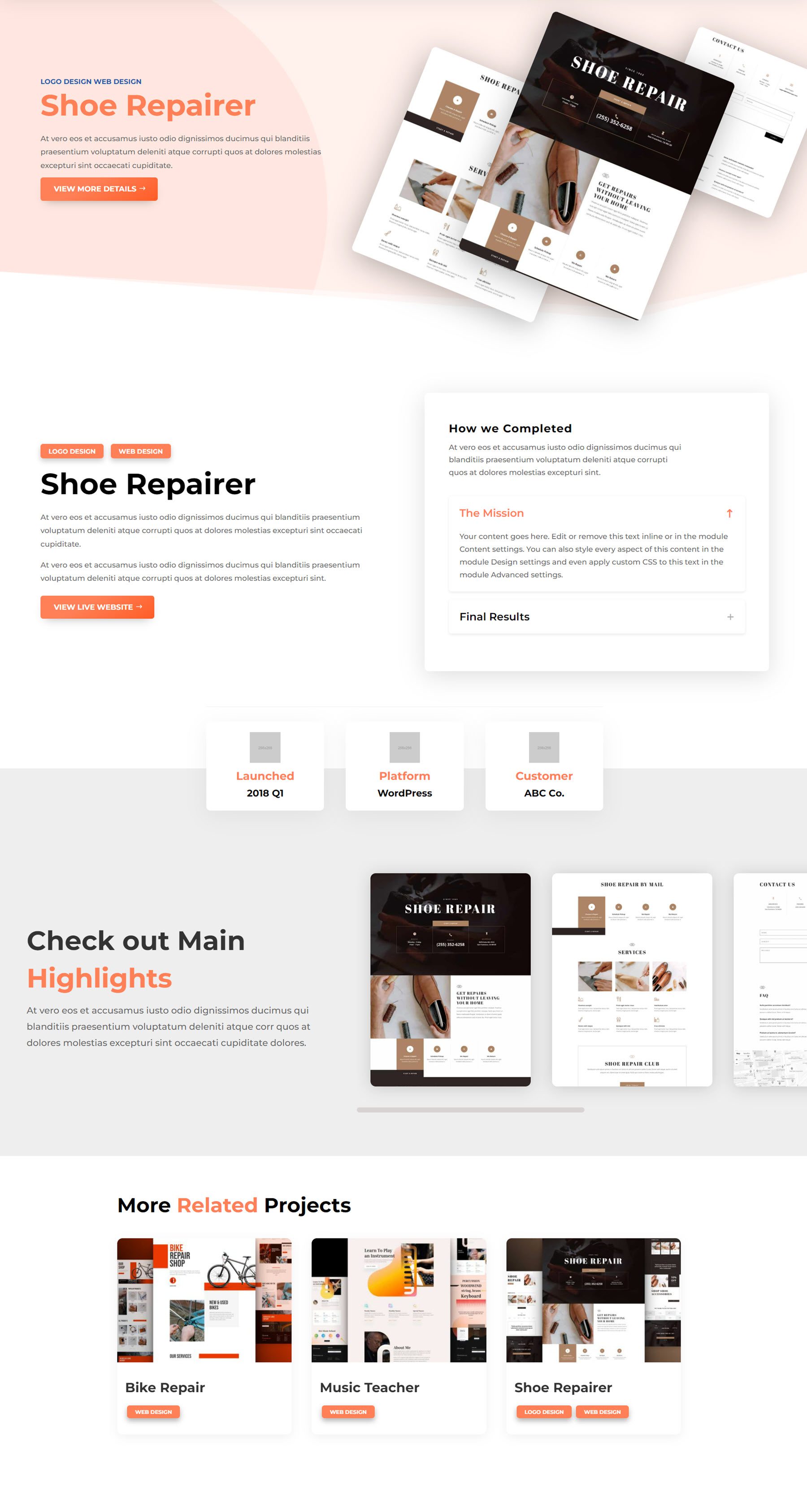
The single portfolio page opens with an attractive display of project images in the header. Below this is a description of the project with the categories linked at the top and a button that links to the project. On the right are two content toggles. Then, there are three blurbs that display some key information about the project, followed by the project highlights. This section features screenshots in a carousel you can scroll through. Finally, the page features related projects at the bottom.
Molti Child Theme Divi Theme Builder Templates
Header Template
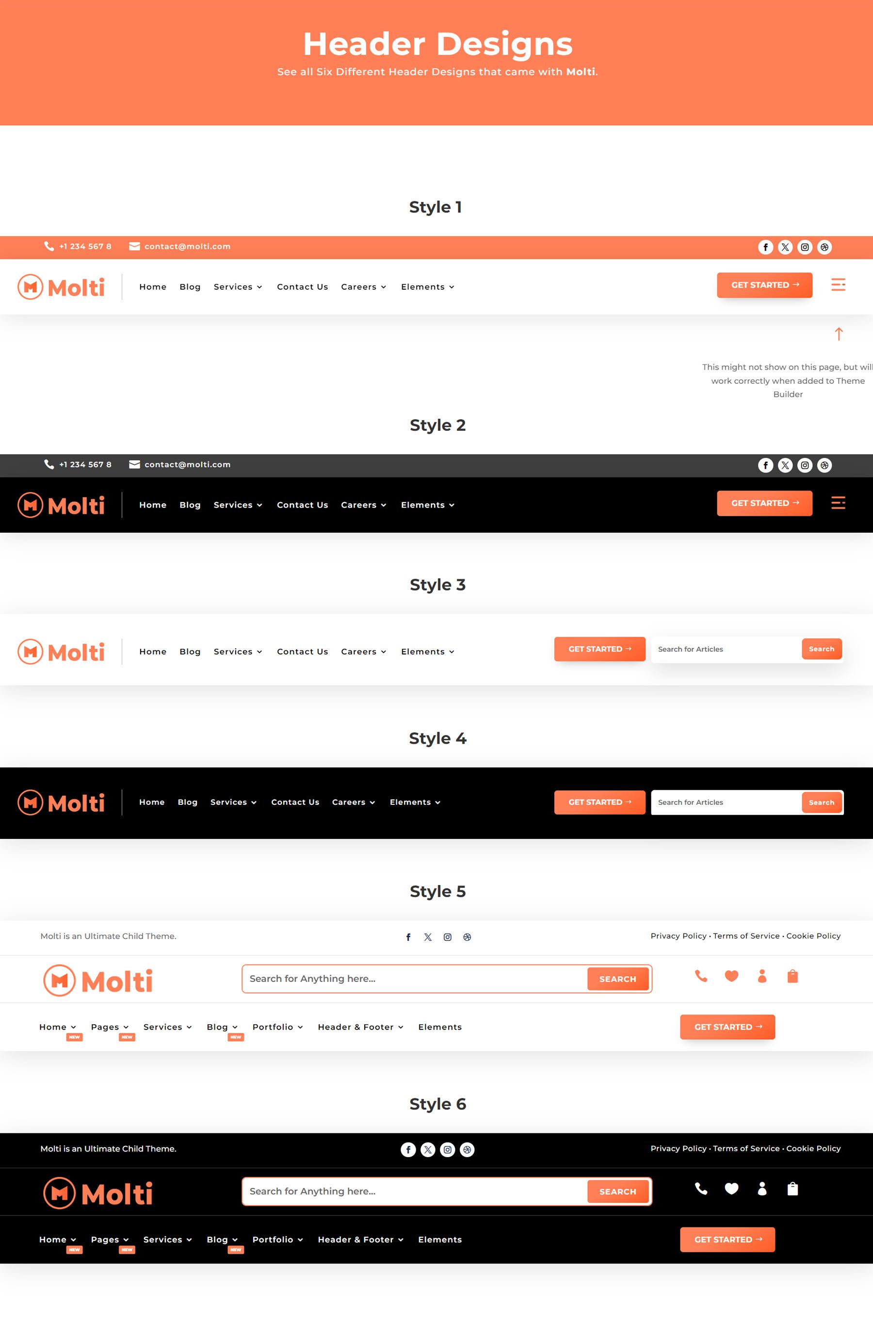
The default header for Molti features an orange secondary navigation bar with contact information and social media links, followed by a large menu bar with a logo on the left, pages in the middle, and a call to action button. The menu also features a hamburger menu icon, which opens a dynamic popout menu.
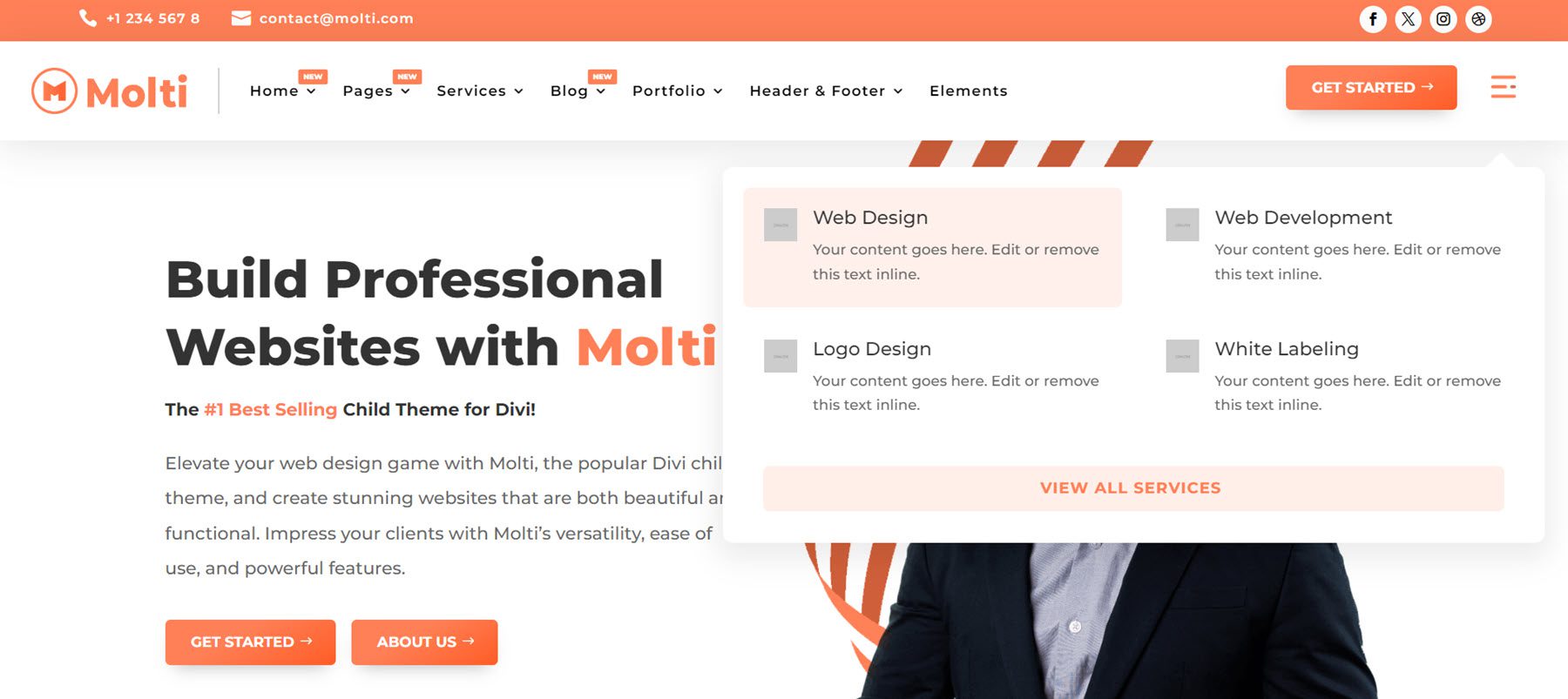
The theme also comes with 5 additional header layouts.
Footer Template
Next, the footer templates. The default template features a logo and some text, followed by a newsletter sign-up icon on the left. On the right are three columns with links, then a column with contact information on the right. The copyright information, policy links, and social media links are on the bar at the very bottom.
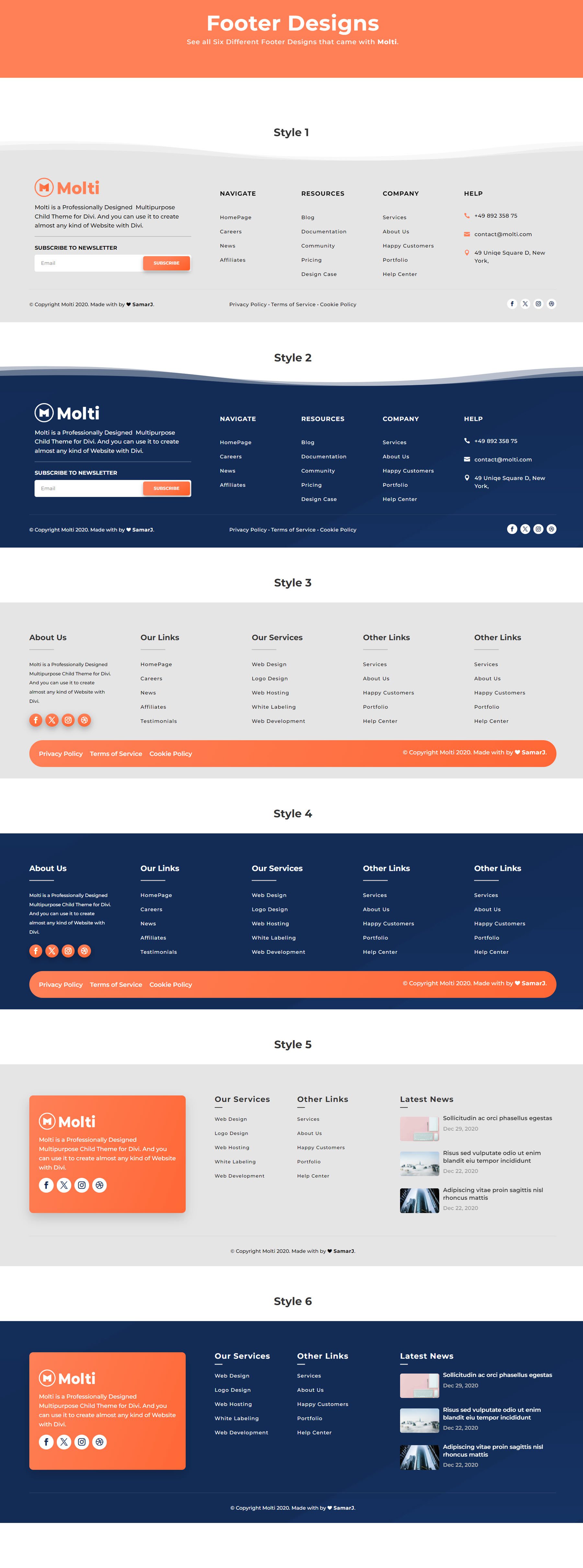
Additionally, the theme comes with 5 other footer designs.

Single Post Page
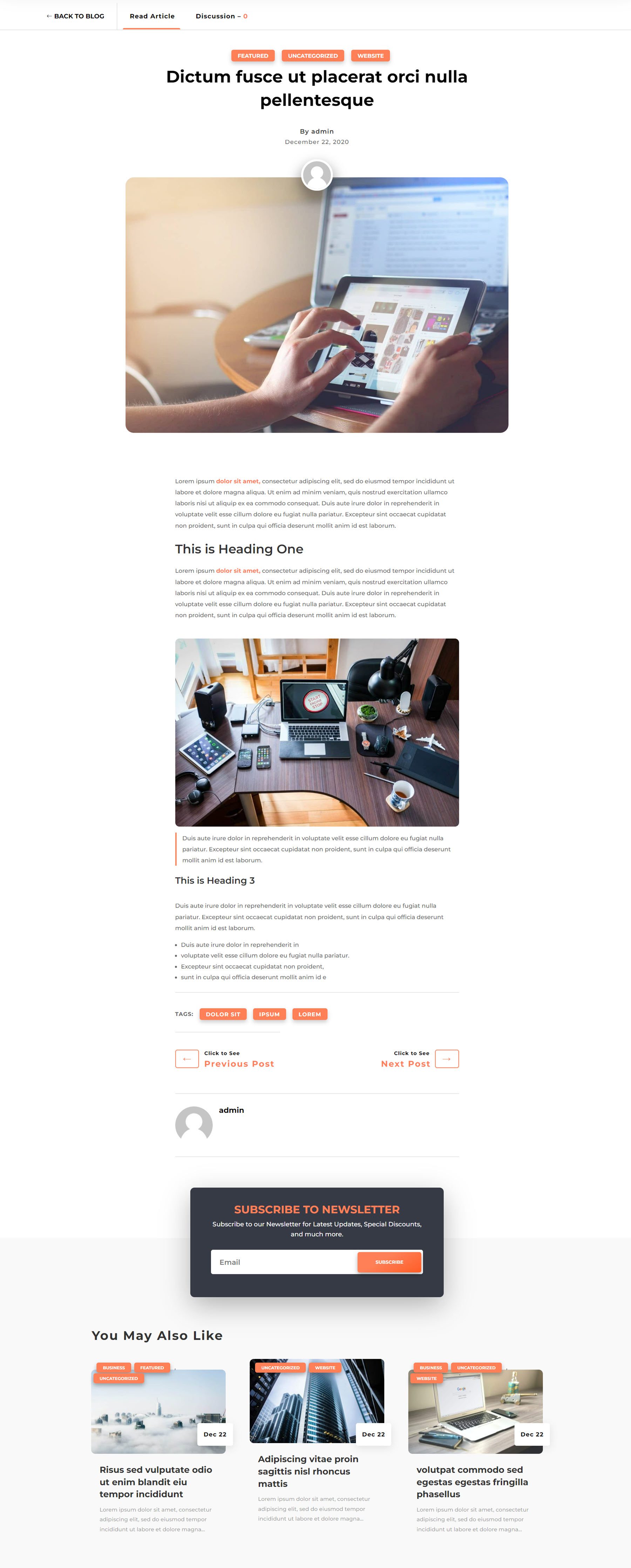
Molti’s single post layout features a header with a link back to the blog and a toggle that switches between the article and the discussion. At the top are the post categories, followed by the post title, author name, date, and author image overlaying the featured image. Following the post content are the post tags, links to view the previous and next post, the author bio, a newsletter sign-up form, and recent posts.
404 Page
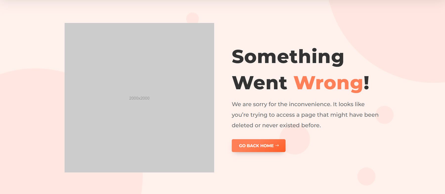
Finally, this is the 404 page template. When users land on a URL that doesn’t exist on your site, they will be redirected to this page. The layout is simple, with a large image on the left and some text and a button back to home on the right.
Where to Purchase the Molti Child Theme
Molti Child Theme is available in the Divi Marketplace. It costs $25 for unlimited website usage and 1 year of support and updates. The price also includes a 30-day money-back guarantee.
Final Thoughts
Molti is a well-designed, modern child theme for Divi that features engaging layouts and an easily adaptable design that can work for many types of businesses. The subtle animations and hover effects help guide the user through the site without feeling overly distracting, and interactive features like content toggles, sliders, and popout menus make the site feel like a premium build. The design includes helpful pops of color that guide your eye as you navigate the site, and the layouts are all completely responsive. The child theme includes all the general pages you’d need on your website and a large selection of elements you can use to create your own designs. Overall, Molti is a fantastic child theme for just about any type of web design project.
We would love to hear from you! Have you tried the Molti Child Theme? Let us know what you think about it in the comments!
The post Divi Product Highlight: Molti Child Theme appeared first on Elegant Themes Blog.
