Creating landing pages is a superpower. Master it, and your conversion rates will soar as visitors turn into customers right before your eyes. But like any leverageable skill, it requires practice and the right resources to harness its potential. This guide will provide a treasure trove of tools, tips, and strategies to create a landing page. We’ve got you covered, from design principles to copywriting tips and conversion optimization strategies. We’ll show you one of the quickest ways to build a landing page, using Divi, as well!
What is a Landing Page?
A landing page is a standalone web page that has everything on it that a visitor would need to take a specific action. It serves as the entry point for potential customers, guiding them towards taking a desired action, such as signing up for a newsletter, subscribing to a service, or purchasing a product.
The magic of a landing page lies in its ability to focus on a single objective. Unlike regular website pages, which may have multiple links and distractions, a well-crafted landing page keeps the visitor’s attention fixed on the intended goal. Whether a product launch, a special offer, or an upcoming event, a carefully constructed landing page can significantly boost conversion rates.
Do I Need a Landing Page?
The answer is a resounding “Yes! You need to use landing pages if you have a clear offer.” Regardless of your business size or industry, a landing page can be a game-changer for your online success. Let’s explore why:
- Landing pages allow you to create highly targeted marketing campaigns tailored to specific audiences. By aligning your messaging with the needs and interests of your various target customers, you can increase the chances of converting them into valuable leads or loyal customers.
- Sending everyone to your homepage may not provide a clear path to action, leading to missed opportunities. A well-optimized landing page, on the other hand, provides a clear call-to-action (CTA), guiding users toward a specific next step you want them to take.
- Landing pages equipped with analytics tools like Google Analytics can provide invaluable data about visitor behavior. You can track conversion rates, understand what drives traffic to your page, and make data-driven decisions to optimize your campaigns further.
Essential Elements of an Effective Landing Page
To create a successful landing page that drives conversions, you must focus on specific elements that captivate your audience and guide them toward your desired action.
Single Goal or Call to Action (CTA)
The call to action (CTA) is the most essential element on a landing page. It drives all conversions and will be central to designing your whole page.
When coming up with one, it should be prominent (color and weight) and action-oriented, guiding visitors toward your goal.
Strong verbs and concise language, such as “Start Your Free Trial” or “Get Exclusive Access Now,” create urgency and encourage an immediate response. The same applies to all your copywriting, but you can go a long way with an undiluted CTA.
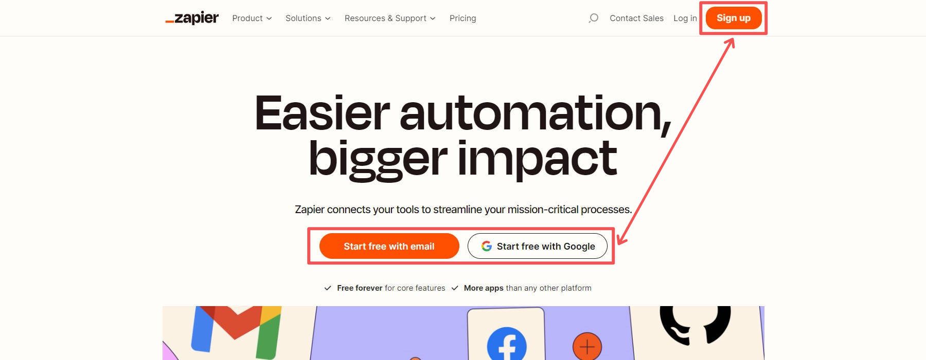
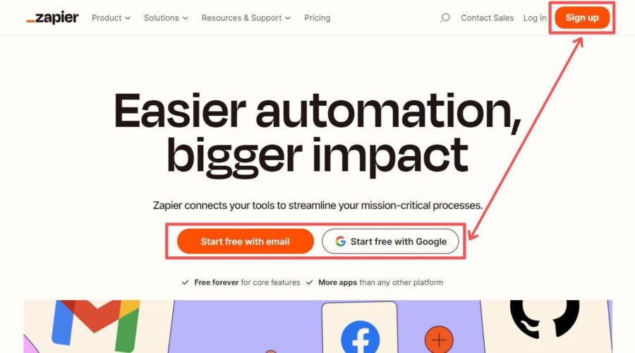
Zapier gives visitors multiple ways to do the same thing: create a free account.
A well-crafted CTA eliminates confusion and makes it easy for visitors to understand what action they should take next, streamlining the conversion process. The above example from Zapier gives visitors who want to move forward one option—create an account and try it out.
Attention Grabbing Headline and Hero Section
The hero section and headline serve as your visitors’ first point of contact with your landing page. It will have a compelling yet concise headline that immediately grabs readers and tells them what they are in for. A well-crafted headline ignites curiosity and entices visitors to scroll through your landing page’s content. It should also pair well with your CTA.
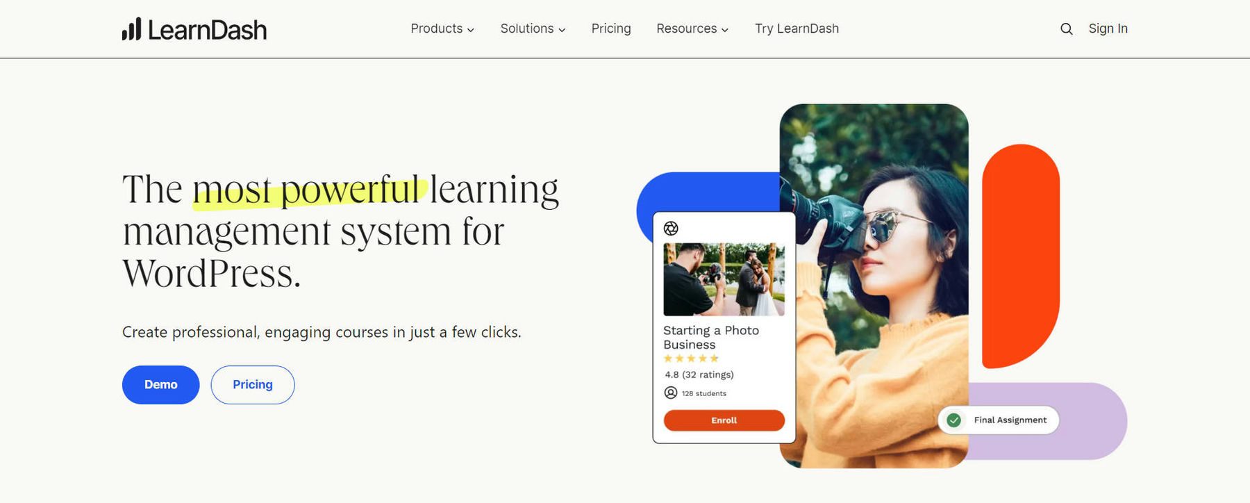
Hero Section by LearnDash
By conveying your unique value proposition clearly and succinctly, you communicate what sets your offering apart from the competition, encouraging visitors to stay and learn more about your product or service.
You may also include a subheading with the headline, which can add more context and clarity to the headline. The headline and subheading should be paired with your most straightforward CTA.
LearnDash’s CTA above is “Demo” and gives readers a chance to put the headline to the test. Is it the most powerful LMS? Let’s see the demo.
Captivating Copywriting
Copywriting is table stakes for a landing page because it aims to persuade readers.
By crafting persuasive copy, you highlight your product or service’s key benefits, clarifying to potential customers why they should take action. Using language that instills confidence and urgency in your visitors creates a sense of excitement and motivation, driving them to explore further and ultimately convert.
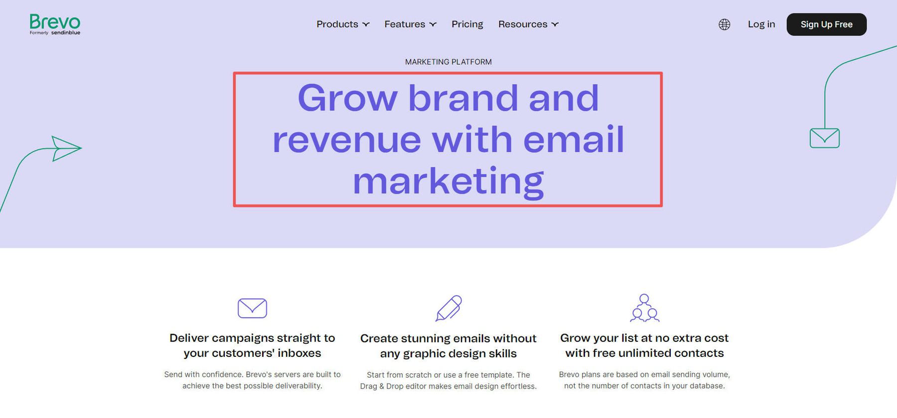
Copywriting Example by Brevo (SendinBlue)
Copywriting Frameworks for Landing Pages
Here are some copywriting frameworks that you can use on landing pages.
- Problem-Agitate-Solve (PAS): This classic copywriting formula identifies a problem, intensifies it, and finally presents a solution. It’s a powerful way to connect with your audience’s pain points and demonstrate how your product or service can help.
Example: “Struggling to create eye-catching graphics? You’re not alone. Many businesses find it hard to stand out in a saturated marketplace. With our graphic design services, you can create stunning visuals that capture attention, and you don’t have to do anything.” - Before-After-Bridge (BAB): This formula paints a picture of the reader’s world before and after using your product, then provides the ‘bridge’ or steps to get there.
Example: “Before using our web design services, your website was just another drop in the digital ocean. But now, imagine a website that stands out, engages visitors and drives new revenue. We move you where you need to be with our expert web design services.” - Features-Advantages-Benefits (FAB): This formula highlights your product’s features, advantages, and benefits to the customer.
Example: “Our eCommerce store specializes in handmade leather boots (feature). Each pair is crafted with attention to detail, ensuring a unique, durable product that stands out (advantage). Step out in style and enjoy the comfort and longevity of our boots, making every purchase a worthwhile investment (benefit).”
Copywriting goes beyond headlines and CTAs. It should be used with every word on a landing page. Your USPs, image captions, and bullet points also deserve the same level of detail.
Engaging Visuals
Visual content can convey mood, quality, experience, and value faster than the best headlines. By selecting visuals that resonate with your target audience and reinforce your brand message, you create an emotional connection and leave a lasting impression, increasing the likelihood of conversion.
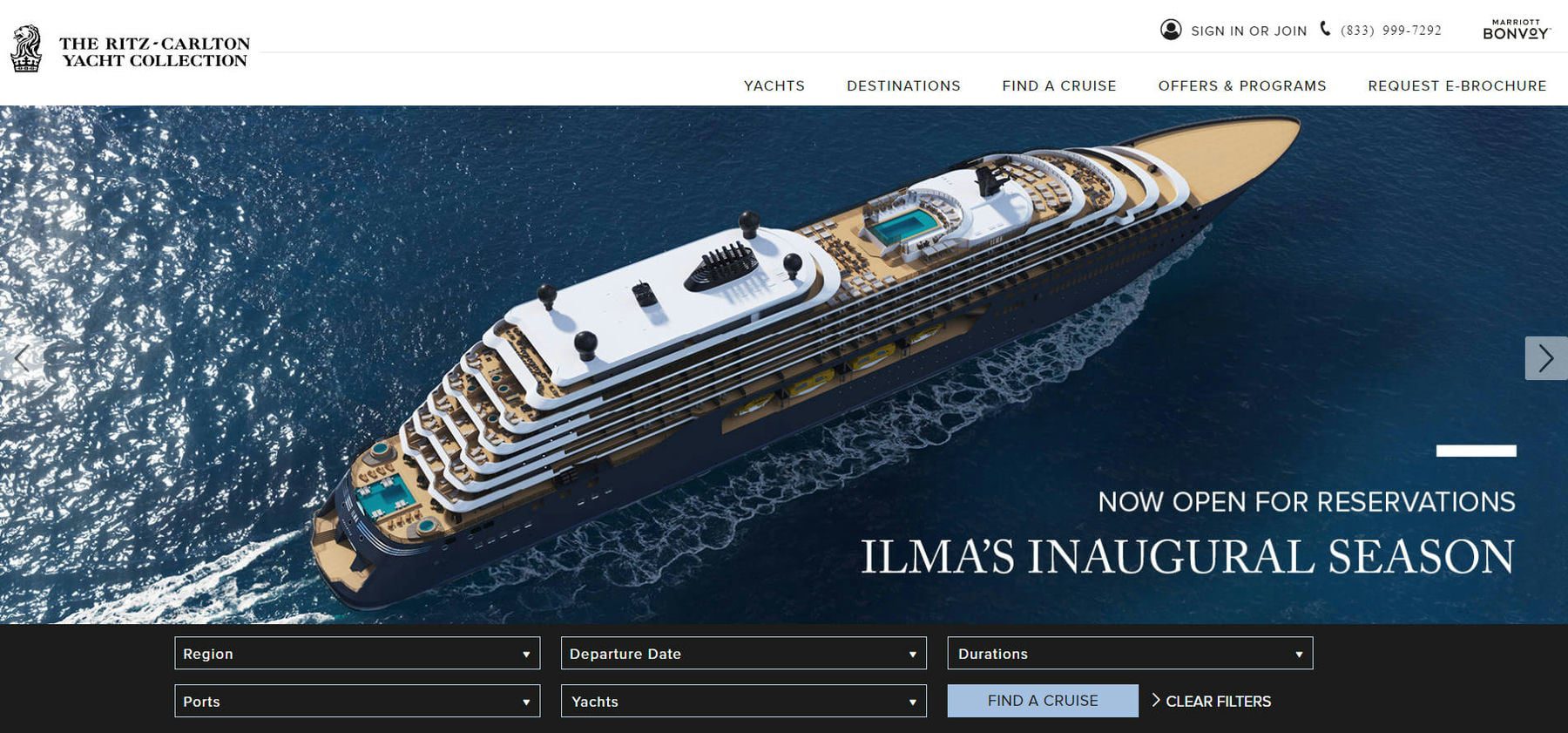
Example of Engaging Visuals from Ritz-Carlton Yacht Collection
If possible, go beyond stock photographs to include people using your products or the general aesthetic of your brand and the benefits you hope to sell customers on. This is why so many commercials have storylines of happy, healthy people—they are trying to sell a brighter future through their offerings versus merely selling gadgets.
If you are in dire need, try out an AI image generator to create images that will move the needle.
Social Proof
Building trust and credibility is crucial in converting potential customers. Showcase real customer testimonials, positive reviews, and success stories that demonstrate the value of your product or service. Include photos or names of satisfied customers to add authenticity and make the testimonials more relatable.
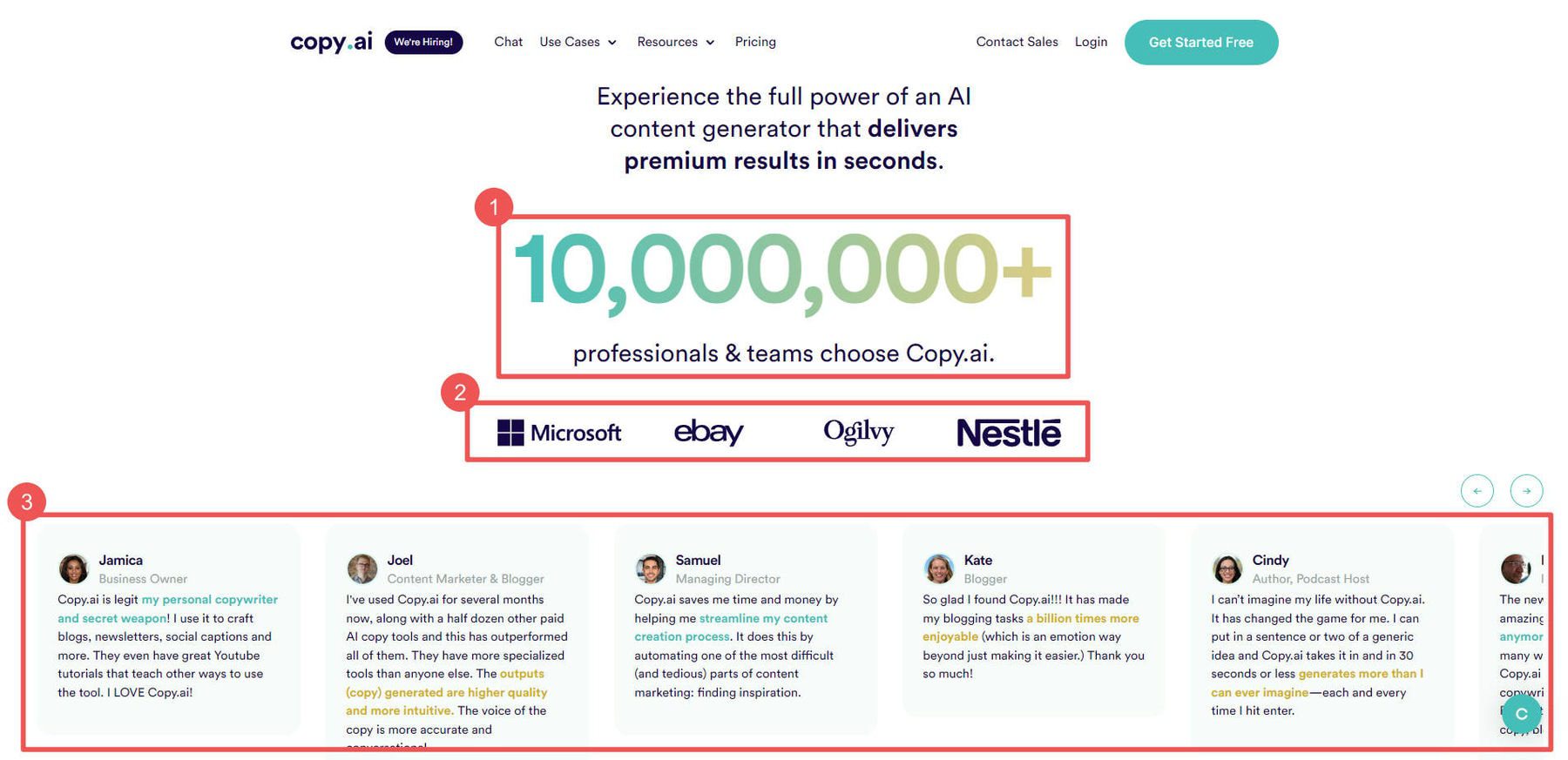
Copy.ai does an excellent job showing (1) social proof, (2) reputation credentials, and (3) testimonials—all in one section.
By any means necessary, ensure that what you are selling is up to snuff—and be sure to back up every claim.
Minimal Lead Generation Form Fields
Keep lead form fields minimal and easy to fill out. Long or complicated forms can deter potential leads, leading to lower conversion rates.
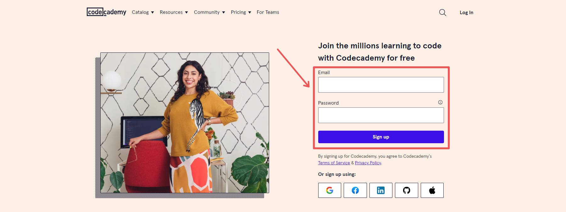
Landing Page from CodeAcademy
By requesting only essential information, you reduce friction and make it easier for visitors to provide the necessary details. Prioritizing simplicity in your form design enhances the user experience, making visitors more likely to complete the form and take the next step in the conversion process.
This is often a hard choice in landing page design because we all think, “If I can just get a little more info, my future marketing efforts will be so much easier.” But it’s better not to sacrifice present conversion results for future email marketing and CRM ease. Build a strategy to collect new information throughout the funnel instead of all at once at the moment of truth for your visitors.
We recommend using Divi Forms or one of WordPress’s best lead-generation plugins.
5 Steps to Building a Landing Page
Subscribe To Our Youtube Channel
Depending on what platforms you use, building a functioning landing page can happen in many different ways. No matter what, if you keep the LP elements mentioned above in mind, you can create a solid landing page.
Here’s the high-level view of creating a landing page.
1. Choose a Landing Page Builder
Choosing the right landing page builder will save you a lot of headaches. Many think building a landing page from scratch requires technical expertise and significant time investment. All that is needed is a platform that can handle the unique needs of a landing page. Tools like the Divi theme for WordPress, WPFunnels, or ClickFunnels all bring to the table essential LP tools.
The top features to look for in a landing page builder are a drag-and-drop visual builder, customizable templates, A/B testing, integration with email marketing tools, and advanced analytics. The best Landing Page plugins can help with this, though you don’t need to use WordPress to create a landing page.
Here’s why many think Divi is perfect for any landing page build:
- Divi has professional landing page templates created for you to plug and play
- Divi’s visual builder lets you visually customize your page’s design
- Track and improve performance with Divi’s marketing tools
- Excellent customer support team to help with any issues along the way
2. Build a Landing Page Using a Template
Most reputable landing page builders will offer templates to kickstart your design process. Divi provides a wide range of professionally designed landing page templates to kickstart your creative process. Within the Divi theme, you can access these templates at no additional cost. Templates span industries and page types to create a whole site with pre-made templates, not just one landing page.
Here’s how to use a layout pack using Divi:
Once in the Divi Builder, click the purple “+” button to add a new section. In the popup, choose “Choose a Premade Layout.” Here, you’ll find a collection of pre-designed templates available to you. Browse the thousands of pre-built pages to see what sparks something for you.
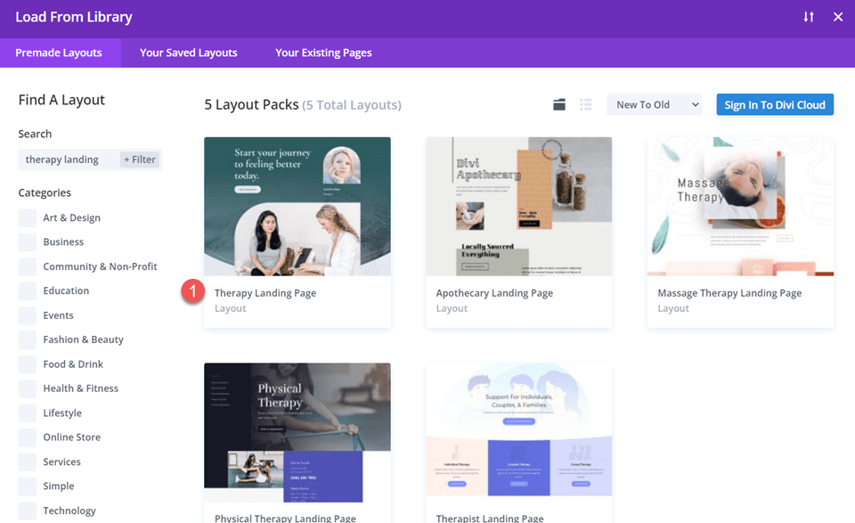
You can preview the layout by clicking into the pack, selecting the page, and clicking “View Live Demo.” When you’ve found one you like, click “Use this Template” to load it to your page.
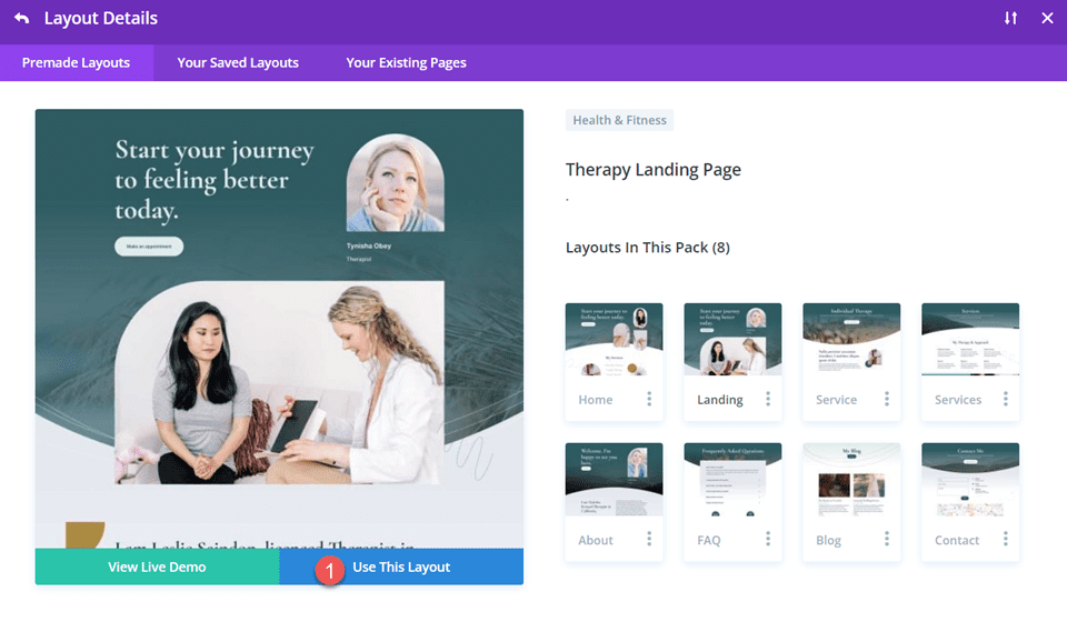
Our Marketing layout pack is ideal for creative agencies. The landing page layout has everything you need to quickly set up a landing page with all the essential elements (plus, it already comes with superb illustrations for you to use).
This layout and many others include an easy-to-read hero section with room for all the needed elements. It has CTA buttons throughout the page and placeholder text to make your case with solid copywriting. It has beautiful illustrations or places to place your images and videos. Lastly, the “How We Work” section can be easily adapted to fit case studies or testimonials.
If you want more than the 2000+ free templates, you can explore the Landing Plus collection (and others) in the Divi marketplace.
3. Set Up Lead Generation
The lead generation form is one of the most crucial elements of a successful landing page. This form is the gateway to capturing valuable information from your visitors, turning them into potential leads or customers.
Divi’s contact form offers a wide range of customization options, allowing you to create forms that match your brand and cater to your needs. It is included with the theme at no extra cost.
You can also consider using WordPress lead-generation plugins if you want something else. These plugins offer powerful features to boost your lead-capturing efforts and seamlessly integrate with your email marketing and CRM services.
For instance, you can explore options like OptinMonster or Thrive Leads, as mentioned in the best WordPress lead generation plugins article.
Note that the goal of your landing pages may vary based on your specific business needs. While some businesses aim to gather contact information for potential follow-ups, others might focus on product sign-ups or demo requests. This is particularly true if they offer software-as-a-service (SaaS) products.
4. Boost Landing Page SEO
Landing pages are excellent when traffic is sent directly from email marketing or social/ad campaigns. However, there is a lot of opportunity to create landing pages that perform well in search results pages (SERPs) and potentially convert top-of-funnel traffic (TOFU).
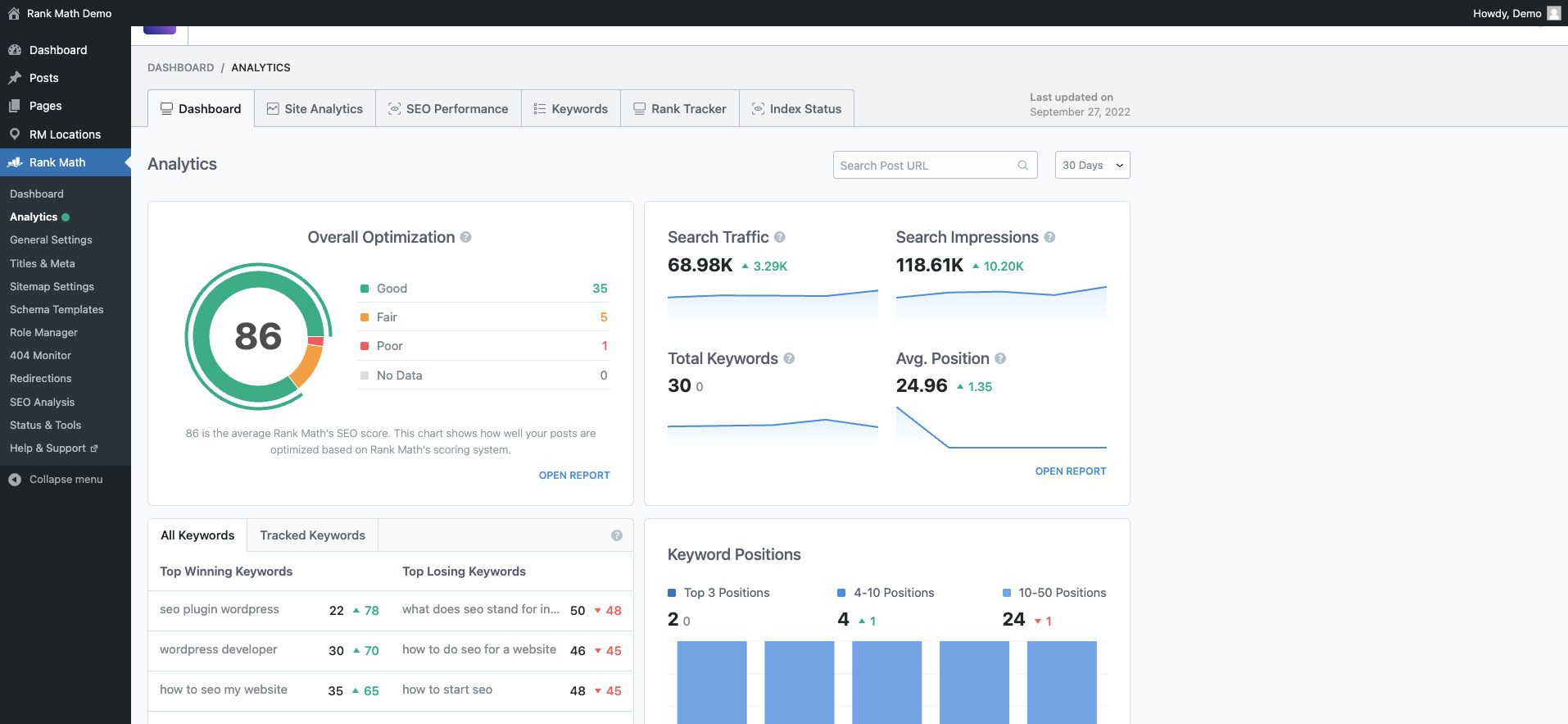
With WordPress, SEO is easy. All it takes is one of the best SEO plugins (there are many). One of our favorites is Rank Math.
It makes it easy to see your whole site’s SEO readiness with a great dashboard. Rank Math gives vital insights and allows effortless drill-down when you see something you want more detail on.
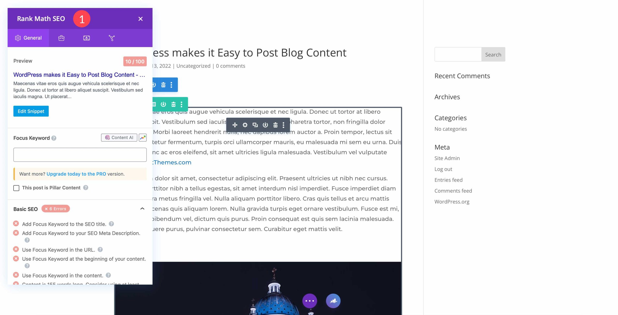
It also makes optimization of every page easy. It scores your page and its content and compares it against the competition. Rank Math then tells you what needs to be changed and tweaked to be in a good position to rank.
5. Improve Landing Page Performance
There is no shortage of tools that can help you analyze the performance of your landing pages. Sometimes, it comes down to choosing a few tools to get a clear picture.
You can consider some of these tools for analytics and analysis of your landing page performance:
- Google Analytics 4 (GA4) for tracking every aspect of traffic movement and conversions across your site. Easily installable on WordPress with these Google Analytics plugins.
- HotJar to see heatmap representations of your LP’s activity.
- Divi’s in-built marketing optimization tools (A/B split testing, conditional display, and native form builder).
While you should use an analytics platform and could consider a heatmapping tool, having conversion-focused tools built into your landing page builder is an excellent addition. It means that you save some money and get the tools built in.
Divi’s marketing tools offer valuable insights and features to enhance your landing page’s performance. You can conduct A/B tests to compare page variations against a set goal. This lets you identify which design elements or content variations you’ve created resonate better with your visitors.
Additionally, it would be best to leverage conditional display logic to display personalized experiences based on user interactions. (See the explainer video for condition options).
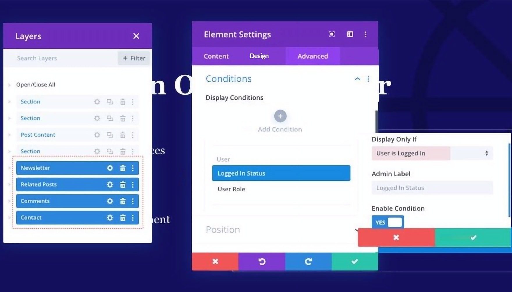
These tools empower you to make data-based decisions and continuously improve your landing page’s effectiveness. Best of all, they are included with the Divi theme and are as intuitive to use as the rest of the visual builder.
Additional Tips for Creating Good Landing Pages
Optimize Your Page Load Speed
A fast-loading landing page is crucial for enhancing user experience and improving conversion rates. To achieve this, analyze your page’s speed using tools like Google PageSpeed Insights or GTmetrix. Look for ways to optimize images, enable browser caching, and consider using a Content Delivery Network (CDN) to distribute content closer to your users for faster loading times. Take a look at all our recommended optimization plugins for WordPress. Additionally, ensure your hosting provider offers sufficient resources to handle traffic efficiently.
Learn Copywriting or Employ AI Writers
No one wants to be pitched or sold to. But copywriting disarms visitors’ and gets them to see what would be of interest to them. Beyond hooking visitors, copywriting also conveys your value proposition and sparks curiosity about how your product can help them with their problems.
Copywriting is a deep well and might as well border on being an art. That makes it hard yet worthwhile to learn. Online learning platforms like Udemy have tons of courses on copywriting. If you write a lot, you should brush up on this and SEO copywriting.
There is also a place for AI writers that specialize in marketing and sales copy. They certainly can create content faster and help you fill a knowledge gap if you have a long way to go in your copywriting.
F-shaped Content/Page Structure:
Organizing your content following the F-shaped reading pattern aligns with users’ natural reading behavior, ensuring that essential information, headlines, and critical points are noticed quickly. Placing important details along the top and left side of the page capitalizes on users’ tendency to skim through content, making it more likely they will absorb crucial information without feeling overwhelmed.
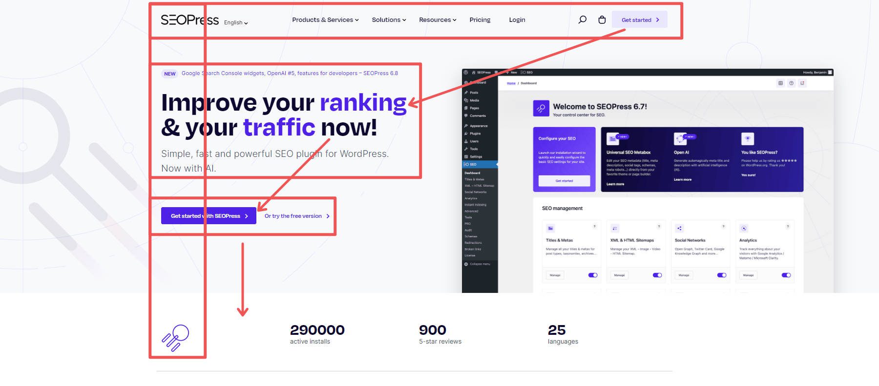
Example Landing Page w/ F Pattern by SEOPress
The F-Pattern for landing pages is backed up by a lot of heatmap data that shows our eyes start at the top left and work their way to the right and down, just like if you were reading a book. The only thing is that as we move down the page, we start to skim more, and thus, we go to the right less and less.
Create a Sense of Urgency
Incorporate time-sensitive elements on your landing page to create a sense of urgency and prompt immediate action. Limited-time offers, countdown timers, or flash sales can encourage visitors to act quickly and take advantage of your offer before it expires. This can be done with the conditional display referenced above. Watch how it transforms your conversion experience.
Mobile-Optimize Your Landing Page
Ensure your landing page is fully responsive and mobile-friendly to cater to users accessing your page from different devices. Test your page on various mobile devices and screen sizes to verify responsiveness and user-friendliness. Utilize responsive design principles to adapt the layout seamlessly for mobile users.
Maintain Consistency with Ads and Email Marketing
Consistency in messaging and design between your ads, email marketing, and landing pages reinforces your brand identity and builds recognition. Ensure the tone, color scheme, and key messages align seamlessly across all touchpoints. This cohesion enhances brand trust and fosters a sense of familiarity with your offerings.
Conclusion
Now is the time to unleash your creativity and bring your vision to life. So take the first step and start crafting your compelling landing page. Success is just a few minutes away, and the possibilities are endless with Divi as a trusted partner.
Whether you opt for pre-made templates to get started quickly or embrace the creative freedom of the visual builder, Divi offers the tools you need to craft captivating and high-converting landing pages.
Remember, a compelling headline, engaging visuals, a clear Call to Action (CTA), and captivating copywriting are the building blocks of an effective landing page. By incorporating these elements strategically, you’ll capture your audience’s attention and drive them toward your desired action.
Looking for more resources? Checkout our top-notch guides for building powerful websites:
- How to Build an Online Store
- How to Build a Membership Site with Divi
- Creating a Learning Management (LMS) Website with Divi
Let us know your progress while building out your landing pages.
Feature Image by Overearth / shutterstock.com
The post How to Create a Landing Page in 2023 (Detailed Guide) appeared first on Elegant Themes Blog.
