Learning how to design websites that work isn’t only about having an eye for design or chasing trends. It comes down to essential principles that the best-performing sites share. Get these right, and everything else falls into place.
In this post, we’ll try to help you understand the web design process. We’ll also highlight why Divi is an excellent tool for designing websites. Whether you’re building your first site or your hundredth, you’re about to discover how to design websites easily.
Let’s get to it!
Why Good Design Matters For Websites
Good design shapes how visitors perceive and interact with your website from the moment they land. Within milliseconds — before reading a single word — they form judgments about your credibility and professionalism.
Cluttered navigation, inconsistent spacing, and unclear call-to-actions create barriers that prevent visitors from finding what they need. Even compelling content struggles under the weight of visual chaos, while strategic design choices guide users naturally through their journey.
Good design works quietly in the background, making necessary actions natural and obvious. It’s about creating experiences that help visitors accomplish their goals, whether reading an article or purchasing information. When design does its job well, users shouldn’t notice it.
Traditional Approaches To Design Websites (And Why They’re Outdated)
Many web design approaches now create more problems than they solve. While these methods once worked, today’s web demands better solutions for designers and users.
- Coding Everything From Scratch: Building websites with raw HTML, CSS, and JavaScript might seem like the “pure” approach, but it’s often a massive waste of resources. Modern frameworks and CMS platforms handle complex functionality that would take weeks to code manually. Why reinvent responsive navigation or contact forms when battle-tested solutions already exist?
- Fixed-Width Layouts: Sites built on 960-pixel grids and rigid tables shatter on mobile devices. Text becomes unreadable, images overflow their containers, and users must constantly zoom and scroll horizontally. These inflexible structures ignore the reality that most web traffic now comes from diverse screen sizes and devices.
- Heavy Animation: Spinning logos, fading menus, and sliding content blocks dominated early web design trends. These animations burden sites with unnecessary JavaScript, increase load times and drain mobile device batteries. Many users find excessive motion effects distracting or even revolting, pulling focus away from meaningful content. Modern design favors purposeful, lightweight animations that enhance user interaction without compromising performance or accessibility.
- Manual Mobile Adaptations: Maintaining separate mobile versions doubles development work and fragments the codebase. Content updates require changes in multiple places, creating inconsistencies between desktop and mobile experiences. This approach ignores how modern CSS and responsive design principles can automatically adapt layouts.
Why These Methods No Longer Work
The web has transformed dramatically since these traditional approaches emerged. What worked for static desktop-only websites falls apart in today’s phones, tablets, and constantly changing content landscape.
Business websites now serve as dynamic marketing and sales tools rather than just digital brochures. Marketing teams have to launch campaigns quickly, test new content regularly, and respond to analytics data. Traditional development methods turn these simple updates into lengthy technical tasks.
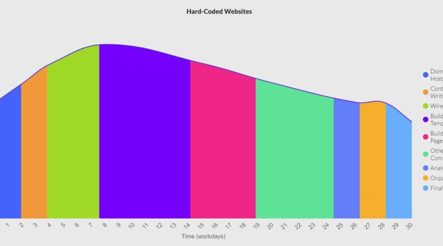
Outdated approaches burden sites with poor performance, maintenance issues, and frustrated users. Moreover, these approaches take a lot — I mean, a lot of time — somewhere around 200+ hours, excluding the actual time it takes to learn these skills.
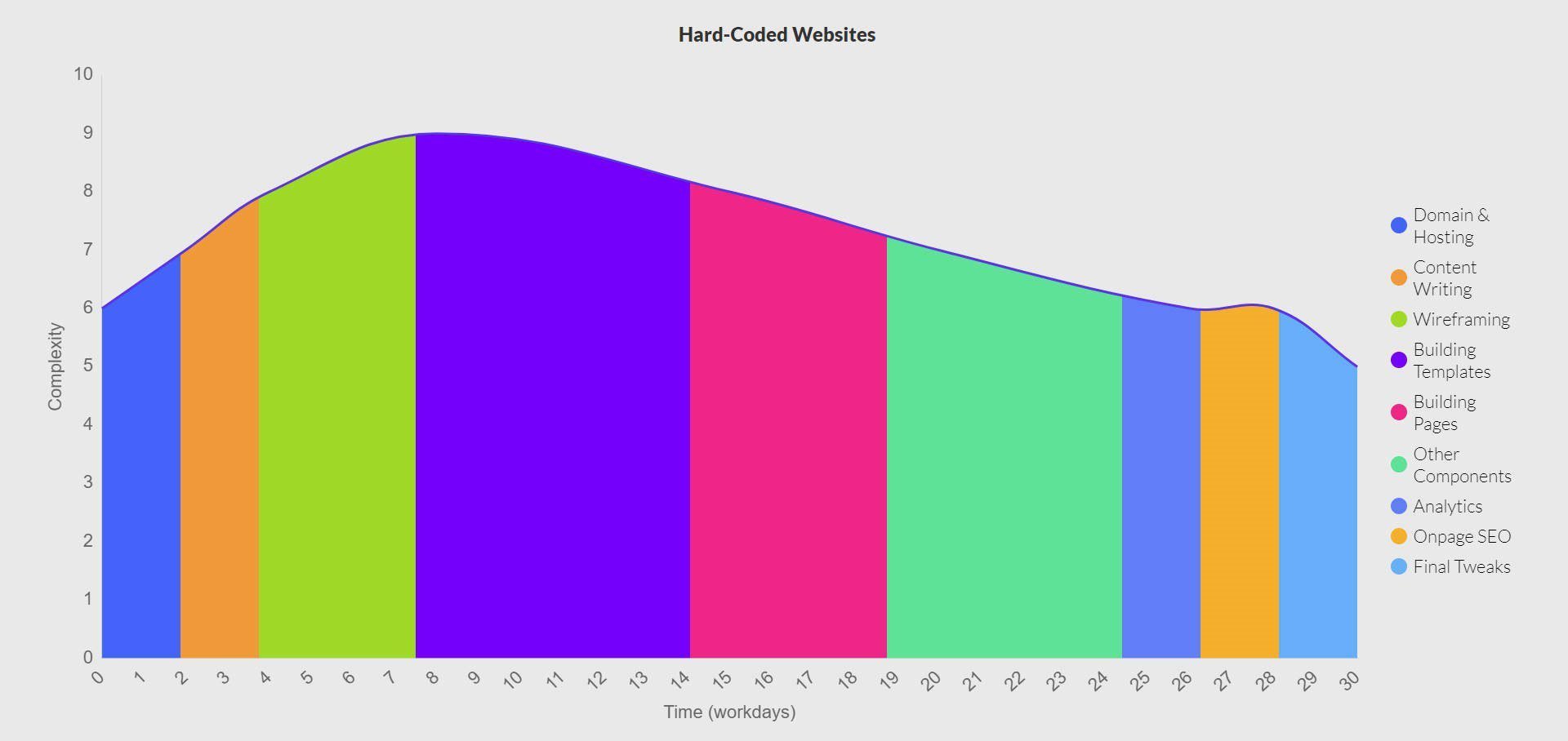
On the other hand, modern web design emphasizes sustainable development practices that scale across devices while remaining easy to maintain long-term. Modern frameworks and platforms have also matured significantly. They handle complex functionality out of the box — from responsive layouts to content management — while remaining customizable for specific needs. Building everything from scratch or maintaining separate mobile versions wastes resources solving already-solved problems.
User expectations have evolved. Visitors demand fast-loading sites that work seamlessly on any device. Traditional approaches like fixed layouts and heavy animations create frustrating experiences that drive potential customers away before they engage with your content.
The Modern Approach To Web Design
Web design has evolved from complex coding to intuitive visual building. Today’s tools and platforms let businesses create powerful websites without getting lost in technical details. Let’s explore how modern approaches make great web design accessible to everyone.
Working On A Robust Content Management System
Remember building websites by editing HTML files directly? Those days are long gone. Modern websites run on Content Management Systems (CMS) that put you in control without touching code. WordPress — entirely free and open-source — leads this evolution, powering over 43% of all websites worldwide.
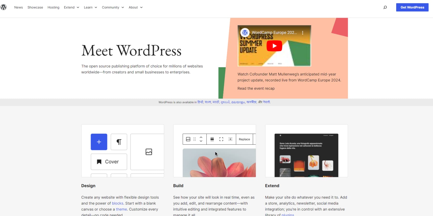
WordPress dominates this space, and for good reason. It strikes that sweet spot between power and simplicity that businesses need. You can jump in and start creating content within minutes, while developers can extend functionality through custom code when needed. The platform’s massive community means you’ll find pre-built solutions for nearly any feature you want to add.
The real magic happens when your team starts using WordPress daily. Marketers can publish blog posts, designers can tweak layouts, and managers can review changes without technical help. Your media library keeps images organized, user permissions control who can do what, and updates happen with a click. WordPress plugins and extensions automatically handle complex tasks like SEO settings, backup scheduling, and security monitoring.
The platform adapts to your growth seamlessly. Adding an online store with WooCommerce, building membership systems, or integrating forms and galleries takes minutes instead of weeks. That simple blog you started with can evolve into a complex business site using the same familiar tools, while WordPress handles the technical complexity behind the scenes. Since WordPress is free and open-source, your only essential cost is quality hosting — check out SiteGround’s WordPress plans for optimized performance, daily backups, and instant setup.
Launch Your WordPress Website With SiteGround
Designing In Real-Time With Visual Builders
Web design has shifted from code editors to visual tools that show your changes instantly. Even the world’s most used CMS, WordPress, now includes a visual drag-and-drop builder called Gutenberg. While WordPress’s built-in Gutenberg editor offers basic block-based editing, many site owners find it limiting for complex layouts. That’s where advanced page builders like Divi step in, offering pixel-perfect control through intuitive drag-and-drop interfaces.
These premium builders work in your browser, showing real-time updates as you design. Unlike Gutenberg’s rigid block system, they let you freely position elements, create complex layouts, and build responsive designs without touching code. You can move sections around, adjust spacing, or update styling while watching your website take shape.
These sophisticated builders transform how you work. Build complete page templates in minutes, save your favorite sections for reuse, and maintain consistent styling across your site. A single click updates global colors and typography everywhere, saving hours of manual editing.
The real power shines through during routine website updates. You can make changes instantly instead of fighting with block limitations or waiting on developers. Visual builders turn web design into a creative process — more like arranging furniture in a room than solving a technical puzzle. These tools offer the perfect balance of power and simplicity for businesses that value design flexibility and time efficiency.
Using Pre-Built Templates That Save Time
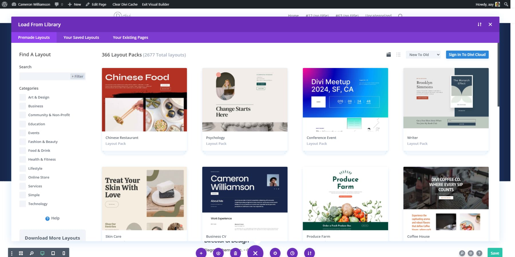
Why start from scratch when you can build on proven designs? Modern WordPress themes pack ready-to-use templates that slash development time. From business homepages to product catalogs — you pick one that fits your vision and make it yours.
The template library in your favorite theme might include complete website packages or standalone page designs. Need a striking About page? Grab a template. Building a team section? There’s a design for that. These aren’t basic placeholders either — they’re professionally crafted layouts that follow solid design principles and convert visitors into customers.
Your visual builder makes customizing these templates a breeze. Swap images, adjust colors, tweak layouts, and add your content. The templates handle the heavy lifting of responsive design and proper spacing, letting you focus on what matters – making the design match your brand.
Leveraging AI-Powered Solutions
Web design has recently taken a significant leap forward. Most modern WordPress themes now include AI tools at some capacity or other that may generate professional layouts and cohesive color schemes automatically. Instead of starting from scratch, you begin with intelligent suggestions based on proven design principles.
These AI features integrate seamlessly with your existing builder interface. Input your brand colors and business details, and the system generates unique designs tailored to your needs. When you need new page content or visual elements, the AI provides options that align with your brand identity — while maintaining professional standards.
The real advantage lies in the balance — AI accelerates the design process without limiting your control. You might start with an AI-generated layout, then adjust elements through your visual builder until they match your exact specifications. The technology simply eliminates common design roadblocks.
This combination of AI efficiency and personal customization transforms the website-building process. You move past initial design decisions quickly and focus on refining the most important details — creating a site that truly represents your brand. The AI provides a professional foundation that you can build upon with confidence.
Divi Changes Everything
Modern web design reaches its full potential when all crucial elements work together. Divi builds on WordPress’s foundation by integrating visual design, templates, and AI into one complete system.
The Visual Builder goes beyond basic drag-and-drop interfaces with live editing and over 200 design modules, each expanding your creative possibilities without touching code.
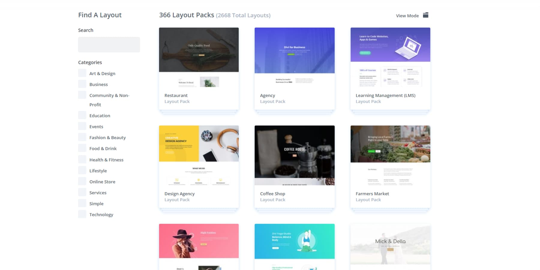
Many website builders promise design freedom but leave you starting from scratch. Divi includes 2000+ professional layouts and complete website packs, maintaining visual consistency from your homepage to your contact forms.
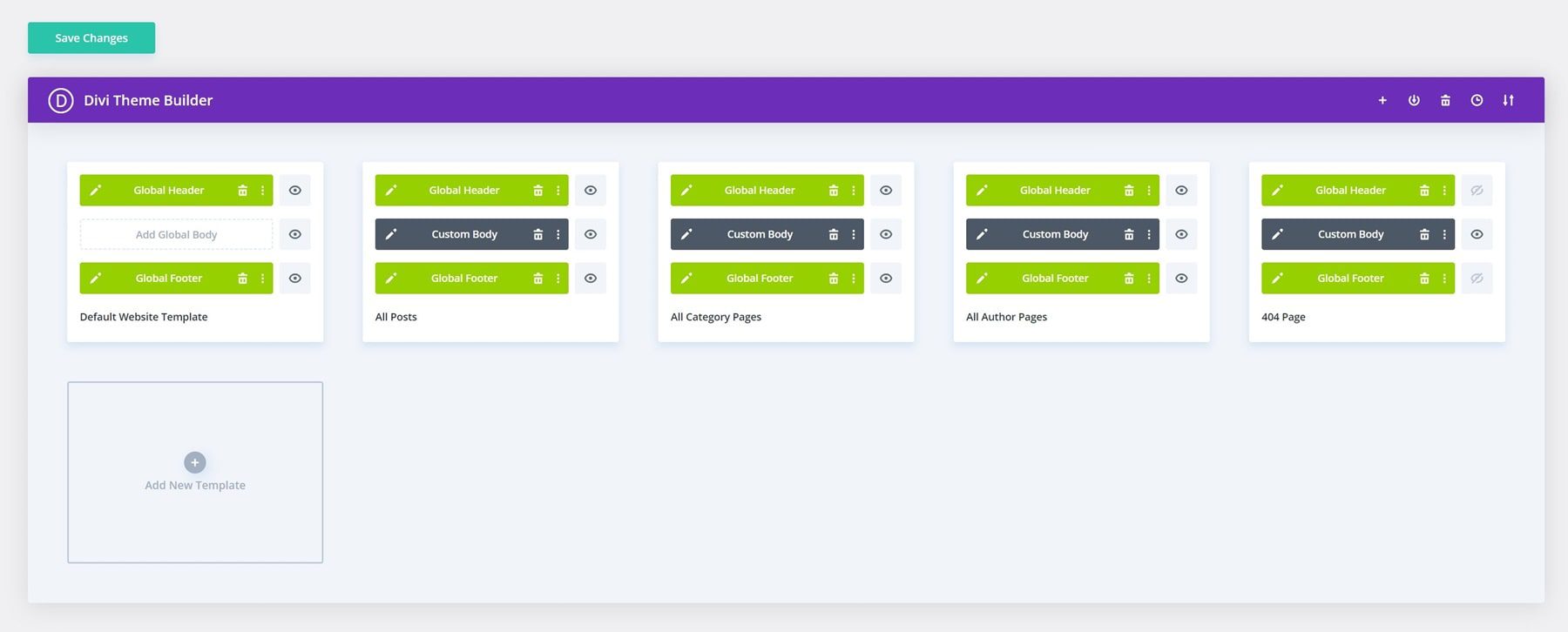
The Theme Builder takes this control further by letting you visually design global elements like headers, footers, and dynamic templates for blogs and archives.
Your Vision, Divi AI’s Creation
Recent updates have brought AI directly into this design workflow. Divi AI functions as a design partner, writing content that matches your brand voice, generating custom images, and building new sections based on simple text descriptions.
You can edit, modify, and enhance your images using Divi AI.
Divi AI further extends through Divi Quick Sites, where AI creates entire custom websites based on your business details. Unlike static templates, Divi Quick Sites produces unique layouts with relevant content and brand-matched visuals — even configuring WooCommerce for online stores.
Behind the AI integration, Divi Quick Sites has a collection of hand-designed starter sites, each featuring custom photography and illustrations from our design team. Selecting one of these pre-built options and adding your business details transforms it into a complete website within minutes.
Every website created with Divi Quick Sites, regardless of AI, is designed with built-in design systems. The system sets up everything from navigation menus to global color schemes. Global presets ensure new elements automatically match your site’s style.
Theme settings maintain consistency across pages, and design modules inherit your color schemes and typography. This foundation lets you focus on the customization that matters: your content, images, and brand.
Build More, Worry Less
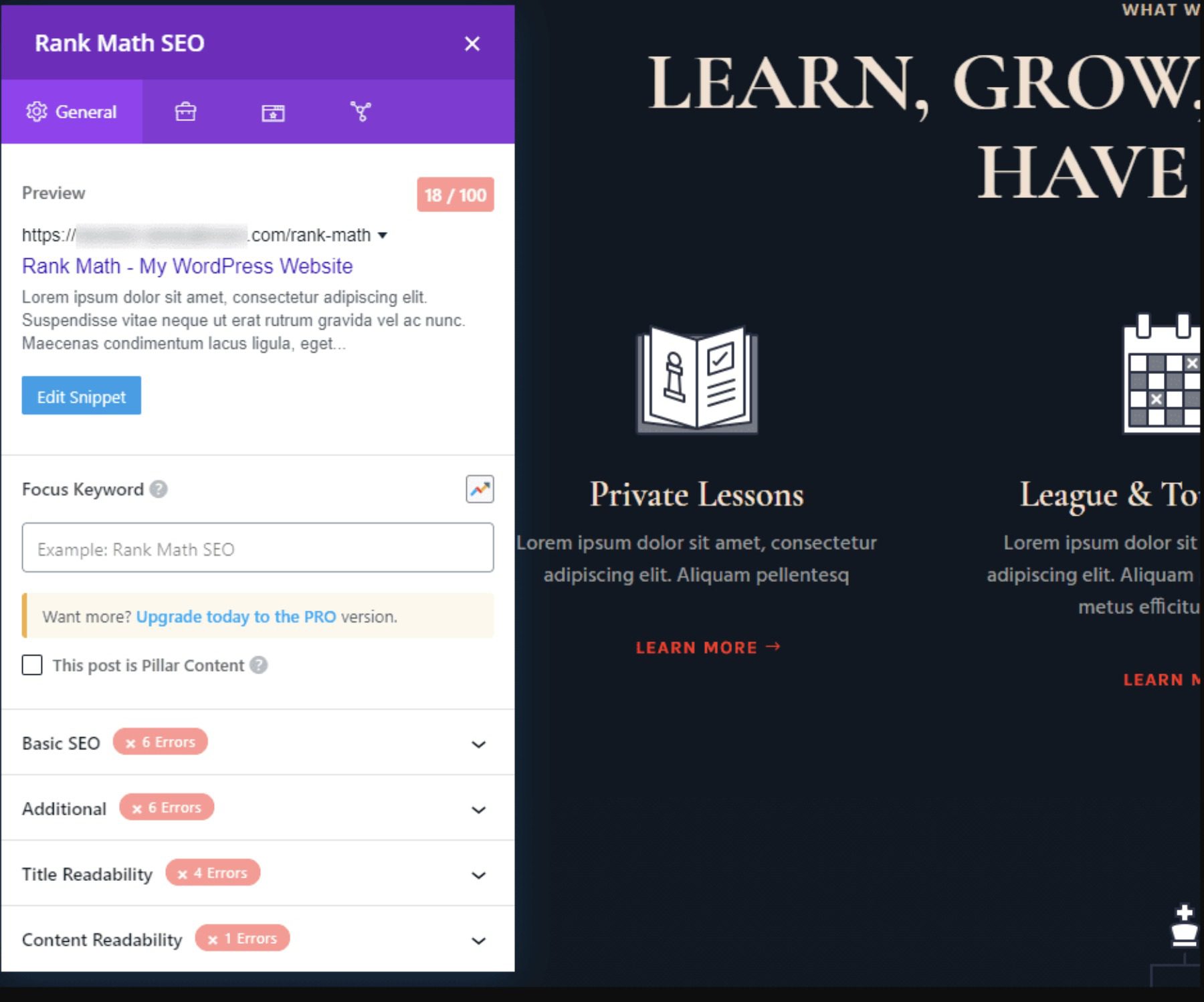
WordPress’s SEO-friendly foundation reaches new heights through Divi’s clean code structure and responsive design principles. Gone are the days of retrofitting SEO after design — tools like Rank Math SEO now integrate directly into Divi’s editor, creating a seamless workflow where optimization happens naturally alongside content creation and design.
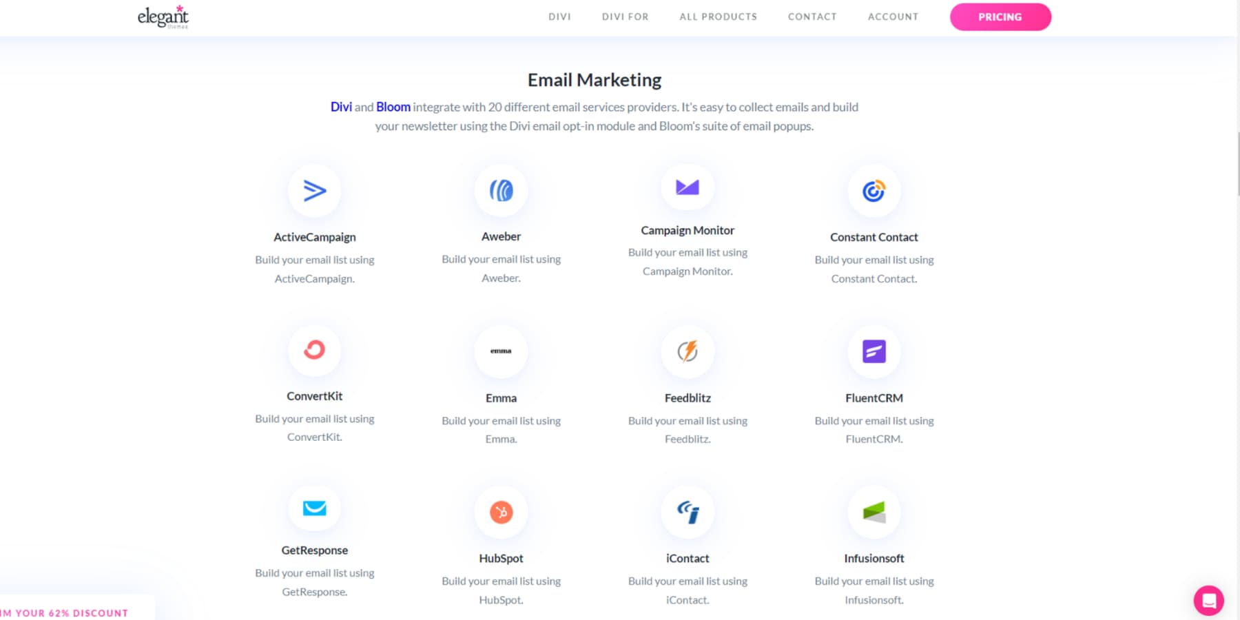
The platform’s marketing capabilities extend far beyond SEO. While WordPress remains the web’s leading CMS, Divi amplifies its potential by integrating over 75 plugins & services.
The open-source architecture provides developers with hooks, filters, and a comprehensive modules API, transforming Divi into a flexible foundation for custom solutions and third-party integrations.
Scale becomes a natural progression with this combination. WordPress has no restrictions on posts, pages, and products, while Divi supports unlimited websites under a single license. Your only consideration becomes hosting capacity — Hosts like SiteGround offer tiered plans to upgrade to match your growth smoothly, ensuring your infrastructure evolves with your success.
Perhaps most valuable is the thriving ecosystem surrounding Divi. Our Facebook community has evolved into a 76,000-member-strong community where sharing solutions and inspiration is a daily affair. When you feel stuck, our knowledge base and top-rated customer support are always there to help.
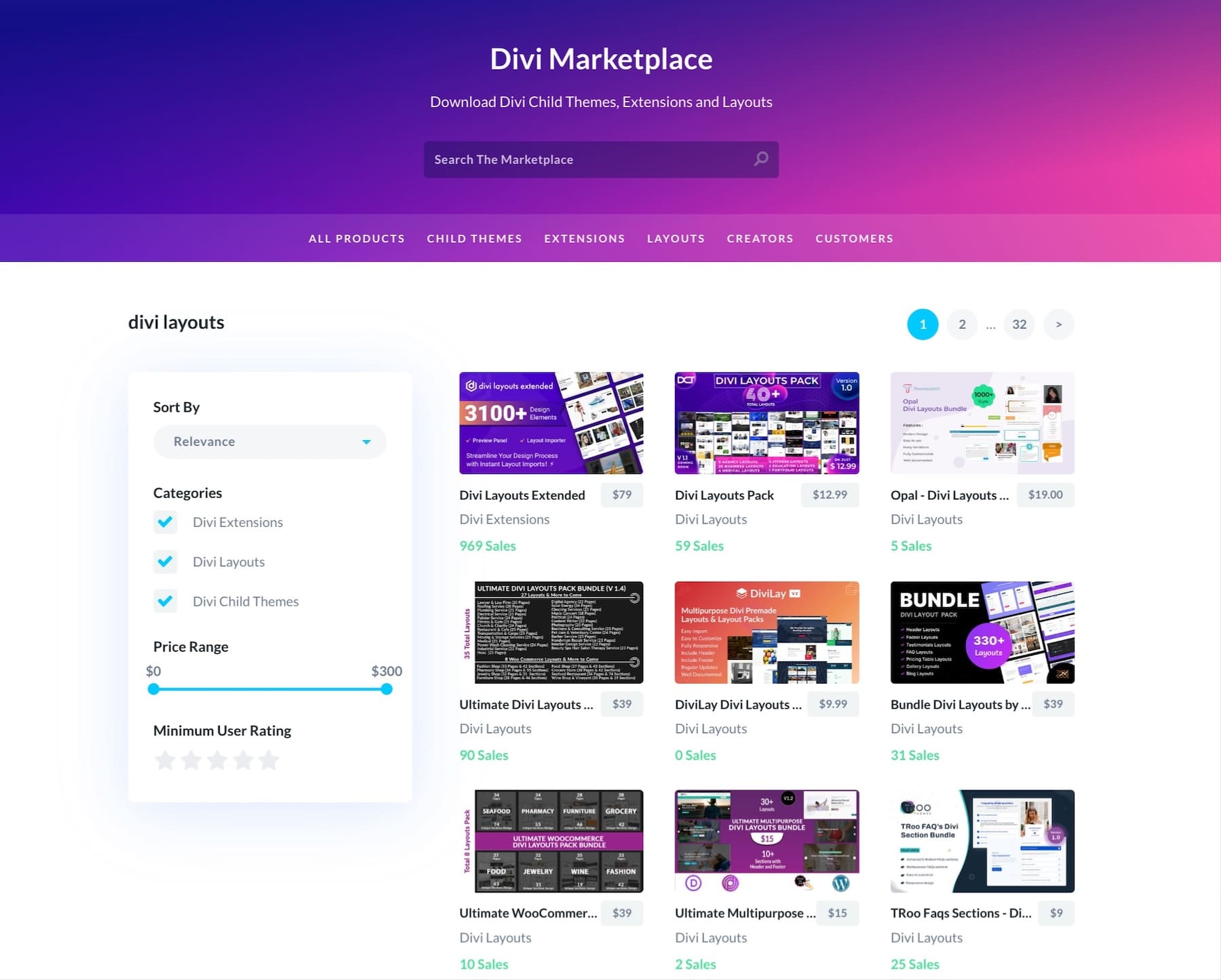
Our marketplace showcases professional child themes, extensions, and design packs from community developers, while continuous platform updates ensure alignment with modern web standards.
This combination of community support and professional development creates an environment where great websites aren’t just designed — they evolve and thrive.
How To Design Websites: Essential Design Elements Everyone Can Master
Creating an effective website doesn’t require years of design experience. By understanding core design principles and elements, anyone can build professional-looking sites. Here are the fundamental components that make websites work.
Your Brand’s Color Story
Colors trigger emotional responses and shape how visitors perceive your brand—from the trust-building blues of financial sites to the energetic reds of food brands. Start with the 60-30-10 rule: 60% primary color, 30% secondary color, and 10% accent.
Traditional color wheels help find complementary schemes, or a simple Google search takes the guesswork out by suggesting harmonious palettes based on your primary brand color.
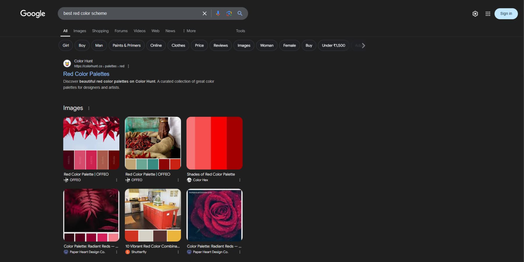
Beyond aesthetics, smart color use guides user attention—try using your accent color exclusively for CTAs to boost conversion rates. Divi’s Global Colors feature allows you to experiment freely, instantly updating colors across your entire site until you find the perfect balance between brand identity and user engagement.
Words That Work
Think of the last website that made you click “buy now” or join a mailing list. Chances are, it wasn’t just slick design that convinced you – it was the words.
Start with headlines that spark curiosity without falling into clickbait territory. Keep paragraphs short (3-4 lines max) and front-load important information using the inverted pyramid: lead with your conclusion, then support it with details.
You don’t need to hire a professional copywriter or a sales wizard for this. Just be clear about what you want your content to reflect, and Divi AI will help you create copy optimized for conversions.
Break up walls of text using Divi’s text modules for subheadings, bullet points, and strategic white space, making content scannable for busy readers. Your copy should address visitor pain points and guide them toward solutions, maintaining a consistent voice that aligns with your brand personality.
Divi’s A/B testing (with Divi Leads) helps refine your message by showing which headlines and CTAs resonate most with your audience.
But content is only half the battle — your design needs to work as hard as your words. Typography establishes visual hierarchy through size and weight contrasts. Headlines should command attention at 2-3 times your body text size (usually 16-18px for optimal readability).
While Divi offers hundreds of Google Fonts, with the ability to add more from Adobe Fonts and upload custom fonts, resist the urge to use more than two or three typefaces. Instead, create variety through weight and size variations of the same font family.
For maximum impact, pair a distinctive display font for headlines with a highly readable sans-serif for body text—think Medium’s combination of a bold serif header with clean body text. Divi’s responsive typography controls ensure your carefully crafted hierarchy scales beautifully across all devices.
Flowy Layouts
Excellent website design guides visitors naturally through your content, like a well-planned museum exhibition. Start by mapping your users’ journeys. What do you want them to see first, second, and third? Break complex information into digestible sections.
Create a visual hierarchy by varying element sizes and using whitespace strategically. Think F-pattern for text-heavy pages (users scan left-to-right at the top, then vertically) or Z-pattern for landing pages (eye movement follows a Z shape).
Divi’s drag-and-drop builder makes testing these patterns easy, while its responsive design ensures your flow works across all devices. Remember: every section should lead logically to the next, with clear visual cues like arrows, buttons, or complementary shapes guiding visitors toward your call-to-action.
Impactful Images
The right images can tell your story faster than paragraphs of text – but choosing the wrong ones can sink your design. Skip the cheesy stock photos; instead, opt for authentic imagery that reflects your brand’s personality and resonates with your audience.
Creating custom visuals is easier than ever with Divi AI. You can generate fresh images from scratch or provide reference images to guide the AI toward your desired style.
Did you find an almost-perfect shot? Divi AI can modify existing images to match your vision perfectly, and since there’s no limit to generations, you can experiment until you’re satisfied.
Before uploading, compress your images or use a plugin like EWWW Image Optimizer to maintain quality without sacrificing load times. Position your visuals strategically: hero shots grab attention above the fold, product photos highlight key details, and lifestyle images build emotional connections. Whatever you choose, maintain plenty of breathing room – cramped photos lose their impact.
Space: Your Secret Design Weapon
White space transforms good designs into great ones, acting as the invisible force that elevates your content. Luxury brands have long understood this principle, using abundant space to create premium experiences. Modern web design relies on strategic spacing to guide visitors through content naturally, letting key elements breathe while maintaining visual hierarchy.
Divi’s spacing controls offer precise margin and padding adjustments, helping create intentional content groupings that enhance readability. Larger gaps around CTAs and crucial features naturally draw attention, while consistent spacing between related elements builds a comfortable reading rhythm.
This approach mainly enhances those hero images and product shots we discussed earlier, giving them room to make maximum impact. Divi’s responsive spacing system ensures these carefully considered gaps adapt seamlessly across all devices, maintaining your design’s professional polish from desktop to mobile.
Step-By-Step Website Design Process
Building a website becomes straightforward when you follow a clear process. Breaking down the design journey into manageable steps helps avoid common pitfalls and ensures nothing gets overlooked. Here’s your roadmap to creating a successful website.
How to CRAFT Your Websites
Now that we’ve covered the essential design elements, let’s put everything together in a practical workflow. I have a systematic approach that combines these principles into a reliable process. I call it the CRAFT method — not because it sounds clever, but because it reflects how successful websites come together. Each phase creates a stronger foundation for the next, ensuring nothing gets overlooked. Here’s how it breaks down:
Collect
- Research your target audience and competitors thoroughly
- Define clear goals and must-have features
- Gather content, images, and brand materials
Refine
- Create wireframes for key page layouts (Use Divi Quick Sites with ‘Placeholder Images’ options enabled to get inspiration.)
- Plan user journeys and content hierarchy
- Plan and Organize your site structure
Assemble
- Implement your brand elements with Divi’s global presets
- Transform wireframes into working pages & responsive layouts with Divi
Finalize
- Test forms, links, and core functionality
- Optimize images with EWWW Image Optimizer and implement SEO best practices with Rank Math SEO
- Check mobile responsiveness
Test
- Run cross-browser testing
- Verify loading speeds
- Double-check all integrations
Common Mistakes To Avoid
Don’t let these common pitfalls derail your website project. Here’s what experienced designers know to watch out for:
- ❌ Burying your value proposition below the fold
- ❌ Creating endless scroll homepages that overwhelm
- ❌ Cluttering navigation with too many options
- ❌ Forgetting to customize your 404 error page
- ❌ Forgetting to set up backups with a backup plugin like UpdraftPlus
- ❌ Auto-playing videos or audio without user consent
- ❌ Skipping analytics setup before launch
- ❌ Missing meta descriptions on key pages
- ❌ Making users think too hard about next steps
- ❌ Hiding contact information in obscure places
- ❌ Choosing form over function
Launch Checklist
Before pushing your site live, run through this focused checklist experienced developers use. These are the crucial checks that make the difference between a smooth launch and a headache:
- ✅ Confirm all links work and open in new tabs
- ✅ Review the site with images disabled
- ✅ Test site search with common misspellings
- ✅ Test user flows in Incognito mode
- ✅ Setup SMTP and check automatic email notifications
- ✅ Verify payment gateway test mode is off (if using WooCommerce)
Designing a website doesn’t have to be overwhelming anymore. By breaking down the process into manageable steps – from initial planning to final launch — you’re setting yourself up for success. The CRAFT method gives you a clear roadmap, our mistake checklist keeps you on track, and the launch checklist ensures nothing falls through the cracks.
Beautiful Design Is Within Your Reach
Web design has evolved from a technical challenge into an accessible creative process. Combining timeless design principles with modern tools allows you to create experiences that genuinely resonate with visitors – from thoughtful typography and strategic white space to intuitive user flows that convert.
The fundamentals of great web design remain constant: clear hierarchy, purposeful layouts, and content that connects. But today’s tools have transformed how we execute these principles. Divi’s Visual Builder and AI capabilities remove the technical barriers, letting you focus on what matters: crafting websites that guide visitors naturally through their journey.
Whether you’re just starting or refining your workflow, you have the foundation and the tools to bring your vision to life. You’ve seen the principles, understood the process, and discovered the possibilities. It’s time to start building.
Ditch Code, Design Visually With Divi
The post How To Design Websites In 2024 (Tips & Tricks) appeared first on Elegant Themes Blog.
