Web design trends drive innovation and enhance user experiences in ways you might not have imagined. Whether setting up a personal blog, building an eCommerce store, or developing a corporate site, staying on top of the latest design trends is important. This keeps your audience captivated and ensures your website doesn’t look outdated.
This post will explore the most impactful web design trends you can implement today. Plus, we’ll show you how Divi’s powerful features and user-friendly interface can help you easily incorporate these trends into your projects. Ready to improve your web design skills? Let’s get started!
Why Are Web Design Trends Important?
Web design trends aren’t just about looking cool — they’re crucial for keeping your site relevant and user-friendly. As someone who has worked for almost a decade designing websites, I’ve seen firsthand how following (or ignoring) these trends can make or break a website’s success.
First off, trends often reflect shifts in user behavior and expectations. Remember when flat design took over, and suddenly, every button looked like a colorful sticker? That wasn’t just a collective decision to ditch shadows. It was about faster load times, cleaner mobile experiences, and guiding users’ eyes to what matters. Ignore major shifts like this, and you’re telling visitors, “We don’t care if you can use our site easily or not.”
Jumping on every trend bandwagon is like using every emoji in a single text message. You might think you’re being super-expressive, but you’re just sending a confusing message that makes people wonder if you know what you’re talking about. Try to understand why these trends pop up, how they can serve your users and business goals, and how to customize them to your needs accordingly.
The bottom line is that web design trends matter because they ensure your site speaks the same language as your users. Just remember, the best trend-followers are trend adapters. Experiment, use what works, ditch what doesn’t, and always keep your unique brand voice singing loud and clear.
The Foundation: WordPress + Divi
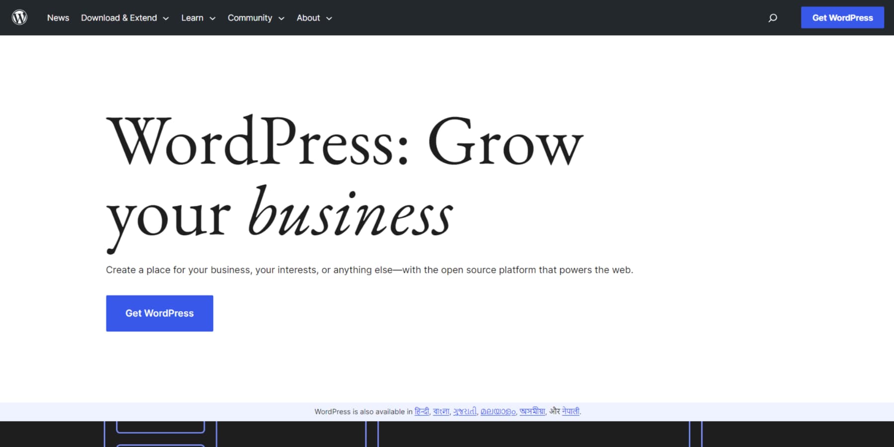
WordPress and Divi give you the tools and flexibility to build websites that look great now and can roll with the punches as trends change. In the world of web design, it’s a tough combo to beat. WordPress runs over 40% of the internet, and it’s not hard to see why. The sheer number of themes and plugins available gives you incredible flexibility. Plus, since it’s open-source, developers are constantly tinkering with it, keeping it up to date with the latest web tech. Even you can easily change its core files to suit your needs.
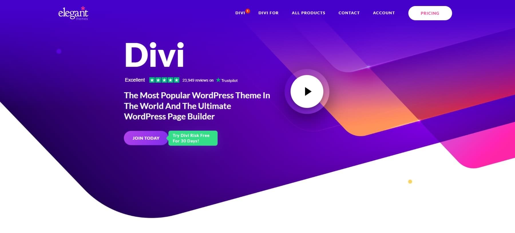
While WordPress is a solid foundation, it truly shines when paired with a robust framework. That’s where Divi comes in. It’s our flagship product at Elegant Themes and takes WordPress to another level. Divi is a visual page builder that lets you create stunning, functional websites without getting your hands dirty with code. Whether you’re just starting or you’ve been in the game for years, Divi’s drag-and-drop interface makes it a breeze to build layouts that match what’s in your head.
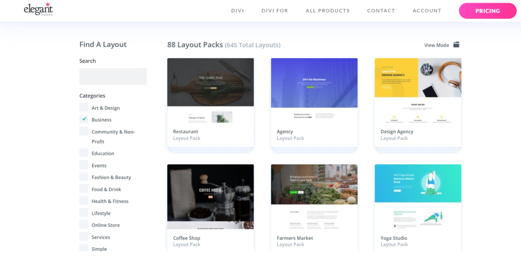
We’ve loaded Divi with many pre-built layouts, starter sites, and modules for various industries and styles. So, if you need to quickly update a portfolio, online store, or corporate site with the latest design trends, Divi has you covered.
Remember what I said about testing and only using the trends that work on your site? A/B testing is your secret weapon here. If you’re unfamiliar with A/B testing, you can pit two versions of a page against each other. Half your visitors see Version A, and half see Version B. You watch which one converts better, giving you solid data on how your audience reacts to those new trendy elements.
Now, A/B testing can be a headache, but not with Divi. We’ve built Divi Leads right into the platform. It’s our A/B testing tool that makes it a breeze to figure out which trends are worth keeping and which ones need to go.
Adapt Web Trends In Minutes, Not Months
Our AI tools, Divi Quick Sites and Divi AI, are game-changers. Divi Quick Sites can create a fully functional website in minutes. Divi AI helps you create, edit, and optimize content efficiently, regardless of whether it is images, code, or just text.
Many trends may require you to add custom code to your sections. So, imagine describing your dream design and watching it come to life without knowing the basics of code – that’s Divi AI in action.
The Theme Builder is another feature that sets Divi apart. It gives you unmatched control over custom headers, footers, and other site-wide elements, keeping your site looking consistent and polished. With Divi’s responsive design, your site will look great on everything from desktops to smartphones—crucial in today’s mobile-first world.
WordPress’s plugin ecosystem is the perfect complement to Divi’s design chops. With thousands of plugins, you can add pretty much any functionality, from hardcore SEO tools to custom forms and membership systems. Divi even offers out-of-the-box integrations with plenty of plugins and services.
Community support is one of the best things about using WordPress and Divi. You’ve got access to many resources – tutorials, documentation, and our Facebook group with over 75,000 members. We even have a marketplace where you can find child themes, extensions, and design packs from our community of talented developers.
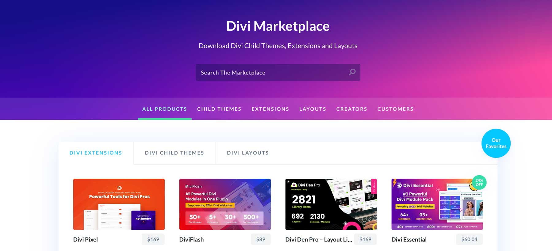
We’re constantly updating Divi, adding new features and tweaks that keep pace with current web design trends. This means you can keep your site fresh without starting from scratch every time something new comes along.
Web Design Trends To Look Out For
Let’s explore the latest trends that are making waves. With Divi, you can bring these innovative designs to life on your website. Let’s see how!
1. Storytelling Through Design
Storytelling in web design has evolved from simple content presentation to creating immersive, narrative experiences. This trend recognizes that users connect more deeply with brands and messages when woven into a compelling story.
Divi’s animations are your secret weapon here. Use them to reveal content as users scroll, creating a sense of discovery.
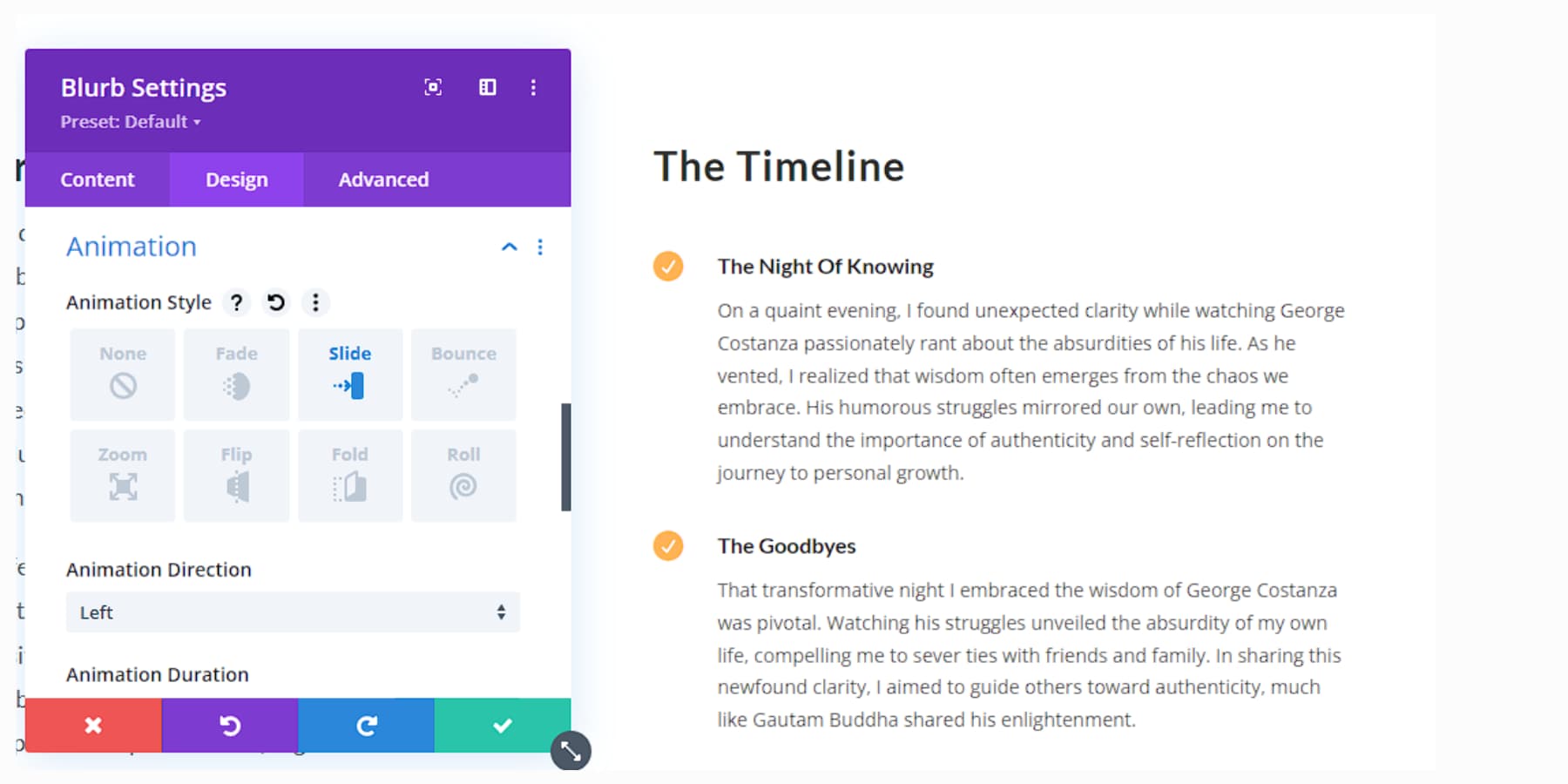
Set up a timeline of your company’s history using Divi Pixel’s vertical timeline module. Get creative with parallax effects to add depth to your narrative.
Video backgrounds can also set the mood for different chapters of your story. Don’t forget about micro-copy – those little bits of text can add personality and guide users through your narrative, and Divi AI can help you enhance the bits.
The goal is to make visitors feel part of the story, not just read it. Keep your navigation clear – your audience shouldn’t get lost in the plot.
2. Microinteractions With Purpose
Microinteractions are subtle animations or feedback mechanisms that guide users’ journey on your site. They’ve gained importance as designers focus more on creating intuitive, responsive interfaces that provide immediate feedback to user actions.
Divi offers many options for adding these subtle touches. For example, you can use hover effects on buttons to give users instant feedback and animate icons to celebrate completed actions.
Create a subtle animation for your logo that triggers when users reach the top of the page. Use micro-interactions to guide users through forms, highlighting each field as they progress. Keep it smooth and intuitive – users should barely notice these interactions, but they’ll feel the difference.
3. Bold + Kinetic Typography
Bold and kinetic typography has emerged as a powerful way to capture attention and convey messages effectively in an increasingly visual online world. This trend combines eye-catching fonts with movement to create dynamic, engaging text elements.
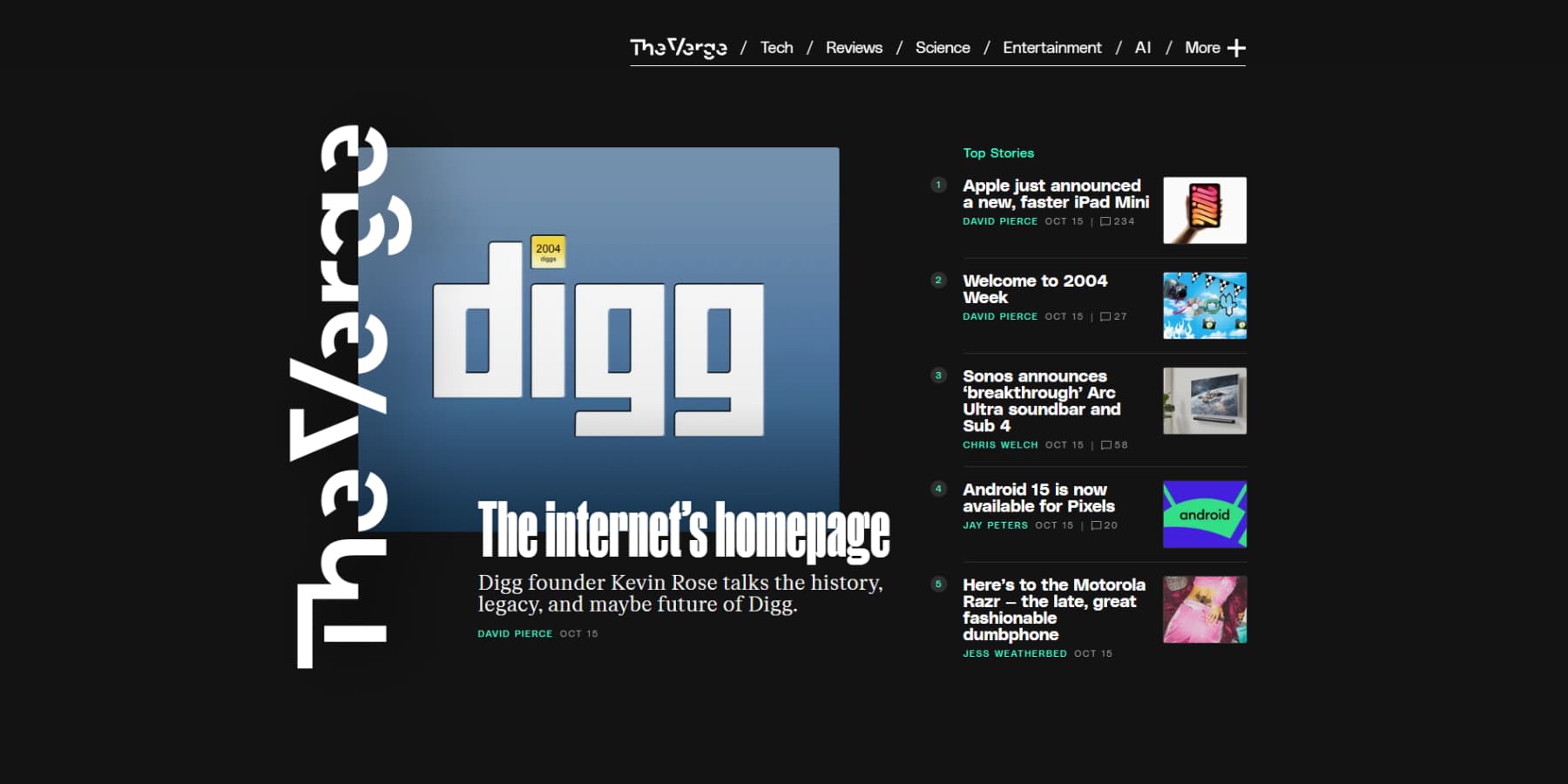
An example of Bold/Kinetic typography from The Verge
Divi provides all the tools to make your text pop. Use the transform options to create oversized headers that command attention. Experiment with mixing fonts for added visual interest. For example, you may use bold handwriting font for headlines and a more readable serif for body text.
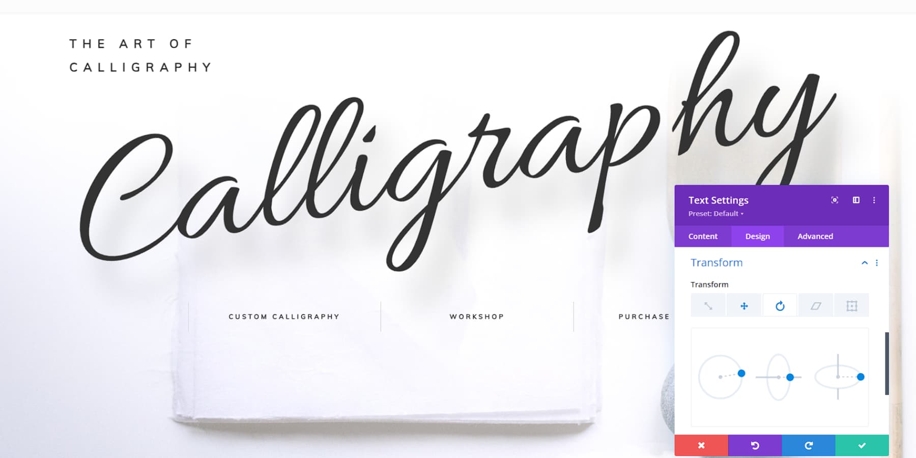
Then, add some life with Divi’s animation effects. Try a simple fade-in as users scroll, or go wild with rotating or sliding text.
Play with color, too. High-contrast combinations can make your typography stand out. Try some text mask effects to give it a pop. Use Divi’s blend modes to make your text interact with background images interestingly. But keep things readable – cool effects won’t matter if visitors can’t understand what you’re saying.
4. Retro Resurrection
The retro resurrection trend brings back design elements from past decades with a fresh twist. Think vintage color palettes, classic typography, and nostalgic graphics that add charm and familiarity. Incorporating geometric shapes, halftone patterns, and retro-inspired illustrations can create a memorable user experience.
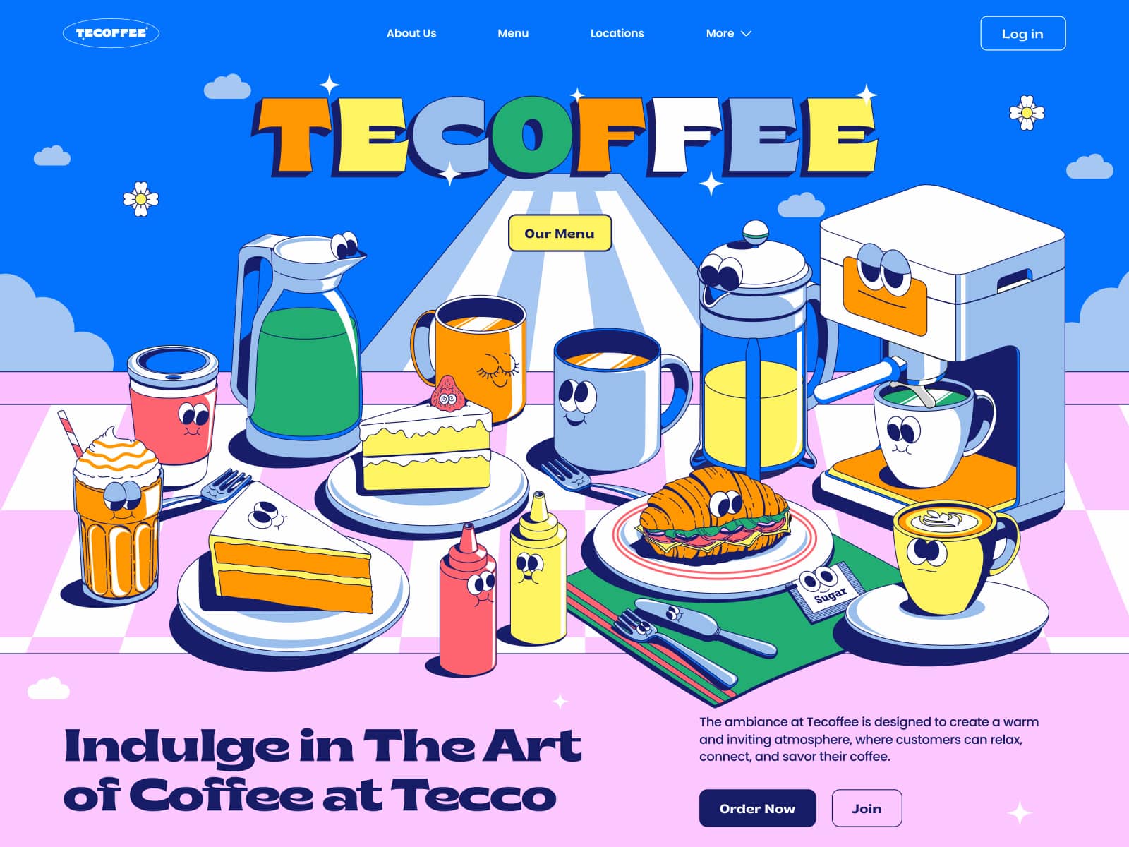
Tecoffee – Header Illustrations by Annisa Puspasari (from Gintera) on Dribbble
With Divi, adding retro flair to your website is a breeze. The Divi Builder provides customizable templates and design modules that let you integrate vintage styles while maintaining modern functionality. Use Divi’s typography options to choose fonts with a retro vibe or apply texture overlays for added depth. Divi’s flexible layouts make experimenting with retro patterns and colors effortless.
Using Divi’s robust design tools, you can blend nostalgic elements with modern trends, crafting a site that appeals to contemporary users and those who appreciate a nod to the past. This balanced approach ensures your site remains engaging and visually captivating for all audiences.
5. Personalization
Personalization is a cornerstone of modern web design, allowing for tailored experiences that boost engagement and conversion rates. Websites can customize content, layout, and functionality using user data to align with individual preferences. This means visitors see targeted recommendations and personalized messaging that make them feel understood.
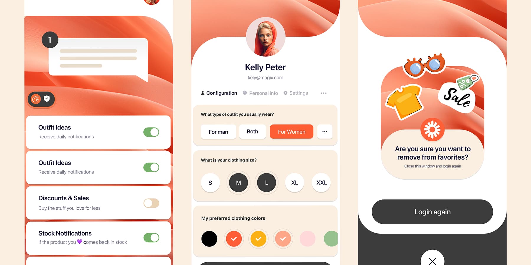
Shopping App- Profile Screen by Mehmet Özsoy (Orizon: UI/UX Design Agency) on Dribbble
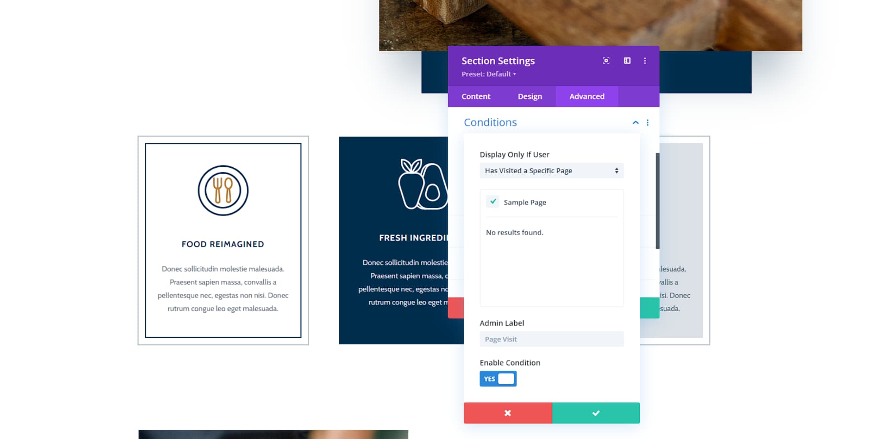
Divi takes personalization to the next level with its dynamic content features. The Divi Builder lets you create layouts that adapt based on user interactions and data inputs—think sections that change according to a visitor’s location or browsing history. With Divi’s conditional logic, elements appear or disappear as needed, ensuring every visitor has a unique experience.
You can effortlessly display your users’ names in sections and pages to give your website a more personalized feel.
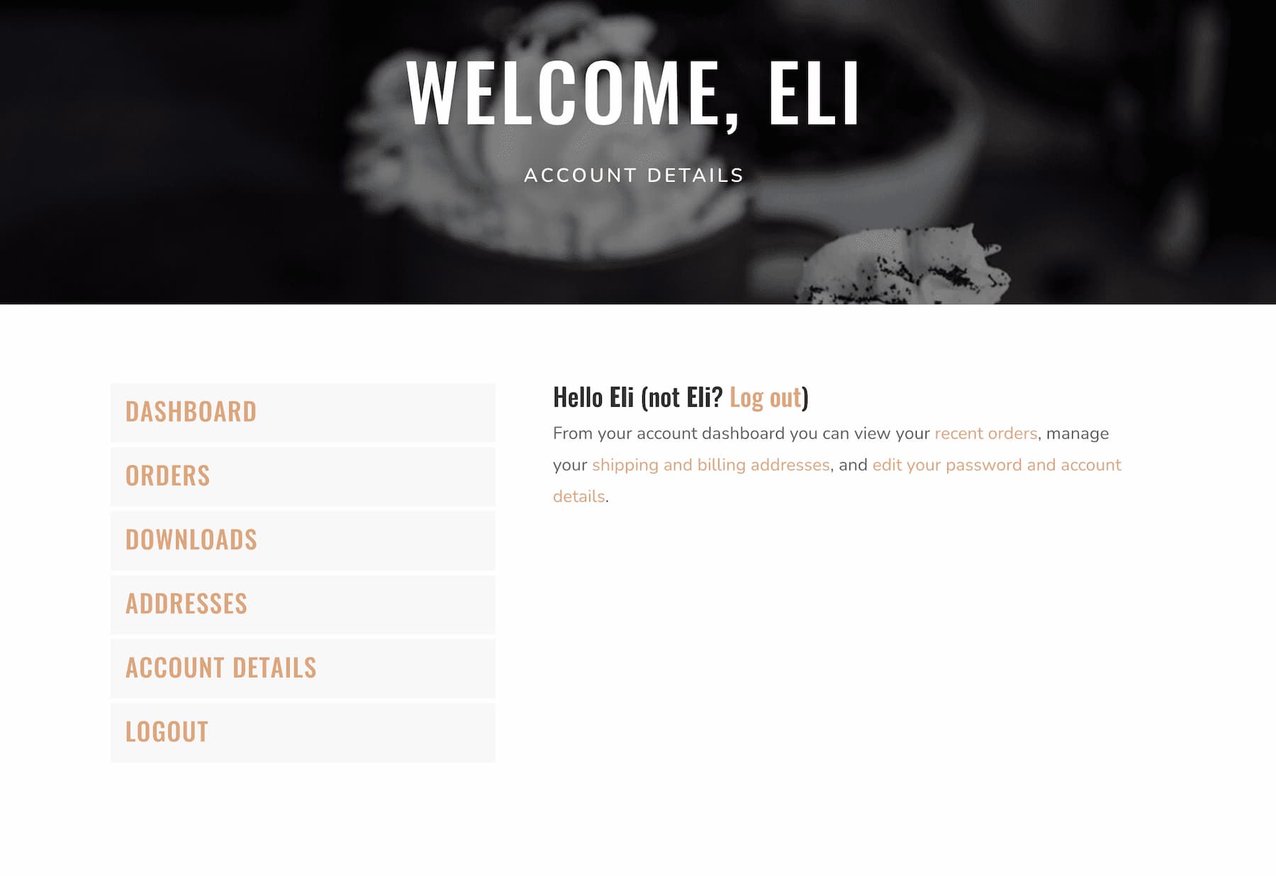
Beyond design flexibility, Divi integrates smoothly with marketing and CRM tools. This makes it easier to implement sophisticated personalization strategies like tailored email campaigns or custom landing pages, helping your site effortlessly meet users’ specific needs.
6. Minimalism / Maximalism
Web design is a battleground of styles, with minimalism and maximalism offering unique perks. Minimalism thrives on simplicity, clean lines, and generous white space, which is ideal for brands aiming for a sophisticated vibe.
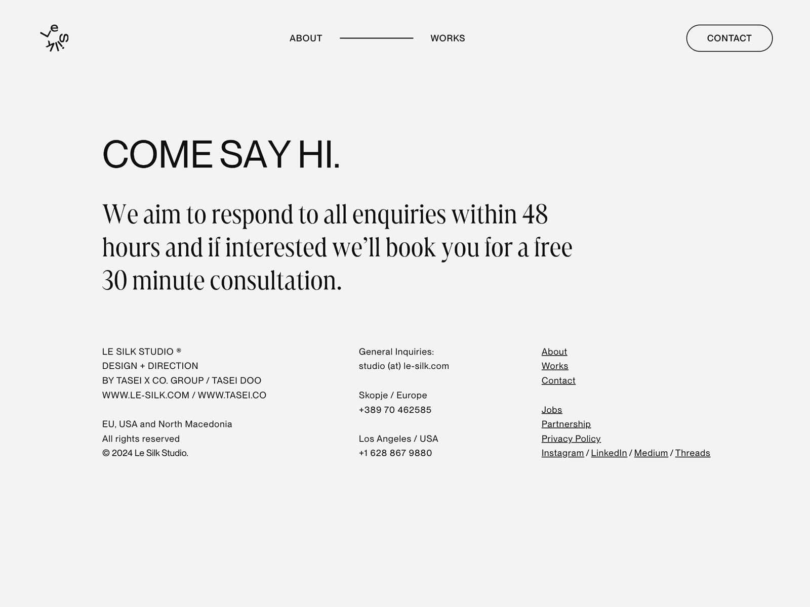
An example of Minimalist design from Le Silk Studio
In contrast, maximalism embraces bold colors and intricate patterns, creating an energetic canvas that showcases creativity and personality.
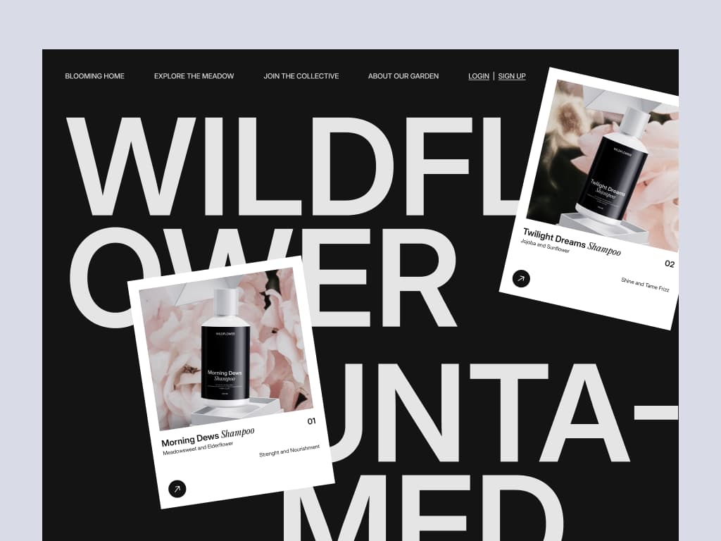
Wildflower – Marketplace Landing Page by Soft Boy on Dribbble
Divi’s intuitive visual builder is your ally in both arenas. Whether you’re crafting sleek minimalist layouts that let the content shine or utilizing Divi’s robust design modules to build vibrant, maximalist sites, the choice is yours.
Divi seamlessly blends minimalist and maximalist elements within a single site, achieving a balanced design that stays true to your brand identity while adapting to trends. With Divi’s tools, you can nail any aesthetic—be it the elegance of minimalism or the bold expressiveness of maximalism.
7. Darker Colors
Dark color schemes, known for their sleek and modern appeal, are making a splash in web design. Dark modes look sophisticated, enhance readability, and reduce eye strain, especially in low-light conditions. This trend is popular among creative industries and tech brands aiming for a cutting-edge look.
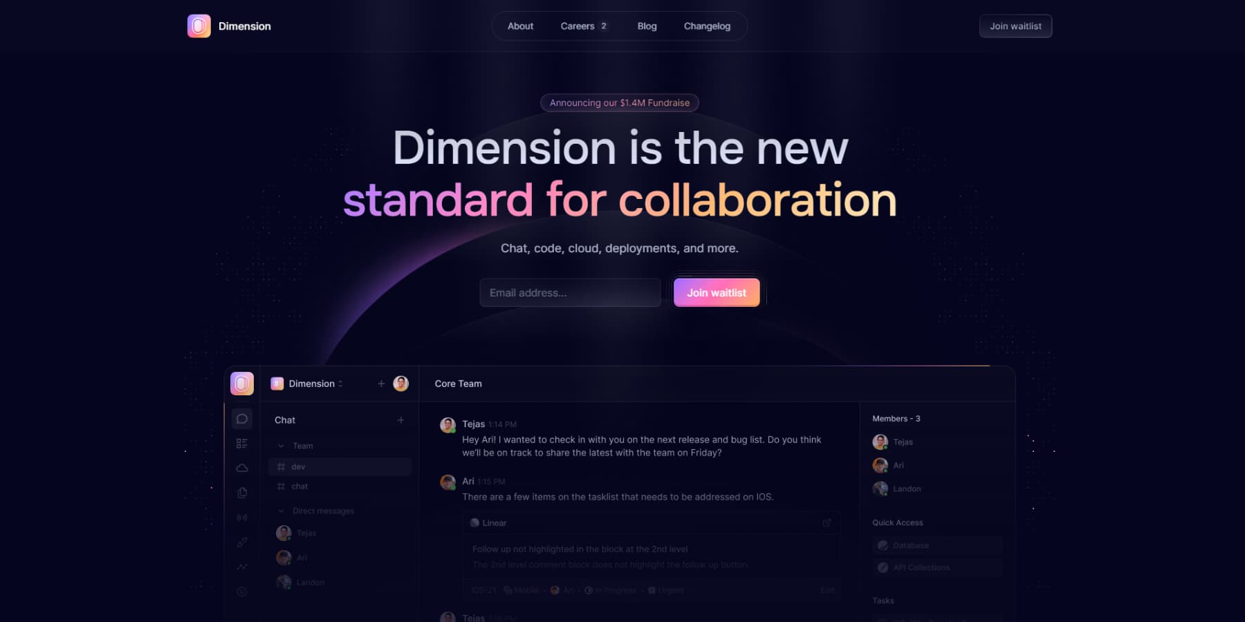
An example of a dark color scheme on a website from Dimension
Divi’s color customization tools make adopting dark themes effortless. The Divi Builder lets you adjust background colors, text hues, and design elements to create a cohesive dark theme. Global color settings ensure consistency across your site.
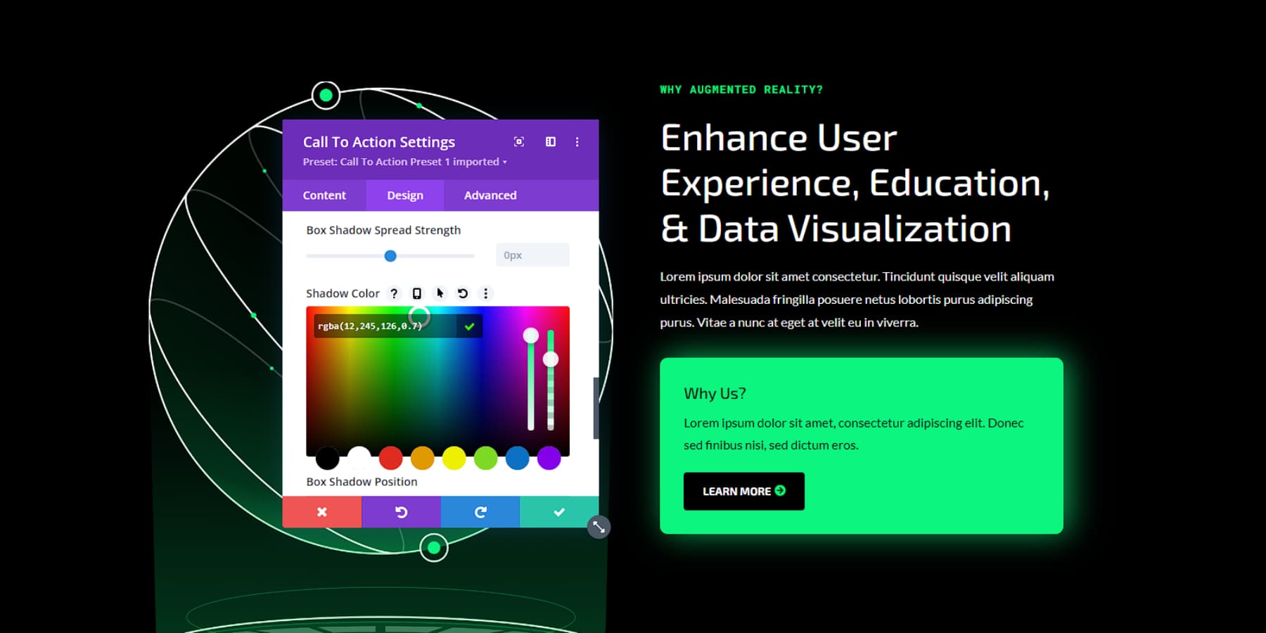
Beyond basic customization, Divi offers advanced styling options, such as vibrant accents or subtle gradients, to highlight content against dark backgrounds, boosting aesthetic appeal and accessibility.
Leverage Divi’s capabilities to craft a standout dark-themed website. Whether fully embracing dark mode or strategically integrating darker elements, Divi provides the tools needed for a professional and engaging site that aligns with current design trends.
8. Mobile-First Design
Let’s face it – most of us are glued to our phones. That’s why mobile-first design isn’t just a trend. It’s a necessity. This approach is all about designing for mobile devices first, then scaling up for larger screens. It ensures that your site looks great and works smoothly whether someone’s browsing on their phone during their commute or on a desktop at work.
Divi makes mobile-first design a walk in the park. The visual builder’s responsive editing mode lets you fine-tune your layout for different screen sizes, so you can make sure your site looks spectacular on everything from a tiny smartphone to a massive desktop monitor.
When designing, consider what’s most important for mobile users. Prioritize essential content, make sure your buttons and links are easy to tap, and monitor your loading times — nobody likes waiting around for a slow site to load on their phone.
Remember, an excellent mobile experience isn’t just about making your users happy (although that’s super important). It’s also crucial for your search engine rankings. So, if you want to stay on Google’s good side (and trust me, you do), mobile-first is the way to go.
Final Thoughts
Keeping your website current means wisely embracing web design trends. While these trends can enhance your site’s appeal, it’s crucial to be selective. Evaluate every trend against your brand identity and user needs, and test thoroughly to ensure it genuinely improves your site’s functionality and user experience.
WordPress continues to lead in web development, offering many themes and plugins. Paired with Divi, website creation becomes even more streamlined. Divi’s intuitive drag-and-drop builder and pre-designed layouts make incorporating modern design elements a breeze. Its AI-powered features also help you fine-tune your site, adapting quickly as trends evolve.
WordPress and Divi provide a robust foundation for creating attractive, functional websites. This powerful combination allows you to maintain a dynamic online presence that meets your audience’s expectations without getting caught up in every passing trend. Don’t let your website fall behind. Harness the power of WordPress and Divi to create a stunning, trend-setting site that stands out from the crowd!
The post 8 Web Design Trends That Are Relevant In 2024 appeared first on Elegant Themes Blog.
