With the release of Divi 5’s Public Alpha, users can now explore the powerful enhancements brewing behind the scenes at Elegant Themes. Divi 5 is a major update, offering a revamped foundation for improved speed, stability, and scalability. Whether you’re a seasoned pro or just starting with Divi, this new Visual Builder will allow you to build websites more efficiently, with fewer steps and faster load times. Engage with this new update from Elegant Themes and navigate it like a pro.
Discover more about the Divi 5 Public Alpha and how to download it.
5 Tips to Master the Divi 5 Interface
Navigating the Divi 5 interface can be exciting for new and experienced users. The updated interface provides a fresh approach to website building with its modern design and improved functionality. Here are some tips we have shared to help you familiarize yourself with the interface:
1. Access Elements Quickly Through Layers View
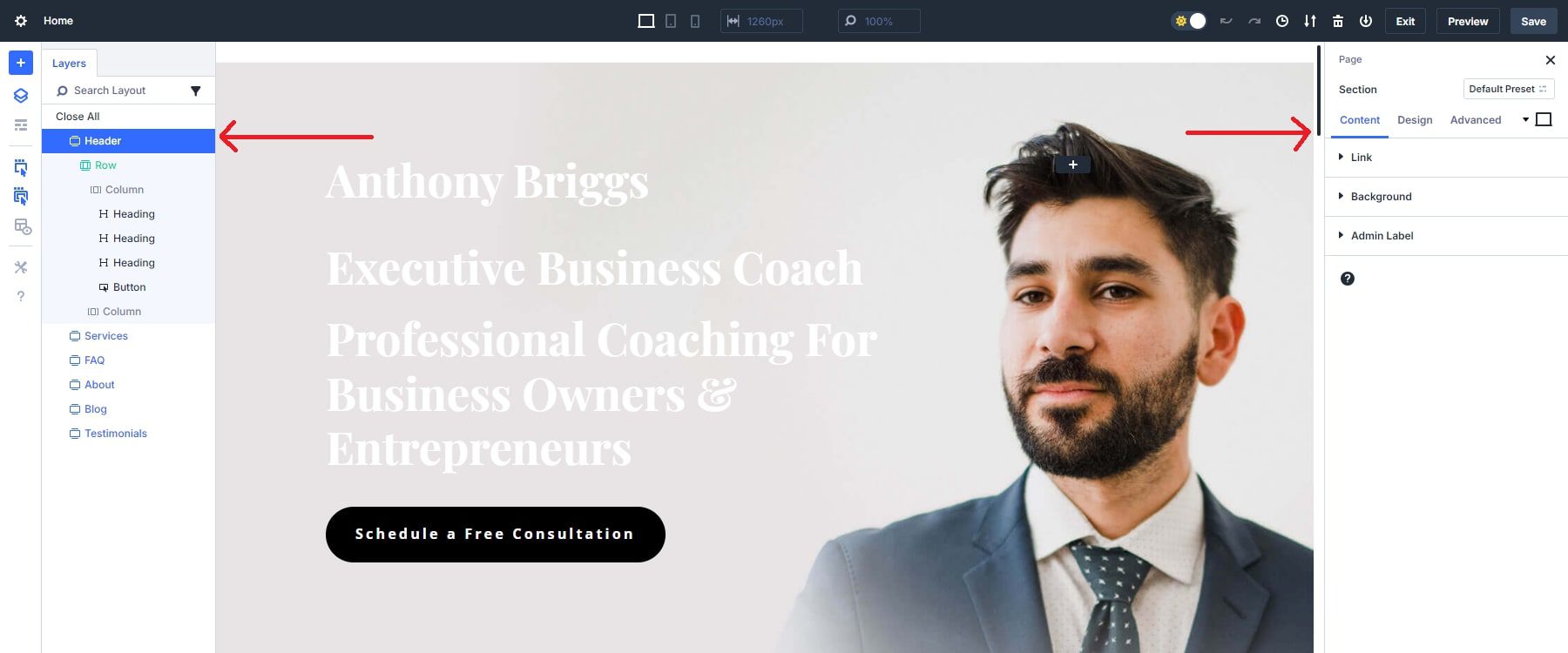
The Layers Panel is not new to Divi 5. We have the Layers View in Divi 4. However, it has been given an improved UI with easier access on the left sidebar. It is also one of the key dockable panels you’ll want to keep in view during your builds. It is a game-changer for managing complex layouts, especially when elements overlap or become hard to select. It is also helpful to search/filter by different elements you are looking for quickly finding multiple elements on large pages.
Open the Layers Panel on the left of your screen to view all elements in your layout, regardless of their position or visibility on the canvas. You can select any layer directly from there, even when hidden behind another module or section.

Pro Tip
Always keep the layers view visible as one of your docked panels. It is just too helpful and convenient to ignore.
Practical Example
Let’s say you want to update all the CTA buttons on your page with new content. In Divi 5, you can use the layers panel to search for your desired element (button) to bring them all into view. Then, with a single click on each button, you can update the settings in the settings panel, which will immediately pop up. This seamless workflow is a game-changer for handling complex, content-heavy designs.
2. Speed Up Edits with Dockable Panels and One-Click
Divi 5’s dockable panels and one-click editing features allow you to keep multiple settings panels open while making quick changes with a single click. This enables fast adjustments and smoother module navigation without repeatedly opening and closing panels.
Pro Tip
Keep relevant panels docked to the side of your screen for quick access, especially when working on multiple sections or modules simultaneously. This reduces the number of clicks needed and speeds up your workflow.

Practical Example
Continuing with the example in our first tip, you need to adjust the button text of all the modules. By docking both the layers and the button’s panels on the same side, you can easily switch between them for quick one-click edits, saving you the hassle of reopening the panels each time you need to make adjustments or having to move your cursor from one end of the screen to the other. This setup is ideal when working on multiple sections that need updates.
3. Streamline Navigation with Settings Panel Breadcrumbs
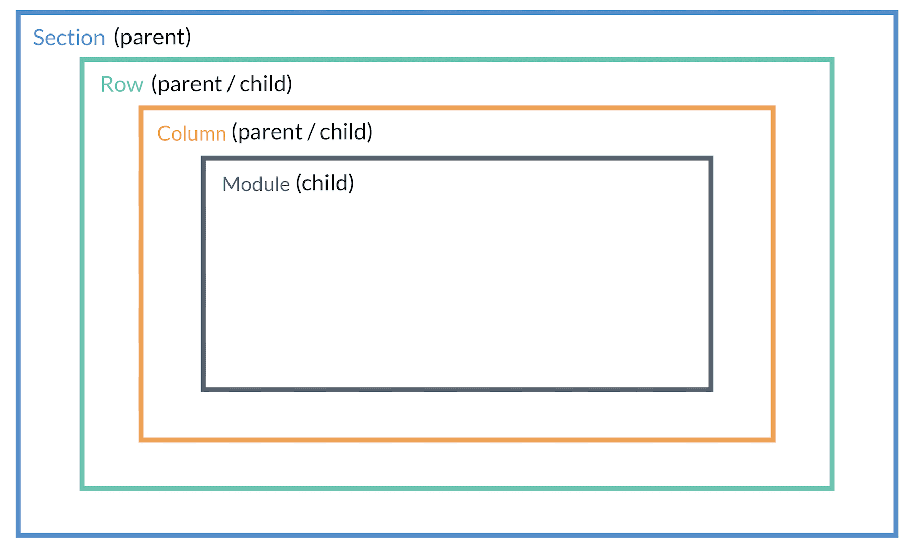
Breadcrumbs in the settings panel are a unique feature in Divi 5. Breadcrumbs allows users to navigate to any of the parent elements of a child element in Divi right from the settings panel. A parent element is basically the container of the child element. Here is a simple illustration of the parent and child structure of Divi elements.

Even modules have child elements (like an accordion or contact form), and sections have “Page” as their parent, which makes the breadcrumbs even more helpful. Previously, in Divi 4, you would have to rely on the layers view or try to find the parent element by clicking inside the builder.
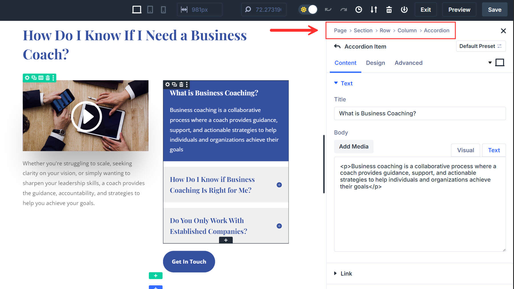
When you open the settings for any module in Divi 5, a breadcrumb trail appears at the top of the settings panel. This trail shows your current location and allows you to move back to the parent element with a single click. Below is an example of what the breadcrumbs are when an accordion item is selected. You’ll see “Accordion” as one of the links in the breadcrumb menu because it is the immediate parent of the selected accordion item.

Breadcrumbs are especially useful when designing contact forms or CTAs that use multiple parent elements to create a single design. Once you have designed the module, you can easily jump to the column or row element to adjust the design accordingly.
Practical Example
Say you are designing a contact form and want to incorporate the row and section in your design. You can make your changes and using the breadcrumbs to access the parent elements you need—all without ever closing the panel.
4. Effortless Responsive Design with Canvas Scaling
In Divi 5, you can scale the canvas in real-time to simulate how your design will look on mobile, tablet, and desktop devices. This tool allows you to visually resize the canvas without leaving the builder, meaning you no longer need to switch to preview mode or resize your browser window manually. Divi 5’s builder automatically adapts as you scale the canvas to display the changes for that specific device size, making it easier to fine-tune responsive designs.
Pro Tip
Use Canvas Scaling to ensure your mobile designs look perfect. Adjust padding, fonts, and alignment while in mobile view so your layout works seamlessly on smaller screens.
Practical Example
After making adjustments to the text, you now need to ensure the design looks good on mobile. By using Canvas Scaling, you can easily adjust the layout for mobile and tablet views without switching between different devices or screens.
For more, check out how to master responsive editing in Divi 5.
5. Streamlining Different Interaction Layers On Different View Modes
Divi 5 streamlines the management of hover effects, sticky elements, and responsive design. In Divi 4, you had to enable these settings for each element manually and often switch between different panels, making it time-consuming to apply and preview effects. Divi 5 simplifies this process by making interaction layers available directly within the same settings panel, reducing the number of steps and clicks required to fine-tune your design.
How It Works
In Divi 5, the design options for hover, sticky, and responsive states are built right into the settings panel for each module. You can quickly switch between default, hover, and sticky states by clicking tabs within the module’s settings. This intuitive interface allows you to apply design effects—like hover animations or sticky behaviors—without navigating through different menus or manually coding them.
Pro Tip
Toggle between hover and sticky modes to preview how your design elements will behave across devices and during interactions. Divi 5 makes it easy to see the effects in real time and adjust them quickly. Previously, in Divi 4, you had to apply your changes to every respective feature, which made it time-consuming.
Practical Example
We have added a button for consultation on our homepage. With Divi 5’s streamlined interaction layers, you can toggle between responsive settings, hover, and sticky states directly in the same settings panel, ensuring each element behaves perfectly across devices. We will start by changing the background color of our homepage button and checking its behavior on the responsive settings.
We will follow up by going into hover mode, changing the button background color, and reverting to desktop mode after making the changes. This will show that the button in the desktop version will have its original (black) color before the cursor is moved towards it.
Lastly, we will activate the sticky mode before checking the button’s behavior in sticky mode. This lets you quickly apply and preview the effects while scrolling on different views without leaving the builder or enabling separate settings.
Learn more about how Divi 5 simplifies design processes here.
Navigating Divi 5 Like a Pro
By mastering these essential features of the Divi 5 interface, you can navigate your designs more efficiently and avoid common frustrations that can slow down your workflow. Whether it’s using the Layers Panel to manage overlapping elements or taking advantage of One-Click Editing and Canvas Scaling for responsive design, these tips will help you get the most out of Divi 5.
Start experimenting with these tools in the Divi 5 Public Alpha and take your designs to the next level. For more tips and resources on getting started with Divi 5, check out our full interface overview and other blog posts.
The post 5 Tips For Navigating The Divi 5 Interface Like a Pro appeared first on Elegant Themes Blog.
