Diving into a redesign can be overwhelming, and it’s easy to get lost without a clear plan. That’s why having a solid strategy and the right tools, like Divi, is essential. We’re here to walk you through planning and pulling off a top-notch website redesign. We’ll also toss in some handy tips to ensure your new site hits the mark for your brand.
Let’s get to it!
What Is Website Redesigning?
Redesigning your website involves updating and improving its appearance, functionality, and user experience to align with your current business goals and audience requirements. This includes updating the visual design, improving navigation, optimizing for mobile use, and enhancing site speed and performance.
The process also involves updating your technology, revising content, and ensuring compatibility with modern browsers and devices. The goal is to create a more engaging and user-friendly online presence that accurately reflects your brand, supports your marketing strategies, and meets the needs of your visitors.
A well-executed redesign will boost engagement and help you achieve your business objectives.
Why Redesign Your Website?
You need to redesign your website to keep it practical and relevant. As users’ tastes evolve, a new design can simplify navigation, speed up your site, and ensure it works well on all devices. By updating your website, you can incorporate modern design trends, making your brand appear more trustworthy.
Your website should reflect new products, services, and goals as your business grows, giving your audience accurate information. Moreover, a redesign allows you to improve your site’s search engine visibility, attracting more visitors.
During this process, you can also fix technical issues and enhance security, ensuring a safer experience for users. A thoughtful website redesign can boost engagement, increase conversions, and support your business goals.
Should You Redesign Or Refresh?
A website redesign and refresh aim to improve your online presence, but they differ in scope and depth. A website refresh involves minor updates to the existing design and content. This could mean changing color schemes, updating images, tweaking fonts, or refreshing written content to keep the site looking current without altering its fundamental structure. This approach is ideal for businesses needing a quick update to maintain a modern appearance without significant investment or downtime.
On the other hand, a website redesign is a more comprehensive overhaul that addresses your site’s aesthetic and functional aspects. This process often includes rethinking the site’s backend, improving navigation, enhancing user experience, and integrating new technologies or features.
A redesign may also involve updating the content strategy, optimizing for search engines, and ensuring compatibility with the latest devices and browsers. While a refresh can provide immediate visual updates, a redesign offers more profound improvements that can significantly boost performance, user engagement, and overall effectiveness in achieving business goals.
Redesigning Your Website: When Is The Right Time?
As mentioned before, redesigning your website can enhance user experience, modernize your branding, and keep you competitive. Let’s explore the key signs that indicate it’s time to redesign your online presence:
When Your Site Looks Outdated
An outdated website can hurt your brand’s credibility and user trust. When visitors see old graphics, outdated layouts, and dull color schemes, they might think your business is falling behind on trends and technology. An old design can also make it hard for users to navigate and quickly find the necessary information.
This can turn potential customers away and lower engagement. Regularly checking your website’s look and functionality lets you keep it modern, attractive, and easy to use. This approach strengthens your brand’s professionalism, shows your commitment to quality, and conveys to your visitors/customers that your organization walks with time.
Inconsistent Branding
Consistency in branding across all platforms, including your website, is crucial for building a solid and recognizable identity. Mismatched colors, fonts, or messaging can confuse visitors and weaken your brand’s impact. A cohesive design strategy helps your website reflect your brand’s values, personality, and mission, which fosters trust and loyalty among your audience.
If your website and other marketing materials differ, this can hurt your credibility and create a disjointed user experience. A website redesign offers a chance to align all branding elements, ensuring that your online presence is unified and effectively communicates your brand’s essence.
New Products Or Services
Introducing new significant products or services is a big step that may be an excellent opportunity to redesign your website. Your site should clearly show and promote these new additions, offering detailed information and easy navigation to help users understand and engage with your offer.
A redesign lets you add special sections, better visuals, and interactive features to highlight your new offerings’ benefits and unique selling points. Updating the site’s structure can improve the overall user experience, making it easier for visitors to find and access the latest products or services.
Upcoming Milestones
This is somewhat a continuation of the above point: anticipating and planning for upcoming milestones, like anniversaries, acquisitions, or major campaigns, can be a strategic reason to redesign your website. A fresh design helps you communicate these significant events effectively to your audience, creating excitement and engagement.
You can highlight these milestones by incorporating thematic elements, banners, or dedicated sections, providing visitors with relevant and timely information. Additionally, a redesigned website can enhance functionality to support special promotions or interactive features related to the milestone.
By aligning your website’s design with key business events, you strengthen your marketing efforts and reinforce your brand’s presence during important periods.
Declining Conversions
If you notice a drop in conversion rates, it might be time to redesign your website. Conversion rates show how well your site encourages visitors to buy something, sign up for a newsletter, or contact you. Several factors can cause lower conversions: poor user experience, unclear calls to action, slow loading times, or outdated design elements that don’t build trust.
A thorough redesign can solve these issues by improving navigation, optimizing page layouts, and enhancing usability. Using data-driven design strategies can also make the user journey more compelling and persuasive, helping you turn more visitors into customers.
Redesigning Your Website: Things To Consider
Thinking about giving your website a fresh look? It’s more than just picking new colors or fonts. A well-planned redesign can breathe new life into your online presence and boost your business. Here’s what you should keep in mind.
Budget
Setting a clear budget is a crucial step when redesigning your website. It helps you cover all aspects of the project — from design and development to content creation and marketing — without overspending. A well-defined budget lets you focus on essential features and allocate resources efficiently, avoiding unexpected costs that could throw your project off track.
It also makes choosing the right tools, technologies, and professional services within your financial limits easier. Additionally, knowing your budget improves communication with designers and developers, allowing them to suggest solutions that fit your financial needs.
Mobile-First Approach
When you browse the web on your phone, you’ve probably noticed how some sites work better. As more people use their phones to go online, it’s crucial to design websites with mobile users in mind.
Think about it – you want your site to look good and work well no matter what device someone’s using, right? That’s where mobile-first design comes in. It’s all about ensuring your site loads quickly, is easy to navigate, and adjusts nicely to fit different screen sizes.
Focusing on mobile users first makes your site more user-friendly for everyone on smartphones and tablets. Search engines like Google prefer mobile-friendly sites, which could help more people find you online. And that’s likely to keep them on your site longer and maybe even turn them into customers.
Content Strategy & Management
A solid content strategy is critical to a successful website redesign. It helps your site communicate your brand message and engage your target audience. Start by reviewing and organizing your current content, spotting gaps, and creating new material matching your business goals. Also, consider the tonality of the content, which will vary according to your industry and target audience.
Good content management involves setting up a content calendar, optimizing for search engines, and keeping a consistent tone and style across all pages. Adding multimedia elements like images, videos, and infographics can boost user engagement and make information more accessible.
Plan your content with the user journey in mind, offering valuable information at each stage to guide visitors toward taking desired actions. By focusing on content strategy and management, you can build a website that draws visitors in, keeps them interested, and encourages ongoing interaction.
Brand Consistency
When redesigning your website, it’s important to keep your brand’s look and feel consistent throughout. This isn’t just about looking good—it’s about building trust with your visitors and ensuring they recognize you immediately.
As you work on your redesign, ensure everything matches your brand’s style guide. And don’t forget about the way you write—your tone should reflect your brand’s personality and speak directly to your target audience.
Sticking to a consistent brand image creates a strong online presence that people will remember. This can help build credibility and keep customers coming back.
Search Engine Optimization (SEO)
When redesigning a website, search engine optimization (SEO) is crucial to boosting visibility and attracting organic traffic. This involves optimizing keywords, meta tags, headings, and image alt texts to improve search rankings.
A redesign lets you restructure your site to enhance its crawlability and indexability for search engines. It’s also a chance to improve site speed, mobile responsiveness, and user experience—all crucial SEO factors.
Implementing proper URL structures and setting up redirects helps maintain existing search rankings. By prioritizing SEO in your redesign, you can increase visibility, drive targeted traffic, and support business growth.
Integration With Marketing Tools
Integrating marketing tools into your website redesign is crucial for success. This integration enhances tracking, analysis, and optimization of marketing efforts. Connecting CRM, email platforms, and analytics tools improves data management and customer engagement.
Linking your site to social media, marketing automation, and content management systems streamlines workflows and ensures consistent platform messaging. Proper integration enables accurate user behavior tracking, allowing for informed, data-driven decisions.
By making your redesigned website compatible with current and future marketing tools, you can improve strategies, boost campaign effectiveness, and achieve higher ROI. This approach creates a powerful marketing hub that can adapt to new technologies, maximize the impact of your online presence, and support long-term business growth objectives. Integrating your marketing tools while redesigning your website is a great way to do this.
Scalability
Creating a website with scalability as a core focus is crucial for supporting future growth and adapting to changing business requirements. Ensuring your website can manage increased traffic, incorporate new features, and expand its functionality without sacrificing performance or user experience is vital.
This process involves choosing a flexible platform, adopting modular design principles, and building a robust backend infrastructure that supports growth. Additionally, preparing for scalability means planning for future content additions, incorporating new technologies, and ensuring the website’s architecture can easily adjust to changes.
A scalable site also considers the possibility of internationalization, allowing for multiple languages and regional content as your business reaches a global audience. By emphasizing scalability in your redesign, you build a robust and adaptable online presence that can evolve with your company, promoting long-term success and sustainability.
How To Redesign Your Website
As we must have established, redesigning your website can give your online presence a fresh look and better performance. Now, let’s take a look at the actual steps to make sure your new site meets your goals and delights your visitors:
Choose The Right Stack
A tech stack is a set of tools and frameworks used to build and run a website, encompassing front-end and back-end technologies. While many website-building tools are available, WordPress stands out for its unmatched versatility.
With WordPress, you have complete control over your site’s design and customization. You can choose from a wide array of themes and plugins to create a site that looks great and performs well in search engines. Its SEO-friendly features and extensive SEO plugins make site optimization straightforward.
One of the best aspects of WordPress is that it is free and open-source, apart from hosting costs and specific plugins. This is a significant factor behind its widespread adoption—it now powers over 43% of all websites globally, which is about 1.1 billion sites!
What About The WordPress Theme?
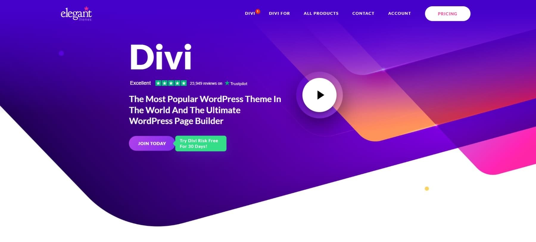
As mentioned, WordPress’ strength lies in its themes and plugins. Themes are the building blocks of your website, and Divi is one of the most versatile choices. With its user-friendly Visual Builder, you can drag and drop to design stunning web pages without needing any coding skills.
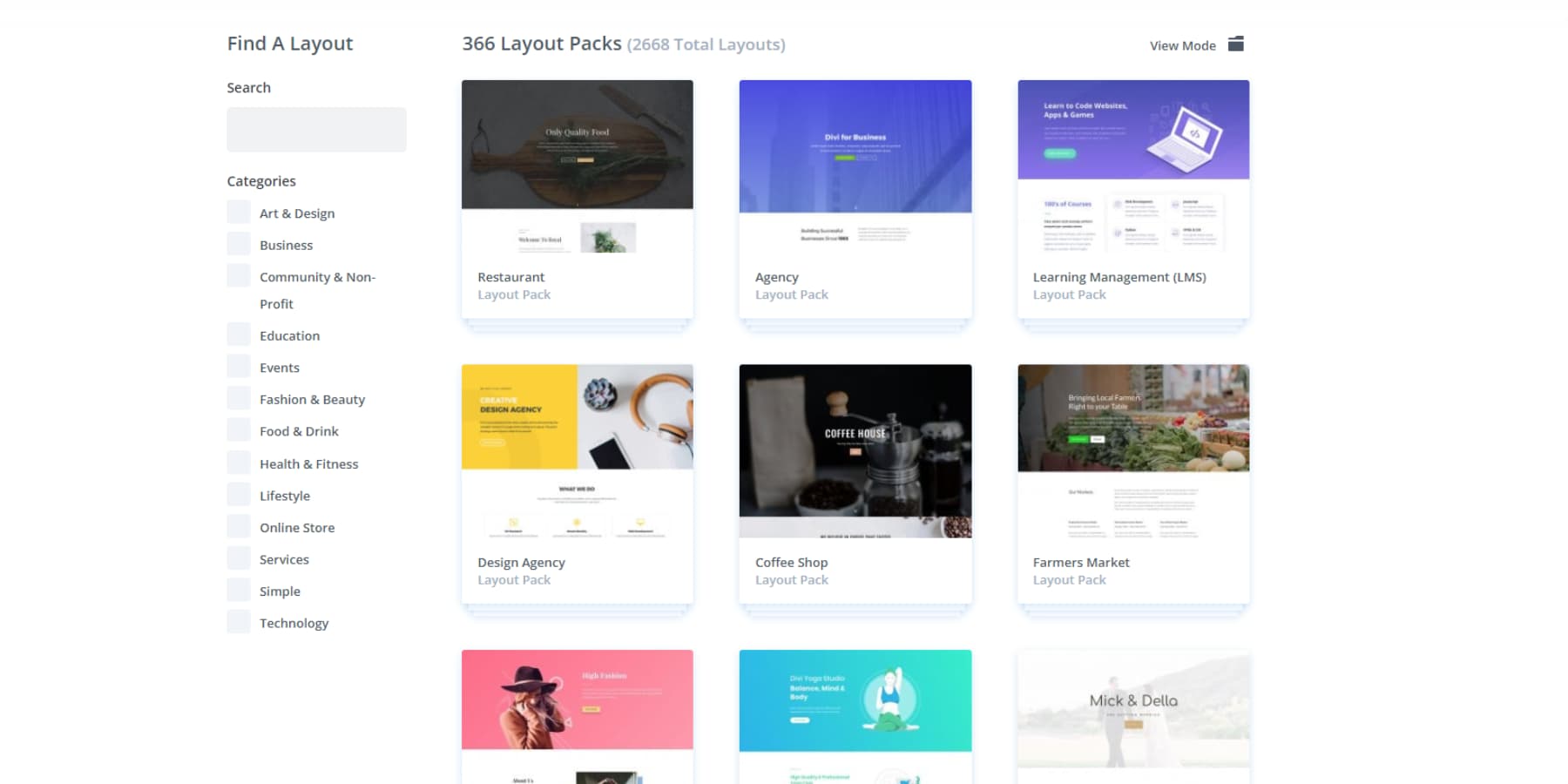
You also get access to over 200 modules, giving you endless creative options. Worried about not being creative enough? Don’t be! Divi offers over 2000 premade layouts and website packs, so you never have to start from scratch.
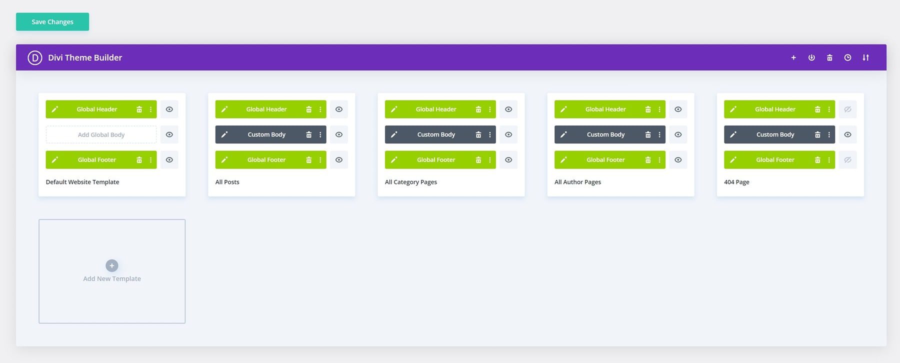
The Theme Builder feature is a game-changer. It lets you control every part of your site, from the smallest detail in headers and footers to fully customized blog post templates and archive pages.
That’s Not All…
Divi is an all-in-one solution for your website redesign. Take Divi AI, for instance. This AI-powered design assistant can write on-brand text, generate realistic images, write compatible code, and even create sections and edit images — all with a simple text prompt.
Using Divi Quick Sites, you can have your entire website created for you through its AI-powered builder. Just provide some details about your business, and Divi AI will act as your web designer, copywriter, and photographer, building a complete site in minutes. Unlike premade templates, it generates unique layouts, well-written content, and custom images suited for your business.
Divi Quick Sites handles everything—from setting up your home page and menu to installing Theme Builder templates and adding global colors. It also supports eCommerce by installing WooCommerce to customize your shop, cart, and checkout pages.
If you prefer not to use AI, you can start with one of Divi’s many premade starter sites. Our team has hand-designed these sites with unique photos and illustrations. Choose a design that fits your business, input basic information like your website title and logo, and specify your page list. Quick Sites will handle the rest. Your site will be ready in less than a minute.
Everything is set up for you, including website pages, the menu, Theme Builder templates, Theme Customizer settings, and presets. Each template has a complete design system featuring dozens of Divi Presets and global fonts and colors. When you add new modules, they match the rest of your site! Once your site is set up, jump into the builder and customize your content.
What About Hosting?
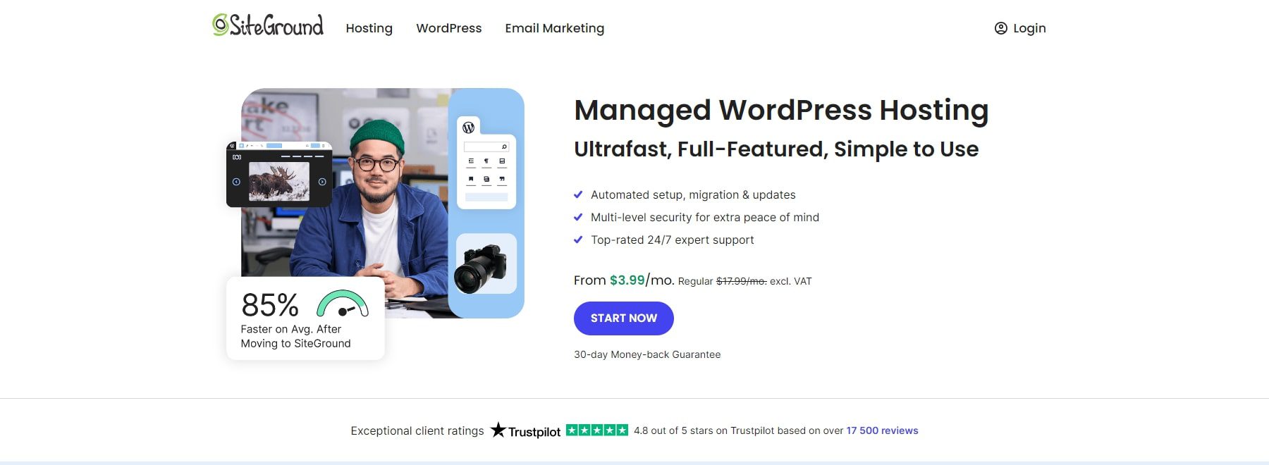
To get the most out of Divi with WordPress for your website, you need excellent hosting, as WordPress is self-hosted. Choosing a server provider, configuring an environment, and installing WordPress can be tricky, especially if you’re not tech-savvy. However, SiteGround makes it easier by preinstalling WordPress and all the necessary tools when you host your website with them.
SiteGround is one of the top WordPress hosting providers. It offers excellent uptime, fast loading speeds, and robust backup features. It also has excellent 24/7 customer support and offers many resources just for WordPress users.
With SiteGround, you can easily use Divi and launch your WordPress site quickly, with all settings ready. They offer features like a free SSL certificate, backups, specialized caching, and compatibility with popular plugins, making SiteGround a solid choice for hosting your new website and preparing it for the future.
Launch a WordPress Website with Siteground
Selection Overview
Let’s take a closer look at how this stack meets all the individual requirements. We’ll use the things to consider from the section above as our helpful guide –
- Budget: You can start with WordPress.org for free, but your main expenses will be Divi and SiteGround hosting. Divi costs $89 annually or a one-time fee of $249 for lifetime access across unlimited sites. Combining Divi with Divi AI and other features in Divi Pro can lead to even greater savings. SiteGround offers hosting starting at just $2.99 per month, making this a budget-friendly choice.
- Mobile-First Approach: WordPress and Divi are responsive from the start. You can easily create websites that work well on all devices with minimal adjustments.
- Brand Consistency: With Divi’s global settings, you gain complete control over your website’s design, including colors, fonts, spacing, and more to the last pixel of your site. You can ensure brand consistency across every element.
- Search Engine Optimization (SEO): WordPress is SEO-friendly and provides plugins like Rank Math for simple content optimization. Divi’s clean code and responsive design enhance site performance and compatibility with SEO plugins. Coupled with Siteground’s optimized hosting, these tools help create mobile-friendly websites that rank well in search engines.
- Integration With Marketing Tools: Most marketing tools integrate seamlessly with WordPress, the leading Content Management System. Divi also connects with over 75 products and services. Divi, being an open-source product, offers a variety of hooks, filters, and a comprehensive modules API. This allows you and your developers to tailor the platform and seamlessly integrate additional services.
- Scalability: WordPress allows you to create as many posts, pages, and products as you need. Divi also has no such limits, nor does it limit the number of websites you can use it for. The only constraint is your hosting plan, but with SiteGround, you can upgrade whenever necessary, making this an excellent choice for growth.
When you combine WordPress, Divi, and Siteground, you create a fantastic foundation that meets all the criteria for your next website redesign.
Plan Your Launch Strategy
Planning your website launch carefully helps everything go smoothly. Start by setting clear goals for your new site. Do you want more visitors, better sales, or an excellent look? Next, create a timeline. Decide when each part of the redesign will happen, from design to launch day.
If you have a team working, please talk with your team so everyone knows their role. This helps avoid mistakes and delays. Let your audience know about the upcoming changes. Use emails, social media, or blog posts to build excitement and inform them of what to expect.
Make sure you back up your current website with a plugin like UpdraftPlus. This way, if something goes wrong, you can restore it quickly. Also, this would keep you prepared for any issues that might come up during the launch.
Planning your launch strategy well ensures a smooth transition to your new website. This careful preparation helps your site go live without problems and keeps visitors happy.
Sketch A Outline/Wireframe
Sketching an outline or creating a wireframe is essential before diving into the design. This step helps you visualize the layout and structure of your new website. A good wireframe should include key elements like the header, navigation menu, content areas, and footer.
With Divi Quick Sites, you can even generate a wireframe of your website. Just describe your business, add a logo, and select the “use placeholder images” option. It can develop an entire wireframe for you in just a few minutes, including everything from headers to footers, pages to templates.
This outline can then serve as a roadmap for your designers and developers, ensuring everyone is on the same page.
Plan The Site’s Navigation
Good navigation makes your website easy to use. Start by looking at your current site’s menu. See what works and what doesn’t. You can also look at your analytics to determine which pages are most important and should be easy to find.
Use clear labels for your menus and links. This helps visitors find what they need without confusion. Organize your content into logical sections. Group similar pages together so users can explore your site naturally.
Add features like breadcrumbs and a search bar. Breadcrumbs show users where they are on your site, while a search bar helps them find specific information quickly. Ensure your navigation looks good on all devices, especially phones and tablets.
Maintaining consistent navigation on every page is not that hard with Divi’s Theme Builder. It lets you apply a consistent header and footer throughout your site, helping users move around without getting lost. Not sure where to get started with the Divi header? Head to our marketplace and find great headers and footers designed by professionals.
Test your menus to ensure they work well and are easy to use. By carefully planning your site’s navigation, you make it simple for visitors to find what they’re looking for. This keeps them engaged and encourages them to stay on your site longer.
Plan Engaging & SEO-Friendly Content
Your website’s content should attract visitors and rank well on search engines. Start by finding out what your audience is searching for. You may use keyword research tools like Semrush. Use simple keywords that fit naturally into your writing.
Create content that is interesting and useful. Write clear, short sentences and use headings to break up the text. Add images and videos to make your site more appealing and easily understood. This is where Divi AI can help you write fitting content in half the time and at the cost it would have instead taken otherwise.
Organize your content so visitors can find what they need quickly. Use lists and bullet points to highlight important information — link to other pages on your site and helpful external resources.
Make sure your content is updated regularly. Fresh content keeps visitors coming back and helps your site stay relevant. Check that all your information is accurate and up-to-date. Focusing on engaging and SEO-friendly content makes your website more attractive to visitors and search engines. This helps you reach more people and achieve your goals.
Test Thoroughly Across Devices
Testing your website on different devices ensures an excellent experience for everyone. Start by checking your site on computers, tablets, and smartphones. Look for any issues with how the site looks or works on each device. Luckily, you can do so inside Divi’s editor, so you won’t need to scramble around.
Try different web browsers, such as Chrome, Firefox, Safari, and Edge. Each browser might display your site differently, so ensure it works well on all of them. Check that all links, buttons, and forms work correctly. Make sure images load fast and videos play smoothly. Test the site’s speed to ensure it loads quickly for everyone. Ensure to use a caching plugin like WP Rocket for consistent performance.
Ask friends or team members to use your site and give feedback. They might find problems you didn’t notice. Use their input to make improvements before you launch. By testing thoroughly, you catch and fix problems early. This ensures your website works well for every visitor, no matter how they access it.
Gather & Act On Post-Launch Feedback
After your website goes live, listen to what your visitors say. Ask them to share their thoughts through surveys or feedback forms and consider their comments and suggestions.
Use tools like Google Analytics to see how people are using your site. Look at things like which pages are popular and where visitors leave. This data helps you understand what’s working and what needs improvement. Respond to feedback quickly. Fix any problems and make changes based on what your users want. Keep updating your site to keep it fresh and valuable.
Stay engaged with your audience through social media and emails. Let them know you value their opinions and are working to improve the site. By gathering and acting on feedback, you can keep improving your website, which helps you meet your visitors’ needs and achieve your business goals.
Revamp, Relaunch, Succeed
Revamping your website is a game-changer that can transform user experience, drive engagement, and sync your digital presence with your business vision. Spotting red flags like stale design, dwindling conversions, or brand inconsistencies signals it’s time for a refresh.
As you embark on this makeover, keep your budget in mind, prioritize mobile-friendly design, nail down your content strategy, and don’t forget SEO—these are the pillars of a successful overhaul. Enter Divi, a versatile theme that takes the headache out of creating eye-catching sites and checks all the boxes. Divi AI takes it to the next level and is a time-saver, whipping up on-brand content and unique visuals in a snap with no limits.
This, combined with the power of WordPress, will help you build a website that wows visitors and converts clicks into customers. Ready to revolutionize your online presence? Dive into Divi today and unlock your website’s full potential!
The post How To Redesign Your Website appeared first on Elegant Themes Blog.
