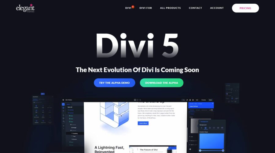
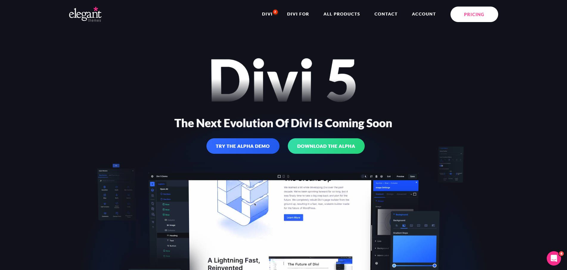
With the introduction of Divi 5 Public Alpha, the Divi theme has undergone a significant transformation. While Divi 4 has a strong foundation, it faced challenges with performance, technical debt, and an outdated structure. Divi 5 addresses these limitations with a complete overhaul as web standards evolve, offering substantial improvements in performance, flexibility, and user experience.
Divi 5’s new framework improves the Visual Builder’s speed and performance, making it more scalable and future-proof. Built to stand the test of time, Divi 5 offers long-term viability and ensures that your websites can easily adapt to future developments in WordPress. Whether you’re a freelancer, web agency, or small business owner, Divi 5 provides a faster, more powerful platform that makes building websites easier and quicker than ever before.
Learn more about the Divi 5 Public Alpha and how to download it.
Why The Transition To Divi 5 Is Important
The release of Divi 5 Public Alpha marks a crucial moment in the evolution of the Divi theme. As web tech continues to advance, the need for a more flexible, scalable, and high-performing theme has grown significantly. Divi 4 laid a strong foundation for millions of websites but was beginning to show signs of technical limitations, such as slower performance and code complexity due to years of feature additions.
Divi 5 is not just an upgrade – it’s a complete rewrite of the theme’s framework. By building Divi 5 from the ground up, the team at Elegant Themes have delivered a solution that addresses past limitations while positioning Divi for future advancements. This overhaul means faster loading times, smoother editing experiences, and a platform that is set up for the future.
If you’ve built websites with Divi 4, transitioning to Divi 5 will unlock new possibilities and a streamlined new interface. While in the Public Alpha phase, we encourage you to download Divi 5, take it for a spin, and let us know your thoughts. During this phase, not every feature is available, but you’ll get a good idea of what’s to come with Divi.
10 Main Differences Between Divi 4 & Divi 5
Divi 5 introduces significant changes that enhance performance, scalability, and the overall web design experience. Let’s dive into the most critical differences that set Divi 5 apart from its predecessor, Divi 4.
1. Core Architecture Rewrite
Divi 4
Over time, Divi 4’s architecture grew and adapted as new features were added. Although this allowed many new features to be added, it also led to a more complex codebase. As Divi 4’s framework expanded, its original structure became weighed down by technical debt – old, inefficient code that had to be maintained for backward compatibility. This complex setup sometimes resulted in slower performance, especially within the Visual Builder. Shortcode processing (more on that in a bit) added another layer, causing delays in rendering content and longer page load times.
Challenges
- Feature-by-feature development, leading to technical debt
- Slower performance as the Builder and front-end had to process shortcodes and load large amounts of unnecessary code
- Increased code complexity due to the evolving codebase
Divi 5
With the release of Divi 5 Public Alpha, the entire framework has been rewritten from the ground up. Instead of patching old code, Divi has been rebuilt with a modern, modular framework. Each module (text, image gallery, etc.) now functions independently, meaning only the necessary components are loaded when you work in the Visual Builder or render a web page. By incorporating this modular approach, speed and efficiency are improved, making adding features in the future easier without slowing down the system. Divi 5’s cleaner codebase not only ensures better performance now but also provides a scalable foundation for development in the future.
Benefits
- A much faster and more responsive Visual Builder experience
- Cleaner, more maintainable code
- Streamlined front-end performance with faster page load times
- Greater scalability and flexibility for future updates and features
Divi 5’s rebuilt core is at the heart of its performance improvements, allowing users to work more efficiently while ensuring websites built with Divi are solid and future-proof.
2. No More Shortcodes
Divi 4
In Divi 4, shortcodes were the backbone of the system, responsible for representing each module and its settings. When you add a module to the page, Divi generates an associated shortcode, which WordPress later interprets and converts into content. For example, when disabling the Divi theme, the backend of your web page would have a series of shortcodes that contained the content of the page:
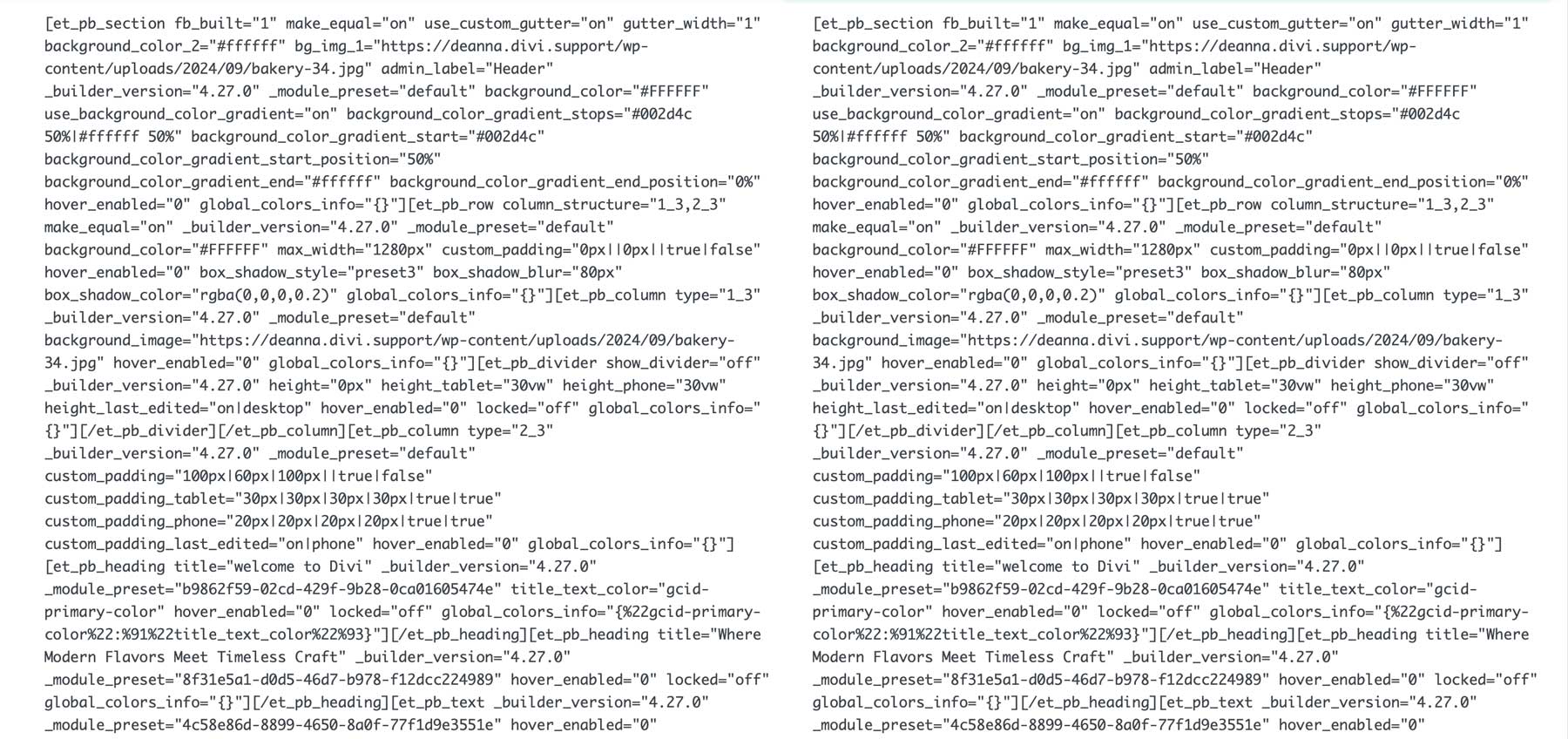
Although this method was generally effective, it added significant overhead during page rendering. The more content you add, the more shortcodes are created, slowing down the web page loading and displaying process.
Challenges
- Shortcode parsing added extra steps to content processing, increasing page load times.
- As the page size grew, so did the number of shortcodes, which could impact performance.
- If there was a conflict or issue with the shortcodes, it could break the page’s layout.
- Disabling the Divi theme left a mess, making it difficult to decipher the page’s content
Divi 5
Divi 5 completely eliminates shortcodes, moving to a more modular framework. This means that instead of generating and parsing shortcodes, Divi 5 works directly with the components on the page, loading them only when needed. This boosts performance and aligns Divi with the future of WordPress and its block editor. Divi 5 increases current performance by making this transition and ensures compatibility with future WordPress releases.
Benefits
- Faster page rendering since there’s no need to process shortcodes.
- More stable and reliable content, reducing the chances of layout issues or content breaking.
- Future-proof compatibility with WordPress updates and its block-based ecosystem.
By removing shortcodes, Divi 5 delivers a faster and more stable platform, improving the building experience and page speed on the front end.
3. Enhanced Performance & Speed In The Visual Builder
Divi 4
As we’ve already shown, the accumulation of technical debt and the use of shortcodes affected the Visual Builder’s speed and the front-end performance of Divi websites. In addition to that, the way Divi 4 managed CSS and JavaScript further slowed down these interactions. As a result, the Visual Builder could become sluggish, especially on larger, more complex websites.
Each change in the Builder required reprocessing of shortcodes and additional resources to load and render the page. This also applied to the front end, where larger CSS and JavaScript files and shortcode-heavy content caused longer page load times, negatively affecting user experience and SEO.
Challenges
- A more sluggish Visual Builder, especially with larger websites.
- Longer page load times due to heavy CSS and JavaScript files.
- Processing shortcodes required extra steps, reducing overall performance.
Divi 5
Divi 5’s rebuilt structure places speed and performance at the forefront. The new framework loads components as needed rather than reloading the entire page. Additionally, the size of CSS and JavaScript files has been drastically reduced by stripping away unused styles and scripts, aiding in reducing page load times. When making changes in Divi 5’s Visual Builder, elements are only re-rendered specific to the section you’re working on, providing a faster, more responsive experience.
Benefits:
- Reduced lag and quicker interactions when adding modules or making design changes.
- Leaner CSS and JavaScript files lead to faster load times on the front end, especially for complex websites.
- Enhanced user experience, reduced bounce rate, and boosted SEO rankings.
With these performance enhancements, Divi 5 offers a significant leap over Divi 4 regarding page load speed and the web page-building experience.
4. One-Click Editing
Divi 4
In Divi 4, making changes to a module required navigating through icons and options within the module’s settings. While this method worked, it often slowed down the design process, as users had to locate the settings icon and toggle through different settings tabs to make adjustments. This extra step added time, especially when working quickly or making multiple edits across various modules.
Challenges
- Clicking on small icons within modules to access settings took extra time.
- Slower editing process, particularly when making frequent changes across multiple modules.
- A less intuitive interface for new or less experienced users.
Divi 5
With Divi 5, the editing process is completely restructured with the introduction of one-click editing. Instead of hunting small icons or navigating through multiple tabs to make changes, users can click anywhere directly on the module they want to edit. From there, the module’s settings are revealed instantaneously, making the entire process more intuitive. Whether revising text, adding images, or tweaking colors, one-click editing allows faster changes and a more intuitive workflow.
Benefits
- Instant access to module settings with a single click.
- A more intuitive interface suitable for beginners and seasoned developers alike.
- Enhanced productivity because of the time spent making design edits.
With one-click editing, Divi 5 delivers a more user-friendly Visual Builder experience, allowing users to build Divi websites faster than ever before.
5. Extendability For Developers
Divi 4
In Divi 4, third-party developers had limited access to Divi’s API, which made customizations and integrations more challenging. While creating custom modules or adding functionality was possible, developers had to work around the existing framework. This limited what developers could do with Divi, making implementing advanced custom modules or seamless integrations with third-party plugins and tools harder.
Challenges
- Limited API access constrained what developers could build or customize.
- More complex workarounds were often needed to create custom modules or functionality.
- Fewer opportunities for deep integrations with third-party tools or external systems.
Divi 5
Divi’s newest release dramatically improves the platform’s extendability thanks to a more flexible and robust API. Third-party developers can access the same tools and resources the Divi development team uses, allowing for much deeper customization and more sophisticated integrations. This open approach will enable developers to create custom modules, features, and integrations that work within the Divi ecosystem. Whether adding new functionality, integrating with third-party systems, or building custom workflows, Divi 5’s developer-friendly framework makes it easier to customize Divi to suit your needs.
Benefits
- Divi 5 provides greater flexibility to build more complex solutions.
- A streamlined approach to third-party integrations allows for smoother connectivity with external tools and services.
- Access to the same developer tools as the Divi team encourages innovation and the creation of mower plugins and features.
Divi 5’s enhanced extendability opens up a world of possibilities for developers, making it a more versatile and adaptable platform for developers.
6. Responsive Design Tools
Divi 4
Creating responsive designs in Divi 4 required multiple steps to fine-tune designs for smaller screens. If you wanted to fine-tune your layout for mobile devices, you had to dig through various settings and tabs. While this process was functional, it added extra steps to your workflow, making responsive editing slower and less intuitive.
Challenges
- Extra steps are needed to access responsive editing options.
- Adjusting hover and sticky states involved navigating through multiple settings.
- Slower workflow for making responsive adjustments across different screen sizes.
Divi 5
In Divi 5, you’ll get a more streamlined responsive editing process by making tools more accessible and intuitive. Responsive design options and hover and sticky states are not directly integrated into the settings panel, wiping out the extra steps needed in Divi 4. Users can quickly swap between different device views (desktop, tablet, and mobile) and make real-time adjustments across multiple modules simultaneously. Whether you’re adjusting padding and margin, adjusting font sizes, or adding hovers to buttons, Divi 5 provides a faster, more efficient way to design responsively.
Benefits
- Responsive editing tools are more accessible within the main settings panel.
- It’s easier to access device-specific settings for quicker design changes.
- An easier way to manage hover and sticky settings.
7. Panel Docking & Management
Divi 4
In Divi 4, users had to move modals around to avoid blocking the design view. This resulted in an obstructed view of a module’s design settings and the layers panel, making it difficult to multitask or quickly navigate through different modules or design elements. This also led to more clutter, especially when working on complex designs that required constant adjustments across multiple settings.
Challenges
- Users could only edit one panel at a time, limiting multitasking.
- Frequently moving and repositioning the settings modal slowed the workflow.
- Increased screen clutter as users manually navigated through different settings.
Divi 5
Divi 5 introduces multi-panel docking, significantly improving the overall user experience. This system lets users open several panels simultaneously and easily tab between them. This makes it much easier to multitask, as users can switch between module settings, layers, page settings, and more without closing or reopening panels. With Divi 5, you can customize the workspace to work best for your design style while reducing clutter.
Benefits
- Users can keep multiple panels open for easy access and quicker editing.
- Switch between panels and drag them into tabbed sections, enhancing productivity and speeding up the design process.
- The docked panel system negates the need to constantly move panels, creating a cleaner, clutter-free workspace.
With Divi 5’s multi-panel docking, users can manage settings more efficiently, allowing faster design iterations and a smoother, more intuitive editing experience.
8. Breadcrumbs For Easy Navigation
Divi 4
In Divi 4, there was no built-in breadcrumb navigation to help users keep track of where they were working within a layout. The lack of quick navigation made it harder to move between sections, especially when working on large, complex layouts. As a result, users had to manually scroll, open wireframe view, or utilize the layers panel to find specific elements, slowing down the design process.
Challenges
- No breadcrumb navigation meant slower navigation through page structures.
- Users had to rely on manual scrolling or switching views to find and edit sections.
- Less efficient workflow when managing complex layouts with multiple layers.
Divi 5
Divi 5 introduces breadcrumb navigation, making moving through complicated page structures much easier. This new feature displays a clear path of the current section, row, and module hierarchy, allowing users to quickly jump between different elements within the design. Whether editing nested modules or switching between sections, breadcrumbs improve the overall user experience by providing a clearer overview of your location within the page.
Benefits
- Users can quickly move between sections, rows, and modules with a single click.
- Breadcrumbs reduce the need for manual scrolling or opening different views, speeding up the design process.
- A clearer, more organized approach to navigating complex layouts, making page editing more intuitive.
With breadcrumb navigation in Divi 5, users can navigate their page layouts more efficiently, improving the speed and ease of working on larger, more intricate designs.
9. Light & Dark Mode
Divi 4
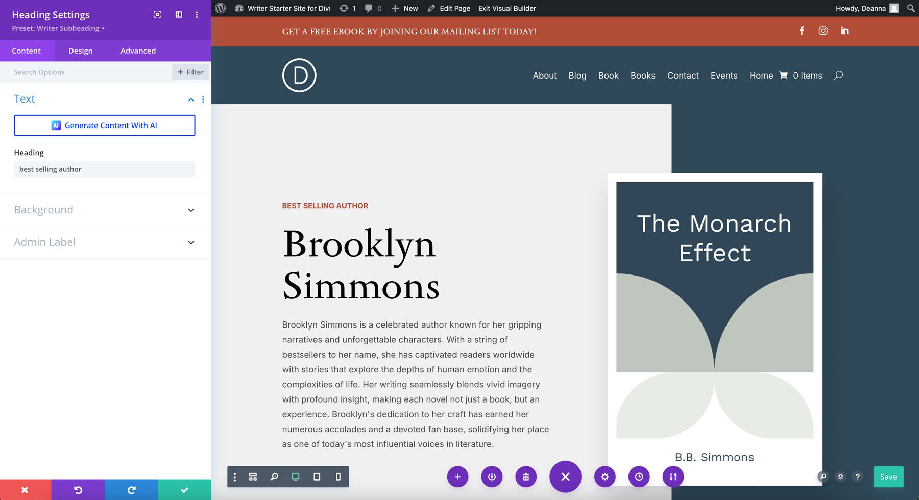
Divi 4 did not include a dark mode option, limiting its interface to a default light mode. While functional, this interface made it less adaptable for users who preferred working in low-light environments or those who favored dark mode for reduced eye strain during extended design sessions. The absence of a dark mode made Divi feel less customizable in its UI than more modern software tools offering light and dark mode options.
Challenges
- No dark mode, limiting user interface adaptability.
- Increased eye strain for users working in low-light conditions.
- A less flexible UI experience overall, particularly for those who prefer dark themes.
Divi 5
Divi 5 introduces light and dark mode options, providing users with greater flexibility and control over their working environment. Users can now toggle between light and dark modes based on personal preference or environmental lighting, ensuring a more comfortable and customizable design experience. Whether working during the day or late at night, the new dark mode option helps reduce eye strain and enhances usability, making Divi 5 more adaptable to different user needs.
Benefits
- Light and dark modes allow users to customize their work environment to fit different preferences.
- Dark mode helps reduce eye strain, especially during long editing sessions in low-light environments.
- A more modern, adaptable user experience in various working conditions.
10. Preset Management
Divi 4
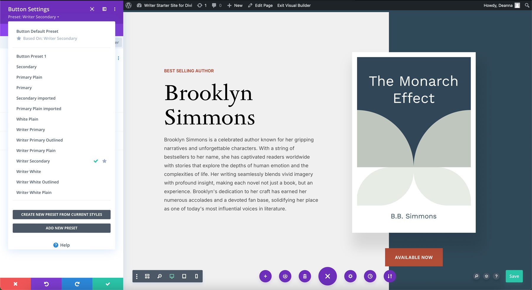
In Divi 4, managing presets was a manual process. When applying presets or making adjustments, users often experienced delays due to Divi’s framework, which required the system to reload and process changes. This not only made editing presets slower but also affected the overall efficiency of the workflow, especially when managing multiple elements with consistent styles across a page or entire website.
Challenges
- Slower responsive times when editing or applying presets.
- More manual effort is needed to apply presets across multiple modules.
- Less efficient workflow, especially when working on large projects.
Divi 5
Divi 5 introduces a faster, more efficient preset management system with the help of a new class-based structure. This system allows users to create and manage presets more quickly, applying consistent styles across modules with a few clicks. Built-in presets and reusable classes make the design process easier by enabling global changes and reducing the need for repetitive edits. This new, class-based system ensures that any updates to a preset are applied instantly across all elements, saving time and providing a more cohesive design experience.

Benefits
- The class-based system allows quicker application and updates to presets across multiple modules.
- Ready-made presets to speed up the design process..
- Designers can maintain website consistency with a few clicks.
With Divi 5’s enhanced preset management system, users benefit from faster editing, improved design consistency, and an improved workflow, making it easier to implement and maintain cohesive styles across your website.
Divi 5 Helps Design & Build Websites Faster
Divi 5 is more than just an incremental update – it represents a complete platform transformation. By addressing Divi 4’s shortcomings and eliminating issues like technical debt and a short code-based structure, Divi 5 is designed to deliver a faster, more responsive experience for designers and developers. With a modular framework more akin to WordPress’ block-based Gutenberg editor, the framework is far more scalable and adaptable to future changes with WordPress.
The post 10 Main Differences Between Divi 4 & Divi 5 (Public Alpha) appeared first on Elegant Themes Blog.
