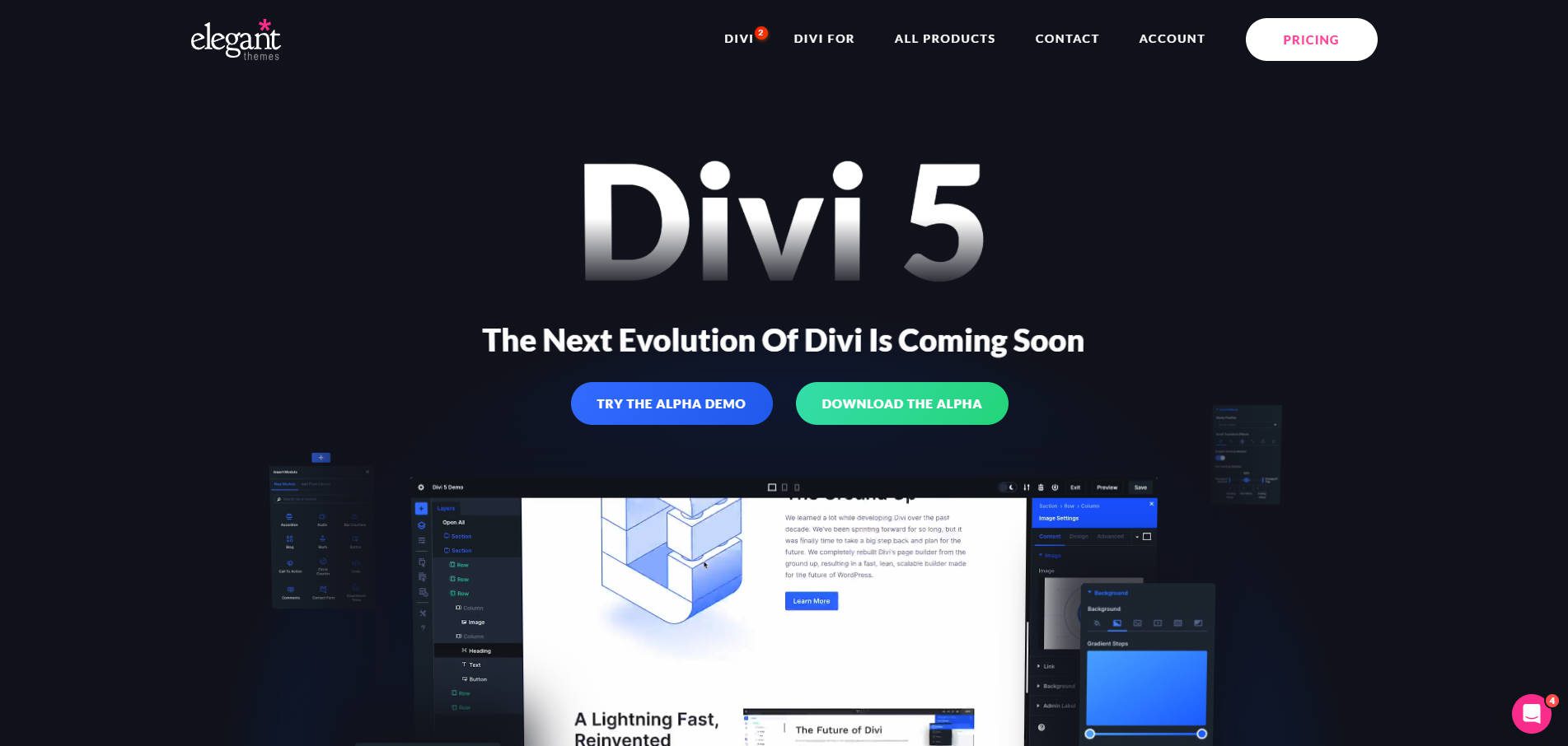
Divi 5 has been reimagined from the ground up, offering unparalleled speed, performance, and ease of use. With a streamlined Visual Builder and a completely overhauled back end, building websites with Divi 5 is faster and more intuitive than ever. Whether you are a seasoned web designer or a beginner, Divi 5 will help you create stunning sites in record time without sacrificing time or creativity.
In this Divi 5 Public Alpha phase, we invite you to explore the new interface. Keep in mind that this version is still under active development. While you might encounter a few bugs, the tips outlined below will help you maximize your efficiency as you test and build with Divi 5.
Learn more about the Divi 5 Public Alpha and how to download it.
10 Tips For Building Websites Faster With Divi 5 (Public Alpha)
With the release of Divi 5 Public Alpha, there are lots of changes and improvements under the hood.
1. Utilize One-Click Editing
In Divi 4, you have to click the settings icon to change sections, rows, and modules. Now, in Divi 5, that’s all gone, thanks to one-click editing. You can click anywhere within the module to edit it, making the design process less frustrating and much faster.
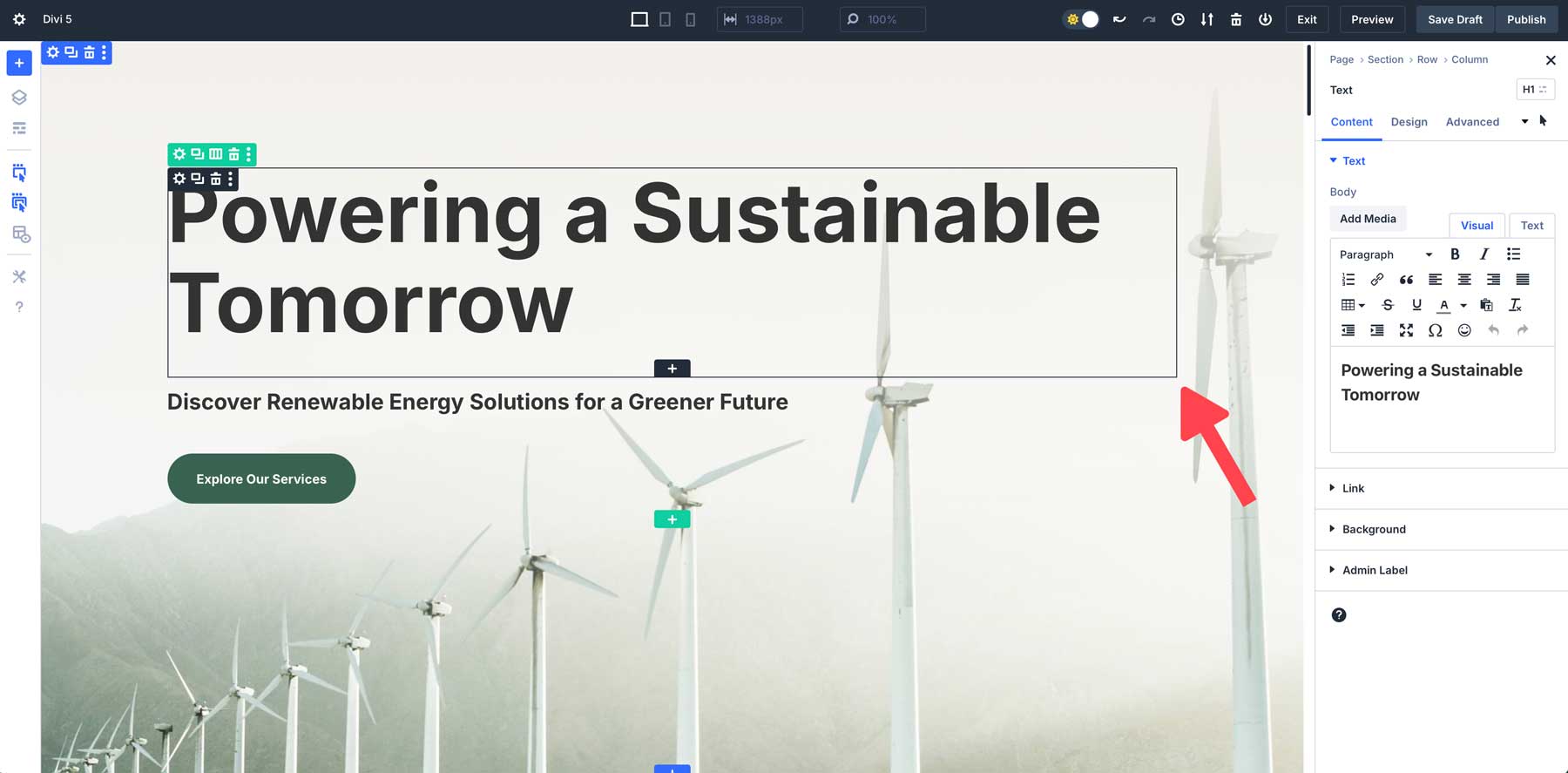
For example, to modify a text module, simply click once anywhere within the module to access its settings instantly.
2. Right-Click For Quick Actions
Divi 5’s right-click context menu adds a powerful new shortcut to your design workflow. By right-clicking on any module, section, or row, you can access a quick action menu of some common actions. Whether you want to copy module styles, duplicate settings, or delete them, this feature lets you perform tasks quickly without opening multiple panels or searching through settings.
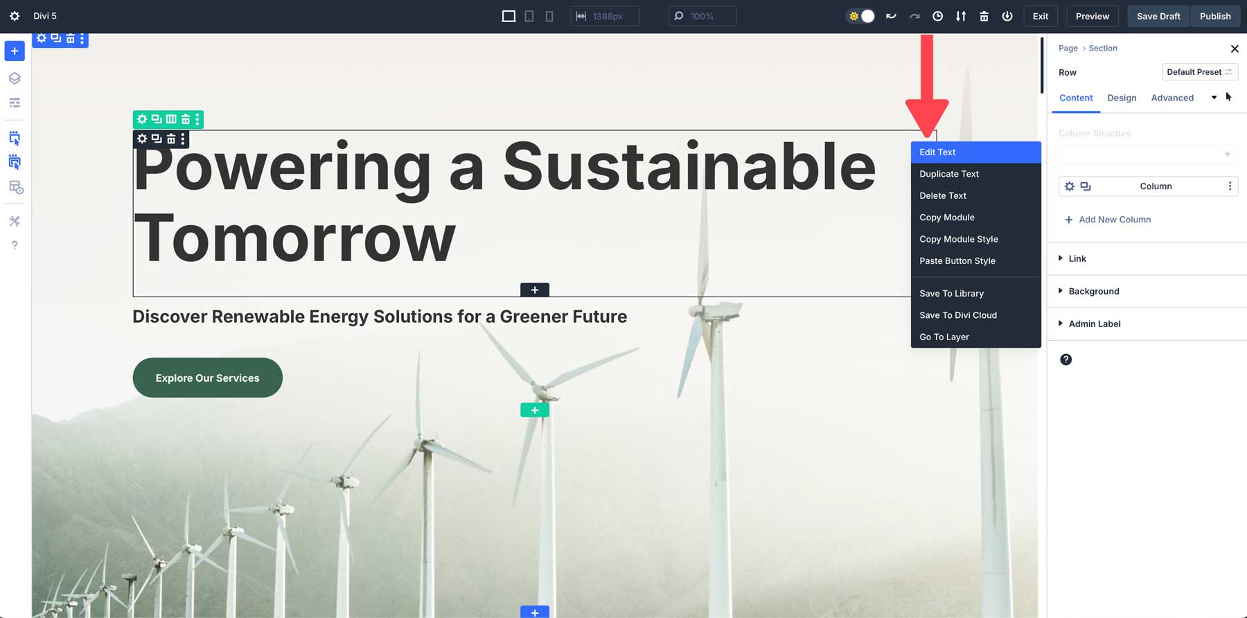
For example, let’s say you’ve designed a button with custom styling. Using the quick actions menu, you can right-click, copy the style of the button, and apply it to every button module you wish to have the same styles on.
3. Dock Multiple Tabbed Panels for Multi-Tasking
Another great new feature of Divi 5 is multi-panel docking, which allows you to open and manage multiple panels at once. In previous versions, you could view more than one panel (layers + module settings, for example), but you could only move them around the canvas so they didn’t block your view. In Divi 5, you can tab panels to keep the canvas clutter-free.
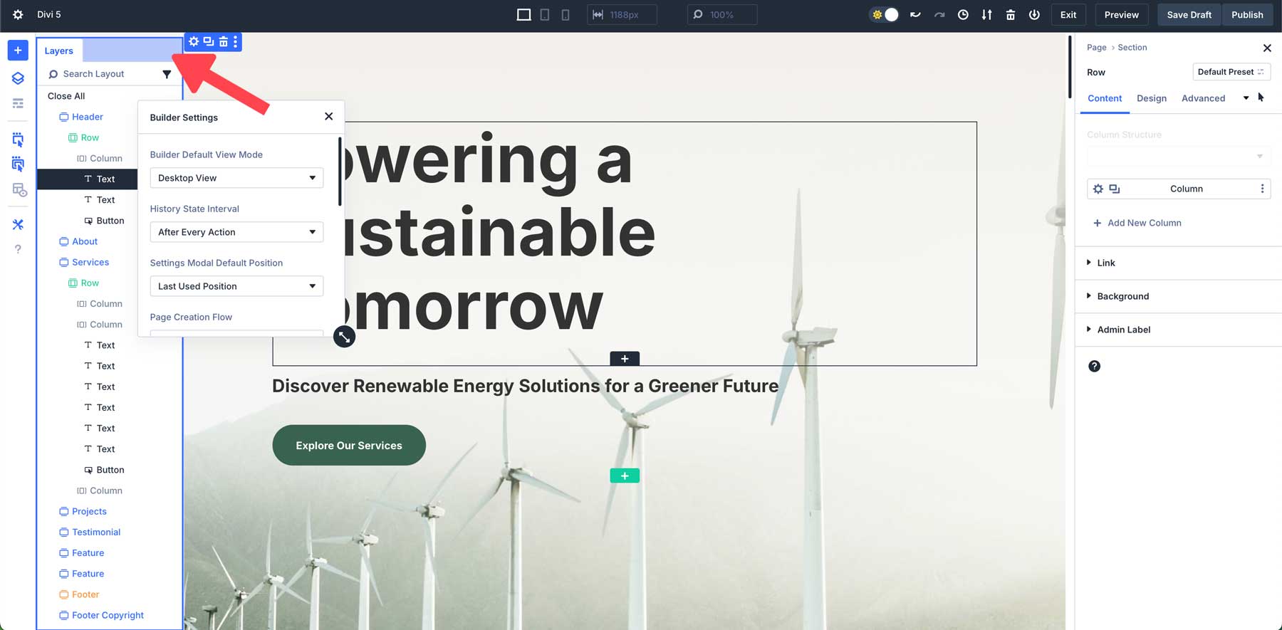
Being able to doc multiple panels side by side makes it easy to adjust different parts of your design simultaneously. Divi 5’s interface lets you move panels around the canvas as you wish, allowing you to create the perfect workspace for your needs. For example, suppose you prefer to have all panels on the left of the canvas. In that case, you can easily detach and move panels to the left, then tab other panels to build a workspace that works for you.
4. Take Advantage Of Canvas Scaling For Responsive Design
Divi 5 introduces a brand new way of designing web pages responsively. With canvas scaling, you can easily scale your workspace and preview how your website will look on various devices without leaving the Visual Builder. Canvas scaling allows you to instantly resize the design canvas, letting you adjust margins, padding, and the overall layout.
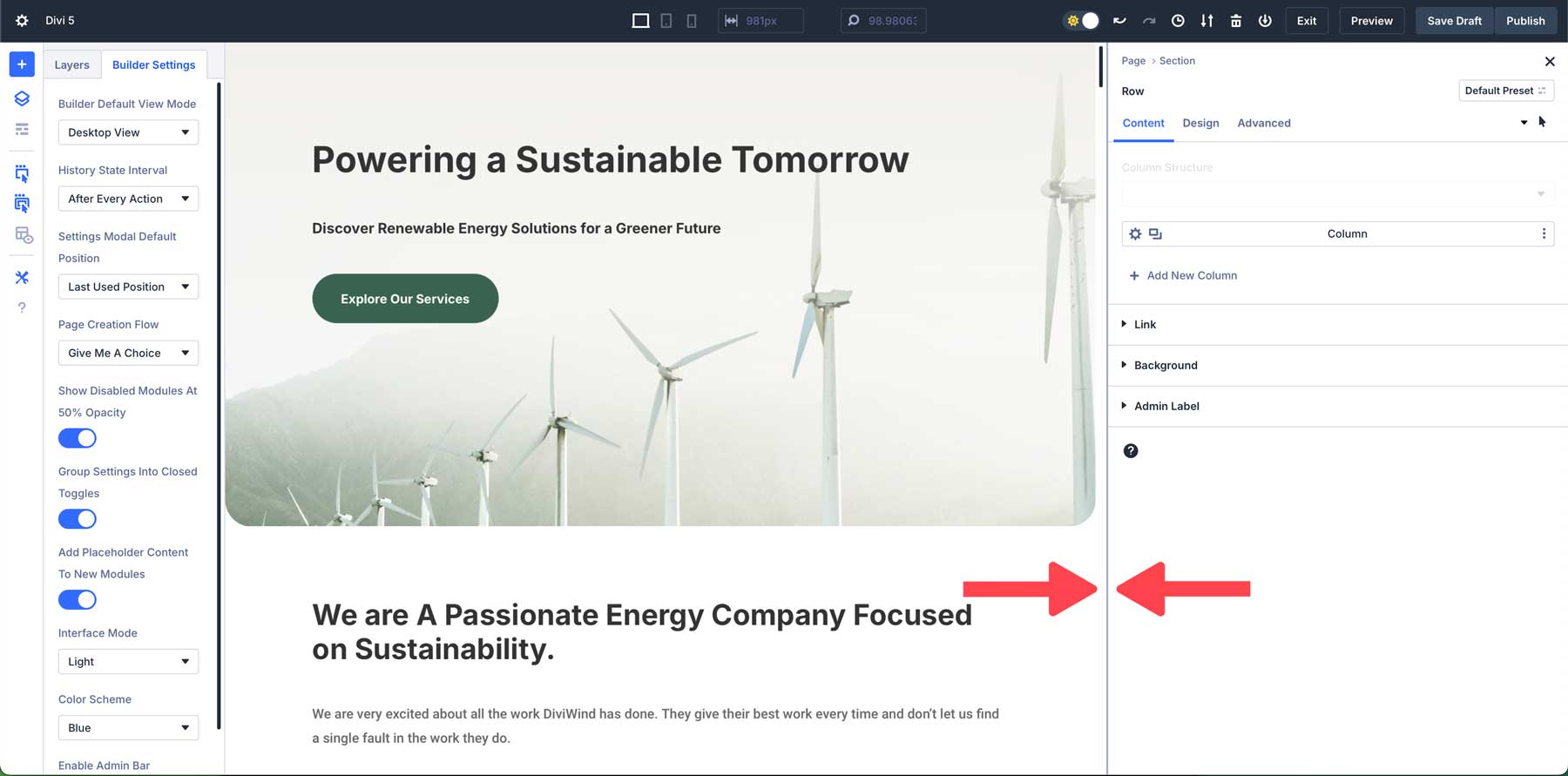
For example, imagine you’re working on a mobile layout and want to adjust the space between sections. With canvas scaling, simply click and drag the edge of the canvas to your chosen size. You can easily fine-tune padding and margins from there to ensure your design looks sharp on smaller screens.
5. Instantly Apply Hover & Sticky Effects
Divi 5 makes adding hover and sticky effects to your designs easier than ever. In previous versions of Divi, users had to navigate to the design tab of a module and dig down into the settings to apply hover or sticky effects. In Divi 5, however, you can apply these effects directly from the settings panel. This new approach makes it easier than ever to create dynamic, engaging designs without interrupting your workflow.
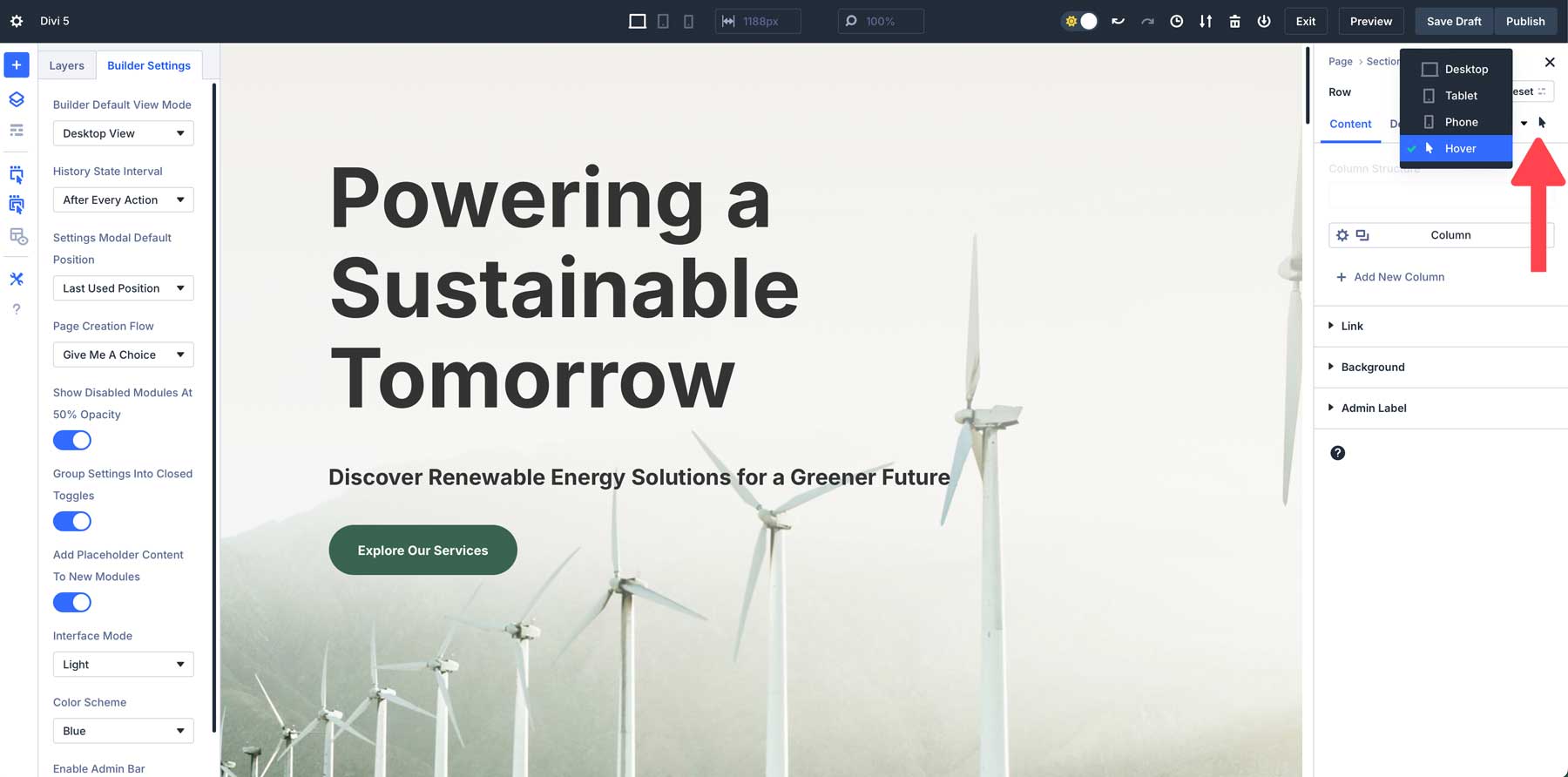
Whether you want to add hover effects to buttons or keep your header fixed at the top of the screen while users scroll, Divi 5 makes the process simple and fast. For example, let’s say you’re designing a CTA and want to add a different color on hover. Simply select the hover state from a dropdown menu within the settings and apply changes in seconds.
6. Use Breadcrumbs For Efficient Navigation
Divi 5 has a new breadcrumb feature that allows users to navigate modules and settings faster and more intuitively. Breadcrumbs act as a visual path that shows you exactly where you are in the settings, allowing you to move between different layouts without getting lost.
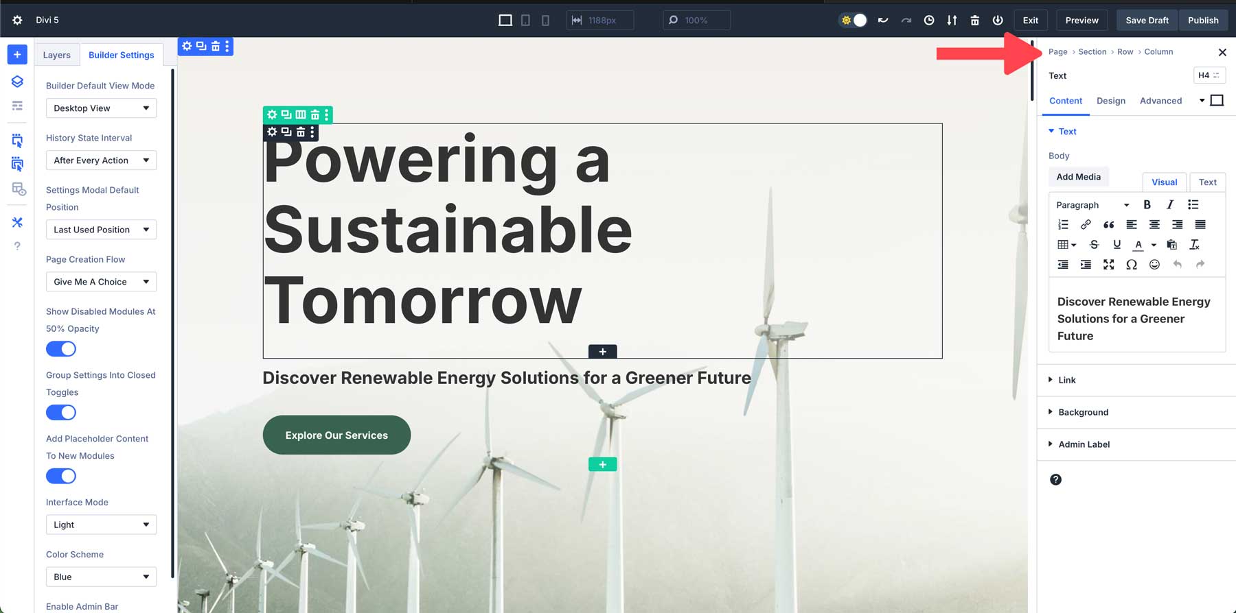
When working within a section, there’s no need to backtrack through menus or lose your place. Each breadcrumb provides a clickable link that lets you easily jump to a previous setting, speeding up the design process.
7. Save Time By Copying & Pasting Styles Between Modules
In Divi 5, you can easily copy and paste module styles between different elements. This allows you to quickly apply the same design settings across multiple modules, ensuring consistency throughout your site while saving time. You can easily copy styles from any module, row, or section within Divi 5 and then paste those styles throughout your design.
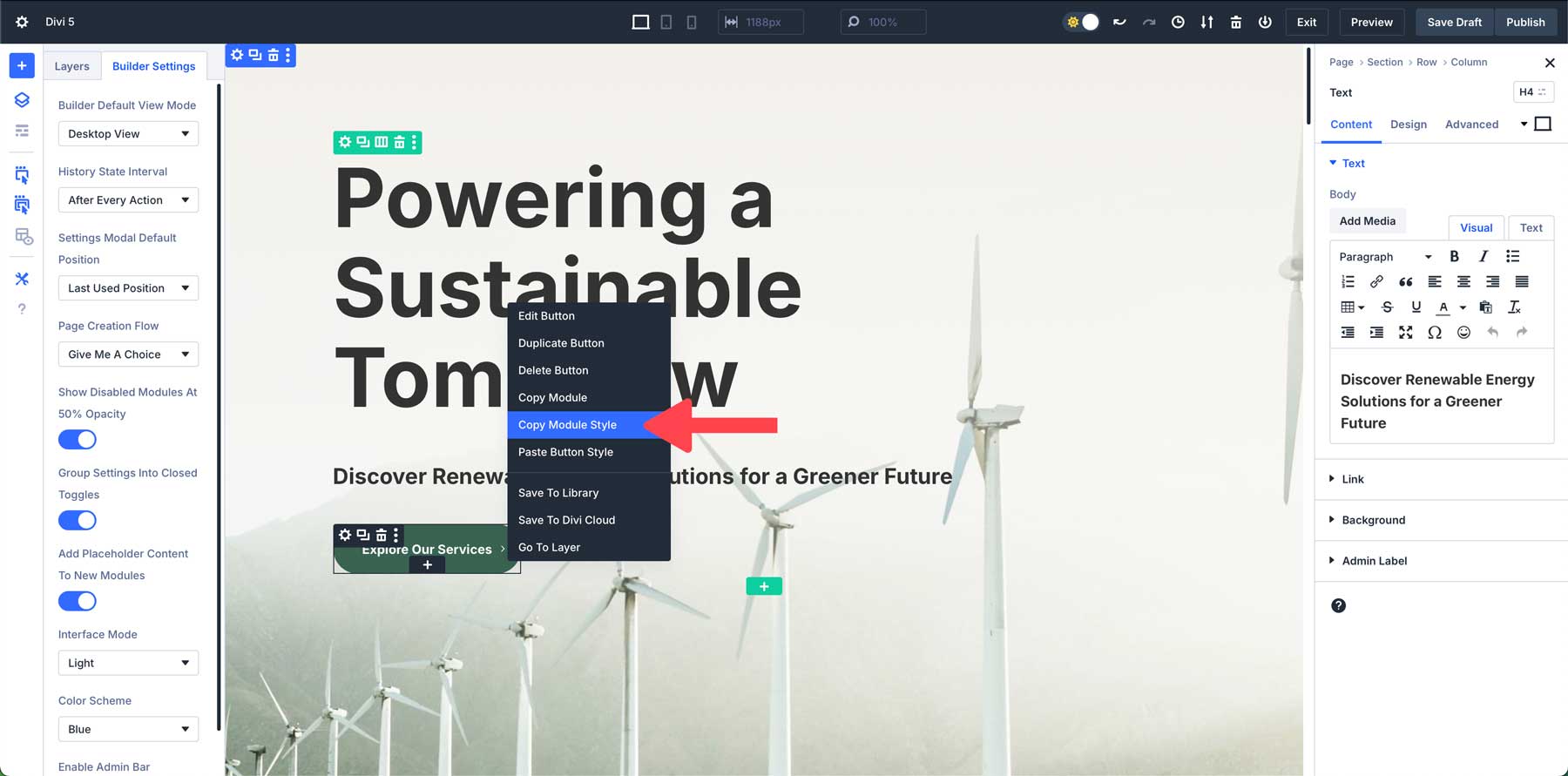
For example, let’s say you have several buttons on a web page that you’d like to have the same style. To apply the style, right-click to activate the Quick Actions Menu, copy the style, and then right-click to paste it on all the web page’s buttons.
8. Utilize Wireframe View For Complex Layouts
Divi 5’s wireframe view strips away a page’s visual design elements, leaving behind a clean, simplified outline of your layout. This view lets you focus solely on the structure without being distracted by colors, fonts, or other visual details. It’s especially useful for complex layouts where you need to quickly adjust the structure.
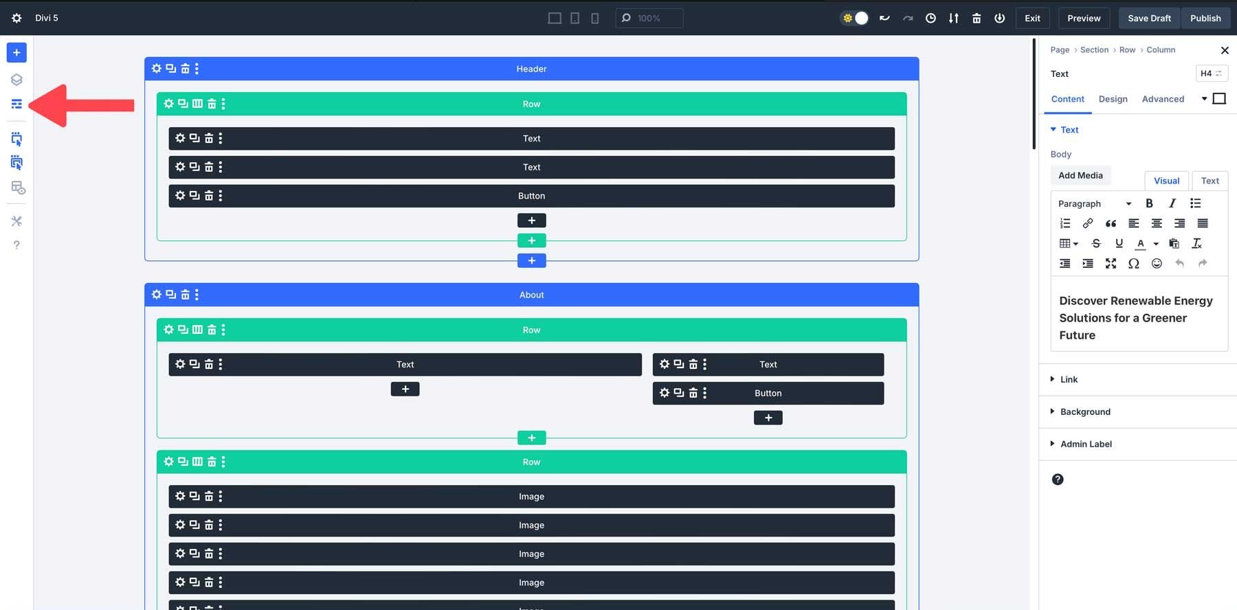
This stripped-down version helps you focus on organizing sections, rows, and modules. When working on a complex layout, the wireframe view makes it easier to manage the structure without worrying about the aesthetic elements.
9. Use The Layers View For Long-Form Content
The Layers View outlines your page’s sections, rows, and modules. This makes it easier to see the entire structure of your layout at a glance. Instead of scrolling through the Visual Builder to find a specific section or module, you can quickly locate it in the Layers panel.
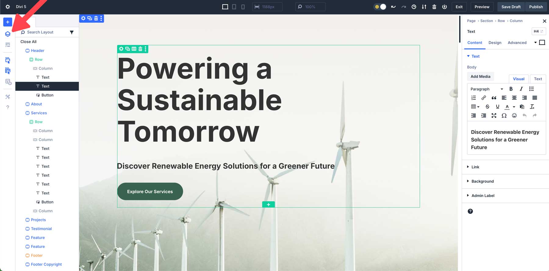
In the Layers View, you can directly select and edit any element within the layout without clicking on it visually within the Builder. This is particularly helpful for elements hidden or nested deep within other modules, such as rows inside multiple layers of sections.
10. Embrace The Learning Curve
Divi 5 introduces an entirely new way to work with the Visual Builder. With all of these powerful updates comes a learning curve. It’s natural to feel a bit overwhelmed initially, especially if you’re comfortable with previous versions of Divi. The good news is that all of the changes we’ve introduced to the Builder are intuitive, so familiarizing yourself with the interface will pay off in a faster, more efficient way to build websites with Divi.
Explore New Workflows
Divi 5’s interface is designed to enhance your productivity, but we understand there are a few things you’ll need to get used to. Take the time to experiment with the new interface. Try docking multiple panels to create a workspace that best suits your needs, or right-click shortcuts to save time when applying styles or duplicating modules.
Revisit Previous Designs
Another great way to learn Divi 5’s new interface is by revisiting your existing designs. Create a staging site of an existing project and use the Divi 5 Migrator to migrate the content to the Divi 5 Public Alpha. Use the layers panel or wireframe view to see how Divi 5’s new structure and tools can help you find that the new interface allows you to fine-tune your designs in ways you couldn’t before.
Take It One Step At A Time
Remember, you don’t have to master every new feature at once. Start by focusing on one or two things, such as canvas scaling for responsive design or the new hover and sticky effects tools. As you get more comfortable with Divi 5, you’ll naturally incorporate more features into your design process.
Be Patient & Experiment
Divi 5 is designed to be more user-friendly, but take your time with the process. Take your time to test different settings, play around with the new interface, and refine your techniques. Each new feature you master will make your workflow smoother and more efficient.
If You Encounter A Problem, Let Us Know
It’s also important to understand that the latest release is only an alpha version. There are bound to be bugs, so we encourage our users to report anything they may find that doesn’t work as intended. After all, we need your help to make Divi 5 the best it can be. Your feedback is critical to its success and will go a long way in molding the final product.
Start Building Websites With Divi 5 Today!
Divi 5 represents a significant leap forward in website-building technology. With its more intuitive Visual Builder, enhanced back end, and innovative features, creating websites with Divi 5 is now faster and more intuitive than ever. With the Divi 5 Public Alpha now available, we encourage you to explore these exciting new capabilities and contribute to its development. By embracing its minimal learning curve and experimenting with the latest tools, you’ll unlock the full potential of Divi 5 and experience a better way to build websites with Divi.
The post 10 Tips For Building Websites Faster With Divi 5 (Public Alpha) appeared first on Elegant Themes Blog.
