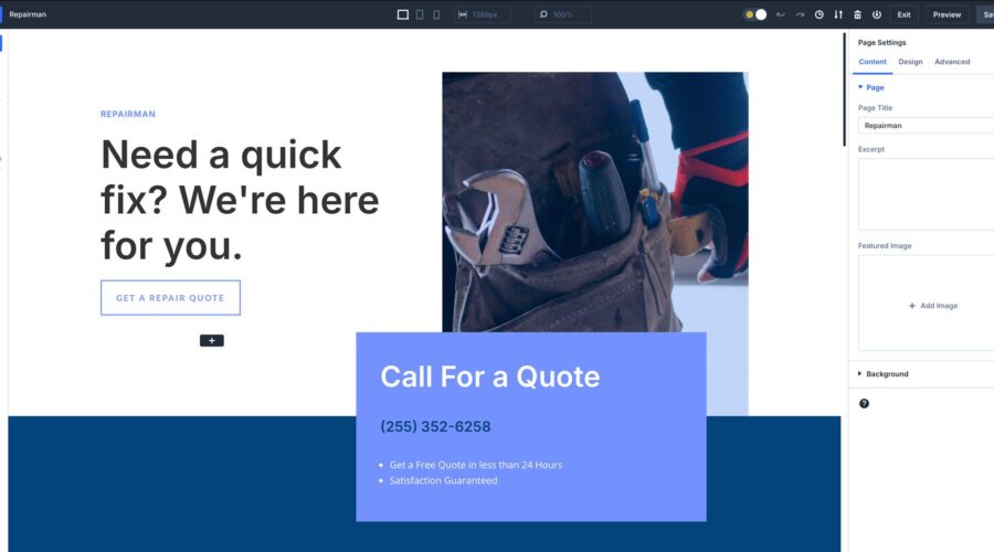
With the release of Divi 5 Public Alpha, users can start to see what we at Elegant Themes have been working on behind the scenes. Divi 5, a major foundational update, has been redesigned to be faster, more stable, and highly scalable to keep up with the future of WordPress.
One of Divi 5’s most exciting new aspects is its redesigned Visual Builder interface, which is more user-friendly and faster. Whether you’re a seasoned Divi user or new to the platform, the quicker, more intuitive Visual Builder will help you create websites in fewer steps with faster load times.
Learn more about the Divi 5 Public Alpha and how to download it.
What’s New In Divi 5’s Interface?
The new Visual Builder experience has undergone a complete overhaul. It provides more workspace, fewer animations, and a fully customizable workspace. Every panel can be moved to be free-floating, docked on the left or right, or tabbed to place your most used settings within reach. But aside from that, there are a ton of features that will help you be more productive, too.
1. One-Click Editing In Divi 5
In Divi 5, we’ve introduced a new way to edit design modules when building a web page – one-click editing. When working within Divi 4, you’d have to hover over a module and click a small icon to bring up its settings. With Divi 5’s improved interface, you can click anywhere on a module to instantly activate that module’s settings.
This new workflow allows you to quickly access your settings without clutter. Whether you’re adjusting text, adding images, or adding padding and margin to sections, one-click editing makes it easy to make changes faster and more intuitively than ever before.
2. More Accessible Hover, Sticky, & Responsive Controls
Divi 5 introduces a new way to easily control the hover state of your elements, enable responsive controls, and enable sticky settings. With these settings now more accessible, you no longer need to enable these options manually at the module level. Thanks to controls that eliminate the need to navigate through settings, these elements are now easier to manage.
Accessing these tools more easily allows you to preview and customize how your content behaves across different devices, add sticky controls to elements faster, and apply hover effects without digging down into the design tab to find them.
3. Tabbed & Multi-Panel Docking
Another amazing feature of Divi 5 is the ability to customize the Visual Builder to suit your needs. This allows you to open multiple panels simultaneously, organize them into tabs, and dock them for quick access. Whether switching between different settings or editing multiple sections, you can keep all essential settings at your fingertips, saving you much time.
By enabling multiple panels to be open and docked at once, Divi 5 speeds up the design process, helping you to focus on creativity without the hassle of navigating back and forth between different menus.
4. Light & Dark Mode
With the introduction of light and dark modes, users can create a more comfortable work environment. Whether you prefer a bright, vibrant workspace or one that’s easier on the eyes, you can now switch between these modes with a single click. A new toggle in the Divi 5 interface allows you to switch back and forth depending on how you want to use the Visual Builder.
No matter where or when you’re working—whether during the day or late at night—you can choose the mode that works best for you.
5. Canvas Scaling For Different Breakpoints In Divi 5
In the past, when you wanted to view your layout in a different breakpoint (screen size), you’d need to dig down into a module’s settings or enable the responsive menu at the bottom of Visual Builder’s interface. With Divi 5, we’ve added a new feature called canvas scaling. This new option allows you to automatically adjust the canvas size to fit different breakpoints simply by dragging it.
By clicking and dragging the edge of the panels to the right or left, the canvas scales down, providing a true-to-size preview of how your content will look on different screen sizes. This ensures pixel-perfect accuracy across all devices, so you can easily design responsive websites.
6. Divi 5 Breadcrumbs
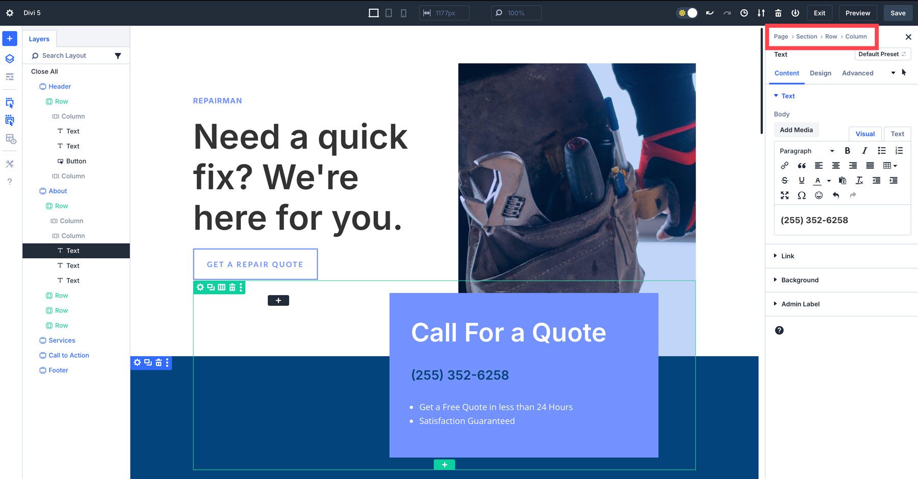
In Divi 5, we introduce breadcrumbs – an intuitive way to see where you are at any given point on the page. With breadcrumbs, tracking and managing design adjustments is easier than ever. As you dive deeper into different settings, breadcrumbs provide an easy way to return to earlier settings with a single click.
7. Faster Visual Feedback & Performance
One of the most significant changes from Divi 4 to Divi 5 is the speed and performance of the Visual Builder. This is due to a complete overhaul of Divi’s framework, drastically improving the Visual Builder’s responsiveness and front-end performance. This new version of Divi focuses on a block-type base rather than shortcodes, which allows it to be more efficient and future-proof.
The Visual Builder is now free of animations and lag that tended to slow down your workflow in previous versions. While Divi 4 is still an amazing WordPress theme, Divi 5 provides a better foundation for years to come. But what did we do to make that happen? Here’s a quick rundown of what’s new in the backend that makes the new Visual Builder so speedy:
- Rewritten Core Framework: Divi 5’s core has been completely rewritten. It eliminates inefficiencies that cause slower performance. We moved from a shortcode-based framework to a modular one, making it adaptable to future updates.
- Code Optimization: Divi 5 reduces code bloat by only using the JavaScript necessary based on the modules of the page. In Divi 4, all JS was loaded, contributing to Visual Builder lag. Now, JavaScript modules are designed to work asynchronously, making the builder more responsive and boosting page speed.
- Faster Canvas Rendering: Changes to a design, such as adjusting spacing or modifying content, now happen instantly on the canvas. This results from code changes that create smaller, independent modules for faster re-rendering of elements.
- Better Use of Browser Resources: Divi 5 works better with modern browser technologies, including advanced caching and improved memory management. Even the most complex layouts and dynamic content can now be handled without slowing down the design process.
Navigating The New Divi 5 Visual Builder
With Divi 5’s redesigned interface, navigating the Visual Builder is more efficient and user-friendly. Let’s look deeper into the tools that make up the new interface so you can start quickly.
1. The Main Toolbar
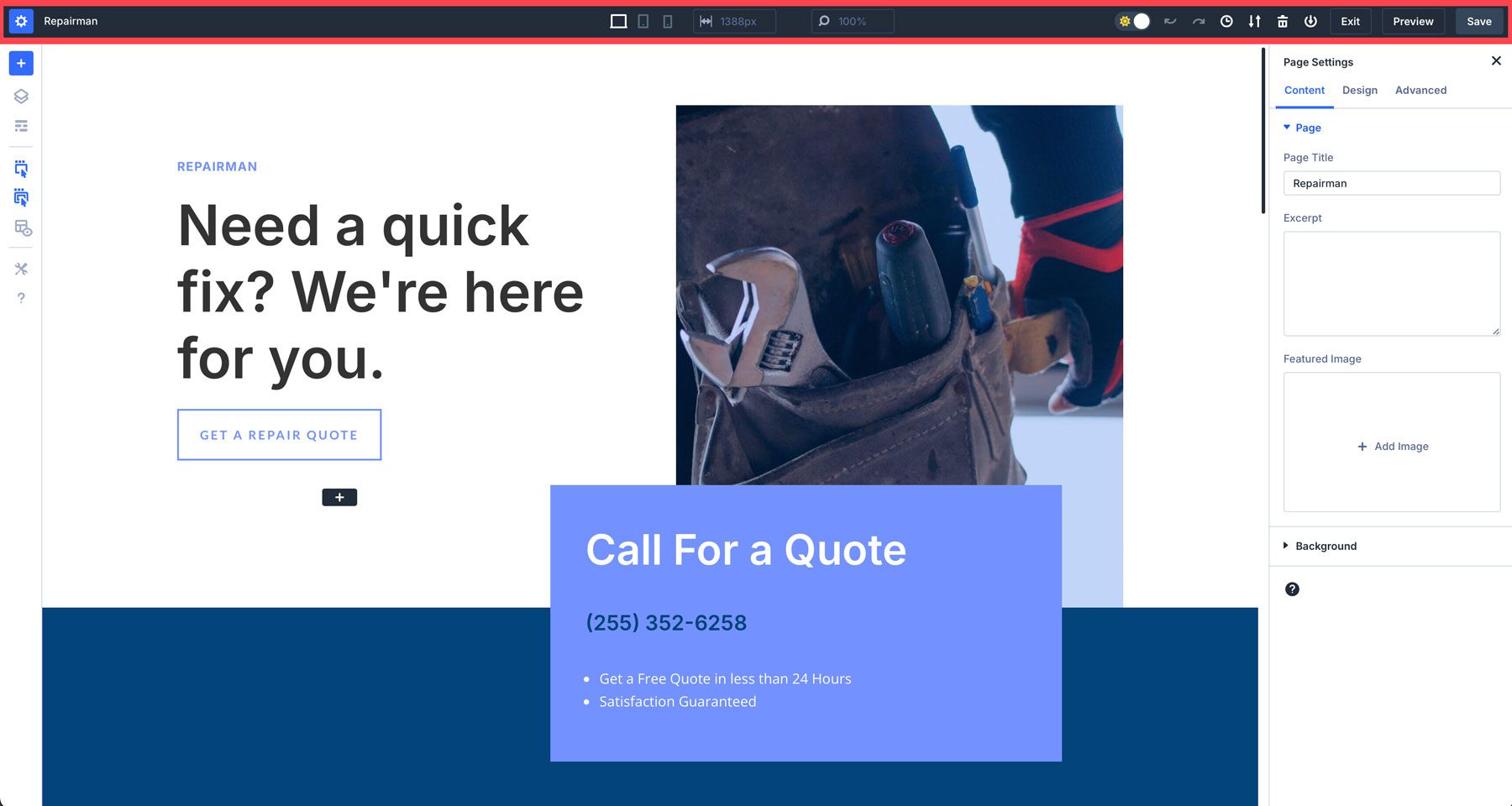
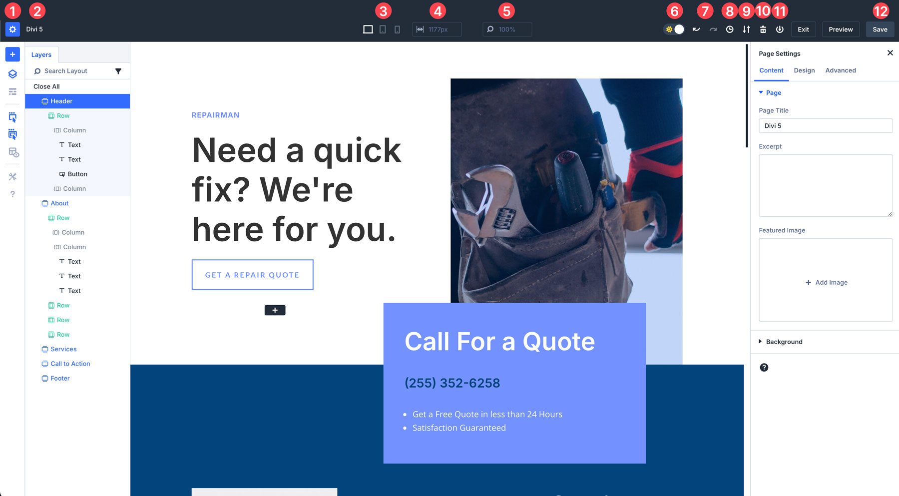
The top toolbar in Divi 5 is where you’ll find essential tools like page settings, save options, and view modes (desktop, tablet, and mobile). Here’s a full breakdown of every setting available:
- Page Settings: Similar to Divi 4, you can add a page title, excerpt, and featured image. Other options include setting the page’s gutter width, text colors, and advanced options for CSS, visibility, and position.
- Page Title: You can also change the page title here by clicking on the name.
- Responsive Controls: Switch between desktop, tablet, and mobile.
- Page Width: Control the width of the canvas.
- View Modes: Zoom in or out to increase or decrease the size of the canvas view.
- Light and Dark Mode: You can switch between light and dark to make Visual Builder more comfortable to work with based on your preferences.
- Undo/Redo: In Divi 5, you can easily undo or redo your last design settings or adjustments.
- View Design History: Get an overview of your most recent actions.
- Export/Import: Export or import a JSON file of your page.
- Delete: Erase the entire layout to start from scratch.
- Save to Library: Save your layout to the Divi Library
- Save Options: Save, preview, or exit your layout.
2. The Left Toolbar
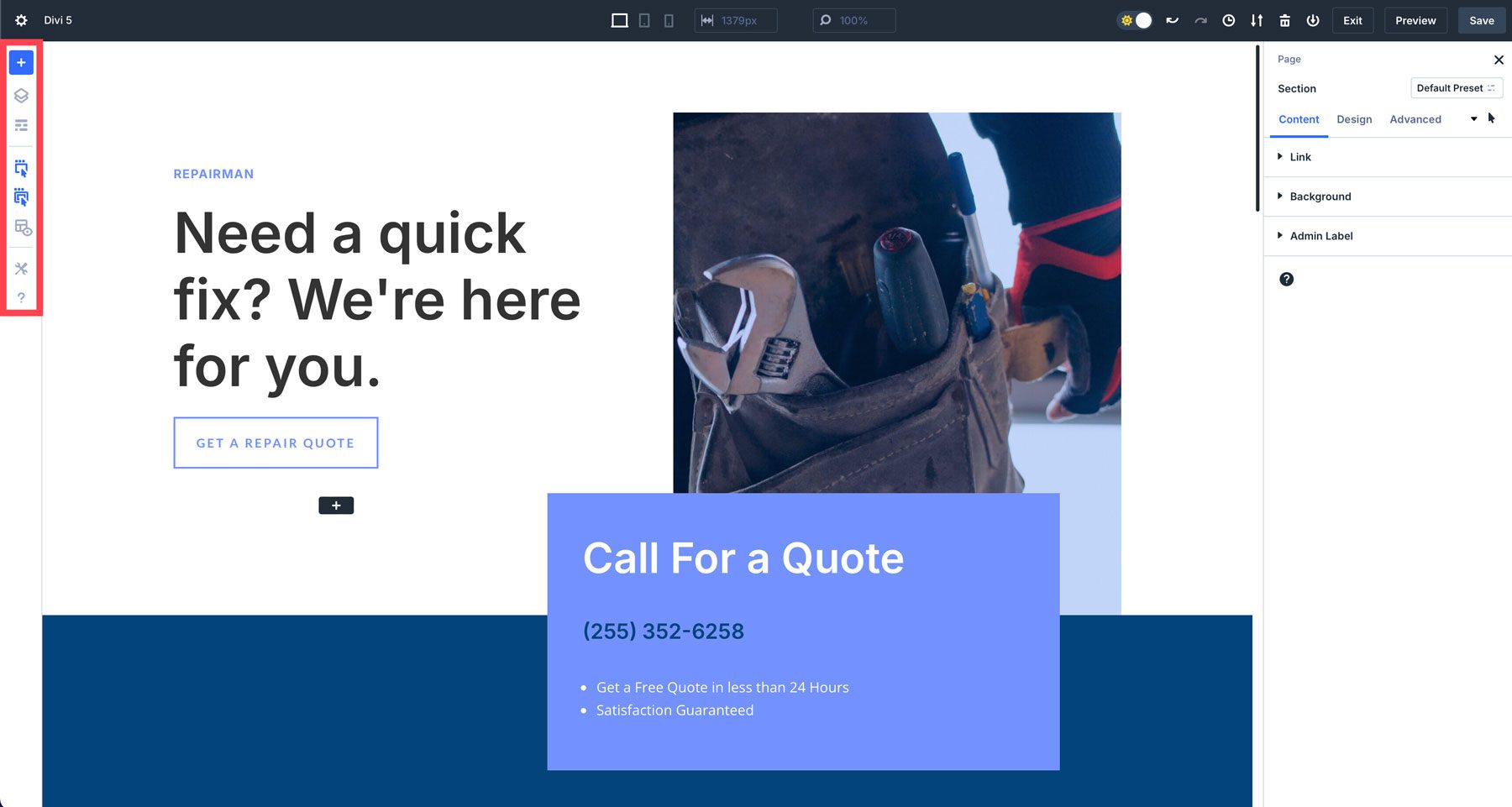
The left toolbar contains tools to help you build more efficiently. Items such as layers allow you to view the structure of your page, making it easier to navigate. There’s also a wireframe mode, which is a throwback to previous versions of Divi.
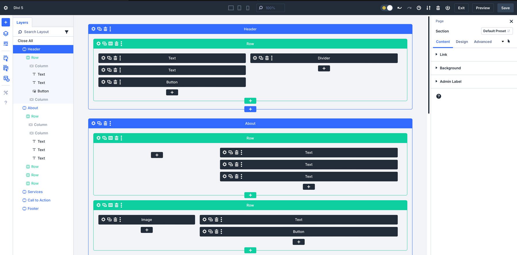
X-Ray mode allows Divi users to see the underlying structure of your designs more clearly. When activated, this mode provides a view of the elements on the page, making it easier to identify how sections, rows, and modules are layered and positioned.
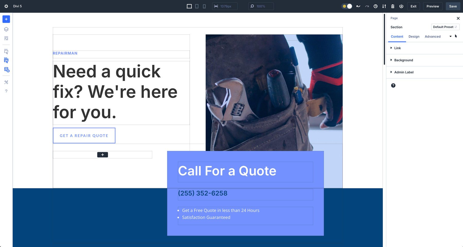
Here’s a full breakdown of all tools in the left toolbar:
- Add Layout: Quickly add a premade layout, a saved layout, or an existing page.
- Layers: Get a quick overview of your page structure to easily find what you want.
- Wireframe View: A throwback view of your page that shows a wireframe of sections, rows, and modules.
- Action Icons On Hover: When enabled, hovering over an element reveals relevant actions like edit, duplicate, delete, or move.
- Parent Action Icons On Hover: Activates parent elements (sections and rows) similar to modules.
- X-Ray: Places a border around design elements to help them be more easily identifiable.
- Builder Settings: Provides customizable settings for the Visual Builder, including the default view, opacity settings, light and dark mode, and color scheme.
- Help: A collection of Divi video tutorials and keyboard shortcuts to help you learn the new interface.
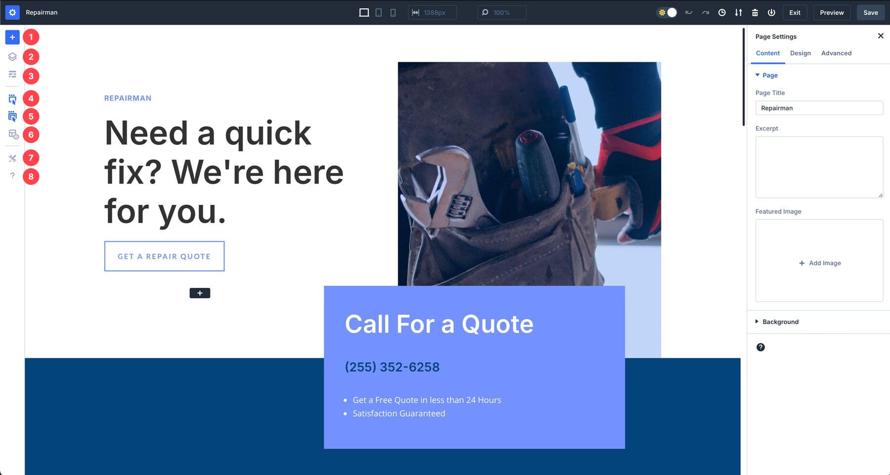
3. The Right Toolbar

The right toolbar in Divi 5’s interface controls page settings by default, as long as a section, row, or module isn’t selected. Once you choose a design element to edit, the module’s settings appear with familiar tabbed sections for content, design, and advanced.
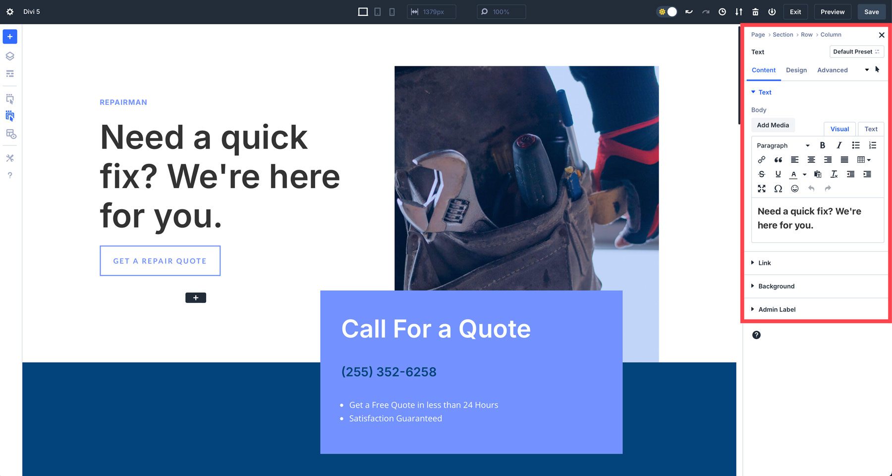
This is also where you’ll find breadcrumbs to help you navigate the settings for quick changes.
4. Quick Actions Menu
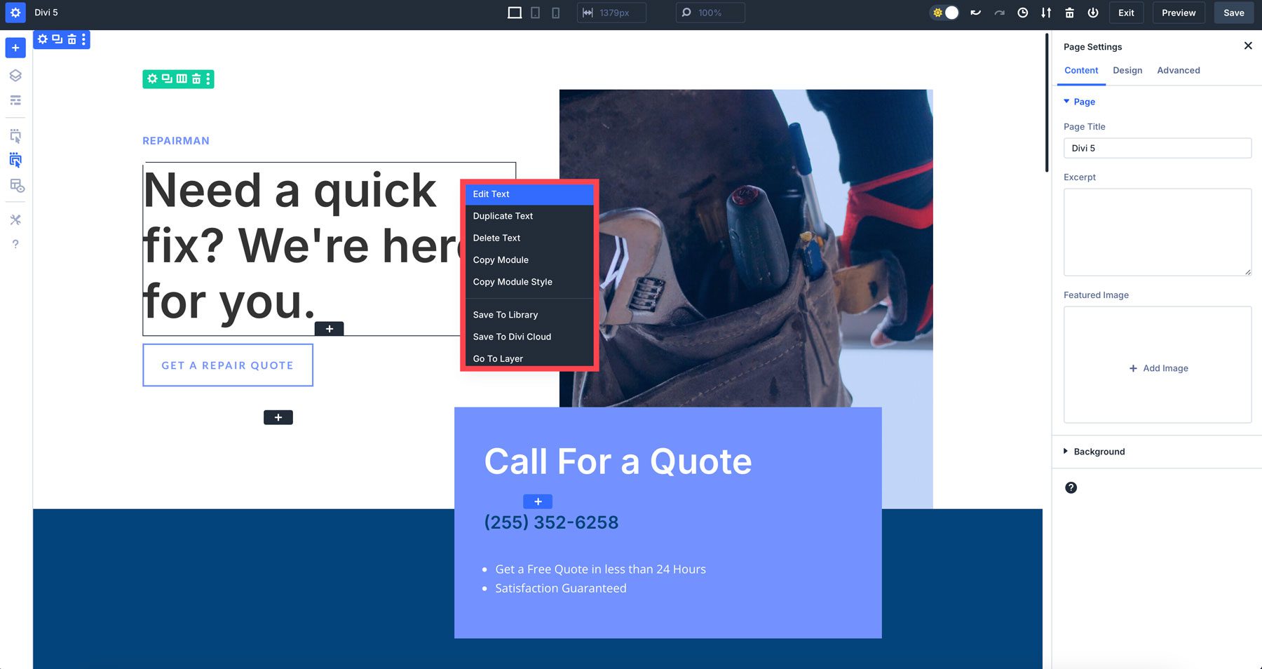
The Quick Actions Menu is a new addition to Divi 5. It offers a fast way to perform common tasks without navigating multiple menus. You’ll get access to options like copying and pasting styles, adding new modules, or duplicating elements by right-clicking on a section, row, or module.
Tips For Getting Comfortable With Divi 5’s Interface
Divi 5’s revamped Visual Builder may feel different at first, but after a few minutes of using it, you’ll realize it’s the same Divi you’ve come to know and love, but with a lot more speed. Here are a few tips to help you adjust:
- Experiment With Panel Docking: Try different panel layouts to see which best suits your design style. You can float panels (similar to Divi 4), dock them, or group them into tabs for quick access.
- Use Canvas Scaling For Responsive Design: Play with canvas scaling to see how your designs respond to different devices. This will be a game-changer when designing responsively.
- Switch Between Light & Dark Mode: Don’t forget that you can toggle between light and dark mode depending on your work preferences.
- Utilize The Quick Actions Menu: The Quick Actions menu is one of Divi’s best time-saving upgrades. Try copying and pasting module styles to speed up your workflow.
Experience The Future Of Divi
Divi 5’s Visual Builder represents a significant leap forward in website design. With its redesigned interface, enhanced speed, and improved performance, Divi 5 empowers users to create stunning websites more efficiently. The Visual Builder’s intuitive design and customizable workspace make it accessible to beginners and experienced users.
Ready to get started? Start using the Divi 5 Public Alpha today!
The post How to Familiarize Yourself With Divi 5’s New Interface appeared first on Elegant Themes Blog.
