Do you ever feel like you need a little more from Divi? If you want to elevate your website’s design and user experience, look no further than Divi Pixel. This powerful plugin seamlessly integrates with Divi, unlocking a treasure trove of new features and customization options. In this Divi Pixel product highlight post, we’ll introduce you to it, walk you through all the features, and demonstrate how to use it.
Let’s dive in.
What is Divi Pixel?
Whether you’re a seasoned Divi user craving more design freedom or a beginner looking for more design modules, Divi Pixel is your secret weapon. You can craft eye-catching blog sliders, dynamic post grids, and captivating call-to-action buttons – all within Divi’s familiar interface. Divi Pixel empowers you to build websites that look incredible and convert visitors into loyal customers.
In this Divi Pixel product highlight post, we will introduce you to what’s possible with this incredible toolkit so you can understand its incredible value.
Divi Pixel Boasts 50+ Modules to Expand Creative Freedom
Unleash the powerful design prowess of Divi Pixel thanks to a massive library of over 50 modules. We’re talking eye-catching flip boxes, various image effects, dynamic post grids, Lottie icons, and more, all ready to be dragged and dropped into your Divi website. Let’s crack open this toolbox and see what is possible with Divi Pixel. While we won’t cover every module available, we’ll showcase a few impressive modules to give you a better idea of what’s possible.
![]()
Flip Box Module
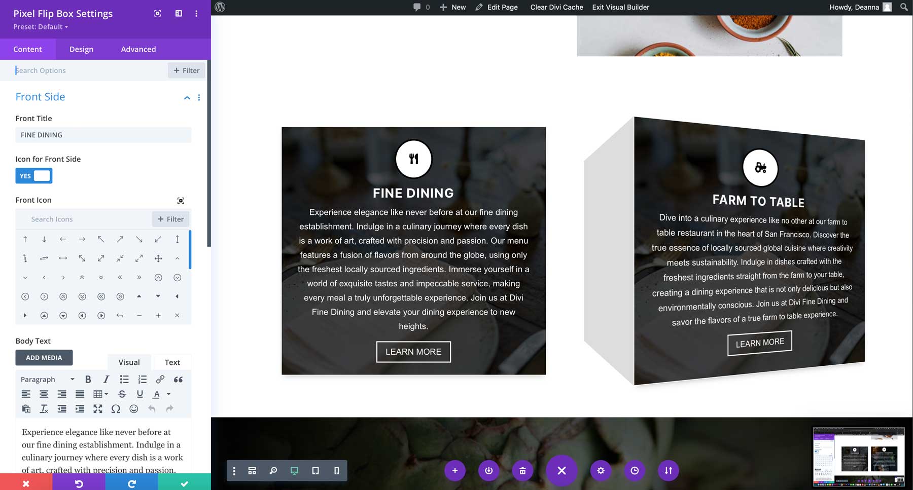
The Flip Box Module is one of the coolest modules available with Divi Pixel. It allows you to display information more engagingly, with content on the front and back that reveals itself with a flip animation. You can add text, icons, and even buttons to link to other content on your website. You’ll have complete control over the module thanks to robust design settings. You can adjust the module’s background with an image, gradient, or color. You can also change fonts and colors for the text, customize the icon and button, and select the type of animation. Some options include fade, zoom, rotate, and slide.
Before & After Module
The Before & After Slider module lets you showcase your images like never before. It allows you to interactively display two versions of an image. You can use the module’s extensive customization options to perfectly match your brand by adjusting colors, adding labels, and more. Whether you’re a makeup artist, hairstylist, fitness guru, or anyone who wants to showcase photographic differences, the Before & After Slider Module is the perfect choice.
![]()
Panorama
The scrolling panorama module allows you to present wide or tall images at their full size within a confined area. You can scroll horizontally or vertically, zoom in and out, and rotate the canvas to explore the entire image. Additionally, it supports 360° videos, making it ideal for travel websites. This feature offers an interactive display of large visuals while maintaining their detail.
![]()
Reveal Module
The Reveal module is an excellent tool for displaying content on Divi websites. You can quickly expand and collapse sections with “Show More” and “Show Less” buttons. This feature is handy for news sites, magazines, and other websites with lots of text, as it gives your visitors more control over what they want to read.
![]()
Filterable Gallery Module
The Divi Pixel Filterable Gallery Module provides a user-friendly way to showcase image collections on your Divi website. It allows you to categorize and filter images, add overlay effects, and show titles and captions in grid layouts. You can easily customize it to display team members and products, among other things. You can effortlessly create visually engaging and interactive galleries with boundless design options.
![]()
Button Grid Module
The Button Grid module for Divi lets you effortlessly add customizable buttons in horizontal or vertical layouts. You can create attractive button designs that improve your website’s look and usability. You can ensure the buttons fit perfectly with your site’s overall design with various customization options.
![]()
Blog Slider Module
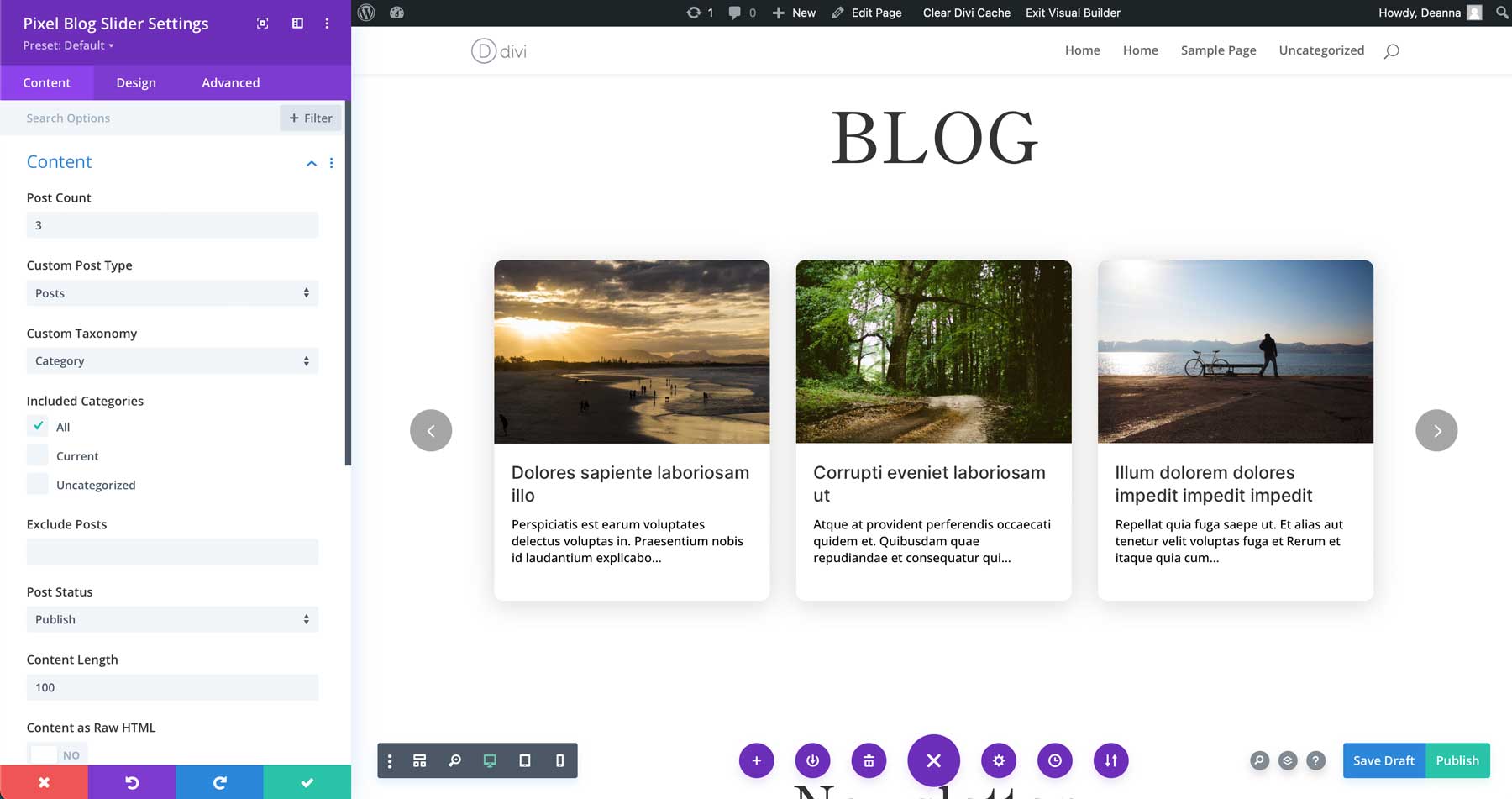
The Blog Slider module from Divi Pixel is an excellent tool for highlighting your blog posts in a sleek, responsive slider format. You can easily adjust the number of columns and fine-tune the look to match your style. Plus, it guarantees a smooth user experience on any device. The Blog Slider Module isn’t just for blog posts, though. You can display projects, pages, and testimonials, too.
Divi Pixel Horizontal Timeline Module
The Divi Pixel Horizontal Timeline Module allows you to create timelines with a horizontal layout on your website. There are multiple layouts to display your content above the Timeline, below it, or in a mixed layout where some content is above and others below. Like every Divi module, the Timeline can be customized in any way you like, with options for changing the card’s background color, choosing custom fonts and colors for the text, adding icons, and more.
![]()
Divi Pixel Extensions
Divi Pixel offers more than just incredible design modules. It’s a comprehensive toolkit with 5 extensions in total. These extensions provide a range of functionality to enhance your Divi website. You can expect to find extensions for adding an eye-catching particle background to sections, rows, and modules, a custom login page, a maintenance mode for keeping your site hidden while under construction, and more. In this section of our Divi Pixel product highlight post, let’s explore what these powerful extensions can do.
Particles Background
With the Divi Pixel particles background extension, you can quickly add interactive particle effects to any section, row, or module. This feature lets you create eye-catching particle backgrounds in minutes, enhancing your website’s look. You can easily customize particle colors, sizes, and movements to match your design. It’s perfect for making your site more dynamic and engaging, especially if your website is in computer/IT space.
Maintenance Mode
Using the Divi Pixel plugin, you can quickly set up Maintenance Mode without needing additional third-party plugins or custom coding. The steps are simple. First, create a new page on your Divi site and design it as your Maintenance Mode page. After your page is ready, go to the Divi Pixel plugin settings, turn on Maintenance Mode, and choose the page you want to show visitors. It’s that simple!
![]()
Custom Login Page
With Divi Pixel’s customizer, you can design unique and attractive login pages effortlessly without needing to code. Simply activate the Login Page Customization feature in the plugin settings, and you’ll gain access to various customization options. You can easily add your logo, change the background of the login page, modify the login form, and adjust the buttons to suit your style.
![]()
Conditional Display
Enabling the Conditional Display option allows you to show sections, rows, and modules based on the user’s login status or role. This will allow you to display modules according to user login status or role and easily manage membership components if your website offers one.
![]()
Custom Browser Scrollbar
With Divi Pixel, you can easily personalize your browser’s scrollbars. Adjust the colors, sizes, and overall look to fit your style. You can change the background color, scrollbar color, and scrollbar width. Additionally, you can tweak the border-radius and add a box shadow for a unique touch.
![]()
200+ Custom Design Options
Apart from the modules mentioned above and extensions, Divi Pixel, with its 200+ customization options, allows you to easily granularly customize various aspects of your website. It is an all-encompassing solution that provides unparalleled control over your website’s design. In this section of our Divi Pixel product highlight post, let’s look at some of its additional options.
404 Page
A 404 page appears when a webpage can’t be found. It’s important because it informs users of broken links and helps guide them to useful content, improving user experience. Using the Divi Builder, you can effortlessly create a personalized 404 page with Divi Pixel. With just one click, you can set it as your 404 page through the layout injector settings without needing to write any code or use any complicated settings or workaround.
![]()
Hide Admin Bar
When you log into your WordPress site, you’ll see a toolbar at the top of the page. This toolbar is always visible, especially on the front page, and it can be distracting since it doesn’t match the page design. With Divi Pixel, you can hide the Admin Bar and have it appear only when you hover over the top of your screen. This way, you can still take advantage of the admin bar’s convenience without interfering with your design.
Back To Top Button
A “back to top” button is a web feature that allows users to quickly return to the top of a webpage. It enhances user experience, especially on long pages, by improving navigation, user retention, and time-saving. Divi Pixel lets you add a back-to-top button and gives you plenty of choices to make your Back-to-top button unique. You can pick and modify the icon, include some text, create a custom link, and select from different button styles and animations to suit your needs.
Popups
A pop-up in website design is a small window over the main content. It’s a great way to grab attention, promote offers, or gather user information without making them leave the page. With Divi Pixel’s Pop-up Maker, you can quickly create unlimited, high-converting pop-ups. You can customize them to fit your marketing needs using advanced triggering settings, adjustable pop-up locations, beautiful animations, a customizable close button, and an overlay blur effect. This might help you turn traffic into leads, sales, and signups.
![]()
Mobile Menu
Divi Pixel lets you tweak your mobile menu extensively using plugin settings and the theme customizer. You can enable different options, add animations, and include mobile menu buttons. You can also integrate social icons, customize and animate the hamburger icon, or even go for a full-screen mobile menu. Plus, you can add custom animations for menu overlays and items.
![]()
These were only the tip of the iceberg. There are more. For instance, you can modify headers and footers to suit your preferences. You can even add a secondary logo on the header when scrolling. It also empowers you to incorporate custom map markers and SVG images effortlessly and add a preloader to your website as it loads so your visitor is engaged while the page loads.
Create Beautiful Webpages with Divi Pixel’s 40+ Premade Layouts
With Divi Pixel, you get a variety of starter layouts designed for every Divi user. There are over 40 distinct designs, each with its unique theme, ready to help you begin your project with flair and personality. Let’s explore some of these options in our Divi Pixel product highlight post.
Bistro
The Bistro and Restaurants Divi Pixel Layout Pack provides a stylish, customizable design with nine expertly crafted pages and unique icons. It features a straightforward color scheme and an elegant logo and leverages 10 Divi Pixel modules to enhance your experience. With clean, modern layouts for sections like services, menu, blog, contact, and more, this pack suits any eatery business perfectly.
![]()
Gardener
The Gardener Layout Pack for Divi Pixel includes nine stunning layouts perfect for landscaping and gardening service websites. You’ll find industry-appropriate color schemes, customizable logos, and unique icons. With 10 Divi Pixel modules, the user experience is top-notch. Ideal for garden and landscaping businesses, this pack offers flexible page designs like Homepage, Services, Blog, and more, ensuring a professional look and feel.
![]()
Agency
The Divi Pixel Layout Pack is perfect for web design and marketing agency websites. It includes ten expertly designed layouts, attractive icons, and a modern color scheme. You’ll find essential pages such as Homepage, About Us, Services, Contact, and Pricing. Additionally, it offers logos, icons, and various Divi Pixel modules to enhance user experience and customization options.
![]()
Garage
The Garage Layout Pack by Divi Pixel is perfect for auto mechanics and car repair services. It includes 11 well-crafted layouts, a modern color scheme pertinent to the industry, and a unique header. With custom icons and various Divi Pixel modules, you’ll have everything you need to create an attractive, functional website for your automotive business.
![]()
Installing Divi Pixel
Getting started with Divi Pixel is straightforward. You’ll just follow the typical WordPress plugin installation process. Once you’ve bought and downloaded the plugin, navigate to Plugins > Add New.
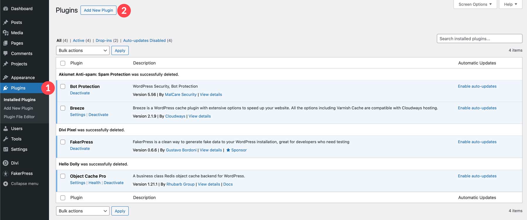
Next, click on Upload Plugin. Then, select and upload the plugin’s zip file from your computer. Once loaded, click Install Now.
![]()
After uploading, initiate the installation by clicking “Install Now.” Finally, click “Activate Plugin” to complete the process.
![]()
How to Use Divi Pixel
In this part of our Divi Pixel product highlight post, we’ll get down to the good stuff. Let’s review the user interface and Divi Pixel options. We’ll also discuss how to use some of its modules effectively.
Divi Pixel’s User Interface
When you upload and install Divi Pixel, it adds its menu item nested under the Divi tab.
![]()
On the Divi Pixel page, you will find seven tabs: General, Blog, Social Media, Mobile, Modules, Layout Injector, and Settings. Let’s take a brief look at what each tab offers.
General
You’ll land on the general settings tab by default when you click on the Divi Pixel sub-menu item. This tab lets you enable various extensions like particle background and maintenance mode. Additionally, you can manage font uploads and customize options such as renaming Custom Post Types (CPT).
![]()
Blog
You can personalize your blog archives and category pages from the blog settings tab. You can choose your preferred blog layout, add related articles, and tailor the comments section to your liking, among other things.
![]()
Social Media
Under the social media tab, you can enable Divi Pixel’s custom social media icons. It offers the same platforms as the Divi theme but with a different look and feel. To use them, disable Divi’s default social media icons in Divi > Theme Options > General.
![]()
Mobile
This section is all about mobile settings. You can add custom breakpoints, set fixed headers for mobile, change logos in the mobile menu, add animations, and more.
![]()
Modules
There are many modules to choose from, which can make your website heavier. To boost performance, it’s best to turn off unnecessary modules. You can do this from this tab.
![]()
Layout Injector
Divi Pixel lets you add Divi Library items to areas that usually don’t support them. You can easily place custom layouts on your Divi site and showcase them across your entire site from this tab.
![]()
Settings
In the settings tab, you can manage different tasks. For instance, you can reset all options and add API keys for services such as Google Maps and Facebook Access Tokens.
![]()
Now that you know about Divi Pixel’s options, let’s quickly review how to add and use some of its modules and customization options. Divi Pixel modules have a charcoal blue background color in the editor, which helps you quickly distinguish them from the core modules.
![]()
Creating and Enhancing a Divi Layout With Divi Pixel
For this next section in our Divi Pixel product highlight post, we’ll combine Divi Pixel and a premade layout to create a gorgeous landing page for a fine dining restaurant. Start by creating a new page in WordPress titled Home. Select Choose a Premade Layout to start the page creation process.
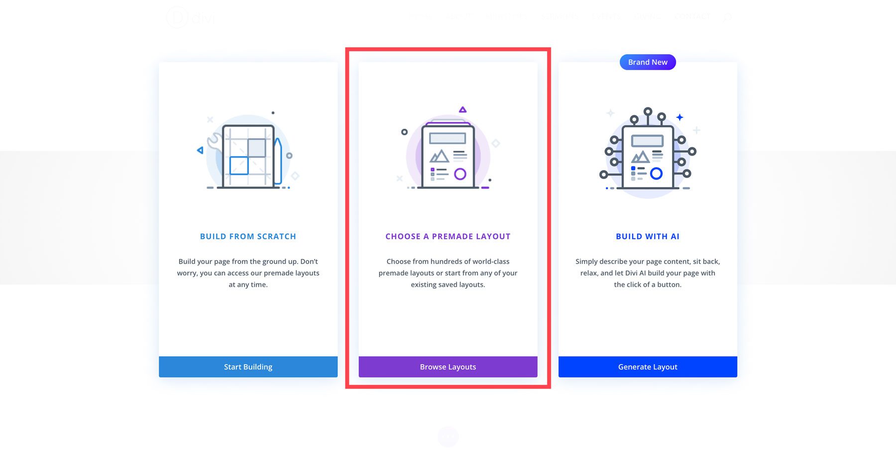
Next, search for and select the Fine Dining Layout Pack for Divi and select the home page. Click Use This Layout to load the layout into the Visual Builder.
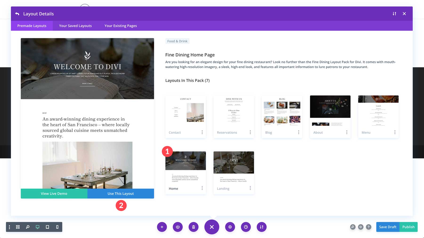
First, we can remove the headline from the hero section and replace it with animated text. Click to add the Pixel Typing Text under the image in the hero section.
![]()
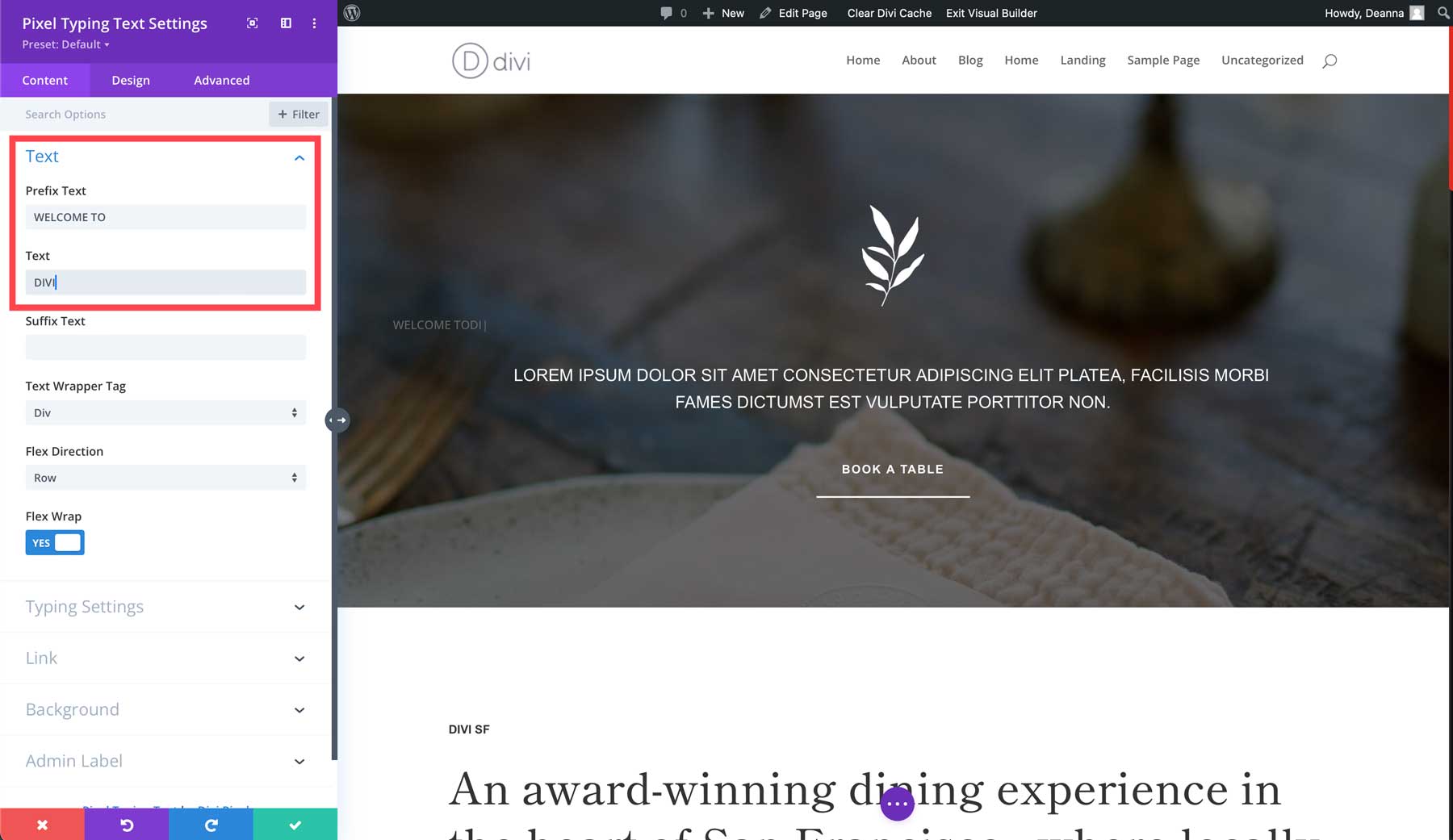
When the module settings appear, start with adding WELCOME TO in the Prefix text box followed by DIVI in the text box.
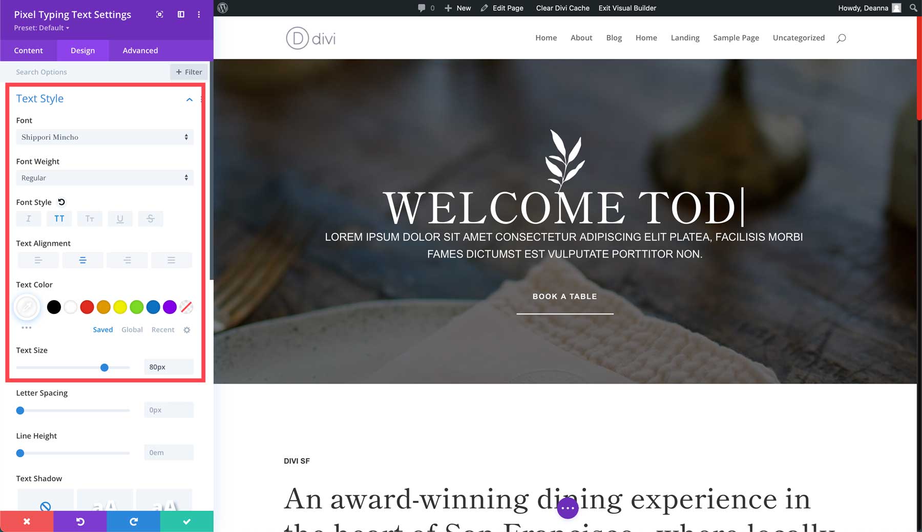
Head over to the Design Tab. Select the first dropdown, Text Style. Select Shippori Mincho as the font, set the font style to uppercase, the text alignment to centered, and the text color to #ffffff (white). Lastly, set the text size to 80px. Note: Be sure to adjust the font size for mobile devices before continuing.
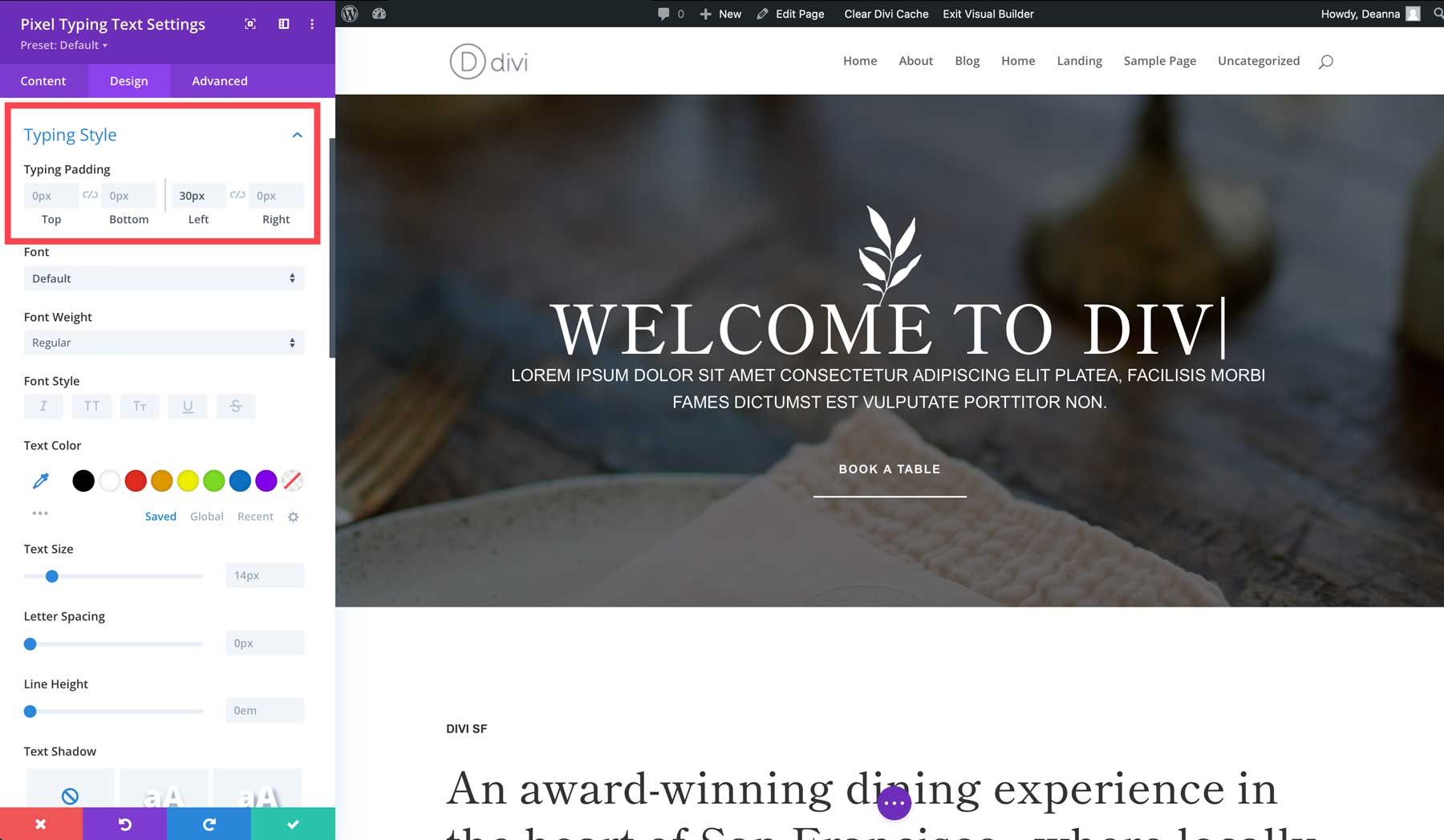
Scroll down the Typing Style tab. Add 30px padding to the left .
Finally, scroll down to Spacing. Add 50px margin to the top and bottom.
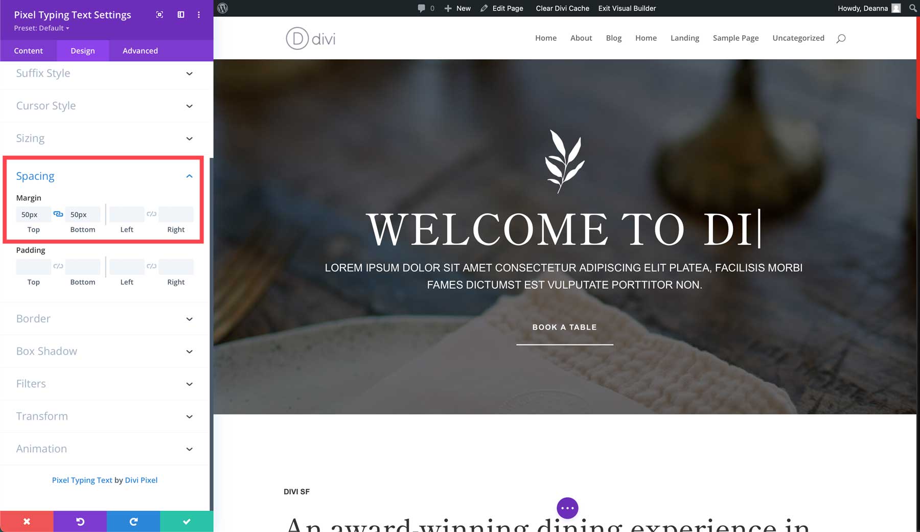
Finally, save the changes by clicking the green check button.
Add The Pixel Advanced Tabs Module
Next, we’ll create a menu with the Divi Pixel Advanced Tabs Module. Let’s start by scrolling down the page past the dining room image and adding a new section. Select a single column row and select the Pixel Advanced Tabs Module.
![]()
Click the Add New Item button with the module settings active. We’ll create six total tabs for a fine-dining restaurant.
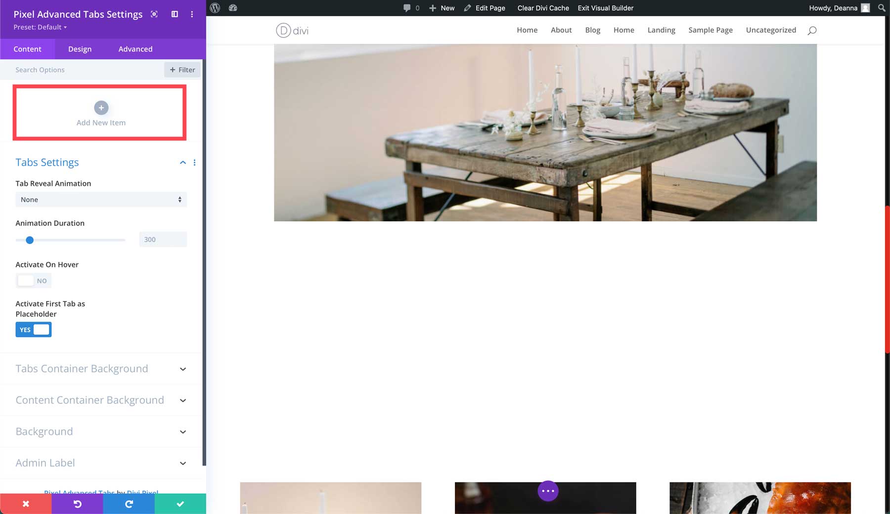
Start by creating the first tab. Under tab title, add APPETIZERS. Toggle the Active on Load button to on. Add some content to the body. You can use an AI program like ChatGPT or Google’s Gemini to help if you need inspiration.
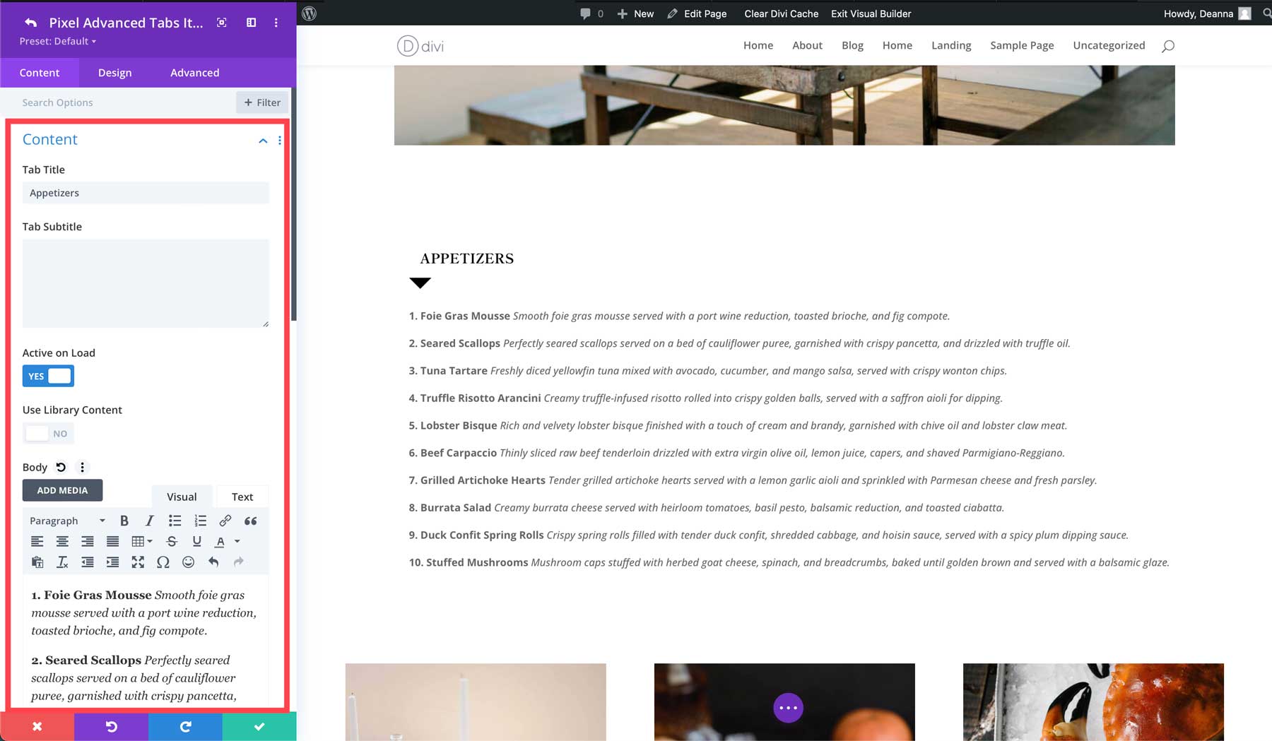
Save the tab by clicking the green check button in the module. Continue creating the remaining tabs for salads, soups, land, sea, and desserts. However, be sure to toggle the Active on Load to off for the remaining tabs.
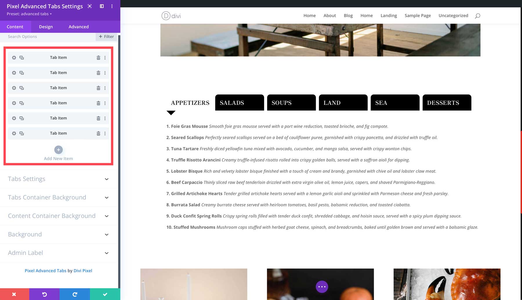
Next, swap over to the Design Tab. Under Tabs Container Settings, set Turn Off Stick On to tablets & mobile and enable Use Fullwidth Tabs.
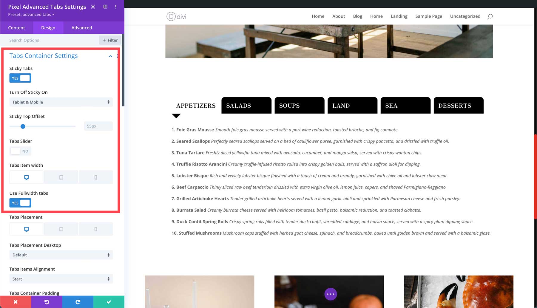
Next, under the Tabs Item group, add 15px of right margin.
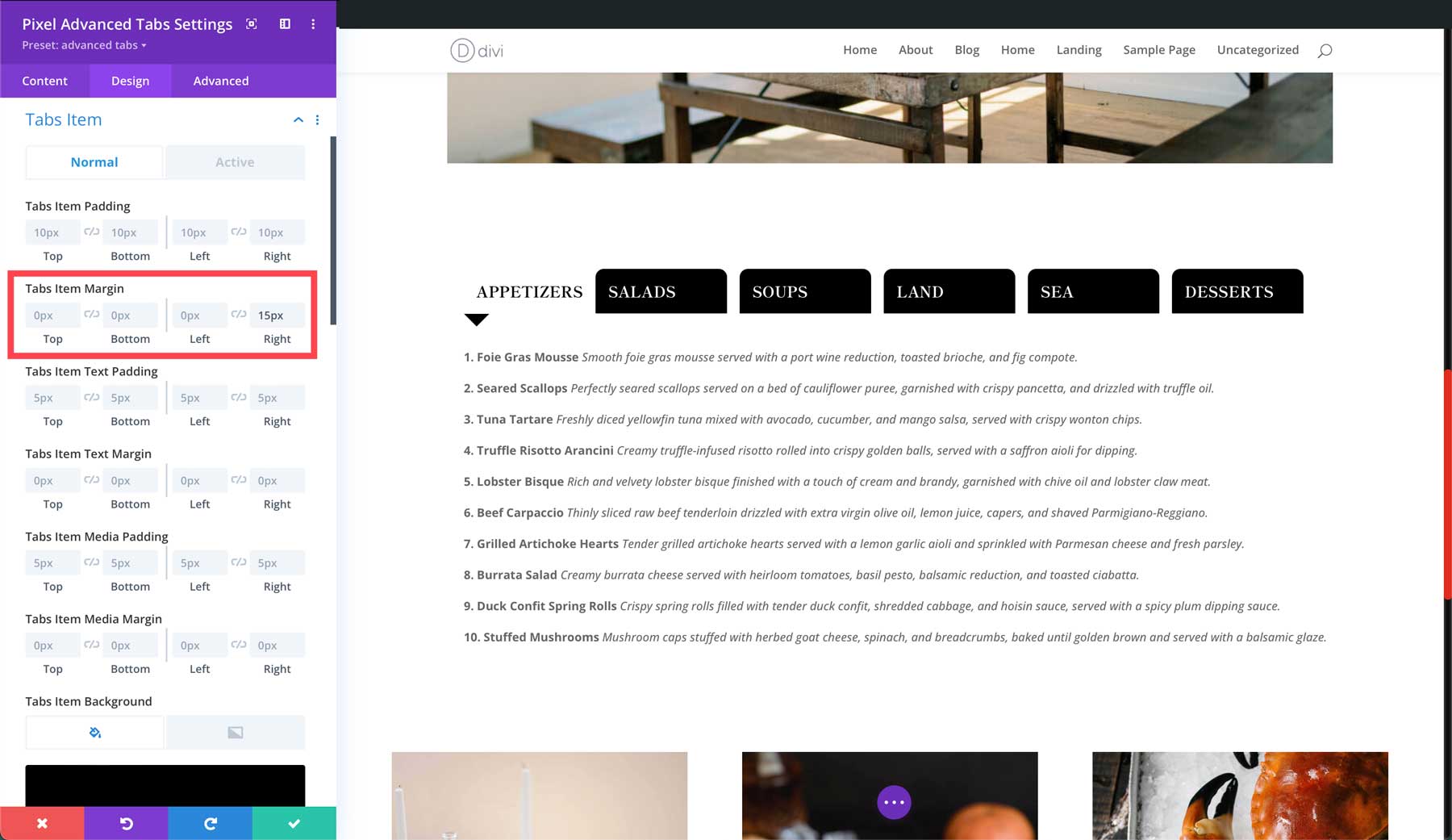
Under the same settings group, assign black as the Tabs Item Background color and add 15px to the top and bottom under Tabs Item Rounded Corners.
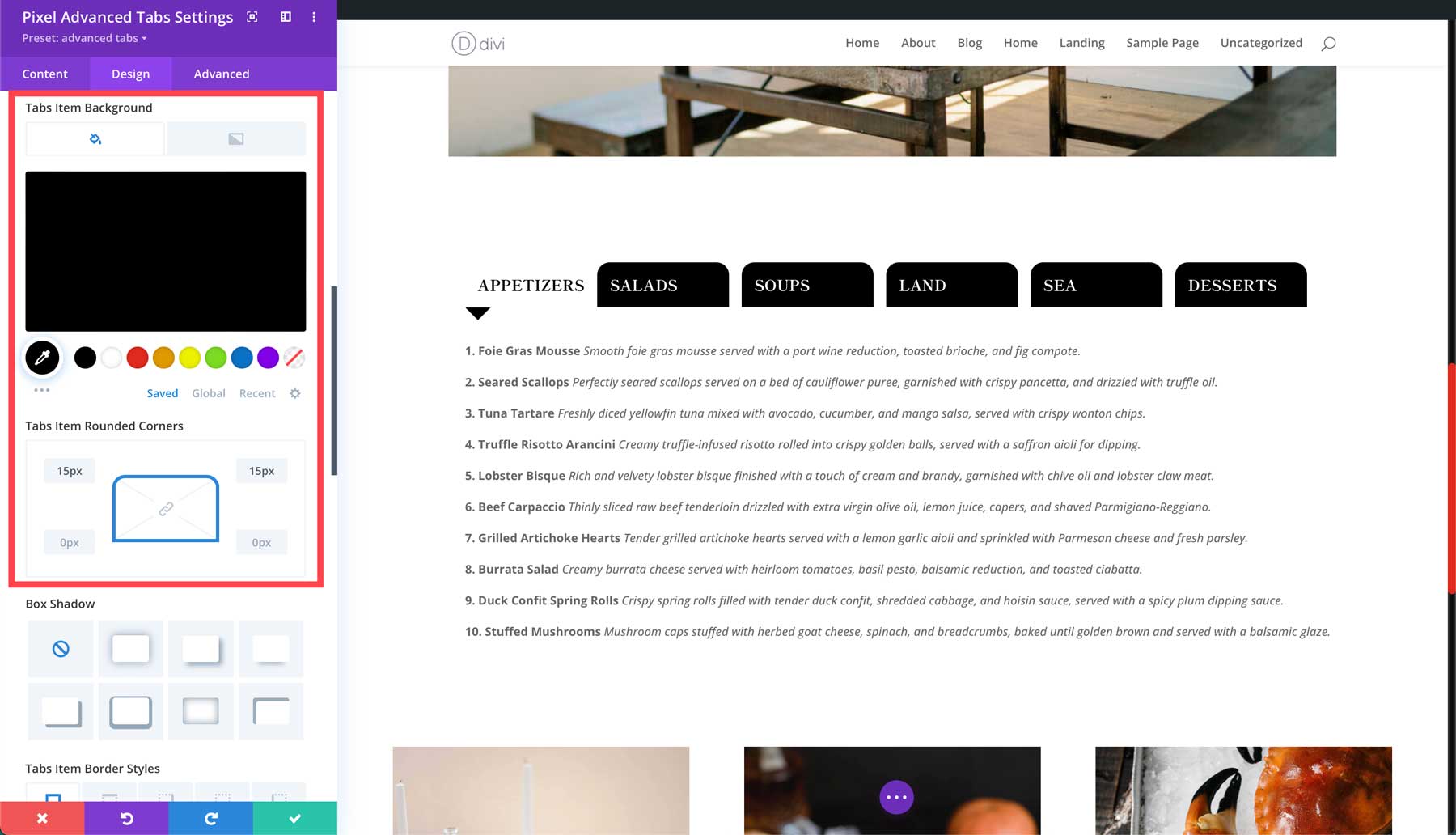
In the Tabs Item Text settings group, select Shippori Mincho as the title font, set the font weight to bold, and title font style to uppercase. Finally, set the title text color to white, assign a title size of 18px, and the line height to 1.7em.
Under Tabs Item Text Active set the title font to Shippori Mincho and set the font color to black. Make the Title Text Size 18px, and set the Title Line Height to 1.7em.
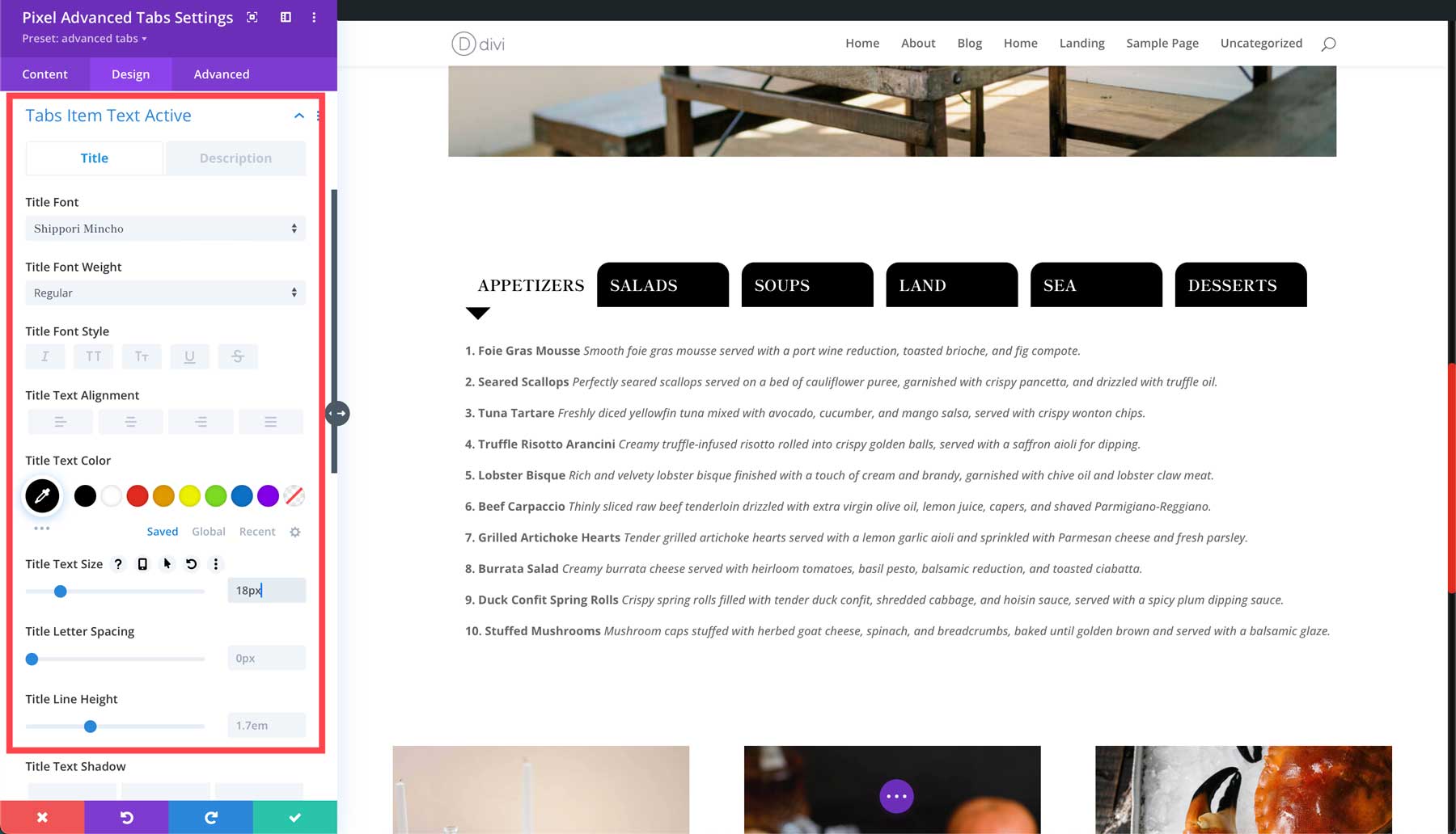
Next, set the Active Arrow Color to black under the Tabs Active Arrow settings group. Set the Arrow Size to 30px.
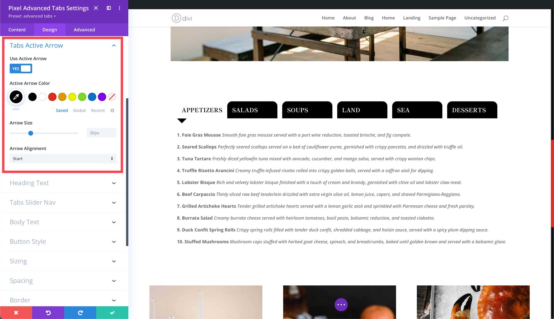
Once finished with these settings, click the green check button to save the module.
Purchase Divi Pixel
The Divi Pixel plugin is available at $169 in the Divi Marketplace. With one purchase, you can use it across unlimited websites. In addition, you get a year’s worth of backup in terms of support and updates. Your satisfaction is their priority, so they offer a 30-day money-back guarantee if the product fails to meet your expectations.
Is Divi Pixel Worth the Cost?
As you can see, Divi Pixel has a lot of design power under the hood. Using the Visual Builder, Divi Pixel’s modules and extensions can make creating websites with Divi more fun. Considering that, Divi Pixel is worth its $169 price tag. Thanks to over 50 modules, 5 extensions, and a generous amount of premade layouts, your Divi website will look better than ever! With Divi Pixel, you can effortlessly create high-converting pop-ups, customize mobile menus, add eye-catching particle backgrounds, and more.
We’re eager to hear what you think. Have you tried Divi Pixel? Please share your experience with us in the comments below.
The post Divi Product Highlight: Divi Pixel appeared first on Elegant Themes Blog.