Are you wondering what a web-safe font is and what the best web-safe fonts are to use for WordPress?
Imagine pouring weeks or months into designing a beautiful website. You’ve checked all the boxes, paying attention to details like choosing the right website theme and even building out the important web pages for your business.
The only problem? Your perfectly crafted site is marred by unreadable characters or awkward text breaks.
In this article, we cover what a web-safe font is and the best ones to choose from.
What Are Web Safe Fonts and Why Are They Important?
Web-safe fonts are already installed on most operating systems, like Microsoft Windows or Apple MacOS. Using a web-safe font stack gives you the best chance of ensuring your text appears as intended, and helps keep your website looking consistent for everyone.
If you use a font that the user’s browser or OS does not support, it will default to whatever the browser or site’s HTML / CSS declares. Which can make your content appear much differently and affect users in a lot of different ways.
Here are a few reasons why web-safe fonts are important:
- Font choice is a reflection of your brand: For example, a romantic font like calligraphy wouldn’t reflect well if you run a non-profit website.
- Font affects user experience: Web-safe fonts mean readers can see your font as intended. For example, if you make a WordPress website with a font only supported by the latest version of Windows 10, many of your users will see something else.
- Font affects sales: Yes, you read that right. Your font choices can affect how many sales you make. Customers who feel comfortable on a site, whether through social proof or simply through reliable fonts, can build consumer trust. This ultimately leads to more sales and money in your pocket.
Here’s the most important thing to remember with web-safe fonts:
“90% of Internet users use a browser that supports @font-face. Not having a font stack that includes Web-safe fonts and a generic font family means that we aren’t controlling how our web design degrades for at least 10% of the Internet’s users. The time and effort required to use a simple CSS font stack that includes Web-safe fonts is very small, so there’s little reason not to continue doing it.”
William Craig – WebFX CEO & Co-Founder
Now, let’s move on to how we chose our list of the best web-safe fonts.
How We Chose the Best Fonts for Websites
With over 650,000 different fonts available online, it can be difficult to choose the right one for you. So that’s why our expert design team has gone ahead and put the most popular web-safe fonts to the test so that you don’t have to do all the research yourself.
With our list, we made sure they met these specific criteria:
- Readability: Fonts designed for different parts of the site. For example, big, bold fonts for headers and clean, simple fonts for the main body.
- Legibility: Fonts where each letter is easy to tell apart and distinguishable from one another. This improves your site’s reading experience and accessibility.
- Comfort/Familiarity: Fonts that feel familiar and comfortable to readers. While creative fonts are helpful, using unusual fonts might make visitors uneasy. For the most part, we stuck to the ones people were most comfortable with so that you can keep your website professional.
- Variety of Styles: We chose fonts that cover different styles like bold, geometric, or classic. Just like any other part of web design, your font should match your brand persona.
- Font Weight: Some web fonts aren’t automatically included in website tools like WordPress or page builders. This can slow down your site and make fonts look different across browsers. To help with this, we included at least one lightweight font in each category. For more tips, check out our ultimate guide to boost WordPress speed and performance.
With that said, let’s jump into the best web-safe fonts to choose from for your WordPress site.
| Font Name | Main Traits | Best For |
|---|---|---|
| Proxima Nova | Sleek, contemporary, subtle elegance, easy to read | Blogs, professional portfolios, media companies |
| Lato | Welcoming, approachable, balanced design | Mobile apps, retail stores, eCommerce websites |
| Inter | Tall lowercase for readability, smooth curves for display | Home pages, digital products, ebooks |
| Roboto | Tech-inspired, friendly, wide open characters | Software companies, app developers, technology blogs |
| Alternate Goth | Condensed, bold, strong presence, sturdy strokes | Home page headlines, thank you pages |
19 Best Web Safe Fonts to Choose From
1. Proxima Nova
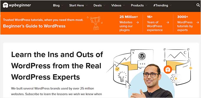
Proxima Nova is one of the most popular fonts out there. It’s the main typeface for large digital media companies like NBC News, Mashable, BuzzFeed, Wires, and, of course, WPBeginner.
Since launching WPBeginner in 2009, Proxima Nova has been a core part of our identity across branding, website, and internal projects.
It has a sleek, contemporary look with rounded edges and a subtle elegance. The letterforms are easy to read and are best known for their professionalism with a hint of friendly touch.
At WPBeginner, we don’t want an overly flashy font since we want our content to speak for itself. Proxima Nova does just that.
Best For: Blogs, professional portfolios, and media companies
2. Lato
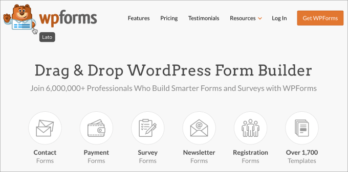
Lato was originally made for corporate clients, but it has now been repurposed and used all over the web.
It’s used on websites like Merriam-Webster, WebMD, Goodreads, and even one of our other brands like WPForms!
This web font gives off a welcoming and approachable vibe thanks to the balance it strikes between sturdy design and gentle curves.
This font matches the use case of WPForms extremely well since the plugin is known for its ease of use due to its drag-and-drop builder and intuitive interface.
Best For: Mobile apps, retail stores, eCommerce websites
3. Inter
Inter is a sans-serif font, which means it does not have the small decorative strokes at the ends of characters that serif fonts have.
The smaller “text” versions of this font have tall letters to help make lowercase text easier to read. On the flip side, the larger “display” versions have smooth curves and fine details, which saves space.
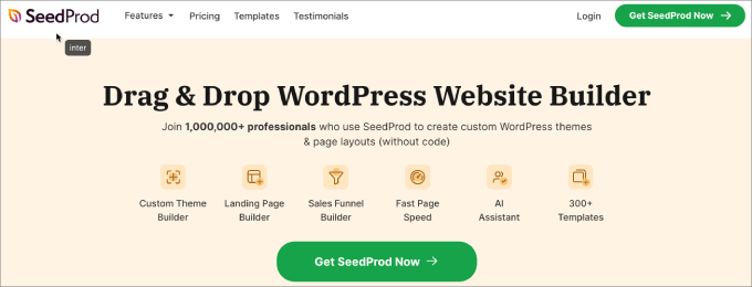
SeedProd, the best page builder plugin, uses the Inter font style, which represents what the software is all about. The font exudes ease of use yet is practical, which is exactly what the page builder is.
Best For: Home pages, digital products, ebooks
4. Roboto
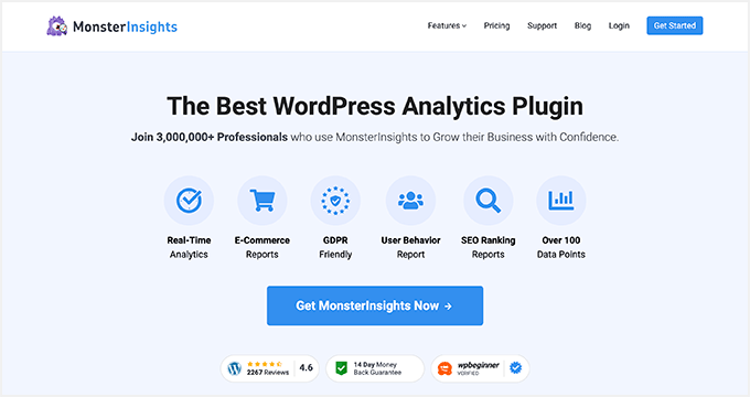
In an increasingly AI and machine-learning-driven world, the demand for typefaces such as Roboto is growing. While Roboto carries a tech-inspired, machine-like appearance, the wide-open characters provide a nice, friendly touch.
Notice how MonsterInsights uses the Roboto font to match the analytical persona of their brand. Many other popular websites use Roboto, such as Vice.com, Flipkart, and YouTube.
Given that it started off as the default font for Android devices, Roboto naturally complements tech-related websites, including software companies, app developers, and technology blogs.
Best For: Tech websites
5. Alternate Goth
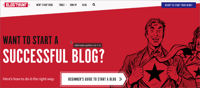
Alternate Goth, famously used in the YouTube logo, is a sans-serif typeface. It features condensed and bold letterforms, which are suitable for headlines and subtitles.
At Blog Tyrant, they use Alternate Goth for headlines only. It creates a sense of strong presence combined with contemporary design due to its sturdy strokes and heavy weight.
Best For: Home page headlines, thank you pages
6. Montserrat

Inspired by posts, signs, and painted windows from a historic neighborhood in Buenos Aires, Monsterrat has become increasingly popular, used on over 17 million websites.
The large spacing and openness of the typeface make it easy to read, even in small text sizes. That said, it also shines when used in all caps in headlines due to the simplicity of the letter. Overall, we find that Montserrat is a versatile web-safe font that creates a feeling of trust.
It’s best to use Montserrat for any business that wants to portray a more friendly and casual tone. For example, agencies, software companies, and online stores that rely heavily on customer service would benefit from Montserrat.
Notice how this Contra website in the image above uses Montserrat, which adds to the playfulness of the overall brand persona.
Best For: Agencies, software companies, online stores, digital products
7. Lora
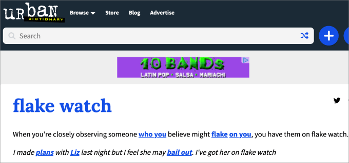
Lora is a contemporary serif font that is available in Google Fonts. The main driving point of Lora is its unique brush strokes at each character’s end, giving more of an artistic vibe than other serifs.
That’s why it’s used in many entertainment websites like Urban Dictionary and The Kitchn. When adding Lora to your website, it’ll convey the mood of an art essay or modern-day store.
Lora is a great font choice for logos, titles, navigation menus, and paragraph texts. That’s because it has a clear and balanced design, making it easy to read, whether the font is big or small. The Lora brush strokes can help make logos stand out, drawing more attention in the process.
Best For: News and entertainment websites
8. Gill Sans

Gill Sans is a modern sans serif font known for its efficient and clean-cut look. While it may not be the best choice for lengthy paragraphs due to its minimal contrast between letters and tight spacing, it excels as a visually appealing headline font or advertising.
Many of the most recognizable companies adopt Gill Sans as their typefaces, such as Toy Story, Tommy Hilfiger, BBC News, Tokyo Stock Exchange, and Phillips.
Best of all, it’s compatible across all operating systems, including macOS, iOS, and Windows-powered devices.
Best For: Advertising and header text
9. Merriweather

Merriweather is a Google Font designed to make reading easier on digital screens, which is why websites like Goodreads, Coursera, and Harvard.edu all use it for their paragraphs and body text.
The Merriweather typeface on the Harvard website looks sleek and clean, which highlights the professionalism that needs to be upheld with such a reputable institution.
Based on our experience, this font is well-suited for designs text-dense designs, similar to what you’ll see in magazines or RSS feeds. Its tall letterforms maintain readability across various screen sizes without taking up too much horizontal space. The typeface has a traditional and sets an overall formal and elegant tone.
Best For: Magazines, non-profit or educational websites
10. Neue Helvetica
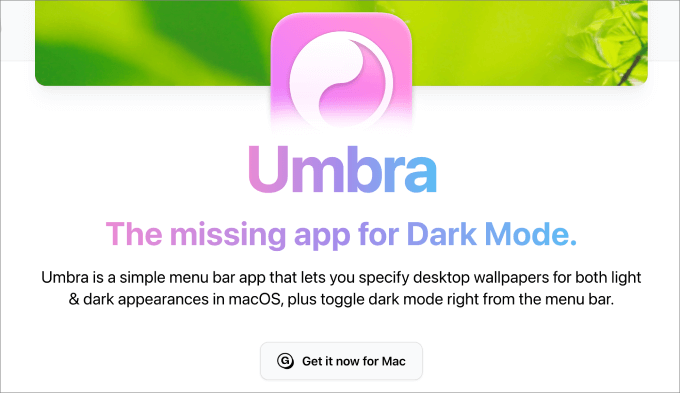
Neue Helvetica is used on over 218,000 websites like eBay, Yahoo, and Facebook. This typeface has a tall x-height, making it easier to read at a distance. As a result, it could be an advantage in helping your website be more mobile-friendly.
Also, there is tight spacing between letters, which saves space on the page.
Best For: Professionals, such as portfolio websites or service-based businesses
11. Garamond

Originally developed in the 16th century, Garamond typefaces are known for their refined and elegant appearances.
Unlike many of the other fonts, these have low constant between thick and thin strokes and have slightly slanted serifs. They’re great for websites looking for a high-end, luxurious look.
Best For: Product descriptions, headlines for premium brands
12. Arial
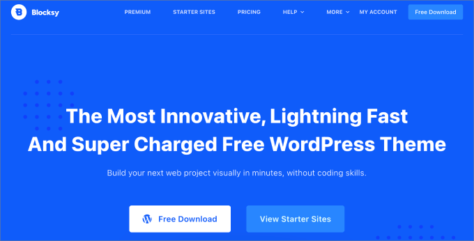
With over 604,000 sites already using Arial, there is no denying that Arial is a web-safe font that just works. Amazon, Facebook, and Google are just a few of the popular websites that use Arial.
It was originally designed by Monotype designers for IBM prints to boost readability. While it’s not the most eye-catching font there, it gets the job done.
The Arial font doesn’t have any decorative stokes and comes with a consistent thickness throughout the typeface to create a balanced and uniform look.
Best For: All types of websites and WordPress blogs. It’s also used in digital products such as reports, presentations, ebooks, etc.
13. Spectral
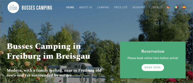
Spectral is one of the newer Google fonts on this list, but it deserves a spot based on how beautifully it handles long-form content on the web.
What we appreciate about this font is how it feels much less heavy-handed than many of its siblings. For example, you can see the lowercase f or r has a curve at the ends.
In general, Spectral is designed for text-rich, screen-first environments that make it easy for long-form reading.
Best For: Blogs
14. League Gothic
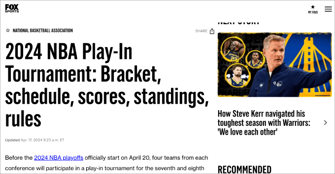
League Gothic is a condensed sans-serif typeface known for its bold and modern appearance. It was designed by The League of Moveable Type, a digital type foundry known for its high-quality open-source fonts.
League Gothic features tall letterforms with uniform stroke widths, squared-off edges, and a bold weight. In other words, if you’re looking to make a statement, this is for you.
Popular sites like The Blaze, Chron.com, and Fox Sports use it.
Best For: Headlines, titles, logos, graphics
15. Black Jack
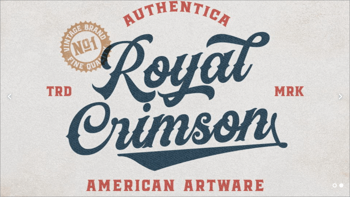
Black Jack is a casual script typeface designed for informal and friendly designs. It has a casual and natural feel to it, thanks to the handwritten style letters not always connecting.
Given its human touch, this font would be a great addition for an agency or service provider that provides white-glove service.
Best For: Agencies and service providers
16. Brush Script Mt
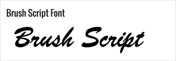
Brush Script Mt is an Adobe font, which can be described as informal, peppy, and unapologetically confident. It mimics the look of handwriting created with a brush or calligraphy pen. Specifically, this font features fluid and flowing letterforms with varying thicknesses and slants.
If you want any text on your site to look informal with a personalized touch, then this might be a great font to use. For example, you can use this in the signature of your About page or author profile page from the founder.
Best For: About pages or logos
17. Bodoni Poster
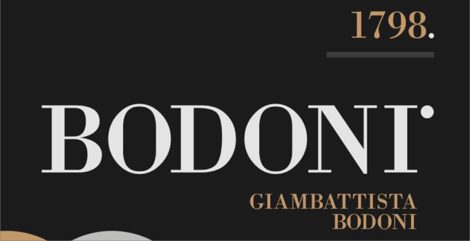
Bodoni Poster is a modern serif design used for site headings, high-end fashion branding, and logos. It uses thick and thin strokes for extreme contrast.
This makes it ideal for creating bold and eye-catching designs with a dramatic impact. This might be great for any type of bold-facing business, like a car dealership, restaurant, or hair salon, and any brand with a large personality.
Best for: Local businesses
18. Baskerville
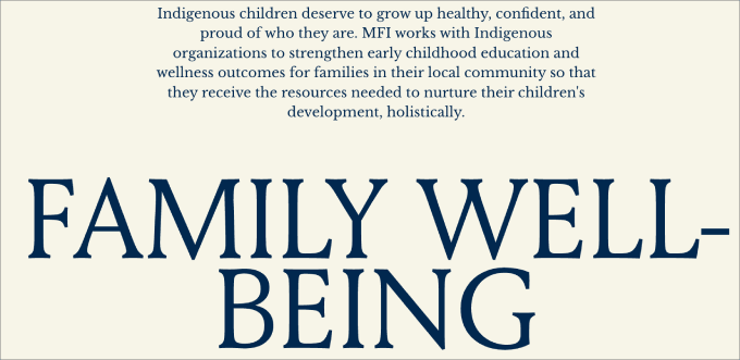
Made in the 18th century, Baskerville features sharper serif, a contrasting style of thick and thin strokes, and a more upright stance.
Its refined look creates a more authoritative presence. This is ideal for websites looking for an intellectually focused aesthetic, such as an IT website.
Best For: Publications, universities, and IT websites
19. Georgia
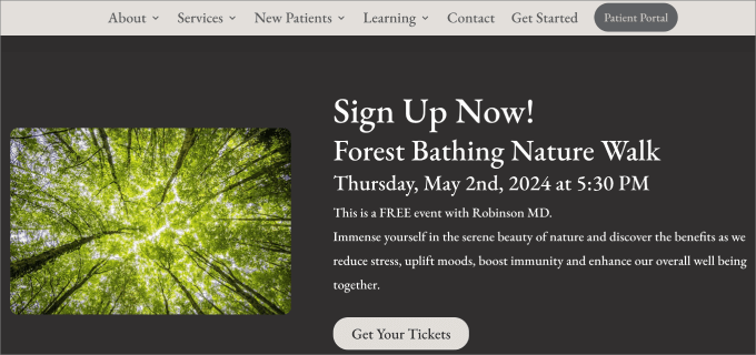
Georgia was made specifically to excel on screens with its bolder strokes and larger style font. It looks like a standard Times New Roman font, except it’s more visually appealing to the eye.
Best For: Blog articles and new sites
Frequently Asked Questions About Fonts
What are Google Fonts?
Google Fonts is a free service that offers hundreds of typography, available to download or link to. If you want your website or blog to stand out, you can skip the default fonts that scream ‘template’ and choose your own family of Google web-safe fonts instead.
What are Adobe Fonts (formerly Typekit)?
Adobe Fonts (formerly Typekit) is a paid service that allows you to access over 25,000 fonts. Whether you’re designing a logo or a graphic for your Woocommerce store or simply want to add a unique typography font to your blog, they have you covered. All fonts are included when you sign up for the Creative Cloud subscription.
How do web-safe fonts affect SEO?
Web-safe fonts don’t directly affect your search engine rankings. However, they impact the user experience. Fonts that are accessible to readers load immediately and are easy to read. This leads to lower bounce rates and longer website visits, which is favorable for SEO.
We hope this article helps you discover the best web-safe fonts to use for your WordPress website. You may want to check out our ultimate guide on how to choose the best web design software or our expert list of the must-have WordPress plugins for business websites.
If you liked this article, then please subscribe to our YouTube Channel for WordPress video tutorials. You can also find us on Twitter and Facebook.
The post What is a Web Safe Font + 19 Best Web Safe Fonts (Beginner’s Guide) first appeared on WPBeginner.
