With the speed at which content is created and consumed, it’s necessary to have the ability to get your message across quickly and accurately. This is where the call to action enters the picture. With the call to action, its meaning is in its name. The purpose of a call to action is to bring about some form of action on the part of the person consuming the content involved.
To begin, a call to action is not only related to online marketing. Calls to action are in traditional media like magazines, newspapers, radio, and TV. The power of the call to action is especially important in online and digital marketing. Terms like ad spend, ROI, and click-through rate are all contingent on the power of the call to action. It is essential to ensure that you include Call to Action Modules on your page accurately. Before you run your next round of ads – or build your latest landing page – consider these good practices when using Calls to Action with Divi.
1. Make Your Action Point Clear and Easy to Attention
When using calls to action in Divi, it is essential to ensure that your action point is clear. As the term suggests, action is key when brainstorming ideas for what you want your users to do when they’re on your site. Divi’s Call to Action Module gives you ample opportunity to encourage your users to take the next step on your site.
Breaking it Down: Divi Personal Stylist

In our Divi Personal Stylist Landing Page Template, we have a solid call to action within the page’s header. There are three main components of the module:
- Title
- Body
- Button

In the example above, the call to action is found within the button. The main goal is to get website viewers to work with Jane. The action that follows clicking the button should match your business goals. You can send clients to a booking calendar. Possibly, you would want them to fill out an intake form. You may also want them to purchase a product or service. Ensuring the action is clear ensures that your users make the right choice when they land on your page.
2. Ensure that Your Call to Action Modules Are Mobile Responsive
We are no longer in the age of the desktop monitor. Tablets, mobile phones, and smartwatches are now firmly a part of everyday life. Devices like Snap’s Spectacles and Elon Musk’s Neuralink are becoming commonplace. Designing for these devices has to be front and center of your process. While we do not have brain chips just yet, we do have to be aware of designing our Divi web pages and sites for smaller screens.
Breaking it Down: Divi Real Estate Agent
This is the desktop version of the Call to Action Module, as seen in the Divi Real Estate Layout Pack. Notice that we can see the button and the title encouraging us to schedule a consultation.

For the tablet and mobile versions, we can still distinctly see all of these aspects. We have the bold title and the button, all of which are above the fold.

When using calls to action in Divi, it is a good practice to test the mobile responsiveness of your Call to Action Modules. Using a checker online like Responsive Design Checker is always a good idea. Or, if you have the ability, checking your site on your phone, laptop, or tablet can be a very eye-opening experience.
3. Remember to Design Eye-Catching Calls to Actions
Our world is moving faster with each passing minute. It is said that today, the average user attention span is approximately 8 seconds. This means that as designers, we have to make the most impact on our users quickly.
Breaking it Down: Divi Poke Restaurant

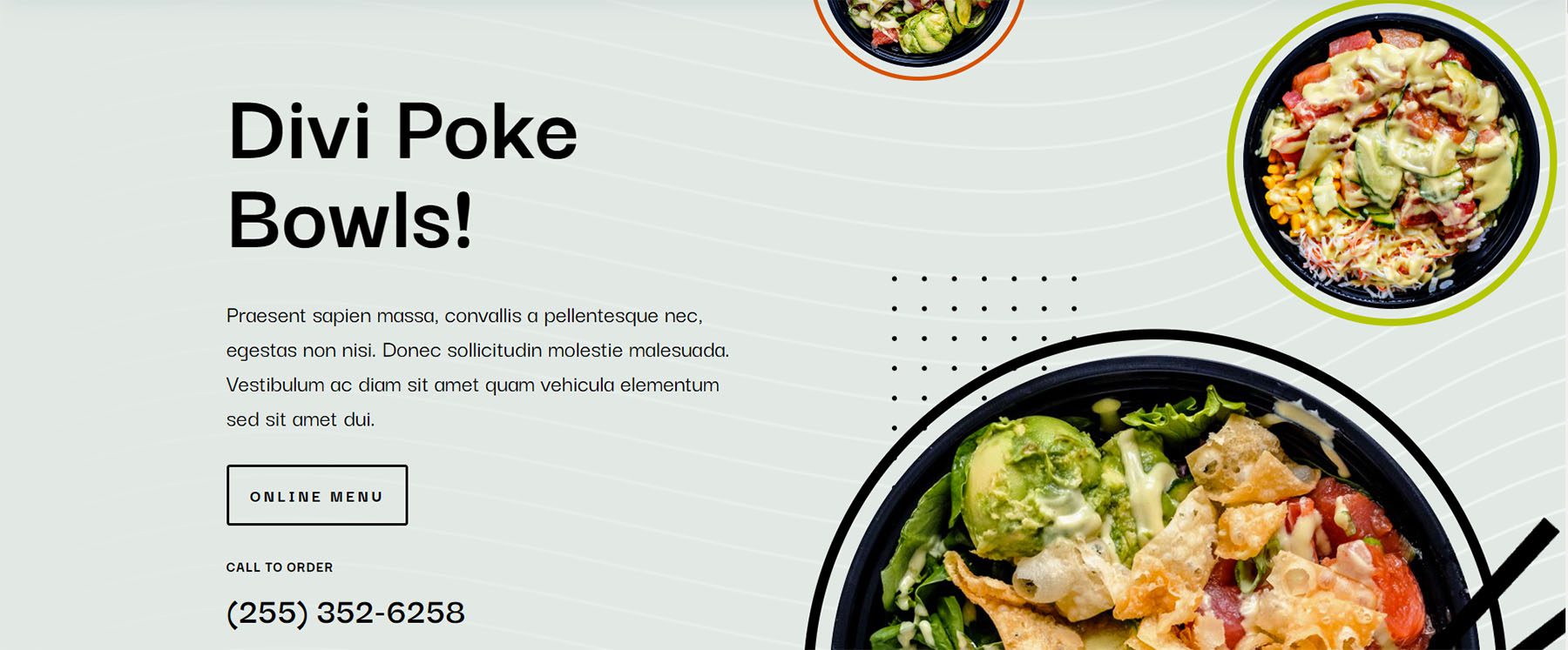
The Poke Restaurant Landing Page Layout immediately lets you know what they’re all about.. poke bowls! The use of high-quality photography, bright colors, and bold text entices you to check out their online menu. This design goes a step further by giving a second call to action as a phone number. An idea to optimize for mobile may be to add a link to the phone number. When clicked, it’ll directly open the phone app.
4. Utilize A/B Testing to Optimize Your Calls to Action
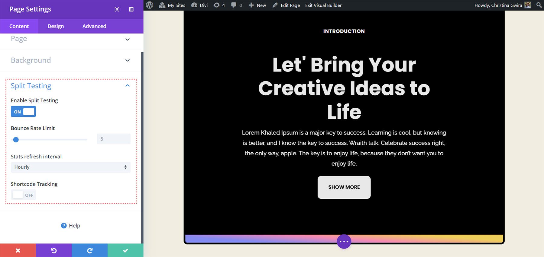
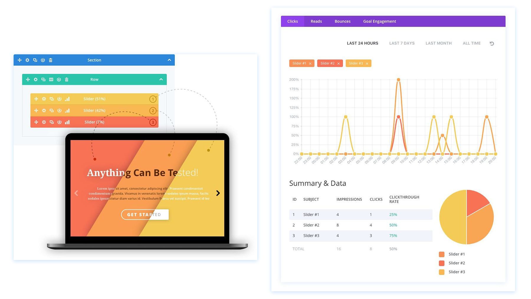
After using design and copywriting to create your call to action, you may consider going further. Using A/B testing can be a way to track and analyze how well your work is doing with users. In Divi, we have split testing and powerful insights built into our builder. These tools allow you to see what you can improve to bring better results to your business.
Breaking it Down: Divi Marketing Agency

Our built-in split testing system means that any Divi element: a module, row, or section, can be tested.

Changes to the Call to Action Modules’ content, design, and more can be changed, measured, and tracked. This will give you a deeper awareness of how your work is performing with your users. This type of information is pivotal in building a successful business, blog, or brand on the internet.
In Conclusion
There are many ways to use calls to action in Divi as well as online. To begin, it is necessary to have a solid hook to draw your user in. Next, it is wise to consider how your call to action will look on the many devices people may use to access your site. Thirdly, one cannot ignore the impact of design when trying to garner people’s attention on the internet. Lastly, it is essential to have the ability to gather and process data on the impact that your work is having on your users and, ultimately, your bottom line. Remember these best practices as you build your next landing page, blog post, or project with Divi.
The post 4 Good Practices for Including Divi CTA Modules in Your Page appeared first on Elegant Themes Blog.
