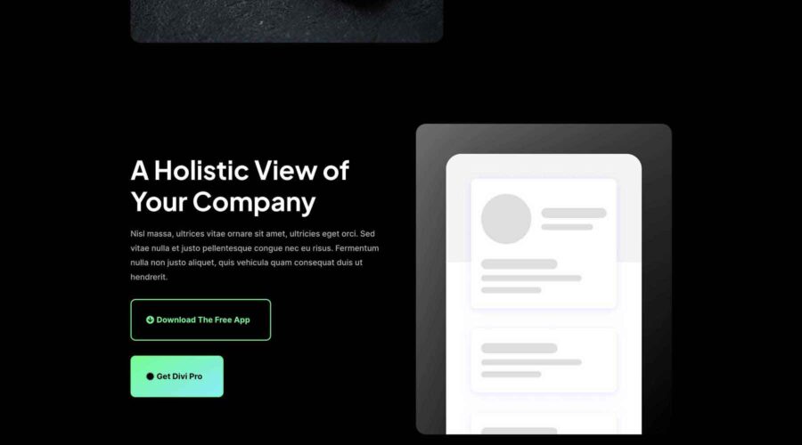
When creating an effective digital marketing strategy, landing pages are always a part of the process. Landing pages are great for drawing potential customers to your website from an ad and are an excellent way to showcase new products, services, and ideas. Regardless of how new visitors get there, a landing page encourages customers to purchase something or leads them to complete an action. That is, if it’s effective. In this post, we’ll walk you through the steps to build a high-converting Divi landing page with one of the highly effective free layouts from this year’s Cyber Monday Sale.
What is a Landing Page?
Landing pages are website pages that serve a specific purpose, such as featuring a new product or service, and typically include sales-driven copy. They usually encourage visitors to purchase something, submit their user information, or sign up for a service. Effective landing pages usually contain an eye-catching call-to-action (CTA), a contact form, compelling copy, and images that reinforce the page’s messaging.
Why Do You Need a Landing Page?
You might be asking yourself why you need a landing page. Could you use your website’s home page? Businesses looking to increase sales or build their email subscription list should use a landing page instead. The main reason for this is to avoid distracting your website’s users. Home pages are great for introducing your visitors to your brand, but if you have a specific business goal in mind, a landing page can help you achieve it.
Landing pages usually omit headers and footers, contain goal-driven copy for a specific service or product, and include relevant CTAs. That way, you can build a high-converting Divi landing page to guide your visitors where you’d like them to go rather than battling competing links and other copy on your site’s core pages.
How Can I Build Landing Pages in WordPress?
WordPress is a robust content management system (CMS) that allows users to build any web pages they want, including landing pages. Numerous WordPress theme builders, such as Divi, function as a theme builder and landing page plugin in one. By signing up for an Elegant Themes membership, you’ll gain access to a powerful front-end Visual Builder and Theme Builder in one, so you can build every aspect of your site, including headers, footers, landing pages, ecommerce pages, and more.
Landing Page Best Practices
To build a high-converting Divi landing page, you should incorporate a few best practices during the building process. These include identifying your audience, crafting simple and concise copy and images, staying true to your messaging, incorporating social media, and always staying focused on design. Thankfully, the design team at Elegant Themes always keeps these points in mind when crafting layout packs, so your job is already a lot easier. However, let’s go over a few of these best practices so you’ll better understand what goes into building the perfect landing page.
Follow a Good Landing Page Structure

First and foremost, a high-converting Divi landing page typically follows a proven structure:
- Start with a good headline: The headline is the most essential part of your landing page. As a general rule, if your headline doesn’t pass the blink test (grab the user as fast as he can blink), you’ve already lost a potential sale. Always craft a compelling headline to grab the reader.
- Keep copy motivating: Unlike core pages that need a lot of copy to be successful, landing pages don’t follow those same rules. Focus on keeping the copy clear and concise. Stay on point, and make that point come sooner than later. People aren’t going to read a book to find out what you’re selling.
- Make CTAs clear: Don’t junk up the page with endless CTAs. Stick to one specific action. For example, if you want readers to call for a quote, don’t also give them a form to fill out. CTAs for multiple actions are confusing and can kill your conversion rates.
- Remove navigational menus: Unlike other pages on your site, landing page visitors should be focused on one page’s copy. Remove menus and footers from the layout so your visitors will stay on the page and complete your desired action.
- Stay on brand: When creating landing pages, keep your website’s overall look and feel. Keep the same colors, fonts, and design elements to reinforce brand awareness.
Know Your Audience
High-converting Divi landing pages usually target a specific demographic, so when planning, take steps to identify your audience. Be sure to ask yourself the right questions, including knowing your target audience’s problems, needs, and wants. Then, you can use that information to write copy with that person in mind.
Keep Copy Simple
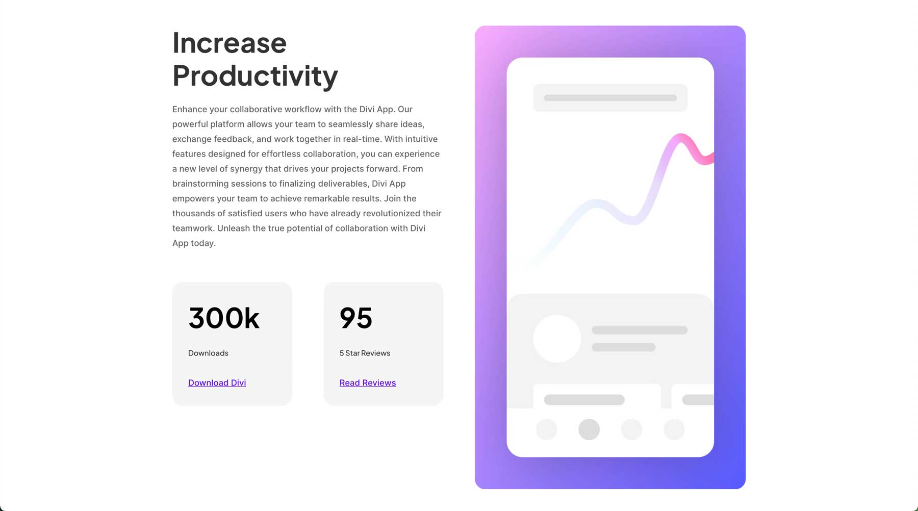
Use clear, concise, and relevant copy. Too much copy can send your readers packing, while too little leaves them confused and frustrated. Determine what you want to say and stick to that message throughout the page. Do you need help getting those creative juices flowing? No worries because Divi offers a great solution for writer’s block: Divi AI. You can use it to generate on-brand copy in seconds so that you can focus more on the aesthetics.
Use Compelling Images
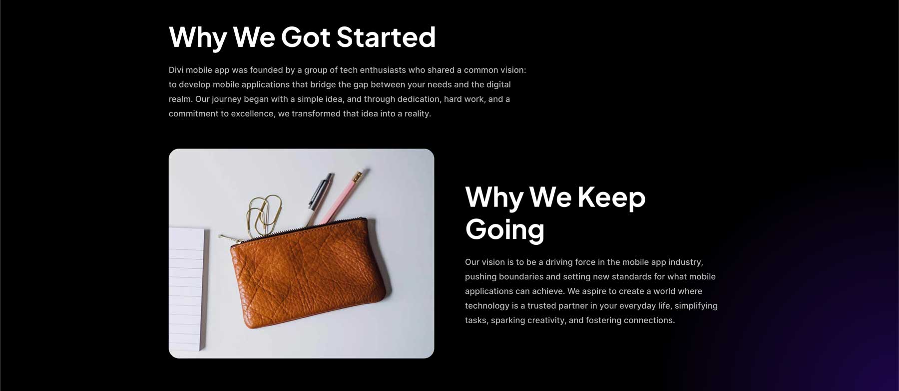
Another puzzle piece is incorporating images that help tell your landing page’s story. Imagery should be robust, invoke feelings and emotion, and be relevant to the page’s content. Thankfully, all of Divi’s website packs include royalty-free images you can use for your website projects. However, if you love the look of the layout, but the pictures leave something to be desired, you can use Divi AI. With Divi’s image generation tool, you can simply describe the image you want and watch as Divi’s onboard Stable Diffusion image generator gets busy creating images for your landing page in seconds.
Include Social Proof
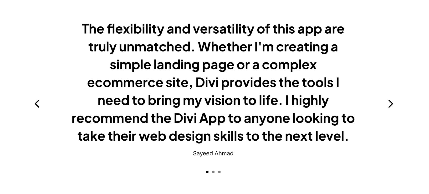
Another essential thing to consider when planning your page is social media. Customer testimonials, reviews, and case studies can all be powerful tools to reinforce your brand’s value proposition. Statistics show that social proof is essential, especially for millennials. Researchers at Inc.com have indicated that more than 90% of that age group are more likely to purchase after reading reviews on social media platforms.
Design for Conversion
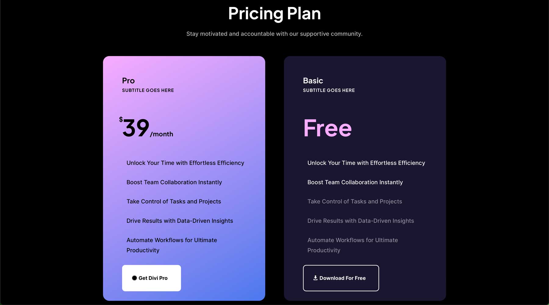
In addition to staples like a good headline, captivating body copy, and supporting images, your landing page should be designed for conversions. It should incorporate design elements, such as a good CTA, a lead form above the fold, your company’s logo, and sign-up or add-to-cart buttons that stand out. Thankfully, Divi’s Cyber Monday Website Packs are designed with high conversions in mind. They’ll generally include most, if not all, of these elements. However, thanks to the incredible design prowess of Divi, you can easily add any missing details with one of Divi’s more than 200 design modules.
Focus on Responsive Design
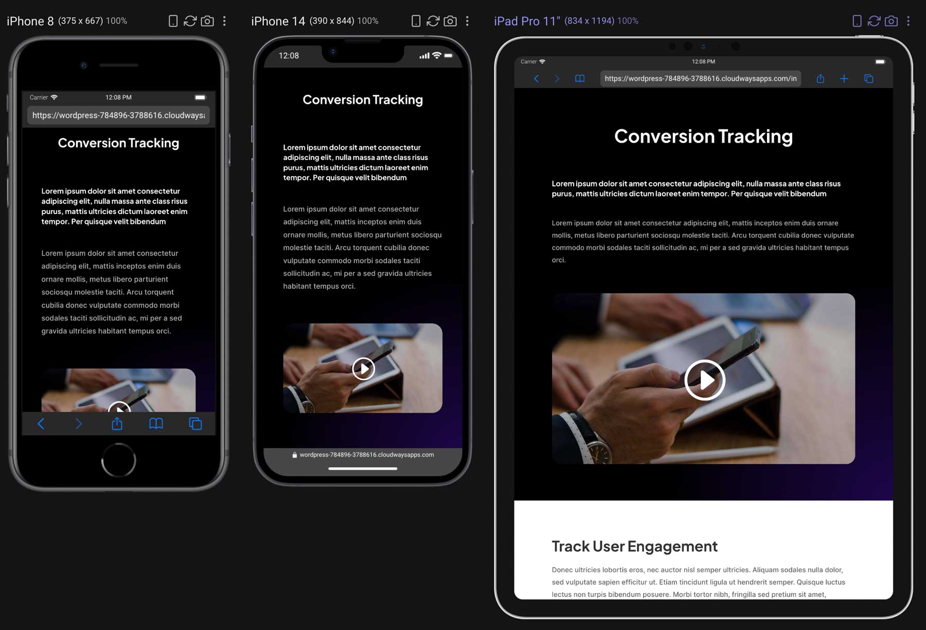
Another crucial aspect of an effective landing page is a responsive layout. A responsive website design means your landing page’s content is visible on desktop screens and mobile and tablet devices. Since more than 60% of people access the internet through a mobile device, you’ll miss out on sales if potential customers can’t view your website correctly. You’ll be glad to know that all of Divi’s free Cyber Monday Website Packs are 100% responsive, meaning they’ll look perfect no matter which device your site’s visitors use.
A/B Test Your Landing Page
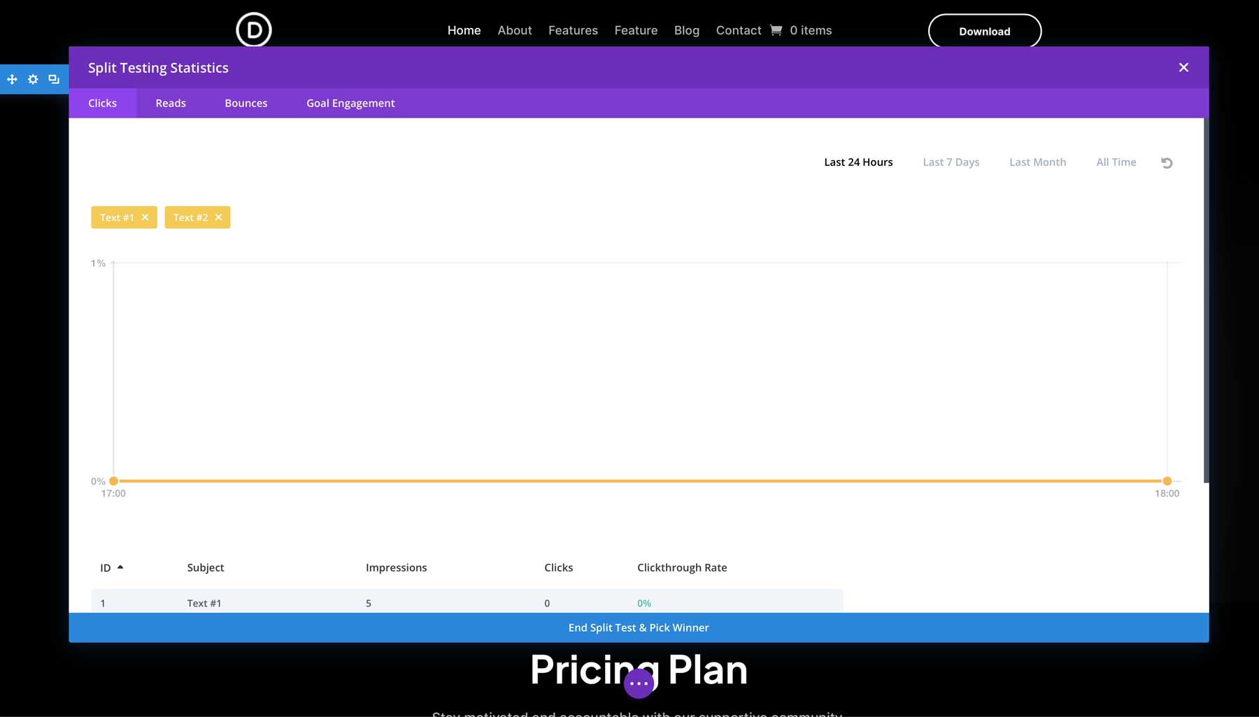
Part of building an effective marketing strategy involves A/B testing. As a Divi user, you have a complete A/B testing suite with Divi Leads. With robust split testing and conversion tracking software built into the Divi Builder, there’s no need to incorporate confusing split testing plugins. It allows you to test different colors, images, and content to determine what works and what doesn’t.
Use a Thank You Page
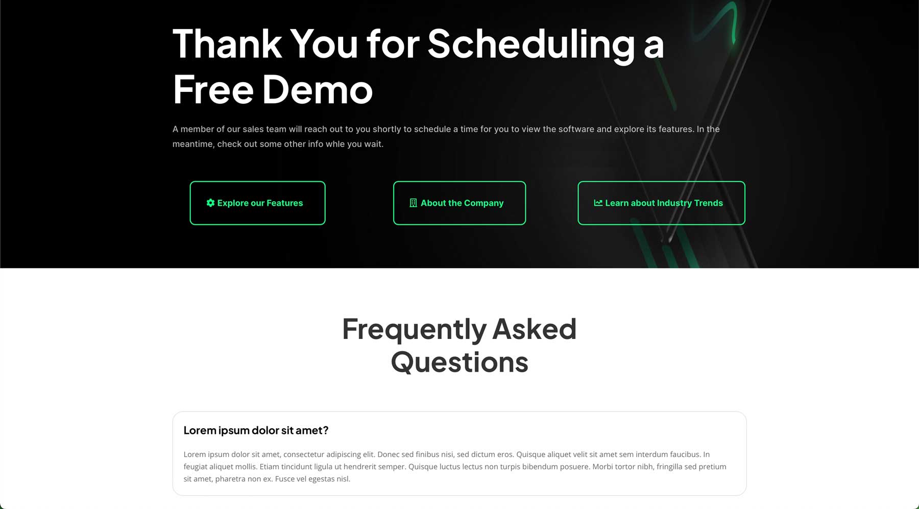
Last but not least, every effective landing page should redirect users to a thank you page upon filling out a form or other CTA. Sure, you could use a thank you message, but there are several reasons why that’s not in your best interest. For example, a thank you page is an excellent way to present the download if you offer a free download for filling out a form. A thank you page is also great for adding information, such as essential blog posts or relevant products. Plus, a thank you page is much more professional than a simple thanks for giving me all your info message. The good news is that Divi’s Cyber Monday Website Packs come with plenty of layouts, any of which can be repurposed to function as a thank you page.
Download the Free Divi Cyber Monday Website Packs
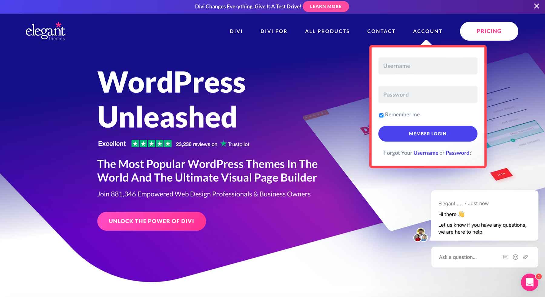
Divi Lifetime members and those who purchased during our Black Friday or Cyber Monday Sales will have access to four complete website packs in their Elegant Themes member area. Start by navigating the Elegant Themes website and clicking the Account tab. A pop-up will appear. Enter your ET member login info and click the Member Login button.
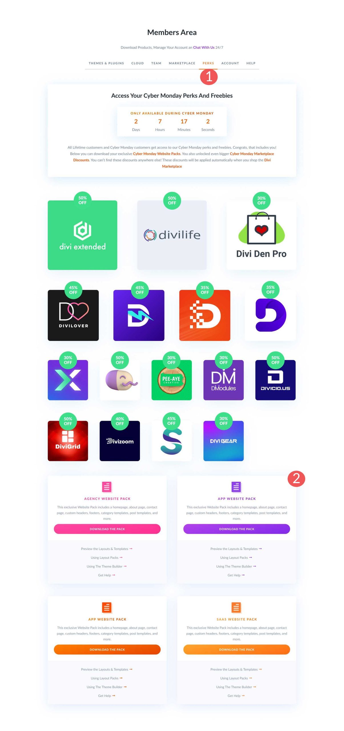
Next, navigate to the Perks tab (1). Scroll down to locate the Website Pack freebies and click the Download the pack button (2).
How To Build a High-Converting Landing Page with Divi
To demonstrate how easy it is to create a high-converting landing page with Divi, we’ll start with the App home page layout within the Cyber Monday Website Pack and then add an email optin form to make it even more effective.
Step 1: Install the App Website Pack Home Page Layout
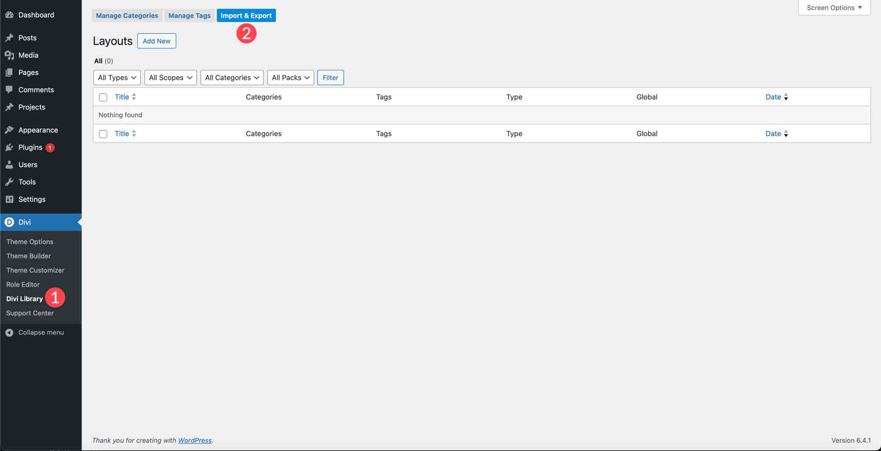
First, we must load the website pack into our Divi WordPress website. In the WordPress admin dashboard, locate the Divi > Library tab (1) on the left-hand side. Next, click the import/export button (2).
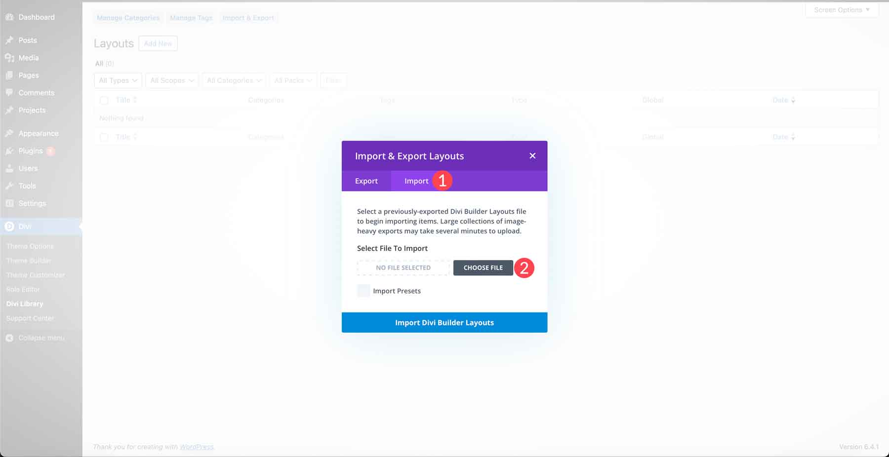
When the dialog box appears, click the import tab (1). Next, click Choose File (2) to select the JSON files on your computer.
Locate the zip file downloaded to your computer. Use a zip utility to unzip the folder, then double-click the Divi Website App Pack folder to open it.
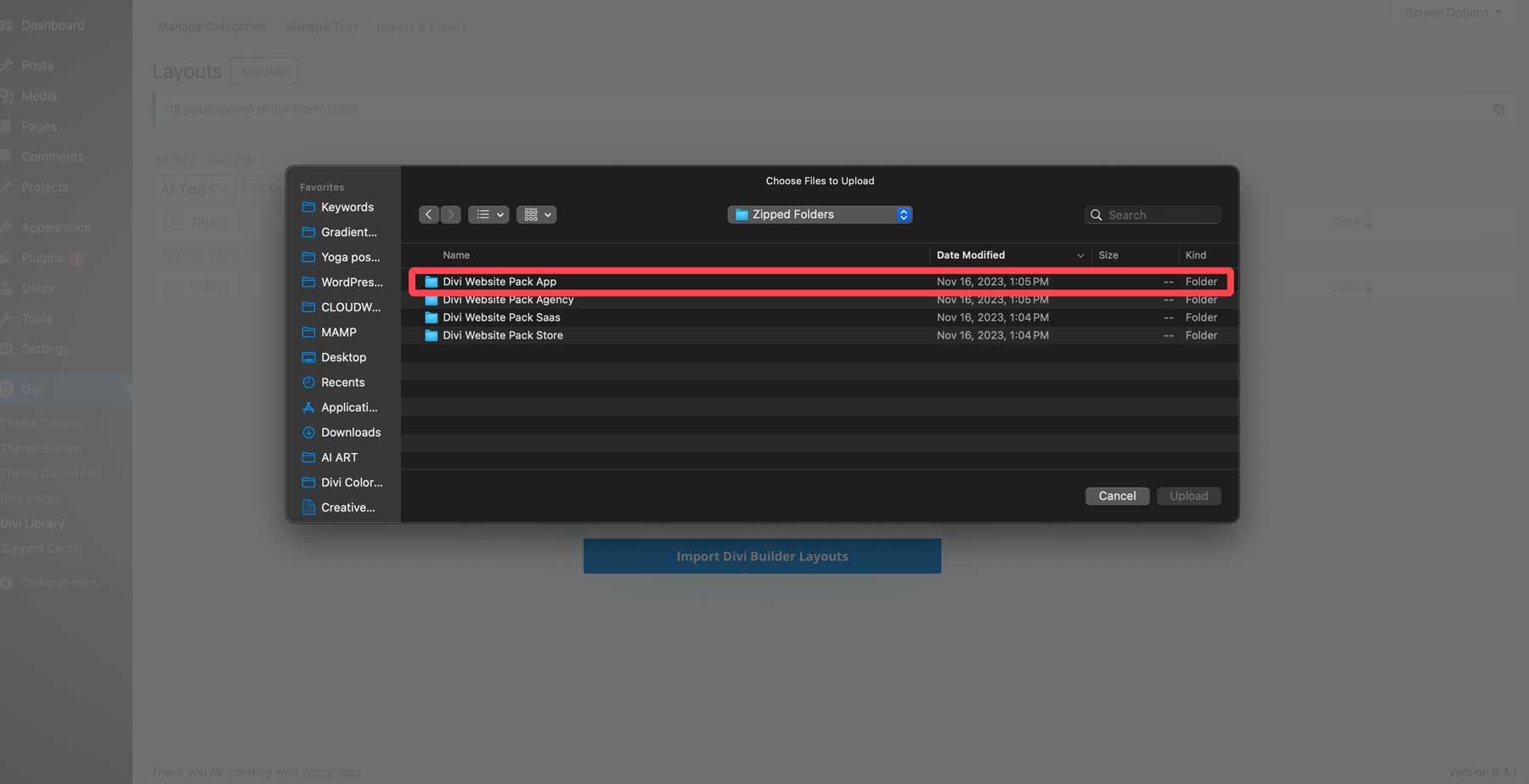
Next, double-click on the Page Layouts folder.
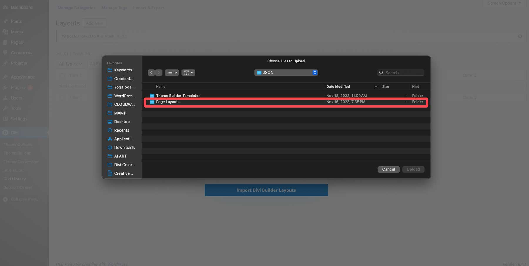
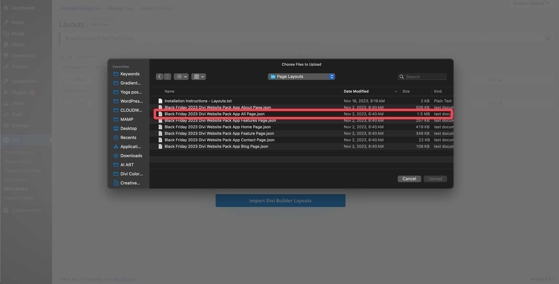
Locate the Black Friday 2023 Divi Website Pack App All.json file and click to add it to the importer.
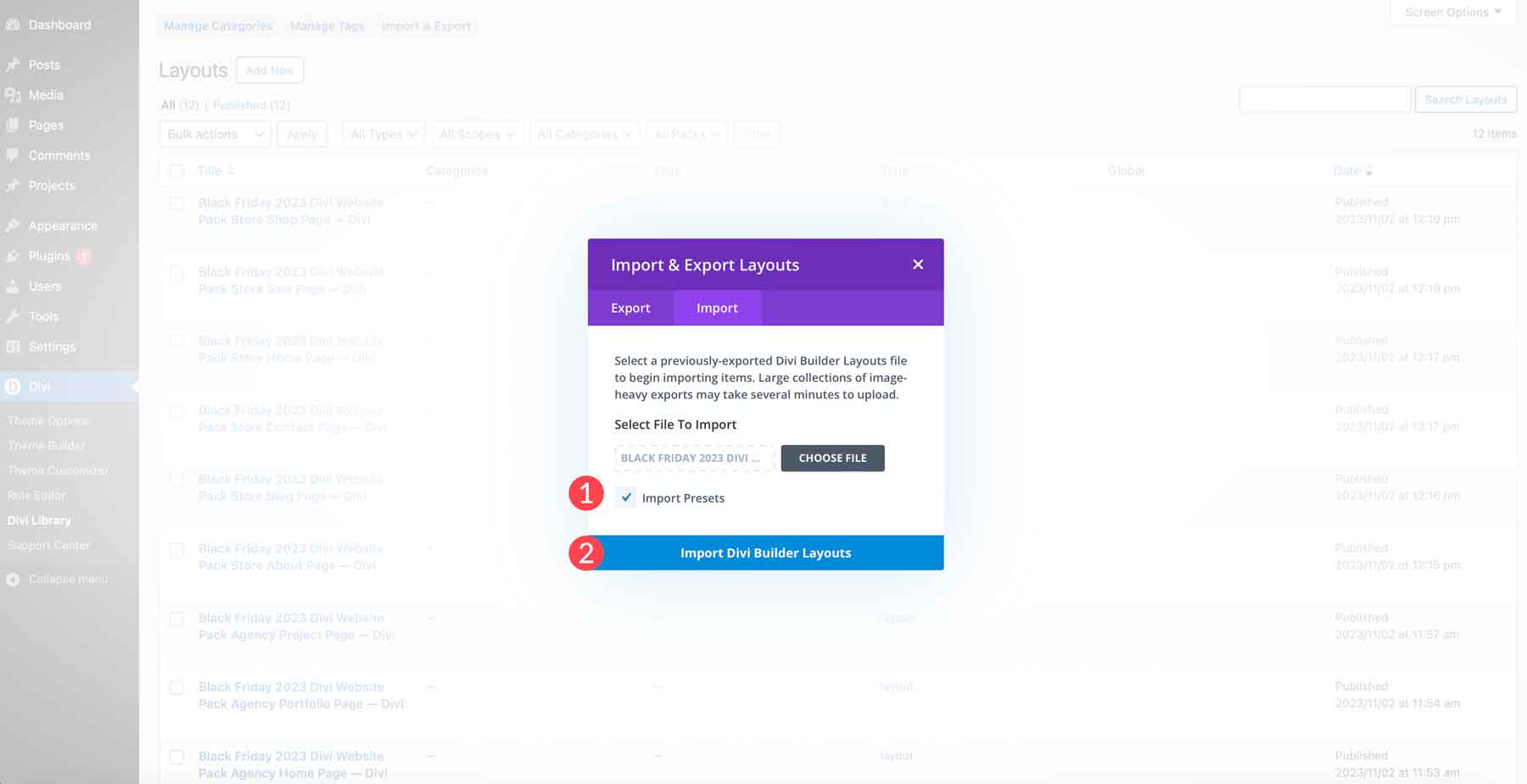
Finally, click the import presets tick box (1) to load all the presets with the layouts, and click the Import Divi Builder Layouts button (2) to load the layouts into your WordPress install.
Step 2: Create a New Page
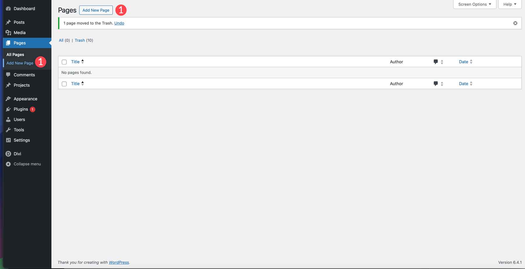
The next step is to create a new page on your WordPress website. Navigate to Pages > Add New Page.
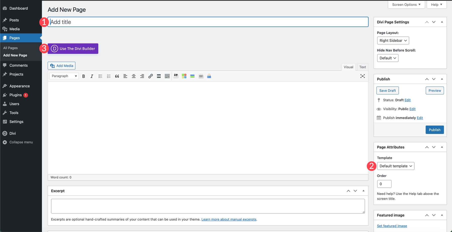
Give your page a title (1) to easily find it later. You’ll also want to swap the page template from default to blank (2). This will remove your website’s header and footer from the page so that you can keep your visitors from wandering when they land on your page. Finally, click the enable Divi builder (3) button so we can load in our Cyber Monday layout.
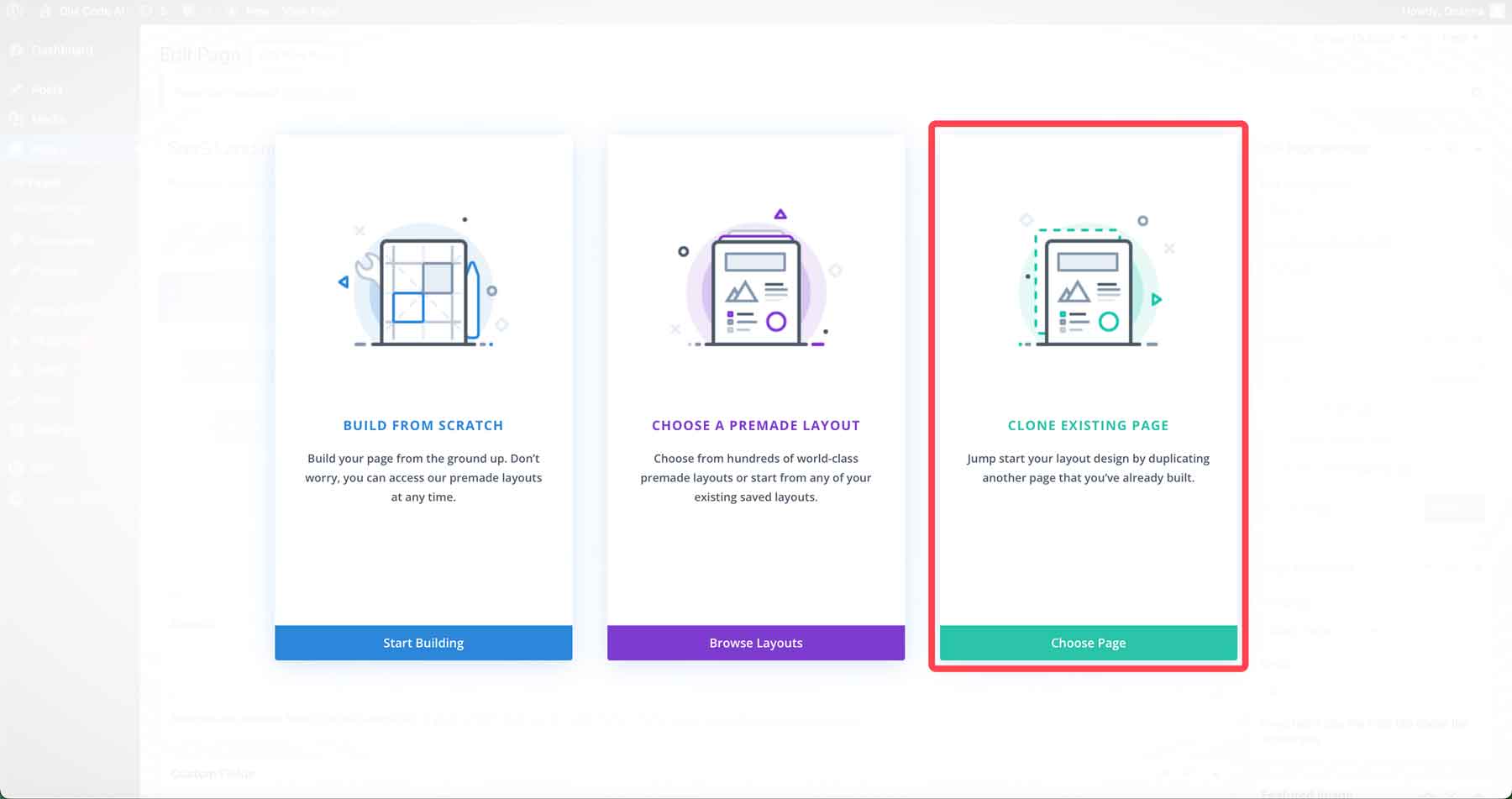
When your page refreshes, you’ll have three options for building your page. Build from scratch, choose a pre-made layout, or clone an existing page. Since we’re creating from a Divi library layout, let’s select clone existing page.
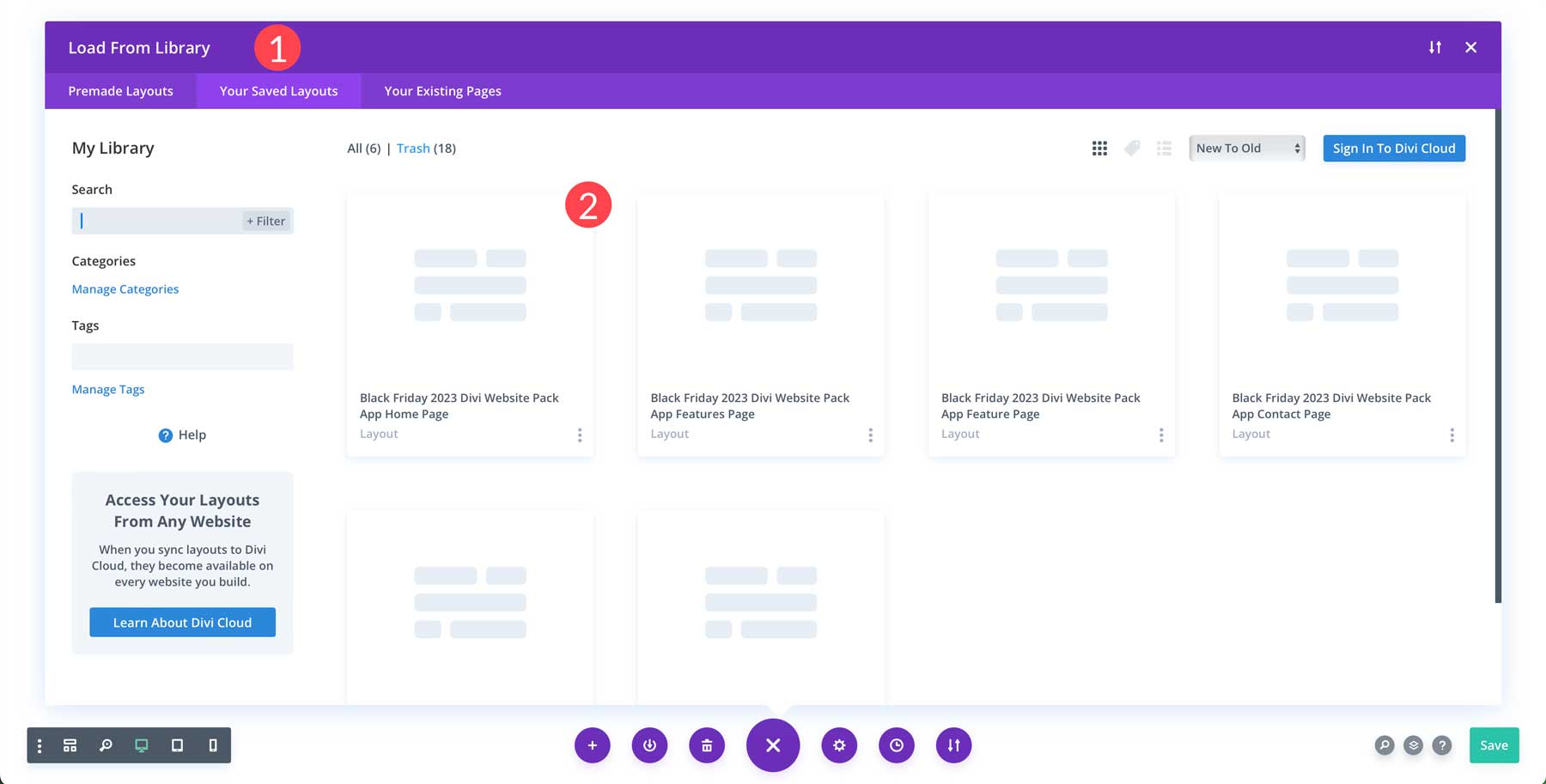
Next, choose the your saved layouts tab (1) to bring up the App layouts we added in the previous step. Search for the App Home Page Layout and double-click it (2).
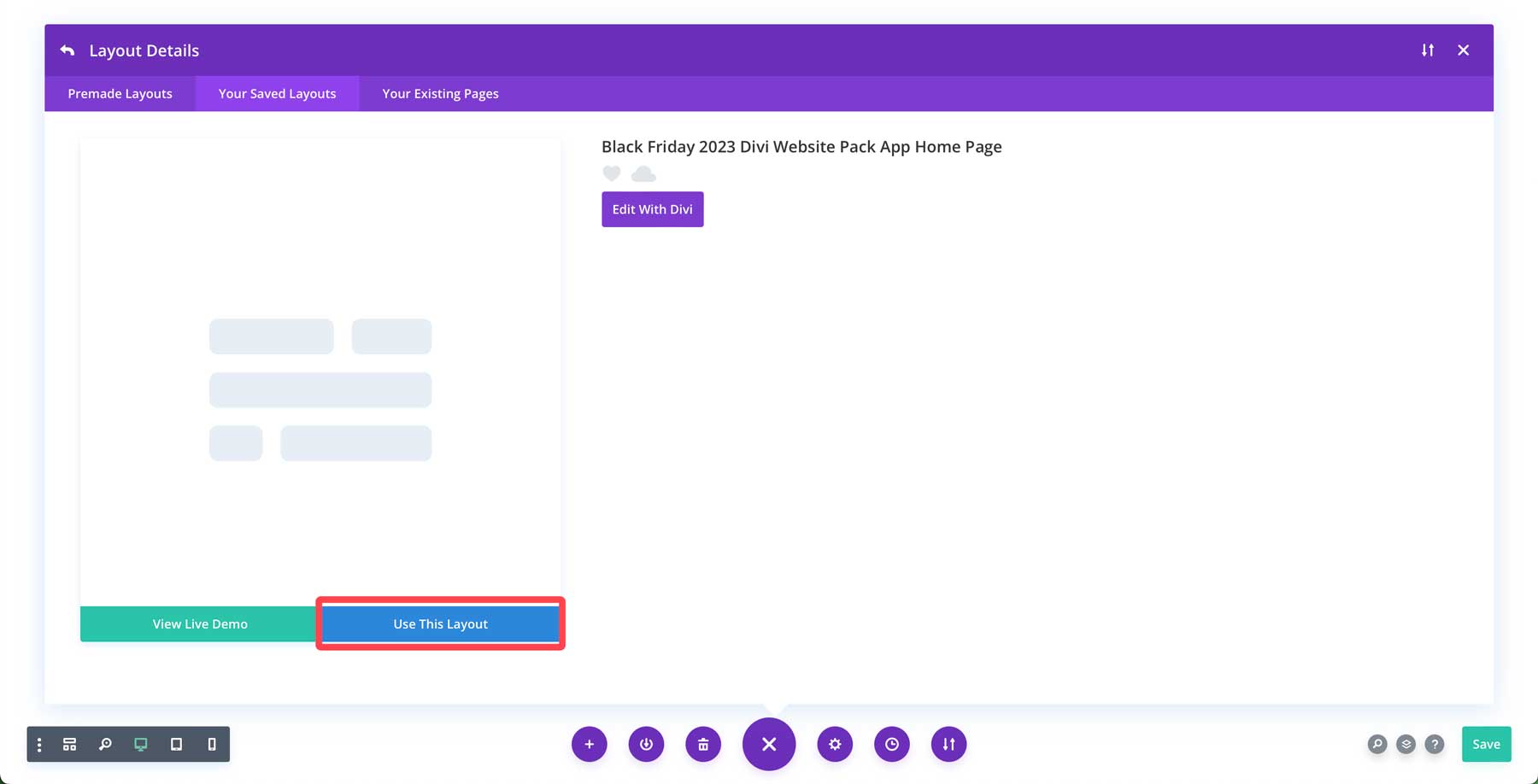
Finally, click the use this layout button to load the App home page layout into the page.
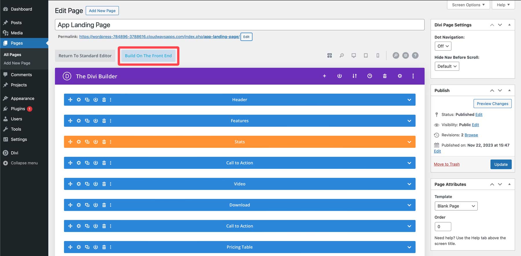
Divi offers two ways to use the Divi Builder. You can design the page on the back end using Divi’s design modules or build on the front end in real time. For most, the front-end Visual Builder provides a much better experience, with the ability to see design changes as you make them. So, let’s click the build on the front end button to load the Visual Builder.
Step 3: Make Changes to the layout
We can get our first look at the layout with our landing page created. Scrolling through the page, you’ll notice several elements already follow the landing page structure guidelines. There’s a prominent headline in the hero, several CTAs throughout the page, a FAQ section, and an attractive pricing module. However, we should add an element to make it more effective: a form above the fold. We should also move the pricing module to avoid losing sales. When you want to build a high-converting Divi landing page, it’s important to remember to put important information as close to the start of the page as possible.
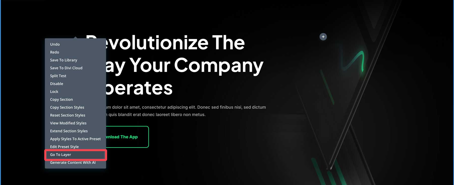
Divi’s layer view makes moving design elements throughout the page simple. While working on the front end with the Visual Builder enabled, right-click anywhere on the page to bring up a secondary menu. Click go to layer.
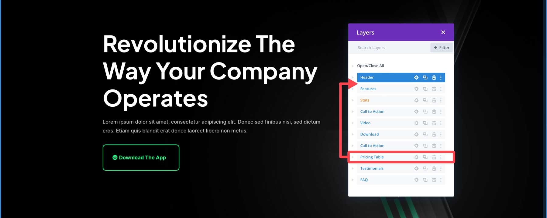
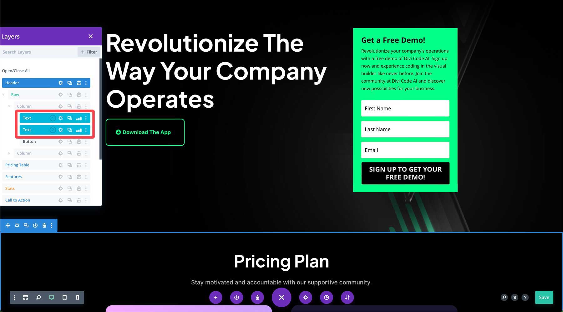
Next, click and drag the Pricing layer in the layers view up and underneath the header section.
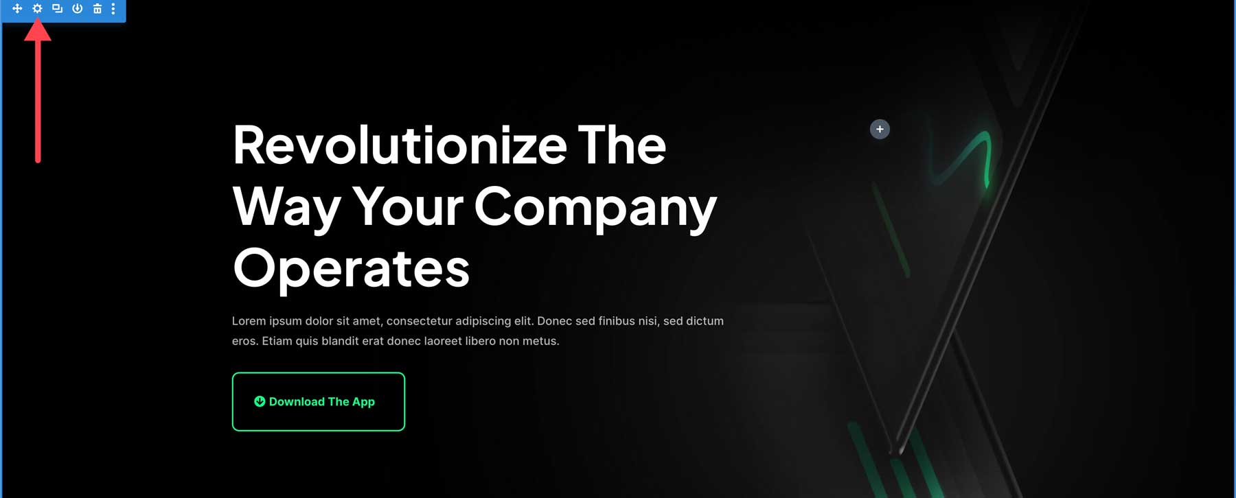
We want the pricing tables to be visible above the fold, so we must modify the padding in the hero section. To do this, hover over the first section of the page and click the gear icon in the hero section.
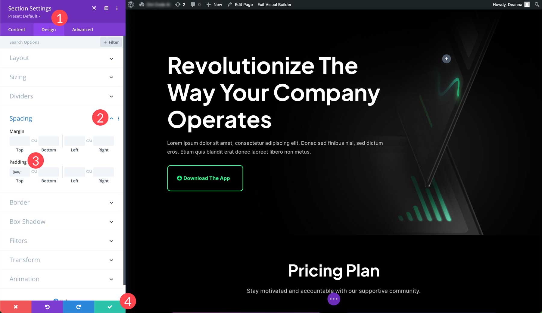
Navigate to the design tab (1), then scroll down until you locate spacing. Click the drop-down arrow (2) next to reveal the margin and padding. Reduce the top padding from 8vw to 4vw (3). Finally, click the green check box (4) to save the changes.
Making Adjustments to the Right Column
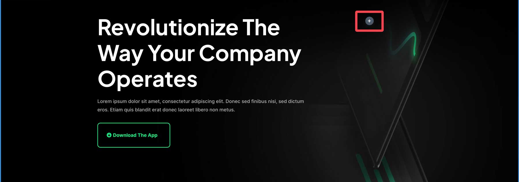
We need to adjust the hero section to make our landing page more effective. The first row in the section is a two-column row, so we want to add an optin form to the right column. Since our landing page is set up to accommodate a form, all we have to do is add it. To add a new optin module, click the gray + icon in the right column.
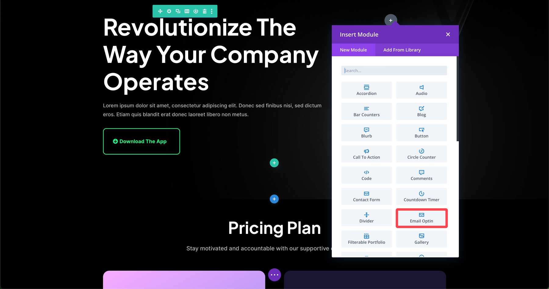
When the module pop-up appears, click the email optin module to insert it.
Customizing the Opt-In Form
The next step is to make our optin form match the rest of the design. Start by clicking on the background tab in the email optin module settings. By default, Divi adds a color to the background in the optin. That’s great, but we want to match the surrounding colors of our theme. The great news is that all the colors in our layout are automatically imported with the files. This makes matching colors easy. Within the background section of the optin module, click the global tab.
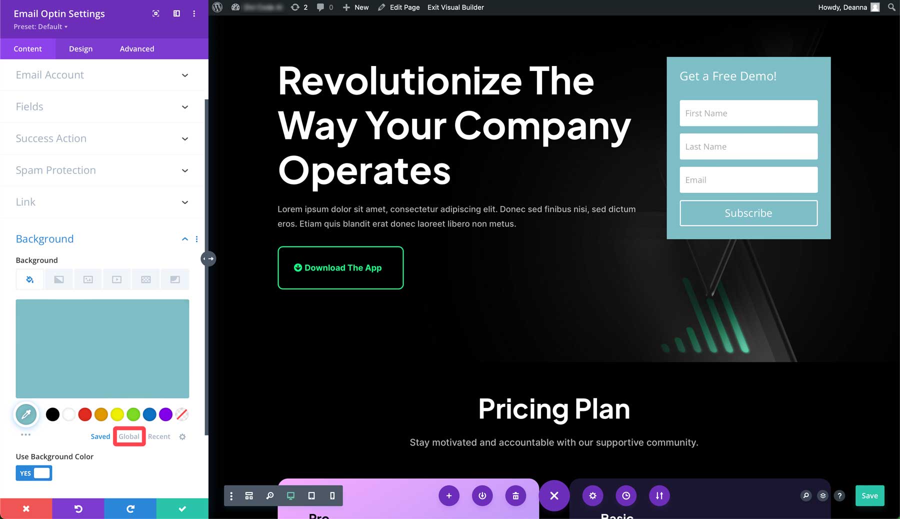
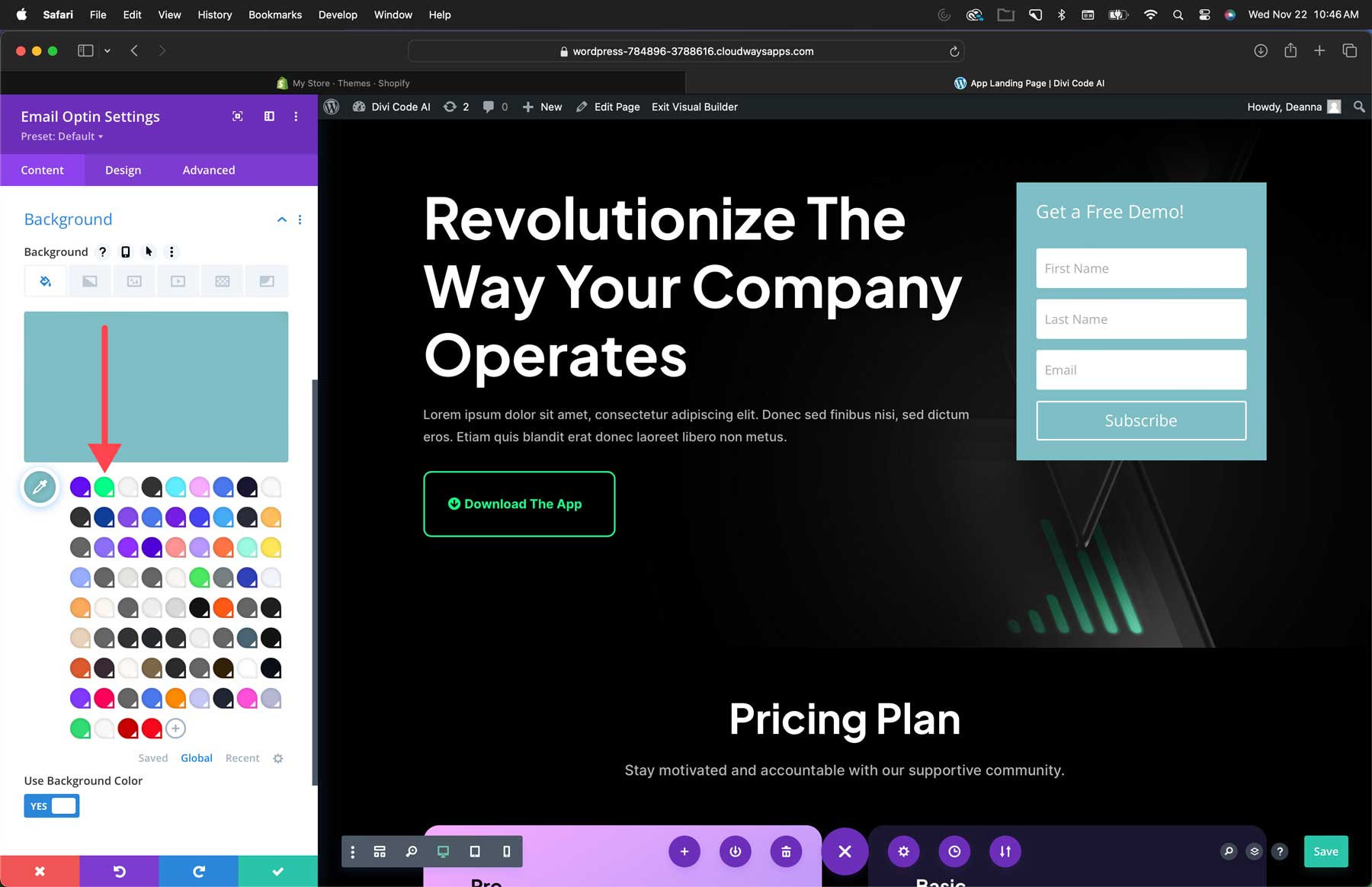
Depending on how many layouts you’ve imported in the past, you may have other global colors present aside from this layout’s colors. However, new colors are added to the top, so finding the correct colors is easy. For our optin module’s background, we’ll select the neon green color of the neighboring Download the App button.
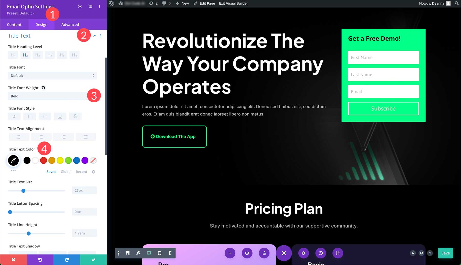
Next, we need to change the text and button of our form. Click the design tab (1) and scroll down to the title text. Click the drop-down arrow to the right of the header to select its options (2). Under the title font weight, select bold (3). Select the first swatch under the title text color, #000000 (4).
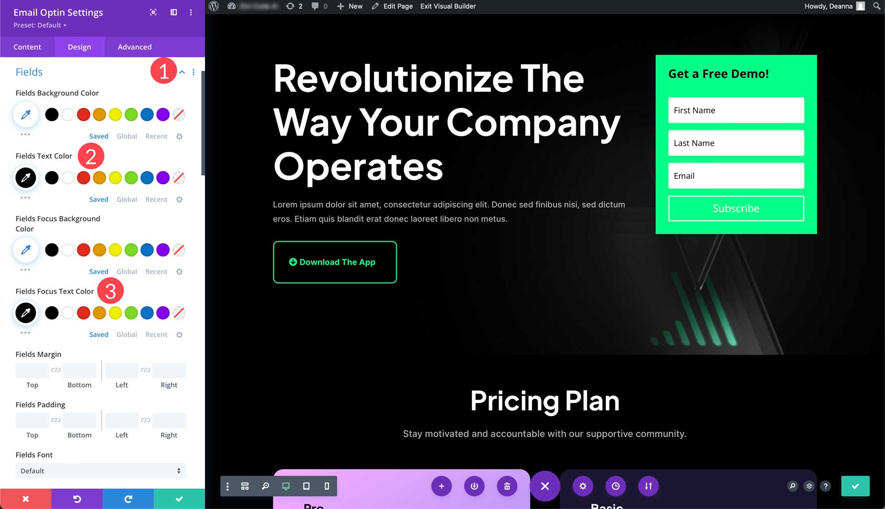
Now select the fields tab drop-down arrow (1) and change the field text color to #000000(2) and the field focus text color to black as well (3).
Finally, we need to customize the subscribe button. Scroll down to the button tab (1) and turn the custom styles for button on (2).
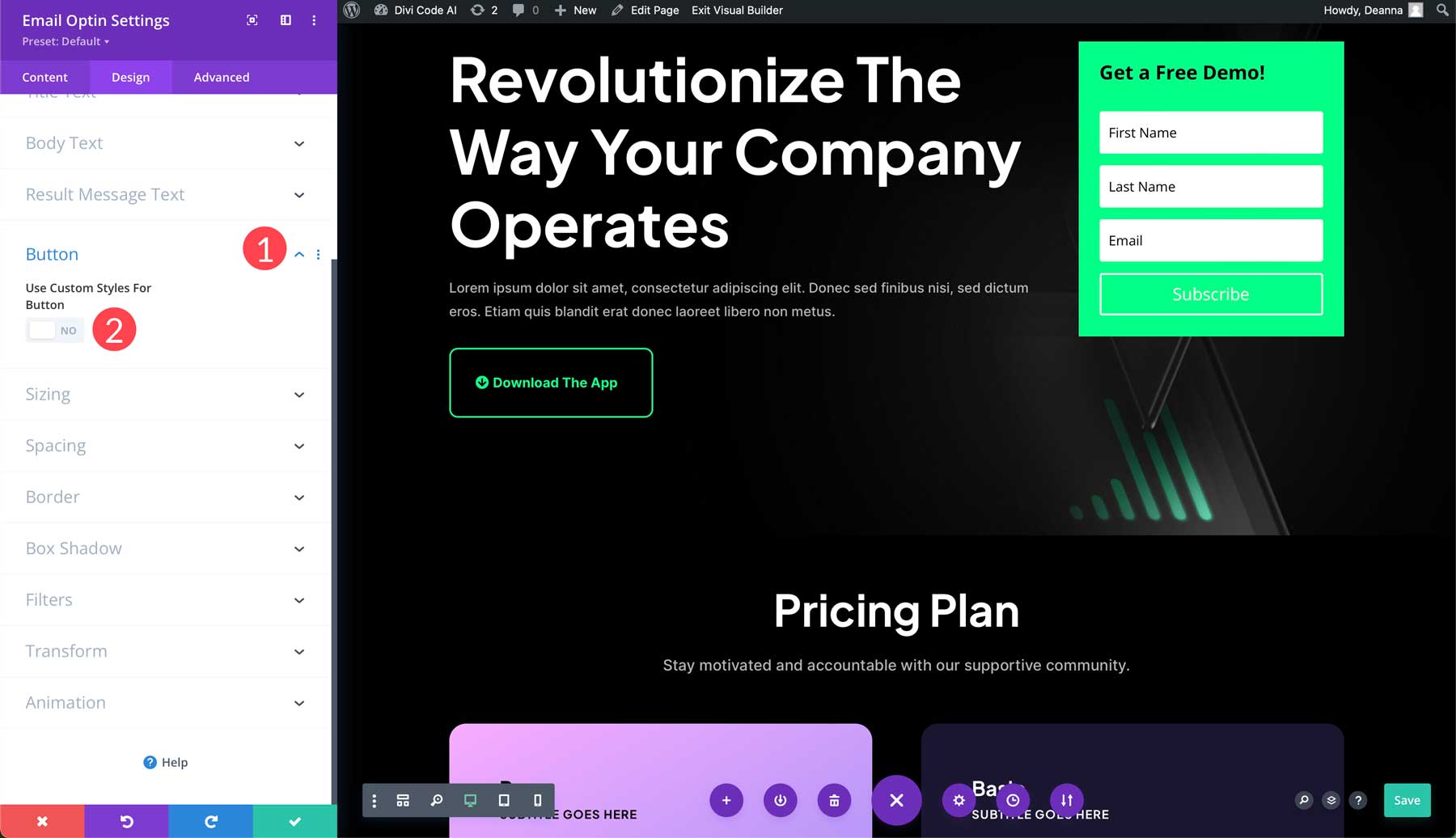
We’ll leave the text color as is but add a black background to our button (1). We’ll also set the border to 0px (2).
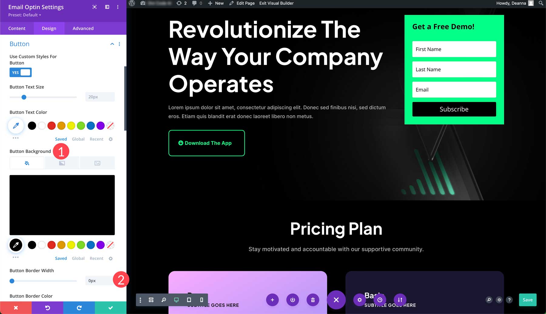
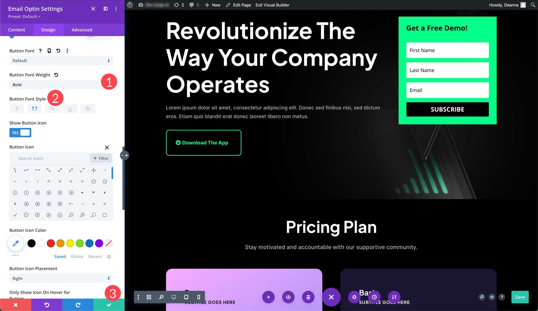
Lastly, change the button’s font weight to bold (1) and select uppercase for the button’s font style (2). To save the changes, click the green check button (3).
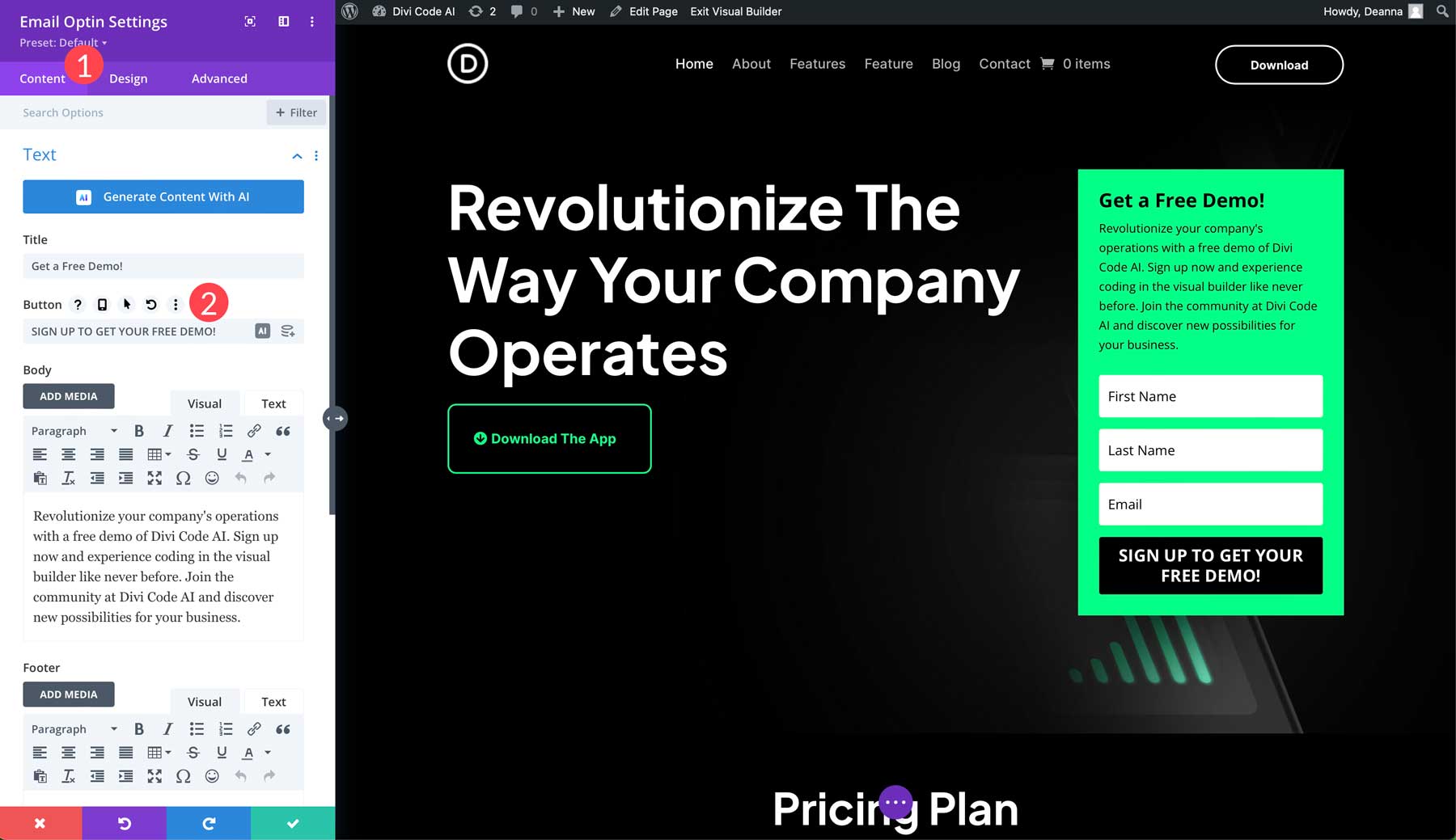
Note: Don’t forget to change the optin form’s text if you plan to use the optin form for something other than a newsletter subscription. The field can be adjusted by clicking the content tab (1) and changing the subscribe text in the button settings (2).
Step 4: Add Copy To Your Landing Page with Divi AI
Now that we have an offer and a CTA above the fold, we can focus on creating compelling copy for our landing page. We could hire a freelance writer or attempt to write copy independently, but with Divi, there’s a better way. Enter Divi AI, your personal copywriting assistant. Writing and improving copy is a breeze, thanks to Divi AI. It works by analyzing the existing content on your site and then recommends relevant, on-brand copy.
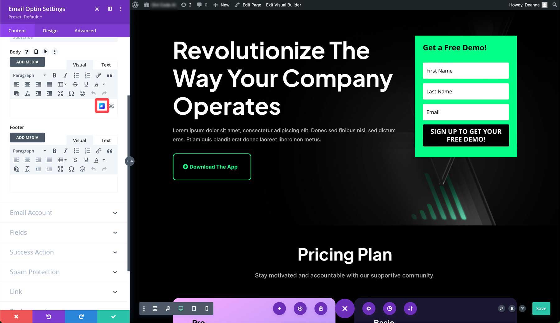
For example, if we want to add text to our email optin, we can ask Divi AI to provide copy based on a text prompt. With the email optin settings open, click the AI icon in the body area to activate Divi AI.
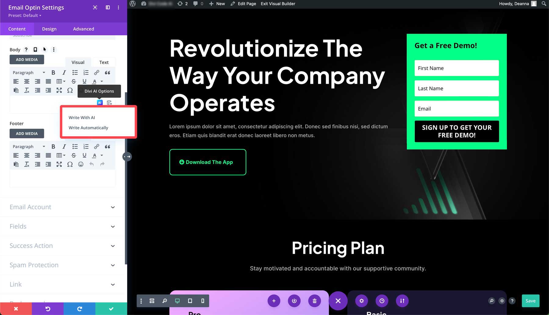
Two options will pop up, including write with AI and write automatically. The first option allows you to guide the AI in creating copy for the module. The write automatically option allows Divi to analyze surrounding content on the page and suggest content based on it. It considers things like your site’s title and tagline and provides relevant text.
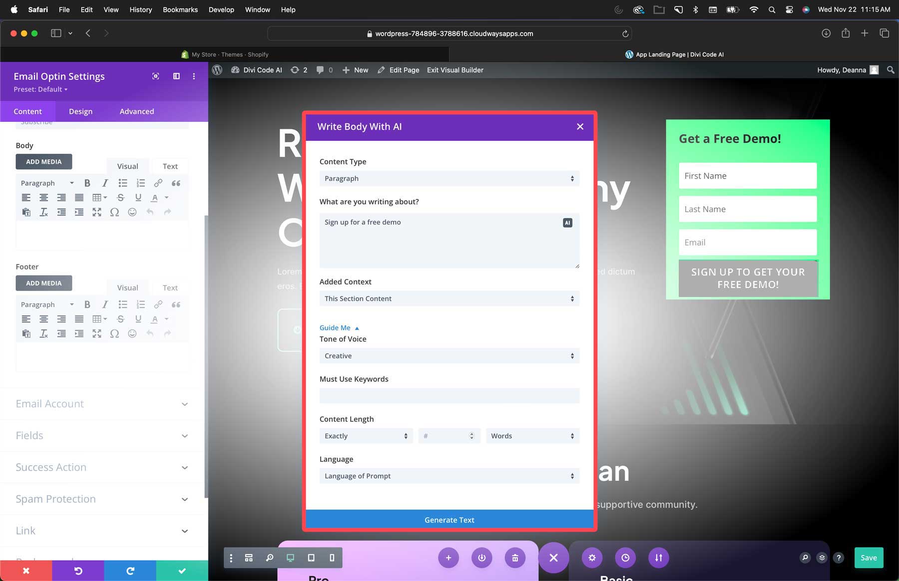
Select write with AI. This will bring up the AI interface. You can choose a content type, provide details about what you plan to write about, assign context, specify a tone of voice, add keywords, choose a language, and tell Divi exactly how many words to write.
Step 5: Generate Images with Divi AI
As previously stated, having high-quality, relevant images is essential in building a high-converting Divi landing page. Thankfully, Divi AI can help with that. Divi’s image generator has good bones. Built on the Stable Diffusion platform, it provides high-quality images in different styles and aspect ratios, making it easy to transform any Divi layout with AI.
Generating an image with Divi AI is straightforward, but you can follow a few good prompting tips to get the most out of the software. The most important is the perfect prompt rule: Image style > description > details > composition.
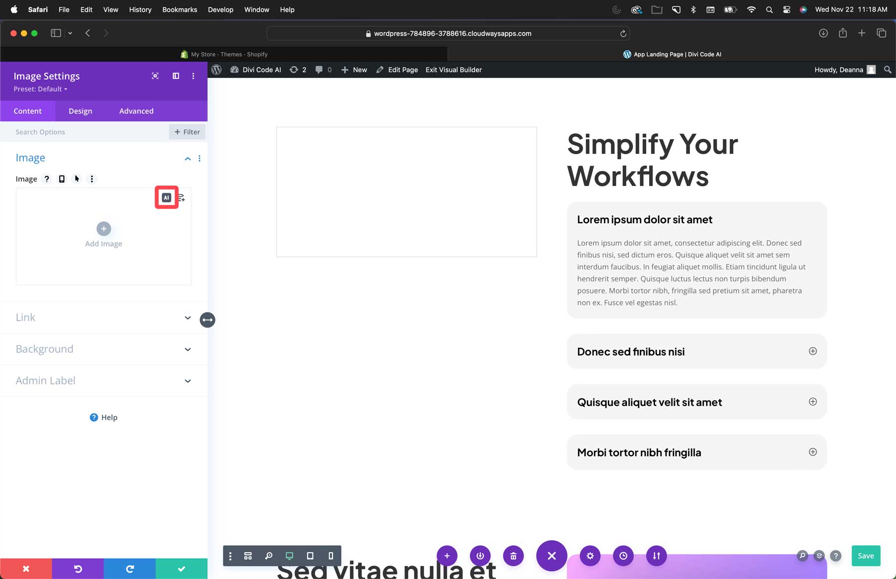
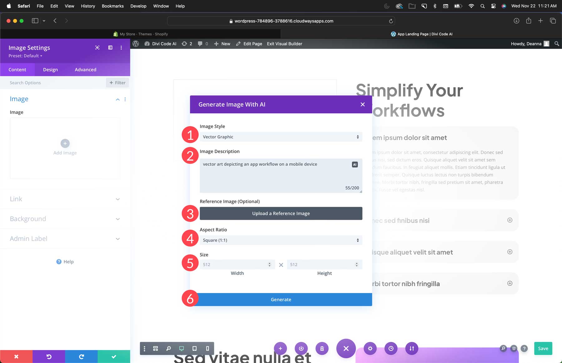
To generate an image, add an image module to your landing page. Next, click the AI icon at the top right of the image field.
Select from one of twelve styles (1), add a description (2), upload a reference image if desired (3), select an aspect ratio (4), add a size (5), and click generate (6).
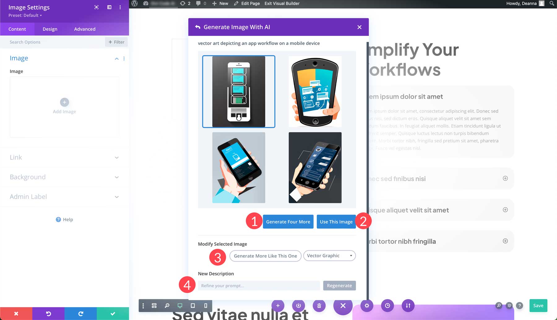
Divi AI will provide 4 images to choose from. From there, you can generate four more (1), select an image to use (2), modify the photo (3), or refine your prompt (4) to generate a completely different set of images.
Step 6: Conduct A/B Testing
Another crucial step to success with your landing pages is A/B testing. It allows you to create multiple versions of a page and then test which version performs better. As previously mentioned, Divi users have this functionality built-in courtesy of Divi Leads.
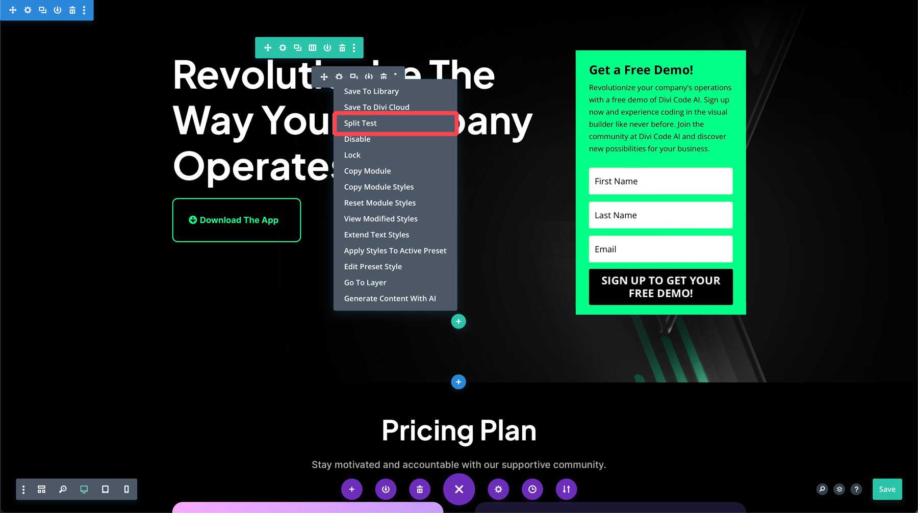
For example, you want to test two different titles for your landing page. You can easily set that up by right-clicking the headline in the hero section and selecting split test.
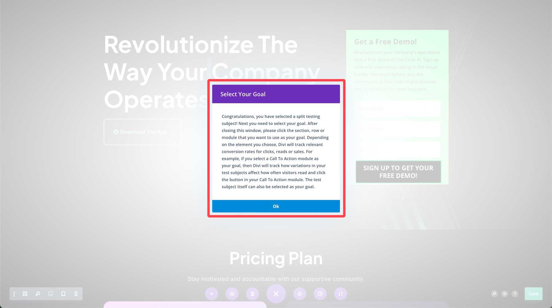
Upon selecting the title for split testing, a dialog box will appear, notifying you that you’ve chosen a subject for testing. The next step is establishing a goal so Divi can track relevant conversion rates for clicks, reads, or sales.
You can click on the headline to make it the subject and goal, then change the text of the second headline. From there, Divi will conduct testing every time a user clicks on your page and identify which version of the headline is more effective. With Divi Leads, you can test any module on the page, so the sky is the limit.
Divi Cyber Monday Website Packs are Perfect for Creating High-Converting Landing Pages
As we’ve demonstrated, all of Divi’s layout packs make it simple to build a high-converting Divi landing page that you can use to feature products, upcoming sales, or new services you want your customers to be aware of. This is true, too, of this year’s free Cyber Monday Website packs. By combining the beauty of pre-made layouts, Divi AI, and Divi Leads, Elegant Themes members have all the tools they need to create effective landing pages quickly.
The post How To Build A High-Converting Divi Landing Page (With Free Cyber Monday Layouts) appeared first on Elegant Themes Blog.
