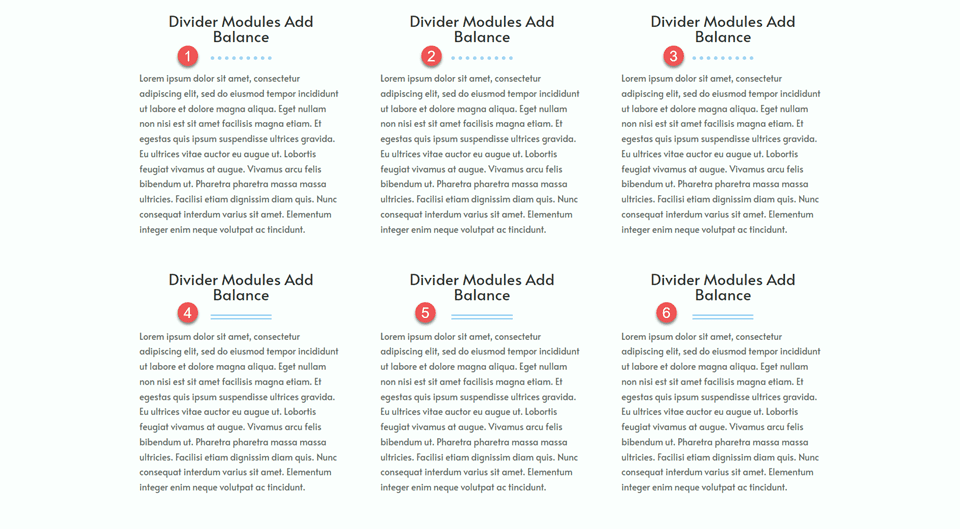
One of the easiest ways to create balance in your website design is by using Divi’s Divider module. Divi dividers are perfect for creating a sense of space between items on your page and establishing a balance in your design. They can also create white space in a design without simply creating blank areas. Not to mention, dividers are a great way to reflect your branding throughout the page, as they can be completely customized to your liking with colors, line styles, and more!
In this post, we will go over why dividers are helpful to include in your designs and show you some ways you can use dividers in your next web design project. Let’s get started!
Why You Should Use The Divider Module
Believe it or not, white space is one of the most important design elements on your website. It’s one of the first things you notice when visiting a website, and it plays a role in the way users scan through the elements on your website and interact with your page. Whitespace can help divide elements and create a sense of separation between sections of your website. It can also help direct the eye to the important elements of your page. For example, you can make an element stand out on the page just by increasing the white space around it. In fact, the white spaces between paragraphs and sections are often just as important to creating balance in your design as the text itself. When you’re designing a website, you don’t want the white space to feel empty or unbalanced—you want it to feel intentional so that it helps people move from one part of your page to the next more easily.
Divider modules are one of the most versatile tools in Divi and are straightforward to use. They help add white space to cluttered designs and can be a great way to break up your content. They can also be used to add color and style while creating balance between two elements on your page, like text modules or images. Here are some examples of how dividers can be used.
Define Headings
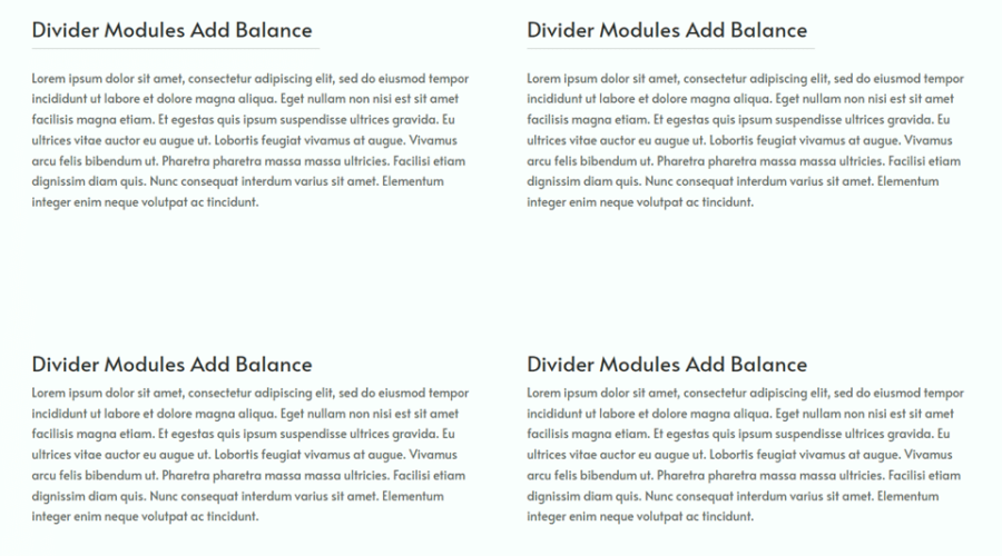
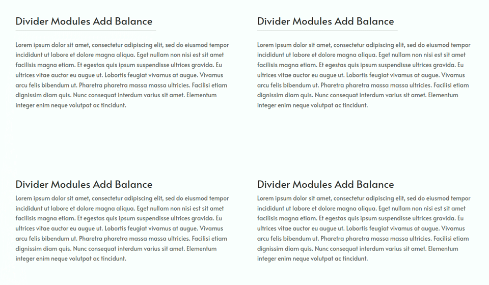
A great way to use dividers in your web design to create balance is to use them to define headings. By adding a divider between the heading text and the body text, you clearly distinguish the heading text from the body text. This can help your headings stand out more so your website visitors can easily skim through the page and find what they want.
In this example, we added a subtle divider line between the heading and the body to create some separation and balance the design. You can see it compared to the blurbs below without a divider.
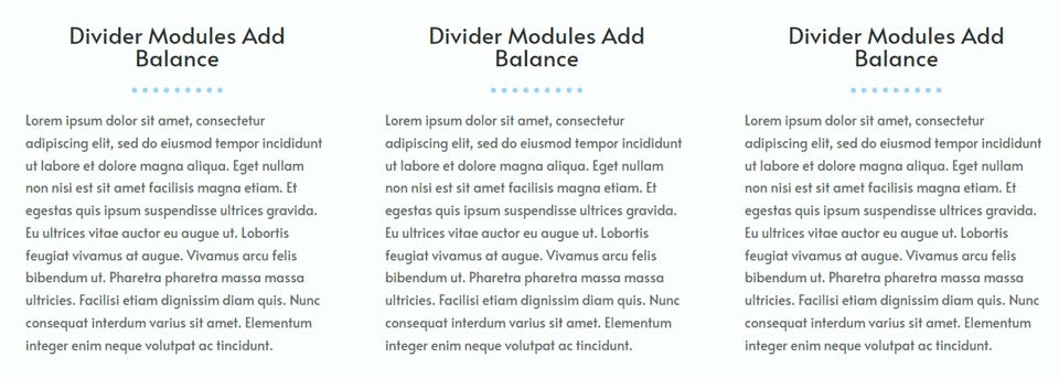
Here’s another example of dividers used to distinguish headings. These dividers are styled to match the design of the page, which we will talk more about later.
Separate and Group Elements
Divider modules make it easy to create visual balance by separating sections of your website and clearly establishing what information is grouped and what information is not. Adding a simple divider module to your page to separate or group elements will help your visitors navigate your content and create a better overall user experience.
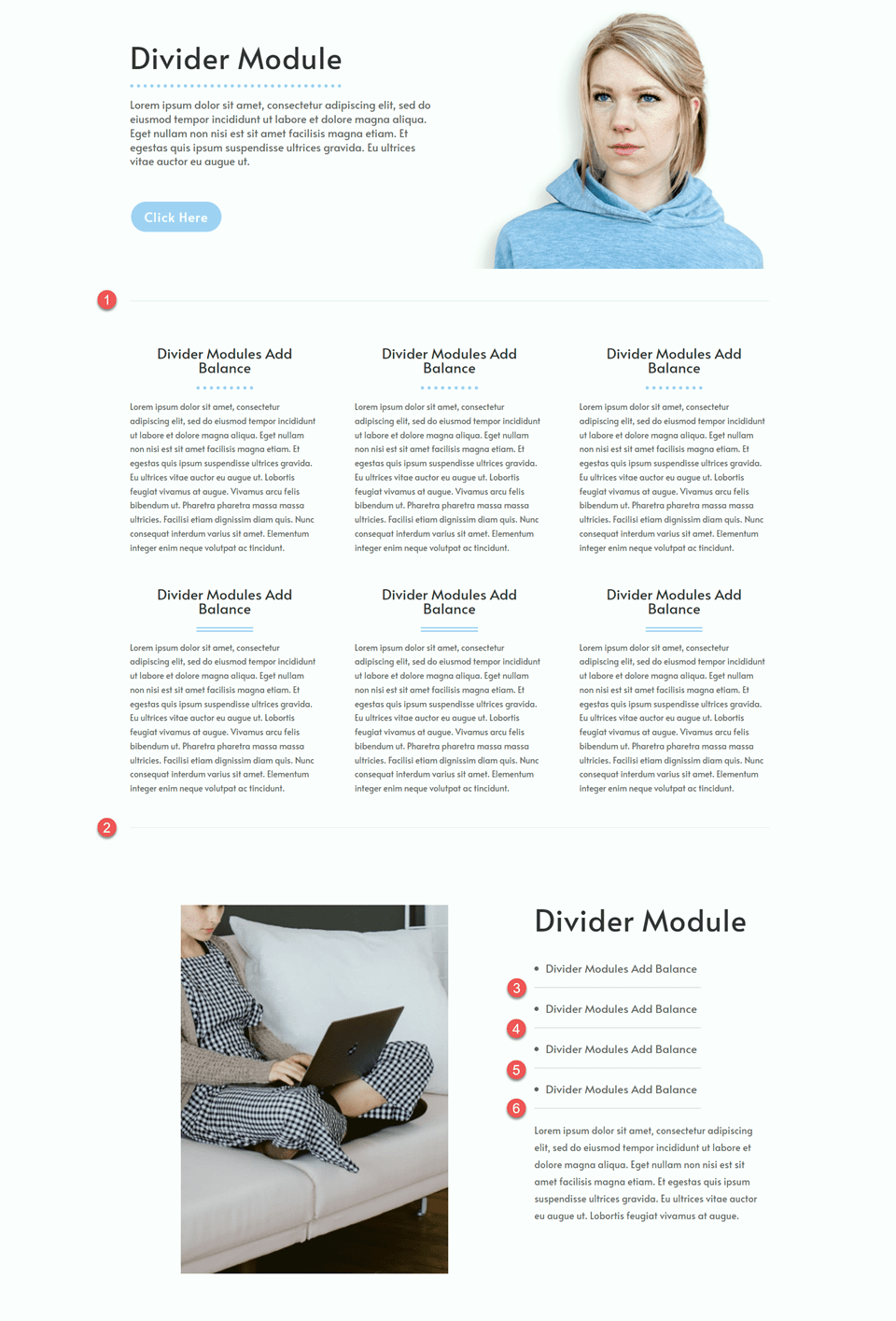
In this example, we added some light grey dividers to break up the major sections of the page and divide some bullet points. Because the divider is light and subtle, it isn’t very distracting to the overall design while still adding some separation to the page.
Reflect your Branding
Divi’s divider module can be customized with any color, so you can bring some of your branding colors into the layout. When combined with other divider settings like the width, weight, and line style, you can create unique dividers that reflect your branding while also bringing balance to your design.
In this example, we used a couple of different divider styles to show how you can modify the divider design to fit your branding. Not only are the divider modules functional and helpful to the user experience, it also becomes an opportunity to strengthen the design of your website and emphasize your brand colors.
How to Use Divi Divider Modules to Create Balance in Your Design
Now that we have discussed the benefits of adding dividers to your website design, let’s go ahead and get to the tutorial part of this article. We will add some dividers to a premade layout from the Divi Library.
Sneak Peek
Here is a preview of what we will design
What You Need to Get Started
Before we begin, install and activate the Divi Theme and make sure you have the latest version of Divi on your website.
Now, you are ready to start!
Create a New Page with a Premade Layout
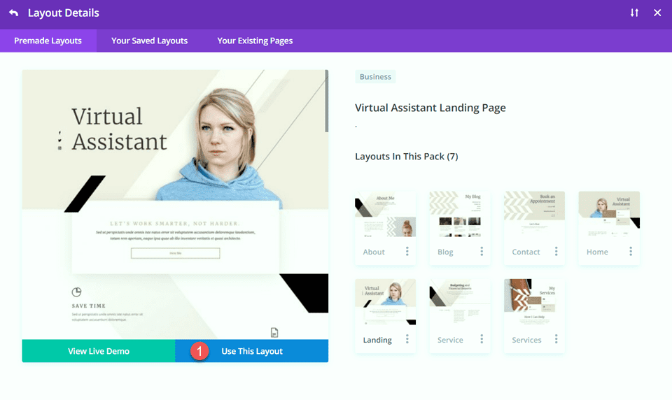
Let’s start by using a premade layout from the Divi library. For this design, we will use the Virtual Assistant Landing Page from the Virtual Assistant Layout Pack.
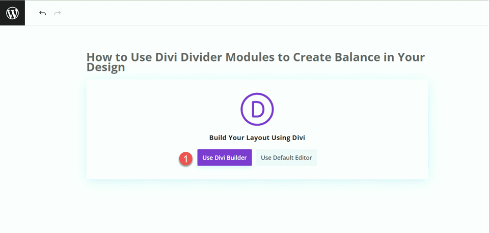
Add a new page to your website and give it a title, then select the option to Use Divi Builder.
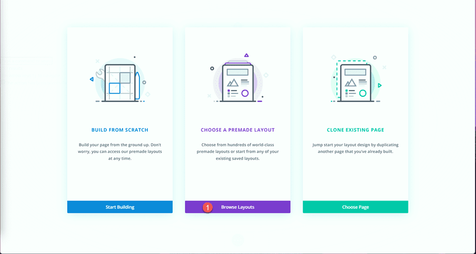
We will use a premade layout from the Divi library for this example, so select Browse Layouts.
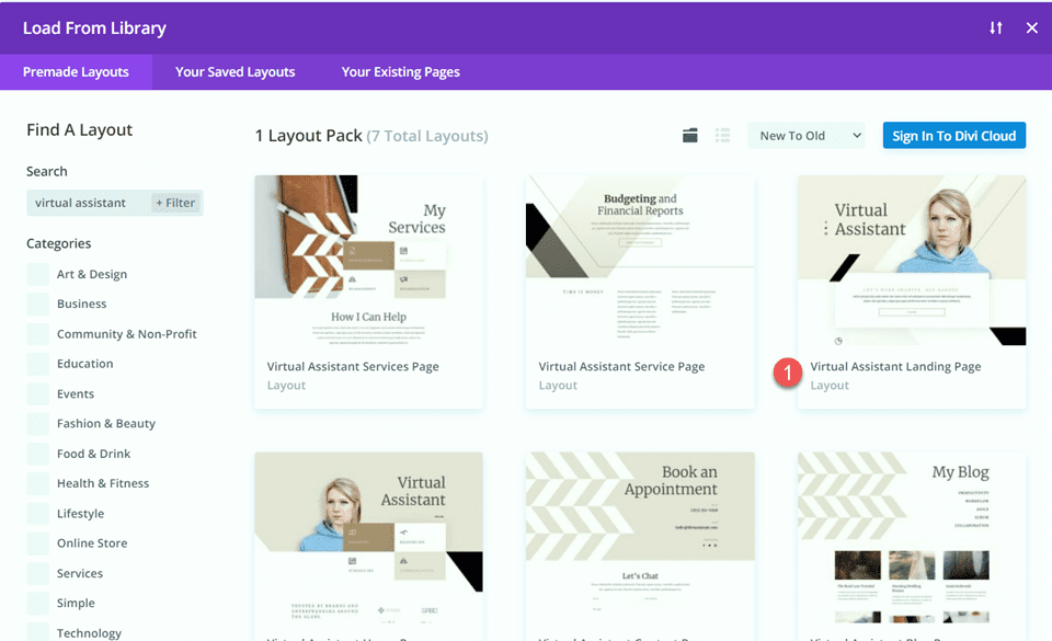
Search for and select the Virtual Assistant Landing Page.
Select Use This Layout to add the layout to your page.
Now, we are ready to build our design.
Add Divider Modules to Create Balance
Modifying the Hero Section
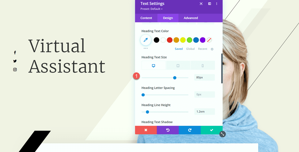
For our first modification, we will add a divider and some body text to the hero section. First, open the settings for the “Virtual Assistant” text and navigate to the Heading Text settings under the Design tab. Change the font size.
- Heading Text Size (Desktop): 80px
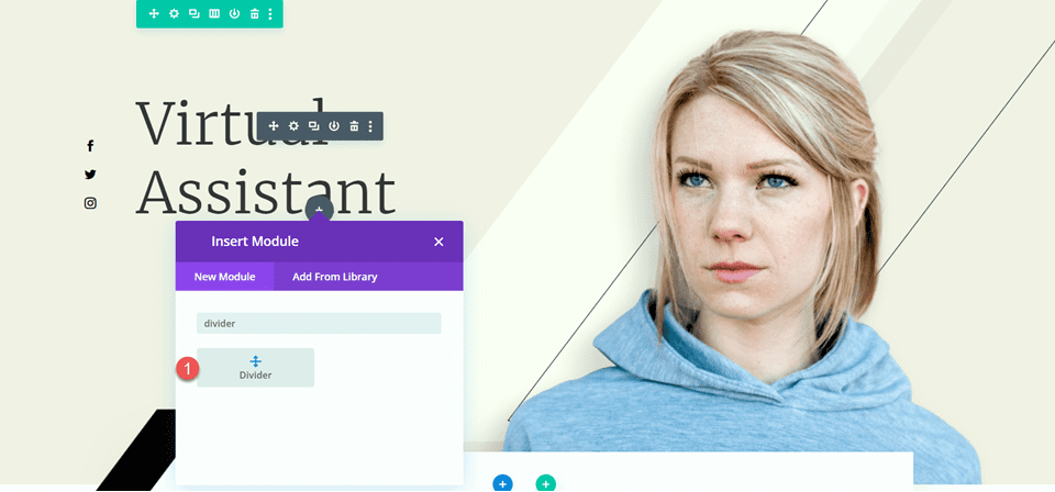
Next, we’ll add the divider module below the “Virtual Assistant” text.
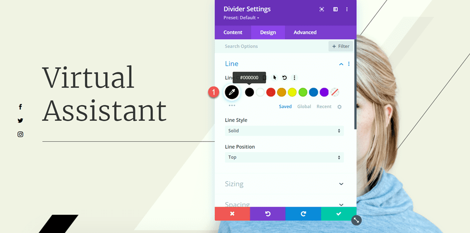
Open the divider settings and navigate to the Line settings under the Design tab. Set the Line color.
- Line Color: #000000
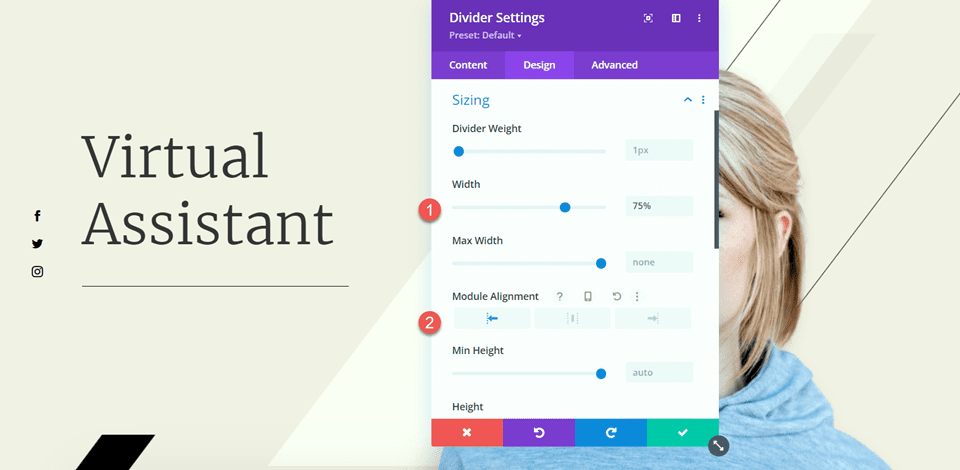
Next, modify the width and module alignment under the Sizing options.
- Width: 75%
- Module Alignment: Left
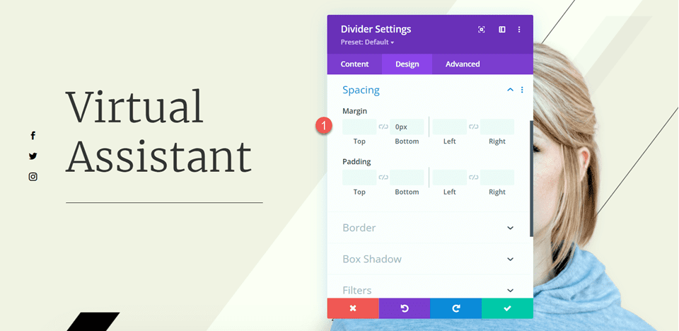
Then, set the bottom margin in the Spacing settings.
- Margin Bottom: 0px
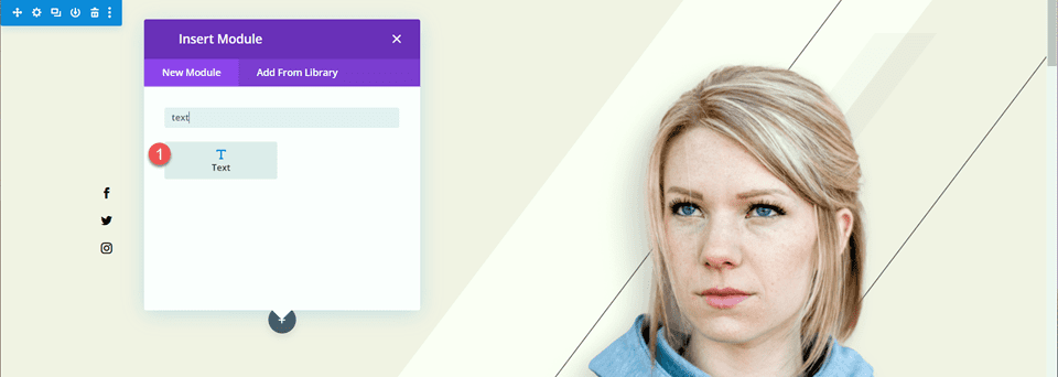
Now add a text module below the divider and add the following text.
- Body: Sed ut perspiciatis unde omnis iste natus error sit voluptatem accusantium doloremque laudantium, totam rem aperiam, eaque ipsa quae ab illo inventore veritatis et quasi architecto.
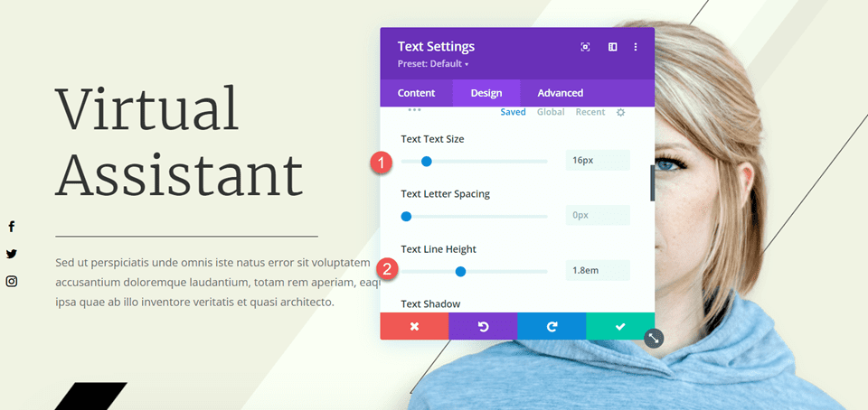
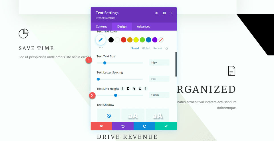
Open the text module settings and open the Text settings under the Design tab. Set the text size and line height.
- Text Size: 16px
- Text Line Height: 1.8em
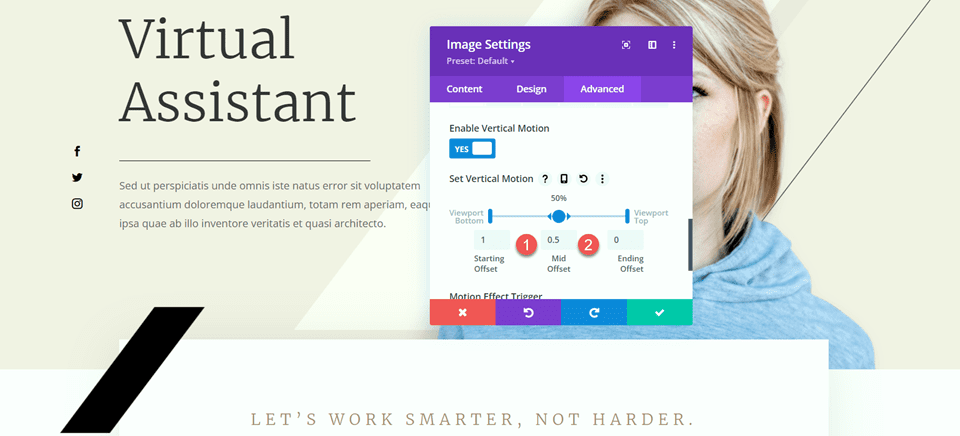
The last modification we need to make in this section is to change the scroll effects for the black bar so that it doesn’t cover the body text we added. Open the image settings, then navigate to the scroll effects section of the Advanced tab. Change the Mid Offset and the Ending Offset.
- Mid Offset: 0.5
- Ending Offset: 0
Modifying the Features Section
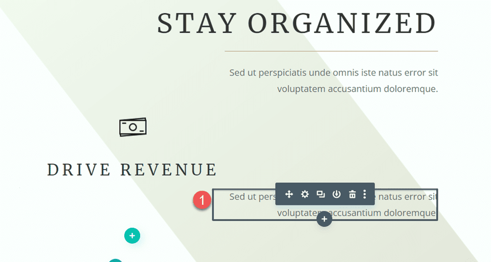
Next, let’s move on to the section with the “Save Time” “Stay Organized” and “Drive Revenue” blurbs. To add more balance to this layout, we will be adding dividers between the headings and the body. Because these are blurb modules, we can’t add a divider between the heading and the body just yet. First, we’ll have to move the body text to a separate text module so that we can add the divider.
“Save Time” Blurb
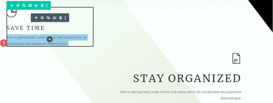
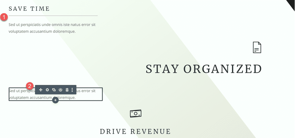
Copy the body text from the “Save Time” module, then delete the text from the blurb module, leaving just the heading and the icon.
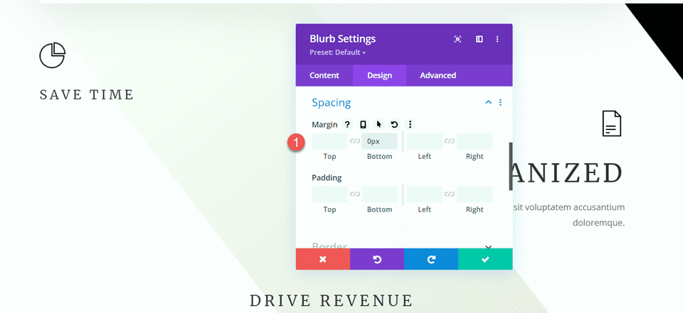
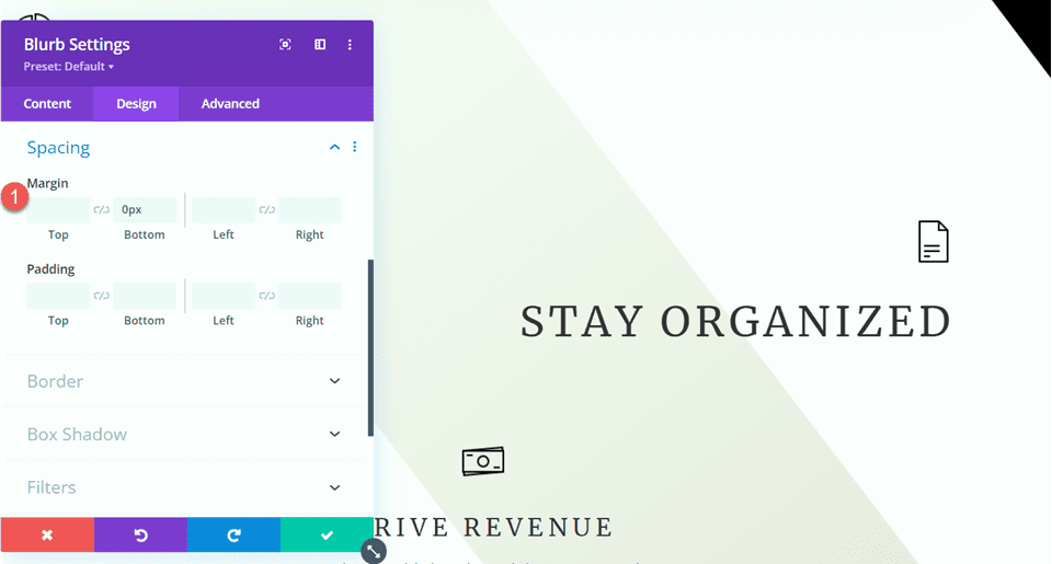
Navigate to the Spacing settings for the blurb module and set the bottom margin.
- Margin Bottom: 0px
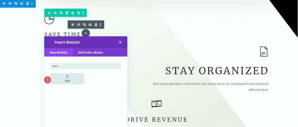
Then, add a new text module below the blurb and paste the body text.
Open the text module setting and customize the text size and line height.
- Text Size: 16px
- Text Line Height: 1.8em
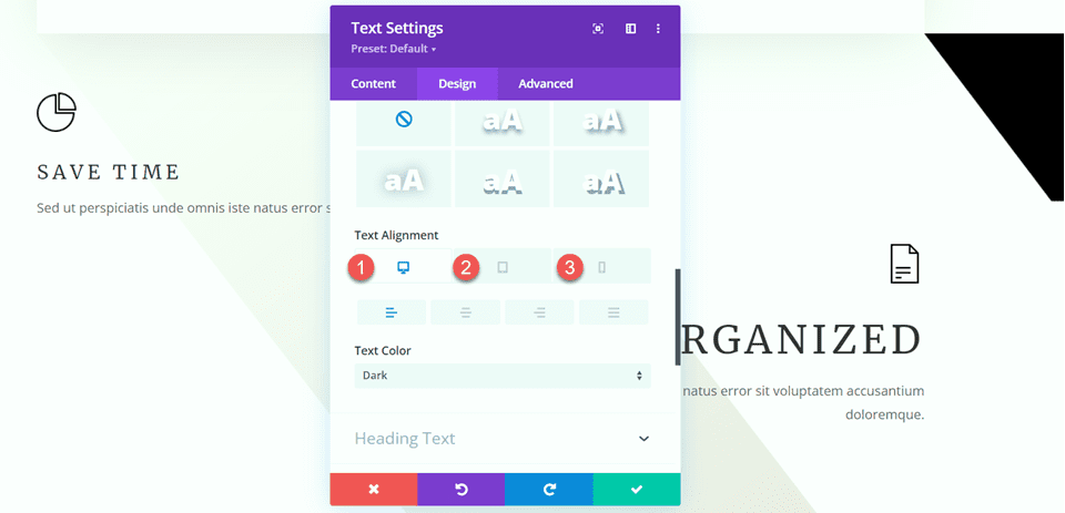
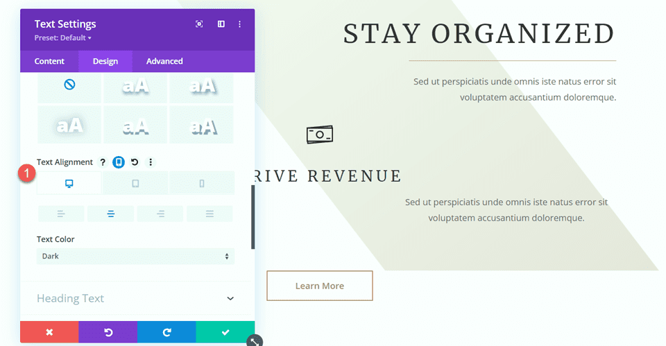
This module will be left-aligned on desktop and center-aligned on tablets and mobile devices. Use the responsive options to set different alignment options for different screens.
- Text Alignment Desktop: Left
- Text Alignment Tablet: Center
- Text Alignment Mobile: Center
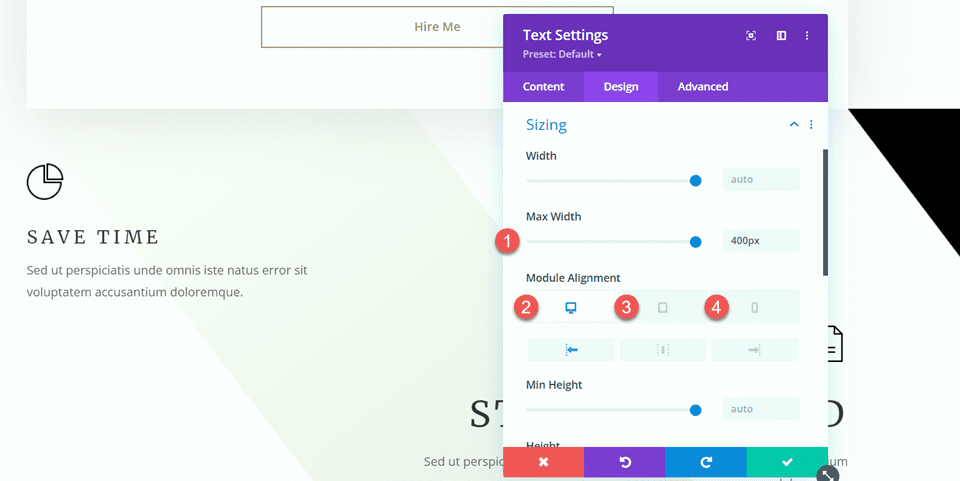
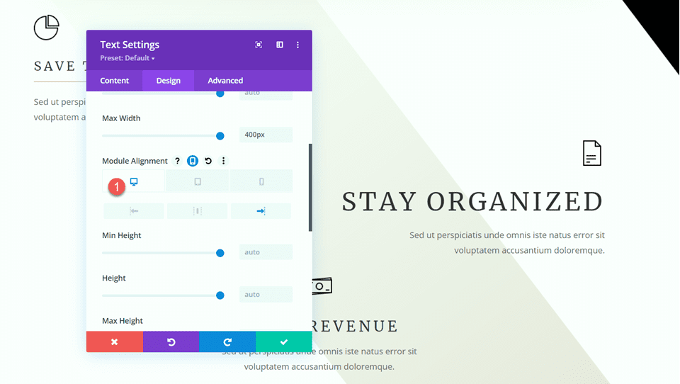
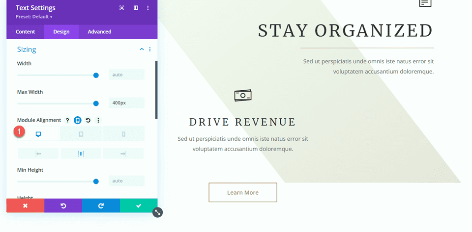
Next, open the Sizing options and set the Max Width. Additionally, use the responsive options to set the module alignment.
- Max Width: 400px
- Module Alignment Desktop: Left
- Module Alignment Tablet: Center
- Module Alignment Mobile: Center
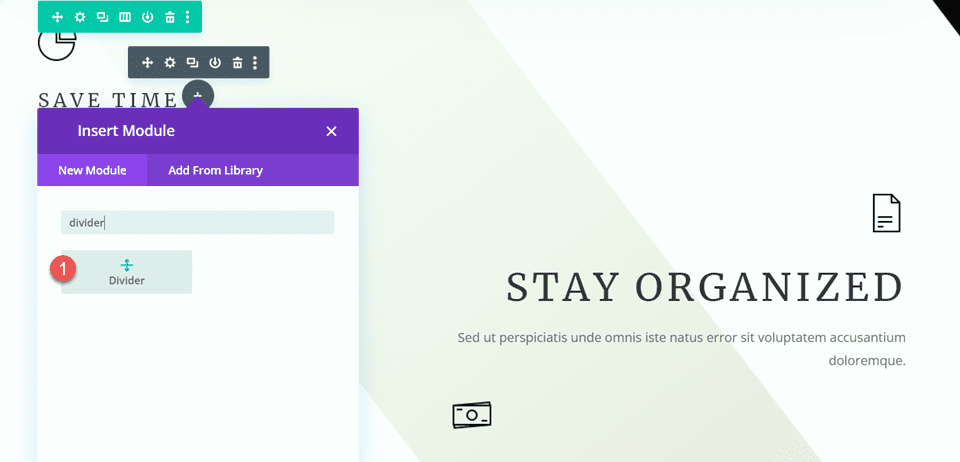
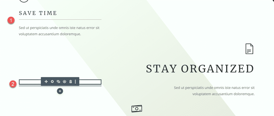
Now, we can add the divider module between the blurb and text modules.
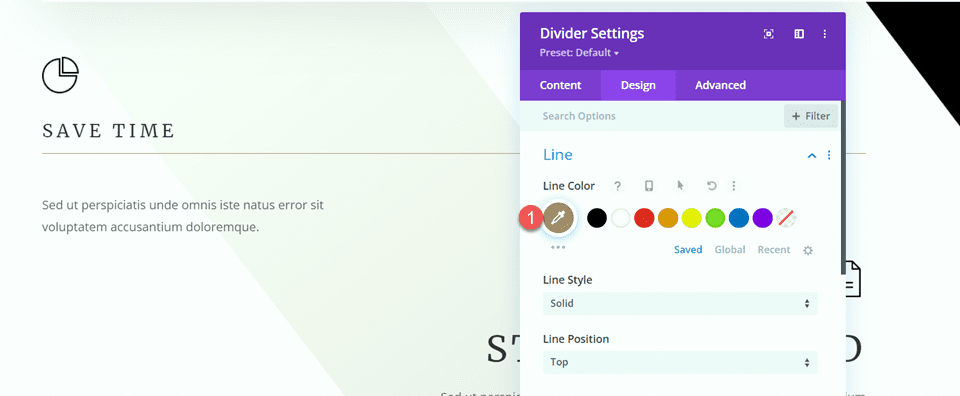
Open the Divider settings. Under the Line settings, set the line color. We will pull in the brown color to match the page’s theme.
- Line Color: #a78e6e
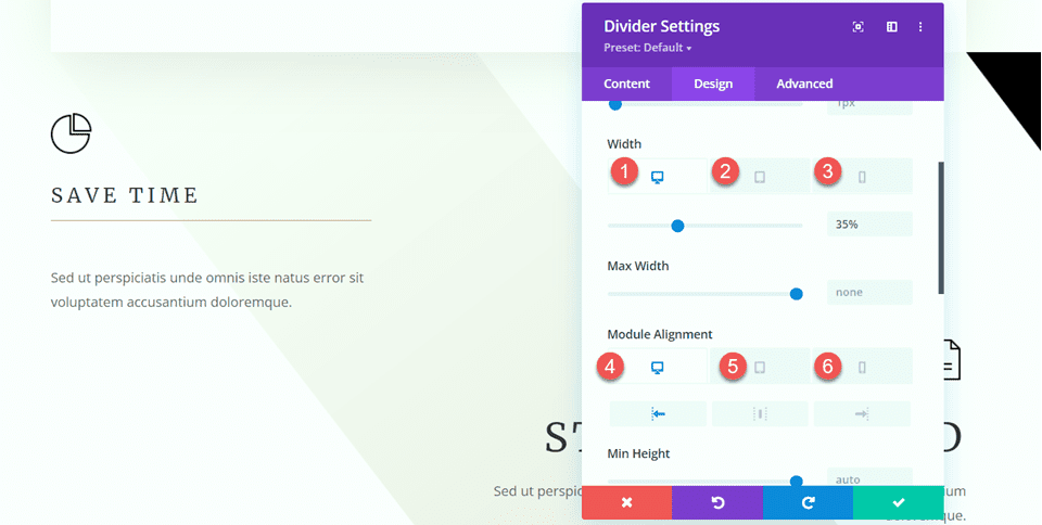
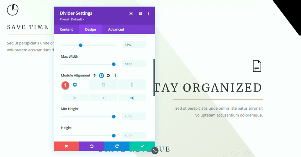
Next, open the Sizing settings and use the responsive options to set the width and module alignment as follows:
- Width Desktop: 35%
- Width Tablet: 40%
- Width Mobile: 50%
- Module Alignment Desktop: Left
- Module Alignment Tablet: Center
- Module Alignment Mobile: Center
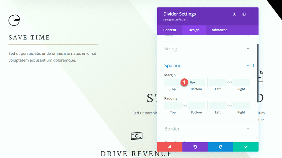
Finally, remove the bottom margin.
- Margin Bottom: 0px
“Stay Organized” Blurb
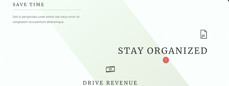
Now, let’s modify the “Stay Organized” blurb. Remove the text from the blurb.
Then, remove the bottom margin.
To save some steps, copy the text module from the “Save Time” section and paste it below the “Stay Organized” blurb.
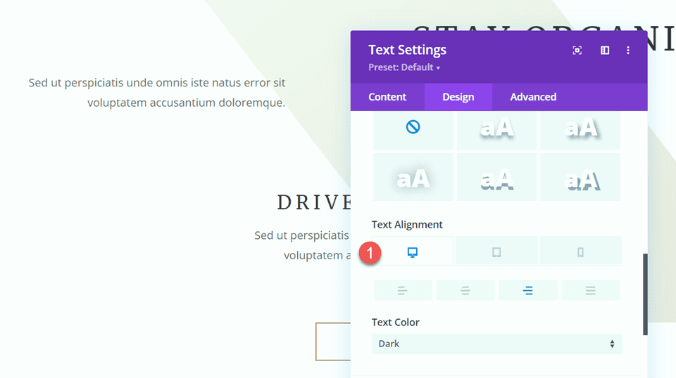
We need to adjust the alignment of the text module, so first, open the Text settings under the Design tab. Set the Text Alignment on Desktop.
- Text Alignment Desktop: Right
Next, open the Sizing settings and set the Module Alignment on Desktop.
- Module Alignment Desktop: Right
Copy the divider module from the “Save Time” section and paste it between the Stay Organized blurb and the body text module.
Open the divider settings and change the module alignment in the Sizing section.
- Module Alignment Desktop: Right
“Drive Revenue” Blurb
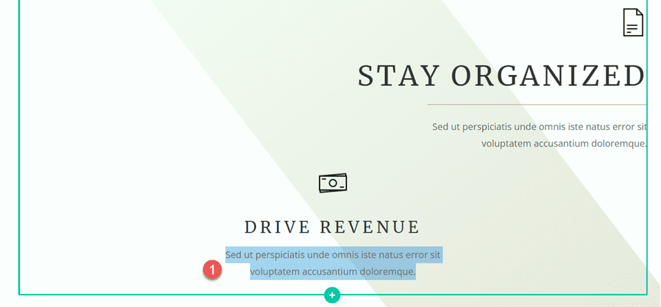
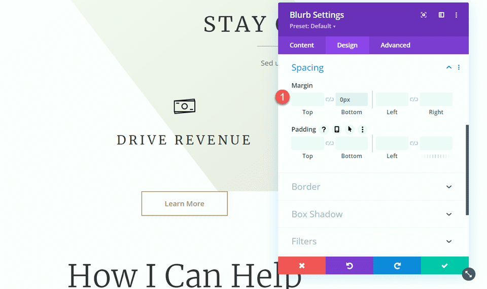
Finally, let’s modify the Drive Revenue blurb. Start by removing the text from the blurb.
Next, remove the bottom margin.
- Margin Bottom: 0px
Copy the text module from the “Stay Organized” blurb and paste it below the “Drive Revenue” blurb.
Then, open the text module settings and adjust the text alignment.
- Text Alignment: Center
Under the Sizing settings, adjust the module alignment.
- Module Alignment: Center
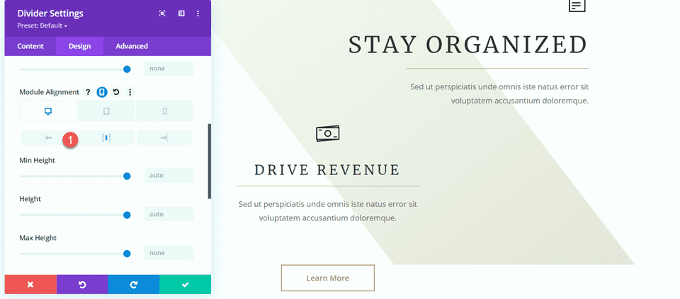
Then, copy the divider from the “Stay Organized” section and paste it between our blurb and text module.
Open the Divider settings and navigate to the Sizing section. Set the module alignment to center.
- Module Alignment: Center
Now, our section design is complete, and as you can see, the dividers help define and separate the heading from the body and also help to bring some balance and additional design elements to the layout.
Add Dividers to the “How I Can Help” Section
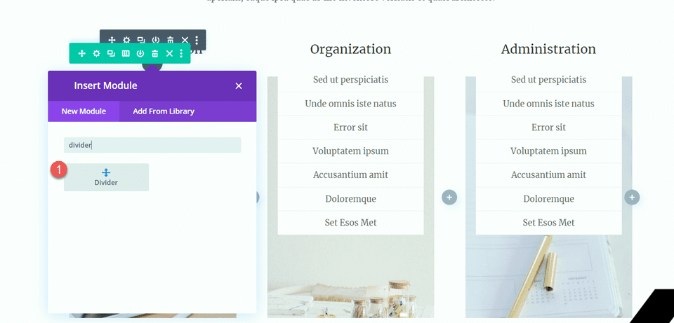
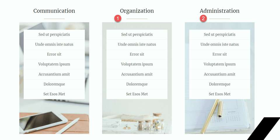
For our next modification, we will add dividers to the “How I Can Help” section. Specifically, we will add dividers under the “Communication” “Organization” and “Administration” headings.
Add a new divider module below the “Communication” heading.
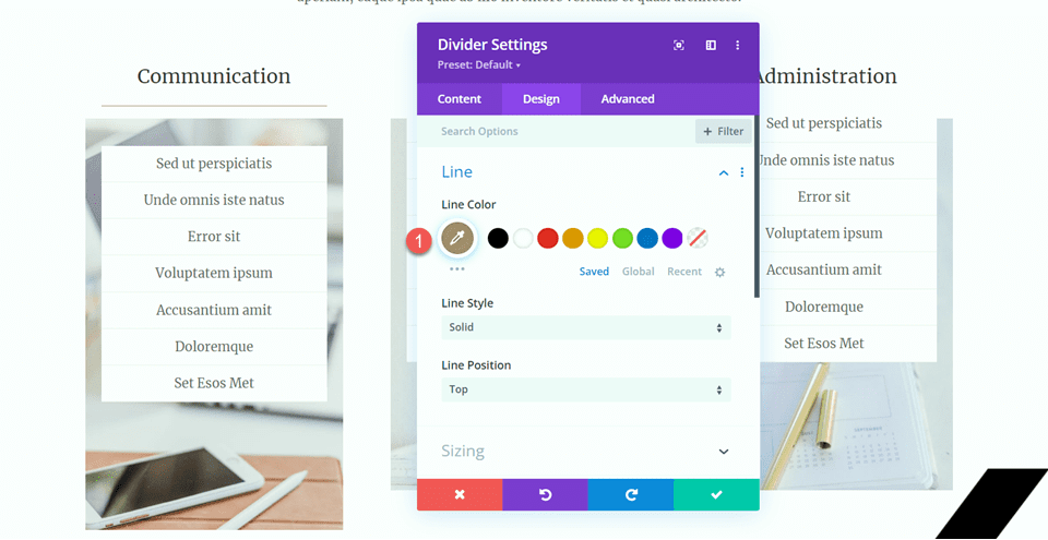
Open the Divider setting and change the line color.
- Line Color: #a78e6e
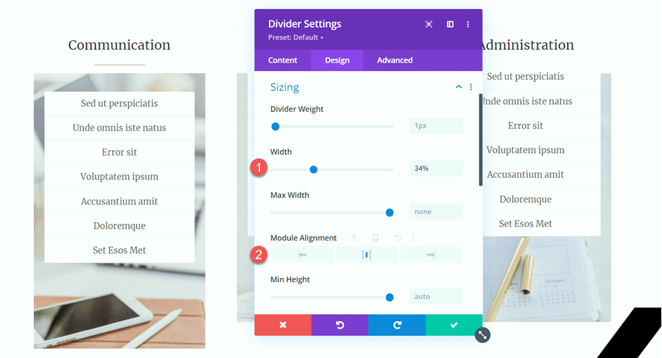
Next, modify the width and module alignment in the Sizing settings.
- Width: 34%
- Module Alignment: Center
Then, copy the divider module and paste it under the “Organization” and “Administration” headings.
Happy Clients Section
For our final modification, we will add a new section to this page to display testimonial quotes, which we will separate with dividers. Let’s get started.
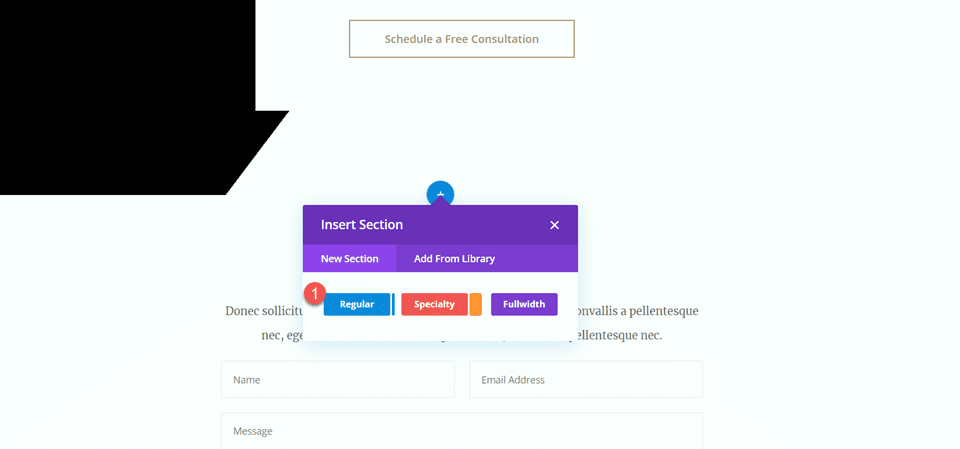
Scroll down the page and add a new regular section between the “10 Reasons to Hire a Virtual Assistant” section and the “Let’s Chat” section.
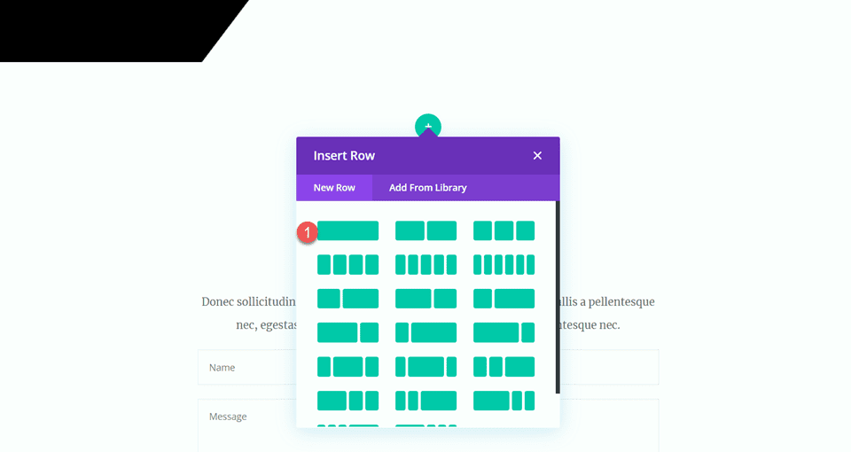
Then, add a row with a single column.
Add Icon
Add an icon module to the new row.
Open the icon settings and select the quote icon.
Customize the icon color and size.
- Icon Color: #e4ded7
- Icon Size: 50px
Add Heading
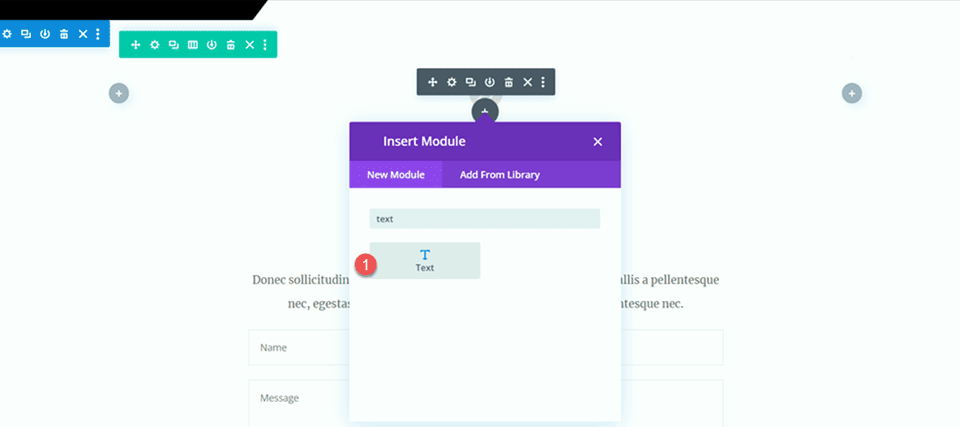
Next, add a text module below the icon.
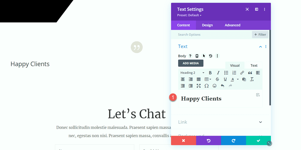
Set the text to “Happy Clients”.
- H2: Happy Clients
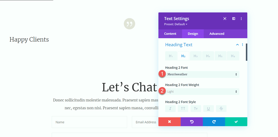
Open the heading settings and customize the styles as follows:
- Heading 2 Font: Merriweather
- Heading 2 Font Weight: Light
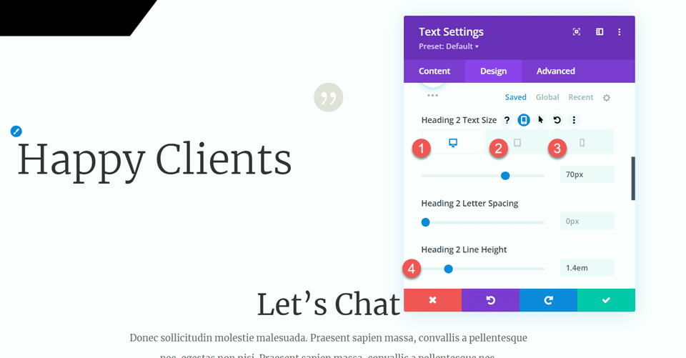
Next, modify the text size using the responsive options. Additionally, modify the line height.
- Heading 2 Text Size Desktop: 70px
- Heading 2 Text Size Tablet: 40px
- Heading 2 Text Size Mobile: 30px
- Heading 2 Line Height: 1.4em
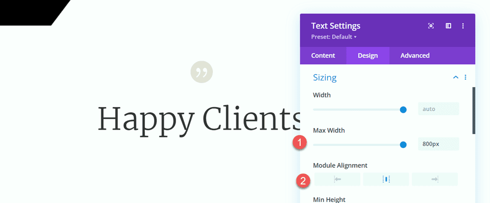
Move to the Sizing options and customize the max width and alignment.
- Max Width: 800px
- Module Alignment: Center
Add Body Text
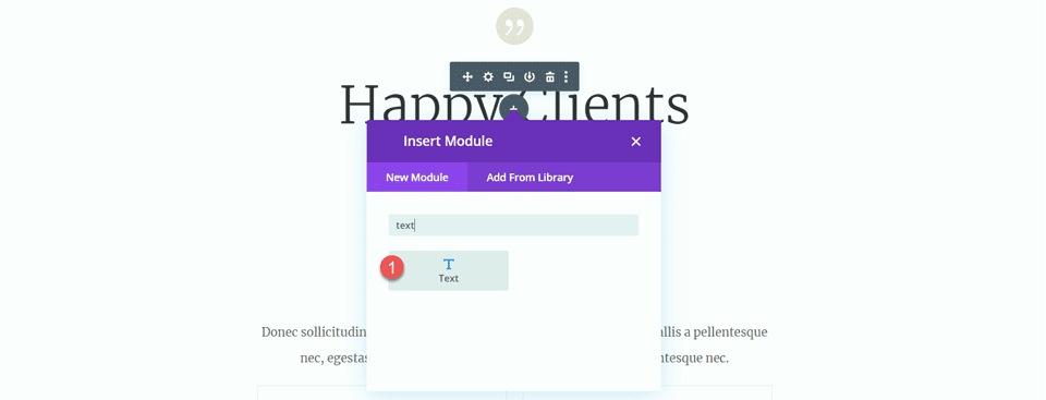
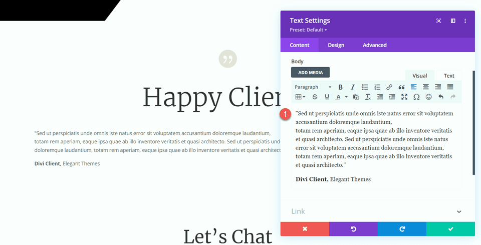
Add another text module below the heading text.
Then, add the following text to the body.
- “Sed ut perspiciatis unde omnis iste natus error sit voluptatem accusantium doloremque laudantium,totam rem aperiam, eaque ipsa quae ab illo inventore veritatis et quasi architecto. Sed ut perspiciatis unde omnis iste natus error sit voluptatem accusantium doloremque laudantium, totam rem aperiam, eaque ipsa quae ab illo inventore veritatis et quasi architecto.”
Divi Client, Elegant Themes
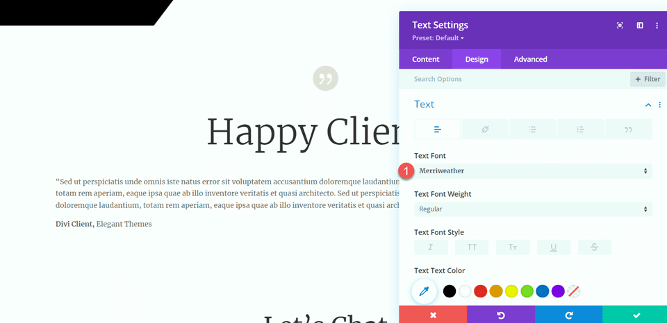
Under the design tab, modify the font.
- Text Font: Merriweather.
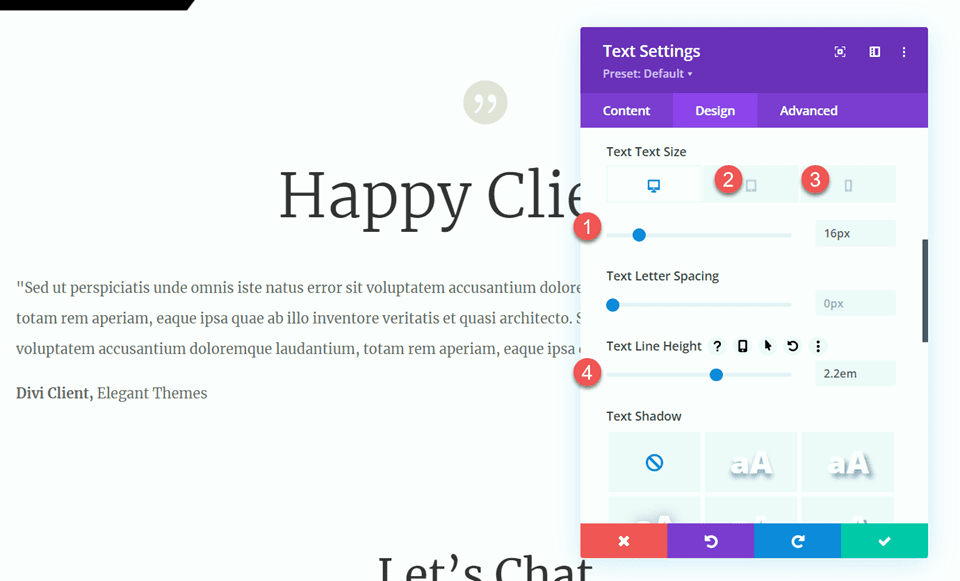
Next, modify the text size by using the responsive options. Additionally, modify the line height.
- Text Size Desktop: 16px
- Text Size Tablet: 14px
- Text Size Mobile: 14px
- Line Height: 2.2em
Add Divider
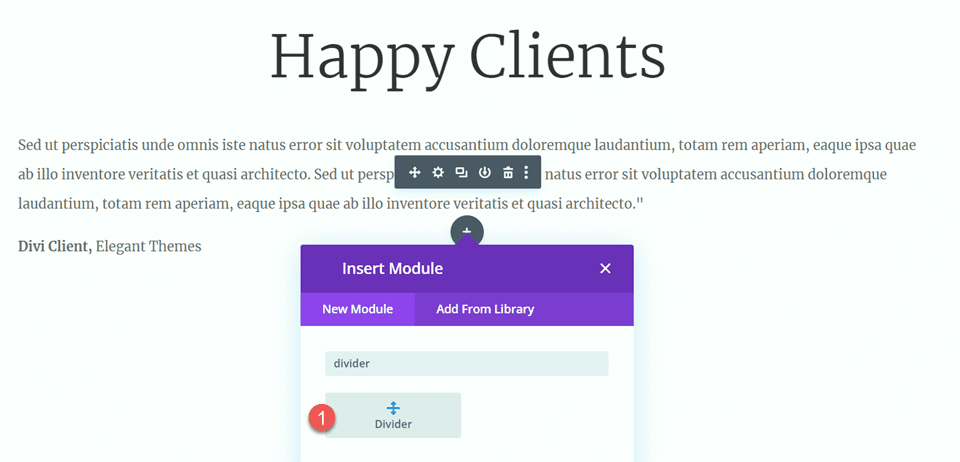
Add a divider module below the testimonial text.
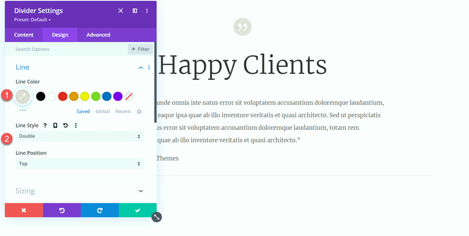
Under the line settings, set the line color and style.
- Line Color:
- Line Style: Double
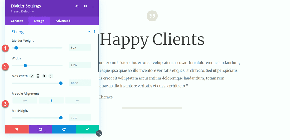
Next, open the sizing settings and customize as follows:
- Divider Weight: 6px
- Width: 25%
- Module Alignment: Center
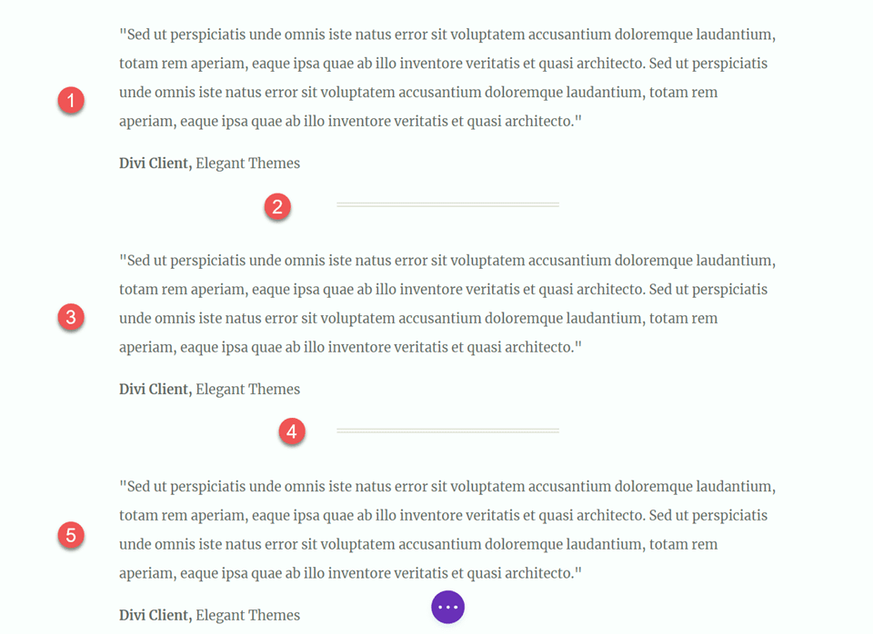
Then, duplicate the body text module twice so there are three body text modules, and duplicate the divider once so that there are two dividers. Arrange the modules so that the dividers are between the three text modules, like in the screenshot below:
Now, our design is complete.
Final Result
Let’s take a look at our final design. You can see how we have added balance and structure throughout the page by adding dividers.
Final Thoughts
Hopefully, this article has shown you how dividers are a simple and effective way to create balance and add whitespace to your website design. With all of the customization options available for the divider module, you can create beautiful-looking dividers that add to the overall design of your website and reflect your brand style and colors. If you want to learn more about what you can do with the divider module, here is a tutorial for 10 Fun Ways to Use The Divider Module. How do you use the divider module in your web design projects? Let us know in the comments!
The post How to Use Divi Divider Modules to Create Balance in Your Design appeared first on Elegant Themes Blog.
