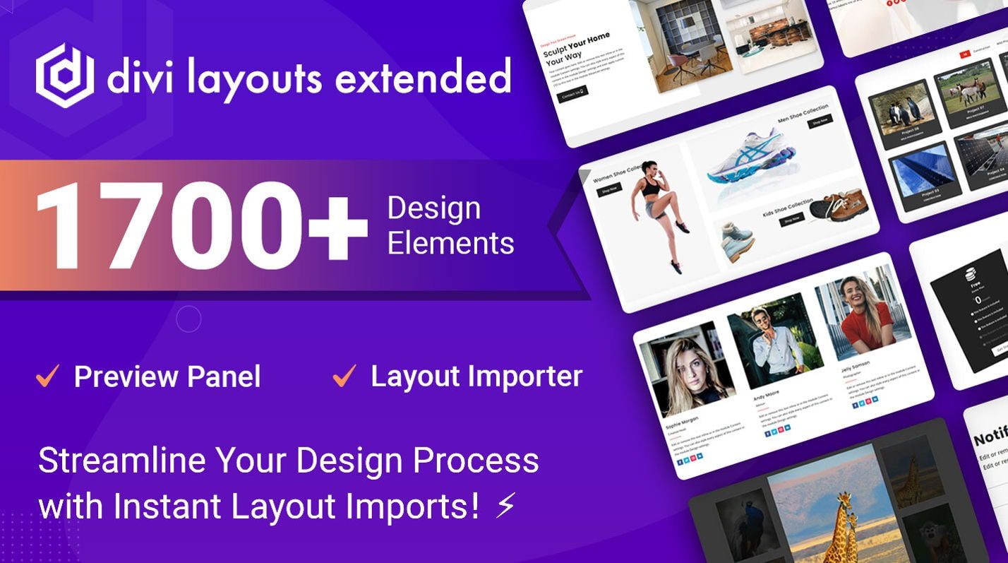
Divi Layouts Extended is a third-party product for Divi that includes over 1700 layouts that are imported through a custom dashboard. They cover a wide range of genres and include modules, sections, and complete pages. In this post, we’ll look at Divi Layouts Extended to help you decide if it’s the right product for your Divi toolbox.
Installing Divi Layouts Extended
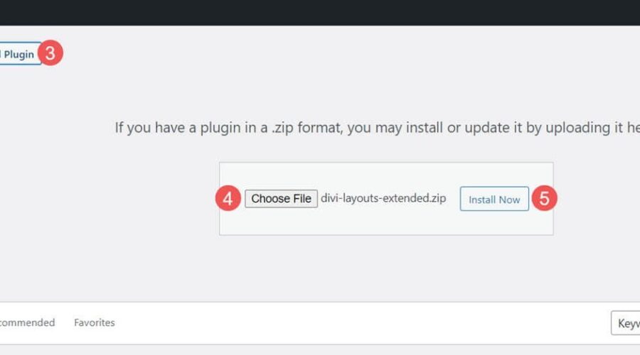
Installing Divi Layouts was simple. Upload it and activate it the same as any plugin. To upload it, go to:
- Plugins
- Add New
- Upload Plugin
- Choose File
- Install Now

Once it installs, you’ll see an option to activate the plugin. Select to activate it, and it’s ready to use.
- Activate Plugin

Update: New User Interface
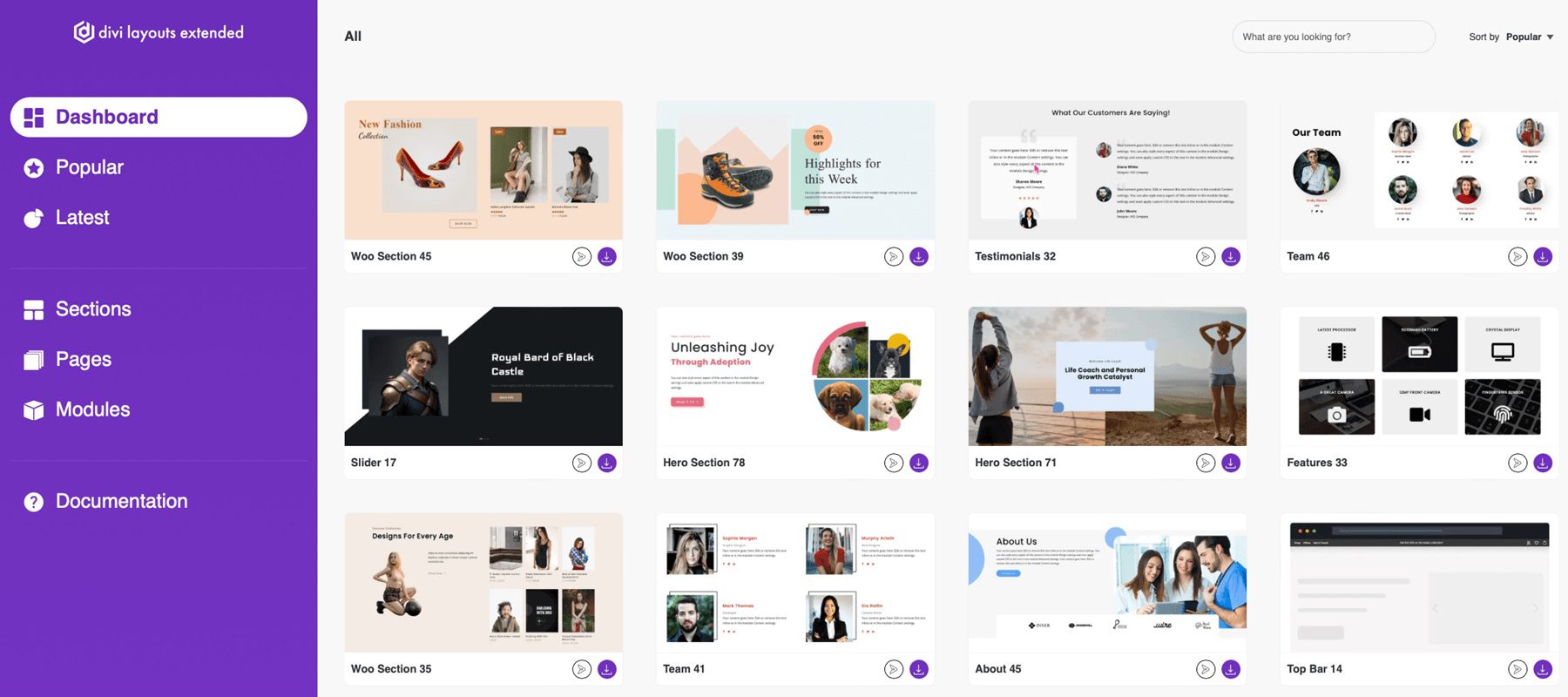
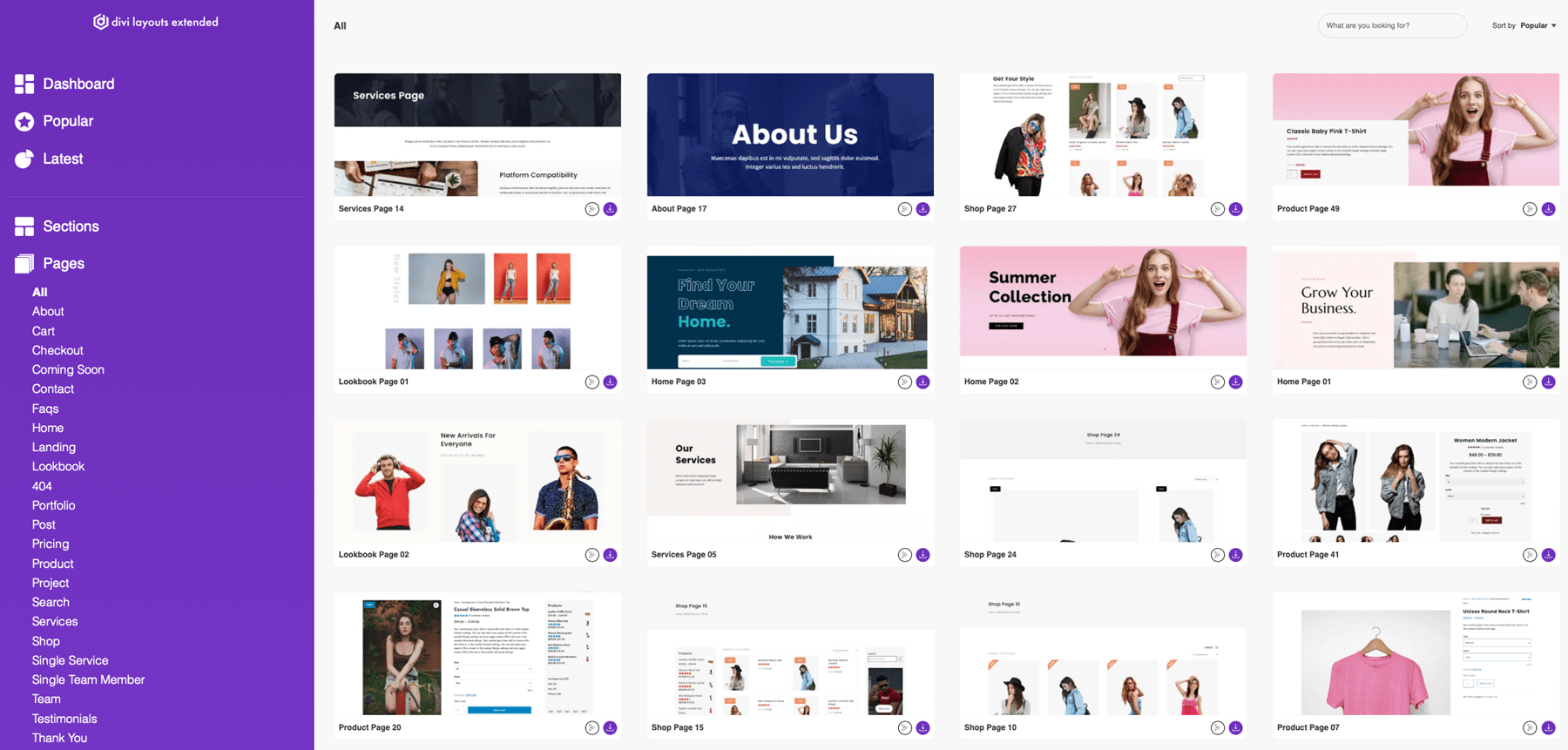
Before we dive into the product highlight, Divi Extended has recently given Divi Layouts Extended a new look and feel. Take a look below to see what you can expect from the new user interface. They’ve also added 200 more layouts to their library, providing you with even more options to choose from when building your websites!
Divi Layouts Extended Dashboard
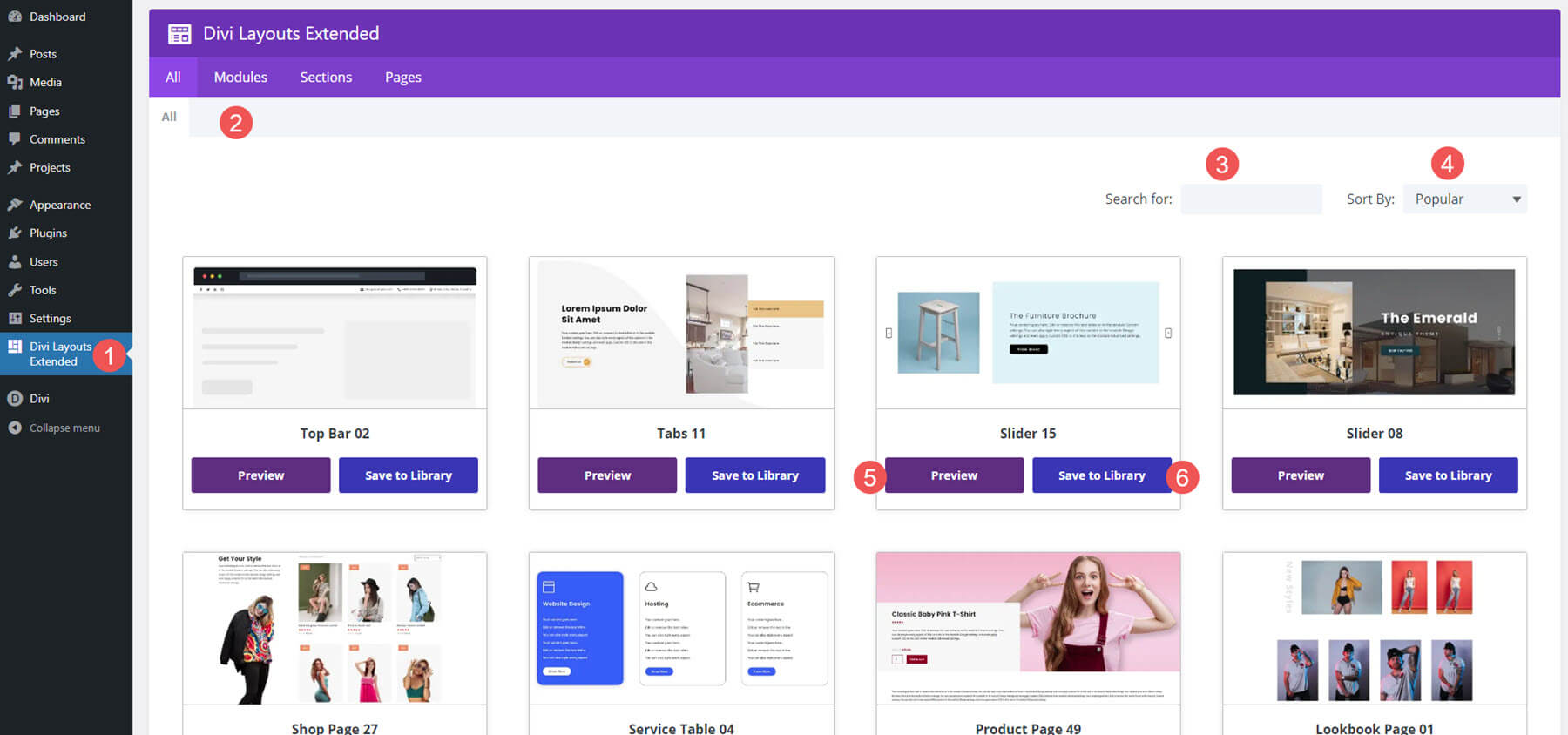
A new Divi Layouts Extended menu is added to the WordPress dashboard. Clicking it opens the new dashboard where you can select the layouts you want. I found this dashboard to be simple and highly intuitive.
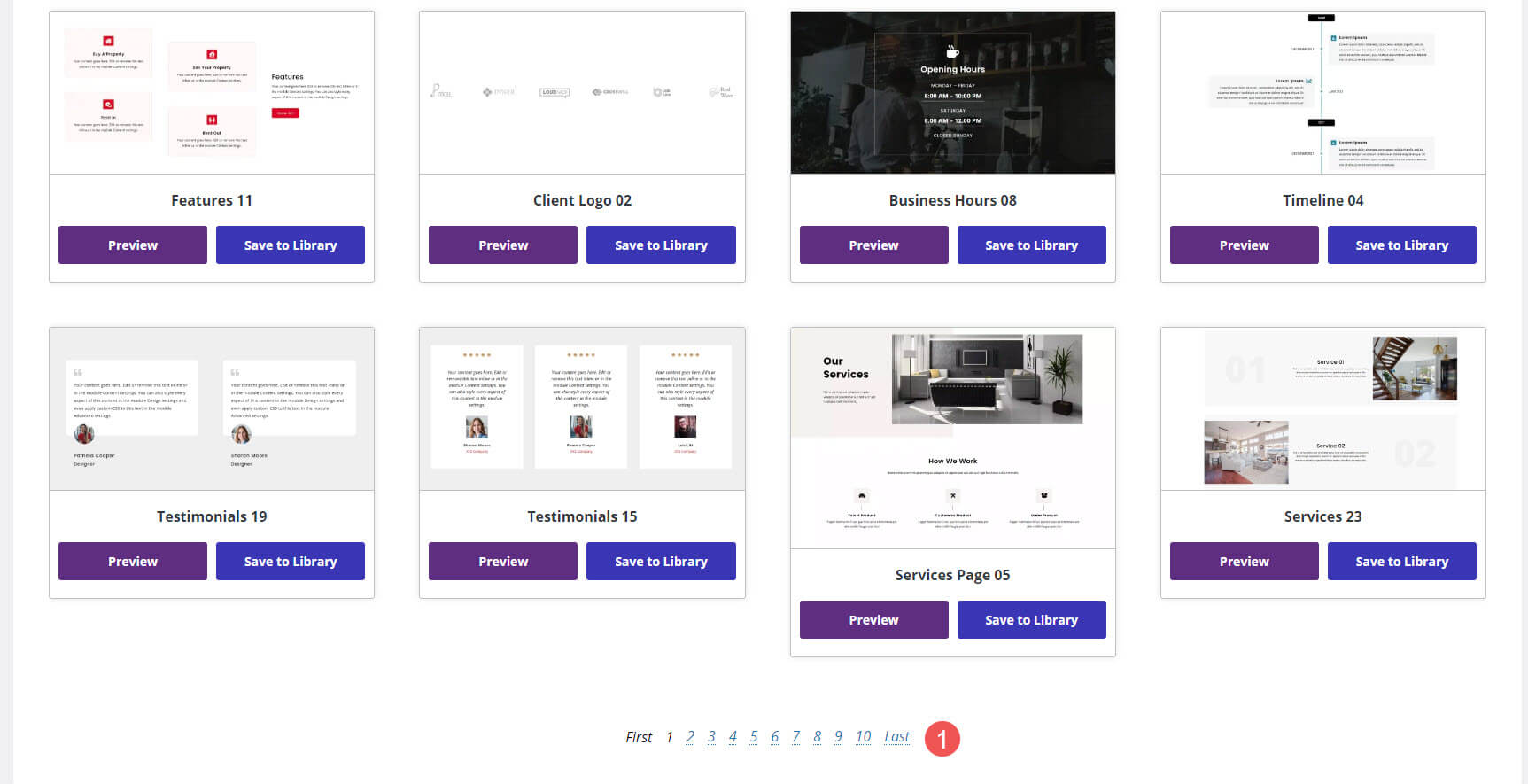
It includes tabs to see the layouts, modules, sections, or pages. You can also search for anything you want and sort them by popularity, name, and date in ascending or descending order. The layouts appear as cards. You can preview the layout or save it to your library, scroll the larger layouts to see them, and preview the layouts to get a better look at them. This example shows the All tab, which includes modules, sections, and pages.
Scrolling to the bottom of the list is navigation where you can select a page or choose First or Last.
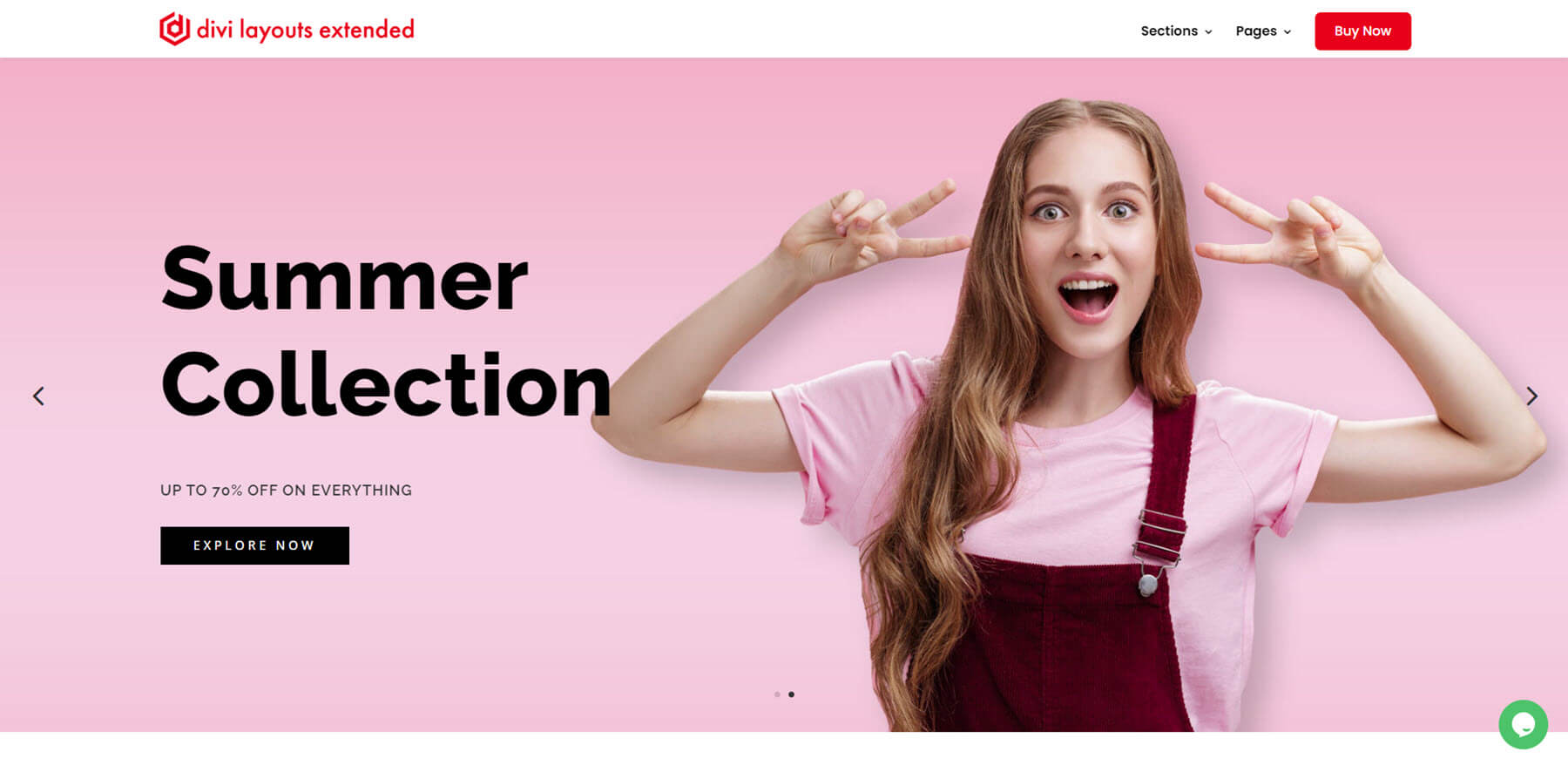
Clicking Preview opens the item on the Divi Layouts Extended website. You can scroll through the layout, click on all the clickable things, hover to see the hover effects, and see the layout with images, products, etc.
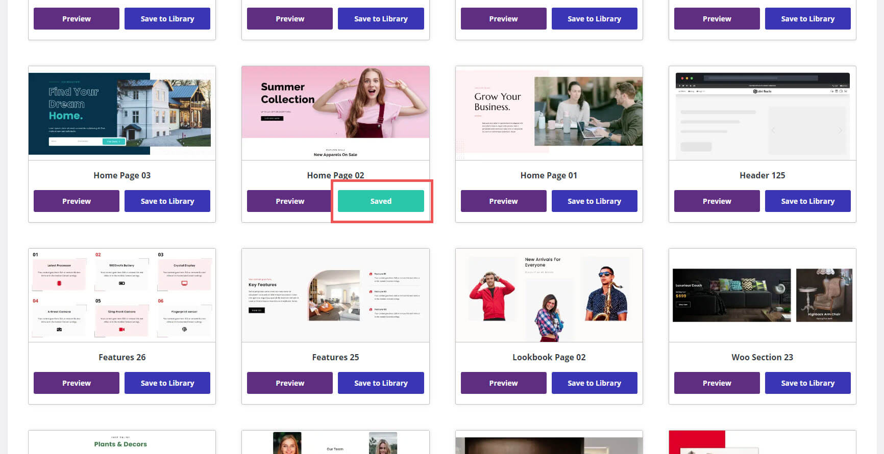
When you choose Save to Library, the layout will import, and the button changes from a purple button to a green Saved button.
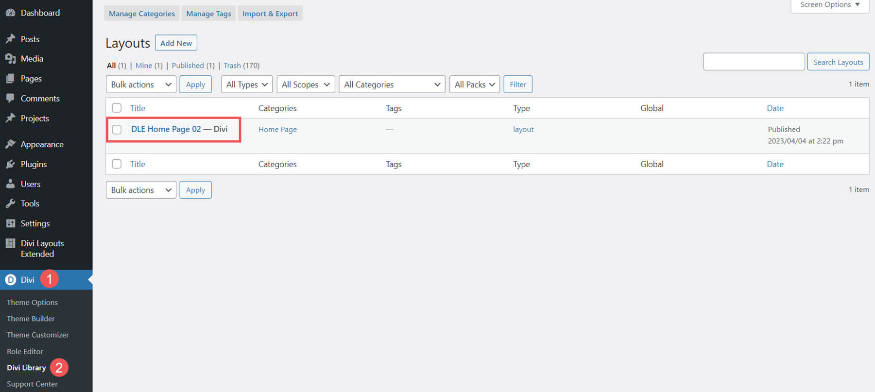
You’ll also see the layout in your library where you can use it as normal in your pages, posts, and the Divi Theme Builder. They’ll include the categories and types. In this example, I’ve saved a home page. It includes the home page category and layout type.
Divi Layouts Extended Modules
The Divi Layouts Extended Modules include buttons and sliders. We’ll look at a few examples.
Divi Layouts Extended Buttons
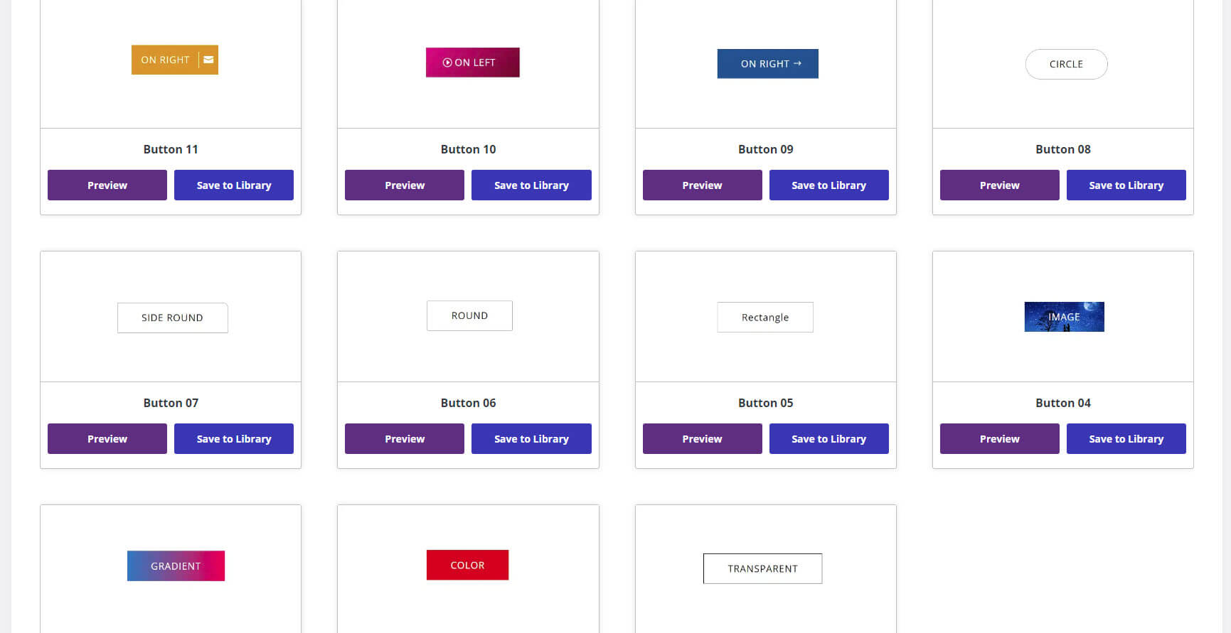
There are 55 buttons to choose from. The button’s text works as a short description of what the button does or its layout.
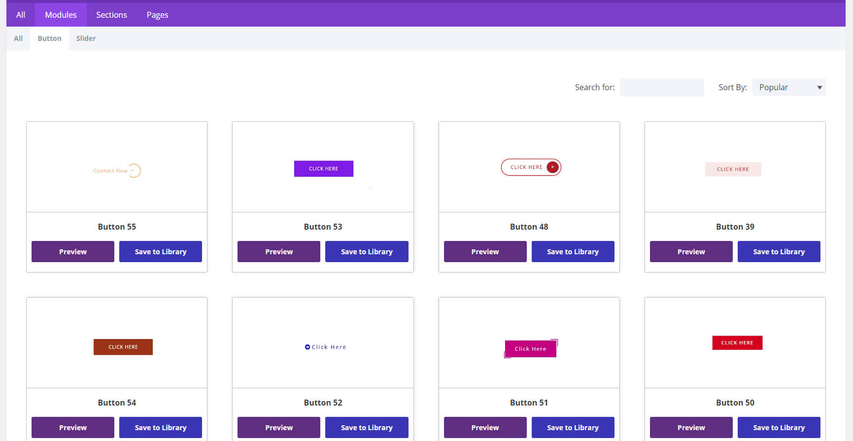
Designs include solid colors, no colors, gradients, images, text, with or without borders, square or rounded edges, with or icons, with or without shadows, with or without hover effects, and more. Most are made to stand out, and they stand out well. I especially like the buttons with icons and with hover effects.
Divi Layouts Extended Sliders
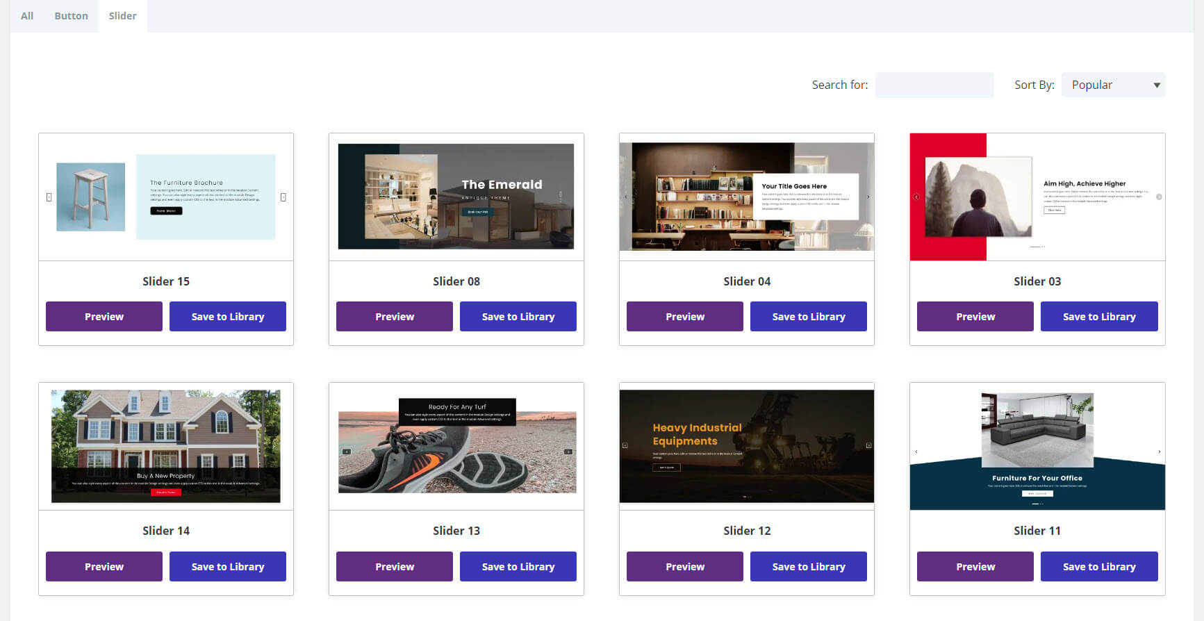
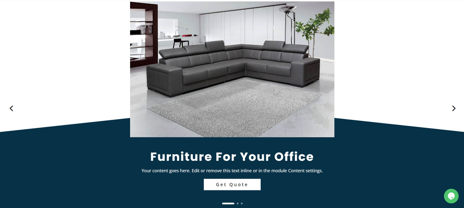
There are 15 sliders to choose from. They’re full-screen and include different designs for their layouts and navigation. They include a call to action, images, backgrounds, products, navigation, etc.
This example shows an angled background, styled navigation, an image, text, and CTA.
Divi Layouts Extended Sections
There are 855 sections in 27 different categories. They include sections such as About, blog, CTAs, client logos, headers, footers, top bars, number counters, testimonials, hero sections, galleries, services, and lots more.
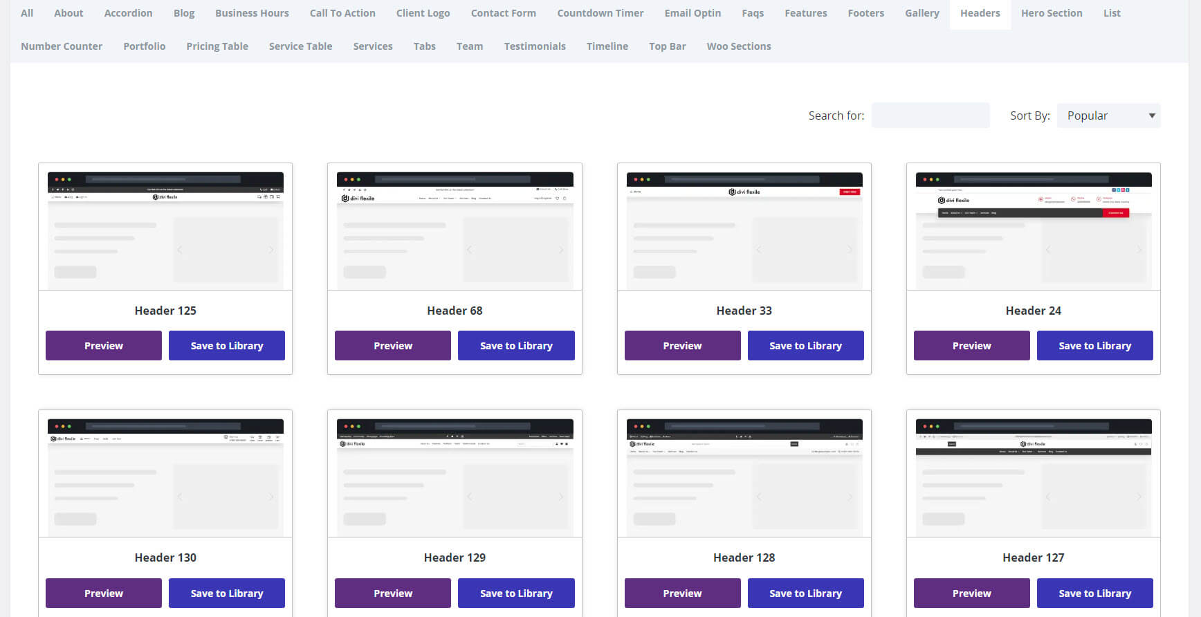
Headers
It includes 130 headers. They include menus, social media icons, search fields, clickable phone numbers, CTAs, styled dropdown menus, and lots more. Many include a top bar.
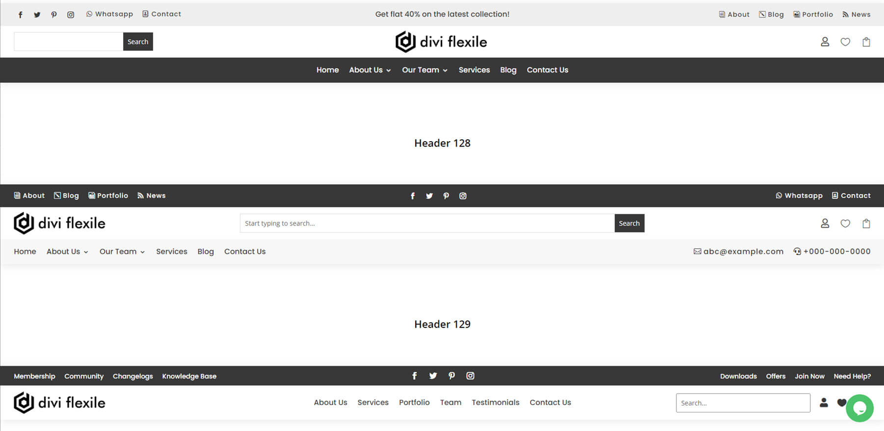
This example shows headers 127-129. They include navigation, social icons, search, contact information, etc.
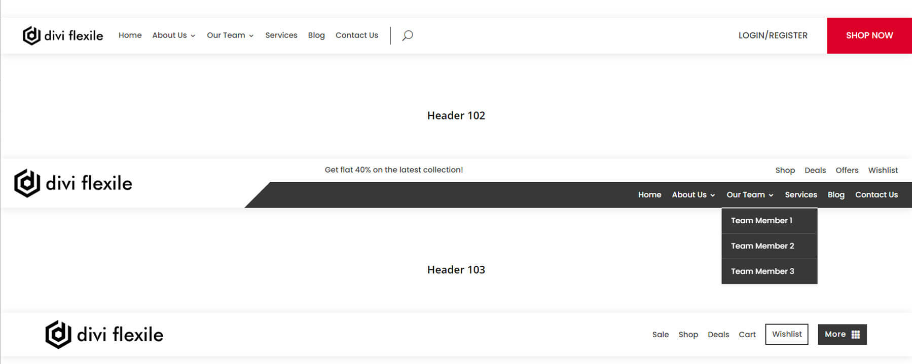
This example shows headers 101-103. They include CTA buttons with hover animations. I’m hovering over the second header’s menu to show the dropdown menu.
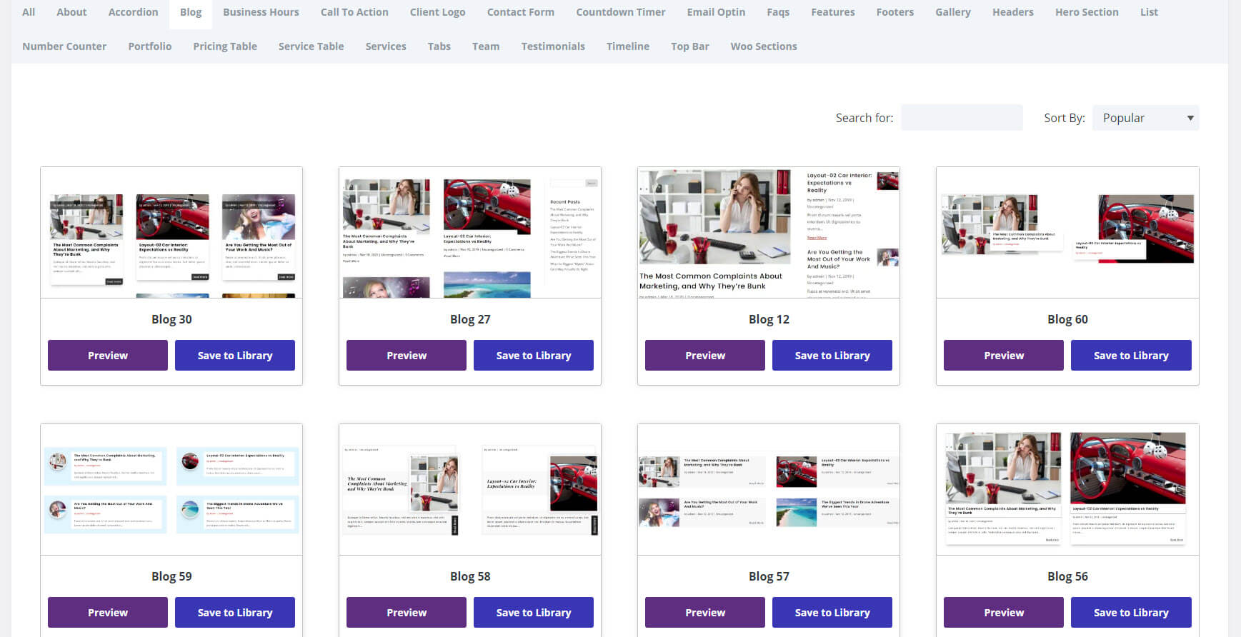
Blogs
There are 60 blog sections. They include grid layouts, alternating layouts, single-column layouts, styling, hover effects, etc. The blog cards provide a lot of styling options.
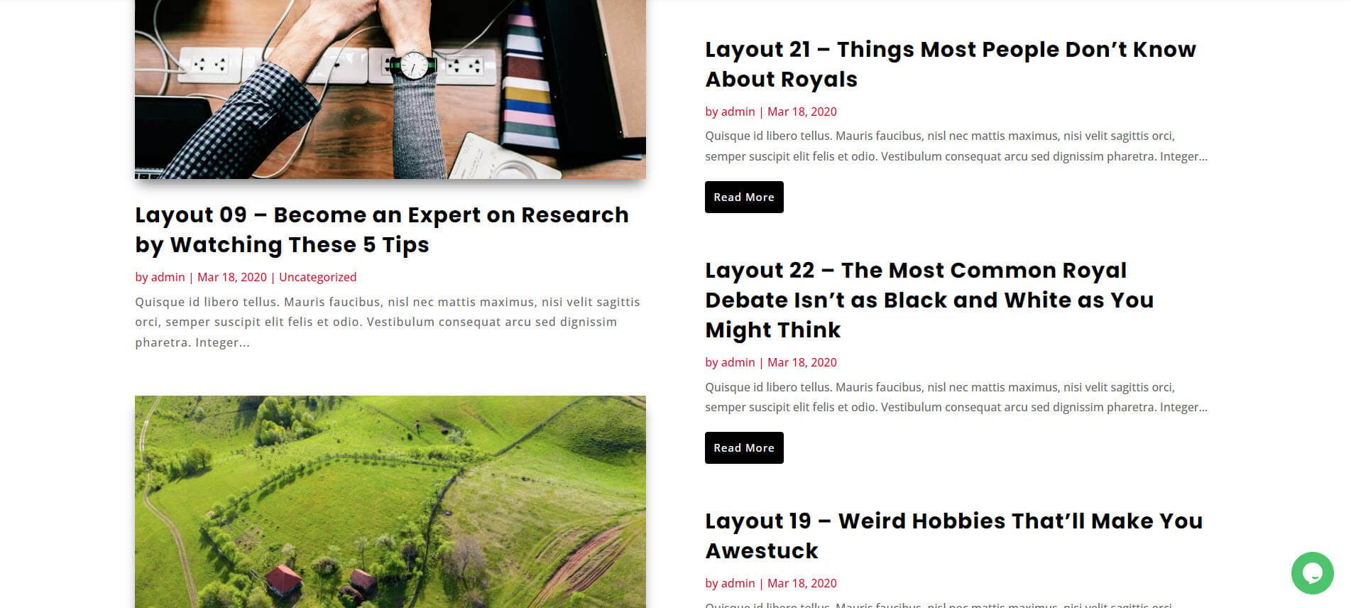
This example has a magazine-style layout with two columns. The latest blog posts are displayed in the left column and include featured images, while the others are stacked in the right column and include large read-more buttons.
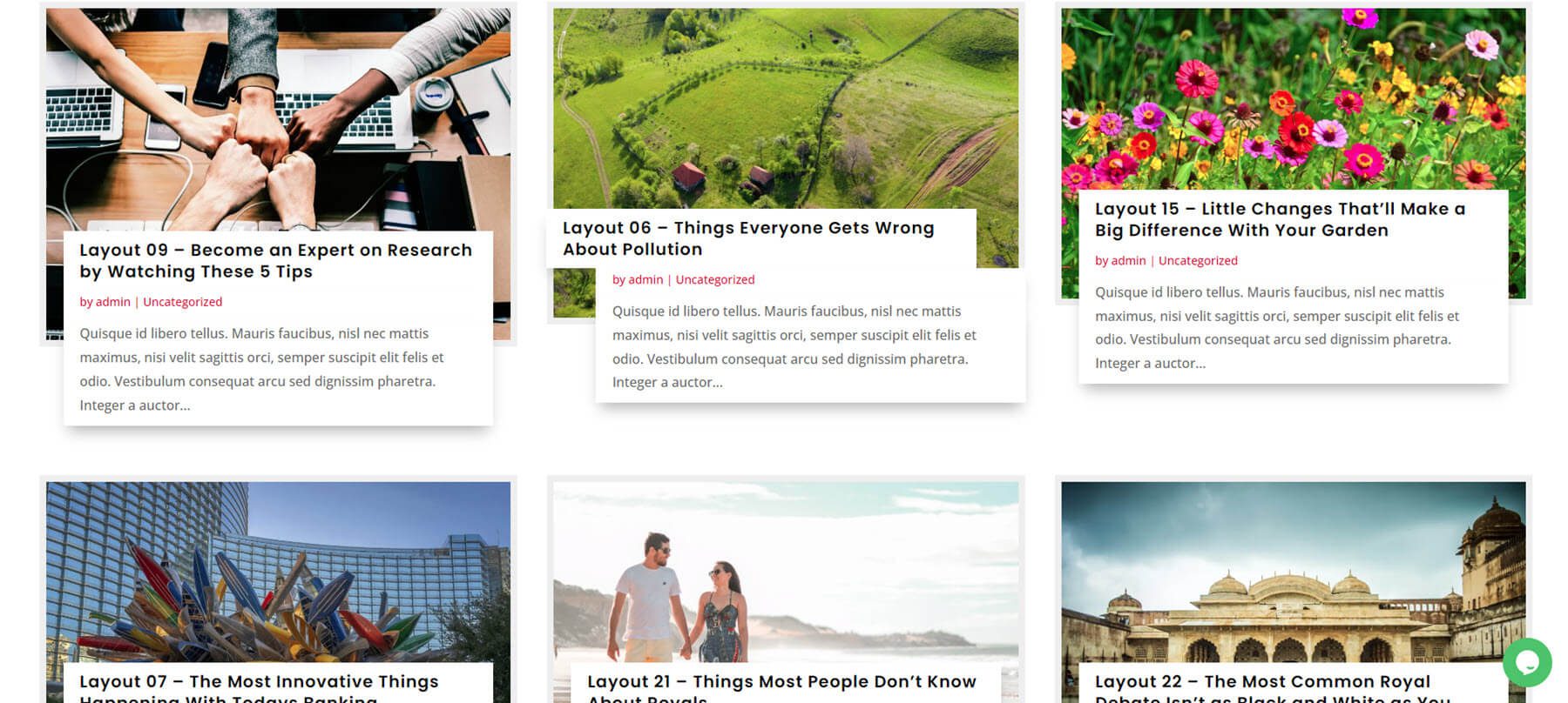
This example shows a grid layout with overlapping titles and excerpts. I’m hovering over the second post to show its hover effect.
CTAs
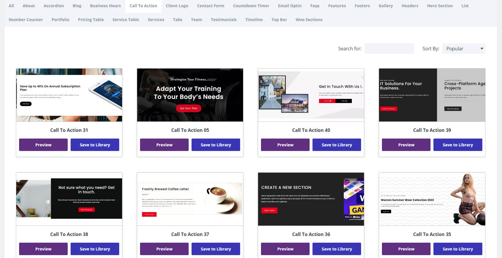
There are 38 call-to-action sections to choose from. They’re full-width and include images, messages, buttons, forms, number counters, and more in multiple types of layouts.
This example shows an email CTA with red highlights and contact information. The phone number is clickable.

Hero Sections
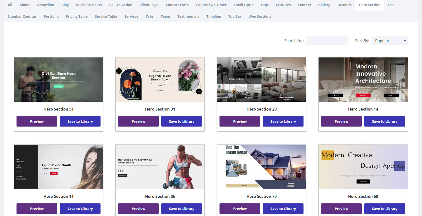
It includes 60 hero sections. They include CTAs, embedded videos, countdown timers, images, backgrounds, forms, blurbs, posts, products, and more. These are some of my favorite layouts in Divi Layouts Extended.
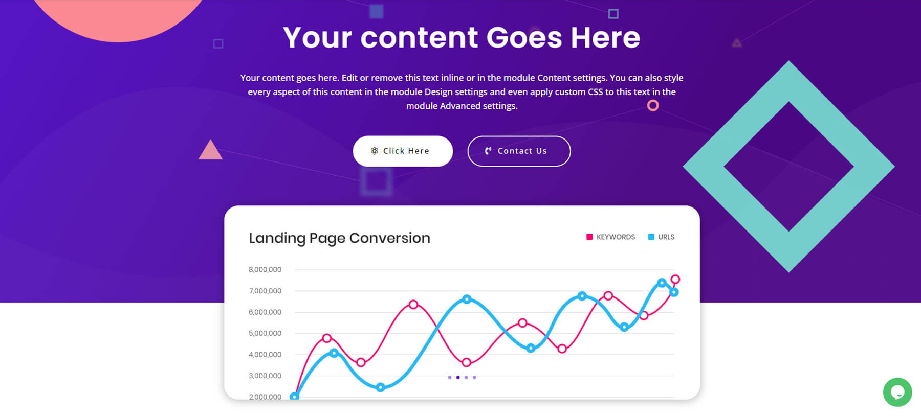
This example shows a CTA with a graph that overlaps two backgrounds. The background includes shapes in different colors to stand out.
This example includes links to the various pages in the shop. They include solid colors and images with titles, buttons, or discounts.

Team
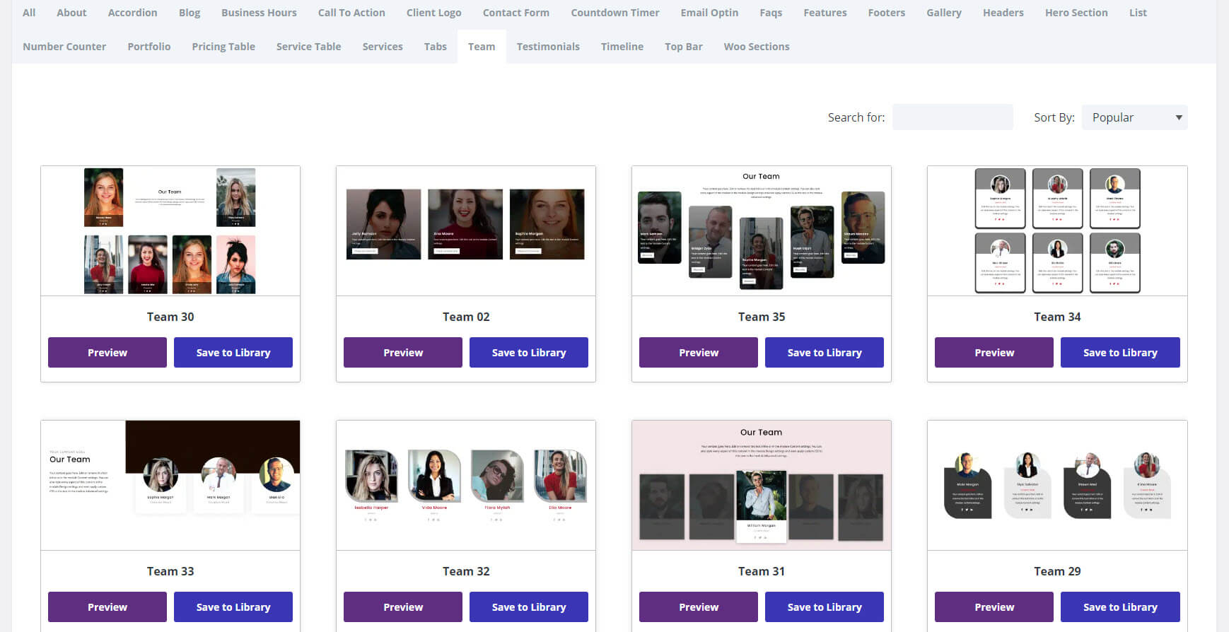
Choose from 35 team layouts. They display styled Person Modules in different ways and include supporting text, buttons, and more. Most are placed in a grid, but there are a few with single-column layouts, mosaic layouts, etc.
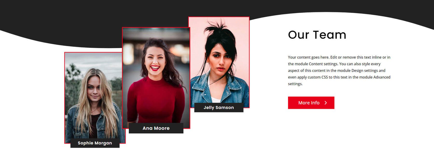
This example shows three Person Modules with text, a button, and a wavy background. Hovering over a module on either side makes it slide on a diagonal.
Testimonials
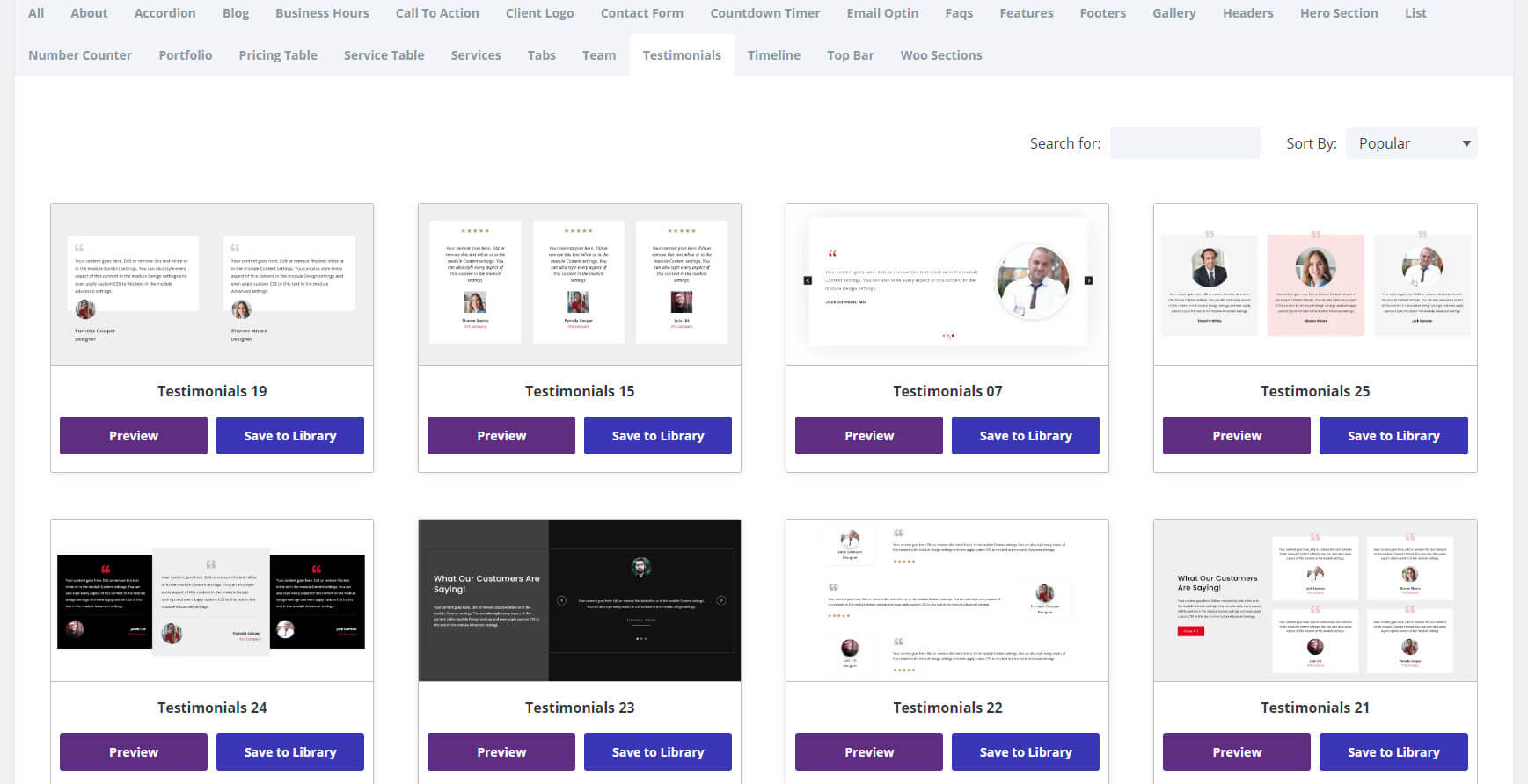
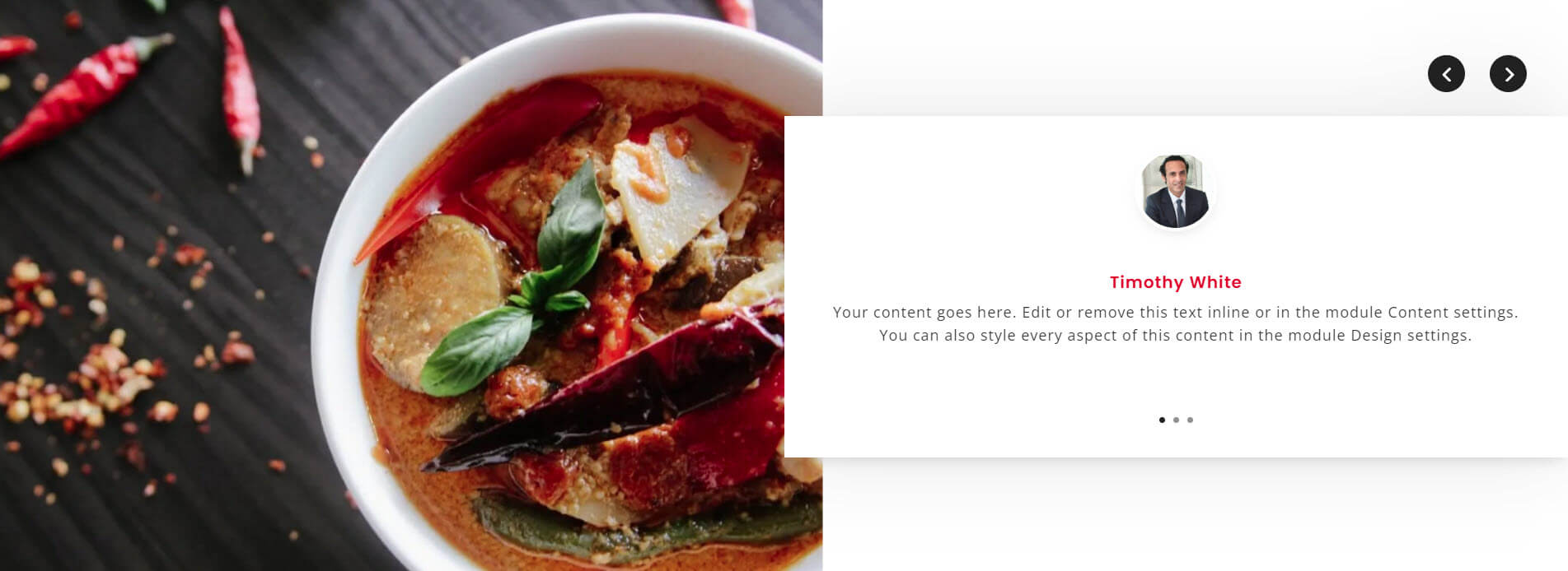
There are 25 testimonial sections to choose from. They include grid layouts, single-column layouts, alternating layouts, and lots more. They include background images or color on one side, different backgrounds for the Testimonial Modules, circled images, squared images, etc.
This example shows an image on one side and a testimonial slider overlapping the image on the other side. The slider includes navigation on the far right.
Timeline
There are 5 timeline sections to choose from. These are great for showing the process steps, a publication timeline, etc. They include horizontal and vertical layouts.
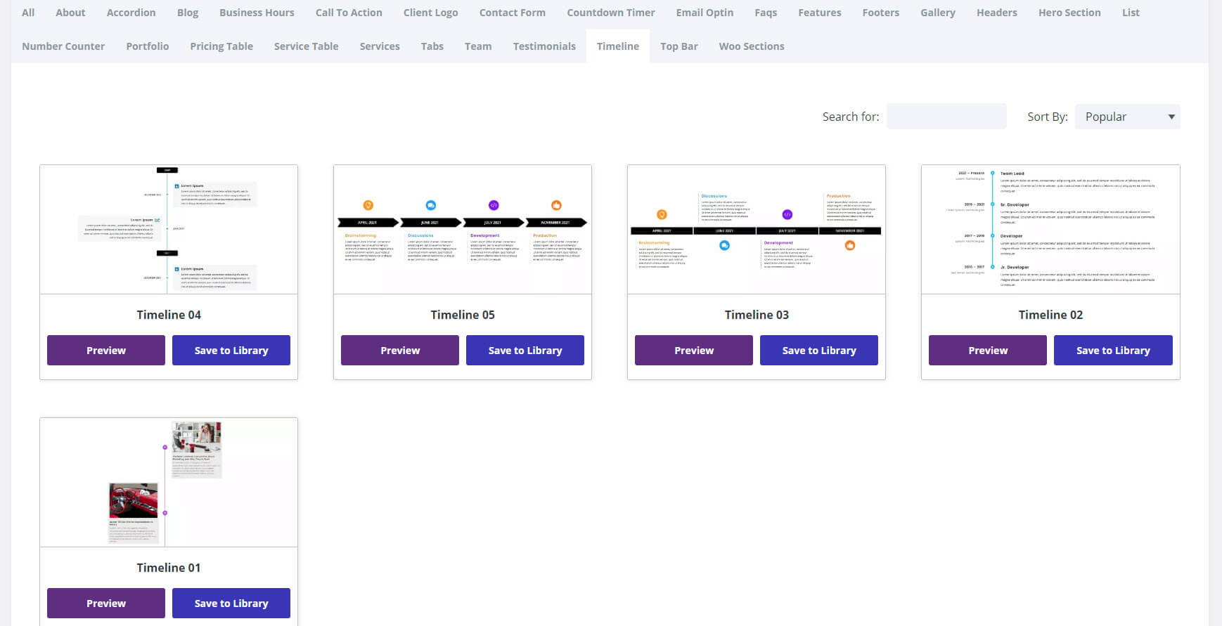
This one shows a production timeline, which is great for project management. It displays the timeline with different colored icons that alternate from the top to the bottom. The text is on the opposite side of the icons and includes titles in the same color as the icons.

Portfolio
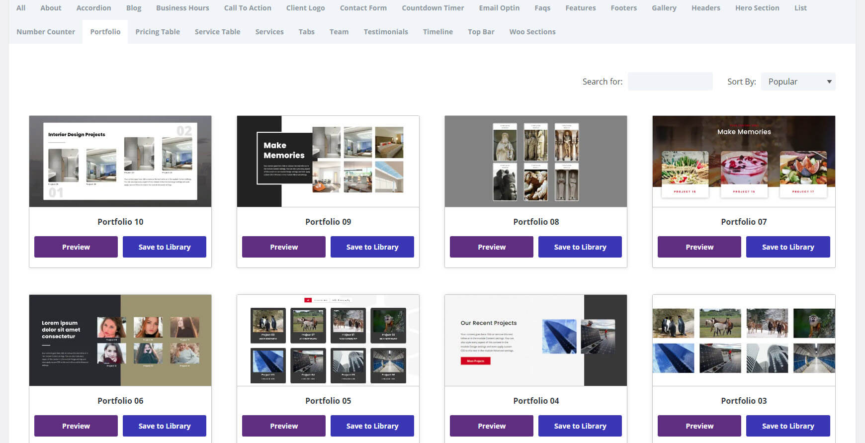
Choose from 10 portfolio layouts. These are some of the most elegant layouts in Divi Layouts Extended. They include several background designs, including images and blocks of color. They include several layouts and portfolio card designs. Some include a CTA or a styled filter. They work for various industries, including industrial, consumer, shops, restaurants, photography, design, etc.
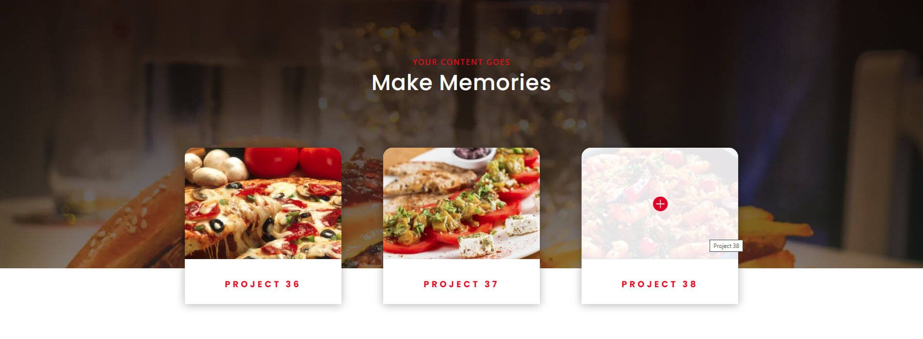
This example uses a portfolio section to create a restaurant menu. The portfolio cards have shadows, overlays, and rounded corners. They overlap the background image. I’m hovering over the item on the right to show the overlay.
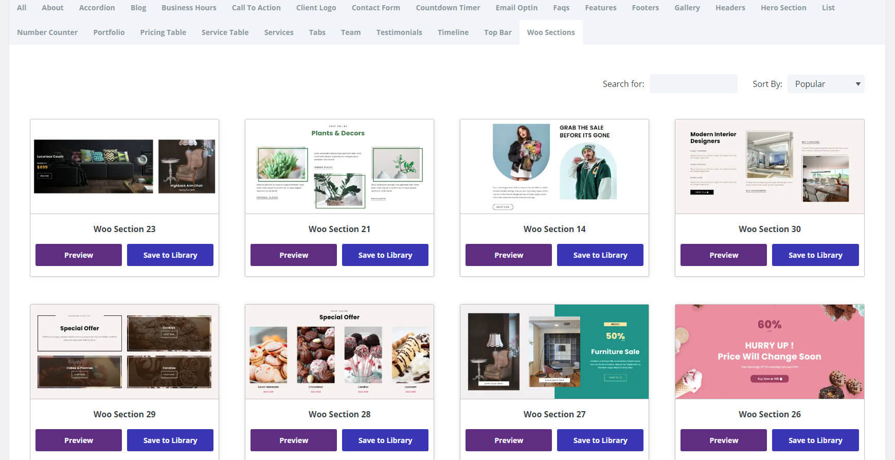
Woo Sections
There are 30 Woo sections to choose from. They work as CTAs in the various categories in the shop and include styled backgrounds, styled images, offers, countdown timers, and many layout designs. They would work great as sections within layouts and as hero sections.
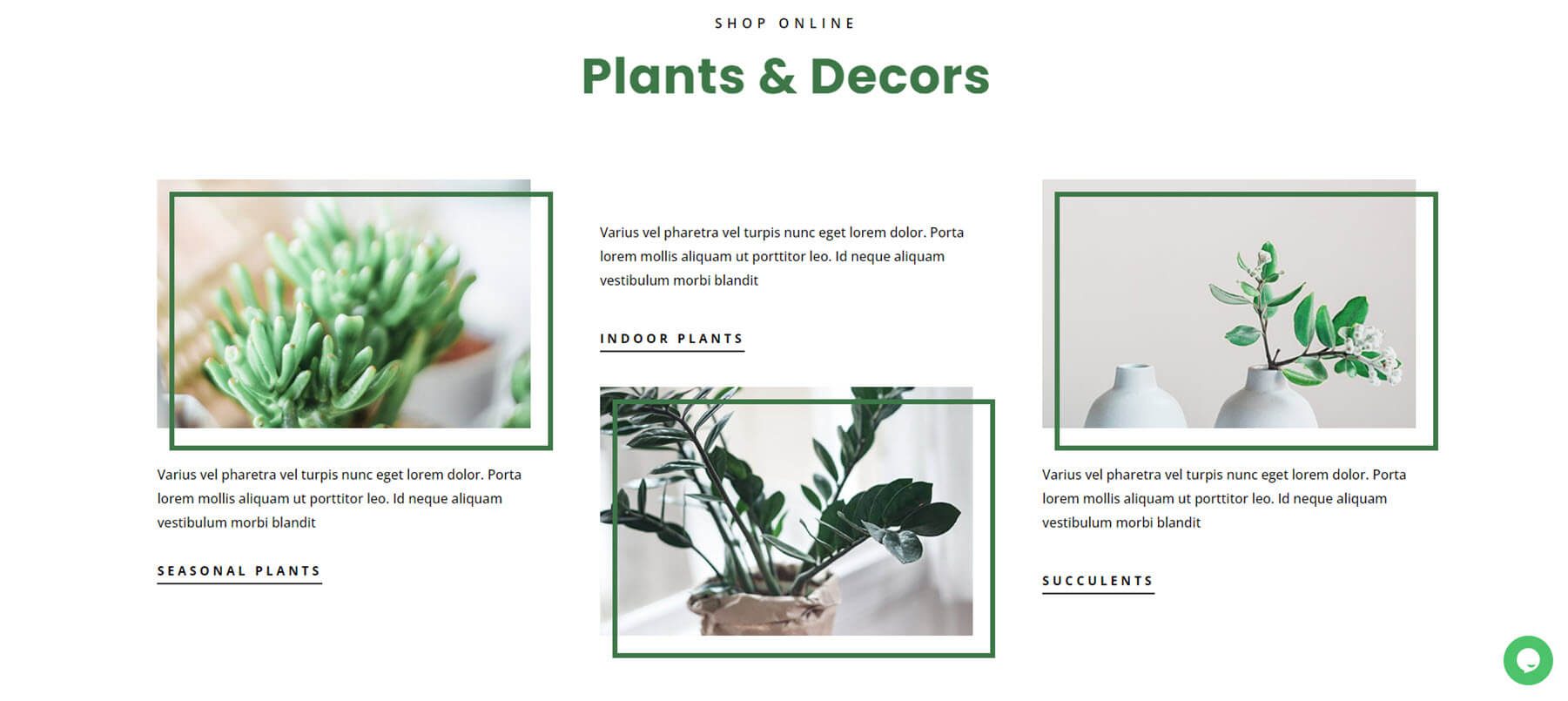
This example shows styled images with offset borders. They include two different layouts within the grid. It works as links to categories in the shop.
This example includes a countdown timer and a button to see the shop.

Divi Layouts Extended Pages
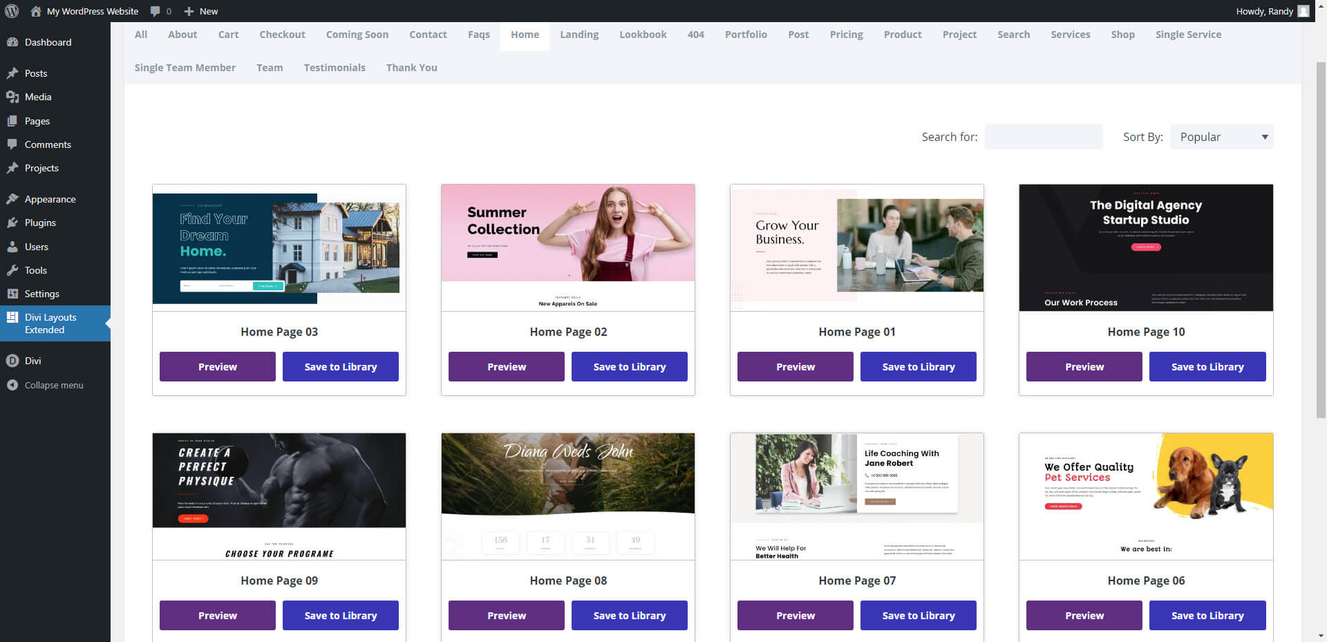
The Divi Layouts Extended Pages tab includes 23 types of pages. They include home, landing, about, coming soon, checkout, pricing, product, search, services, project, shop, team, testimonials, FAQs, Lookbook, 404, and more. They use the modules and sections from the other tabs to create pages in several genres with custom styling for each one. Here are a few examples.
Home
Choose from 10 home pages to choose from. They’re designed for shops, agencies, bands, real estate, weddings, and several service-based businesses.
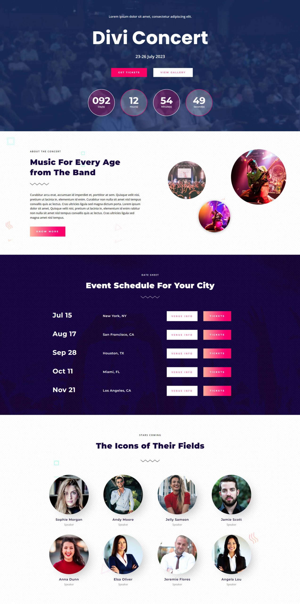
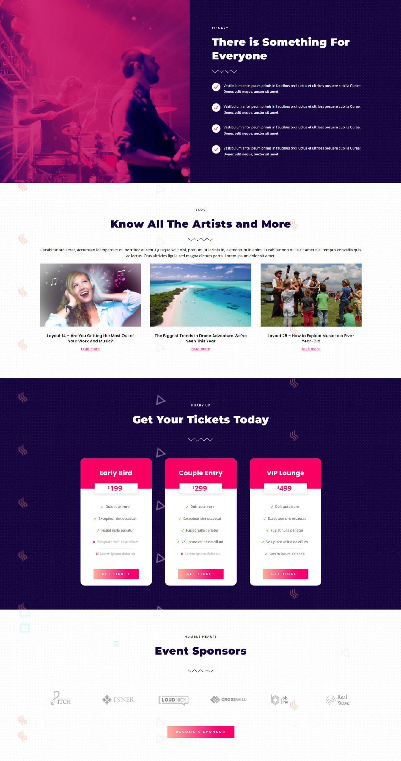
This example shows the first half of Divi Concert, which was designed for bands and live events. It includes a hero section with a background image, CTA, and a number counter. It also includes sections for information, an event schedule, and a team section for the band members.
The second half includes an itinerary with two sections that display an image on one side and blurbs on the other. Also included are a blog section, pricing tables, and sponsor logos.
Landing
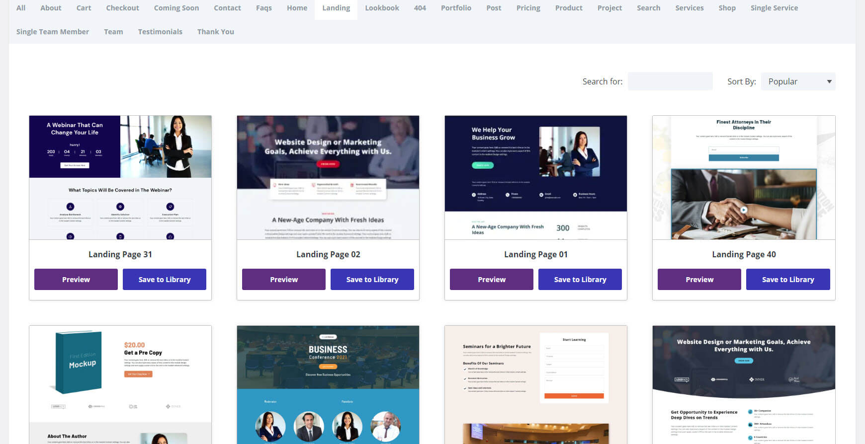
There are 40 landing pages to choose from in several genres with a focus on business. They include agencies, conferences, authors, podcasts, webinars, etc.
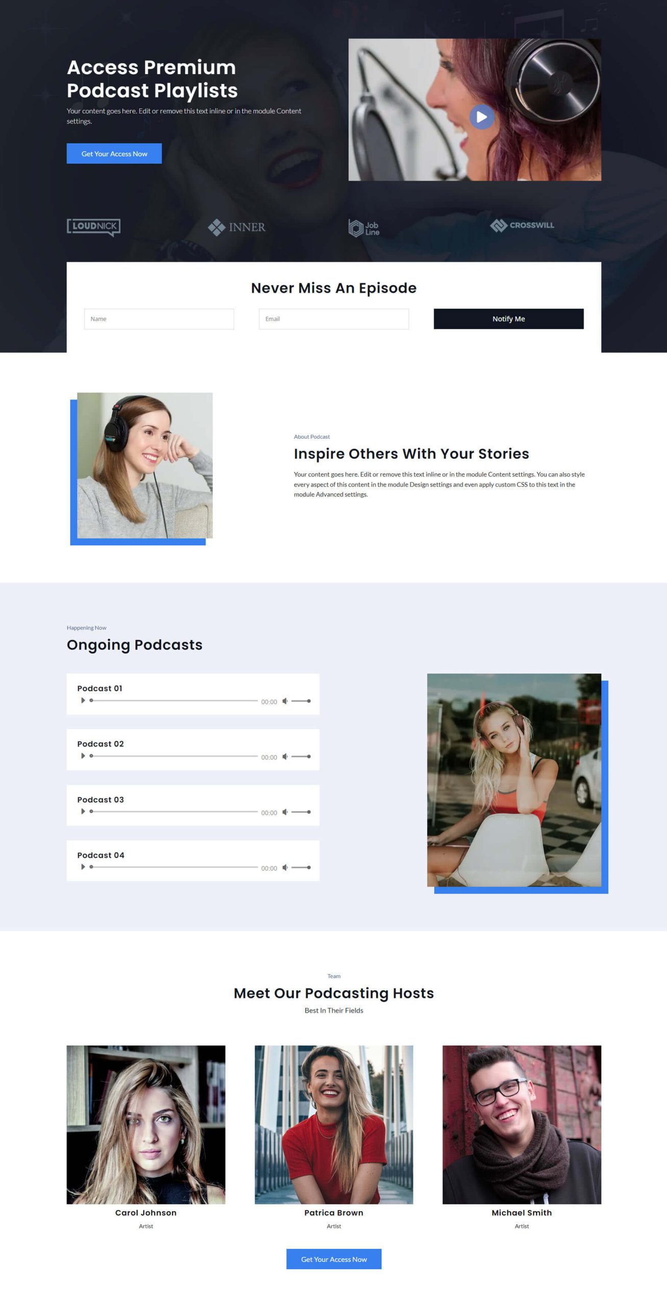
This is the landing page for a podcast. It includes a hero section with a CTA, an embedded video, sponsor logos, and an email form. It also includes a section for information, embedded audio files, and hosts.
Lookbook
There are 3 Lookbook pages to choose from. They include lots of styled images in various layouts to build shop pages that focus on images.
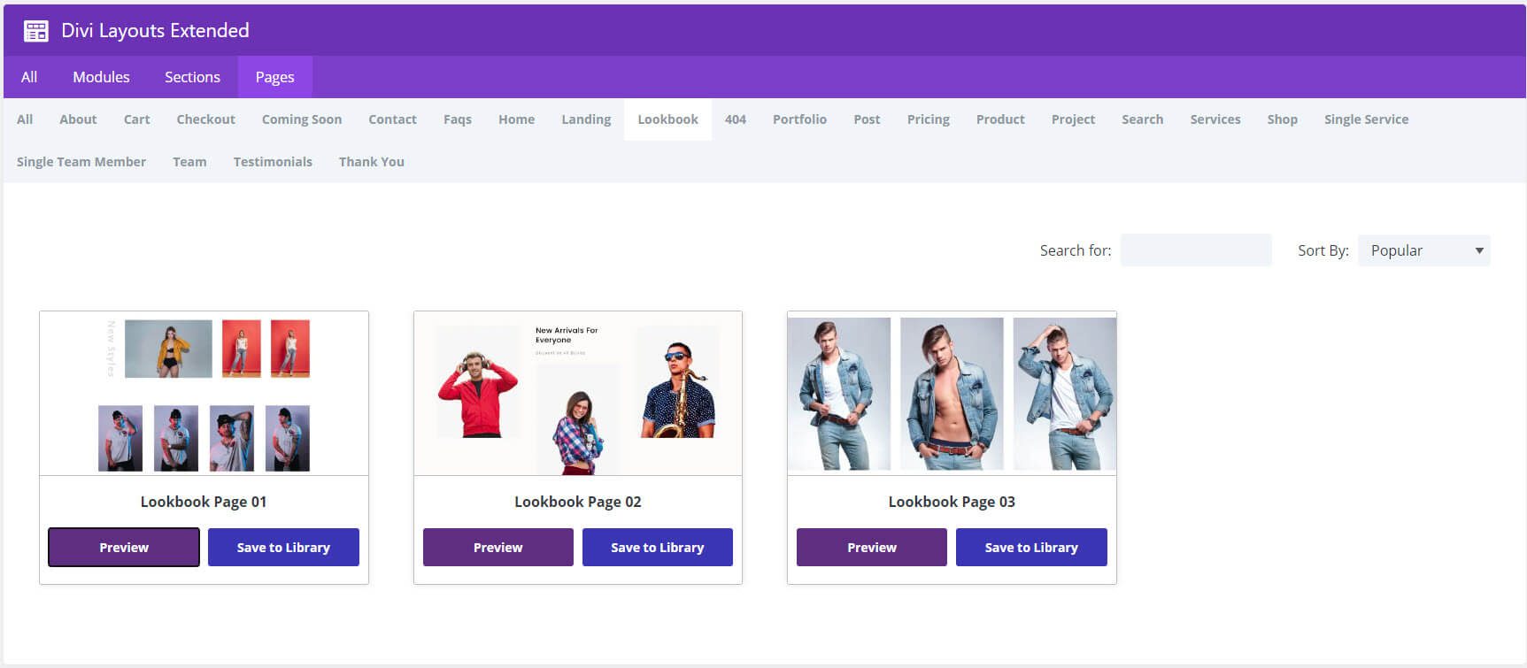
This example shows several sections of product images and includes a countdown timer and featured products.
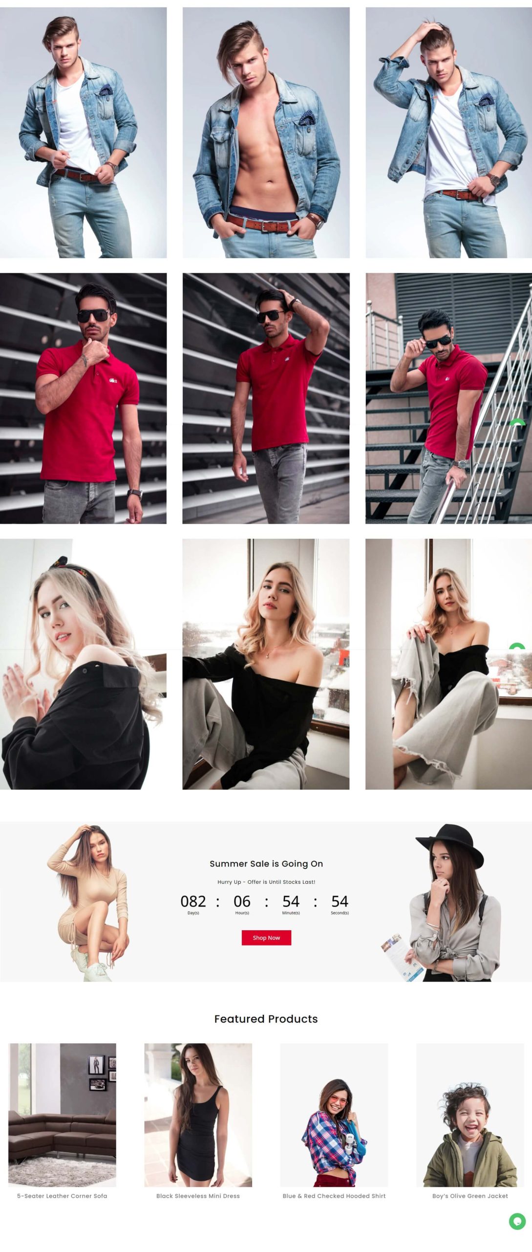
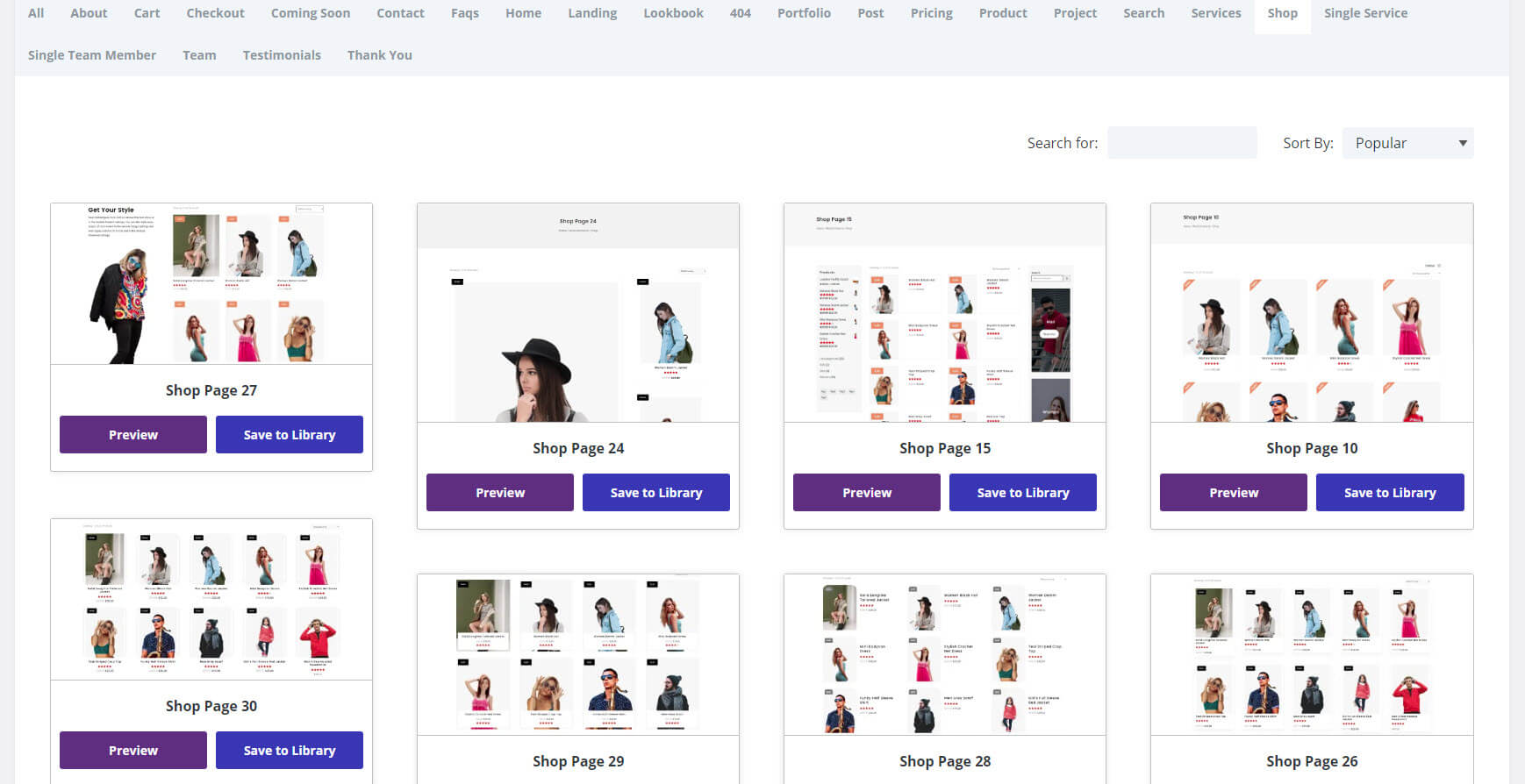
Shop
There are 30 shop pages to choose from. They display products in various ways in grids, with large or small images, with or without sidebars, and with or without CTAs.
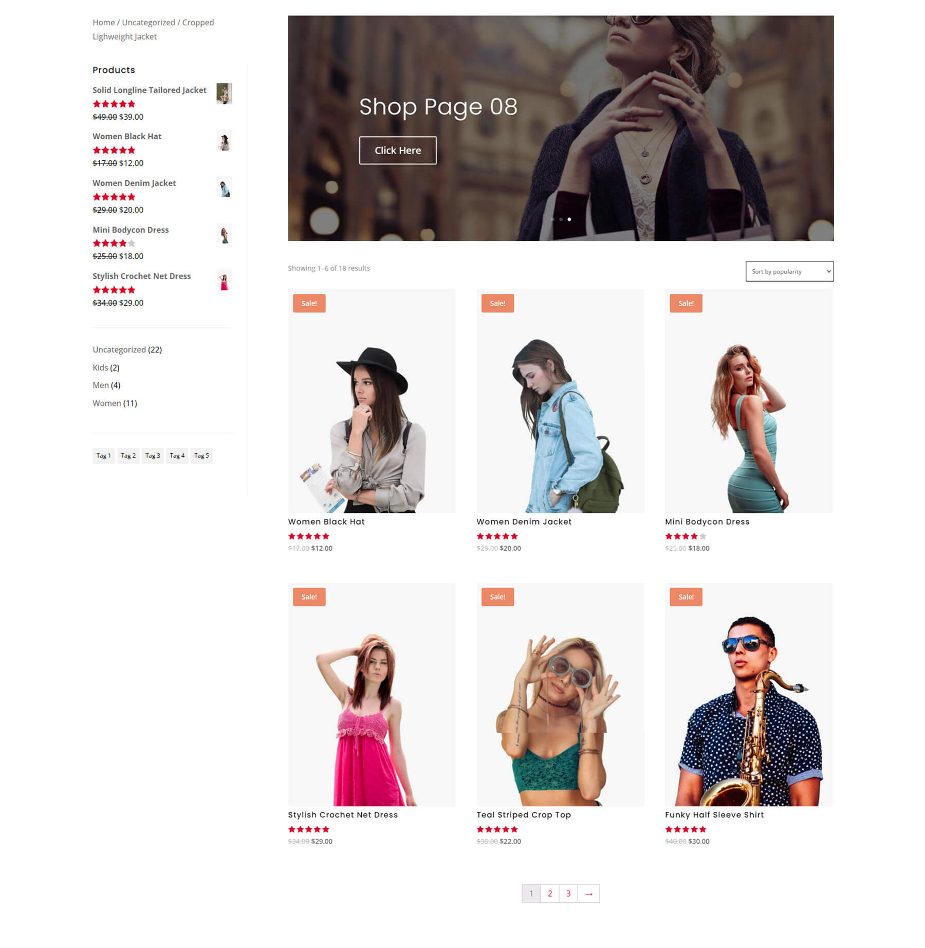
This example includes a sidebar with breadcrumbs, products, categories, and tags. A slider at the top of the page links to categories. The products include styled elements.
Post
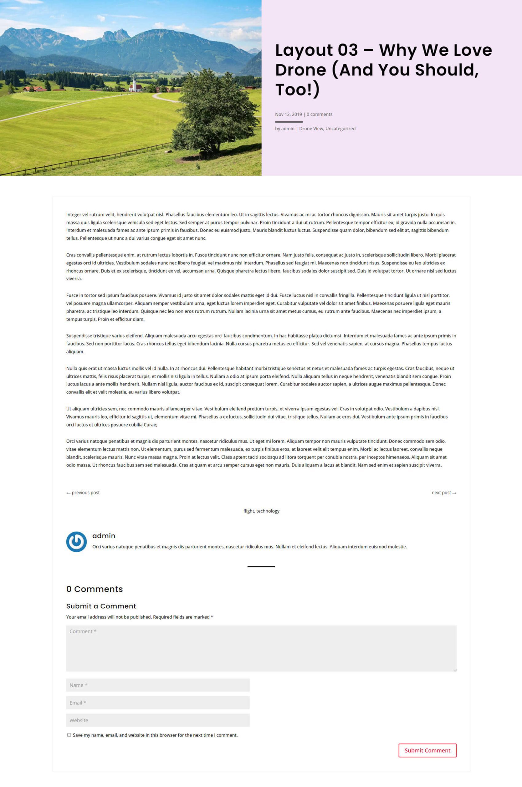
There are 25 blog post layouts. They display the post elements in different ways. Choose a layout with or without a sidebar.
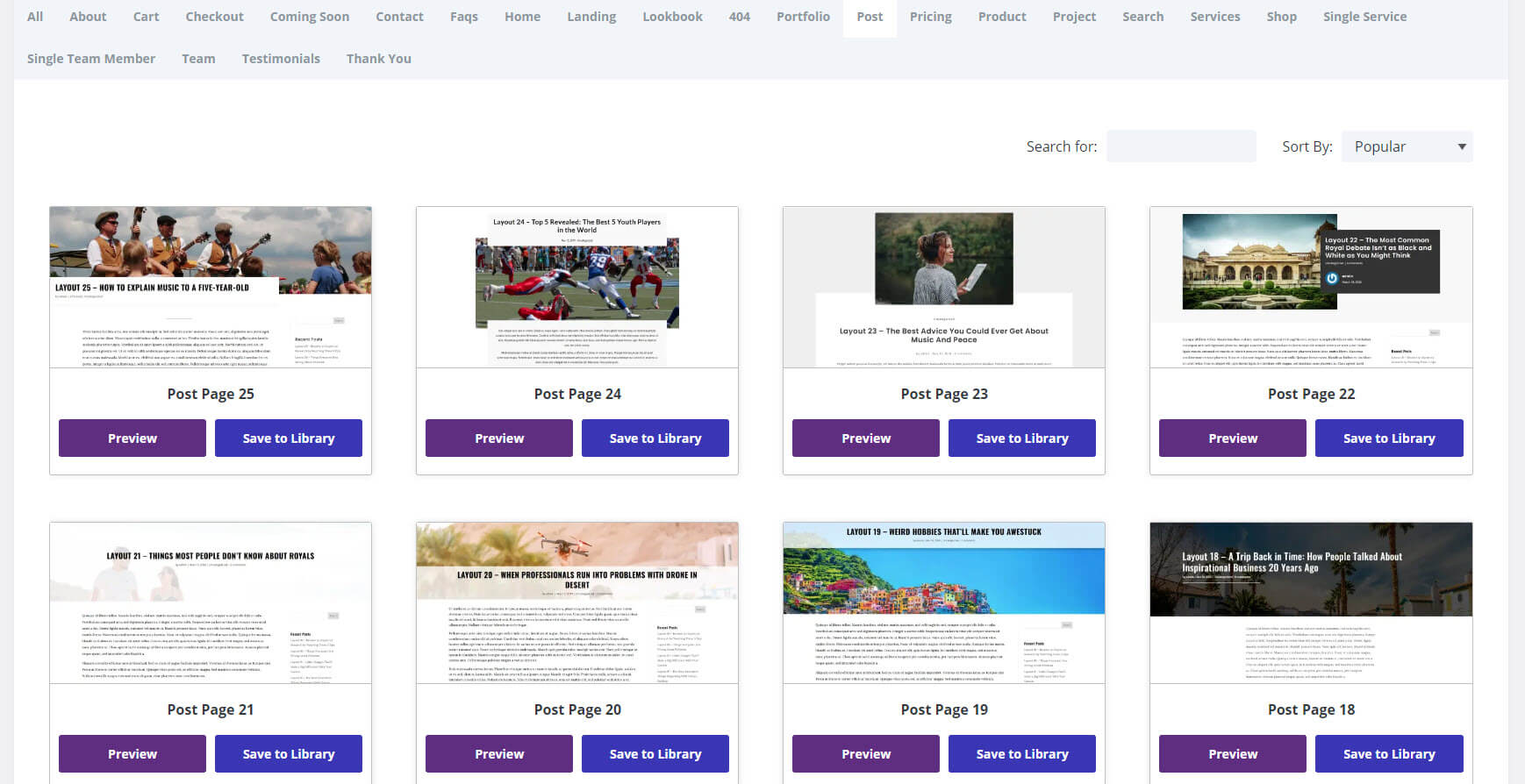
This example places the featured image on the left with the text and metadata on the right over a solid background. The content is presented in a wide single-column layout with post navigation, tags, and comments.
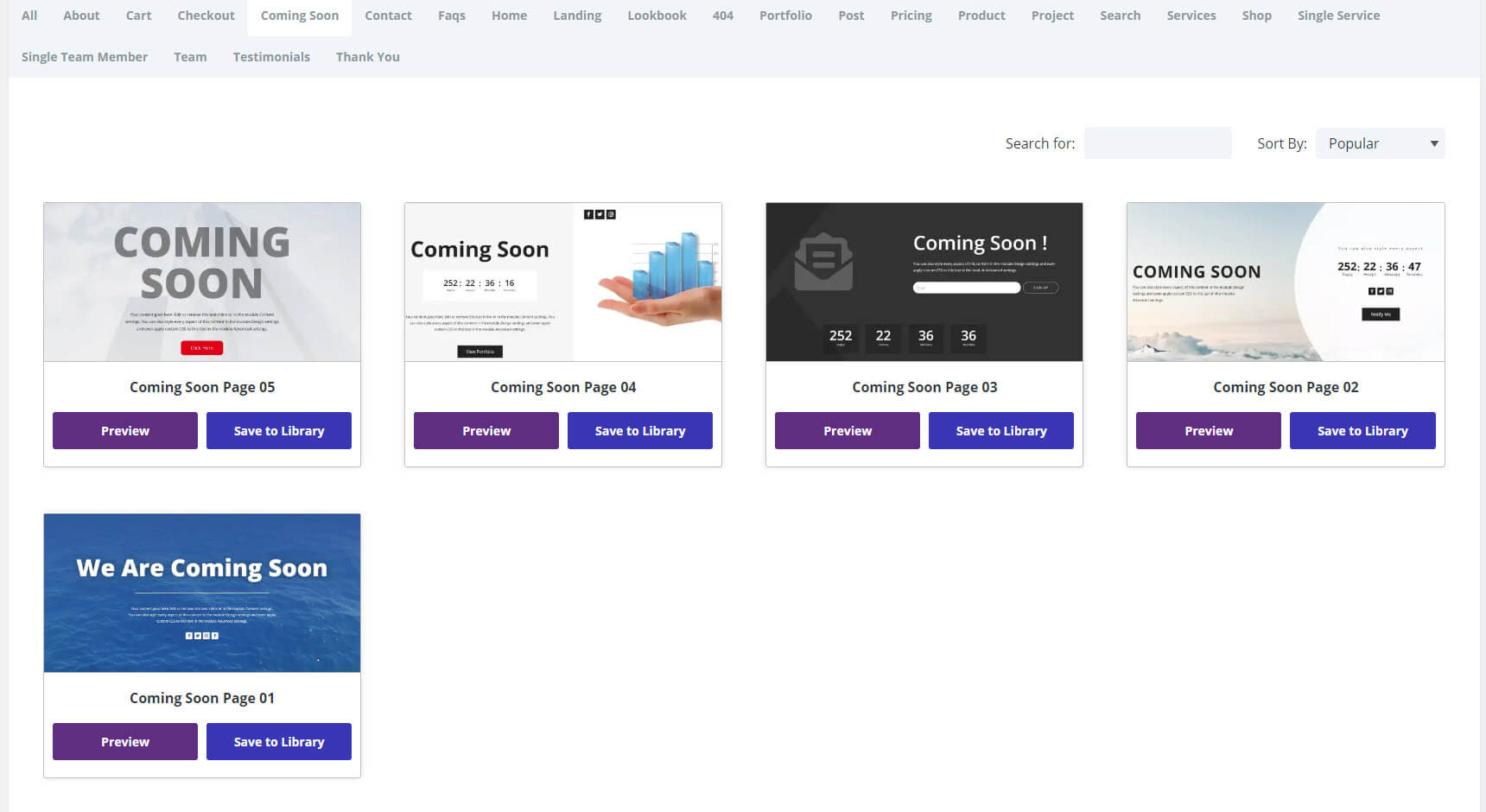
Coming Soon
There are 5 coming soon pages to choose from. They include large text, countdown timers, email forms, and social media follow icons.
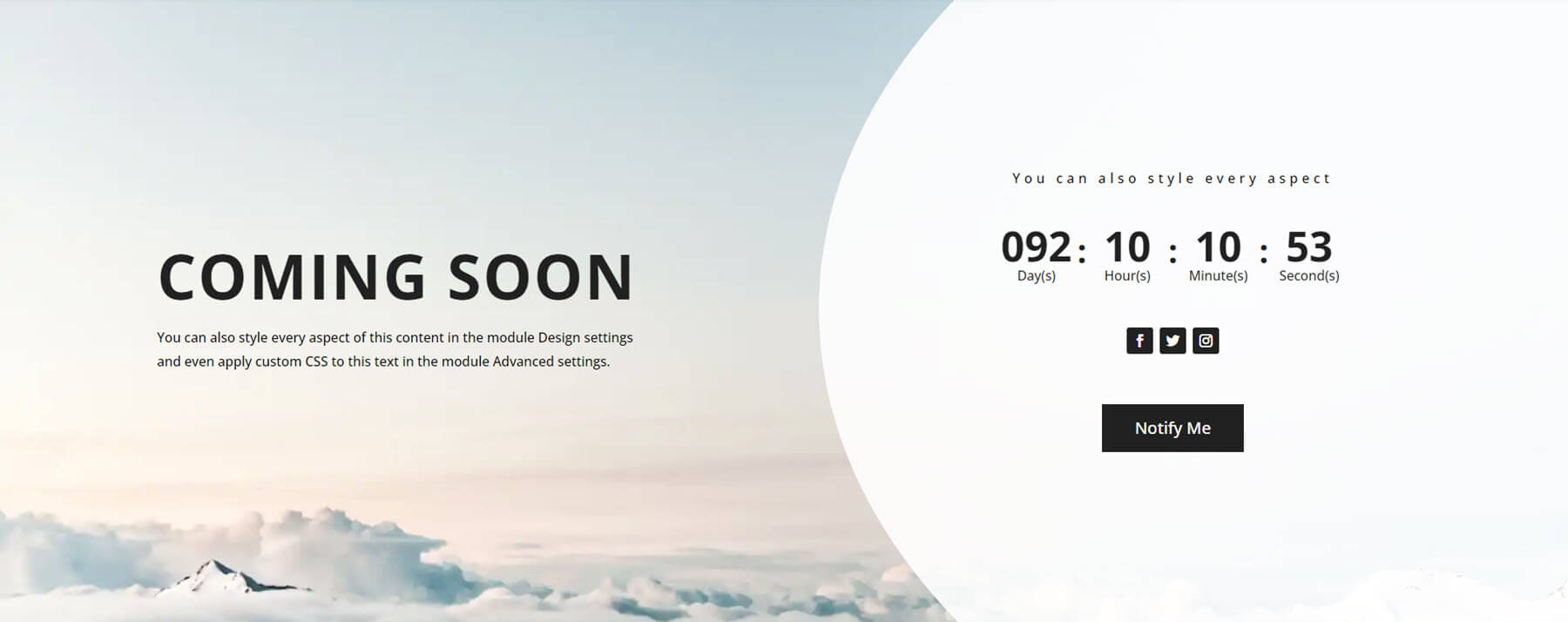
This example displays the message on the left over a background image. On the right are a countdown timer, social media icons, and a button for an email form, all placed over a white background with a rounded left edge.
404
There are 10 404 pages. They include a combination of graphics, images, typography, social follow icons, contact information, search boxes, and a link to the home page. Most only include a few of these elements, which keeps them simple and easy to understand.
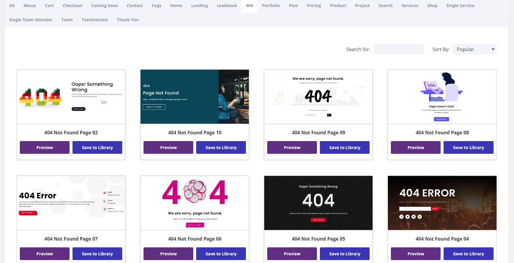
The example uses a background image of an event, which works great with the Divi Concert landing page. It includes a full-width background image, the 404 error message, a search box, and social icons.

Where to Purchase Divi Layouts Extended
Divi Layouts Extended is available in the Divi Marketplace for $49. It includes unlimited website usage, one year of support and updates, and a 30-day money-back guarantee.
Ending Thoughts on Divi Layouts Extended
That’s our look at Divi Layouts Extended. There are a lot of well-designed layouts in this Divi plugin. The dashboard is easy to use and only imports the layouts you want, keeping your Divi Library clean. Once imported into your Divi Library, they work the same as any Divi layout. If you’re interested in expanding your library of Divi layouts, Divi Layouts Extended is a great choice to consider.
We want to hear from you. Have you tried Divi Layouts Extended? Let us know what you think about it in the comments.
The post Divi Product Highlight: Divi Layouts Extended appeared first on Elegant Themes Blog.
