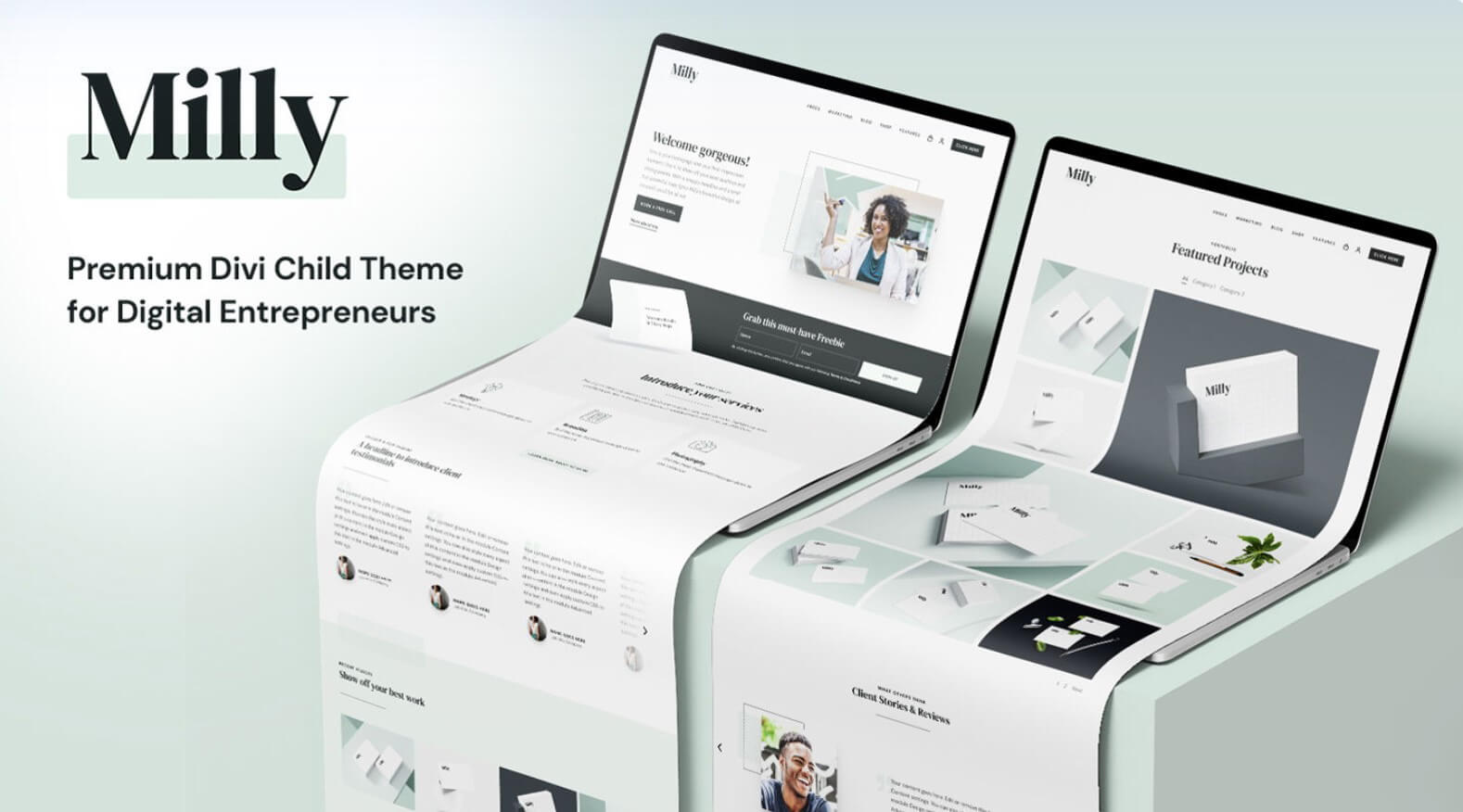
Milly is a third-party child theme for Divi that was designed with entrepreneurs in mind. It comes with lots of pages, layouts, and styled modules to build any type of business website and create new pages with the sections. It even adds extra features to help your shop or business stand apart. In the post, we’ll take a close look at the Milly Child Theme to help you decide if it’s the right Divi child theme for your needs.
Installing Milly Child Theme
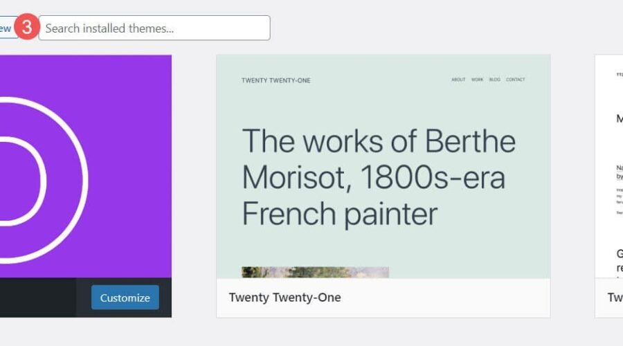
First, we’ll look at how easy it is to install Milly. Installing the Milly child theme was simple. Firstly, go to Appearance > Themes and select Add New.
- Appearance
- Themes
- Add New

Secondly, with Divi activated, upload the child theme as you would any theme. Select Upload Theme, Choose File, navigate to the file, select it, and click Install Now.
- Upload Theme
- Choose File
- Install Now

Thirdly, once the child theme has finished uploading, activate it.
- Activate

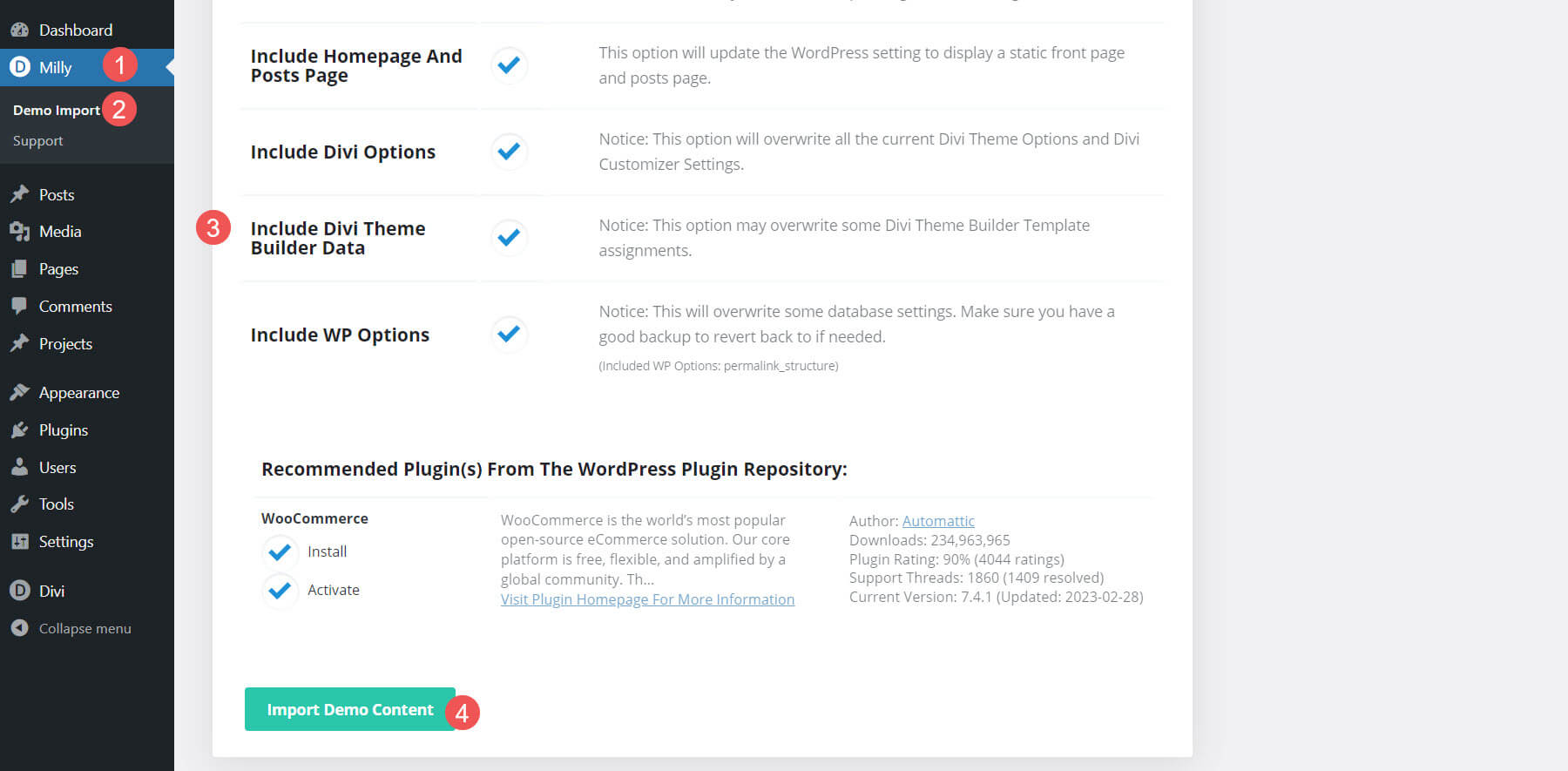
Fourthly, you’ll need to import the demo content. This will make your website look like the demo, but it does not include images. Instead, it shows a dummy image with the size you’ll need for that location. To import the demo content, go to Milly > Demo Import, select all the files you want to import (I recommend leaving this at the default), and Import Demo Content. It will also install and activate WooCommerce for you. WooCommerce is selected by default.
- Milly
- Demo Import
- Make your selections
- Import Demo Content
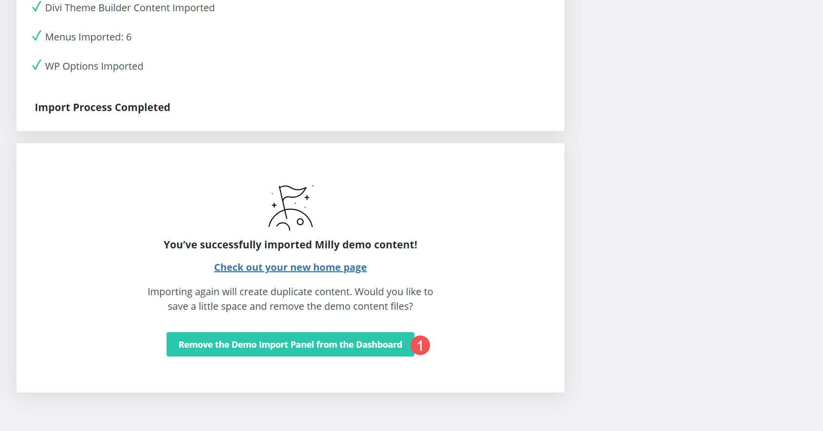
Fifthly, remove the demo import panel. This cleans up your dashboard so you won’t have links you no longer need.
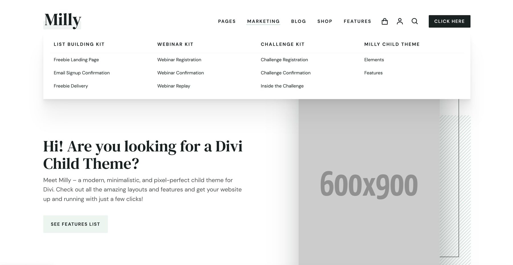
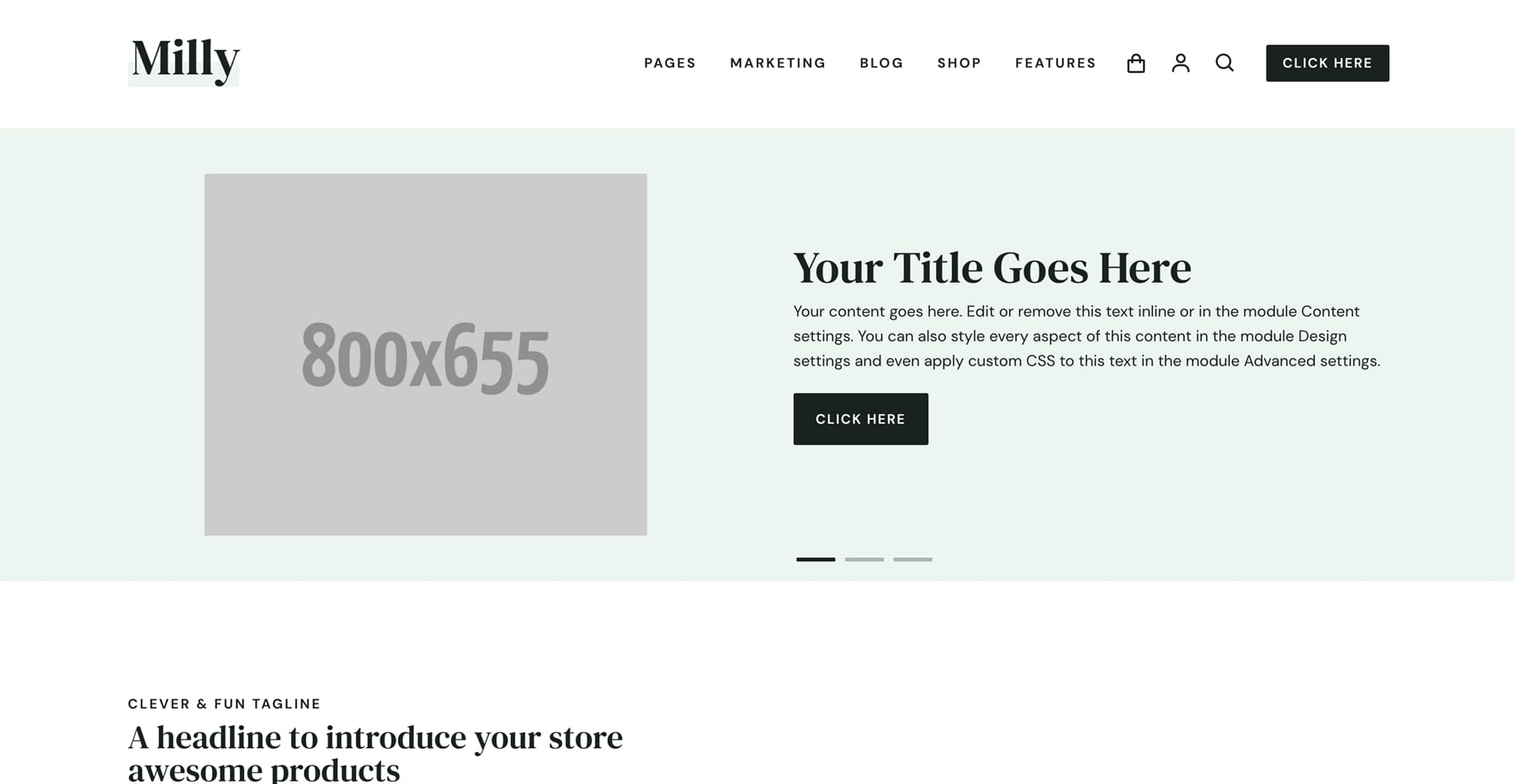
Finally, the Milly child theme is ready to use. Here’s the home page after the demo content has been imported. Next, let’s take a look at what’s included.
Milly Child Theme Pages and Layouts
First, we’ll look at the pages and layouts. Milly includes lots of marketing templates. This includes four home pages that are built around different types of business models. It also includes an about page, a project page, a case study page, a sale page, a service landing page, resources, contact, FAQs, blog, and shop pages.
Pages
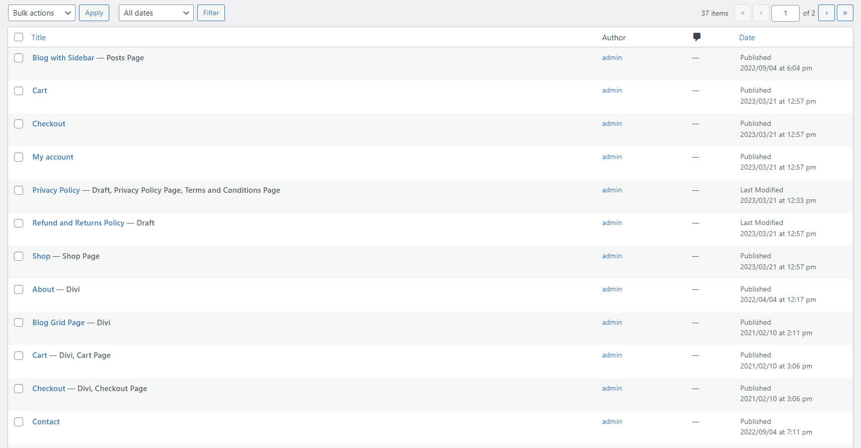
There are over 30 pages added to your website. They include multiple home pages, standard site pages, and lots of eCommerce pages. The home pages include a default page, one for freelancers, an eCommerce page, and one for a business agency.
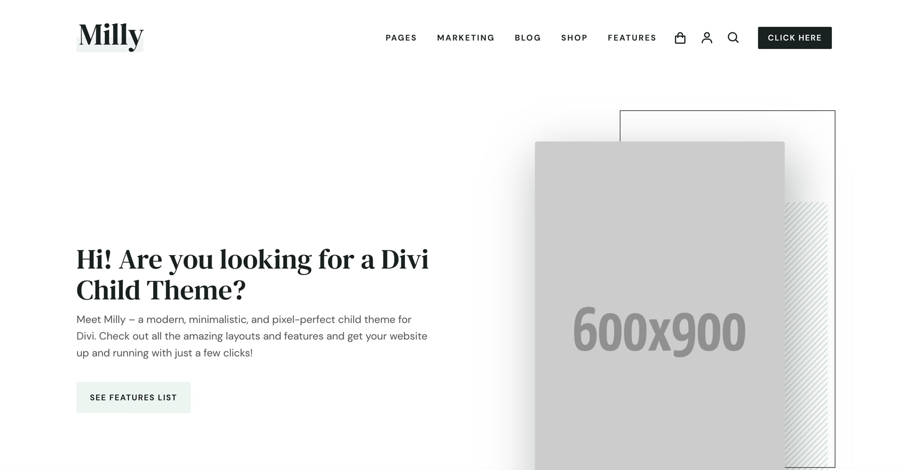
This is the default home page. It includes a CTA on the left and an image on the right that follows your cursor. Other sections include blurbs that show benefits, number counters, a CTA, an embedded video, a different set of blurbs with large icons, another small CTA, and a product slider. We’ll see these elements as we explore the features. It has a white color scheme with a few dark gray backgrounds.
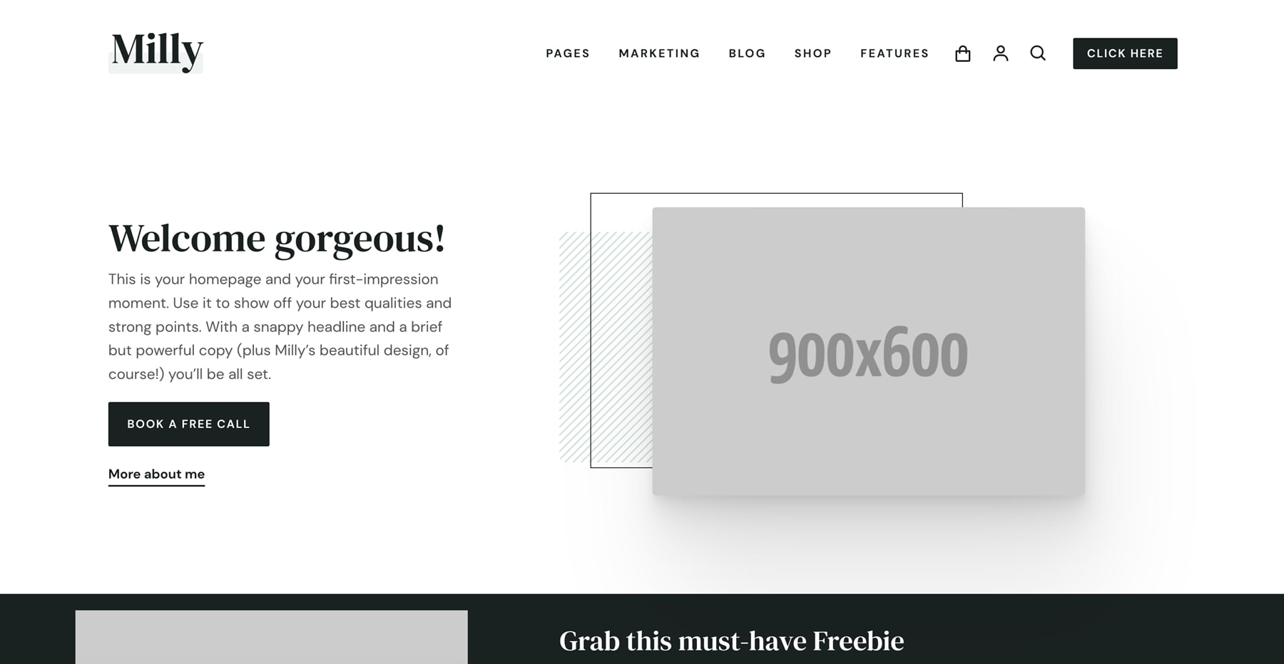
This is the freelancer/entrepreneur home page. This one has two CTAs on the left and a smaller image on the right. It also includes a section for a freebie, blurbs with hover effects, a testimonial slider, a project slider, and a CTA.
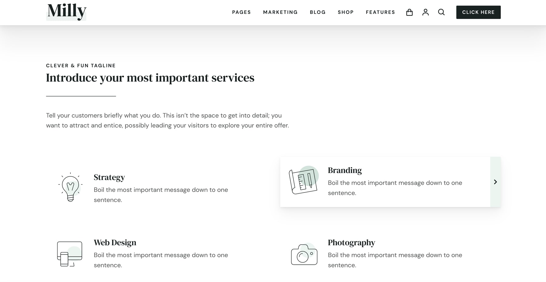
Here’s the business/agency home page. Instead of a hero section with a CTA, it has blurbs with a focus on services. I’m hovering over one to show its hover effect. This home page includes a large blog section, a CTA, number counters, client logos, and a CTA with steps. It adds a section with light green for the background. This example also shows the custom icons.
Here’s a look at the eCommerce home page. It places the hero image on the left with the CTA on the right. It also uses a large shop section to show products, benefits, a testimonial slider, and a shop CTA with two products.
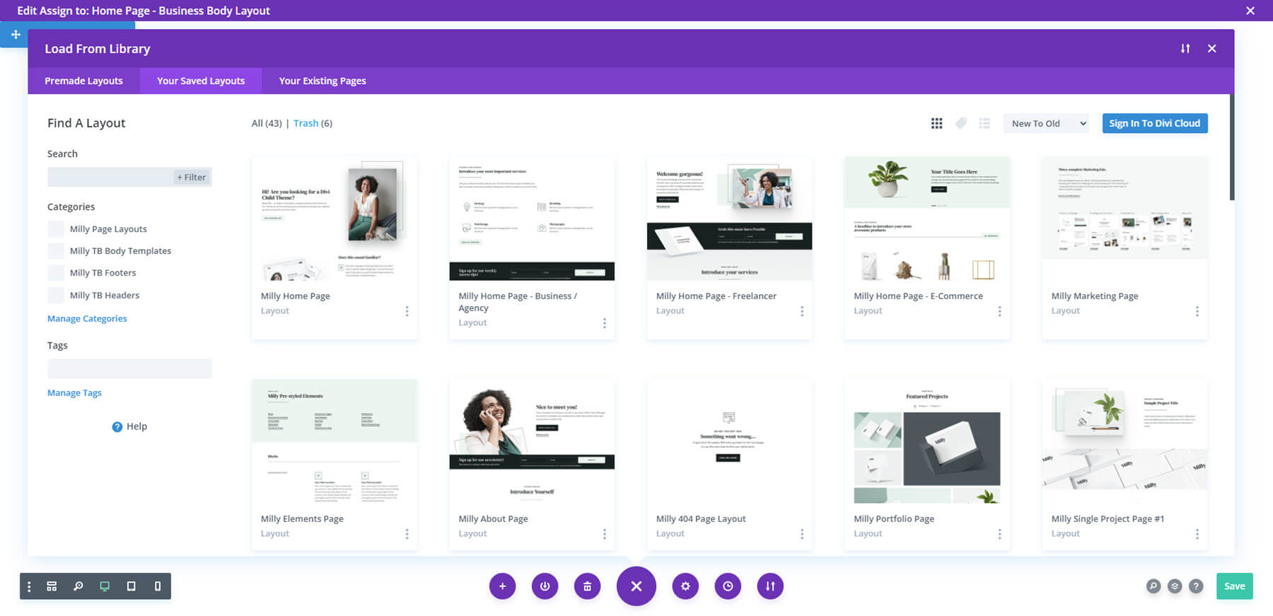
Divi Library
There are 135 layouts added to the Divi Library. They include all the templates that are used on other pages and in the Theme Builder. They also include icons. Let’s look at a few at random. I’ll save the WooCommerce layouts for a different section.
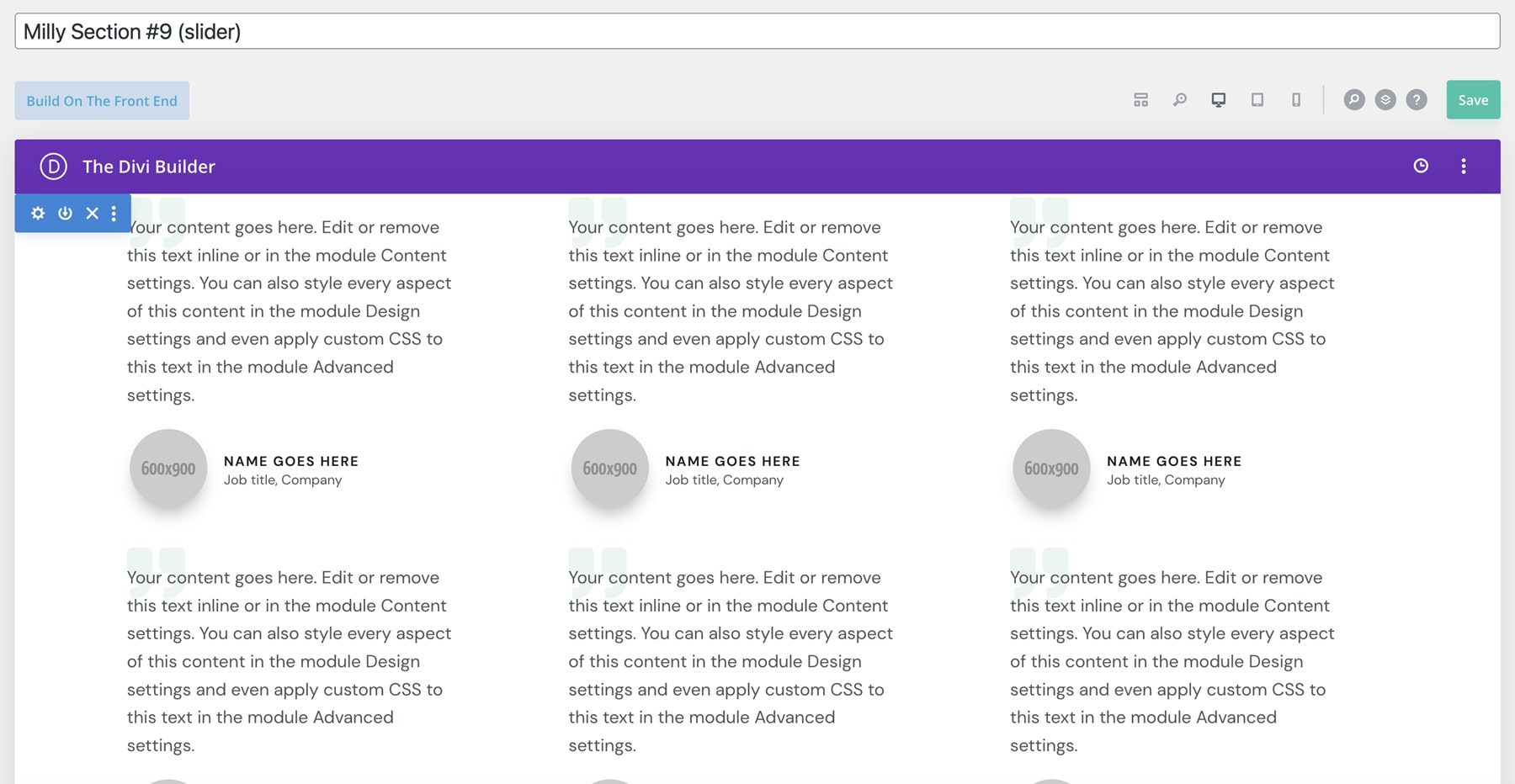
This example shows a testimonial slider. The testimonials are built as cards.
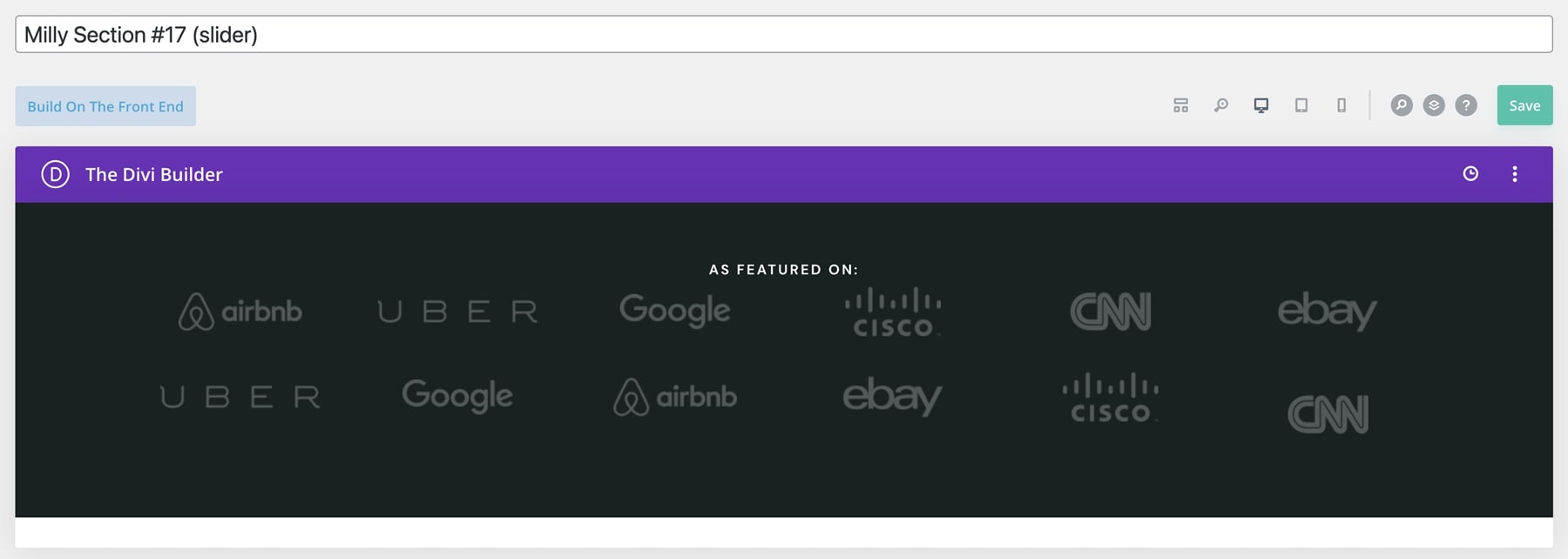
Here’s another slider. This one shows client logos.
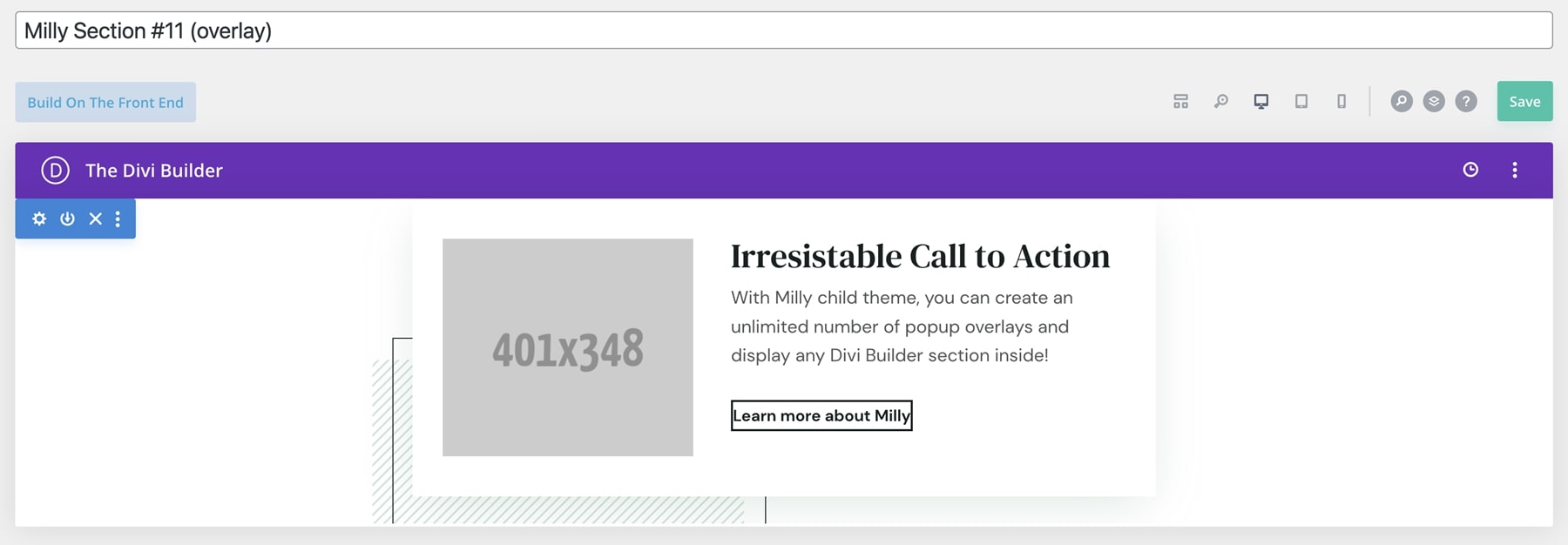
This layout is a popup overlay. It’s a CTA with an image and a button.
This layout is a promo bar. It includes a CTA to the shop. This bar is included on the shop page. On that page, it sticks to the bottom of the screen until you scroll far enough, and then it scrolls with the screen.

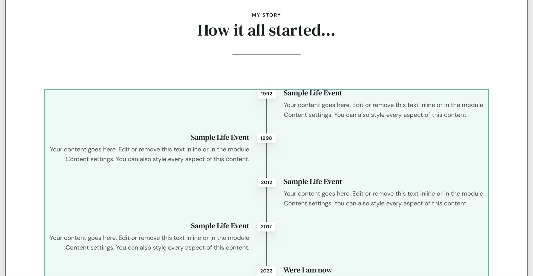
This section shows a timeline in an alternating layout.
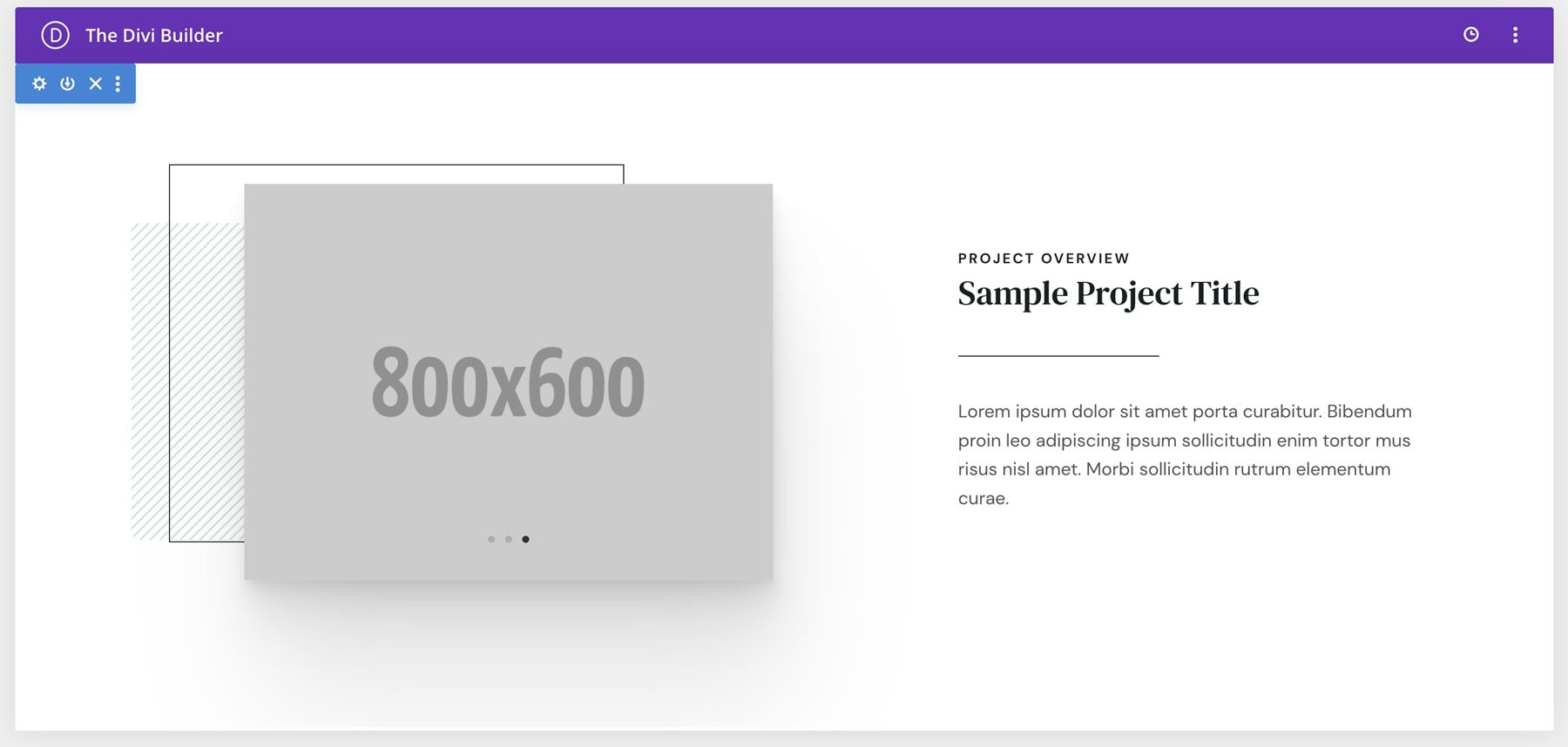
This one shows a sample project. It includes a slider.
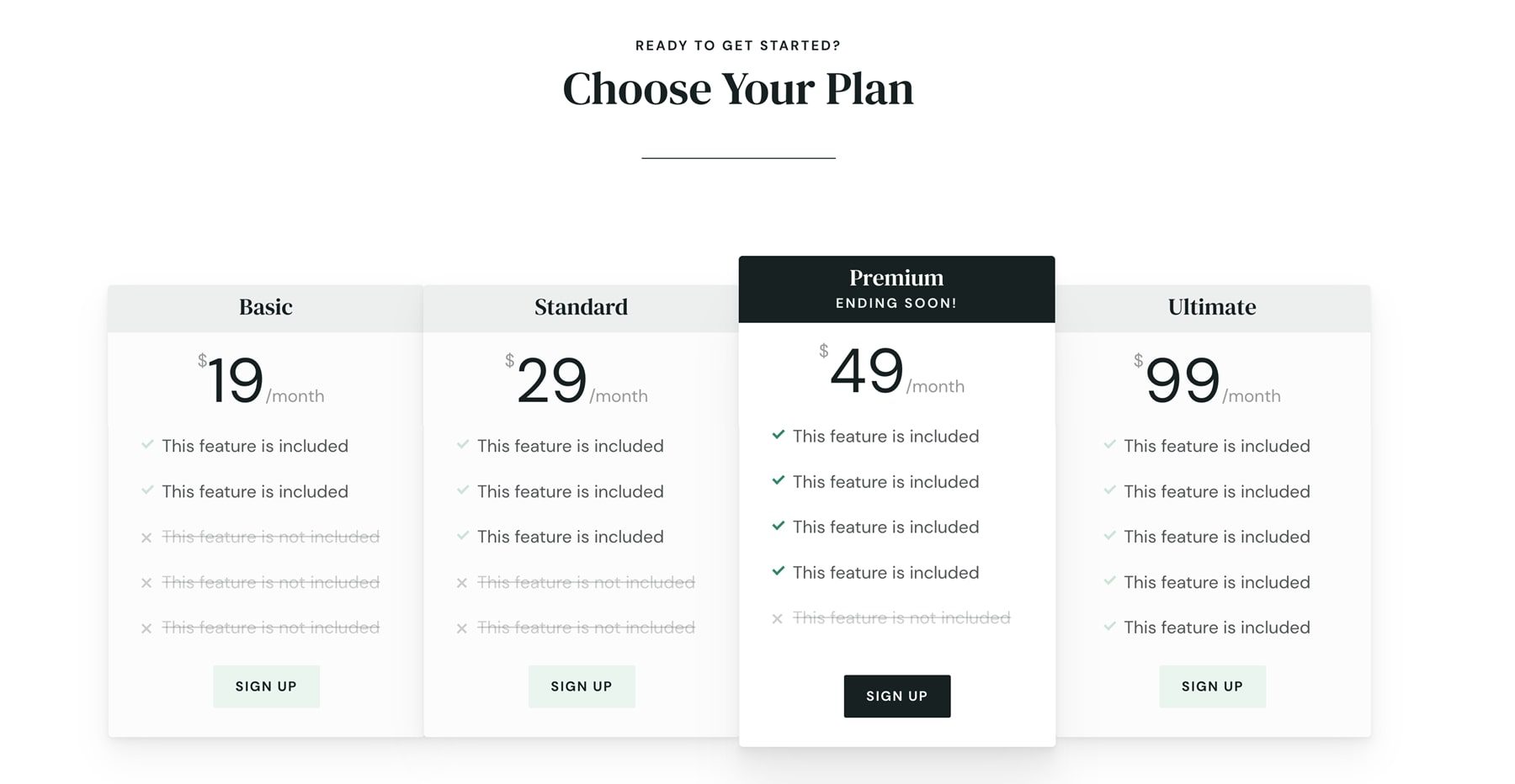
This example shows a pricing table.
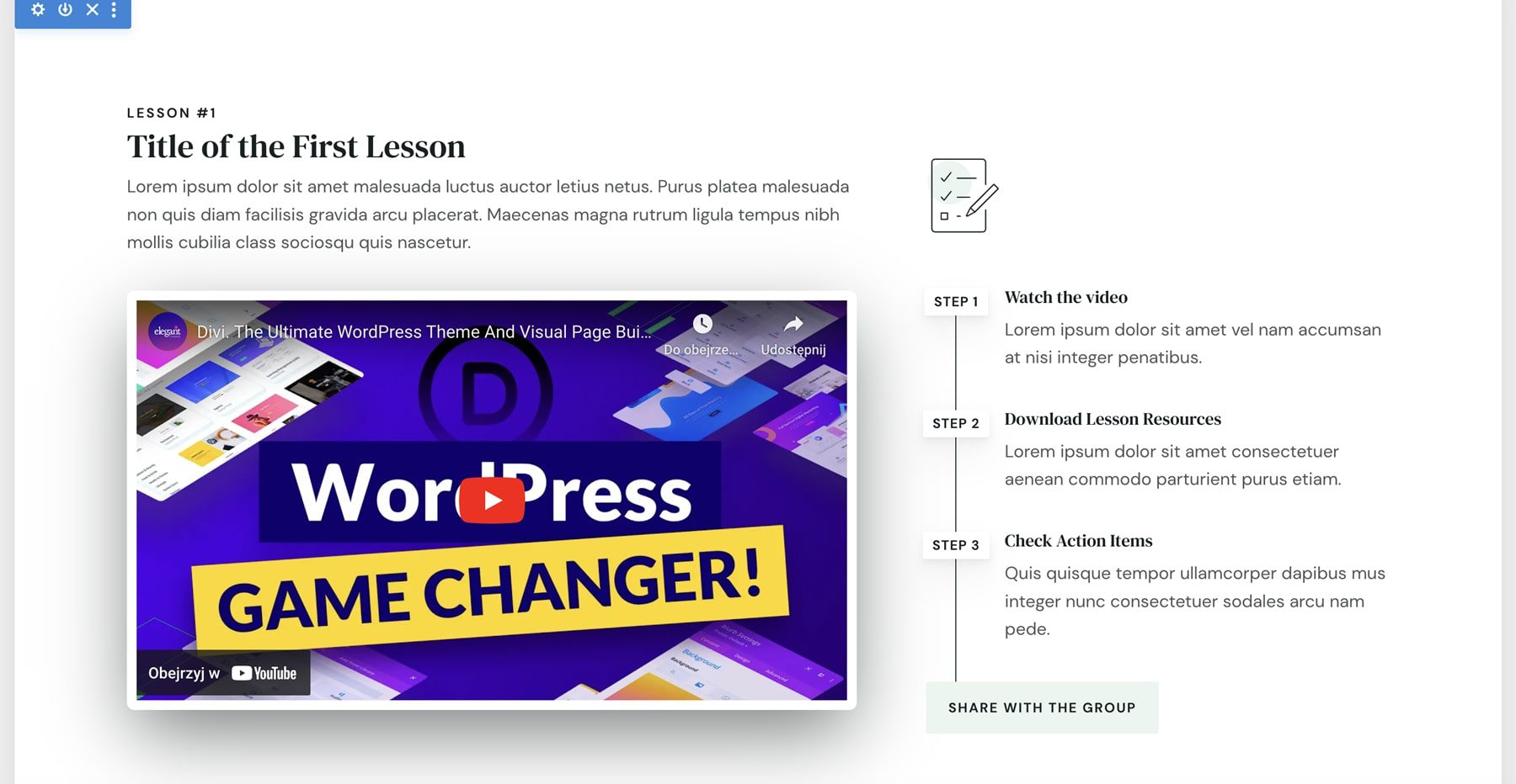
This section includes an embedded video and lists the steps. It also includes a button to share the video.
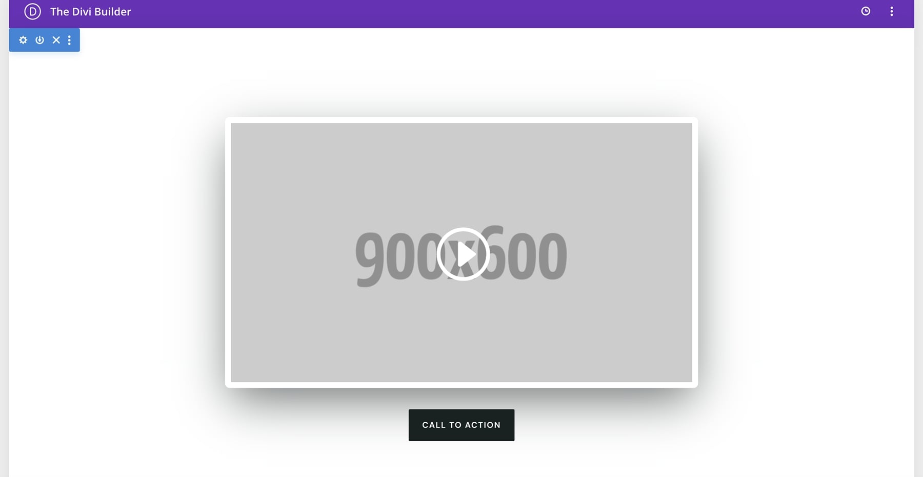
Here’s another overlay. This one includes a video and a button.
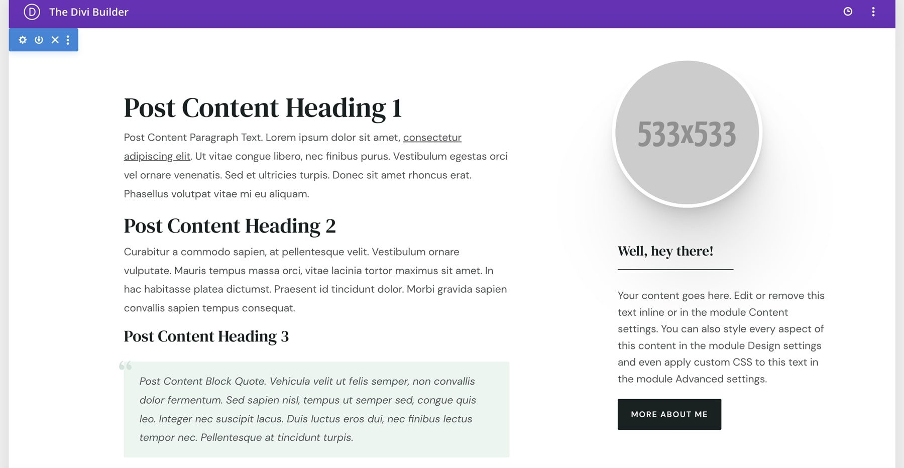
This layout is a sidebar. It includes a circled image and a button to learn more.
Theme Builder
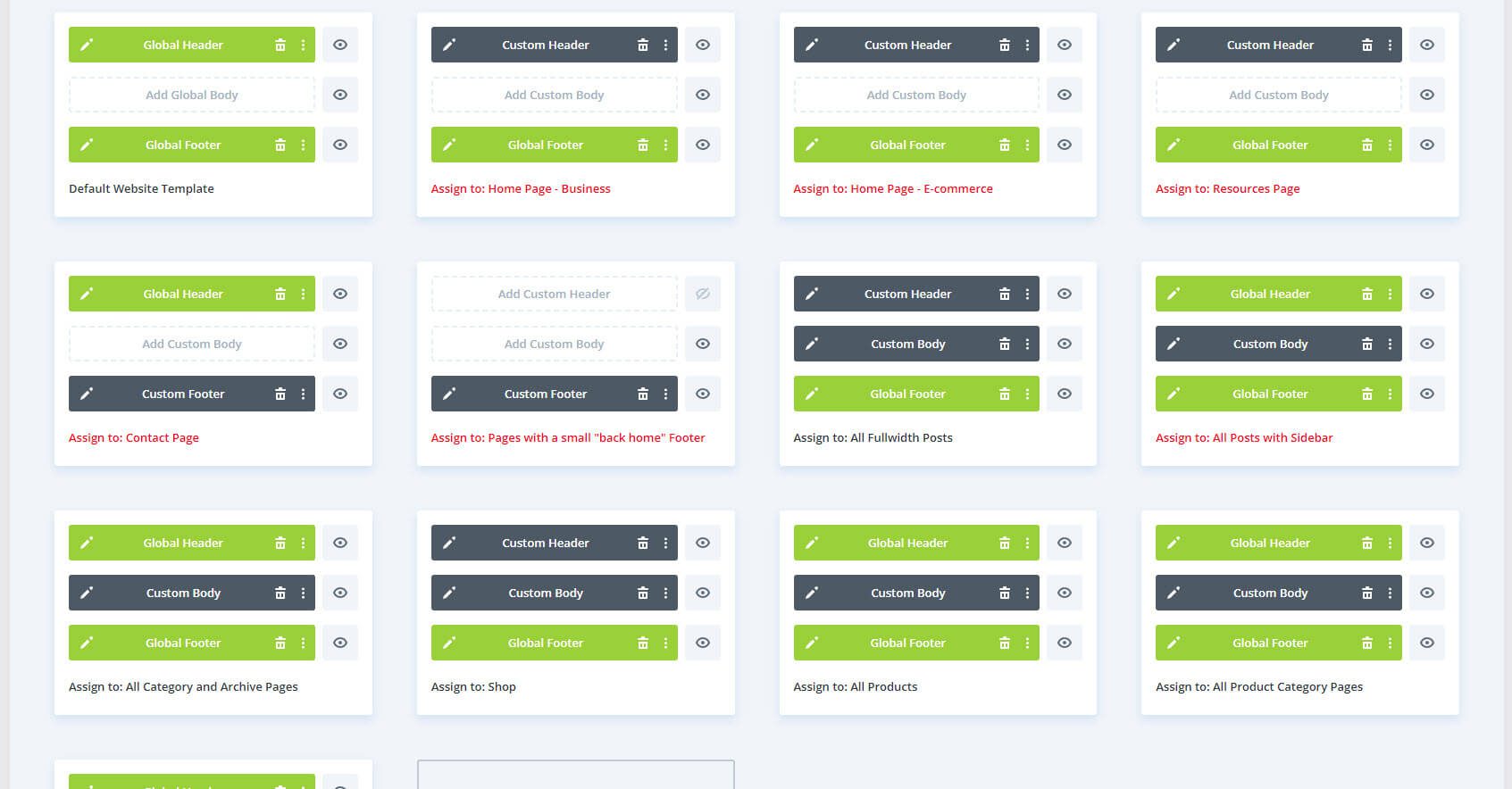
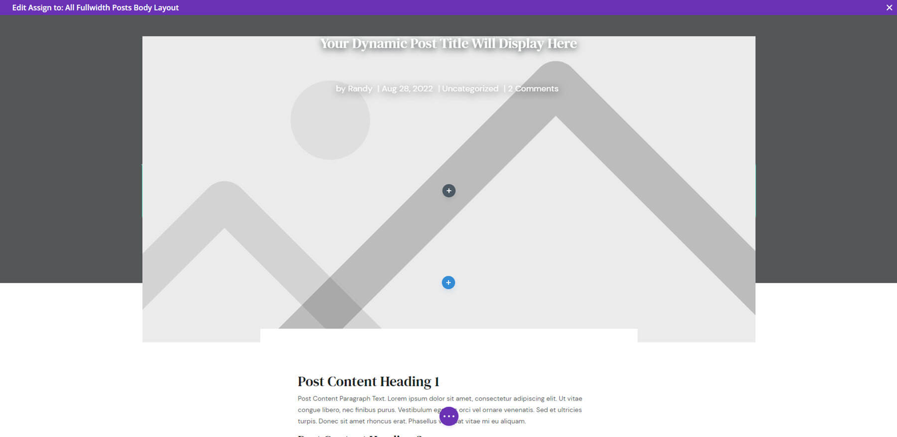
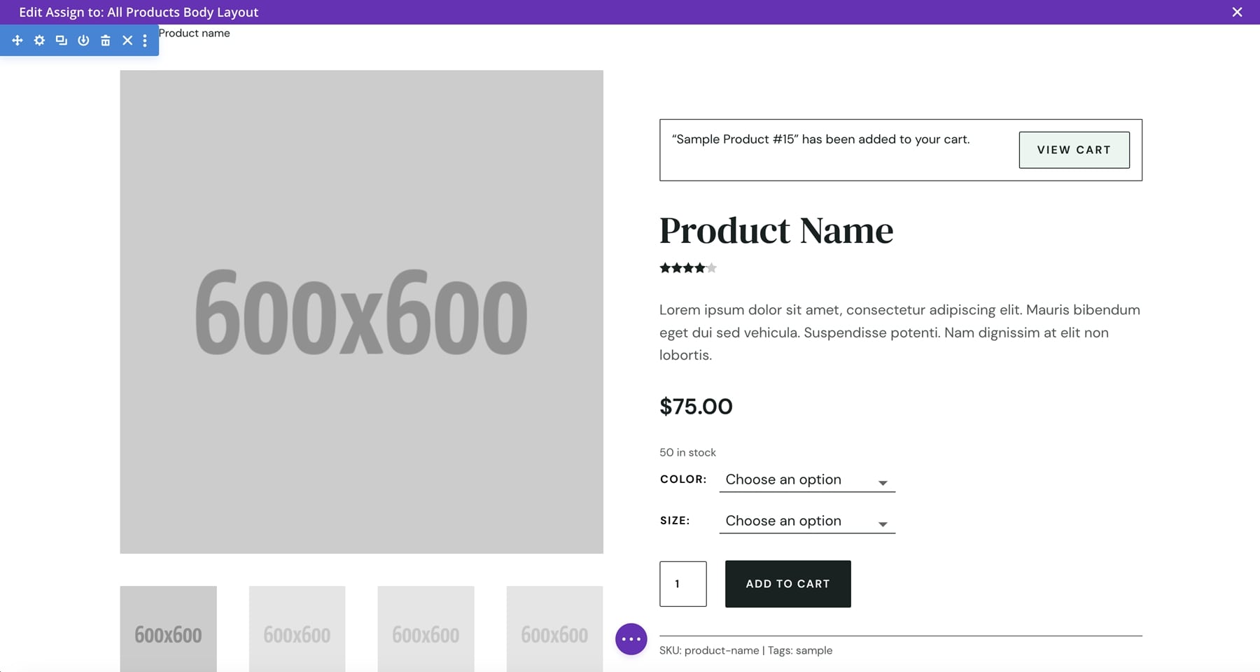
There are 13 layouts in the Divi Theme Builder. These include headers and footers, the body layout for posts in full width and with a sidebar, the shop page, product pages, and a 404 page. Some are not assigned, so you get to assign the layouts you want to use.
The layout for all posts includes a large, featured image that overlaps the background. It also includes previous and next articles, related posts, and an email signup form.
The product’s body layout displays a large product image with a gallery and description under the featured image on the left side. The right side includes all the product information and options. The right side stays in place until the end of the description. It also includes related products, testimonials, and shipping information.
Here’s the 404 page. It includes a hover animation for the icon.

Milly Child Theme Sales Funnels
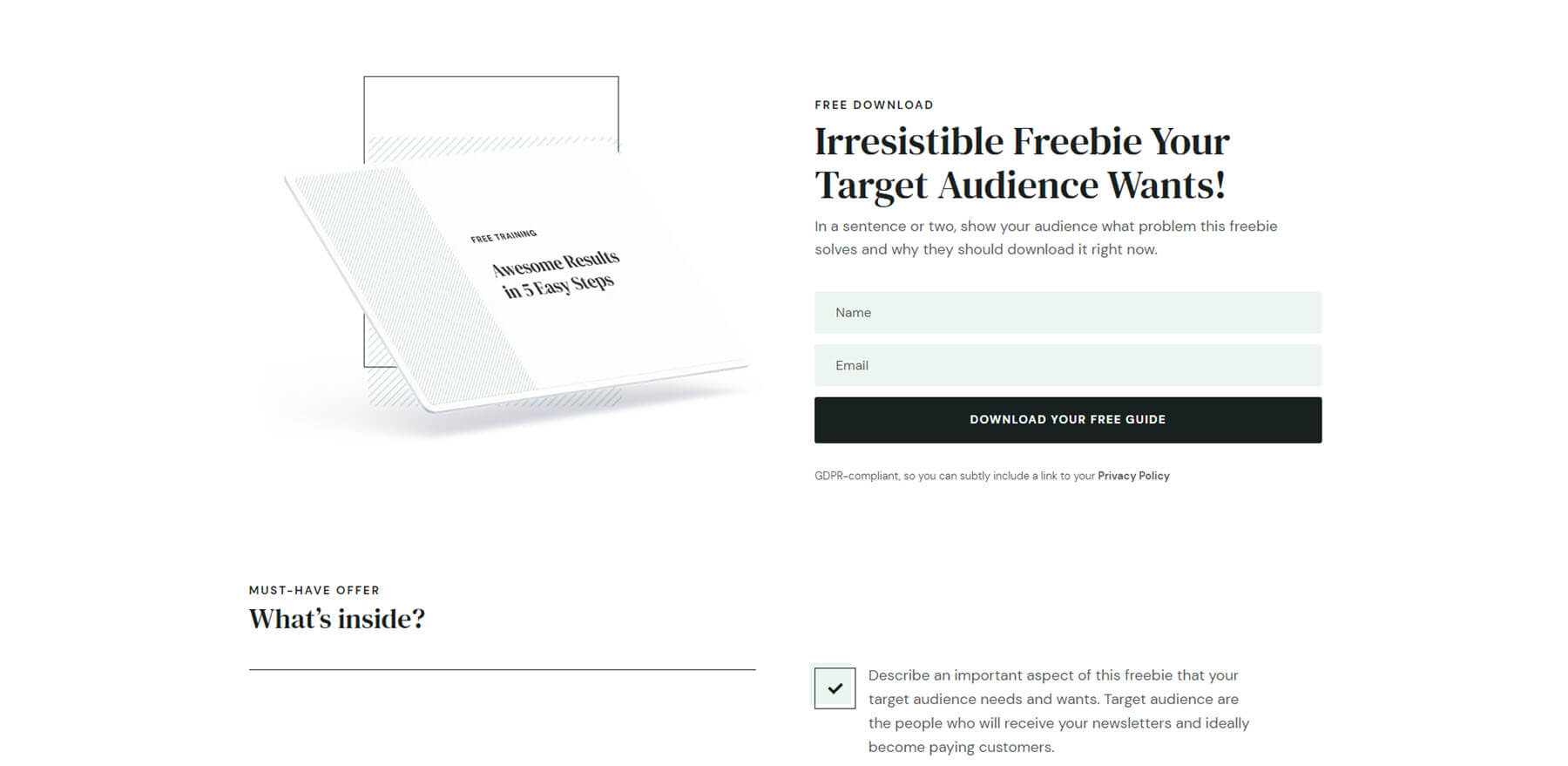
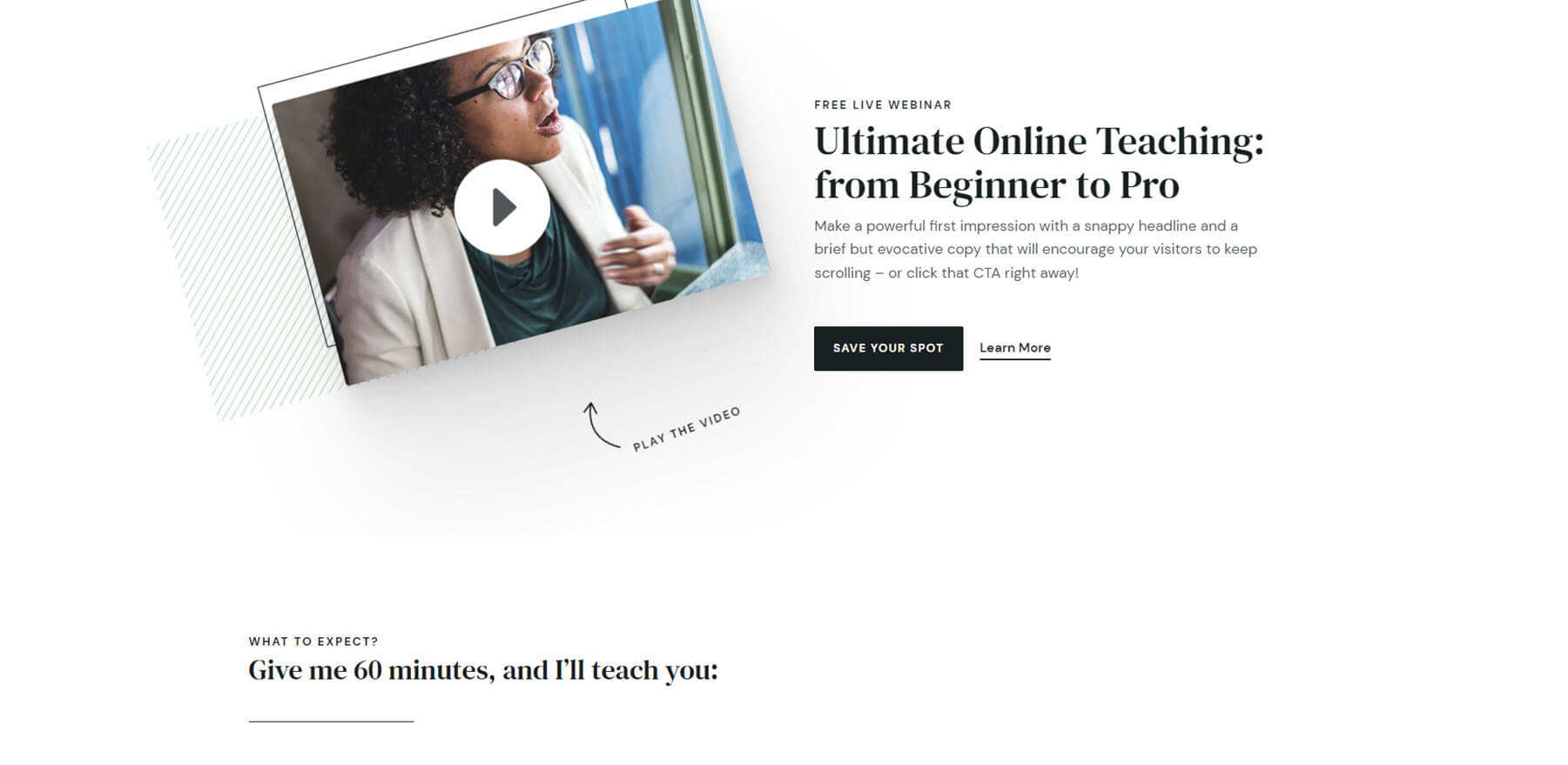
Milly includes three marketing kits: Webinar, Challenge, and List Building. They include pages to build marketing campaigns.
The List Building Kit includes a freebie landing page, email signup confirmation, and freebie delivery. This example is from the demo page, so you can see how it looks with images.
The Webinar Kit includes registration, confirmation, and replay. Here’s a look at its demo page.
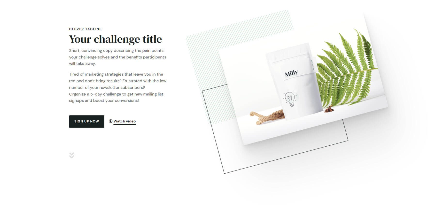
The Challenge Kit includes registration, confirmation, and inside the challenge. The image elements move independently on hover.
Milly Child Theme Header
The header includes submenus, a CTA, and custom WooCommerce icons, including a product count for the shopping cart icon. The CTA includes a hover animation to get attention. It also includes a popup. On certain pages, such as the shop page, the header is placed under the hero section. It scrolls with the page and sticks to the top of the page when it reaches that area.

Milly Child Theme Icons
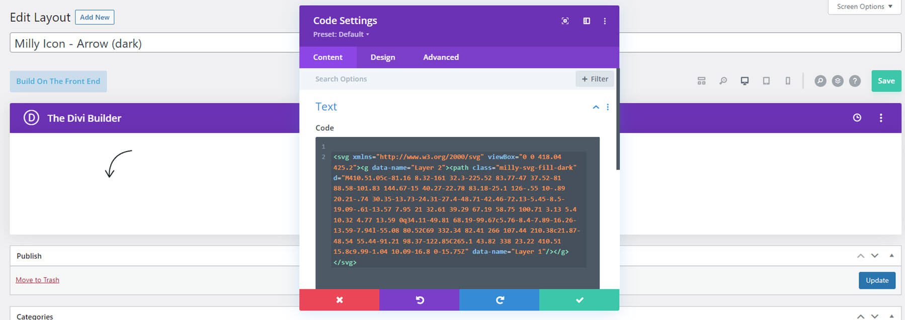
Over 20 of the layouts in the Divi Library are custom icons. This shows several of the custom icons. Most of the icons have a green circle in the center.
![]()
This example shows the rest of the icons.
![]()
They’re created with Code Modules. This example shows a Dark Arrow. You can load them from the Divi Library as Modules.
Milly Child Theme WooCommerce Pages and Layouts
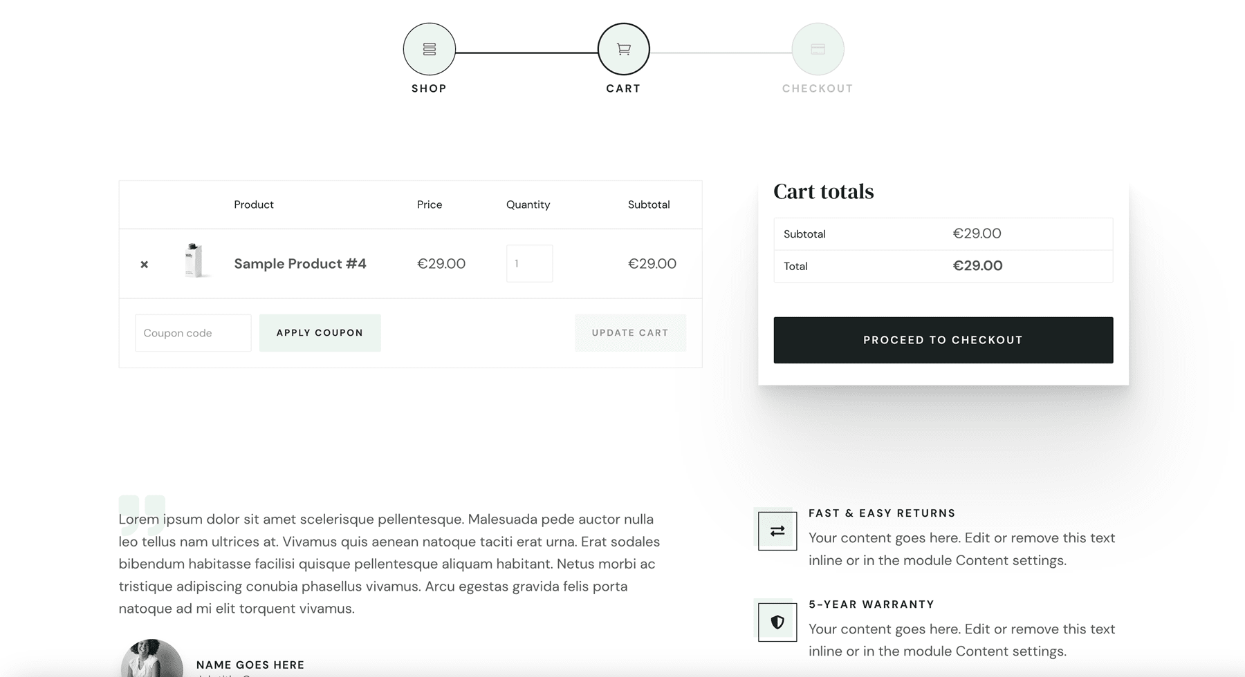
Next, let’s look at the WooCommerce features. Milly includes several pre-styled product pages and sliders to display your products. It also includes a custom cart, account page, and checkout page. Let’s look at a few of them.
Shop Page
The shop page includes a hero section with a CTA. The promo bar sticks to the bottom of the screen at first.
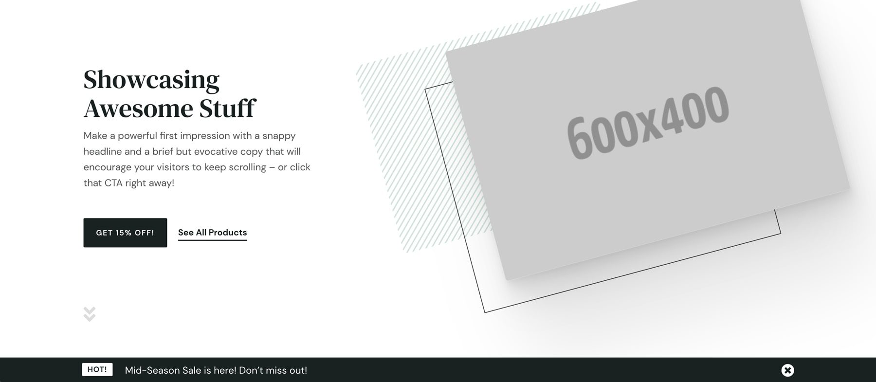
Scrolling reveals the header. This section includes a product slider.
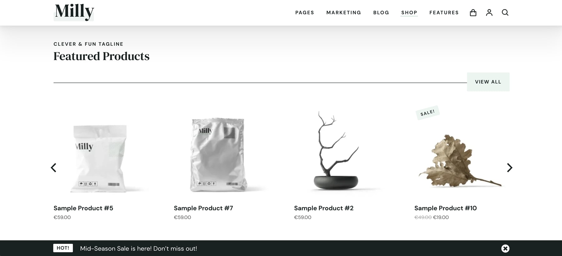
Related products are also shown with a product slider.
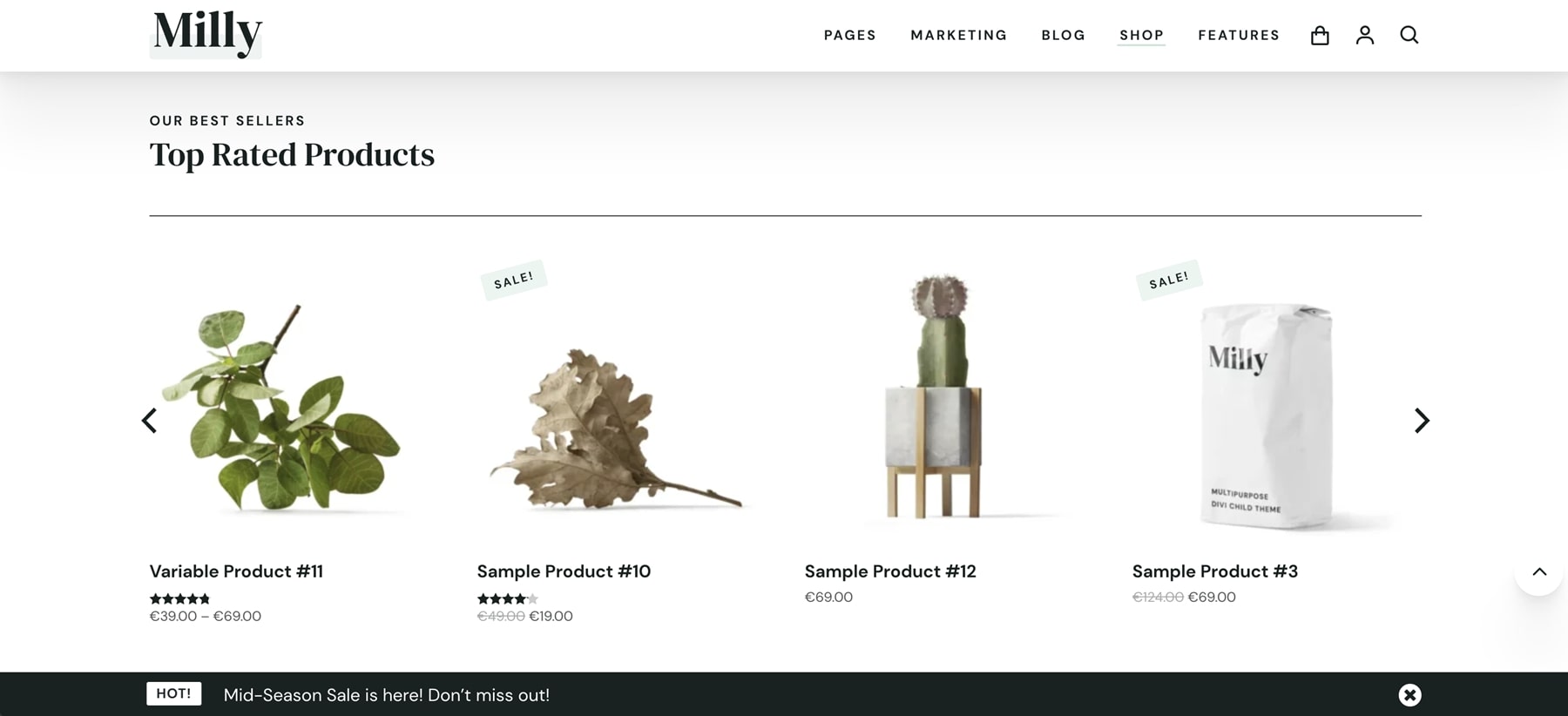
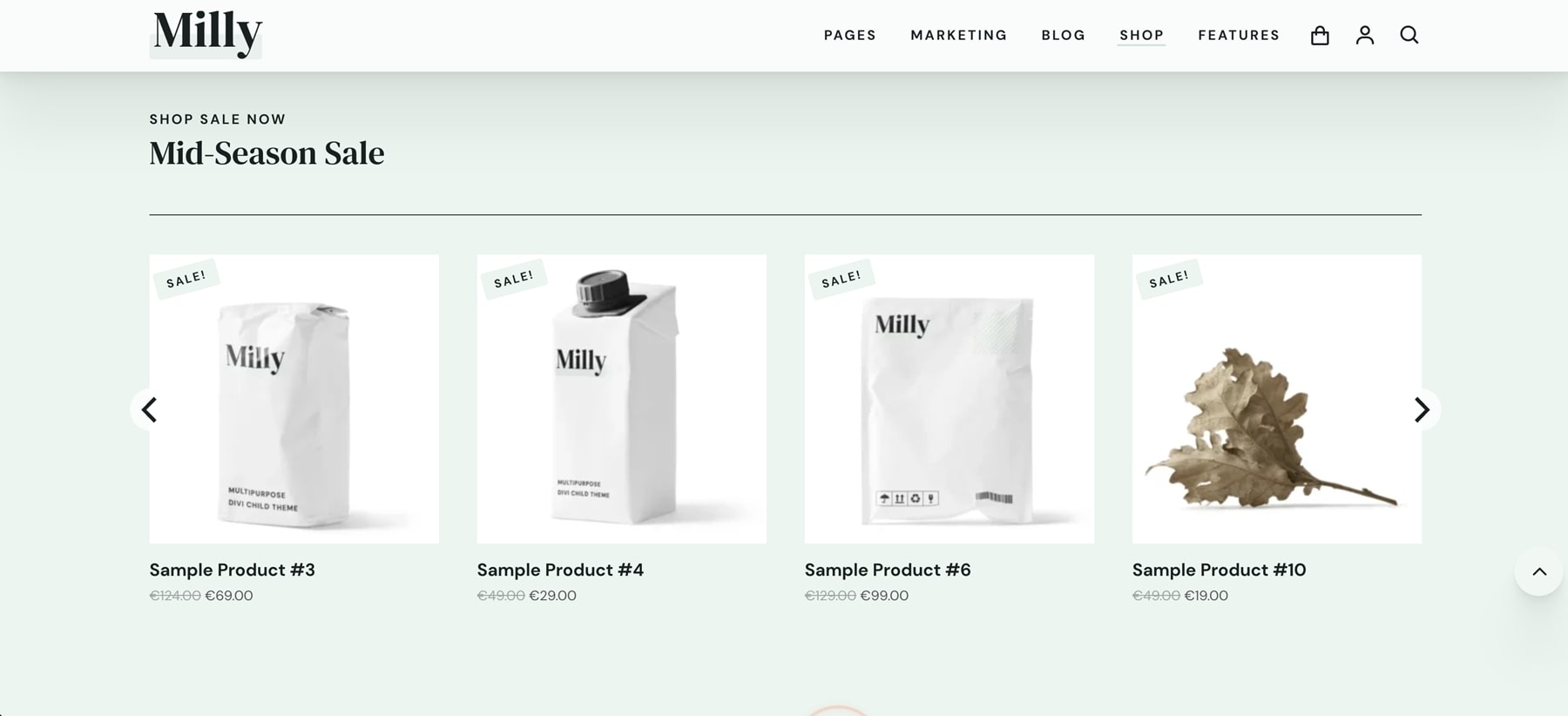
This example shows the sales slider. The promo bar has now scrolled with the page.
Cart
The cart page includes icons with a bar to indicate where you are in the process.
Milly Theme Options
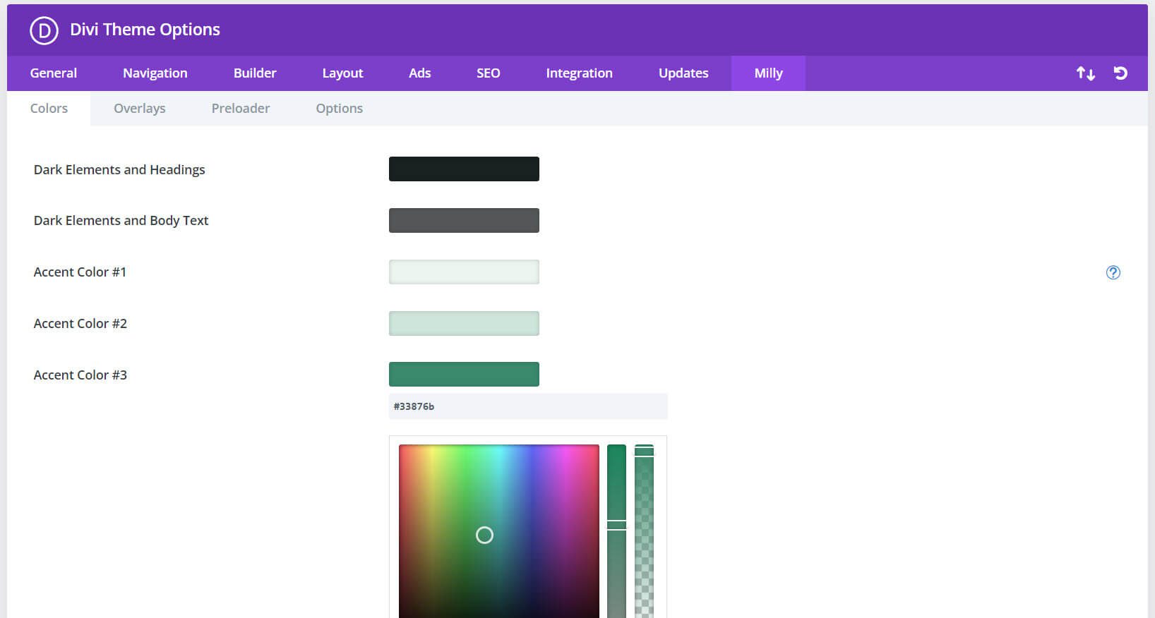
Finally, we’ll look at the theme options. Milly adds a tab to the Divi Theme Options. Here, you can choose and adjust several options.
Colors
The colors tab lets you select colors for dark elements and headings, dark elements and body text, and three different accent colors. Clicking on a color opens a color picker where you can select the color you want.
Overlays
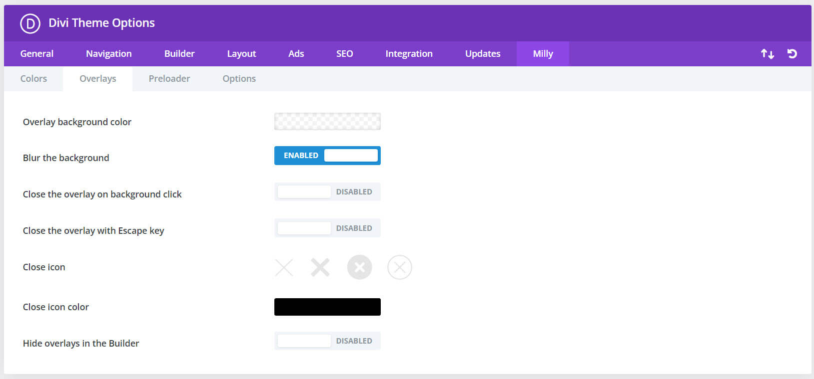
Milly can use any section as a popup. They’re triggered by a click. Just add the CSS class to the section and the element you want your visitors to click. This means you can build a popup with the Divi Builder with any layout or custom design you want. The overlays tab includes settings for the background color, blur the background, close on click, close with the escape key, close icon, close icon color, and hide the overlays in the builder.
Preloader
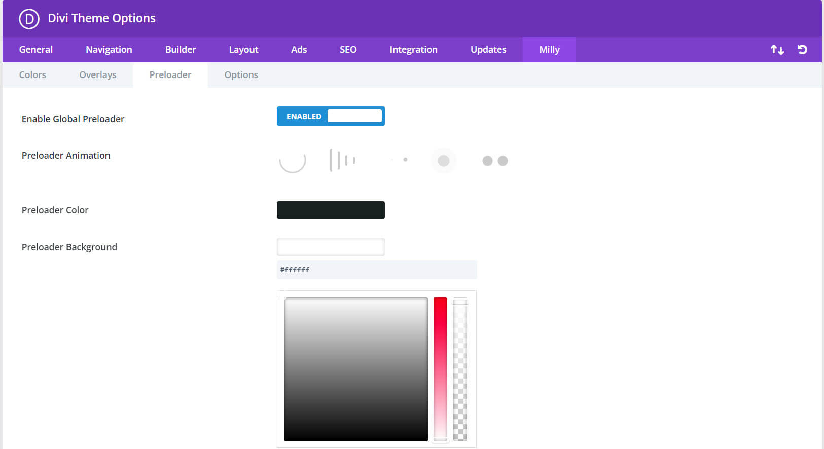
The preloader tab lets you enable the preloader and choose its options. The options include animation, color, and background color.
Options
The options tab lets you enable the parallax effect and enable carousels and sliders.

Milly CSS Classes
Also, there are 11 other CSS Classes designed for the Milly child theme that lets you customize the way it works. You can find the list in the documentation. Place the CSS Class in the advanced tab of the section where you want to use it.
Where to Purchase Milly Child Theme
Milly Child Theme is available in the Divi Marketplace. It’s regularly $97 and includes unlimited website usage, a 30-day money-back guarantee, and one year of support and updates.
Ending Thoughts on the Milly Child Theme
That’s our look at the Milly Child Theme for Divi. The design is clean, and I found Milly to be easy to use. The features have a strong focus on sales, making it ideal for anyone wishing to run an eCommerce website or capture leads and guide them through a sales funnel. I was impressed with the number of pages and features. I especially like the preloader and popup overlays. If you’re interested in a child theme for business, the Milly child theme is worth a look.
We want to hear from you. Have you tried Milly Child Theme for Divi? Let us know what you think about it in the comments.
The post Divi Product Highlight: Milly Child Theme appeared first on Elegant Themes Blog.
