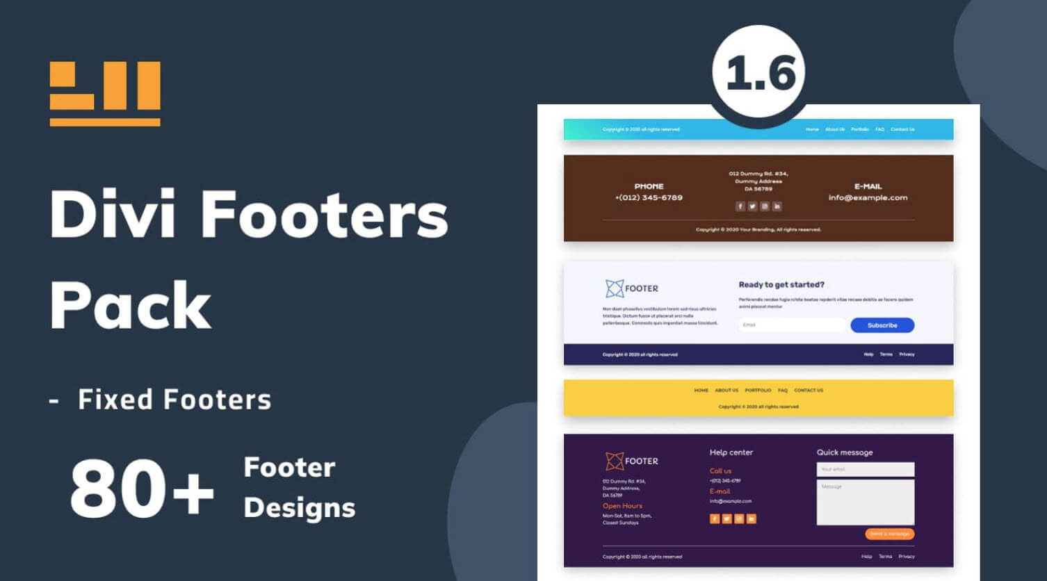
Divi Footers Pack is a third-party plugin for Divi with over 80 custom footer designs. The footer is often an overlooked area of any WordPress website. A layout pack such as this one can ease the footer design process. In this post, we’ll take a look at Divi Footers Pack to help you decide if it’s the right Divi product for your needs.
Uploading Divi Footers Pack Layouts
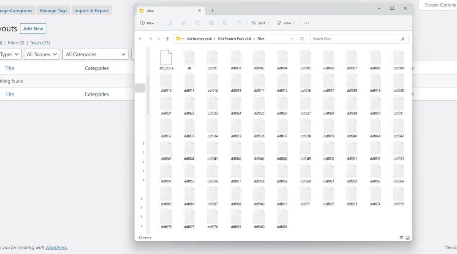
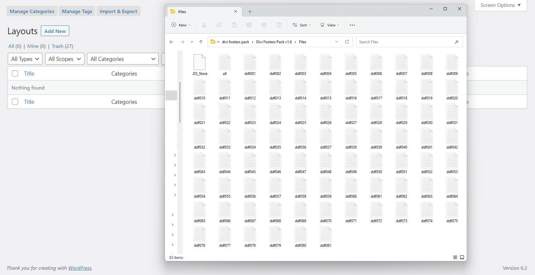
The Divi Footers Pack layouts are JSON files that can be uploaded to your Divi Library. First, download and unzip the file. You’ll see 82 JSON files in your unzipped folder.
- Download
- Unzip
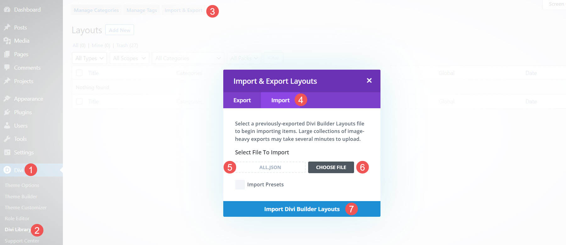
Next, go to your Divi Library and import the file you want to use. You can preview them from the product page. This is the only way to know which layout to use before uploading them. Fortunately, you can upload all of them at once if you want, or you can just upload the specific footer layout you want. I’ve selected to upload all the files in this example. To upload them, go to:
- Divi
- Divi Library
- Import and Export
- Import
- Choose File
- Import Divi Builder Layouts
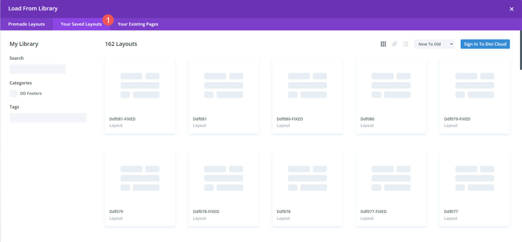
Once they’ve uploaded, you’ll see them in your Divi Library. The layouts are now ready to use in the Divi Builder and Divi Theme Builder. Once the upload was completed, I had 162 files in my library. This includes the layouts with and without a fixed setting. The regular footers scroll with the page while the fixed footers remain in place and are revealed as the user scrolls. They’re labeled, so it’s easy to know what the variation is.
Divi Footers Pack Layouts
Here’s a look at a few of the footer layouts. I’ve selected those that stood out to me the most. I’ll describe them and point out what I like the most about them. We’ll see how they look on the front end with a Divi layout. I’ll show wireframes and the mobile view for a few of them. I’m using the landing page from the free Coworking Layout Pack for all the examples.
Divi Footers Pack Footer Design 1
Footer Design 1 is the first footer layout in the Divi Footers Pack. It displays the footer menu on the left with a copyright notice under it. On the right are social media icons. Everything is in red.

Here’s how it looks on the front end.

Footer Design 2
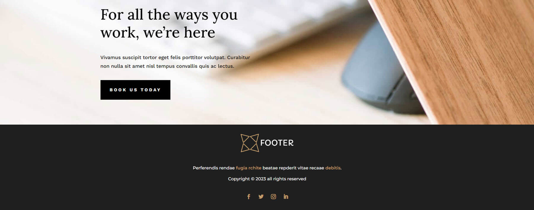
This is the second footer in the layout pack. It has a simple and clean layout with colors that work great together.
Footer Design 7
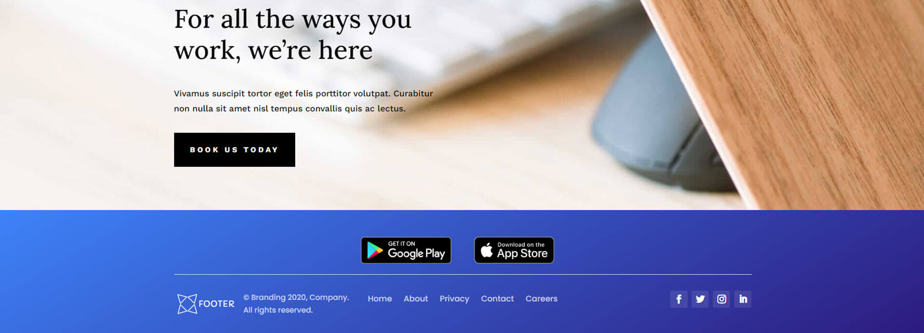
Footer Design 7 includes a blue gradient background and adds buttons for the app stores above the rest of the footer content. This one is still fairly small and doesn’t overwhelm the layout with too much content in a small space.
Footer Design 12
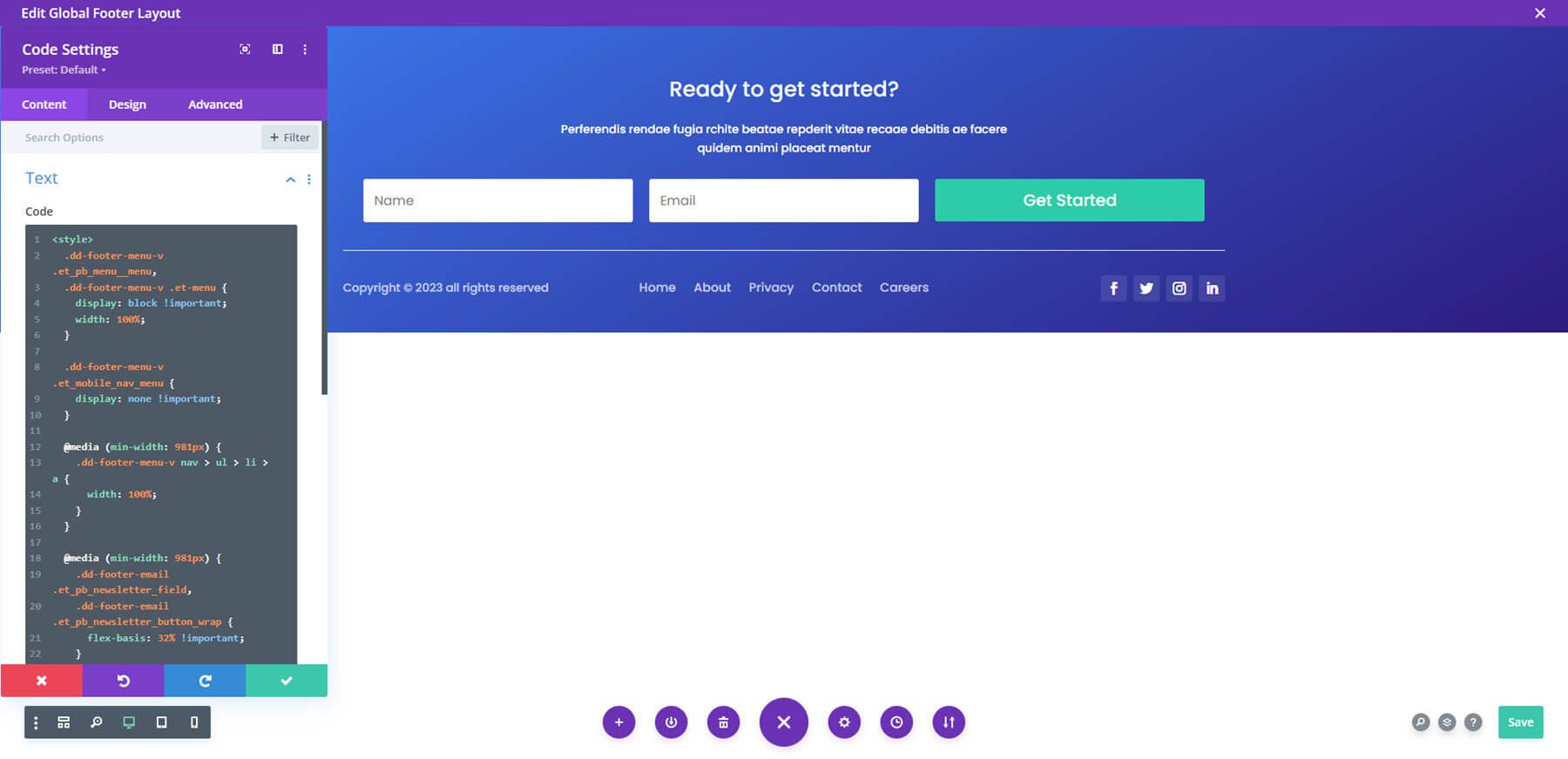
Many of the footer layouts include Code Modules to add custom styling. This is Footer Design 12. It also includes a gradient background and adds a large email form.
Footer Design 14
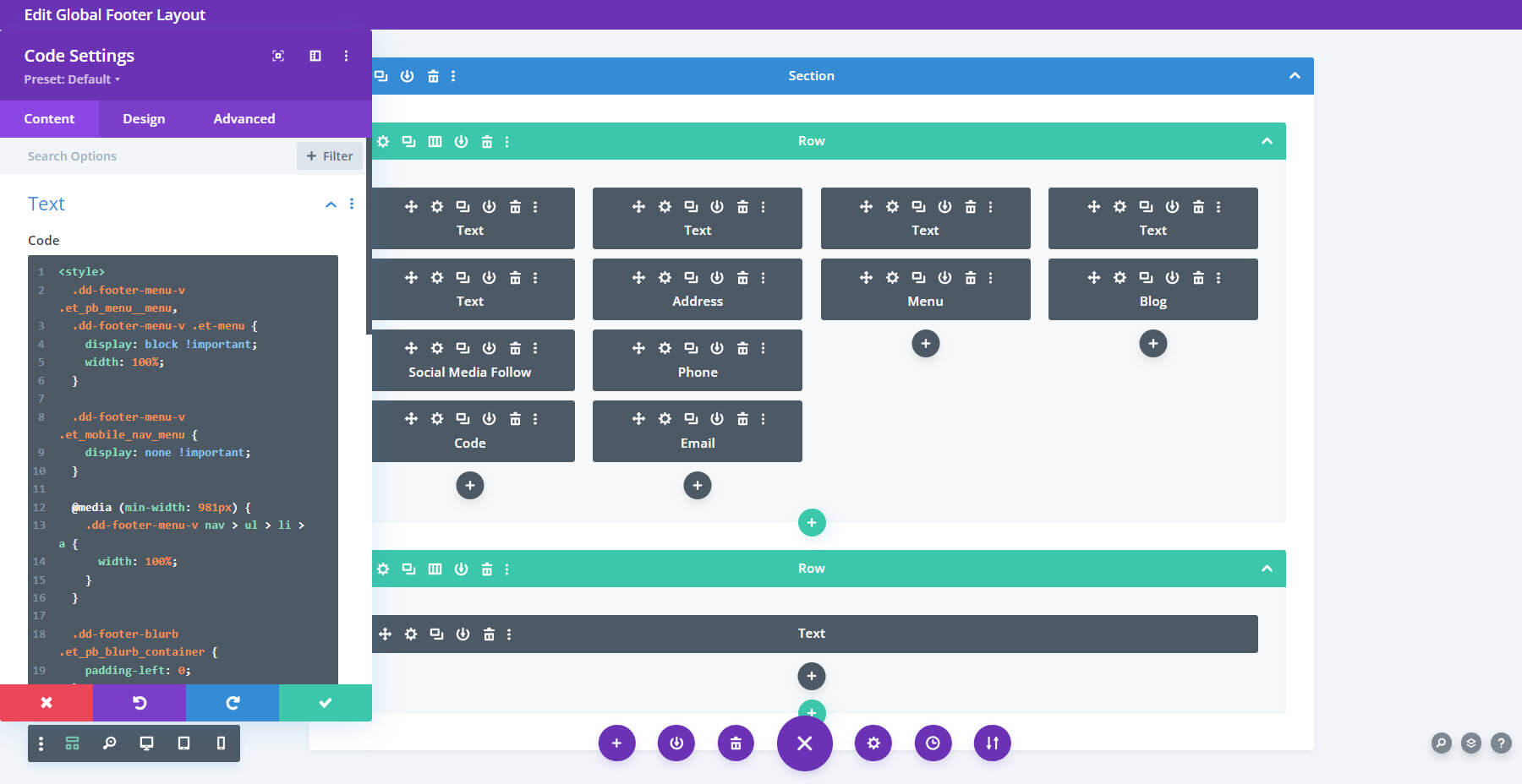
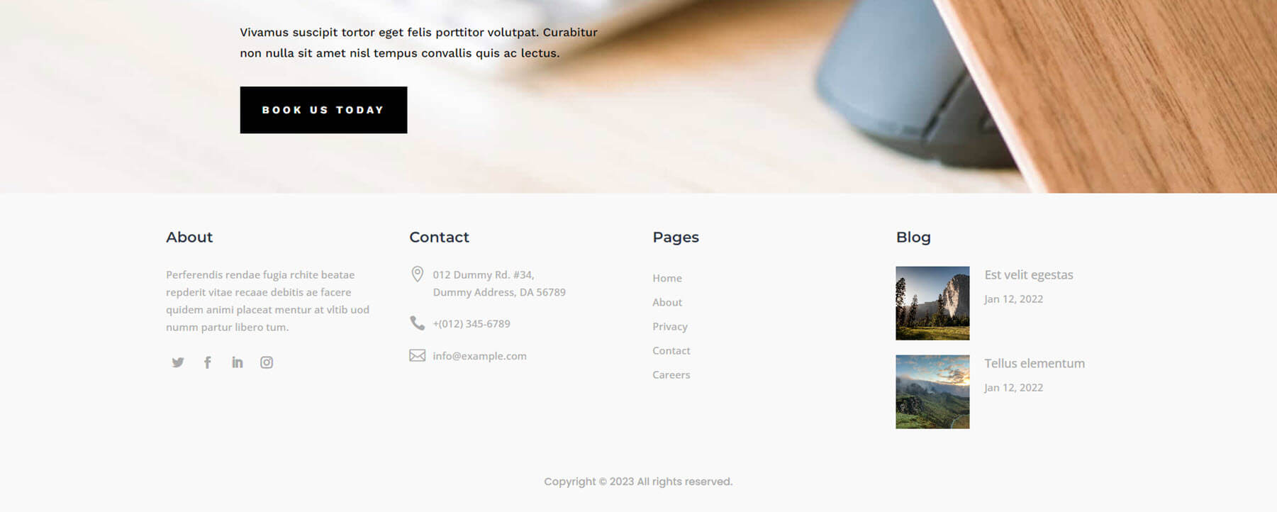
Footer Design 14 displays four columns with links, a menu, and a blog. This one also includes a Code Module for styling. Here’s the wireframe with the Code Module open.
Here’s how it looks on the front end. There is a lot of white space around the columns. The blog shows two posts with small thumbnails. The white background and small text give this one an elegant look and feel.
Footer Design 16
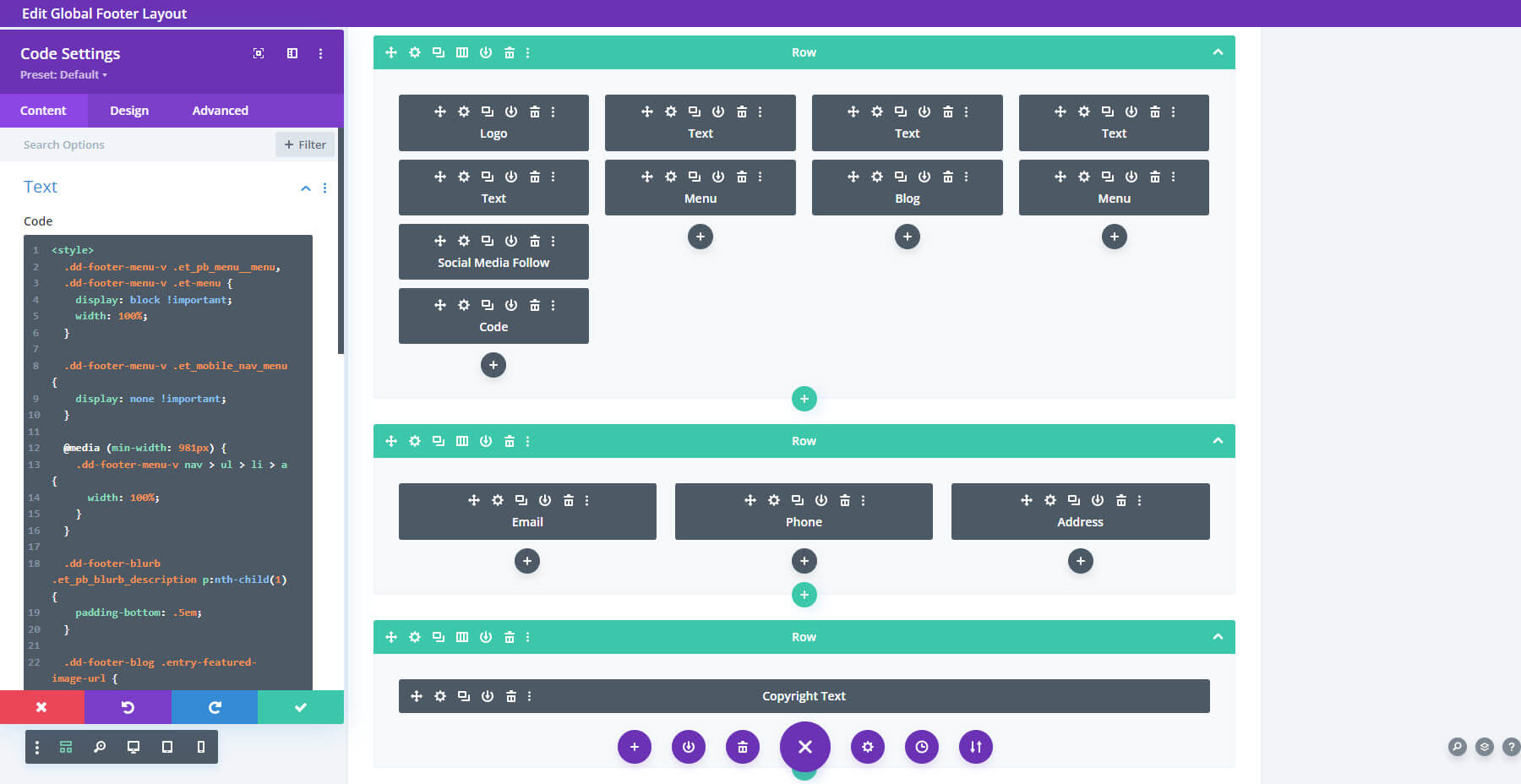
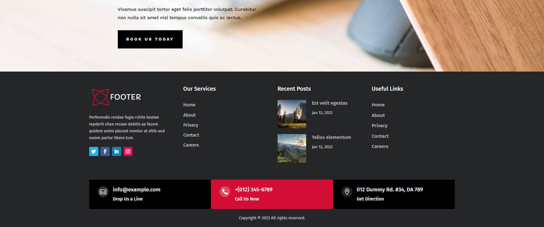
Footer Design 16 adds multiple rows in various columns. This one also includes a custom code. Here’s the wireframe.
Here’s how it looks on the front end. It adds clickable contact information at the bottom with bold colors that stand out.
Footer Design 18
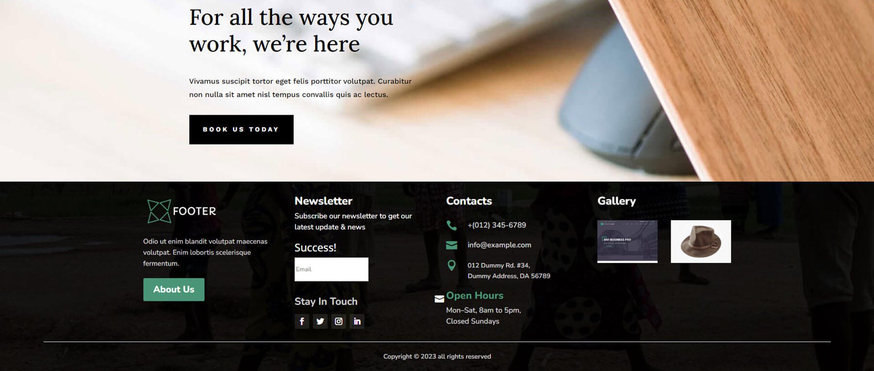
Footer Design 18 adds a background image and overlay to the section. It also includes four columns with lots of extras, including a CTA button, Opening Hours, and a Gallery.
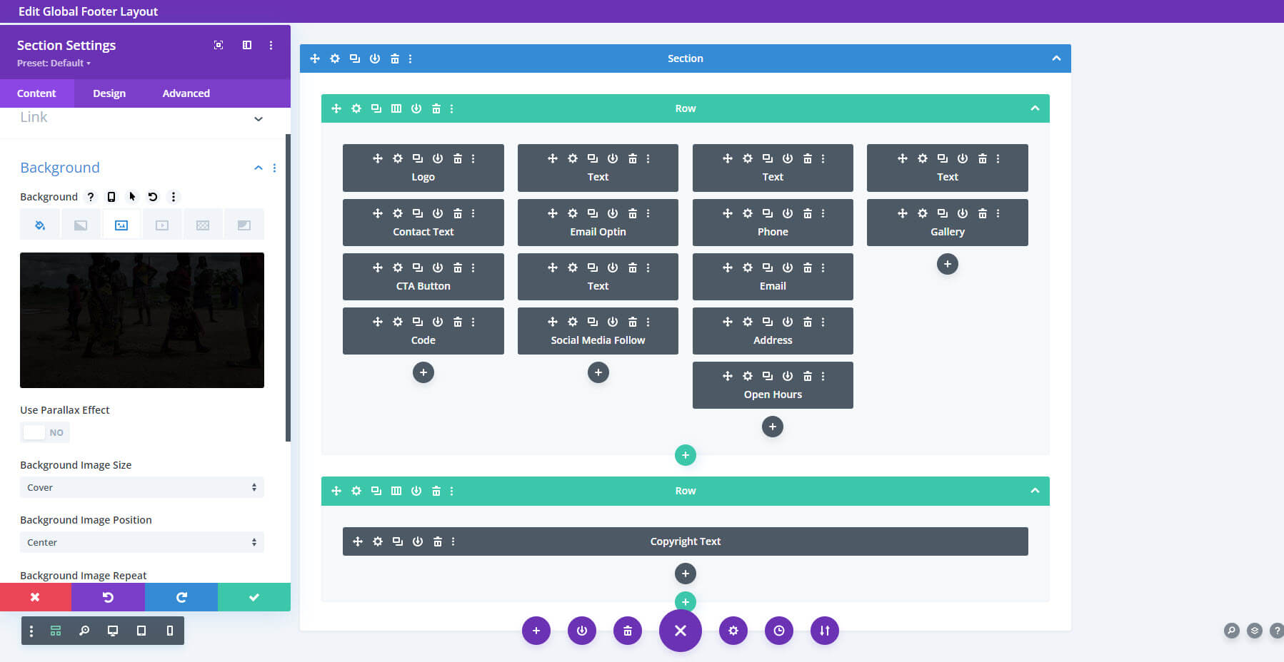
Here’s the layout on the front end. This is one of my favorites. It adds icons to the contact information, the gallery includes small thumbnails. The colors work perfectly over the background image.
Footer Design 25
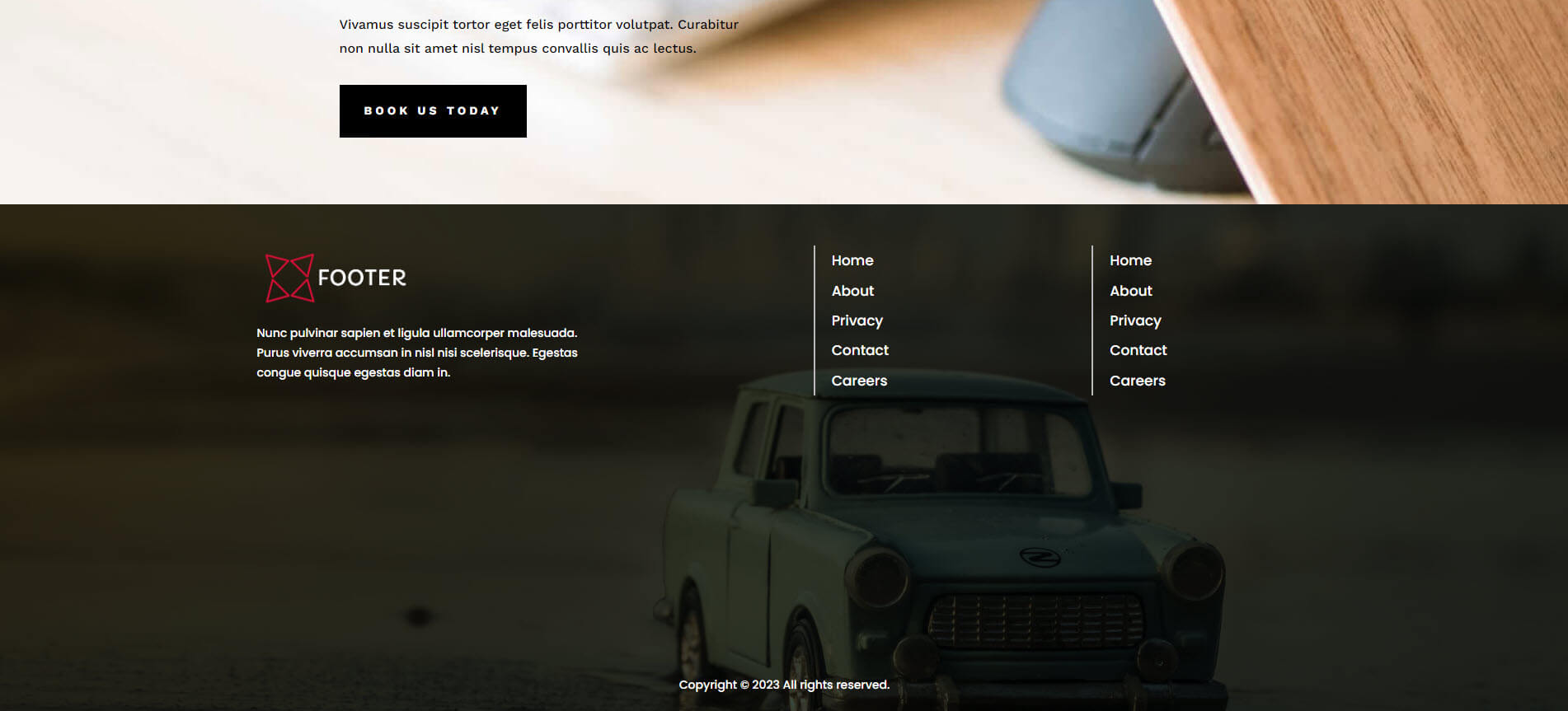
Footer Design 25 is another layout with a background image. This one adds a lot of space under the links to give room for the background image to show.
Footer Design 26
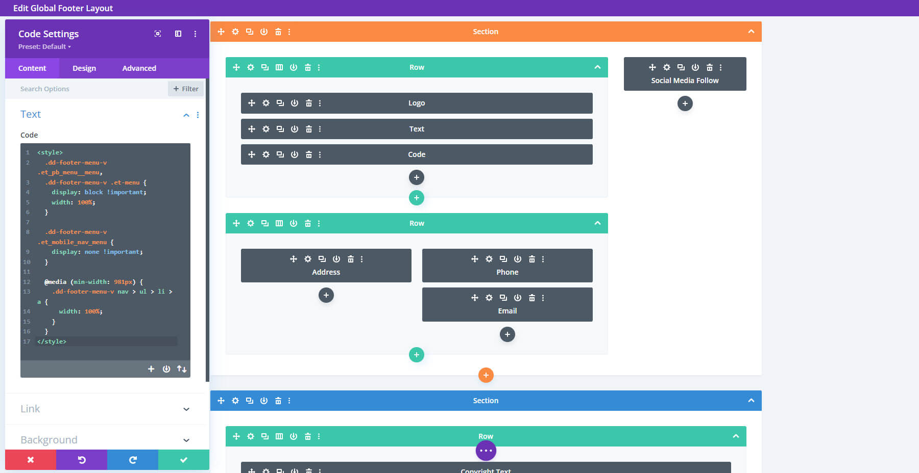
Footer Design 26 uses a Specialty Section to create a multi-column layout. Here’s the wireframe.
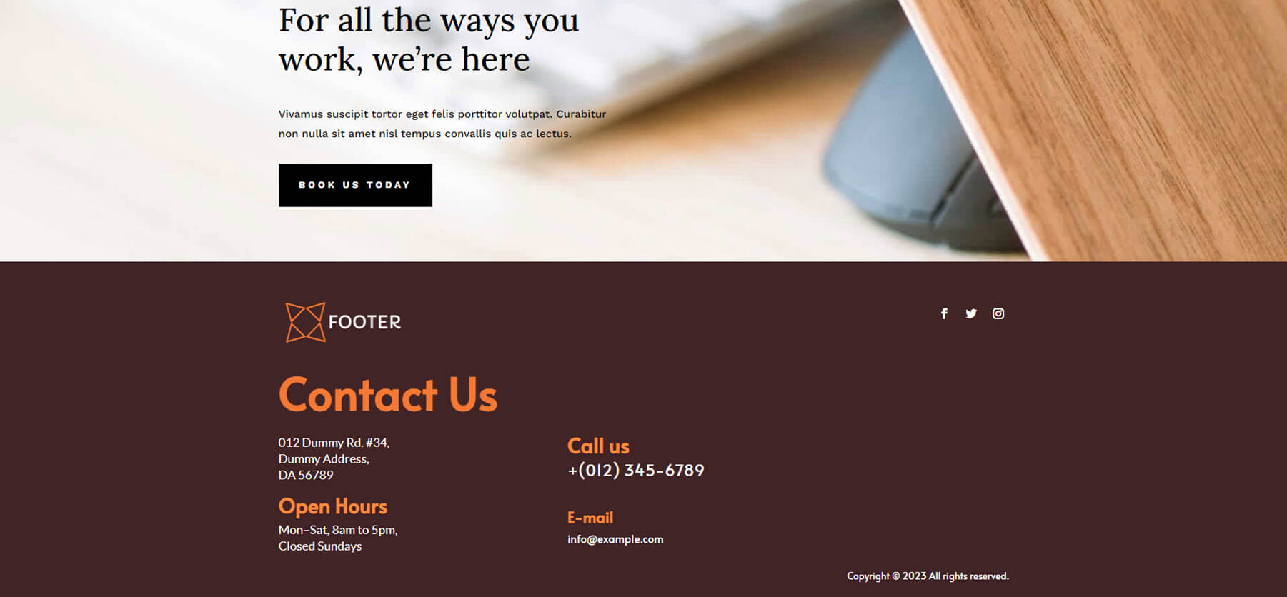
It makes interesting use of negative space. I like the large text and colors for this one. The orange text is easy to read over the brown background.
Footer Design 30
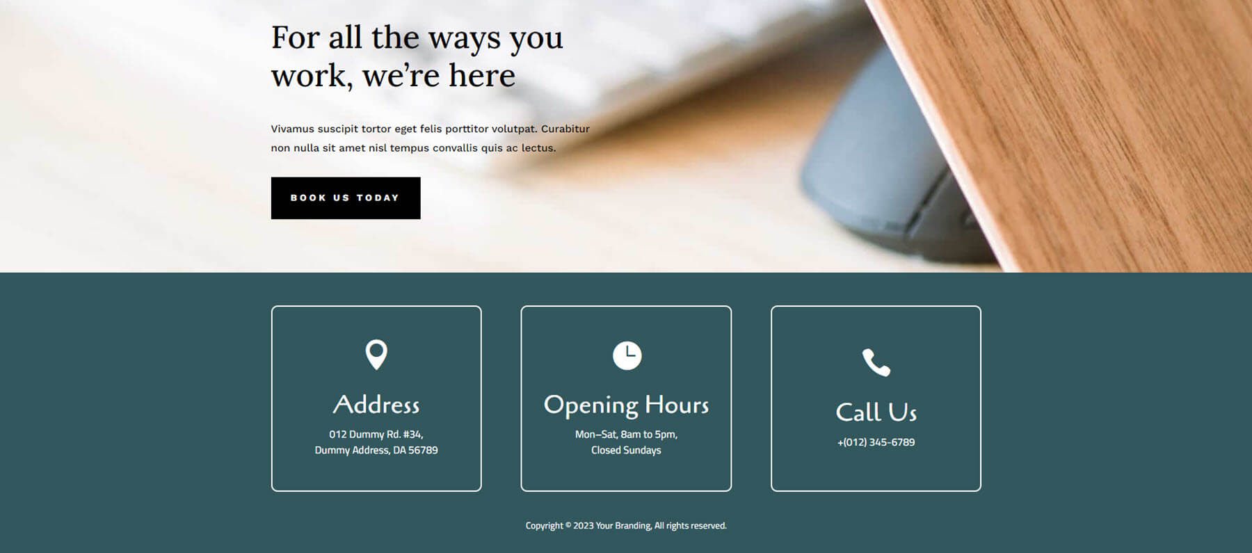
Footer Design 30 displays contact information within large blocks with white borders. The backgrounds of the blocks match the background of the section. This one is simple and clean, providing only limited information.
Footer Design 34
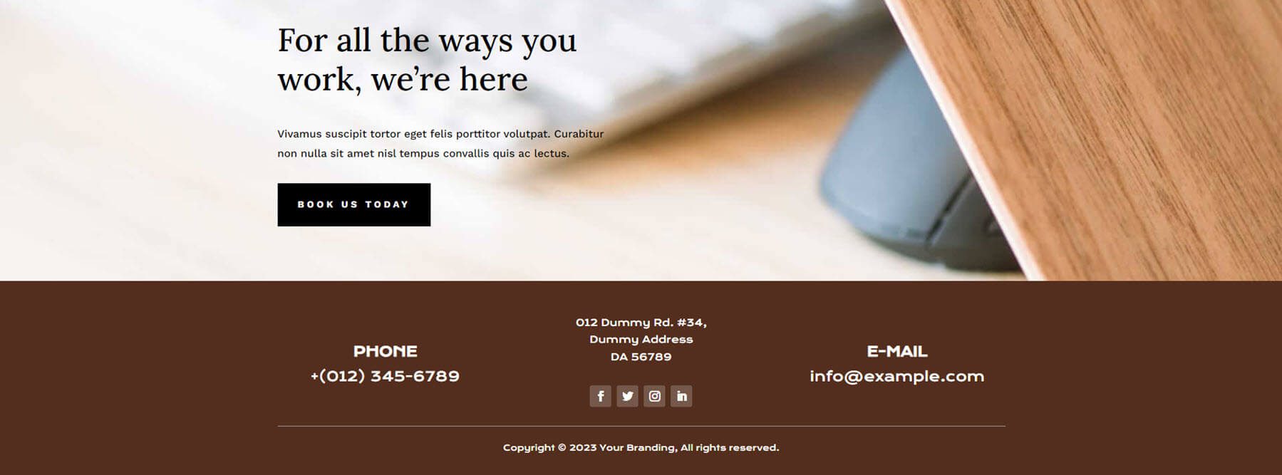
Footer Design 34 uses a brown background with white text. The layout includes three columns with clickable contact information. Backgrounds for social icons stand out just enough to get attention.
Footer Design 37
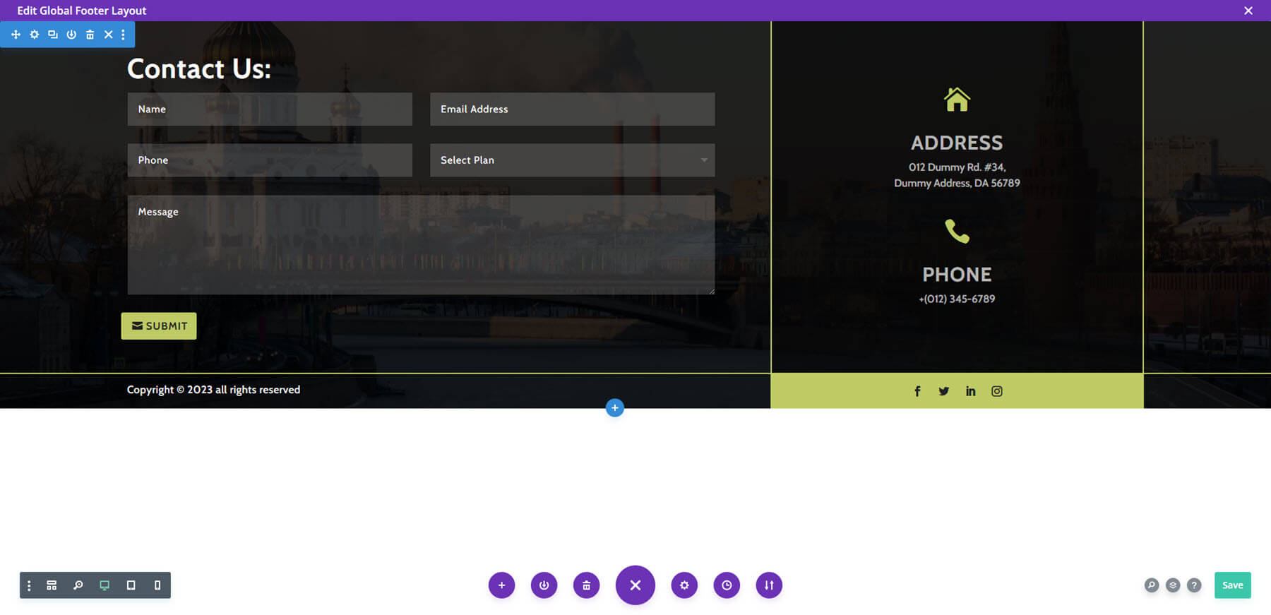
Footer Design 37 includes a background image with a contact form and contact information in the foreground. This one divides the elements into segments with yellow borders around each segment. The icons, the submit button, and the background of the social media segment are yellow. The background behind the contact information is more opaque, making it stand apart from the rest of the footer’s content.
Footer Design 38
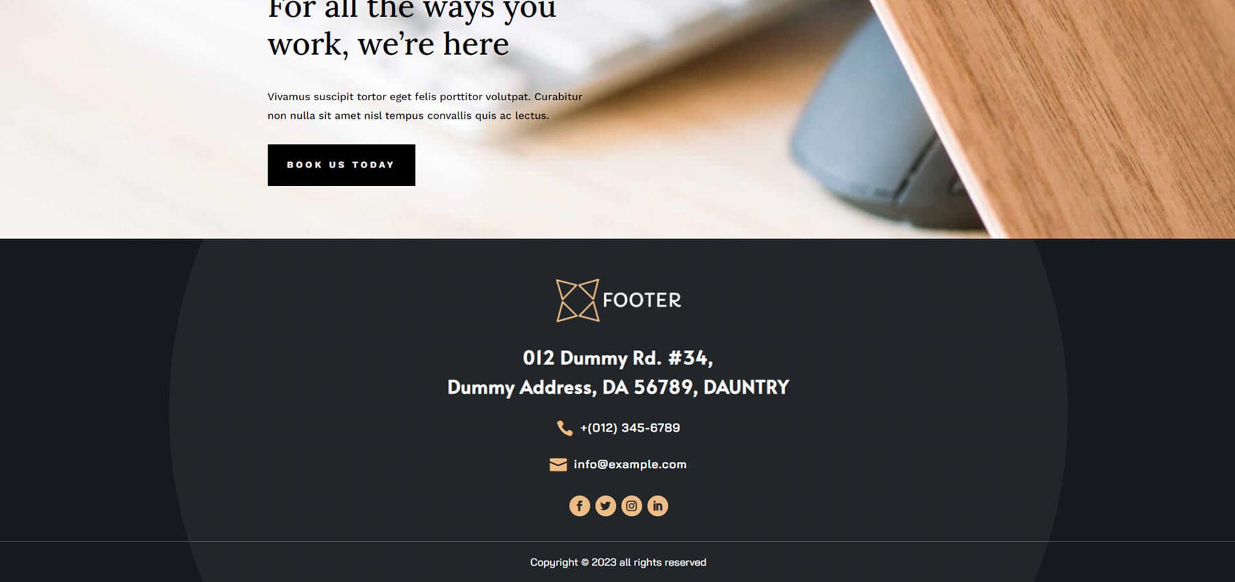
Footer Design 38 displays the content in the center of a large circle with an even darker background behind it. The centered content has enough separation that nothing gets lost in the layout. The font and icon colors work great against the dark gray background.
Footer Design 41
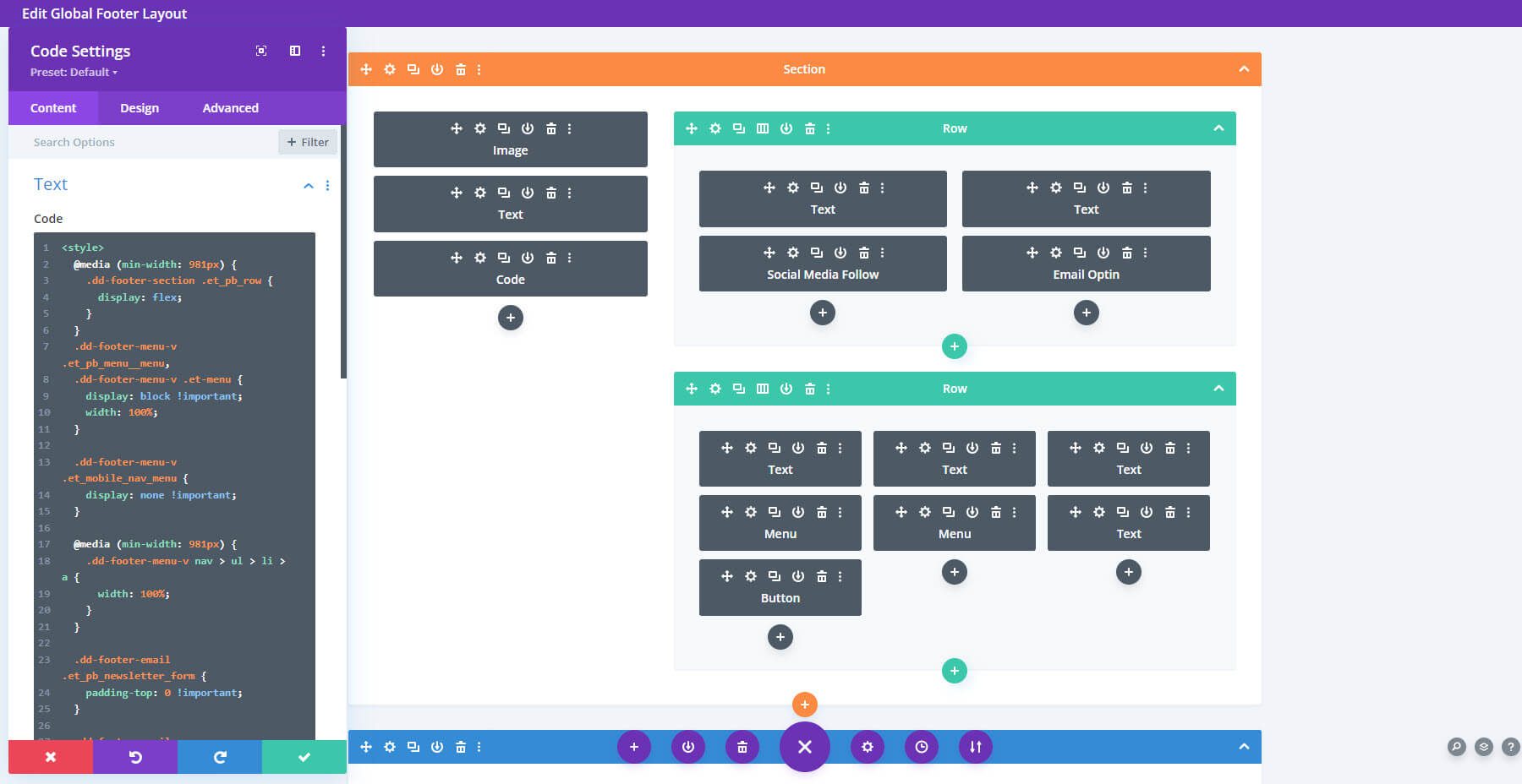
Footer Design 41 also uses a Specialty Section to create a layout with multiple columns. This is the wireframe view.
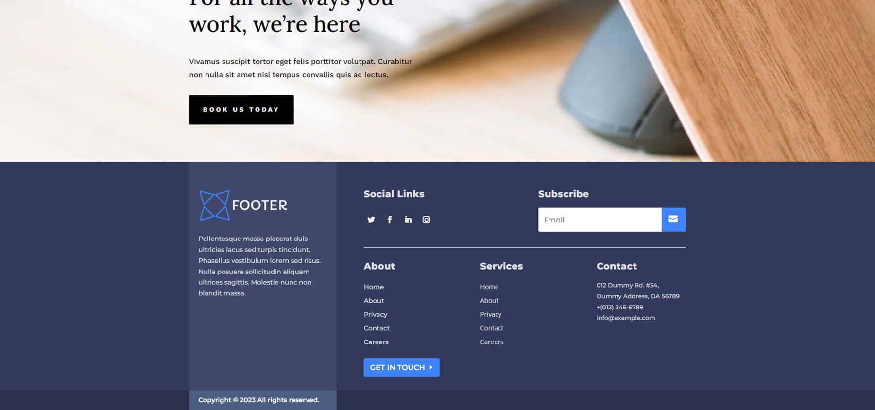
Here’s how it looks on the front end. It includes a dark blue/gray background with white text that stands out. The email form is small and fits the area well. The information area has a lighter background, so it stands apart from everything else.
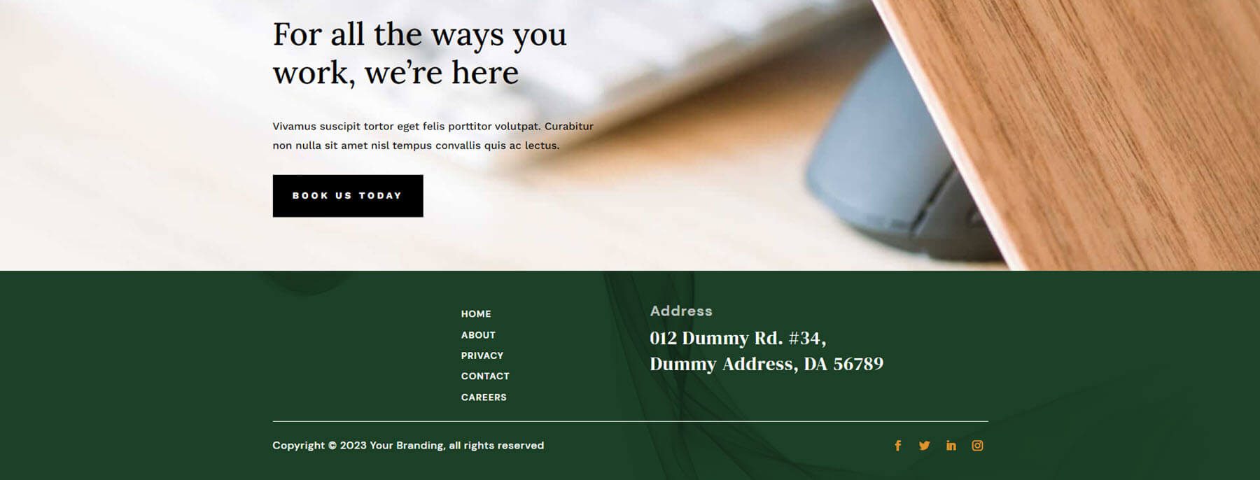
Footer Design 43
Footer Design 43 provides a background image with a dark green overlay that stands out. The menu and address take the center and stand out from each other. The social media icons are bold gold that makes the small icons pop. I like the white text and gold icons against the green background.
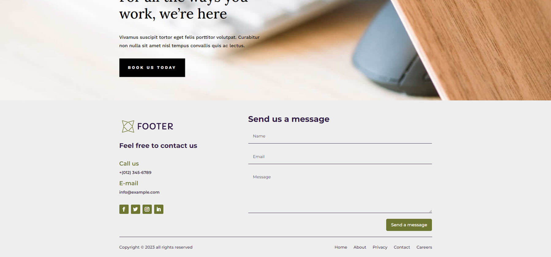
Divi Footers Pack Footer Design 46
Footer Design 46 includes a two-column layout for the main portion of the footer. It includes a larger column with a contact form that blends with the footer’s design. The button, titles, and icons are in green and stand out well against the beige background, drawing attention away from everything else.
Footer Design 52
Footer Design 52 includes a dark gray background with multiple sections and columns to present the contact information and menu links. The text is white and includes large titles and small links. This one also includes icons with contact information.
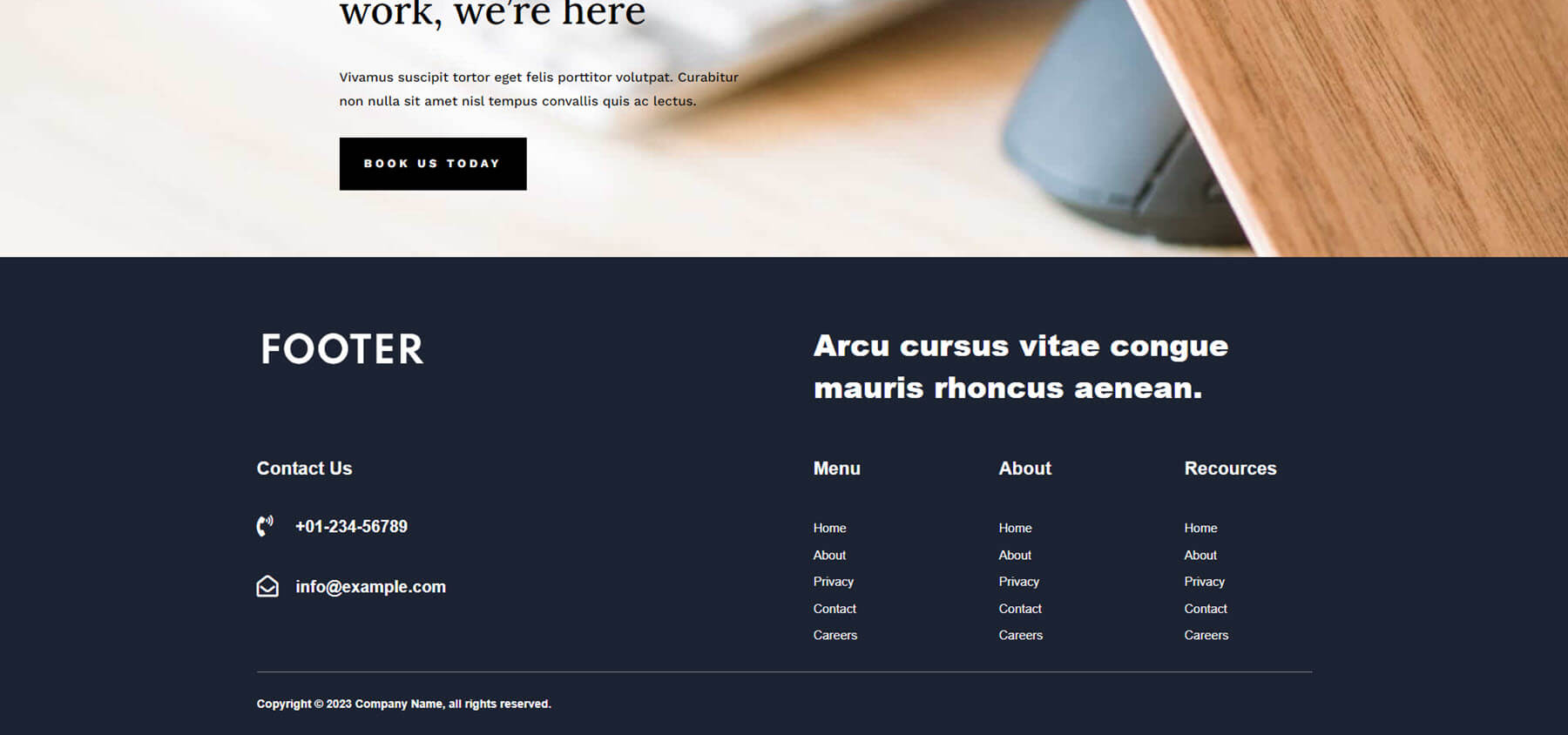
Footer Design 55
Footer Design 55 is simple, and it just works. The main focus is a CTA with large text and a clickable email address. It has plenty of negative space to draw attention to the CTA. It also includes a menu and copyright notice.
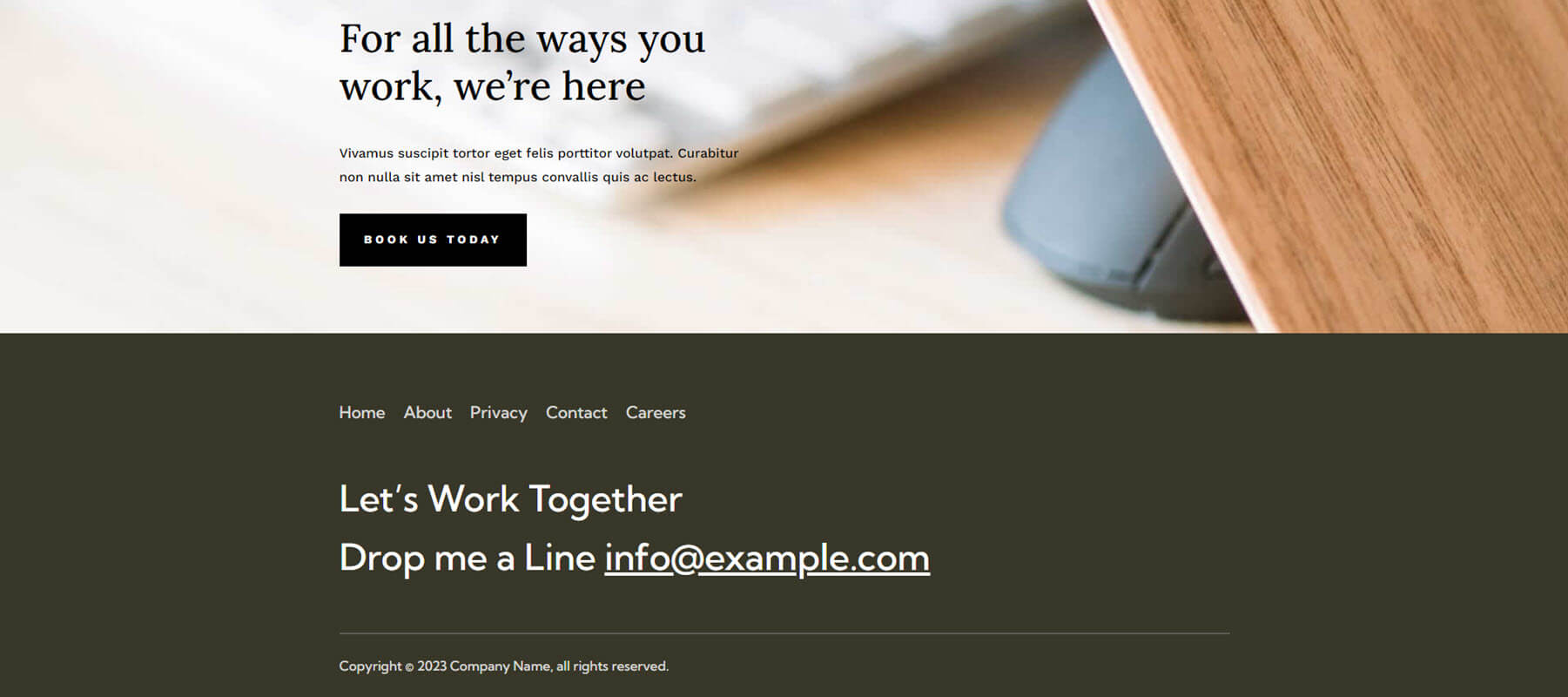
Footer Design 59
Footer Design 59 includes a two-column layout with text on the left and a contact form on the right. A vertical line separates them. It includes a black background with bright blue highlights for the titles, a contact form button, and social media icons. A bottom bar with the same bright blue background displays the copyright notice.
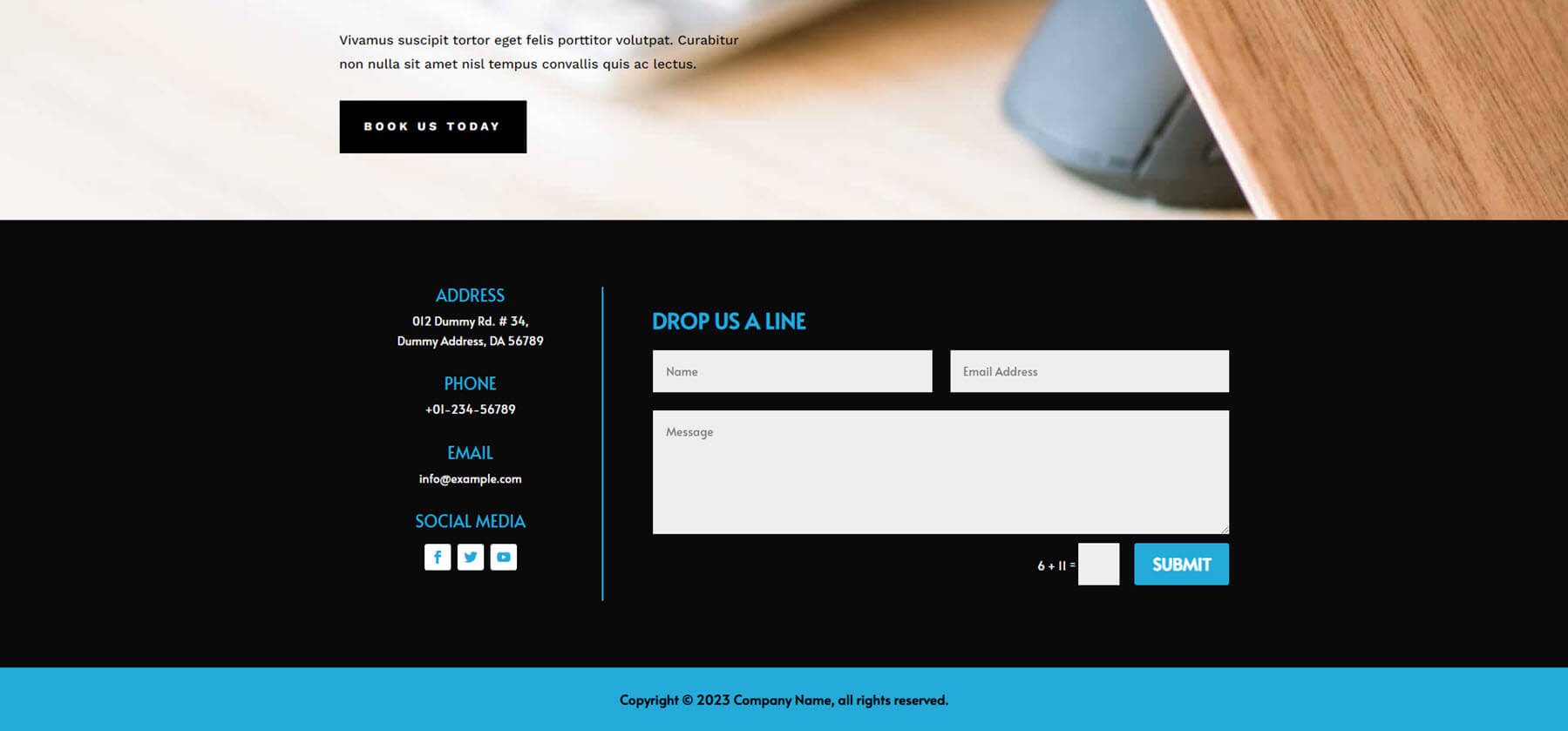
Divi Footers Pack Footer Design 63
Footer Design 63 includes a three-column layout with two CTA buttons on the left, contact information in the center, and an email form on the right with a design that matches the CTA buttons. The buttons and email form give the footer a well-balanced symmetry. The purple and plumb colors work great against the brownish-gray background. Both the phone number and email address are clickable. All the buttons include hover effects.

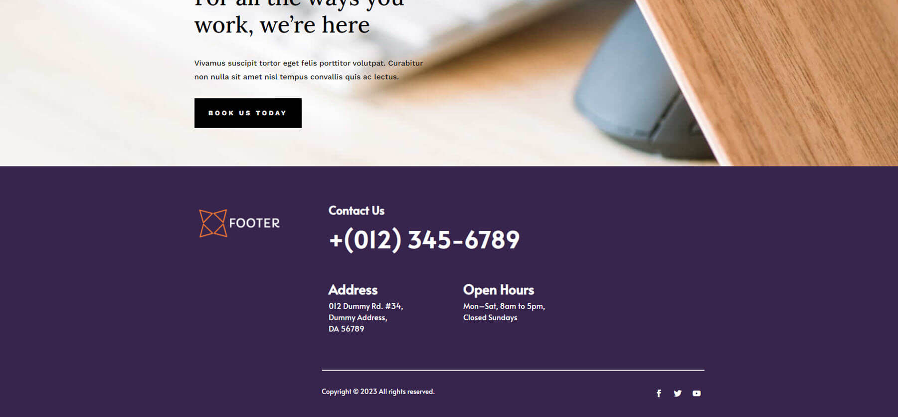
Footer Design 67
Footer Design 67 has an interesting layout. The wireframe shows multiple columns, but some are intentionally not used.
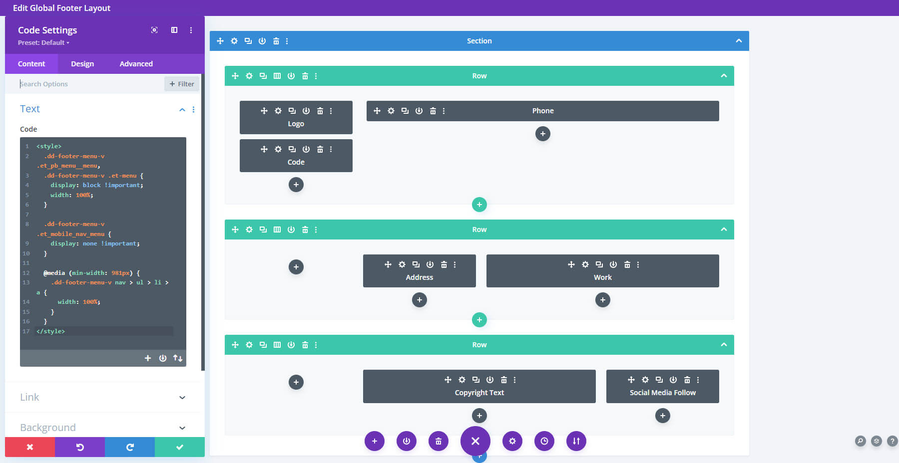
On the front end, this creates elegant spacing for the footer elements. It includes a purple (technically a dark blue/magenta) background with white text. The extra-large text for the clickable phone number draws attention as a CTA.
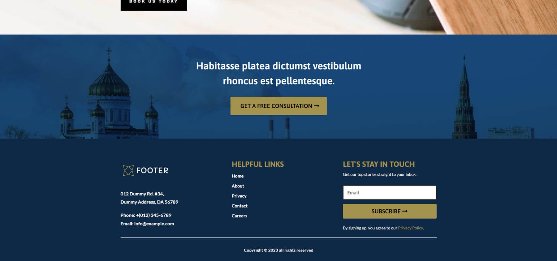
Footer Design 69
Footer Design 69 is one of the largest footers in the Divi Footers Pack. It includes two large sections. Both have blue backgrounds and gold text. The top section displays a full-width image. This section creates a CTA. The second section includes the standard footer elements with contact information, links, and an email form. The white and gold text works perfectly with the blue backgrounds.
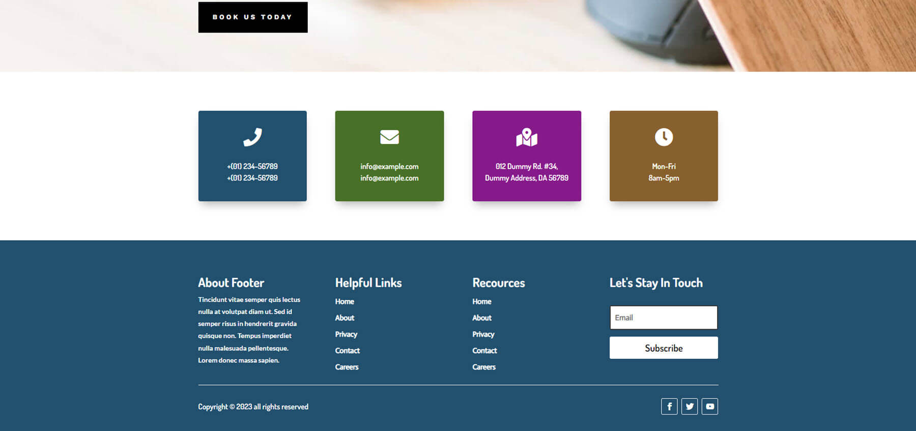
Footer Design 77
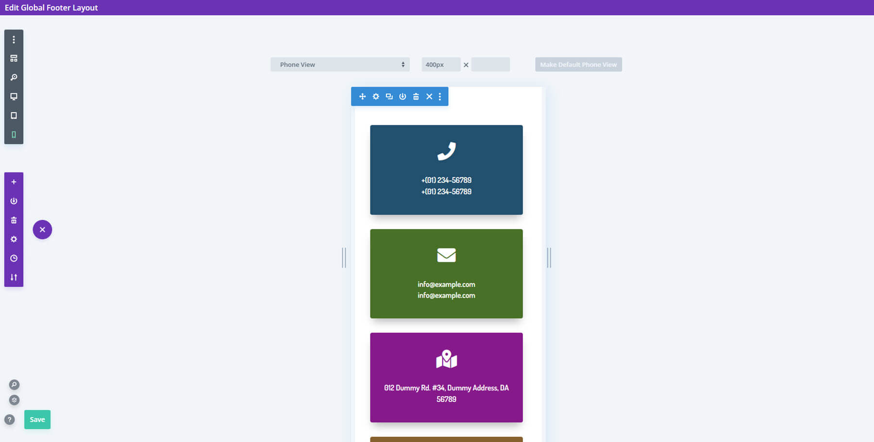
Footer Design 77 also includes two sections. The top section displays contact information in large boxes with clickable text and icons. Their backgrounds contain different colors, and they stand out from everything else. The bottom section includes four columns with the standard footer content in white against a blue background. Social media icons sit under the email form.
Here’s a look at how this footer works on mobile. The contact information blocks, as well as all of the footer elements, stack.
Divi Footers Pack Footer Design 81
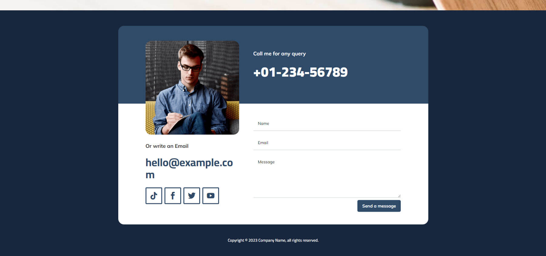
Footer Design 81 includes a large blue background with styled contact information in the center with rounded corners. Contact information includes a two-color design with an image that overlaps the colors. The top portion shows the phone number in large text over a blue background. The bottom portion includes a white background with an email link and social media links under the image, and a contact form on the other side. I like the square border for the social icons.
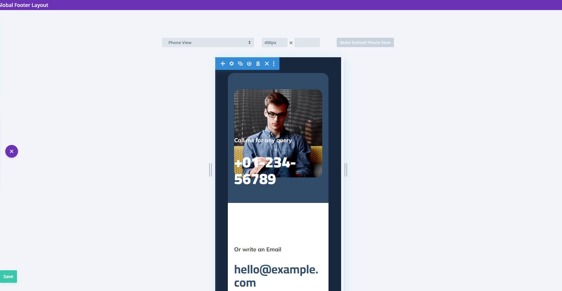
Here’s how this one looks on mobile. All the columns stack. The contact form fits the width of the screen.
Where to Purchase Divi Footers Pack
Divi Footers Pack is available in the Divi Marketplace for $19. It includes unlimited website usage, one year of support and updates, and a 30-day money-back guarantee.
Ending Thoughts on Divi Footers Pack
That’s our look at Divi Footers Pack for the Divi Builder. There are a lot of pre-made footer designs in this pack. We’ve only looked at a few of the layouts in this post, but this should provide a good idea of how well they work with any Divi layout. They are easy to use, but I recommend uploading all of them at once if you want to use more than a few of the layouts. All the layouts look professional, and they have a wide range of designs to choose from.
We want to hear from you. Have you tried Divi Footers Pack? Let us know what you think about it in the comments.
The post Divi Product Highlight: Divi Footers Pack appeared first on Elegant Themes Blog.
