Measuring your site’s performance has often been a hit or miss job. This is because the available tools didn’t give us a proper insight into the experience of the user relative to that site performance. However, Google Lighthouse fixes a lot of these drawbacks, and makes it so you can fit it into your development workflow. One of the ‘opportunities’ within Lighthouse is to defer offscreen images in WordPress. The good news is this is simple to achieve.
For this post, we’ll look at  how to defer offscreen images in WordPress using both code and plugins. First though, we have to clear up a few terms about Google Lighthouse, then talk about where the Defer offscreen images metric should sit on your list of priorities.
The difference between an audit recommendation and an opportunity
Before we get into how you defer offscreen images in WordPress, it’s important to understand how this instruction slots into Google Lighthouse. It’s a performance ‘opportunity’ rather than an audit recommendation. Here’s the difference:
- Audit recommendation. This will have a definitive impact on your scores within Google Lighthouse, and you should give these metrics your attention as a priority.
- Opportunities. While these will still have some importance, they won’t impact your audit scores. As such, you can consider them a secondary concern.
The Defer offscreen images metric is an opportunity. This means it can still have an impact, but it’s something you can look at once your score can’t improve any more.
Defer offscreen images – a definition
Your website will likely use images across all sections of your pages. Some of these will display ‘above the fold’ – i.e., on screen without the need to scroll. As such, the offscreen images represent everything else.
The Defer offscreen images metric refers to visual elements that meet any of the following four criteria:
- An image has to begin below the visible page area, and end three times the height of this area.
- Super-small images (those less than 0.02 MB in size) won’t factor into the Defer offscreen images metric.
- Pages that take more than 50ms to load will trigger the opportunity.
- If your page defines a loading attribute, you won’t see Defer offscreen images at all. Spoiler alert: get comfortable with
loading="lazy"now!
What’s more, you might find that a site with a lot of offscreen images will see poor Largest Contentful Paint (LCP) scores. This brings up a confusing change to Google Lighthouse 10, which we’ll cover next.
Improving Time To Interactive (TTI) is a depreciated metric
In older versions of Google Lighthouse, Defer offscreen images affected TTI. However, Google now considers this a depreciated metric. The 10% weighting this gave the overall Performance audit score transferred to Cumulative Layout Shift (CLS) and now provides 25% weighting [1][2].
This brings about a problem, in that regardless of whether you do or don’t defer images offscreen, this won’t cause a layout shift. As such, this is why Defer offscreen images is now only an opportunity, rather than a full audit recommendation.
Why Google Lighthouse will ask you to defer offscreen images
Despite the relegation of Defer offscreen images, it still has some importance for loading speed and performance. You can see the impact of fully loaded offscreen images in seconds within whatever tool you choose:

While this metric doesn’t impact CLS or TTI, it can have an impact on LCP – albeit minor in many cases. It’s also a good reminder that you should only load images when you need to. Next, we’ll discuss why.
Why you shouldn’t load all of your images at once
In conversation, we all work upon the ‘cooperative principle.’ This isn’t a social sciences lesson, so we won’t go into huge detail here. However, there’s an important facet of this concept that matters to the Defer offscreen images metric. ‘Grice’s maxim of quantity’ states that you should only reveal as much information as you need to establish context.
Why is this important? Because if you give too much information, this can cause overload for the listener (among other issues.)
As such, you shouldn’t load all of your site’s images at once either! This is for a few solid reasons:
- A user won’t see the offscreen images, and they will otherwise take up resources that you’ll need for elements on screen.
- Loading offscreen images could contribute to a poor User Experience (UX,) because a page will load without anything happening of note within the viewport.
- For the user, this might also cost them financially. For example, consider someone browsing to a site that doesn’t defer any offscreen images while using mobile data, rather than Wi-Fi.
Given that Google Lighthouse’s focus is on UX and how perceived performance affects it, all of the above is vital to understand. The good news is that there’s a straightforward way to defer offscreen images.
How to defer offscreen images on your site
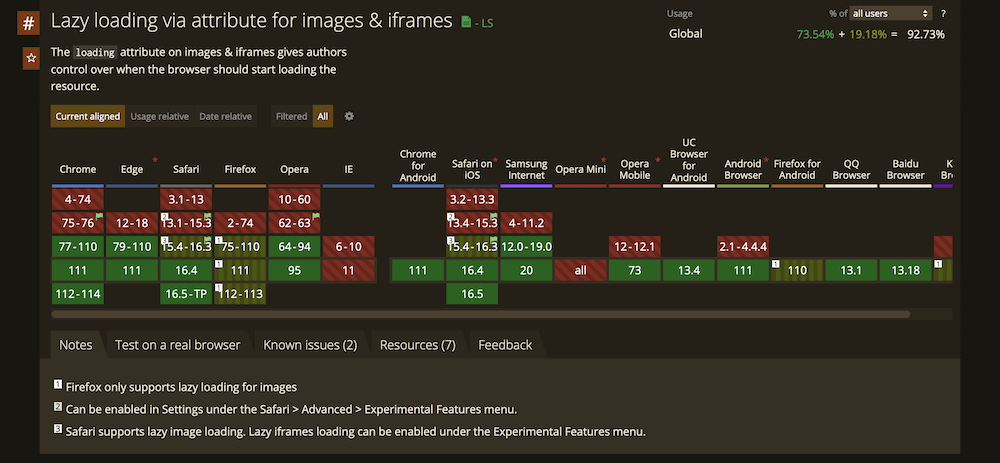
The answer is: lazy loading. This is the most straightforward and effective way to reduce the impact of offscreen images on your site’s perceived performance. Even better, most browsers support lazy loading:

However, Firefox only supports lazy loading for images, which will matter if you choose to implement this for Inline Frames. Still, you have a number of ways to implement this. The main approach uses the HTML loading attribute within an <img> or <iframe> element. You’ll get the option to use three different values:
eager. This will tell the browser to load these images first. It’s the default option, and is as good as not including it at all, in that images will always render regardless of where it is on the page.lazy. This will defer loading an image or iframe until it reaches a hard-coded distance from the viewport. The exact distance can differ between browsers, and you’ll also want to always specify image dimensions too.auto. The browser will choose the best option for the job.
This is as simple to implement as you’d expect:
<img src="image.png" loading="lazy" alt="" width="200" height="200">Of course, there’s nothing to see on the frontend here, because the image will be offscreen and invisible anyway.
If you choose to use Accelerated Mobile Pages (AMP), you can implement lazy loading on an automatic basis using the amp-img element. When it comes to other platforms, modules or plugins are the best way to implement lazy loading.
If you wish to defer offscreen images in WordPress, you’ll want to use a dedicated plugin to do so. By default, WordPress implements lazy loading for all images, but this broad brush might not suit your exact needs.
Using WordPress plugins to add lazy loading to your site
Whenever you want to add any extra functionality to WordPress, a plugin is always your best bet. When it comes to lazy loading, this can also be the case.
WordPress has a number of plugins that can help you add lazy loading, but not all are equal. For instance, some have poor ratings and reviews, others don’t get many updates, and some even can’t provide the right level of functionality. However, Optimole can deliver the goods when it comes to both image compression and lazy loading.

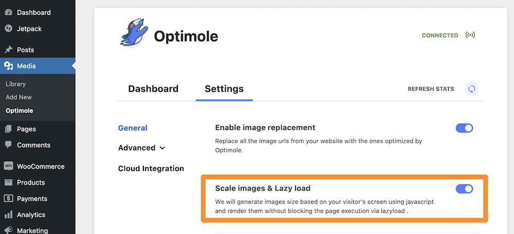
This won’t be an overview of what Optimole can do in general – our sister site Themeisle can show you that. Instead, we’ll highlight the quick and pain-free options you have to lazy load images. To find the right options, head to the Media > Optimole > Settings screen, then look for the Scale images and lazy load toggle switch. You’ll want to make sure this is on:

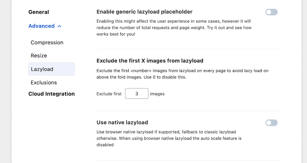
Once you do this, a whole host of options will become available within the Advanced > Lazyload section:

This gives you a valuable set of options to work with. For instance, you can enable a placeholder for your images, toggle between browser native or classic lazy loading, enable image scaling, and more.
However, there are two settings you’ll want to investigate further. The first lets you exclude a set number of images from loading. The default is three, but you can set this to however many images you have above the fold. It means you’ll implement lazy loading for all images on site:

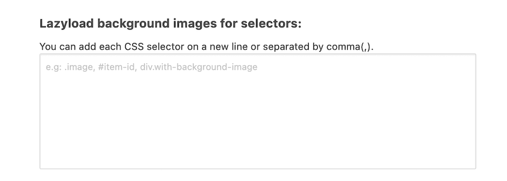
The other cool feature is the ability to specify CSS selectors to help you lazy load background images:

This gives you a way to customize the entire lazy loading experience based on your needs and Lighthouse score, yet retain some flexibility. What’s more, all of the above is possible with the free version of Optimole!
Conclusion 
If images aren’t on screen, you don’t need to load them. Without a solution such as lazy loading, you stand to lengthen the time it takes for your site to load. It will also affect some of the most important metrics that relate to performance. Google Lighthouse’s Defer offscreen images opportunity gives you a push to implement some kind of lazy loading, and there are plenty of code-free ways to do so.
For instance, Optimole is one of the best plugins to help you defer offscreen images in WordPress. You’re able to set options with a greater specificity than the global ‘always on’ approach WordPress takes. However, there are other plugins that help you do this too, such as caching plugins. Even the coding path is straightforward, and even better, you get support from nearly every browser.
Will Optimole become your method to defer offscreen images in WordPress? Share your thoughts with us in the comments section below!
